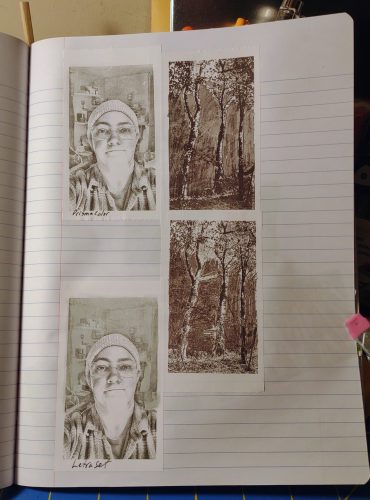
I have written here on multiple occasions about my love for David Hockney’s work. I’ve been fortunately to see a couple of his shows when they’ve come to the east coast. One that stands out was when my friend Jane and I met up in Portland, Maine for an artist’s date and decided on a whim to go to the Portland Museum of Art. I don’t know if Jane knew there was an exhibit of Hockney’s work there or not but I was delighted to go into a relatively small room and see a number of his works, including a favorite, Pearblossom Hwy.
Done in 1986 he used a point and shoot 35mm camera to take multiple shots of the same scene. Which he then pieced together into a 48×64 inch collage. He’s also got a series of works done with a Polaroid arranged in a grid.
really interesting stuff.
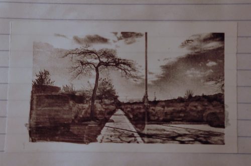
My friend Erik went to a recent Hockney show and snapped a picture of Pearblossom Hwy and sent it to me said he wondered what I could do with one of the thermal printing cameras.
And hot damn, I set out to test out the idea. I wanted something more interesting than just a landscape. I headed to the Willows for one of my morning constitutional walks and thought I’d do something with one of the benches or buildings.
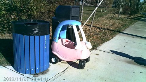
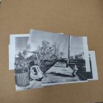
Instead I was presented with a ripe opportunity- someone had discarded a Little Tykes Cozy Coupe, in faded red and blue; at the recycle and trash bins. It was backed into the bin like it had been parked there purposefully and not illegally dumped. I decided this was weird enough to be my subject. So I set about snapping a whole range of photos, 5 up and 6 across. A total of 30+ images.
I learned a lot with those 30 images. First off, space my images out a lot more. And don’t move my feet, much. To keep things in the same perspective I tried to keep my hands at the same level and played with just tipping the camera.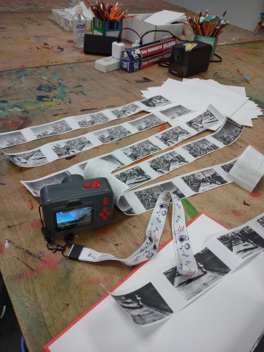
Obviously I need to test this out some more. but what a really cool little range of images I got from one set of 25 images.
Later That Week: Further Explorations
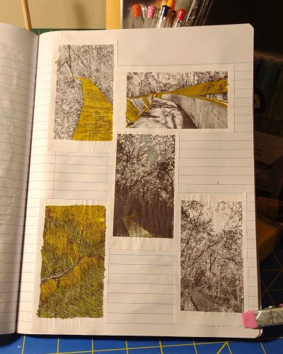
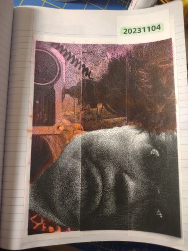
I headed back out to the Willows to see if the Little Tykes Cozy Coupe was still next to the trash, and it was. What luck. I moved it back to the same spot where it had been. (It had been moved around.) I then set about to take more photos of the scene. I took what I learned- move the camera more between images and move to the sides and above more.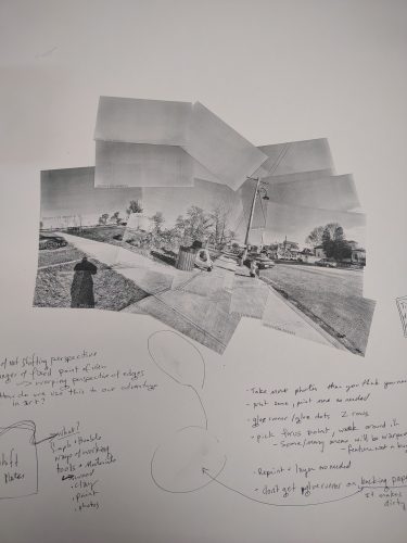
IN this image you can see I took many more images, probably close to 50 or 60. I did not use them all, but having more was better than too few. I also used this as an example and working piece to figure out some more stuff. More on that.
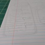
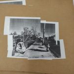
I also tried another scene, this one of a do not enter sign, and another of the parking area for Blue Bikes. 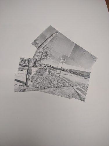
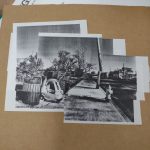
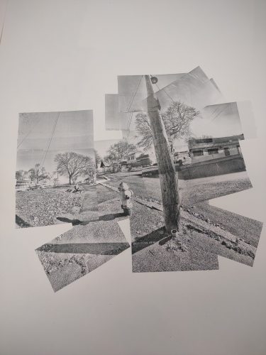
I think this telephone pole and fire hydrant is super cool and really shows how the camera can distort and tweak the image.
With this one I focused my attention on the do not enter sign and getting a clear image of that leads to distortions around it. There’s a metaphor there.
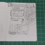
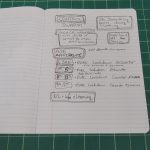
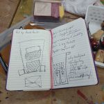
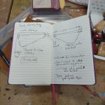
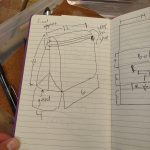
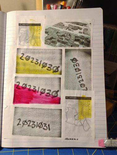
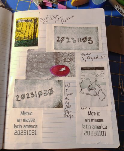
For the notes:
- Take more pictures than you think you need or want.
- Print some of the images, then print more as needed.
- Use a glue runner or other film style glue instead of glue stick- glue stick tends to curl paper and not stick to the plasticky coating of the paper.
- If you pick a focus point you’ll get distortions as you move the camera around, this can be very cool.
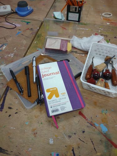
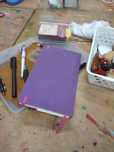
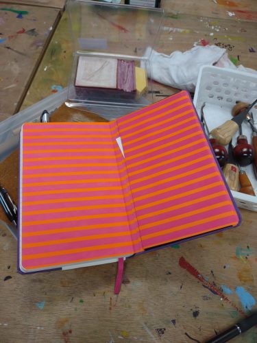
- Use a heavy weight paper or put it in your journal.
- The time stamp can be very distracting in some areas of the image. I like it in most of the image so I work around it.
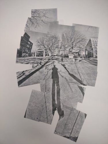
With this last image. I shot maybe 100 pictures but only printed 50 of them to start and printed more as I needed to fill in areas, but I REALLY wanted to play with the idea of perspective and distortion around the edges. So I really worked with keep my feet planted and moving my upper torso around to take the shots. I then realized I could keep one foot planted and ROTATE my other foot around it. I chose to keep my left foot planted and rotate around on the ball of that foot. This worked REALLY well at creating the warped perspective I was looking for. I think I could go back and fill in the empty areas with some more shots. Either way this piece is much larger than the others. The others are about 6″ square while this one is about a foot and a half high.
Anyway I really dig this.
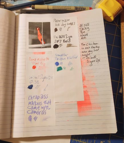
This is the camera I have been using for this exploration. It prints a little more slowly but it’s black and doesn’t draw attention despite being pretty large when compared to the other cameras I have.
Links are affiliate to amazon. Bezos tosses me a few coins should you buy anything via my links. It’s not much but it helps to keep me in coffee. If you are interested in buying me a coffee and helping this blog stay up and running hit up my Ko-Fi page. I post there regularly and you get all of the posts here a week in advance. I also post some members only content for supporters. thanks for reading.
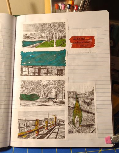
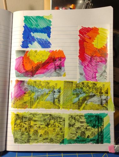
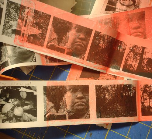 Short answer is: yes, it will work, but you need to finesse it.
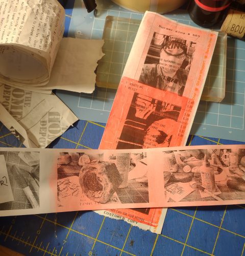 Too much paint and it obscured the image. Too light an image and details were obscured too much. To opaque a paint and you can’t see the image at all. Too much paint of a transparent color- image is obscured.
 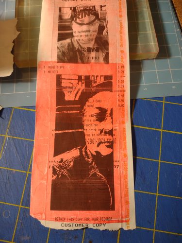 I started with an excessively thin coating of paint. This produced a very washed out color. I did layer on a second coat of paint and the paper did okay but felt weaker. This paper is pretty weak compared to sketchbook or even regular printer paper. Let it dry completely between coats from the gel plate otherwise you risk tears.
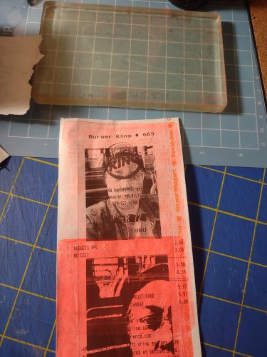 I found this really let me get a nice lovely layer of complete color over the image. I’m thinking of the usual ways I use a gel plate to create images- masking and stencils…. I’ll get more into that in another post.
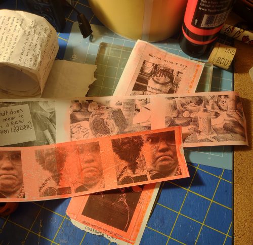
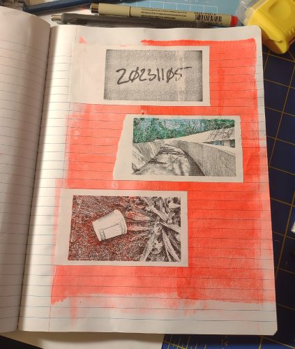
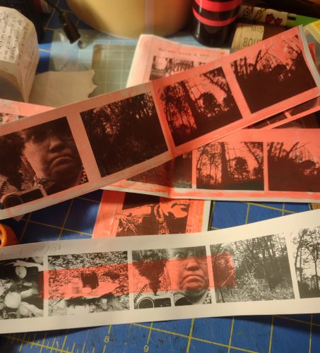 I didn’t spend much more than 15 minutes on testing this idea out and I think it adds a lot to these images. There’s something about a pop of color that can really bring out an image. I can’t wait to play with stencils and masks with these.
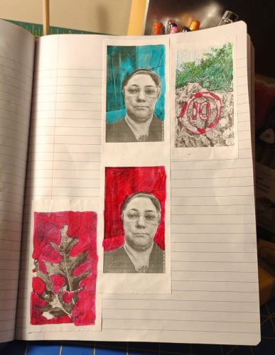
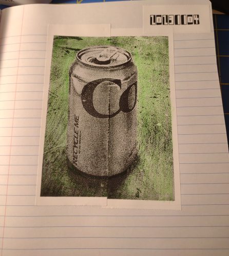
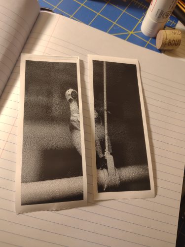 Then I had to decide how many cuts, and how large I’d like the image. 2 cuts keeps it small, 3 cuts makes it larger. The original shape of the photo will matter- the soda can is much large than the chicken because it was taken with an app set to 16:9 while the chicken was cropped to 4:3.
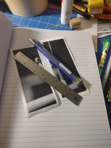 Some notes: These images did not print exactly, that is to say some of my prints were longer than others and some shorter. They didn’t match up perfectly either, it was like there was a 2 or 3 pixel gap. I think the imperfections work perfectly for my uses- my journals.
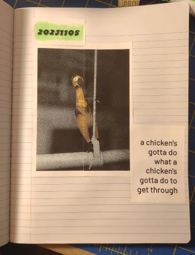 Notes:
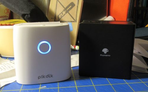
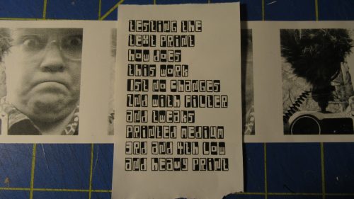
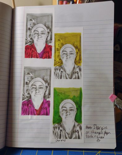
 I suppose some of this is a minor quibble. The prints are fantastic, it’s just I want more control and you know I like to print a lot of photos all at once. I want to print 10 or 20 in a reel to create my crankies. Having to print one at a time is annoying. I can print more than one at a time in the graphic edit mode, but I cannot adjust the contrast or exposure.
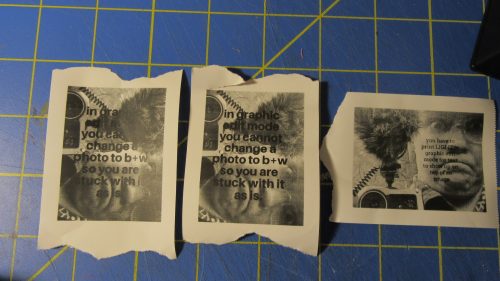
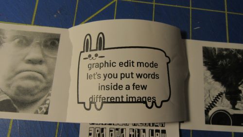
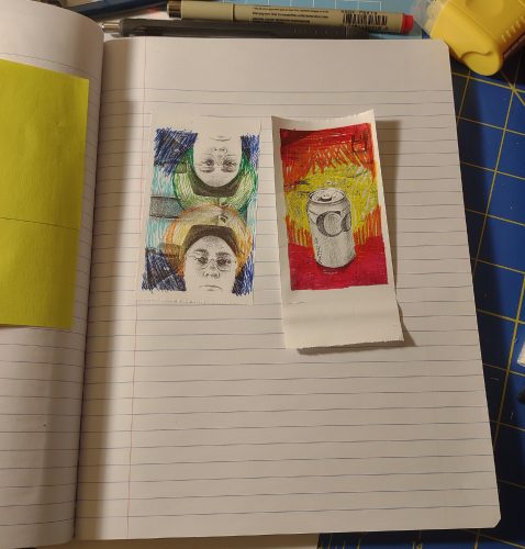
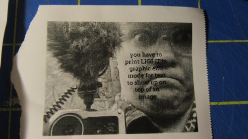 I like this. I didn’t test this, but I have printed and then reloaded the image into the printer and printed over it. I’ve also taken a reel of images from my toy cams and printed words over them. It can be really cool.