Review: NovelPad Cloud-Based Writing Tool Part 1

As part of my new series on writing processes I am exploring a series of websites and apps that are similar to Scrivener but are a little different. NovelPad.co is a browser and cloud based novel writing app. It features a chapter and scene card based outlining and writing tool, a character and scene tracking and outlining tool, goal tracking, an insights tool, and the ability to export into a variety of formats. I’ll explore all of these tools in detail in this review of the cloud-based writing tool, NovelPad.

Everyone’s writing needs are a bit different from another person’s, but I need an app that will sync across devices and can be used on my PC* laptop, android** phone, and Fire*** tablet. Whatever I use to write, needs to work as well, if not better than Docs on these 3 devices. When I hit save on one I want to see that work on all 3 as instantly as possible. 

I currently writing in the morning and evening on my cheap laptop, on my lunch break on my tablet or phone. In the pre-Covid times I wrote in a café on Friday evenings and Saturday days. When I’m out and about my tablet and a small compact BT keyboard are a lighter weight option so it is important that any of these writing tools I review work seamlessly on the tablet and phone.

To start this review out, NovelPad works well on all my devices. It has been speedy and smooth my my cheap laptop, slick in the Silk browser, and great on Chrome on my phone. Chrome is sideloaded onto my Fire tablet and it seems that the ‘Zon interferes with sideloaded apps and their ability to use BT devices connected to the tablet. I have been able to work in all my usual manners in almost all my usual locations using NovelPad.NovelPad Opening Screen- Review of the cloud-based writing tool, NovelPad.

NP has a simple and clean interface. At the website you are greeted with a clean page that include icons that look like books with the titles of your novels. When you mouse over, or tap them, they open the book and offer for you to open that document. It opens to the “edit in context” option, where you can write directly into your novel. Along the left side of the screen are a series of icons. It took me a moment to figure out the icons and their meaning, and the tutorial is pretty clear.

NovelPad Navigation Bar

The icons are as follows:

  • Edit in Context
  • Chapters
  • Plot
  • Characters
  • Location
  • Insights
  • Goals
  • Save
  • Export
  • Settings
NovelPAd Chapters Horizontal View

Horizontal View

NovelPAd Chapters Vertical View

Vertical View

I really wish it opened to chapters for many reasons. Chapters is what makes NP really stand out. Chapters allows you to set up chapter cards and scene cards within each chapter. You can then easily drag and drop scenes and even whole chapters into new locations. Chapter 3 not working between 2 and 4? Does it need to be between 7 and 8? Drag, drop then renumber. It’s ridiculously smooth and easy. And I love it.

As I was working on my NaNo novel, I realized I’d left out a scene at Thanksgiving. I dropped a scene card in that said, “Add Thanksgiving angst.” I then highlighted it in orange so that it would stand out as I worked on my novel. The color coding is meant to assist you in tracking plots and scene changes, but I have found in my raw writing stage it most useful to remind me of where I’m currently writing and what scenes need more work.

I really like that I can open the chapters tab, click the pen icon for a scene, and a writing area pops up. The writing area can be half or full screen. With this I can keep an eye on the outline as I write. I can easily toggle between my writing and my outline. It really helps to keep me on track.

Each scene has an associated notes section, the icon looks like a tiny sticky note in the corner. This allows you to drop in research notes, character ideas, and other associated information into the body of your work. The notes section can also be set up with a reminder, that can be set to remind you in an hour, a day, week, or month. Nifty.

Because I’m finishing my NaNoWriMo novel I decided to stress test all the apps I’m testing with a cut & paste of the 58k words in a Google doc into each app. I wanted to see if the app would 1. divide the doc up into scenes and chapters based off my heading structure 2. use three * to divide into scenes 3. be able to handle the giant number of words dumped into the app.

I don’t recommend dumping nearly 60k words into any app, heck even Docs doesn’t handle it well and Word’s online version was shaking apart at the seams. It took several tries for NovelPad to accept the cut and pasted doc. It did not divide into chapters and scenes in a way that made sense, though it did break the novel up into several scenes, though they seemed to be rather random. Instead of cutting and pasting 60k words at a time, I’d suggest pasting the novel in a chapter at a time.

This might seem like it’s a negative, but does anyone really expect any app to handle that large a document in one large cut and paste? I would like to see NovelPad include an upload feature that works as well as their download feature.

Once your novel is finished you can download it in markdown, ePub, and Word formats. The process is simple and easy. Best of all it works well.

In Part 2 of this review I’ll look at the Plot, Character, Location, Insights, and Goals sections of the app.

Continue reading

Week Links 202102

Jestine wrote about running tasks lists in bullet journals at Rediscovering Analog. It’s a great way to keep a week’s worth of tasks organized and would blend seamlessly with an Every Thing Every Where Journal.

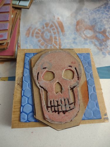
I’ve been thinking about rubber stamps, mainly because I’ve gotten a bunch of them for my Every Thing Every Where Journal. Also, Andy of Erasables asked about stamp pads over in the RSVP group. Ana (of The Well Appointed Desk) has a good review here, and carries Ranger Archival ink pads in her shop and writes about them here. I like Ranger ink pads but I also really like Staz-On for stamping on the outside of my journals and for making stickers and labeling envelopes. It’s messy stuff though. I also have an assortment of pigment pads. Pigment pads might take longer to dry and make a mess of your stamp (clean them well after use) BUT the richness of the ink is worth it.

State of the Art: Coffee Bag Wallets

I’ve been making recycled coffee bag wallets for years. I used them extensively throughout grad school and sold them. I haven’t had time to make them recently.

Many of the coffee companies I’ve been getting coffee from have changed the bags they use- they’ve gone from the tube style to a style that has 4 sealed edges or are short and squat. I welcome that they use less plastic but the lower amount of plastic means I don’t get to make the bifold bill fold wallet, since there just isn’t enough bag there to make one.

I started looking at some of the wallets I like online, and my Baronfig card sleeve. I’ve always wanted a slim wallet that holds very few cards and takes up as little real estate in my pocket as possible. But I’ve always wanted something that holds cash as well. The Baronfig sleeve doesn’t hold cash well.

I decided to make something a bit larger all around than my Baronfig sleeve, not to hold more card, but to hold cash.

I attempted to heat seal the pieces together but that didn’t work well at all, so I’ll try stitching them together. That’s for next time.

Review: ScribbleSheets Orange Opal Edge Journal

ScribblSheets popped up in most of my social media feeds and I admit I was quite taken with the pretty edges. I reached out to the company and requested a copy for review, I’m really glad they said yes. Shipping was delayed due to the current state of the USPS, but wasn’t as bad as some of the other things I’ve ordered recently. The journal was packaged in a bubble mailer and within that a crisp cellophane wrapper.

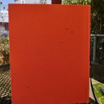
At first glance the ScribblSheets Orange Opal Edge journal looks like a standard moleskine style journal, and in many ways it is. It measures 8.25×5.75 inches or 21x14cm also known as A5. It includes a sturdy elastic and a generously long narrow ribbon. The ribbon arrives heat sealed but I hit mine with a lighter just to get that seal a bit extra.

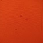
The covers are black vinyl or what everyone is calling vegan leather these days, and I won’t rant on the disingenuous nature of the idea of vegan leather. It’s plastic, and vinyl at that. It’s a nice vinyl and feels grippy and slightly squishy. On the lower back cover the ScribblSheets logo is debossed. It’s small and tastefully done.

The back cover sports an elastic loop for a pen, it’s large enough to accommodate a fountain pen, mine is currently holding my Wing Sung 3013. But It’ll hold a Preppy snuggly. It will not hold a pencil. I find that it’s a tad narrow and my pen flops around a bit, but in my Lihit Lab Bag in Bag it’s fine.

The inside back cover lacks a pocket, but I added a little slash pocket of my own. Inside there aren’t any markings at all. No logos, no square or lines to write your name or address. I used a ruler and added mine own in pencil then cleaned it up. Easy. There aren’t any page numbers either.

The grid is perfect. It’s the palest grey imaginable, so it completely disappears behind your writing no matter the color. I love it. At 5mm it’s a perfect distance for my writing. Each page has 40×28 dots per page. It’s a good number for a bullet journal- enough spots for a monthly log and more than enough for a day’s task list. My Peter Pauper ruler works perfectly with this grid size.

The paper is amazing with pencil, it’s got just the right amount of tooth for an HB like the Musgrave Harvest Pro or even the firm core of the Blackwing Eras. I also really like it with ballpoint and gel inks.

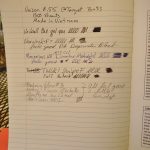
The paper does okay with finer nibs and well behaved fountain pen inks. You’ll be able to see in the images some long fibery feathering that reminds me of the old moleskine paper. But then it does fine with other inks and nibs. Generally, thus far I’ve been sticking to my Wing Sung 3013 loaded with Shaeffer Skrip Peacock Blue. It has been doing really well with this ink.

Now, let’s talk about the Orange Opal edge on this journal. It’s incredibly pretty. I’m not sure how they get the edge colored, I’m assuming that it is some sort of printing process, what ever it is it’s great. The colors are lovely and soften as the journal is opened. I really love the pattern and how it looks. It’s a nice touch on a nice journal.

Inside there are 160 pages stitched in using the Smythe (the same as the moleskine) style. They lay flat and the pages stay open. I had a few loose stitches in the start of my journal, but it didn’t impact my use. I had absolutely no glue creep between signatures or at the stitches. The block of the journal is affixed to the covers well. Like most journals the spine is stiff at first but then opens flat and is flexible.
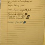
Overall I really like the ScribblSheets Orange Opal Edge Journal. With 160 pages I’m not looking at more than 3 or 4 months use before I have to start a new journal, but I like starting a new journal. At $16.99 it’s not cheap but the pretty edge is a nice design element, and while the insides are sturdy and useful, that edge makes this journal stand out. It’s a pretty element that might seem a little frivolous at first, but it’s an understated design element that only the keen observer of your bullet journal will notice, but I notice every time I open up the journal. I like that.

This isn’t going to be your fountain pen journal, but the journal you use on the go with a pencil or gel pen, maybe even a Bic Cristal.

Continue reading

Maker: Setting Up My Every Thing Every Where Journal

I mentioned on instagram that I had decided to retire my 2020 Every Thing Every Where Journal (ETEWJ) and start a fresh one for 2021. I never do this. The whole POINT of the ETEWJ is that it is flexible and not retrained by dates or years, rather it flows undated with my needs and my uses.  The next issue of Useful Journaling (1.3) explores the idea of Every Thing Every Where Journals.

My need for 2021 is to leave behind 2020. Also, the Baronfig Work/Play III has a lot of really intense journaling that needs to be left behind, though referred to often. Mostly I did not want to carry that weight with me on the daily.

So I ripped open my new ScribblSheets (full review soon!) journal and started to set it up. You’ll recognize many elements from Bullet Journaling, but with some added flexibility. I’d cut out chunks and added things as I need change.

To start I add a bunch of sticky notes to the front pages- a few extra large lined, a few regular 3×3 inch, a few 2×2, a few flags, and a handful of tabs. I use these to flag books I’m reading but to also flag important notes in my journal as I’m working. I’ll slap the large post it notes on the outside of the journal to trigger me to remember specific things.

The first spread of pages gets divided into 3rds, and I add in what would be called a “future log” but only includes 6 months. My ETEWJ rarely lasts 6 months, sometimes they are abandoned, but more often than not, I fill them in 4 to 6 months.

I then add in monthly logs for the next 2 months. I use a durable file tab in blue to mark the current month, on the fore edge of the book for easy access. I use these to mark off weekends, pay dates, dates when bills need to be paid, and when I need to do various assort things around the house. Blogging info goes in here as well.
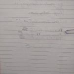
Then I’ll start specific project logs. These only get a paper tab when I’m actively working on that issue. If you think of GTD, this would be your project to do list- it’s got all the things that need to get done to make this project a reality. I call this my Every Thing Task List In the case of this example, Useful Journaling, the to do list doesn’t change, but it helps to make one of these lists for each issue. The opposite page get the rough outline for the current issue I’m working on. This will get translated to Google Docs or NovelPad for drafting.

The next spread gets my Blog Posts To Do list. This page gets a durable plastic tab on the top edge of the page in whatever color I’m feeling at that moment. When a stationery item arrives at my house it gets logged here. As I write, photograph, or post I tick off the appropriate box.

Then come my weekly logs. I use a separate DayJob bullet journal, so my ETEWJ only concerns my side hustles and other creative work. Having a daily log for all of this seems unnecessary and I don’t put pressure on myself to do this work during my DayJob work week. Generally these are labeled with weekend dates. The opposite page is for information gathered in regards to my side hustles and creative work. The left page is for short bursts of info, quotes, and things I want to remember.

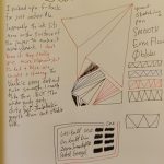
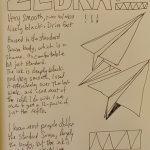
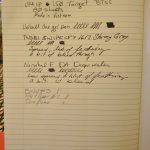
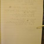
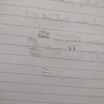
This series of notes is from my old ETEWJ.

This series of notes is from my old ETEWJ.

After this I’ll use the next free series of pages for notes. If I’m reading my ETEWJ is there with me. I’m taking an edX class on Project Management, my ETEWJ is there with me as I take notes and learn. I also use as many pages as I need for planning and designing things I’m interested in. I’ve got ideas for making planters out of pallets so I drew up some basic designs in my journal.

Then I’ll start the weekly log for the next week. The ribbon marker is always on the current week’s log.

Rinse, repeat as needed.

What I like about this system is that it is fluid and easily adapts to what I need,

Review: Wing Sung 3013 Vacuum Fountain Pen

The Wing Sung 3013 vacuum filling fountain pen is 100% copy of a TWSBI Vac 700. I won’t lie, I purchased the Wing Sung because the price of the Vac 700 is out of my reach right now  especially for a pen that I wasn’t sure I would like.

For $7.42, the 3013 is a steal. It feels well made when compared to some of my other knock off pens. The body is sturdy, threads well molded, and generally looks pretty nice. The cap continues the TWSBI knock off theme and looks startlingly similar to TWSBI’s caps. The clips is generic looking but sturdy. The finial is plain domed chrome. The cap is postable but throws the balance of the pen off.

The nib is the classic Wing Sung Pilot knock off, and mine is fine, and writes smoothly. The feed is clear plastic and also a Pilot copy. The grip section is round plastic and reminiscent of the TWSBI Diamond series.

The back end has a cap that unscrews. One must be careful to NOT unscrew the silver band just below the cap as that will allow you to removed the mechanism. Once the cap is unscrewed the piston slides in an out much like the plunger on a hypodermic needle.

The mechanism builds up a vacuum until the plunger reaches the bottom of the body of the pen, at which point the vacuum releases and sucks up ink. Getting a full fill takes some work and practice, but once done, this pen sucks up an enormous 2 ml of ink. To compare, most pens take up about 1 to 1.5 ml. A converter gets about .75ml, while a cartridge has around .5 to .75ml. 2ml is a huge amount of ink!

The only problem with it sucking up that huge amount of ink is that only only get to fill it once in a long while, and frankly, I really want to watch this thing suck up ink!

The nib is smooth and the grip is nice. I did fine that the body of the pen is a bit sharp, but this didn’t actually impact my use. The sharp area didn’t rest on my hand or under my fingers. I did use a sharp knife and patience to knock the sharp edge off the body of the pen. I know that the sharp edge was a complaint of some early Vac 700 users.
Overall, I really like this pen. At $7.50 it’s a steal. The combination of the fun filling mechanism, nice heft, and smooth nib makes this an everyday use kind of pen. That is to say, that since I received this pen and filled it I have not put it down. There is no getting around the fact that this pen is a direct rip off of the TWSBI Vac 700. After using this pen, I’m convinced I will like the Vac 700 and I’ll be using the Vac 700 as a carrot on a stick.

Continue reading

Week Links 2021-01

I’ve been thinking about index cards again. I just picked up a new to me but VERY vintage steel card box to match my other vintage steel card box and just wow are they pretty.

But it got me thinking about using index cards again. Here are some links to pictures that I spent time pouring over and reading.

The Pile of Cards Method:

Pile of cards album

Pile of cards album 2.

Then there’s this collection of techniques.

Maker: Demise of Small Companies

Way back in 2009 or even further back I picked up a copy of Make the Cut a fabulous software that let me control my Cricut craft cutter. I was able to cut anything I wanted and items of my own designs. Awesome.
Well that was fun, until Provocraft decided they didn’t want third party software controlling their machines. Then sued the makers of Make the Cut. Make the Cut was tied up in court for years. Googling the company shows several lawsuits. Eventually the software was locked down and the code needed to make the software able to work with the cricut was locked out. If you upgraded your copy of make the cut past MTC 4.1.0 it can’t be hacked to work. You also need to install the pccplugin which you have hopefully saved on a thumb drive somewhere.
Make the Cut is now abandonware. The developer has allowed the site to come and go it is currently up and you can download the software, though there are reports in the forum that the new serial numbers no longer work. The forum and site are up now, I was unable to get any assistance from the owner for getting my reg key. I used their automated system and it did not work. I also have not received an answer via their support ticket system. According to several users on the forum, the user has not responded to anything on the forum for over 5 years at this point (writing this 12/2020).

If you have access to the computer you had Make the Cut installed on you can use these instructions to attempt to retrieve the registration code. I was able to successfully reboot my nearly dead old laptop and pull the code out. Then I emailed it to myself AND saved the MTC4.1.0 installer, pccplugin, and reg code to thumb drive. This will get stored in a safe place and I’ll also back these files up to the cloud. And you should to.

I’ll update my old posts about MTC. Apparently now you need to use Sure Cuts a Lot, but I do not think it can be hacked to work with the crapcut. Again I salute Provocrap with a middle finger salute. We should be able to use the Crapcut with any software in the same manner we use a printer.

Continue reading

Review: Peter Pauper Metal Stencil Bookmark for Bullet Journals

The name of this ruler is ridiculously long. It tells you everything you need to know about what this thing is in one giant mouth full.

I have been eyeballing this stainless steel ruler for a few years. It would go out of stock then jump up to $10 then drop down to $5 and go out of stock before I got home from work. Bonkers.Stencil bookmark for bullet journals

I finally say it was $4.95 again and IN STOCK! After ordering it arrived in a few days. The ruler/bookmark is wonderfully thin. If you ever used an eraser shield, it’s slightly thicker and sturdier. The ruler is laser cut into the metal and looks great with metric on one side and imperial on the other. Between the two are a variety of dashed and solid lines, rectangles and ovals, as well as an assortment of little icons sized for a standard 5 or 6mm dot grid bullet journal.

I purchased this for the bookmark and ruler aspect. I find a thin ruler like this incredibly useful when setting up my bullet journal pages in my Every Thing, Every Where Journal (ETEWJ.) Even better is that a slim ruler can live in the pocket of my ETEWJ and not make a giant bulge to write over.

The ovals and rectangles will be the shapes that I most use in the stencil part of the bookmark. I don’t use icons when I habit track but I did test them out. The stencils work pretty well when used with a fine liner or felt tip pen. It did not work well with any of my gel pens and in fact ruined the tip on an Energel Pro refill! Luckily it was almost dead anyway. I did not test this with a fountain pen, but I would image it would kill the tipping on a good pen.

The little icons did fit in the 5mm squares of my BaronFig journal and I did not think to test them in my work Leuchtturm 1917. While I don’t see myself using the icon stencils in the future, I know a lot of people who are less confident in their ability to draw an envelope than I am, this is for them.

Overall, I really like this as a ruler and as a bookmark. It’s sturdy and the laser etched markings mean than the ruler will last. For $5 this is a great add on to any journal purchase or gift.

The link is an affiliate link to the ‘zon. If you follow the link and make a purchase, Amazon tosses me a few pennies sometimes halves and quarters of pennies. I did purchase this with Ko-Fi funds.

Week Links

In this week’s links I dive down a few rabbit holes.

Gelatin printing is the predecessor of the gelli printing plates. Linda Germain has a great blog and website dedicated to make plates out of gelatin. If you sign up for her newsletter you can get a very easy recipe for a partially plasticized version of the plate. That just means that the gelatin has been stabilized with glycerin and won’t grow mold the way just gelatin will.

I’ve been using Insight Timer to relax a bit here and there. It has free and paid options, and best of all the app has a nice little timer that uses different chimes instead of my phone’s horrible blaring alarm. There are loads of different folx doing the mindfulness and meditations so you can find a voice you like, versus getting stuck with voices you hate.

I love to look at drawings as much as I like making drawings. I discovered this guy via Austin Kleon’s blog.