Reflection as I Prepare for 2020

This, 2019 has been a rough year. I changed jobs, a family member had cancer and went through chemo and radiation, another family member has been ill, and then we have the whole government thing here in the US. This has been a year of transition and change, and rough patches.

Transitioning from one job to the next is always rough, especially as I moved from one with a top-down leadership style to one that focuses on teamwork. After nearly 20 years of working in top-down styled workplaces, moving into a teamwork environment has been a more difficult transition than I expected. In the past I planned for the first 6 months of any job transition to mean that I would work much less on my outside pursuits of writing, blogging, reading, art, crafting, and garden. And wow, was all of that impacted and for longer than 6 months. Hell, I’m going on a year and I’m just settling in. Add to all that I screwed up my shoulder and had a carpal tunnel flare up and whoa a recipe for not wanting to sit in front of the computer.

When I transitioned I had quite a few blog posts partially written and images shot so this blog didn’t see much of an impact until June. At that point, the combination of all the things in my life hit the fan and I simply was not able to focus on the blog much at all. My plan for 2020 is to get back into writing more posts, focusing on a few art materials, getting back into my professional ink series, and my cheap pens from China.

Another thing I might focus on is the use of the materials. Some of you may (or not) know that I started another blog, FermentStuff.com a place to focus and document my fermentation and gardening efforts.  I use pens and pencils heavily in my documentation of my garden and ferments. Recipes must be documented and seed purchases recorded.

After I wrote the above I was informed that my Grandmother passed away. Despite her advanced age and frailty, it was unexpected. As with any death, it has put me into an introspective mood. 

If there is one thing that 2019 going into 2020 taught me it is that we’re all human and life is short. Despite all my best intentions of writing and exploring art and writing materials, sometimes, life just gets in the way and things, like blogging, must be set aside for the moment. For now, I’m looking closely at how I use my stationery in my other hobbies- podcasting, writing fiction, and gardening; and let’s not forget the DayJob. It is always surprising to see how the stationery I love gets used in the pursuit of all my other interests. Stationery is a support and a tool. And with that thinking, I’ll be exploring a bit of that in this blog. I’m not sure how those posts will look, but they’ll be there. Despite taking a bit of time off from this blog, I’ll be back, with hopefully more reviews, weird little writings, some art, and an assortment of other written things. 

If you aren’t already following my instagram, my facebook, and twitter you should. Though I’ll warn you Twitter is where I get salty and rant a bit and my Instagram is a lot of food and cooking pictures, and if you don’t like plants you won’t like my instagram. You can also follow my other blog, FermentStuff.com for more cooking, growing, and queered urban homesteading activities.

Review: Baron Fig NYC Vanguard

Before I get into the nitty-gritty of this review, Dade and I sat down and recorded an episode of RSVP about the use of stationery in support of our other hobbies and activities. This has always been a core component of how I review but is especially important in this particular review.

I’ll start with the basics that you all know about BF. I love their cream-colored toothy paper that works just as well for pencils as it does for fountain pens and gel ink. It holds up to brush pens and colored pencils and feels great every step of the way. To boil that down- if you like dot grid and use almost any writing utensil it’s great. They use the same paper in the Vanguards as they do in the Confidants. Near paper perfection.

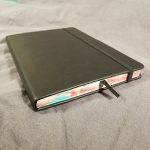
The vanguard is a 72 page stitched soft cover notebook. The cover stock is thick and textured. The stitching on this edition is black and sturdy. They do use back tacking to secure the ends, which is better and more secure than cutting the stitching but can leave an unsightly bundle of threads at the edges of the book. None of mine have this issue. Occasionally the stitching will be crooked or off-center, but all of mine were good.

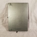
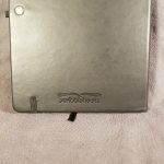
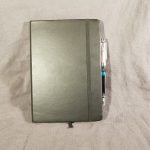
The covers of this one have art created by Josh Cochran. The colors are subtle blends of CMYK to create a near monotone effect. I’m not sure if this is intentional but I enjoy the various shades created. The lines in the art are both thick and shaky at the same time, and folks, I am here for it. Inside the covers are printed with a softer shade of the exterior of the main color of the covers. The back cover features a little doodle in the same theme as the cover. They are cute and a fun little addition to the notebooks. There are 3 different designs for the covers one yellow, one blue-green, and one in pinks. They are all lovely.

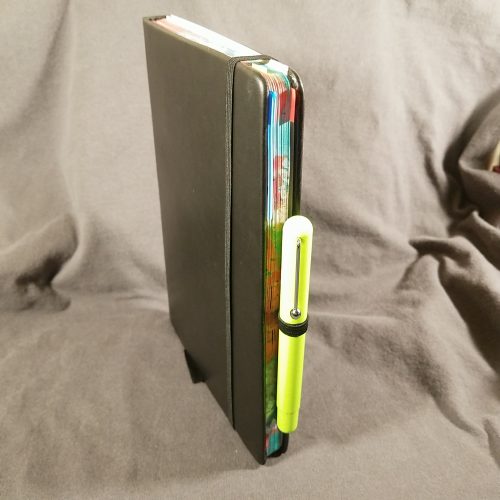
After ripping this package open, shooting pics for this review, I immediately pressed what I term the “summer” or yellow notebook into use for my garden planning and seed starting log. I’ve made my way through about the middle of the book. It has been tossed around my bag, the truck of my car, and had copious plans scribbled into its pages. What I really love about the Vanguards is that they are just the right size for a small to medium-sized project. 72 page is just right. The size of the pages is just right, and the softcover format allows you to open the book up flat to spread your ideas out across 2 pages without an overwhelming lump in the middle.

What I have been really surprised about with this vanguard is that the cover has stood up to this kind of abuse and use. Normally most of my notebooks get tossed into my bag or onto a desk. They don’t get wet as I log hydroponic feedings or smudged with dirt as I fill seed starting pots. What is most impressive with this is that despite being a paper cover it cleans off nicely.

You can get these lovely little notebooks over at BaronFig.com

Review: Pen + Gear No. 2 Wood Pencils 12-pack Black

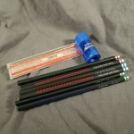
I write the bones of my review with the item in whatever journal I’m using at the time. It felt a little weird to write with this review in the Baron Fig Clear Plus journal. It’s a 5 cent pencil being reviewed in a nearly $30 journal. But this pencil performs more like a 50 cent pencil than a 5 cent pencil.

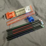
The Pen + Gear (P+G from here) pencil arrives in a hard plastic box, honestly, I’d prefer cardboard with a window, but this is a decent box. There is a bit of flex in the packaging which can contribute to cracked cores. I chose the package of black pencils, but there are now many colors and decorative features available. It is important to note where the pencils are made while making your selection. Those made in India are the pencils you want. The rest are not good. The made in India are made by Hindustan and are great pencils.

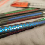
The paint on these pencils is glossy but thin. Some grain is evident through the paint. The wood it covers appears to be bass, linden, ash, or one of the many other pale-colored kinds of wood available for pencils. From the smell, it is likely to be bass/linden. It sharpens perfectly in every sharpener I’ve used, from the Classroom Friendly to the KUM Masterpiece to the M+R Pollux. The graphite takes a lovely point.

The graphite inside is smooth and dark. Much like most of the HB or dark pencils made by Hindustan. These are not super soft. In fact, their point retention is on par with many HB pencils. I used my several test pencils on several different types of paper- from the smooth paper in my work bullet journal, rough pulpy index cards, kraft paper, rosin paper, and in the Baron Fig Confidant Plus. It was silky smooth on all paper, but also the point survived longer than expected on all the papers. I filled an entire page in the Confidant Plus before feeling like I needed to touch up the point. 

The eraser… Generally speaking, erasers made by Hindustan are pink chicklets of disappointment. They rub the graphite around the page but not off, they melt into a sticky puddle atop the pencil. Not these. These black erasers are dust-gathering or sticky, and they actually work relatively well for erasers on pencils. I’m pleasantly surprised.

During the review period, which usually lasts about a week, I found myself reaching for this pencil over and over again. At the end of the week, I kept reaching for this pencil. It simply works and works well. I wasn’t sharpening it every 2 seconds, or pulling shattered cores from the wood. I didn’t fight with the sharpeners. Most importantly, I was able to use the same pencil throughout staff meeting at work without sharpening.

At $1.97 a 12-pack, these weren’t the cheapest Walmart pencils, but they are solidly good.

Review: Baron Fig Clear: Habit Journal Confidant Plus

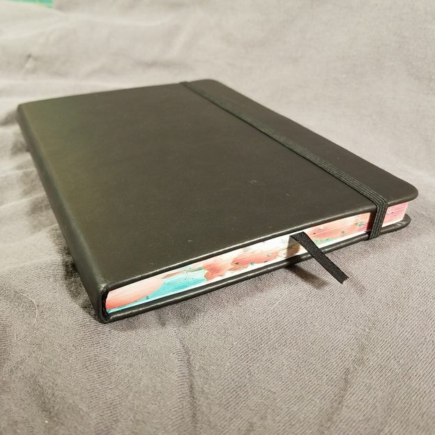
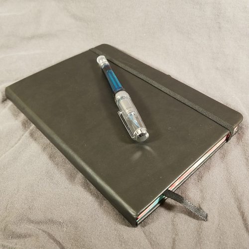
When the Clear Journal was first introduced by Baron Fig I passed on it, thinking that I really didn’t need a purpose-built journal for bullet journaling. I’m in the camp that believes any journal can be turned into a bullet journal. I still believe that but when I was offered the Confidant Plus size (aka The Big One) I thought I’d give it a try. I’ve been itching for more space in a few of my journals and figured this would scratch that itch.

Let’s get a few things out of the way. This is a Baron Fig Confidant, but bigger. Same great paper. Same quality binding. Same quality fabric cover. If you like a standard Confidant you’ll like this special edition. I’ll get into the special bits later. But thus far, the standard stuff is all great.

The Confidant plus size is much larger than a standard-sized journal and larger still than a Confidant. It makes other journals look diminutive. This results in a journal that is more than a little bit heavier than the regular Confidant. So if you carry your journal around with you, this might be one you leave on your desk.

There are a few extra extras on this journal- a pair of ribbon bookmarks, which like all Baron Fig bookmarks are just smidge too short. (Hint to BF- if you are thinking of adding an inch, add 3) I have small hands and dexterous fingers grabbing one of these ribbons is a feat worth celebration. I love BF ribbons. They feel great when I can grab them.

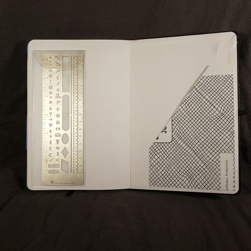
The end sheets in this book are gorgeous, as usual. The back features a pocket. Whhhhhat the what? BF included a pocket? I was shocked and happy. I love pockets in my journals. They house all sorts of stuff. This one won’t hold my ruler, as it’s a slash type pocket, but it will hold all the other garbage I shove in there. Slash type pockets are superior for stashing assorted papers to the typical envelope style pockets. Envelope style pockets allow for stashing of smaller loose things, AND rulers. But the slash is best for papers.

The final addition to this journal is an elastic. Baron Fig’s elastic when they use them, are awesome. Stretchy and soft but not loose. They hold the book closed in a snug way, but when not used just hangs out in the back of the book not catching on things. Because this book is a Confidant I often find myself forgetting that the elastic is there.

The lovely BF paper is printed with a few extras. In the front there are one line a day monthly pages. 12 of them. This is simplified with 1-31 and the months printed along the edges. Circle the month and then write on the day as normal. I like the layout and look of these pages. It is intended for you to ponder a single prompt or to keep track of the things you do in a month. The highlight reel. This is not how I use a journal but I see how it could be appealing. I tried it, and after a few weeks of boring entries; Dried pears. Made pear butter. Put bok choi into the cold frame. Checked ferments. I gave up on the highlight reel. I found myself wanting to use it like my regular bullet journal where I enter upcoming tasks and things- Cancel Hulu. Order water filters. So I did.

The notebook section is an upgraded dot grid that BF and Clear call “split grid.” The center of the horizontal and verticle is denoted with a + while the quarter sections are denoted with – or |. This saves you from needing to measure things out, just find the appropriate -, |, or + and make lines. I cannot explain to you how much I LOVE this format. It adds speed and flexibility to a bullet journal that makes setting up a new page fluid. I’m in favor of BF adding the split grid to all their Confidants.

In the back are habit trackers. I’ll be honest, I haven’t found a use for these. The set up doesn’t seem to work with how I track habits. Or have in the past. I appreciate the idea, and have read Clear’s vision for these, but they simply don’t work for me.

The final section of the book is devoted to a few pages of a variety of productivity methods* and ways to use the habit track and split grid of the journal portion. All of these are useful tools and can help you to figure out your bullet journaling style.

Overall I love this confidant. I love the little additions and attention to detail. I adore the larger size. You can sit down at a desk and really noodle out some ideas in a way that I’ve always thought the smaller (roughly) 6×9” size sometimes makes limiting. I find myself reaching for this journal again and again. The black with copper accenting is gorgeous. The end sheets are lovely. That subtle blue split dot grid on the creamy BF paper makes me very happy. It melts into the background behind pencil and pen. I’d love this color on more BF Confidants.

The Plus size is $28, a mere $4 more than a LE Confidant. If you’ve been aching for a larger size this price is good. There are 208 pages. 32 of them are either black, text or other places where you won’t journal. In total the book are 176 pages usable for journaling.

Review: Blackwing Volumes Number 10

I’ve been struggling with how to review the special editions and pencils made for other companies by Blackwing aka Palomino. How does one review a pencil that has a topnotch core that is one of 4 different grades (extra firm, firms, balanced, and soft) wrapped in perfect cedar and then coated in a thick coat of lacquer? We’re already starting off with a wonderful product that may be a little higher priced, it is after all marketed as a premium pencil, that we know has quality going into it.

After all I acknowledge that the Blackwing is a premium well-made product at a slightly higher price than I like to pay. I’ve detailed in other posts that I will now only purchase singles or trade for the editions I REALLY like. Otherwise, I’ll live with one to use and one for my collection.

So how do I review the number 19? The story is great. For me the tribute means less to me than the rest of the pencils, even divorced from the story the pencil is great. I love a matte coated pencil, and the flat cool gray is wonderfully grippy. My hand doesn’t slide at all. The imprint smudges a bit which seems to be deliberate and in keeping with the newspaper theme. The charcoal eraser looks black to me but goes well with the pencil itself.

My one problem with this pencil is that the ferrule fit was not great. In Bob Slate, I noticed that all the ferrules were off. I don’t care much about the centering, that is dealt with by twisting the ferrule into place. Easy. Instead the ferrule just didn’t fit deep enough. Once I arrived home, I removed the ferrule and sliced off a mere millimeter and the ferrule fit perfectly. Gone were the janky looking bits of cedar hanging out around the sides and chips of paint. Once dealt with this pencil became amazing.

Now comes the argument that evolved as I used this pencil. Once dealt with the janky issues, the looks are perfect. But I had to deal with them. I had to do work on this pencil. A pencil that costs $3 (when bought as a single at Bob Slate, and even when not bought as a single it’s well over $2 per pencil) shouldn’t need to be worked on for it to be perfection. If I were spending 50 cents I don’t care about reattaching the ferrule in a pleasing manner, but when a pencil is sold at a premium price the quality control of said pencil should match that premium price. It shouldn’t be janky once it is boxed and sent out to buyers.

In short, this pencil is a perfectly sedate pencil that feels great in hand but it is hampered by janky production values that don’t belong on a $3 pencil. If I’d bought a 12-pack of these for $26 or $30 and they all looked this awful I’d have been very upset.

Review: Baron Fig LE The Editor Squire Pen

People call me many things but traditional is not usually at the top of the list. When it comes to editing I’m a bit of a traditionalist. I want red ink that pops off the page and looks as though I’ve cut an artery onto the page. Those pages should bleed with my edits. Enter Baron Fig’s latest limited edition Squire- The Editor.

The packaging is spot-on perfect for this pen. Black and white punched up with hints of red, just like an edited page of text. The text is some info about the pen and editing. Slide the cylinder open and you have a red pen.

I was expecting something bright, carmine red, instead, it’s blood-red a deep dark red that still pops off the page. It works well against the white and cream-colored paper. The red of the pen body is a shade or two darker than the ink inside. It works.

Along one side of the pen are laser etched proofreading and editing symbols. I love the tactile feel of the etched symbols. They contrast with the smooth colored body of the pen. 

As always the fit and finish of my pen is perfect. The twist mechanism turns smoothly and deployed the refill perfectly. Just because it arrives with a red refill doesn’t mean that is the only refill you can use with this pen. You can use any of the Baron Fig or Schmidt D8126 refill inside. SO if you like this pen but need black or blue ink, you can have that instead.

Overall, I love this refillable pen body. The Squire is a classic twist pen with streamlined good looks. While I’d love the addition of a slide on clip designed by Baron Fig, I love the look of this pen. The red is just so perfect and the symbols are awesome.

Review: Muji Mini Utility Knife

While I was visiting Johnny and Dade in Boston we went to Muji. I’d never been and I have to say it was worth the effort. I spotted the mini utility knife right away as I browsed the stationery goods. It immediately went into my grubby paws as well as a package of replacement blades.

I love a good utility knife. My bar for a good utility knife is the Olfa brand. I have 2 of their stainless steel models covered in translucent plastic. I have several other brands and models but the Olfa is the bar. I’ve never been able to find the Olfa without the plastic coating and I’ve wanted one. The mini Muji fits the bill.

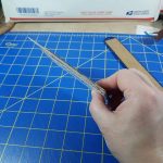
The tiny knife measures less than 3 inches weighs next to nothing and nearly disappears into a pocket. The clip slides onto a pocket notebook cover but not onto a thicker cover. The clip loosens up with use and eventually could slide off. The clip has a tiny slot to assist in breaking off the dull portions of the knife. The replacement blade box has a slot for the same. The blade box also doubles as disposal for those broken bits of the blade. Useful. The blade is the same size and shape as a regular utility knife blade, simply shorter. Each blade has 3 scores. You could take a used blade from a full-sized utility knife and save them for this tiny blade.

The blade slides out of the knife with a gentle click click. It does not lock into place but stays in place for light-duty cutting- opening envelops, cutting small amounts of paper and sharpening pencils. All the regular stuff you might do with a knife like this. Any heavier pressure on that blade and it slides right up into the body of the knife. I did snap one blade off accidentally when I slid out too much of the blade to pop the seal on a med bottle, and it snapped off at the end. 

This tiny little utility knife isn’t going to be a go-to for heavy cutting. The handle is too small to be comfortably held for long cutting sessions. It is a good size for opening letters, cutting for short periods of time or small projects. It is a great little knife for sharpening pencils while sketching. The price is tiny as well- at about $3 for the knife and $2 for ten blades, you get a super-compact knife that sharpens pencils and goes under the radar. I’ve kept mine clipped to my wallet for quick access and have found it to be very useful.

Review: Baron Fig Gather LE Review Journal

If you are trying to get away from reviewing anything online, or maybe you need to take some notes for your online review the LE Gather is a perfect option.

The packaging for Gather is light olive colored with and an assortment of illustrations scattered across its surface. These are rendered in traditional Baron Fig white and gray. Between these items are stars printed in thick glossy ink, they remind me of thick embossing powdered rubber stamps. (Only a few of you will get that reference.) Like all their other products the packaging is eminently giftable, maybe to yourself maybe to someone else.

Cracking this box open reveals a gorgeous olive green cloth cover debossed with icons that look suspiciously close to those you might find on your phone. The bookmark is a slightly darker shade of olive while the elastic closure is dark gray. Opening the book reveals olive end sheets with lighter green stars and some of the icons scattered about the page. Further, into the book, you find a quick start reference and a key to the icons.

The set up of the review page is very simple, along the edge is a bar with all the icons, you circle of check off what you are reviewing, then at the top of the page is a pale green bar to write the name of what you are reviewing. Then there are lines to write the body of your review, a 5-star rating guide, then high and low points. In the far back of the journal are a few pages about each item and a brief almost how-to on reviewing those items.

I tested my Gather with a few pencils and pens. I notice that the paper feels less toothy than other iterations of the Confidant. I’m a fan of the toothy paper, but this doesn’t eat a graphite pencil to a nub in short order. Also, my fountain pen felt great on the page but the ink did seem to spread wider than my nib size. There was no feathering or bleed through but it should be noted that my EF looked a bit like an F. I love BF’s cream-colored paper and the pale green accents on this color are subtle but lovely.

My low points on this journal are that they spend 11 pages explaining how to review each item represented by an icon. This would have been a perfect Confidant to introduce a pocket- to collect ticket stubs and other ephemera gathered as you gather your reviews. The top 10 lists in the back seem a bit redundant, but also like they could be useful for some folks. An index might be helpful in finding where particular items have been reviewed.

The high points are definitely the color and design. Like all Baron Fig products, this is well designed and work really well for their intended purposes. It also assists in giving something some thoughtful inspection, examining why you might like something or dislike it, without snap judgment. As someone who reviews all the things that comes into her orbit (from restaurants to books to pens and paper) this is a fun way to focus my thoughts and not nitpick every tiny thing with the thing I’m reviewing. I do think this is far too small a format for books, but that’s just me.

Overall, this is a great starter review journal for someone you know that likes to think deeply about all their things, or if you want to start out reviewing and don’t want to use an online service- this is a great tool.

Review: Baron Fig Fortress LE Squire Click

Purple. Blue-ish purple, not the normal burgundy shade of purple Baron Fig often uses, nope, true purple on the violet side of the spectrum. If this were an ink shade it would be referred to a blurple. The shade of purple hit me straight away when I browsed the Baron Fig site checking out their newest limited editions.

When I was a kid I loved purple. I loved purple so much that every gift-giving occasion I was gifted purple things. Until I hit 13 and I hated the world and only wanted things in black. Deep down my affection for purple was still there.

If you haven’t gotten it yet this pen is purple, and it is a lovely shade of purple. Gorgeously blueish in hue.

Etched into the sides of the pen are Castlevania-esque stairs, bricks, and windows. I’m talking old school 1990s era Nintendo Castlevania, not the new Netflix cartoon Castlevania. The version of the game with an endless scroll of jumping and swinging as you kill vampires in the castle. The design is simple, covers the whole body of the pen and is elegantly done. I’m not sure a casual observer would recognize the design as a fortress/castle.

I always love Baron Fig’s packaging. The presentation makes these pens perfect for gifting, maybe to someone else but also for yourself. BF hasn’t made a Stone for the Click yet, but the base of the tube is perfect to act as a desk stand until they adapt the stone for the Click.

I like the slim feel of the click, if you have smaller hands this might be the perfect Squire for you. You can see my previous review of the OG Click here. My issues with the nock still stand, I find is soft and mushy and I miss the satisfying click of a good nock. This nock is sturdy and works really well, but it just doesn’t give me a good click.

I like this pen, it’s slim and comfortable and feel great in hand. The nock is a bit mushy and doesn’t have a resounding CLICK when depressed, At $50 it isn’t cheap, but like I’ve argued before, a refillable pen body is an investment that is well worth the initial expense. Get yours here.

Review: Wing Sung 5502 Fountain Pen

This pen was ordered from a seller on eBay and arrived in my mailbox 22 days after payment. It was shipped in a zipper bag and a bubble envelope. I paid $5.69 for this pen.

This is another of those pens where it feels like some designers at Wing Sung got really stoned and dumped all the parts of pens into a brown bag, shock it, and drew out parts, and said, “Yeeeeeaaaaaaahhhh, man, that’s rad.” In this case this works. In this case we have a pen that looks inspired by the TWSBI Eco, Lamy Safari, and Pilot Prera.

This pen features a locking piston mechanism. To use it you first slide the little end cap away from the pen then twist. When filled align the tabs with the notches and push the cap in to lock it into place. There is a little bit of play in the cap that allows you to lock it into place without losing any ink. Speaking of which, this ink holds roughly 1.8ml of ink. Which is kind of surprising given the size and weight of the pen.

This pen feels very light weight but not cheap. Despite it being a little more slim than other Wing Sung pens it’s very comfortable. The grip is triangular and a riff on the TWSBI Eco grip. It is narrow. I find it comfortable but many folks won’t.

The cap can be posted but the length of the pen becomes ungainly and far too long to be realistically used. The clip is sturdy and holds to my shirt or other location tightly. There is a stop that cuts the depth of the clip and seems unnecessary. The cap and piston have color coded pieces of plastic. I’ve only seen this pen in black, white, and pink.

The nib and feed are Pilot style, giving you many options for upgrade. The feed is black instead of clear and my feed was quite constricted leading to a miserly flow of ink. A little work with a razor blade opened up the channel and the flow is perfect. This might not be a problem for everyone. The nib was perfectly smooth out of the envelope. Of course I smoothed it a bit more, but it didn’t need the work to be serviceable.

Overall, this is a great little pen. At $5.69 it’s a good price and the ability to swap out Pilot nibs really adds to the usefulness of the pen. That it holds a mammoth 1.8ml of ink means you can write and write and not need to fill. I’ve yet to write mine dry and frankly since getting this pen, I keep reaching for it again and again.