I reviewed the Canson XL Watercolor pad a few weeks back, mostly with inks and scraping of acrylic paint. I determined through that use that it would be #1 a great paper for binding into a journal #2 great for watercolor crayon and acrylic. I didn’t put it through its paces with watercolors.
I did this weekend.
I use a variety of watercolors from Holbein to Academy. This paper holds the colors true. For a cold pressed paper the paint absorbed just enough to dry quickly but allowed for easy lifting of color when needed. Some “student grade” watercolor paper sucks. Its cockles, it’s as absorbent as a paper towel, which is not the case with this paper. It’s good stuff.
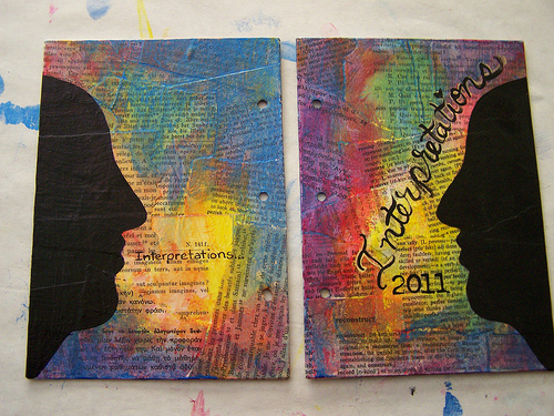
Check out some of the images below, all are done on the XL watercolor paper. Vibrant saturated colors throughout.
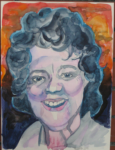
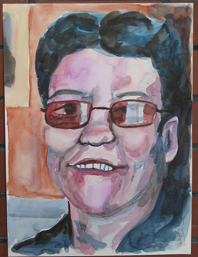
I can without reservation recommend this paper for watercolors. It’s cheap enough for throwaway sketches and nice enough for finished work.