Author Archives: leslie

Week o’ Links

One of the many things I left behind when I stopped blogging as much was my link love posts. Since I’ve been doing more reading of blogs (yay for more time?) I have stuff I want to share again. Don’t expect this to be regular, nah week links will be totally irregular.
I was on Erasable having a conversation about NaNoWriMo with Johnny of Pencil Revolution and Harry of Home Work and other goodies. It was a great conversation.

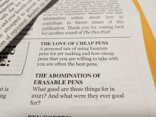
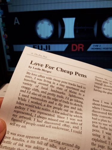
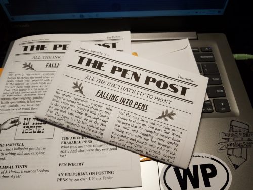
Brad of a little podcast called The Pen Addict mentioned Useful Journaling, Pencil Revolution, and The Word Distro on his podcast. Awesome, everyone should read zines, especially mine, and Johnny’s and Ed’s.

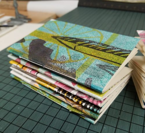
I’ve been reading about bookbinding again. When did I ever stop? Alisa Golden <3 posted this single sheet binding technique that makes me think about zine possibilities… Just sayin’. Also, a snake book, a pretty common structure that I’ve seen again and again in many books. Here’s a nice art journal format.

The Comp book reviews keep pulling folx over to using the finest cheapest of stationery goods- the composition book. The Write Experience has the right experience with a classic- the Pen+Gear composition notebook all the way up in Canada.


On Making Things: Return to Roots

If you’ve been reading CSS for more than the last few years, you realize this blog didn’t start out as a review site. I started out blogging about a break up and my attempts to find my footing in my new single life. It quickly morphed into an exploration of art, journaling, and bookbinding. Soon the old title of the blog no longer fit and I chose Comfortable Shoes Studio as an homage to a gag project I’d made in college. I moved my blogging to CSS and the transition was easy.

Here I started to write about my art and other projects. I was open about sales, ranted about eBay and PayPal fees increasing and all the other issues that occurred with being an artist and craftsperson online. Through all of it I was open and transparent about the business side of things and about the process of making art and art journaling.

Reviews were (are) a side effect of making art and writing. I did product reviews because I was making art and using the materials and readers had questions.

Then life got complicated. Work got complicated. I went back to school. I changed jobs, a couple of times. I made less art, but I had a lifetime of using art materials and could write reviews with much less effort than writing about making art, which I was making less and less of. As for bookbinding? I do less of that than ever because my wrists and hands ache after a binding session, the act  of pulling a needle through paper and board causes pain like no other. So I just don’t do as much of it as I used to, it hurts too much, and if I’m honest, it hurts a lot to think about not being able to bind like I once did.

I’ve gone back and looked at some of my old posts, posts where I’ve “shown my work” when it comes to art, zines, and the business of art. Now that I’m in a more stable place in my life I hope to reclaim some of my writing about more than just reviews.

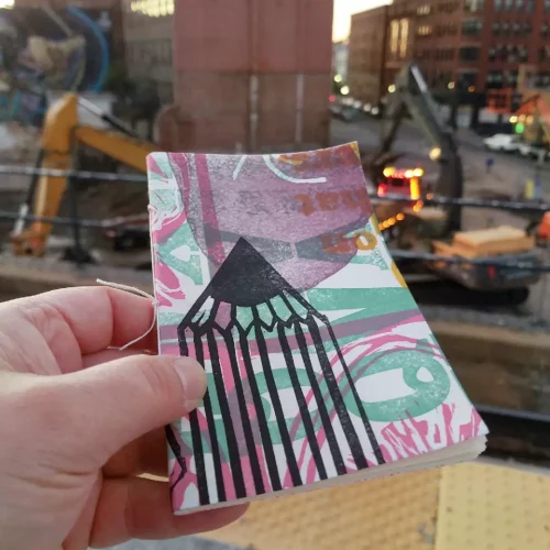
I wanted to write a bit about the creation of Useful Journaling. While it is a culmination of a lifetime of journaling, it is also about teaching myself how to paginate and do layout for printing and binding. In the past I have always done my layout with a physical original. I’d cut and trim things to a paper copy and make a first really good copy of that which I’d print from. I really like the physical aspect of making a paper original copy. There is something really nice about sitting down with a glue stick and craft knife and making that first original. 

I like learning things, I saw learning how to do layout on the computer as a challenge. And wow is it. I hate and love it. I love how clean it can make the flow of words from page to page. I write all the zine in one doc and cut and paste it into Publisher* and it just flows through the document. Easy. I then add in the various elements I’d use glue and scissors for a physical copy but instead I photograph them and crop in the computer. It’s similar skills but all in the computer. It was a challenge to learn how to bring it into the computer but I know I can also make a physical original which I can scan and turn into a PDF and print from that.

Another challenge is printing. I really like the idea of a color laser printer for the cover and inserts. But WOW are they a total pain in the ass. Of course the one I was gifted is old and I needed to order new parts and do a thorough deep clean, but it hates printing on smooth cardstock. HATES it. So future issues will use coverstock, which means I can possibly add 4 more pages.

Which brings me to another thought out aspect of UJ, the size. I wanted the zine to fit into the pocket of an A5 notebook, so it had to be pocket notebook size or a quarter sheet of US letter sized paper. I also wanted it to ship for the cost of one US stamp in the US, even if I added extras (and I did) so I went with pocket notebook size. The number of pages was determined by weight, I knew if I went with 16 pages I’d stay below an ounce for that single stamp. The hard part is that I WANT to make it longer. I want to pack in the content. I also wanted to keep the font large enough that it could be easily read. I get frustrated with zine with font sizes that are too small to easily read.

Anyway, I’ll be chronicling more of my art adventures here, but still be writing product reviews, just less of them.
Continue reading

Review: Staedtler Metallic Norica HB Pencil

Staples had these up with a limited time exclusive sign. I’m not sure if that means that these pencils will only be available at only Staples for a limited period of time or if it means they’ll be available like some of the other exclusives I’ve seen from Ticonderoga where they are available at Target for a limited time period then everywhere later. I’m thinking of the Ticonderoga Stripes in particular, which were sitting next to these on the shelf. I didn’t buy these because they were an exclusive Staples item, rather because they had really pretty shades of metallic paint.

The 10-pack costs $2.99, which is pretty pricey in the land of Norica pencils. At 30 cents each these are among the most expensive Noricas available.

The package is a nice blister pack, though I do wish they were in a simple cardboard box, with a window instead. At least this is a good rigid package. Upon opening the package I found that some of the packaging printing had adhered to the paint of the pencils. I was able to scrape the stuff off with my fingernail and the paint underneath looked great. The lacquer is thinly applied but nicely metallic and glossy. The rough areas of wood are fully visible. The imprint is silver and well done. The ferrule is a simple silver job and on a few pencils had pushed up the paint around its base. Not too awful, but not overly pretty either. The white plastic eraser is nice and works really well.

Inside all that is linden/basswood wrapped around a smooth core. The pencil is very lightweight. I added a silicone gel grip to decrease my urges to death grip the thing. It is not as dark as the previous version but for a 30 cent pencil it is smooth and holds a point well, even on rougher papers.

I’m glad I bought a pack of them and they’ll likely get used, I’m a real sucker for metallics. These would make a great gift for a kid or adult interested in pencils.

These pencils were purchased with  Ko-Fi support!

How To: Fitting an Energel Refill into a Baronfig Squire

I read once that the older Baronfig Squire pens accepted some gel ink refills. Imagine my surprise when mine did not. Apparently somewhere along the way things were redesigned and the Squire lost the ability to accept a standard gel ink refill. It is non-reversible, but the pen will accept the old refill once the mod is completed.

To do this mod you will need:

  • A Baron Fig Squire
  • 1/8th drill bit for wood
  • Skewers and masking tape
  • Pentel Energel Pen- you need the refill and the spring
  • Patience
  • Craft knife

I went through the process of stuffing every gel ink refill I own from Pilot G2 to Pentel Energel to Zebra Sarasa into the pen, and each and every time, blocked. I poked around with a skewer, and found that there is a lip down inside the tip area that holds the narrow tube that holds the pen’s tip. It is snug to stop the refill from rattling around. Since I really like the Energel Pro for sketching doodling and general writing, I measured it against the Schmidt P8126 refill I usually use for the Squire. There was exactly 1mm difference in the diameter of the tubes, and the Energel refill’s tube was roughly 1/8th of an inch.

I decided to do this mod by hand, for many reasons but I did not want to take a chance of removing too much material and damaging the Squire beyond use. I’m not kidding when I say the Adrift is my favorite Squire. I grabbed a brand new 1/8th drill bit intended for wood and taped it to a wooden skewer, yes, masking taped it to a skewer. Again, this was to force me to use a light hand and prevent me from binding up the bit into the metal.

The skewer also allowed my short bit to reach deep into the pen. It is important to point out that you drill the INSIDE of the pen, NOT from the tip in. So drill inside out. While I do not recommend it, if you chose to use a drill press for this mod, you’d need an extra long bit.

I bored the inside a small amount then test fit. Then repeat that until I had bored out roughly ¼ inch or 5mm deeper. I attempted to use the Squire’s spring. It didn’t work with my Energel refill. The Energel spring did work. Even when I went back to the original refill I still needed the Energel spring. The Energel refill will need to be cut between 76 and 78mm from the base of the ink reservoir, not the tip, depending on how far you would like the tip to emerge.

Results? It works perfectly with the Energel refill. The metal part of the Energel tip fits perfectly into the Squire and there is no rattle or more movement than you usually see with a Squire. It’s smooth in deployment, the knock works perfectly and man that gel ink is great.

You might wonder why I went with the Pentel Energel Pro over say a PaperHate Inkjoy or Uniball Signo or even the Sharpie SGel or Zebra Sarasa refill. I really like the Energel Pro for sketching but also writing. It is also the only refill available in a 12-pack. I can buy singles or 2-packs of all of the mentioned refills but I really wanted a 12-pack. When I’m sketching, drawing and even writing a lot, I drain gel ink pens. Buying a 12-pack feels the most economical and ecological. I know a lot of people will buy entire pens and just use the refill. I feel wasteful doing that, so I’m going to stick with buying refills for this pen.

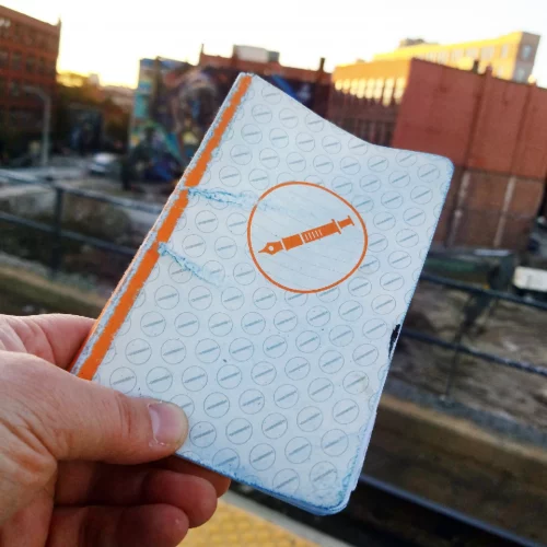
Useful Journaling Issue 1

It has been awhile since I’ve made a zine. I decided it was time to take the manuscript that I wrote about journaling and work it into something. I’ve taken that old manuscript, torn it apart, lumped pieces of it into themes, and I’m putting those themed chunks and making pocket notebook sized 16 page zines. I chose to make this zine small so it would fit into the back pocket of most A5 or 6×9 inch journals.

The theme of the first issue is Simplicity. Each technique explored is deceptively simple but can lead to wonderfully deep and rich content. This first issue explores an evening mind dump, gratitude, and using prompts. Future issues will explore fear of the white page, picking out materials, and more involved journaling techniques.Useful Journaling is $2.50 plus 50 cents for shipping in the US and $1 worldwide. For now it is only available via my Ko-Fi shop.  Ko-fi shops are great for creators- they don’t take a cut if you are a Ko-Fi gold member (I am now) and allow the maker to post all sorts of different items for sale. PayPal still takes it’s cut (which is hefty) but this is a step in the right direction for all makers.

Review: Pentel EnerGel Pro 0.7

I like Pentel EnerGel pens. We’ve got a box of the needle tip 0.5 at work and quite a few of them find their way into my desk after a trip to the supply cabinet.* I should do a full review of those too, since I’ve never done it

This is a good bold pen. That is my one quibble with this pen. Where UniBall and Zebra 0.7 tips lean a bit fine, Pentel has determined that their 0.7 tip shall actually be a 0.7 tip. Had I noticed the pack I picked up was 0.7 I’d have swapped it out for a 0.5. The line is fat and rich. The black is DEEPLY black and on the warm side. 

The ink is great.

The body of the pen is okay. It is all plastic with a shaped rubber grip and a chromed plastic tip and knock. The clip is metal. All logos are in silver printing. The pen feels okay. It feels about as substantial as a Pilot G2 or Zebra Sarasa but not quite as put together as the UniBall 207/307. I’m sure that doesn’t make a whole lot of sense to anyone who puts the 207/307 above all other gel pens, but it does to me.

This is a doodler and sketcher’s dream pen. The ink bonds to the page and doesn’t lift or move once dry. That is the kicker, it takes between 10 to 15 seconds to dry on good paper (less on absorbent pages) and a good swipe of the heel of your palm over it and it makes a mess. I tested it with a few drops of coffee on an index card and even the hot coffee didn’t lift the ink. I’ve yet to test it with water colors but if coffee won’t lift it, I doubt most watercolors would. I will say if you use any pencil lines on smooth glossy paper that you’ll need to clean up after a drawing is rendered, be prepared to reink some lines. I found that EVERY eraser grayed the ink out immensely. You might be able to see that in some of these images. I’m not sure how well my camera picked up on this.

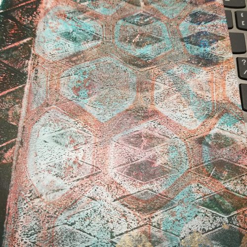
During a couple of meetings I doodled a composition book pattern onto a nice sheet of cardstock. I did notice a few things. First this was Neenah cardstock with a SMOOTH finish the pen felt great on it but on areas where I scribbled a couple of times the ink would lift itself or skip. I also noticed on areas where I’d used my fingers to fold the page, the ink would skip over my fingerprints. That said, areas where I scribbled, allowed the ink to dry, and then scribbled again, accepted more ink without skipping or hollow lines. I didn’t notice any blobs as I drained this pen dry.

One of the truly great things about this pen is that you can buy refills. They are listed as LRP7 and are $1.65 on Jetpens as of this writing. You can get 12 Energel Pro refills on the ‘Zon for about $13. As far as sketching and doodling pens, these are in my top 5 list for sure. IN terms of smoothness they are up there with the Sharpie SGel and waterproofness with the Unibal Signo. I might’ve ordered a 12-pack of refills right after writing this.

Continue reading

Review: Musgrave Harvest Professional 320 No. 2

Musgrave has two versions of the Harvest pencil, the standard and the Professional. The numbering is the same- they are both labeled the 320. The standard is available in numbers 1 and 2, while the Professional is only available in number 2. They both feature a sharp hex, golden yellow paint, and a gold foil imprint. Both have an eraser that works significantly better than the erasers of Musgrave past. So what is the difference?

Let’s start with packaging. The Professional arrives in a nice sliding box in brown, yellow and gold, that I love. It has a simplicity of design that hearkens to eras past while also capturing the feeling of a farm harvest. Musgrave has upped their packaging game on some of their pencils, and the Professional wins out. The standard arrives in that plastic bag. Again I really wish Musgrave would use a paper envelope instead of plastic.

The imprint is slightly different between the two pencils, both have gold printing, but the Professional is a little bolder and beefier. The standard is cased in what I think is basswood or linden while the Professional is cased in cedar. Both woods sharpen with ease in a crank or by hand. The standard has a gold ferrule with a burgundy band while the Professional is distinguished with a plain golden ferrule with some texture to the center of the band.
The cores are also drastically different. The standard features what I’d call a very nice but typical HB while the Professional features a darker smoother graphite though it is also labeled HB. Despite the graphite in the Professional being a tad bit softer it’s still got point retention to spare. I found myself writing several pages in my composition notebooks before reaching for a fresh pencil. Often I only get a page out of my favorite dark smooth pencils.

While the standard Harvest is an okay pencil, the Harvest Professional has won over my heart and it is a true writer’s pencil. The yellow paint is standard yellow but it’s a nice shade of yellow and not overly glossy and the gold imprint is done well. While I don’t love the sharp hex I find I don’t notice it as much as I used to. The creamy smooth graphite combined with terrific point retention is killer in the Professional. At $9 a box for the Professional, it’s a bit of a price increase over the standard’s $6, but it arrives in better packaging and is overall a significantly better pencil. Get yours here at Musgrave here.

Continue reading

Review: Baronfig LE Squire Liberty

Dade and I discussed this pen on the last episode of RSVP. We both questioned why it is made of brass and not copper like Lady Liberty herself. While I think a true tribute to Lady Liberty would be copper, this pen is not just about Lady Liberty but the entire concept of Liberty. We also discussed that some people missed that Baronfig is making a donation to Vote.org to help increase voter awareness in this voting cycle and for future votes. I see that as a positive.

Included is a small booklet highlighting important historical moments related to liberty throughout US history. The color scheme is simply black, white, and gold. It pops. Another insert is the Declaration of Liberty, a little piece of paper with a declaration of liberty for the owner of the pen to sign and date. On the back of the box it notes that this pen is made in the USA.
Let me get out of the way, I like Squires y’all know this. I’ve been killing it with an Adrift for months now, and before that used many LE over the course of years.* I love the twist mechanisms and the way they feel in hand. They are great for fidgeting. They are great for writing. They are simply great.

I am a quietly patriotic person, oftentimes the US has made me feel insignificant and less important, and occasionally less human, than others. My rights haven’t been respected. It took years of legal battles for me to get the same rights as others, and still, those rights are threatened. So when I saw a patriotic pen. I waited to say yes to the review. Perhaps this is the least patriotic I’ve felt, but also this is the most important that I’ve felt that the use of my tool of patriotism and liberty, my vote, is important.

I adore the change in packaging. It looks like this is more than the usual Squire LE. The packaging stands out, it doesn’t match the lightness and fun of the previous Squires. No, the Liberty is dead serious. As such opening the package and pulling that pen out of it’s box felt weighty, and perhaps that is why a brass version is better than a copper or patina green anodized pen body, because this pen is weighty. It seems a bit dramatic to say that such a weighty issue deserves a weighty pen, but it does. I really like that the lettering and images are on 2 sides of the pen.

Typically I have dry hands, and generally brass doesn’t make them smell, but WOW does my hand smell like brass today. If you have moist hands you may or may not notice that your pen will patina quickly. I’ll be using mine for a few weeks at least. (You’ll definitely see it in a few more reviews. Hint hint)

This is a terrific pen. You have to like brass and some weight to use this pen. If you like a lightweight pen this might not be the best choice for you. It is well weighted for my hands- I like a pen that is ever so slightly weighted to the front, and this pen seems to fulfill this requirement. This is an investment pen, it clocks in at $80. But again, if you’ve been a reader of this blog for any period of time, you know how I feel about investing in a reusable, refillable pen, do it. 

Continue reading

How Much of a Pencil Point Do We Use?

Subtitled: How much does collaring impact the writing experience?

Throughout this post I use the term “collared” from the David Rees book How to Sharpen a Pencil. While I find the book… silly, it is the easiest way to describe this effect and likely language than many people into pencils will understand.*

About a month ago I picked up a package of Tennessee Red pencils, quite a while after reading some folx harping on the off centered cores, and after I read a couple of the reviews on the Musgrave website I really wondered how much does the off center core impact the writing experience? Certainly we can all agree that aesthetically an off center core is unattractive, but does it really impact writing?

I’ve ordered and used many pencils from Hindustan from Marbled to Metallic to Trikones and they have some of the worst centering of any pencils I’ve ever laid eyes on. But truthfully, I cannot point to a time when a minorly off center core impacted my writing. Even some largely off center cores haven’t impacted my use of a pencil. The only time I’ve had a core impact my writing was a particularly egregious Dixon No.2 where the core was roughly 1mm from one side of the pencil.

My hypothesis is that minorly off center cores will not impact the writing experience. That only grotesquely offset cores will impact writing. That collaring while ugly, is less of an issue for use and is largely an aesthetic issue.

The experiment went as follows: I purchased 96 Pen+Gear pencils at Walmart. These were purchased with the understanding that they generally have many off center cores and I’d be able to pick a handful of terribly off center cores and some that were perfect and compare them visually. Then I’d use a small handful of them to test them in writing. For writing I would test them with 4 sharpeners: Classroom Friendly, Apsara Long Point Hacked, Dahle 133, and Alvin Brass Bullet.

Results were interesting.

Annoyingly, these 96 Pen+Gear pencils were the most centered of any Pen+Gear packages I’ve ever purchased! Only 31 of the pencils were off center, with 10 of those being visually really terrible, and not even one egregiously off center.

Visually, I found that even the most egregious of off center cores in my sample of 96 pencils did not have collaring that went to the point even when sharpened. One might argue that the Classroom Friendly minimizes the appearance of collaring, however I found that with the brass bullet the appearance of collaring was minimized, as was the impact of it in use.

So, yes, the collaring was visually unappealing. No matter how you look at them the collaring looked awful. My expectation was that my writing would be impacted, badly.

I selected the 5 worst of the collared pencils, slid them into a pencil cup and one additional near perfectly centered, nearly uncollared pencil to go into my cup. Each pencil was assigned a number. Measured and recorded. Then I used them to write to the point where I would sharpen. More measurements taken, and recorded. Then finally sharpened with another sharpener.

I measured each pencil point at sharpening from the highest point of the collar to the point, recorded that, then measured it at the end of the writing session. I also used my Vernier Caliper to measure the diameter of the point at the end of the writing session.

Results were interesting. I reach for a fresh pencil almost precisely when the pencil point  reaches 2mm in diameter, regardless of the sharpener used. After I completed my test I checked this with a Blackwing Diana and found the same thing, occasionally I would push the softer pencil a bit further and go to 2.5mm in diameter.

I only came with 1mm of the collar on a rare occasion and with 2 of the pencils, but I stopped use not because of the collar, but because I’d hit the 2mm diameter. I did not have a single instance of stopping use due to collaring.

My writing sample size was relatively small, 6 pencils, 5 of which most pencil fans would have called egregiously off center, but in the end had no impact on their use. I could pull the rest of the 31 terribly off center pencils and use them, but I have no doubt that there would be little change in my results. In my use of several hundred pencils I have only had one or two where the centering and collaring impacted my use.

So, if you have some “horribly” off center Tennessee Reds, feel free to send them my way, I’ll use them up. Continue reading