Author Archives: leslie

Back-to-School Sale Composition Book Round Up

This is a very image heavy post!
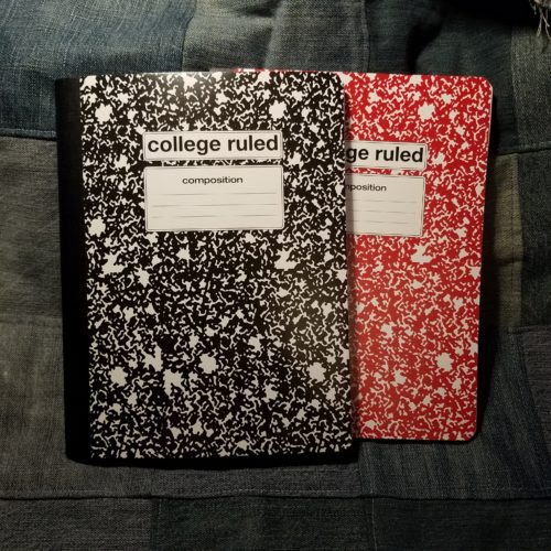
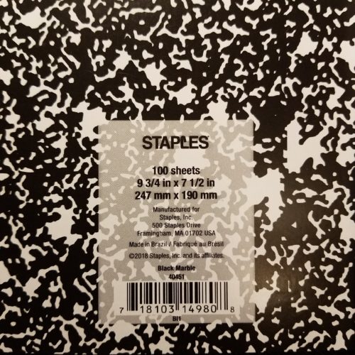
I decided to head to back to school sales and pick up a few composition notebooks to update my old best of Composition Notebook review. I go through a lot of them writing my drafts, so I have room in my budget to spend the money to buy during the sales, because for the most part comp books are around 50 cents at Back To School Sale time. All are college ruled. Unless otherwise stated these are all the typical size for comp books:9.75X7.5 inches or 247x190mm.

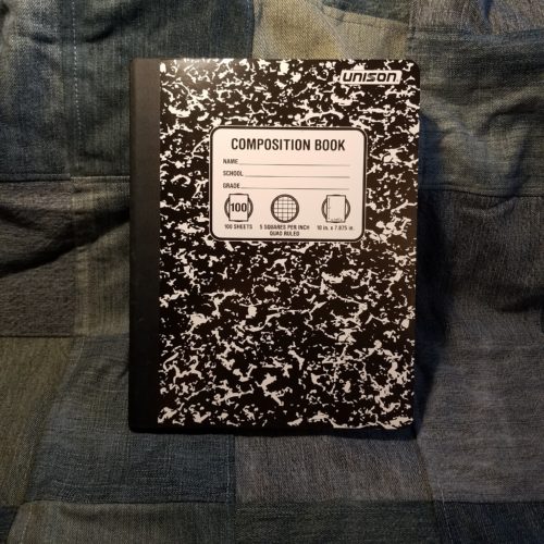
Entry 1: Generic Made in Taiwan 51 cents (Target)

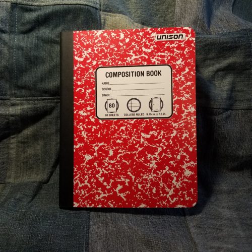
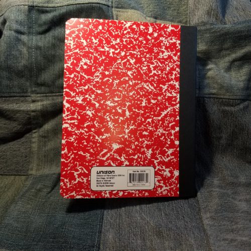
Target’s entry has thin flimsy card covers graced with a marble pattern that has bled together so much as to have little white space. It has a black textured paper tape spine. Beneath the tape it is stitched. It does have a nice oval shaped Composition label on the front cover that looks absolutely generic. I kinda love it.

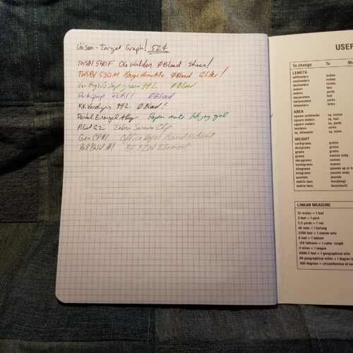
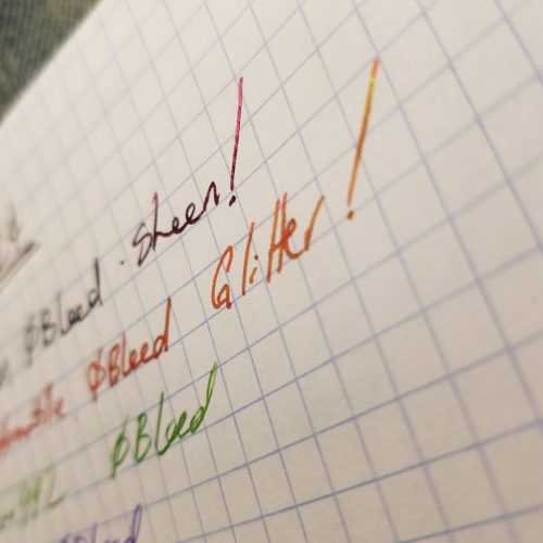
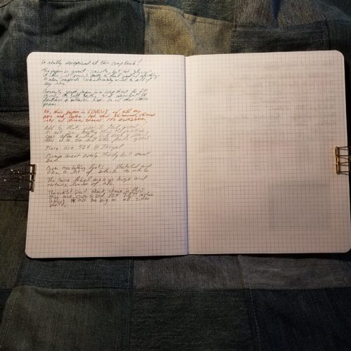
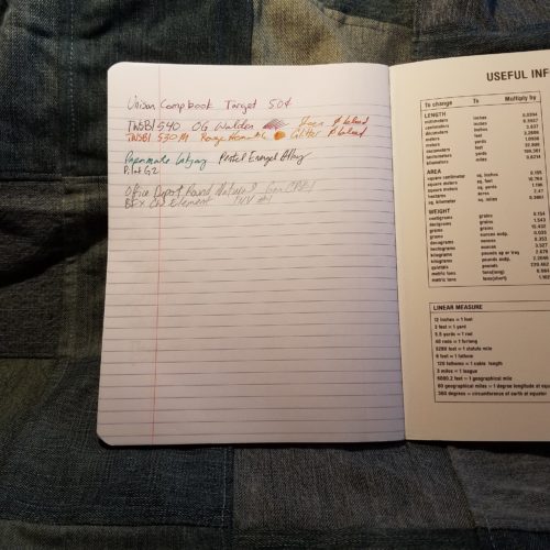
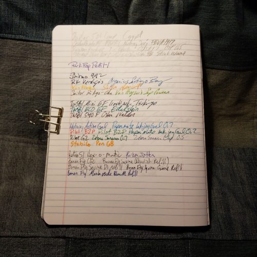
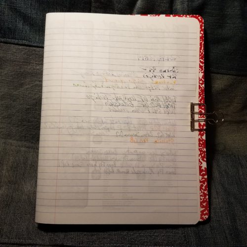
Inside are 100 sheets or 200 pages of thin smooth paper. In my testing I found it worked well with pencil, rollerball, ballpoint, and gel ink. Fountain pens bled through but didn’t feather until I started to use wet nibs paired with inks that tend to feather. With fine and extra fine pens it did okay. With any darker colored ink the verso of the page won’t be usable as the show through is intense.

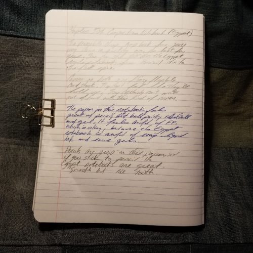
What sets this comp book apart from the pack is the smooth paper. It is smooth yet toothy enough that pencils were superb on its surface. Point retention is phenomenal even with soft dark pencils like the Glimo Super Black. Smudging was minimal.

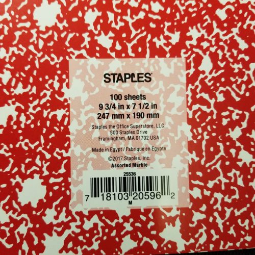
Entry 2: Staple’s Made in Brazil 50 cents

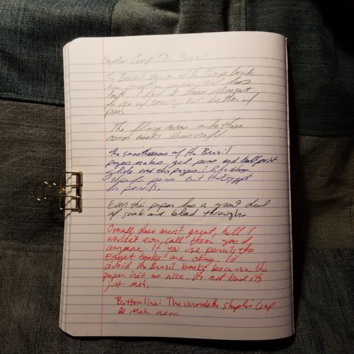
The latest iteration of the venerable favorite has thin flimsy card covers. A definite downgrade over past years. The marbling is splotchy and evenly distributed between white and whatever color cover you purchase. It isn’t very marble-y. The label area is rectangular and rounded over. Rather boring. The spine has a black textured paper tape over it.

Inside are 100 sheets/200 pages of thin bright white paper with a dark purple-blue ruling. The ruling is far too dark and never receded into the background.Even with thick black ink it stands out. Gross.

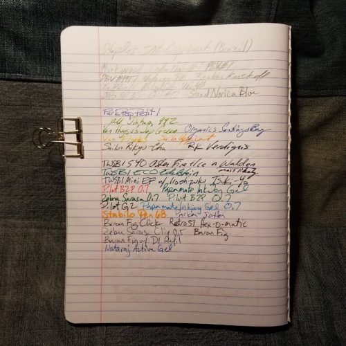
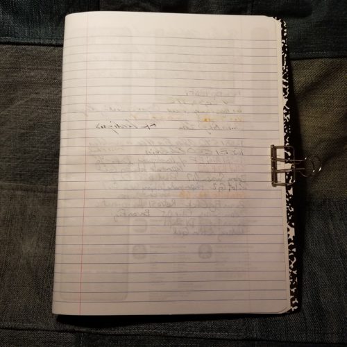
Testing proved that this toothy paper did well with the usual round up of pencils, rollerball, ballpoint and gel inks. It was shite with any fountain pen. Even the thinnest and stingiest of nibs feathered and bleed with the best behaved of ink. Wet thick nibs soaked through to the page beneath. The verso of the page is unusable with any liquid or hybrid ink. Even some of my gel inks tended to show through. What a  mess.

What an abysmal fall from grace.

Entry 3: The Mead Poly Cover Made in Vietnam $1 (Target)

I’ve had very bad luck when it comes to Mead comp books in the past. This year’s is far different than the past iterations. There are 70 college ruled sheets, though they are also available in wide rule. The poly cover is thin and rather floppy. The tape is gray textured poly. The cover has lines printed on the fore edge but no other design. The typical label area lacks anywhere to write your name or other information. This is a sad oversight.

Inside the 70 college ruled sheets feature very thin pale blue lines that recede into the background of every ink. I’m in love! The paper is thin and crisp. It’s not slick feeling but it performs remarkably well with every pen and ink combination I’ve used. My wet pens and inks glide over the surface and feel wonderful. Better yet, there is no bleeding, feather or soak through. No, I even get sheen on this lovely paper. There is show through, but that is to be expected from paper this thin and crisp.

I find it shocking that I have a Mead contender for best Comp Book of 2017!

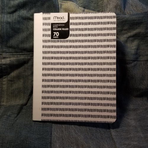
Entry 4: Mead Card Cover Made in Vietnam 79 cents (Target)

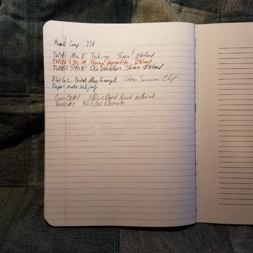
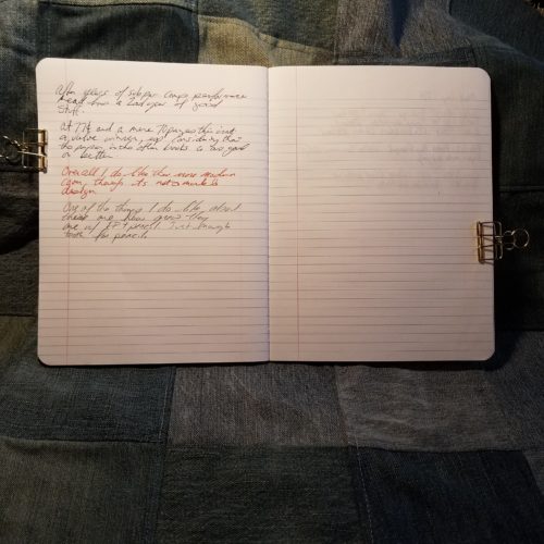
Repeat everything I said about the Mead Poly cover here. No Feathering, bleed through, or feathering. Loads of lovely sheen, even from my EF pens.

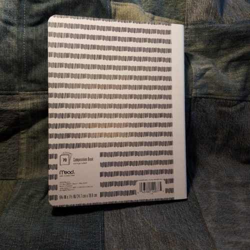
The covers are decently sturdy card, and at least at the Target where I purchased my sample they had 2 patterns- one for wide and narrow lines. The patterns consist of stripes made of vertical lines roughly the height of the lines inside the book. Clever. They were offered in a rainbow of colors with textured paper tape over the spine. Sadly this also lacks the classic front cover label area.

The big downside of this paper is that because it doesn’t absorb liquid ink, it takes quite awhile for that ink to dry, resulting in smudging.
Not only do I have 1 but I have 2 contenders for best comp book from Mead. Shocking.

Entry 5: Mead Five Star Poly Cover Made in Vietnam  $2.99 (Target)

In another shocker, repeat all the good stuff from the last two Mead entries and it applies here. The paper is great. There are 100 college ruled pages in the 5Star. It features a classic textured black paper tape along the spine. Mead skips the classic front cover label area.

These poly covers are among the toughest of the poly covers. Though they are still floppy, they are less floppy than others. The interior of the cover is also lined with white poly so that the contents aren’t on display. Further, it features some of the classic composition notebook interior goods- class schedule and conversions.

Comparing this to the other Mead offerings, this is not a great value. The paper is wonderful and the poly cover sturdy but not enough (to me) to justify the increased cost  over the other poly cover.

Entry 6: Up & Up Card Cover Made in Mexico 5 for $4/80 cents per book (Target)

It is tempting to return these and cash in on the Target 100% satisfaction guarantee. Yes they are that bad. The poly cover is thin, flimsy and floppy. The paper taped spine features glue squeezed out of it’s edges. Unlike most of the comp books written about thus far which have stitches at roughly 10mm, the Up &Up is stitched at 15mm.

The paper is bright white with pale blue ruling. The positives end there. Every fountain pen I used feathered and bled, even dry extra fine nibs using dry well behaved inks. Blotter paper is less absorbent. The only thing that works okay on this paper are ballpoints and pencils. Even pencil doesn’t feel that great on the paper. It lacks tooth to get a decent line and what graphite does get onto the paper is pale and smudgy.

This goes on my do not buy list.

Entry 7: Greenroom Decorative Card Cover Made in Vietnam $2.50 (Target)

Here is another comp book with only 70 pages. The paper is cream colored with brown ruling. The lines are actually tiny dots. I really adore this ruling and wish that I had better things to say about the actual paper. This paper feathers and bleeds with every fountain pen used. Gel ink also feathers and bleeds. Unlike our last entry, pencil feels good on this paper. Rollerball and ball point are also quite nice, so there are a few more options for use than the Up &Up.

The very pretty card cover is very thin, very flimsy and as floppy as the poly entries. It will not survive carting around in a book bag for long. A spill will spell the end of this comp book. The textured paper tape is well applied and looks good with the lovely printing of the cover.

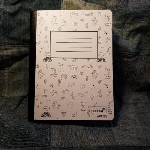
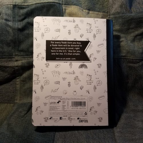
Entry 8: Yoobi Card Cover Made in Vietnam $2.29 (Target)

The Yoobi comp book is a venerable contender and little has changed since the last time I purchased one- the covers are sturdy and thick, printed with one color or a fun pattern. The textured black paper tape is well applied. The front cover features a large block where you can label your notebook with your name and other info.

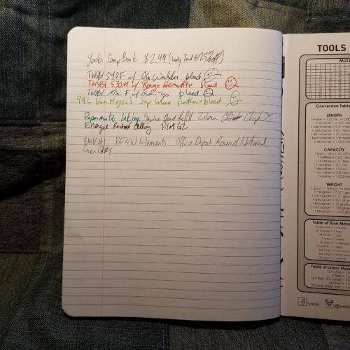
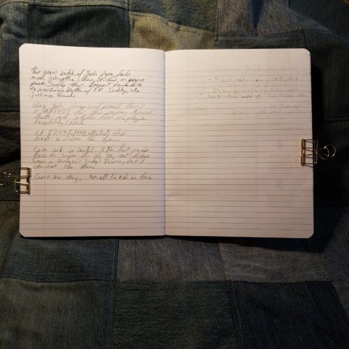
Inside are 100 college ruled sheets. The ruling in this year’s is pale and thin. I like it. The paper is smooth but not too smooth. It’s toothy enough for pencil but not so toothy that it eats up your graphite. Fountain pens fair less well than in the Mead notebooks but fine and extra fine do really well.

Though the Yoobi books aren’t the greatest value at full price, they are a great cause. Plus they go on clearance often enough that you can usually snag some decent deals in the middle of the winter.

Which is the winner here?That really depends on your final use of these notebooks. If you are a fountain pen user you can’t go wrong with the Mead card covered available at target for 79 cents. The paper is phenomenal for everything tested for this review. I was able to see sheen even with my finest fountain pens. Nothing bled or feathered. The per page price was 1.13 cents a sheet. While this isn’t the cheapest, it’s squarely in the middle of the road. If you are planning on using pencils or ball points (looking at you Bic Cristal lovers and folks who put the Fisher Space refill in friggin’ everything) you really can’t go wrong with the Staples 50 cent composition notebooks. At 0.5 cents per page these represent the cheapest of the cheap. Sadly they no longer fair well with fountain pens or liquid inks. Finally if you want a solid writing experience, fun covers, and a good cause, the Yoobi books are a good choice.

There are two here I’d avoid at all costs. Sadly the pretty Greenroom notebooks are just far too expensive at 3.5 cents per sheet to have paper that performs so poorly. Though the Target Up &Up brand is on the low end of cost at 0.8 cents per sheet the performance of the paper is abysmal and the shoddy stitching will likely give out before the poly covers have a  chance to break down.

This series of mini reviews reaffirmed something I’ve know for a long time; I hate poly covers. They are floppy, you can’t write in hand or even in your lap. The plastic won’t break down for ages. The brighter the poly cover the more likely you are to be able to see through to your contents. They add unnecessary cost to a product that should be inexpensive. Here let’s put it into “print:” poly covers are garbage. Continue reading

Review: Franklin-Christoph 1901 Mixed Grade Pencils

For those of you not as obsessed with stationery as I am, Franklin-Christoph (FC from here) is a fountain pen company that prides themselves on making their amazing pens here in the USA. When I saw that they were set to offer pencils, well, I contacted them for a pack for review.

F-C has confirmed that these pencils are manufactured for them by Musgrave, which can be good and bad. Many of the Musgrave produced and private labeled pencils are pretty good. Hell the SSC pencil is among my favorite round pencils for writing. The only Musgrave pencils with mixed grades are their Unigraph pencils, a pencil that I can only say is terrible. In fact they were so terrible I chose not to review them. Comparing the two seems inevitable

The first reviews that I’ve read about the FC 1901 were just as I’d feared- pretty terrible. They have all the usual issues we associate with pencils manufactured by Musgrave- thin blotchy paint, uneven imprinting, ferrules or caps set poorly, and like the Unigraph, cores that are barely discernable from one another. They also feature a sharp hex. Some people  like this some hate it. I’m indifferent. The sharp hex doesn’t bother me. For more detail on the looks read the linked reviews.

The packaging is gorgeous. The cardstock box is cut and folded well and it has a lovely F-C logo imprinted. It’s a gorgeous color too. Could the box be a harbinger of good tidings? Not likely, given the previous reviews.

I’m not reviewing these as a pencil for writing but rather from the direction of an art pencil. For writing they are fine, ugly but fine. In art looks matter less than the performance of the pencil. After all I’m pretty happy to use a variety of General’s pencils for drawing and they also feature shitty paint and bad imprinting. Their cores are significantly better, or at least the majority of the Kimberley and Draughting pencils I’ve used aren’t gritty.

So how do the F-C pencils perform?

Surprisingly good. The cores are silky smooth and really pleasing  to use. That said the HB and B are nearly identical in tone and feel. While the 2B and 4B are also nearly identical to one another. The step between B and 2B is not steep, though it is enough to be noticeable. In my testing on hand Book travelogue paper and HP laserjet 24LB paper I could barely feel the difference in grades let alone see them. The smoother the paper, the less of a difference I could see and feel. In fact on the smooth HPLJ24lb I couldn’t tell the difference between grades in feel or looks. I only noticed the difference on rougher paper. These pencils do a good job on rough paper

Curious, I tested them on rougher and tougher paper- some kraft sketch paper that is closer to grocery bag than it is to drawing paper. Again, the pencils did a great job, the various grades performed better. Though still the HB and B, 2B and 4B felt too similar to say they were different.

My final verdict on these is that for writing or drawing on rougher paper with loads of tooth, these are pretty decent pencils. Yes, ugly and poorly finished, but the graphite is silky smooth and decently dark. No the grades don’t differentiate enough, but if you think of HB and B as the same and 2B and 4B as the same, well, you get 2 grades of dark pencil. For the price, well, they aren’t a value. I like them well enough that I’m tossing them into my on the go sketching kit where they’ll be used up pretty quickly on the rough sketch paper for which they are best suited.

Continue reading

First Look: Baron Fig Limited Edition Confidant Raspberry Honey

The Baron Fig LE Confidants have fresh covers wrapped around quality innards.Their newly updated paper stock is thick, has some tooth, is decent with fountain pens, pencils, gel, rollerball, ballpoint, and other inks. There is minimal bleed and show through. Feathering? The new Baron Fig paper doesn’t even know what feathering is, bro! The dot grid pattern is pale enough to fade into the background, which I adore. The book block is Smythe sewn and done well- I have no glue creep or loose stitches in mine. The creamy off white paper is great for long writing session and journaling. This paper is great and I love it.

They have changed up their limited editions a little bit, in this box there is an included booklet with a short 16 page illustrated short story called… Raspberry Honey. The illustrations from the story adorn the box and the end sheets. Which is a lovely touch. The cover of RH is brick red or as BF calls it maroon. The color is dark enough that dirt and dust won’t mark it up easily. It will gather cat and dog hair, so if like me you have light colored dogs, well, all that hair will show. The cover is debossed with little bees all over. They are precious and tactile. It is a really different cover from the previous Metamorphosis edition. And I love it. I love feeling the little bees under my fingertips but know that they aren’t felt when I write on the pages of the notebook. The color on this one is hard to photograph. I tried my best to capture it, but you know every monitor is different. It looks good on mine.

Sadly, the ribbon book mark is still about an inch and a half too short. It is a lovely shade of pink that reminds me of raspberries and cream, or rosé.

You can get one at Baron Fig’s Website here.

Continue reading

Review: The Classroom Friendly Sharpener

The Classroom Friendly Sharpener (from here on out, CFS) is a sturdy metal bodied sharpener with a guide that grips your pencils and draws them into the sharpening mechanism. It is sold by ClassroomFriendlySupplies.com As you turn the handle the pencil is gently pushed further into the blades until it has a fresh perfect point. Then it stops via an ingenious auto stop mechanism. Check out the video that demonstrates how the guide works.

The sharpener arrives in a sturdy outer cardboard box, with some paper packaging and big air pockets. Inside that is a sturdy plastic box that perfectly holds the CFS. The sharpener and clamp are inside their own cellophane baggies. The box is unbranded and has no stickers, just a few well placed bits of tape to hold the box closed. The sharpener itself is also remarkably free of garish branding. Rather the shaving bin has a tiny print of the website and the top has a  single small sticker with the website. Simple and clean branding.

My version is sky blue, with a shiny chrome faceplate and crank, with black plastic grips. The roomy shavings drawer is clear plastic. As a test to see how much the bin will hold, I sharpened 16 pencils- 8 from a factory point to CFS point and another 8 from unsharpened to CFS. I could have easily have sharpened another 4 pencils but felt the bin was pretty full. That is plenty of shaving capacity for a desk or a classroom. The clamp works well enough and securely holds the sharpener to my desk.

In use the crank rotates smoothly and the blades cut cleanly and fast. It took just a few rotations and few seconds to take an unsharpened pencil from flat to super pointy. Let’s talk about that point because it’s awesome the CFS point is the best bang for your pencil sharpener buck around. At less than the price of a M+R Pollux you get a similar point that lasts and lasts while you write. It’s slightly convex, and long. I love this point

The great thing about the CFS is that it works on expensive Blackwing Volumes, less expensive General’s Cedar Pointe #1, inexpensive Nataraj Trikone, to the el cheapo Wally World Casemates, and even the horrible pox upon the house of Dixon the unnamed #2 Dixon. It doesn’t care about the price of the pencil or what it is made of- it just grinds off the wood and shapes it to a perfect convex long point meant for ages of writing.

And, yeah, it’s pretty quiet.

The one complaint that I’ve read about this sharpener is that it leaves teeth marks on pencils, tiny little holes. If this bugs you, you can use the Welfle Method of wrapping a post it around the area where the teeth with grip the pencil, it’ll still get plenty of grip on the pencil, but not leave the holes. Or you can be like some of us and embrace the pencil as an ephemeral tool that you destroy to create art. Whatever floats your boat, maaaan

An additional positive of the CFS is that you can buy a fresh blade when yours dulls. This is awesome. The company makes these easy to find and easy to buy. Lose your clamp? Break your plastic shavings bin? They have that covered too.

Continue reading

Review: Nataraj Marble HB Pencil

This is marbling done right. I really adore the look of these pencils. They range from cool shades of pink to hot red and yellow with a bit of blue interspersed. The swirls are lovely and again range from big swooshes of color to tiny thin whorls and peaks. There are occasional bubbles that mar the surface of the lacquer but for the most part mine are smooth and well done. There is no seam to overlap because these pencils are actually marbled.*

In my 50 pencils, or half a tub of them, I had a few that were warped, but mostly mine are straight and well done. Cores are about as centered as I’d expect for any pencil made by Hindustan- that is to say, a handful of my 50 are off center with a few of those really off center, but are totally usable. The white end dip is pretty well done, though they do occasionally crack, but I’ve yet to see that in this batch.

When you order a bucket of these, depending on the vendor, you may get graphite dust all over the pencils. It’s ugly but pretty easily cleaned using either a wet wipe or hand sanitizer or electronics cleaning spray on a microfiber cloth. The graphite wipes right off. The graphite won’t harm you and it never seems to get on my hands from the pencils I haven’t bothered to clean.

The graphite in these is a nice smooth HB that reminds me of the Apsara Beauty “Dark Writing” core, and I suspect it is one and the same. Thus far in this batch, the handful of pencils I’ve sharpened are consistent. I’ve bought a few in the past that seemed harder and lighter. That said, these have a really nice core.

End point? These are nice pencils that are cheap as dirt when you order them via Amazon. You get 100 for about $25. You can order a handful on CWPE or hit up The Curious on Facebook to get fewer. If you order the bucket of 100 expect a few to be warped, a handful of cores to be off center, and maybe some cracked end caps.

Continue reading

Review: Palomino Blackwing Volumes 73

It is difficult to review the Blackwing Volumes (BWV) limited edition pencils. The various stories don’t do a great deal for me as I see them as marketing. Divorcing the pencil from the sales hype is a bit of a chore. Add to that the core is one of 4 from the Palomino Blackwing line- soft, balanced, firm, or extra-firm. The wood is always Cal-Cedar so really with a Volumes edition we’re evaluating the paint job, because I don’t think anyone out there would pretend that the Blackwing pencils aren’t quality. So you review the paint job and perhaps the story.

There is always some wild speculation that the core is just slightly softer/harder than the core Palomino tells us is inside. Of course Palomino/Cal-cedar is notoriously tight lipped about the whole thing and any difference can only be attributed to batch variation, or wishful thinking.

I digress, back to the fancy paint job on the 73. The cobalt blue paint is a stunner- bright and cheerful without being garish. The white imprint is perfectly done. The silver ferrule holding a white eraser looks fantastic with the blue and white.

The raised topographic printing looks awesome and feels great. It lends a grippiness to the pencil that I really enjoy. The only quibble that I have is that the seam where the print meets itself is  doesn’t match up. The seam is really obvious and rather unattractive when compared to the rest of the well designed pencil. It seems (LOL) like a poor design choice, but which also makes me think that perhaps the machine used to print on the pencils can’t do a seamless design.

The white eraser is a huge improvement over previous BWV erasers. It actually works and it’s is dust gathering/ sticky. I want these in all colors and for all my Blackwings, please.

I love the new paint job on the soft core Blackwing. It’s pretty, tactile, and the new eraser is sharp. The BWV aren’t a great value at $25 a package but they are pretty and nice. They also donate money to music education, so that’s a bonus.

Continue reading

Review: Yoobi Journal

The Yoobi Journal is available in 2 sizes and styles: The vinyl covered 12.7×20.95cm or 5×8.25 inches which retail for $6 and the paper printed 8.5 x 6 inches and retails for $7. This review is for the vinyl covered version, though I’ve used both and the interior is the same.

The Yoobi Journal is just another vinyl covered journal/notebook. It breaks no new ground in the category of Moleskine knock offs. It’s got a hard vinyl cover with matching elastic and generously long place marking ribbon. The ribbon is heat sealed to prevent fraying. The corners are rounded. It lacks a pocket, but that is no big loss for a journal meant for writing. There is a 3mm overhang on all edges. They are available in a range of colors and prints- aqua, blue, pink, purple, white, and black. Sadly, they aren’t yet available in the new Yoobi color of coral.

Inside is a book block that is smythe sewn. In some of the signatures there is glue creep along the stitching, but I’ve seen worse. It bears mentioning. There are 160 pages of off white paper. The lines are thin and gray. The ruling is 6.5mm and does not go to the edge of the page. There is a 1cm gap around the page and a generous header..The color is pale enough to disappear behind my writing with most colors. If you’ve been reading this blog for awhile you know that this pleases me greatly. The paper is smooth but has enough tooth to be very nice with pencil. It does okay with extra fine and fine fountain pens, but those gushing mediums and broad nibs are going to soak through. The EF and F did have a tendency to show through but not bad enough to be a deal breaker. These really shine with pencil, rollerball, ballpoint, and gel inks.

The cover is able to be folded over onto itself for writing in hand. The covers are stiff enough that this is comfortable. The notebook does lay flat on a desk even when first opened.

It has the bonus of being inexpensive even at full retail. If you are patient, you will end up finding them on clearance for half price at Target or even the Yoobi website. I have picked up all of my Yoobi Journals for $3 each. This is a great value. This is a budget journal that is serviceable and tough. That vinyl cover stands up to abuse. I’ve been carting one around in my backpack and abusing it for months now and you’d barely notice the wear.

Continue reading

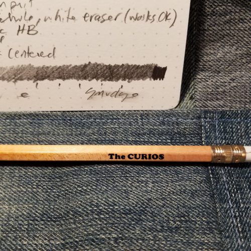
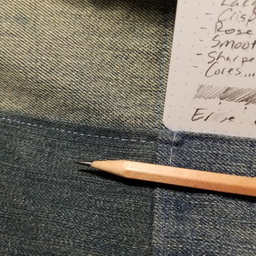
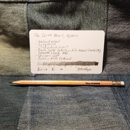
Review: Apsara Beauty Dark Writing Pencil

The Apsara Beauty, or as I often mistakenly call it Black Beauty in some sort of homage to my childhood spent wondering why so many of my classmates loved the book and the movie Black Beauty while I continually thought to myself, man, shoveling horse poop is hard work.

Since these arrived on my doorstep I’ve had one in my hand, in my pocket, or in my pencil case every day. These tick several boxes for me- no eraser, mostly black, nice dark core. I love pencils without erasers. They are mostly black. I’ve written about how black pencils satisfy my emo goth inner child so I won’t digress. They have a jaunty little red end dip that makes me super happy. The imprint is gold, but there is a simple little double red foiled bar on the pencil. That red foil logo is awesome. The looks of this pencil hits every happy pencil look that I want. I love how these look. The lacquer is thin and the grain of the wood is visible, but it’s super glossy.

The included pencil sharpener is the Apsara Long Point sharpener. It does a decent job for a freebie. The eraser is the Apsara Non Dust Eraser, I reviewed that over here.

Inside the delightful paint and foil is either pine, linden, or basswood wrapped around a smooth dark core. The core has decent point retention/durability when compared to other Hindustan pencils, so I’d rate this a B core. It’s smooth on all the paper I’ve tested them on, and also nicely dark. It does smudge on some paper, so it does lay down quite a dense line. It sharpens well in almost everything thing I’ve used. I did have one pencil with a partially shattered core that my Pollux ate up, but another pencil did a-ok with the Pollux. I suspect the core not the sharpener.

The one thing that I don’t like about this pencils but other will find as a plus- it’s super lightweight. They feel like nothing in my hands as I write. I prefer a little more weight to my pencils but these write so well I forgive their lack of weight.

As for price I picked up 2 boxes, so 20 pencils, 2 sharpeners, and 2 eraser for a mere $5.23 for those of us keeping track at home, that is 22 cents per item in the box, if you discount the sharpeners and eraser then you are looking at 26 cents per pencil. I love these and they have taken the place of the Casemates premiums as my favorite super cheap pencil. Continue reading

Review: Moleskine Ballpoint Click Pen

I picked up the Moleskine Ballpoint Click Pen (MBCP) at Staples off the clearance rack for a mere $6. Which compared to their original MSRP of $15.95 is a steal. Inside is a standard parker style ballpoint refill. Sadly Moleskine didn’t think to use all the same refills across all their products, so this one uses a Parker style refill, another pen uses their gel ink refills and so on. The ballpoint refill is pretty meh. It does the job but my wife described the experience of using it as scratchy. I don’t find it scratchy but it isn’t smooth, not at all. 

Outside of the meh refill the feel of the pen in use is weird. First let’s discuss that shape- a rounded over rectangle that is thicker than a carpenter pencil but also not as wide. It is, as my wife said, shaped funny. The flat shapes never seem to settle into a good place in my hand and I’m constantly wanting to rotate the edge away from my thumb, but then the narrow shape sits on my middle finger and feels off. The shape is just not comfortable for longer writing. It’s too weird. For quick notes it’s ok.

The pen is extremely light weight. It’s made of ABS plastic, similar to the Lamy Safari, but unlike the Safari, the MBCP feels thin and cheap. I am not sure exactly why I think it feels cheap but it feels insubstantial. The thin metal of the clip feel too pliable and easy to damage. The seam is visible and unsightly.

Though the clip is too thin, it is a genius design. It slides over the fore edge of your notebook/journal, keeping the pen flush with the book and at the ready. I’m in love with the clip and I really wish that the writing experience was up to par with the clip.

Moleskine is no longer producing these pens, so I’m late to the game but here is where I think that a company could have reached out to the large community of Moleskine and pen enthusiasts across the world. I’m pretty sure they’d have been told- the shape is too weird, the pen feels cheap, among other issues. Instead they got caught up with their own design and drank their own Kool Aid. Slap a Moleskine logo on it and it’s sure to sell. Sorry Moley, you put a cheap product on the shelf for $16 across the aisle from a whole assortment of pens people know will work well for less money, and most people are going to buy the 10 pack of InkJoy for $15 instead of the weird rectangle pen. Which is why we see so many of these on clearance racks at Target and Staples- they don’t sell worth a damn because they are overpriced and don’t perform. I get better performance from a Bic Cristal at a fraction of the price.

Continue reading

Review: Nataraj Trikone Super Black Pencil

The Trikone sports a core of Nataraj’s Super Black graphite. I’ve reviewed other Super Black pencils before, and these are no different. The core is silky smooth, dark, and I love it. The point retention/durability isn’t the greatest, but nor is any 2B pencil, and that is exactly where the Super Black cores sit- in the 2B range of graphite. With that aside, all we’re looking at is the rest of the pencil.

The Trikone is a triangular pencil. It arrives in a nifty triangular box, mine was very battered in shipping, but thus far the pencils seem no worse off. Inside the top of the box is nestled a standard Nataraj 621 sharpener and a nifty triangular eraser. The sharpeners work well enough to be used, while the Trio eraser was good enough to warrant it’s own post and a glowing one at that.

The Trikone is a standardly sized triangular pencil with rounded side and rounded over points on the triangle. It’s got the jelutong inside like most Hindustan pencils. It sharpens well with anything I’ve thrown it into.. The exterior of this pencils is what I see as markedly different from other Hindustan pencils. The lacquer on these is thickly applied and glossy. Though there are some issues here in there in the finish, for the most part these are better finished than most of the Hindustan pencils. I cannot see the grain through the lacquer.

The imprint is gold and deeply set into the paint. The triangular logo is smart looking and I rather adore it. Honestly, I might order more of these just for that logo. The colors of these pencils deserves to be mentioned. I really like the color combinations Hindustan comes up with for it’s pencils. In this case we’ve got yellow and red, blue and yellow, green and blue, red and orange, and finally orange and green. These color combos are just awesome. The shades of each color are bright and vibrant. I love the contrasting end dip. Speaking of the end dip, it’s thickly applied as well, and almost looks as if it were individually dipped.

I tend to be pretty meh on the whole triangular pencil front. They seem to be an odd shape to me, but these are pretty comfortable and feel more like around pencil than one with a mere 3 sides. I love the look and the feel. A handful have entered into my regular use pencil cup and like many of the Super Black pencils are in regular rotation. They aren’t a bad deal either, at $4.99 shipped they come in at a mere 42 cents if you include the “free” sharpener and eraser as items. Even if you don’t that is 49 cents a pencil.

I’m linking to the item I bought from the vendor I bought them from. However, I didn’t order the Trikone, I ordered the Trio 621.  So roll the dice?
Continue reading