I’ve discussed in previous posts how my workplace offers the finest of the cheapest papers that Staples sells. Every quarter they buy 10 to 12 cases of whatever is the cheapest at that moment. This means the paper is never the same, though it is always one of Staples finest cheapest offerings. Sometimes we get 30% recycled, sometimes it’s not recycled but bright white whatever. You get my drift. The paper varies and it’s always rough and absorbent. As much as I’d prefer to fill out my paperwork with my Namisu Nove F with a Ti nib loaded up with Iroshizuku Tsuki-Yo, it’d feather and bleed through any of the papers. For awhile I was was using an EF or F Platinum Preppy loaded up with Diatrementis Deepwater black. The combination does okay on some of the cheap crappy paper, but not the most recent batch. This has led me on a quest to find the best gel and rollerball pens for crappy paper.
Simply because I’m on a quest for the best pen for the crappiest of terrible paper doesn’t mean that I want to sacrifice my writing experience. I want to keep a smooth enjoyable experience despite the hardship of writing on terrible paper. There are many ballpoints that do well on the crappiest of crappy paper, but I’m not including these in this discussion for the simple fact that I already know they work on crappy paper. You want a solid ballpoint for crappy paper- get a Bic Cristal or Parker Jotter. You want gel? There is much more to discuss.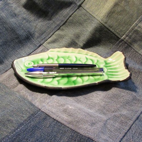
I’ve already written about how a Pilot G2 is always a solid choice– in both black and blue ink for crappy paper. It has become a go to for my work place. Any point size seems to work well. I stick with the standard offering of the 0.5. I did pick up the Pilot B2P, which is loaded with a G2 0.7 refill and it works quite well. So add the Pilot B2P gel to your G2 choices.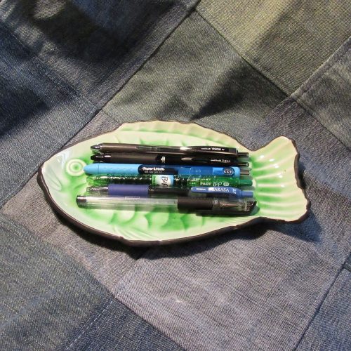
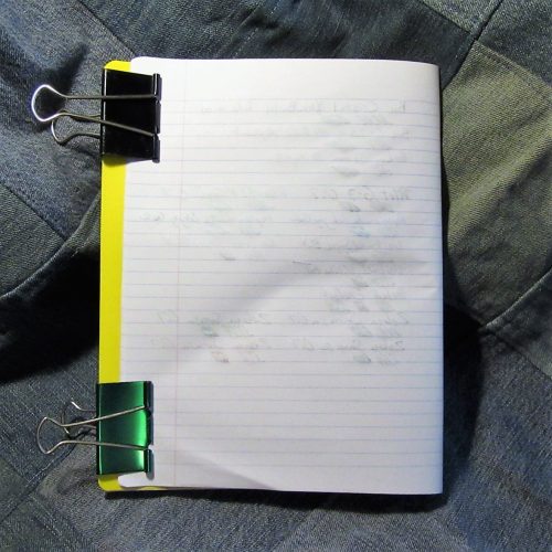
While I quite enjoy the Paperhate InkJoy gel pen in my pocket notebooks and journals when I use it on crappy absorbent paper I blow through the refills incredibly fast. The InkJoy gel seems to flow faster on crappy paper. It is already a firehose of a pen, but cheap paper makes it write wetter and drain faster. Also I’ve noticed that it has a tendency to bleed through on the paper. These faster flow and bleed through makes the Inkjoy a poor choice for crappy paper.
The Uniball Signo series in all colors does well on the crappy paper. It performs as well as the G2. In my mind I like the Signo over the G2 because I’ve never had one dry or skip as I have with the G2. The Signo writes and writes. Plus the BLX colors are just great.
Another Uniball, the Vision, is a rollerball rather than gel ink like the Signo, works very well on most of the paper at work. It writes and writes with good ink flow. Occasionally I’ll notice a few spots of bleed through, but that seems to be a rare occurrence. I use these in the standard black only.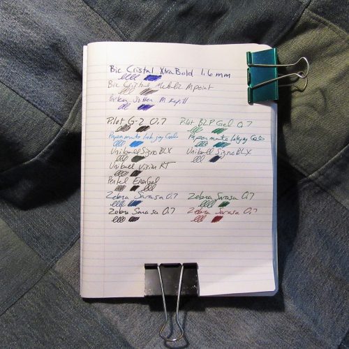
I’ve used a few Pentel EnerGel pens, and while I like the blue on the crappy paper at work, the black isn’t as good. I noticed that the edges of the line are darker than the center. My lines are less dark because of this. The ink flow is good and it doesn’t skip, nor does it bleed. I simply do not like the darker line edges the black produces. The blue does not seem to exhibit this characteristic. I prefer to buy these in refills and fill my Pentel Alloy body- as I always seem to snap the Energel plastic bodies in half before the pen is finished.
The unsung hero of crappy paper is the Zebra Sarasa. Not the Sarasa Clip, just the regular old Sarasa you can find in multipacks in any Staples, and oddly as Singles in many Walgreen’s locations in the US. The 0.7 retractable Sarasa is a decent and solid pen on crappy paper. On better paper it tends to skip and show that weird lighter in the middle line variation I saw with the EnerGel. The Sarasa doesn’t skip, bleed, or anything but write on crappy paper. From the moment I remove the waxy blob on the tip to the moment the refill is drained, it writes and writes.* Combine the Sarasa’s writing with it’s low price and availability it has become a staple in my cheap paper arsenal.
Many of my workplaces have offered Staples brand capped black gel ink pens in 0.7mm tips. While I prefer a click pen at my DayJob, I grab these when they are offered. These seem to be modeled after a Uniball Signo UM-151. They may even be made for Staples by Uniball. (The ink isn’t waterproof or lightfast.) That said, they perform as well as the Signo 207 series of pens on crappy paper- really well. They write and write without skipping or bleeding. That said, the refills are smaller than in the Uniball or Sarasa, so I tend to drain these pens faster than others.
In terms of affordability, the Staples is the most affordable. Because so many workplaces have accounts with Staples you can often get the person who orders to order you a box of 12 of the Staples pens at least once. If you cannot get the Staples pens ordered for you, the Sarasa is probably the most affordable next option. The Sarasa can often be found for less than the G2 or the Signo. If you look for sales, other pens are an option. I’ve been trying to keep my options to be $1 or less per pen. I’ve managed to score some serious deals in the post Back-to-School Sale season- I snagged 5 Indigo Sarasa for 10 cents each. Keeping a close eye on sales and clearance racks has helped me to find enough pens to last at least the next year at my DayJob.**
Continue reading →
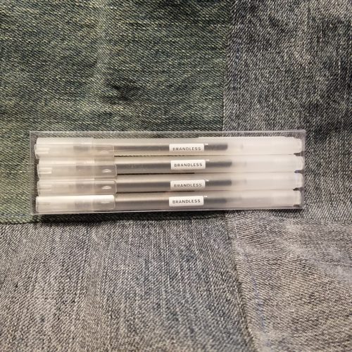
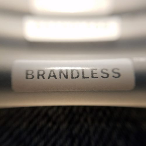
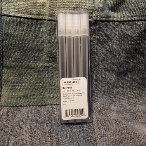 The pens are available in a 4-pack for $3. The package is a clear hard plastic box. The backside sports a white label with product info. Simple. The pens are semi-opaque white frosted plastic. The plastic is matte with a glossy white “Brandless” label printed in the middle of the pen. Simple.
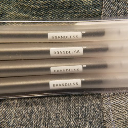
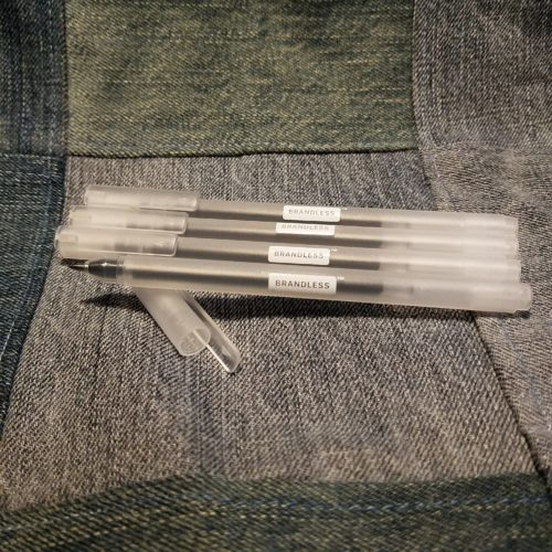 The cap is short and reminds me of many other inexpensive gel pens, specifically Poppin, but without the bright colors and carefully designed clip. The clip on the Brandless pen does its job, holding the pen to a notebook or the placket of a shirt. The cap is short. It offers a soft click as the pen is capped or posted. The pen posts easily and the cap stays in place.
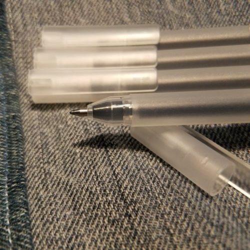 The refill is held in place with a rear cap that screws into place. When my pens arrived this rear cap was loose on two of the four pens. It was easily screwed down with my fingers. Once tight the refill doesn’t move or wiggle. It is quite an efficient method of holding the refill in place. I found that several of the refills weren’t as full as others.
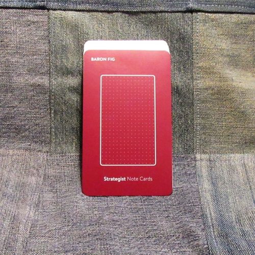
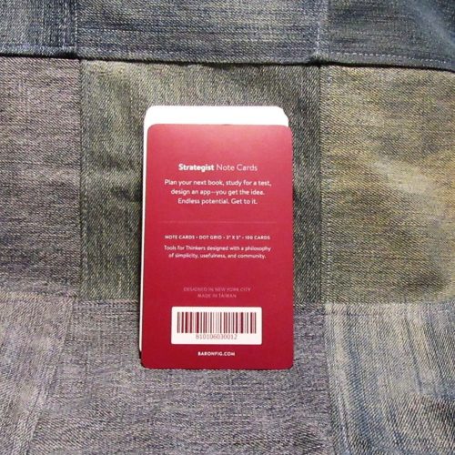
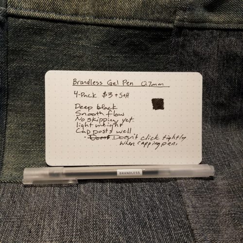
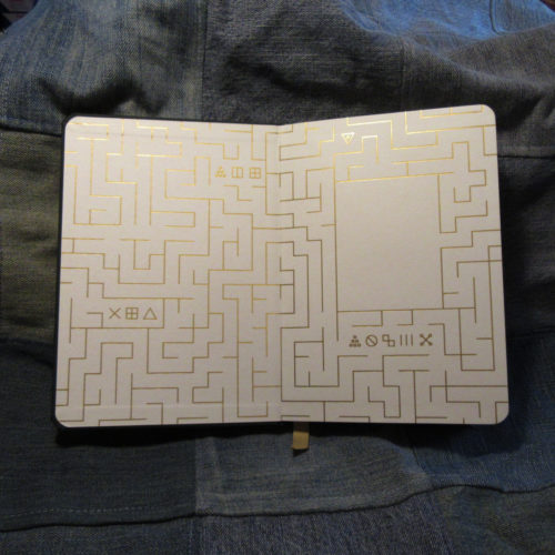
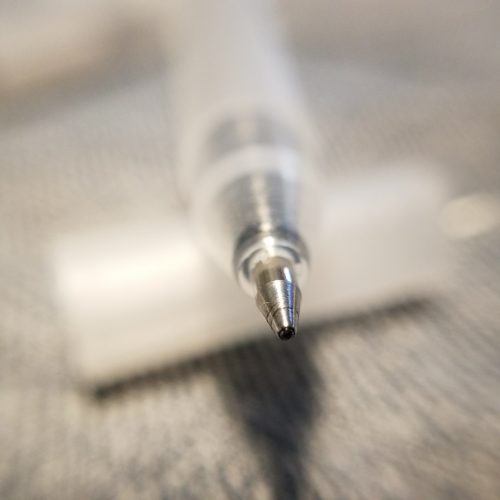 In use I find the pens quite comfortable, they have a slightly thicker body than other gel pens. They fit my hand well. If you grip your pens close to the tip you might find that the drop between the tip and body is uncomfortable. The ink flows smoothly and darkly without soaking through most of the pocket notebooks I use, or the crappy paper at my DayJob. They respond quite well to crappy DayJob paper but also in my Baron Fig confidant I use as my book journal.
 Continue reading
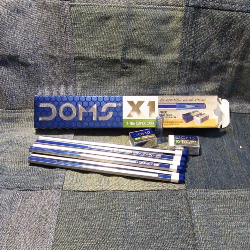
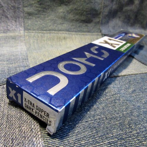 The X1 reminds me of a higher end Staedtler Rally- the paint is thick and glossy and on my package of 10, evenly applied. The blue is bright and on every other hex with silver paint between. The imprint is silver foil and white and applied on the blue sides. It’s clearly a pencil made for school kids as there is a spot to write your name. Fancy. The UPC is in the center but closer to the business end and printed in white.
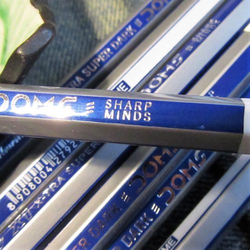
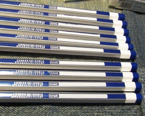
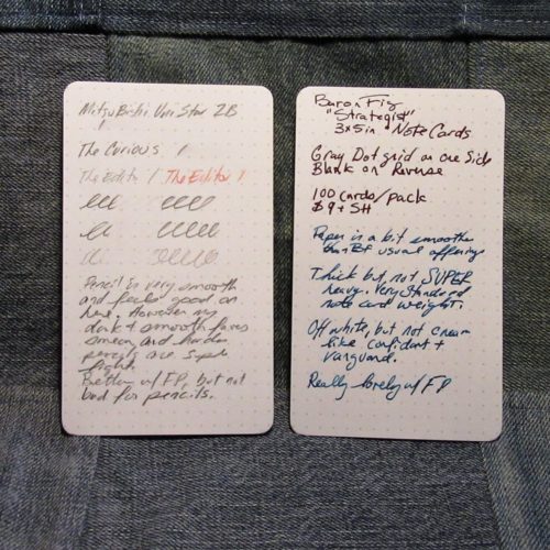
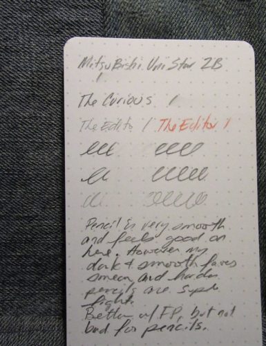
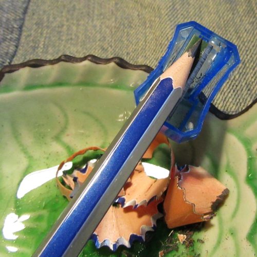
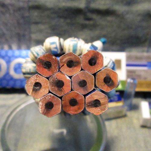 My package arrived with 10 pencils, a matching translucent blue sharpener, and point protector. The wood appears to be popular or bass. It is definitely not cedar. It’s straight grained and sharpens with ease. Inside the thick lacquer and wood is a thick core. Most of my 10-pack was well centered, though a few were off but not by enough to cause issues with sharpening. The core itself is described as black and it is, it lays down a dark line. It’s smooth and lacks even occasional bits of grit. The core is softer than most HB pencils and I’d describe it as close to a B than HB or 2B. It sits right in a happy spot for point retention and darkness. It is also quite suitable for sketching. The lead is capable of quite a range of tone and value- from a nice light grey to a deep dark. Because it is smooth the graphite lays down effortlessly. I have quite enjoyed it for sketching a few portraits here and there.
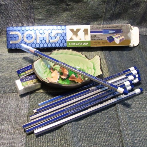
 Overall the X1 is a jaunty little pencil that can be used for many uses. Its blue and silver stripes are cheerful. The thickly applied lacquer makes the pencils appear more expensive than they are and the end dip is precisely done. The thick core sharpens well in a Pollux, Masterpiece or Classroom Friendly. You can sketch or write with its smooth dark graphite.