Author Archives: leslie

Six Pencils for September

There are a lot of challenges on the internet- use this material, use that material, use only so many pens, etc… None of them really interested me. I dislike rules that aren’t my own… The first challenge that I’ve see that I really feel like I can do it the “6 Pencils for a Month” challenge that I first saw on the Erasable Facebook group.

Last month I struggled with which pencils to chose? I already had a pencil case full of 9 pencils. I chose not to take part in the challenge.

This month I decided to go with the following, with a few caveats, which I’ll detail later

  1. Musgrave TS 100– a solid pencil for note taking and sketching.
  2. Mitsubishi 4563 2B– Soft dark, but yet doesn’t wear down like crazy. Awesome for notes and sketching.
  3. Tombow 8900 B– A great pencil for notes and sketching. Dark but with decent point retention.
  4.  Staedtler Tradition B– I’m less familiar with this one, it’s dark and soft, we’ll see how it contends with the rest for notes.
  5. Palomino Blue HB end dipped– One of my last pencils of this fine iteration of the Palomino HB. I was sad to learn that these are no longer produced.
  6. Caran d’Ache SwissWood Dark HB– the only true HB of the lot, but a very nice HB. Smooth. It smells like a campfire. I wish this pencil came in a 2B. I say 2B and not B because I find Cd’A’s graphite to run substantially harder than more other brands. I am doing this for Toffer. He can consider my using a hard pencil like this his wedding gift.

My 6 for September.

A photo posted by Less Herger (@lessherger) on


My caveats, because I cannot follow someone else’s rules without also imposing my own to flaunt them, are as follow:

  1. If I use a pencil down to a nubbin, I can replace it with one just like it.
  2. Or not if I don’t like it very much, or it proves to be a pain in my ass.
  3.  I can also chose to replace it with something else from the pencil cup.
  4. I’m free to use whatever I’ve put into my bullet pencil.
  5. Art pencils and pencils used for art don’t count.
  6. Pencils may not be replaced until worn down to a nub.

Another issue that I will be running into is that all summer I’ve knife sharpened all of my pencils into delicate hummingbird points. I’ve found that I can write for 4 or more pages with a pencil sharpened as such, and have grown quite fond of these points. The issue that I’m going to run into is that if I don’t point up my pencils before heading into school, I’m kinda screwed. I feel like I have to decide to either remember to sharpen the pencils the night before or sharpen them with the “long” point sharpener. *grumble* Knife sharpening in a outside of the art rooms is not looked upon kindly.
So that is my personal challenge, with caveats.

Review: J.Herbin Fountain Pen

I look at this pen as the partner to the J.Herbin refillable rollerball, which seems to have been around for awhile. There is a reason I see it as a partner and it’s hard not to compare the two, as the body and cap and even grip are nearly identical. They differ only in the writing point and the color of the J. Herbin logo on the cap. The fountain is silver gray and the rollerball sports red. Both take standard small international cartridges. An yeah, I tried to stuff a long cart in, no bueno.JHerbin Fountain

The plastic of the body and cap is not crystal clear but has a milky appearance. I suspect this is due to the type of plastic used, as the body and cap have a certain amount of flex. The grip section is a different kind of plastic which is crystal clear and hard with zero flexibility. The cap snaps on for capping with an audible and to me, satisfying, click. For posting, and you must post or the pen is too miniscule, even for my lady hands. It friction fits. I found that I had to jam it on there or it would work it’s way off.JHerbin FountainThe nib at first use/inking/ out of the display (no packaging or box) worked well. I was surprised at it’s smoothness, even with the dry J.Herbin cart I loaded up. I, of course, polished it up a bit, and frankly the nib is great for the price of $15. The nib looks to be a fine or medium, depending on what  you measure it against, I’d put it as right between the two. There are no other options, purely one size fits all on this baby.JHerbin Fountain

I’ve been using this for about a month and have just burned through my mixed cart of Noodler’s Nikita and J. Herbin Indien Orange. I’m pretty happy with the performance and expense. This pen was $15 to the rollerball’s $12 and I find this to be the better value of the two. The nib performs well for this price range and the flow is great, even with dry J.Herbin ink. All in all a good value for $15.JHerbin Fountain

This would be an excellent give for someone looking for a cheap pen to leave in the office, gift to a preteen, or teen. It would be a great beginner pen. This and a few packs of J. Herbin or Diamine inks carts and a journal would make a fantastic gift.JHerbin Fountain JHerbin Fountain

For my pen hacking readers, this is a pen that maybe up for eyedropper mod. With only 3 small, tiny, holes in the back end, this is a prime first seal-it-up pen hack. The little holes could easily be filled with a small dose of E6000 and the threads treated with silicone grease. It would hold a decent amount of ink, probably triple the amount of the little short carts. I might try this and report back.

Highly Visual Calendar

Because I am a visual person, I’ve always used some manner of large wall mounted calendar to keep track of the things I need to do. When I had a nifty office for my job, I had it mounted right next to my monitor and wrote in stuff as far in advance as I knew it was going to happen. I’d also add in a variety of things that were reoccurring. I attempted at one point to use a fancy Palm Pilot but it didn’t get my visual nature as well as a simple calendar.

Then I left my job and I used pocket planners alone, but I found that stuff would slip my mind. Last fall I started out with a simple piece of cardstock in a Trapper Keeper folder with a clear pocket on the front. Each class was assigned a color and I’d write out each assignment and the due date onto a Post-it  of that color. I used the small 2×2 cube Post-its.

Not only was this visual, but when each task was accomplished I was able to rip the Post-it off, crumple it, then toss it into the trash. I’m telling you the feeling of tossing the Post-it was better than a gold star.

Enter this fall and a slightly fuller class load than the previous semesters, plus the looming possibility of having to write a thesis, and my  simple piece of cardstock isn’t BIG enough. Yup, I’ve only got 2 of my 4 syllabi and the single sheet is full. Some of the notes are redundant- Blackboard responses to readings, ongoing art responses, etc… But for the most part, if I subtracted those, I’d still have a metric ton of Post-its. Plus, 2 more classes need to be added.

To accommodate the additional course load I decided to make a 5×4 landscape table in publisher, with a super thick grid. (PDF here.) Notice that there are no labels. I just write above the grid M-F. I omitted Saturday and Sunday because the grid was too small with them, and those days will simply be days for reading and writing, with the exception of weekends where I have class. I’ll have special Post-its for those weekends… Probably.Visual Calendar

What this gives me is a flexible and HIGHLY visual calendar. I can see at a glance that the week of October 12-16th is going to be busy while the week of September 14th through 18th is going to be pretty quiet.Visual Calendar Visual Calendar

You can buy this already printed and with all 7 days from Post-it themselves. Or make one that works with whatever sticky notes you happen to have on hand. The grid was easy to set up in Publisher, but would also be just as easy to do in any word processing program like google docs.*

I also use Google Calendar to remind myself of reoccurring items like my Blackboard assignments. I tend to forget about things like that. though the due date is the day of the class, I tend to not have time on the day of the class and self impose that those assignments are finished in advance of the actual due date.

Continue reading

Revision: Pocket Notebook Set Up

Every successful system and tool must be reviewed periodically to assess its usefulness. Case in point is my use of pocket notebooks. I’ve been using a little card with a 3-month calendar taped to the front of the book. This has served me pretty well, but requires transfer from book to book.

I’ve also pretty much stopped using the 2-page “To Do” list pages. generally, when I move to my next book the pages are nearly empty. Now this could partially be due to this being the summer or just because I’ve slightly outgrown the list.setupv

I’ve been on the lookout for a one month rubber stamp with blank month/year/etc. I finally found one from this seller on etsy. It fits perfectly onto a half page of a pocket notebook and leaves room below for making notes for important dates. This will go on what was my blog to do page and will replace my calendar card, as I’ve found in my last few books the washi tape tore the cover. Which annoyed me more than anything.20150827_175119The new set up is as follows:

  1. index
  2. catch all page
  3. shopping list/ to do list
  4. Calendar pages (2)

The shopping list and to do lists will be combined onto one page with the top half being the shopping list and the bottom half the to do list. If I need to make a large list of stuff to review for the blog, I’ll make that within the notebook at a random location. I can find it quickly due to the index page.setup  setup


Review: J.Herbin Refillable Rollerball Pen

A brief digression before I begin the actual review. This pen is a prime example of why I am so against what I term the beauty, drive-by, or first impression reviews. While I think there is a certain validity to a first impression, it must be balanced against longer term usage to give the reader a real idea of the true nature of the item being reviewed. That is to say my first impression of an item may be “Wow this is great.“ Which can change to, “Holy jeebus crisco, this is the worst thing I’ve ever used.” In the course of a month of use. A beauty review can tell us how something looks but nothing about its longer term performance and this pen is a prime example of how initial functionality loses out to performance over time.

This is a pretty good looking pen when compared to other pens in it’s price range. Like the J. Herbin cheap-o fountain pen, this has slightly milky clear plastic for the body, but has a crystal clear grip section, in this case, it houses a feed and a rollerball tip. The pen accepts short international standard carts. Sadly it will not accept long carts.JHerbin RollerballThe cap is made of the same milky yet clear plastic, that has just a small amount of give. It snaps on for capping the pen with a satisfying click. It posts easily, but I found initially could work it’s way loose as I wrote. However, after some use, the cap posted just fine. You will need to use this pen posted unless you have smaller dainty hands than my lady hands. I found it too short to use unposted. It stayed clipped to pockets, lapels, and notebooks without an issue. The clip is snappy and strong.JHerbin RollerballThe pen itself is very lightweight. It would be ideal for longer sessions of writing and maybe even note taking sessions.

So here is the issue, sticking point, or rub after a month of on and off use the tip is scratchy as hell. When I first purchased this pen, it was smooth and nice in my Field Notes and other notebooks I tested it in. Now it’s not smooth on everything. In my composition notebooks I feel like I’m writing with a sharpened  stick dipped in sand. The ink flow is just right and it keeps up even with the thirsty paper, but ewwwww it feels gross. It is still smooth in my Field Notes, Fabriano, and a few other papers, but I do the majority of my notes and longer form writing in composition notebooks, and this puppy is awful after a month’s use.JHerbin RollerballDepending on your paper, and intended use, this pen might not be for you. If you stick to smoother papers- Rhodia, Clairfontaine, etc you will likely enjoy this pen for many months. If you use rougher cheaper paper like Staples comp books, even those that are good with fountain pens, you will likely be highly disappointed with this pen, especially with it’s longevity. A month is not a long time for a pen that touts its ability to be refilled and reused to wear out. So, yes, I quite like this pen, but as I stated above, have a few qualms against recommending it.JHerbin RollerballFor my readers who hack or kludge, this pen could EASILY be converted to eyedropper with the use of silicone based glue like E6000  and a few dabs of silicone grease. There are 3 tiny holes in the back end which could be filled with ease. The threads are tight and would need just a dab or two of silicone grease to keep this thing ink tight. (I may attempt this hack and get back to you. A more lubricated ink may solve the scratchiness on cheaper paper. I’m thinking Noodler’s Heart of Darkness.)

Review: Uniball Air

Here is another pen that if I’d reviewed it when I first purchased it would have received a better review than after about a month of on and off use. I resist my urge to again rant and rave against drive by beauty reviews that are pretty but lack a substantive amount of use to back the reviewer’s claims.

I picked up a 3-pack with red, blue, and black capped pens. The pen body is made of translucent plastic the same shade as the pen which is then covered in a print. The print is in black and gray and looks to me like a generalized idea of black carbon fiber… The pattern is slightly raised and feels nice. The cap is smoke colored with an inset attached to the clip matching the ink. The cap secures over the business end with a nice click. It posts deeply and I have no fear of losing it.UNI Air

The pen is lightweight and well balanced both posted and unposted.  I found that the grip section was slippery in longer writing sessions and that I could feel the coordinating colored bit. Something about this annoyed me. I think mostly that the section was slippery and thus I had to  adjust my grip frequently. I am not a sweaty hand person, I use metal and plastic sectioned pens all the time with no issues. So this was not a matter of my hand but the slick nature of the plastic.UNI Air UNI Air

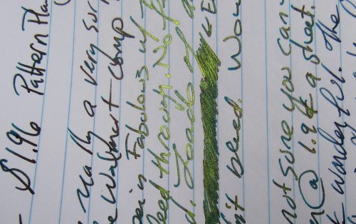
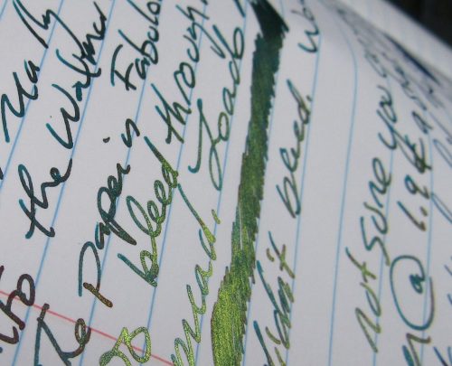
The pen tips glide over every surface I’ve used them on and I think this is due to the huge ink flow. These pens are gushers. Using them in my comp books meant I had bleed and show through everywhere. This is less of an issue with these books as I don’t use the reverse of the page other than writing brief notes about things I need to address later or ideas for edits. But it does show how much the pens saturate the paper as well as how much ink is wasted. The pens were only available at target in the large 0.7 but I’d put them on most paper at a 1mm. The ink really spreads out. This is anything but a fine tip.UNI Air

These pens are so smooth that you can almost feel the ink being pushed out of the tip. My wife described these as a combination in feel of a gel ink and a fiber tipped pen, and I think that is an apt description. I did not like these for writing very much because they felt so weird, BUT they were really nice for drawing and the ink is waterproof. The high flow of ink really lent the pens to doodles and sketching. But again, because of the flow, lingering anywhere on a page will cause bleed through. These really flow so wet that writing on regular paper is akin to writing on toilet paper.

I really liked the shade of red and blue that was offered in the 3-pack. The red is a nice bright red, perfect for marking up edits. The blue is a wonderful shade that is both bright and bold. The black is deep and dark.UNI Air

Overall, I don’t really them much. I also think they are overpriced. With the ink flow being so high, I’ve used a quarter of the black already and can see myself blowing through this one if I used it more frequently very quickly. At $7.99 for 3 at Target, or $5 at Staples, and $6.57 at Walmort, or a whopping $12 on amazon, these are just not a value. Especially when you consider how quickly they squirt ink onto the page. Also, they are a little ugly. Actually, a lot ugly. The futuristic design will appeal to high school kids and possibly dudes, maybe dudebros. The slick grip was also uncomfortable even with my cool dry hands. If you must buy these, get them while they are on back-to-school sale for $5 at Staples.

There are much better options at better prices- the Uniball 207/307 or Signo gives you better feel and the same quality ink with a better grip, ink flow, and look.

Review: The Mt. Tom Six by Four by Bob Slate

In complete opposite to the last notebook review I did, I’m ecstatic over this one, even though it has a spiral binding, and I’ve written about how much I despise spiral bindings. The Mt. Tom is a 6×4 inch 80 sheet notebook sold by Bob Slate Stationer in Cambridge, MA. The spiral binding is bright silver and tough. The paper is bright white with dusky blue college ruling. The cover is raw tan card and is stiff enough that you can write in hand.MT TOMThe paper is very nice. It responds well to juicy fountain pens and scratchy pencils and smooth Palomino Blackwings. I was quite surprised at how nice the paper responded to everything I threw at it. The construction is solid. the spirals, though the notebook lives at the bottom of my backpack, are hardly squished or bent. The stiff cover allows me to take notes on the go and is delightful for scratching out ideas on the train. The printing on the book is in red, much like their line of notebooks branded for Harvard, but is a little more subtle.MT TOM MT TOMThe price is right too, at $1.95 this notebook is not only a quality winner, but a value.MT TOM MT TOMAs for the spiral binding, I wish they would produce a composition notebook with this paper inside. It would allow for any tool to be used on it’s pages with success. I also tested out another of their notebooks, which I’ll write about later, but no where on their shelves did I see a Bob Slate composition notebook. If half as good as these, I’d buy a dozen. I suffer the spiral binding, though I loathe them, because sometimes you need a notebook where pages can be torn asunder and passed to another. To do and grocery  lists must be jotted down and fulfilled. You can’t just tear out a page of a Field Notes without destroying it’s structural integrity, rather, you keep something like this for those occasions.

Use it Before Reviewing it

I’ve previously written about what I’ve referred to as the beauty or drive-by review. I think it’s better called a first impression review, which lacks the derogatory inference of the terms beauty or drive-by. Though, I do believe that such reviews are inferior to reviews with lengthy use supporting the opinions of the reviewer.use it use it

This in the front of my mind as I have two reviews in my queue that if I had reviewed them after writing only one page right after purchase, my review would have been skewed overwhelmingly favorably. Now that I have at least a month of use on these pens, I have different feelings. I have written in my Field Notes, composition notebooks, assorted cheap paper at work, my sketch books, and other paper, and the results have varied wildly. I’ve also subjected each pen to long writing sessions, brief notes, being uncapped for brief and longer distracted periods. Each method of use gave me a better of idea of how the pen felt and worked. Also the longer review period gave me a better idea of the longevity of the pen. I can better answer, “Will this pen last?” or “Is this pen a value?”

If I chose to place emphasis on quick initial impressions, as in my TWSBI Eco(nomical) first impression “review”, I should label them as such. Can I accurately report on a pen or pencil if I have only used it for the single sheet of paper I used to write the review? Or should I hold myself to a higher standard and use the damn thing for longer? If I only use the pen/ink/pencil in a Field Notes/Rhodia/composition book/Hand-Book sketchbook, how am I telling people about the performance? I’m not, I’ve only got the one point of comparison.

I know that the standard has been set that reviews on pens and pencils are done on one sheet of paper by one manufacturer, but it’s a simplistic precedent and one that those of us who do reviews should revolt against. There is a division between reporting on the aesthetics of a tool and it’s overall performance. I fully believe that the performance of a pen/pencil/paint/paper cannot be done with a single written page.

Review: Mitsubishi Boxy Eraser

After reading a bunch of reviews I sprang for a Boxy eraser. I’ll also admit that I have a thing for black erasers. They are super cool, or have been stuck in that “super cool” frame since I was 12 and in 8th grade and most erasers were pink. I missed out on the bright neon Yikes! erasers that came out in the following years. See I graduated straight from pink pearls to art erasers, and once I became an art kid only art erasers would do. I digress, back to the Boxy.Boxy

I must admit that I was underwhelmed with the Boxy when I first used it and it has sat in  my eraser cart* for months before I pulled it into regular rotation. The only reason I pulled it into regular rotation at all was because I misplaced my Sakura Foam, which is STILL the greatest eraser of all time. When compared to the Foam, the Boxy falls short. The Foam is still superior.Boxy

Enough talk about the Foam, the Boxy is not a BAD eraser, it’s a great eraser. First off it is a great shape, the long squared rectangle is perfect for cleaning lines of text out of small tight areas.It also cleans my soft dark 2B and 4B pencils off every page I’ve used. I used the Boxy during a class and it cleared away General’s Cedar Pointe #1 graphite off a composition book page like it had never been there. The soft body of the Boxy got into the nooks and crannies of my writing and cleared that graphite until it was gone.Boxy Boxy Boxy

I also got a chance to test out the Boxy on some art. I had sketched a drawing onto really rough thick paper and then inked it with Carbon Black in a brush pen. Loads of dark pigment over the graphite. Now the main issue when cleaning up graphite is that the eraser also picks up some of the ink and either smudges or grays it out. The Boxy did not gray out my image, at all. Areas that were damp smudged but the dry ink didn’t turn gray. Which is awesome.Boxy Another added benefit of the Boxy is that it is sturdy enough to carry in a pocket without any additional protection other than it’s own paper sleeve. The Sakura Foam turns blue in the pocket of my jeans and seems to shrink as the cotton wears away at it’s soft body. The Boxy has none of these issues. First it’s black, so even if it were dirty who would know? And secondly it’s a smidge firmer than the foam so the simple act of walking doesn’t create quite enough friction to wear it down.

Now my biggest gripe with the Boxy is that it leaves crumbs everywhere. The eraser bits, so eloquently known as crumbs, roll up a bit but don’t stick to themselves or to the eraser. Because it is a soft eraser, it makes  a ton of crumbs. After using the Sakura Foam for so long I spent a few minutes looking at the mess of crumbs on my paper and trying to press the eraser to them to see if they would stick with little success.  Your page must be brushed or tapped clean. I don’t find this quite as annoying when drawing as I do when I’m making notes in a notebook, the crumbs get caught in the gutter of the book and leave bumps. Annoying.Boxy

Bottom line: The Boxy does a fantastic job of cleaning the page and stands up to pocket carry better than the Sakura Foam. If you are looking for a pocket eraser that does a great job, get the Boxy, Available at a bunch of retailers, but I got mine from Jetpens with my own cash money for general use and not for teh purposes of review. The review occurred organically.

Continue reading

Portrait Process

I thought I’d show you some of the process of creating the images of the presidential wannabes.

I start by looking through google and assessing the kinds of pictures they have available. I don’t use just one as a reference, sometimes an image will wash out the nose, or the lips. Quite often all of the images made the candidate look pink, really really pink. Occasionally they’d be orange or gold. I think it depends on the photographer, but man, many of them should get their blood pressure checked, because their faces are RED.  After I find 3 or 4 images to reference, I start with a sketch, it’s basic. I was using a “iron blue” (AKA payne’s gray) Derwent Inktense. However, my local stores only carry Inktense in tins, and I have no interest in having a tin of them. I like them for under drawings for watercolors because after I add water and they dry, they stay put. However, they aren’t light-fast, or all the colors aren’t. So I don’t want to rely on them because I don’t want to use them in anything but my journal. I have moved to other brands of watercolor pencils and I’m debating which I like best.processprocessAfter the under drawing us finished, I hit it with water, blending the color out and into the proper tone.process processAfter this I start to layer on the actual colors. I and working with a bright and dark palette of not true to life shades. I start with pale pinks and yellows, brushing these on in broad strokes. I’m using a #10 synthetic brush. I then layer on medium shades, and finally the fully saturated dark colors. I’m a huge fan of mineral violet and indigo. Such amazing colors. process