Author Archives: leslie

Discus

Soooo. I've decided to go with the discuis system for commenting. You'll need to set up an account but once you do no more annoying code or other crap. I've been using it for other blogs for awhile now and it's much easier to use. Sorry for the hoops but now that typepad offers it, I've decided to start to use it. Now that I've made the change the comments will be down for about 24 hours. Sorry!

Now if they would just get off their collective arses and make an app for android I'd be much happier with them.

EDAJC: Bullet Pencils

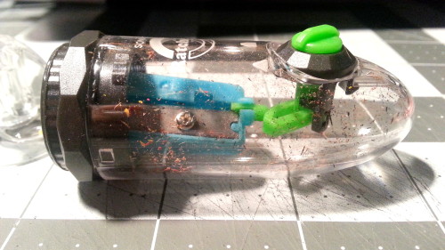
Over the years I’ve developed an appreciation for vintage things. The patina that only time and use gives to an object is something I look at and enjoy. I’m not sure exactly when the love of vintage took hold, perhaps it was when I realized that many of the new tools I  purchased were not made as well as things I purchased as a kid, or perhaps it was simply an acquired affinity for the unique patina that only time can bestow. Regardless, I have been acquiring a few simply, low priced objects that are old, and I’ve begun to love. One of these object is the simple bullet pencil.

IMAG1652

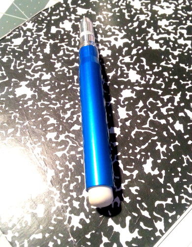
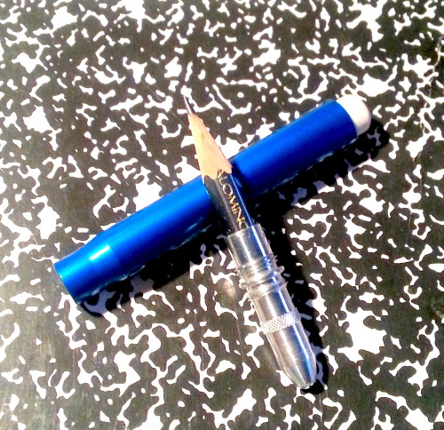
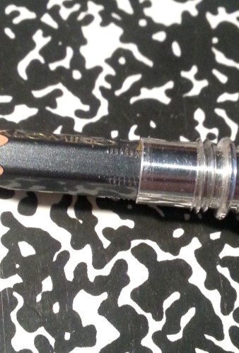
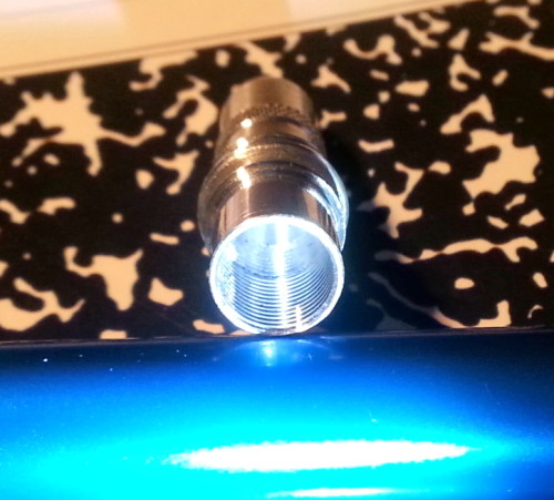
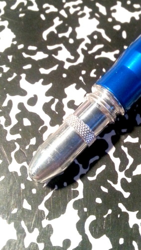
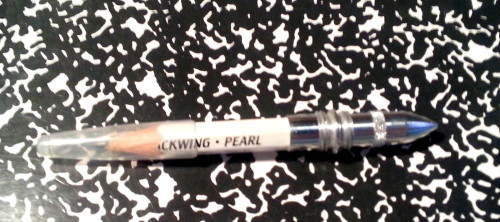
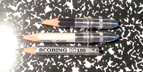
I purchased my first on eBay, but received it after I received my second purchased bullet pencil.* the first to arrive is a lovely restored chrome plated steel bearing the advertising info for “Collingwood Grain Company.” It’s a dusty blue color with bright chrome and a fresh eraser planted in it’s sturdy ferrule. Inside the old pencil has been replaced with a three inch nubbin of a Palomino Blackwing 602. It’s a lovely piece of American history, that I intend to cart around in my pocket.
IMAG1651
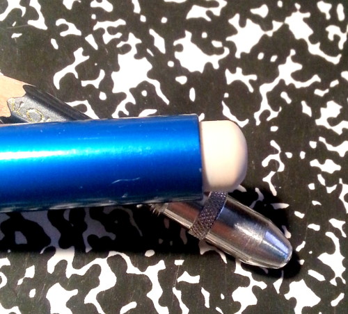
The second to arrive is an aluminum barreled “Badger Fertilizer Company” pencil. It arrived unrestored and in need of a little work. the eraser was glazed over, and though I could have simply carved off the glazed exterior, or flipped it, I chose to remove it and use it as a pattern to carve a new eraser. I’ll do a different post about how to do that later. The body of the pencil is in good shape. I merely wiped it down with a damp cloth and the bright red-orange of the advertising was good to go. The aluminum needed no care. Inside I swapped out the dry and brittle pencil with a three inch chunk of regular orange Palomino in H.** The bright orange of the Palomino paint goes very well with the red orange of the Badger logo.

IMAG1650

Why do I like these pencils so much? Well, there are times when a pen just won’t do, and in those cases when you look for a pencil, you can have one, in your pocket and ready to go in a moments notice. This low tech and simple solution to being able to carry a sharp pencil in your pocket works remarkably well. A testament to their effectiveness as a tool is shown through the fact that they were an advertising staple from the late 1800’s until about 1980. Their sturdiness is evinced by the fact that so many of them are still around in good condition.

IMAG1653

While it is easy to refurbish one of these into a usable and cool tool, there are sellers who sell them already refurbished. This is the easier option. You can also refurbish them yourself. You can find lots of them pretty cheaply on eBay or if you go junking. I found some lots of dirty bullet pencils on etsy as well. Prices range from a buck a pencil to way more. Some of the vintage pencils go for a lot more money if they are of collectible brands. Myself, I looked for interesting colors. I like dusty blue and red-orange. You can also plug in any 3 inch chunk of any regularly sized pencil. I used a serrated knife to cut off a chunk of Palomino.*** (Don’t cry.)  


Anyway, for those of you looking to flesh out an EDAJC**** this is a good way to carry a pencil in your pocket without stabbing yourself in the sensitive bits of your body. It’s compact, lightweight, and adaptable.

Continue reading

Technique Today: Composition

One of the questions I get pretty often is about composition. "How to make a good looking art journal page, that is composed well?" It's one of those questions that usually annoys me, because I dislike the idea of planned out pages in an art journal. But as someone who has studied composition for art and photography, I intuitively arrange what i'm doing around the rule of thirds and the golden mean. I no longer think abotu composition, unless I'm working on a specific project.

So my initial response is that you should study composition. In school we spent a lot of time looking at art and photos. Looking specifically at how things are aranged on a page and how our eyes moved around in relation to those objects and color. I filled pages of a journal with little doodles based off the covers of magazine.Simplifying the objects down to simple shapes. faces became ovals, bodies triagles and rectangles. Works becames rectangles. And so on. Now when I work in my art journal I simply don't think abotu these things. So go to barnes and noble, pull a dozen magazines off the rack, grab a cuppa coffee and look at each mag, and block the cover and a few pages out in basic shapes. Think about how you look at the page. Do this a dozen times across the next 6 months. Composition will become much more natural to you over time.

If you have issues viewing the videos here on my blog please click the title of the video on the upper left of the video and it will open up in YouTube for your viewing pleasure.

Continue reading

Making Shitty Drawings

Occasionally I hit rough patches with my drawing. It’s not a block or a rut, because the desire to draw is still there, but nothing good will emerge from my pen or pencil. As I’m making these rough drawings I hear my inner critic shouting at me that my work sucks, my drawings are no good, and that I should just pack it all up and never draw again. That’s how the critic works. The asshole* in my head waits until my defenses are down and then starts to wail on my already frayed nerves. It’s not so much that I give up, rather I keep plugging away, filling up page after page with shitty drawings.

IMAG1662And that is what I’ve been doing. Over the last few weeks I’ve had a load of crap on my shoulders, real worry inducing crap. The kinda crap I can’t just take my mind off. It’s always there and pervasive. This is when I’ve found my pen starts to create shit on the page. Noses off, eyeballs in the wrong direction, proportions that would make Picasso proud.

IMAG1661

The thing is, that this shit, is gold where art journaling is concerned. Shitty drawings give me a window into my head in a way good drawings don’t. I can see the weight of everything that is on my mind in my bad drawings. I’ve regressed 2 years back in my drawing habit. This has nothing to do with the goodness or badness of the art (the art itself is just fine) it has to do with what I personally see in the art. Yes, there are specific things like proportion, perspective, and other REAL problems in the art, but that makes the drawing neither bad nor good, it simply IS.IMAG1660

A art therapy guy named Shawn McNiff ** writes about having a dialog with your art. That you should have a conversation with your piece, and listen to what it tells you. While I find that idea a tad whooo whooo frou frou for my tastes, I do listen to my art, I look at it and gain perspective on what is going on in my life. Like reading your own tea leaves or tarot cards, listening to your art is focus driven and largely a meditative process.


I’ll get more into how I personally reflect on my pages in a future post.


It was good to identify why my drawings were turning out “shitty.” Being able to look through my book*** and see on this day my drawings were really off, and on this day this happened, it was really weighing on my mind= invaluable lessons. Once I identified what was weighing on my mind I was able to break through the barricade in my head and the drawings started to flow from my pen and onto the page in my usual style.

Continue reading

Technique Today: Colored Pencils

Colored pencils are great in an art journal. With just a few of the right colors you can get a lot of colors. Layering is easy with GOOD colored pencils. Though I've included a video with crayola colored pencils, I do not recomend them. They will only leave you frustrated. Get a 12 pack of colors in a good brand.

If you have issues viewing the videos here on my blog please click the title of the video on the upper left of the video and it will open up in YouTube for your viewing pleasure.

 
(More videos after the break, having all the videos load at once was making the page load slow.)

Continue reading

Make Art with Anything

I've ranted and raved about commercialism in art journaling before. (been under a rock or just discovering me now? Click here.) And I keep ranting about it. I've been gathering videos for technique today over the last few days. (It gives me a nice 20 minute or so break from reading heavy stuff.) It's becoming increasingly difficult to find videos with good solid art technique, if I stick to videos related to art journaling. I'm not usually too shy about looking at stuff that is art andnot art journaling related. But as I viewed video after video, it really hit me.

It's hard to find a video about art journaling that isn't a blatant ad for a product or process or linked to classes. All of it is trying to get us to part with our money. I'm wary of technique videos that read like a who's who of products. Tim Holtz this. Glimmer Mist that. Hellmuth's paints. Grunge Board. Glossy Accents. Spray inks. The videos don't teach us a technique but to be reliant on these products. They don't teach us how to make these product (though there are some old vids that do) they teach us to buy more.

Here's the deal, the secret, all you need to art journal is a pen and a journal. Call me a minimalist but my every day art journal carry (EDAJC) has been the following for the last 2 weeks: A Field Notes notebook, a BanditApple Carnet PeeWee, in a leather cover I made myself and a shitty ballpoint pen*. If I were to extend out my EDAJC I'd add a tin of watercolors in limited colors, a waterbrush, a camera**, a pencil and eraser.

I'm not making "great" art but I am making meaningful art. The art I'm making is helping me to remember the look of the sky as I waited when I picked up my partner. Or the jerking of the train as it rounded corners. Or calmed me after a busy class. This, to me, is what making and creating a journal is all about. It's not about the products I'm buying andusing. It's about the memories I'm creating. It's about my life.

It's real.

IMAG1607

Continue reading

Review: Kikkerland Retro Pen

I tend to wax philosophic about higher end writing instruments while stating “You can make art with anything!” I also write more often about fountain pens, since fountain pens are a passion of mine and I enjoy using them I tend to shove that love into everyone’s face. In some sense I think that if you try a FP you’ll love it, but the truth is that sometimes, a ballpoint or rollerball pen will do just fine. My next few reviews are going to focus on the lower end of price spectrum, while one is for a fountain pen, it’s one I think is worth reviewing (but that’s next week.) This week it’s all about the cheap, old fashioned, clicking ballpoint pen. If you are of a certain age you remember a time when businesses handed out pens with their contact info on them. My Grandmother always kept a cup of them handy near her phone. Because we lived in the country and we frequented places that sold feed and seed a good number of them were for that sort of location. The gas company, gas stations, electric company, and other places handed these out. At one point you could order the Bic Clic or Papermate pens in school colors. These pens were ubiquitous. They were the business party favors from the 50s to the 80s. In the mid 80s everything switched over from the refillable click pen with a metal clip to the Bic Clic Stic. You can still find the old metal clip Bic Clic online, if you want to order 300 of them you can get them for about 75 cents each, less if you order more. Well I don’t have about $200 laying around to buy cheapo pens, but I did have $6.

IMAG1481

Kikkerland, the company known for selling the SuckUk and as being the former districbutor of Moleskine in the US, sells “Retro Pens.” For about $6 (less if you have an artist and craftsman near you) you get 5 made in China old school style click pens. They arrive in a hard plastic box, that is useful for storing the unused pens.

IMAG1482

The five pens are mixed colors of dusty blue, cream, grey, green and black. Each pen has 2 colors, again a nod to the fact that most of the advertising pens you could buy had 2 colors with an imprint on the bottom half of the pen. In the middle of each pen is a slim metal ring with a matte finish. The clip and knock are the same matte silver metal. The clip is printed KIKKERLAND. The plastic is smooth and shiny. I noted a few scuff on each pen from being tossed about in the plastic box, but nothing that I really cared much about, considering this is a $1.25 pen.

IMAG1483

The point deploys via a satisfying click from the knock. The point itself has a very small amount of wiggle at the tip. It isn’t noticeable as I write and draw. The knock does flop around loosely after the tip is deployed, but not an issue if you aren’t a pen spinner or jiggler as you think. Again it’s just not noticeable if you are writing or drawing.

IMAG1485

So, how does it write? Not bad. As far as cheap pens go, it could always be improved with a better refill. But straight out of the box it does okay in writing and drawing. It flows smoothly and evenly. It also has what I call the ability to create a “sensitive”line. Which means it responds to the pressure I use as I draw or write. Low pressure= light line higher pressure= darker line. For the style of drawing I’ve been doing this is very useful. The ink is nice and dark.  Do I think i’m going to be drawn to start taking class notes with this pen? Probably not. I’ll keep using my fountain pens and gel inks for class notes. I got these specifically to draw on the subway and train. For that purpose they are wonderful.

IMAG1488

I have to say that the variety of colors is nice, especially if you are into matching your pen to your notebook/journal cover.

IMAG1489

You can get these on Amazon . You can also buy retro or vintage pens on etsy. Sometimes the sellers have rehabbed the pens to be in working order, and others you can get a few pens that need work or a new refill.  IMAG1490
  You can get refills on amazon or almost any office supply store. These are new pens so I haven’t messed around with refills yet, but when I do, I’ll keep you updated.


I've been using one of these non-stop for a little over a week. I've been putting it through it's paces as my EDC pen and thus far it's performing admirably well. While it's not as tough as an all metal bodied pen, I'm decidedly NOT careful with it. It's been getting shoved into my back pocket with my notebook and sat on, walked around, and generally abused. It's really getting the ass end of the deal… Anyway, sophomoric humor aside. The point is a little scratchy at a couple of angles. If I rotate the pen, the scratchiness disappears. This is, I think a function of the cheap refill. Which I've used over half while nearly continuously writing or drawing over the last week. I suspect that in another week I'll have killed the refill. As I've learned, I use a lot of ink. I might have to go hit up the refill display at Bob Slate again…


Continue reading

Ghosts of Bay State Blue

While I can say I've never been a big fan of the color that is Bay State Blue (BSB) I've never been a detractor either. Even though it stained my pen, sink and hands I shrugged my shoulders andfigured whatever, to each their own. I like Private Reserve Electric DC blue. Not everyone likes that.

I ordered one sample of BSB in 2011 and used it prretty much straight away in a Noodler's Nib Creeper pen. I  used most of it in a Rhodia Webbie. I noted that there was some show through and some bleed through, but not all of the time. I used it for journaling and for drawing.

Like my Fisher Space pen in red, it ghosts after a few years. What is ghosting? When an ink migrates through to the reverse side of the page and you can see a "ghost" of the image on the front. The ghosting with the Space pen red was dispersed and faded, very pink. Also each line had a halo of ink that had migrated away from the original lines. With the BSB The migration to the reverse of the page is intense and amazing. The original drawing or writing can be viewed (or read) in detail. I can see a slight haloing on the fron to fhte page. If I had filled both sides of the page with BSB it would no longer be legible.

Can anyone else report this effect?

IMAG1610
IMAG1610
IMAG1610
IMAG1610
IMAG1610
IMAG1610
IMAG1610
IMAG1610

Technique Today: Midori or Fauxdori

If you've been reading my blog for any peruiod of time you know I love me some fauxdori Midori traveler's notebook covers. I find them ingenious, easy to use, and encourage journaling every day and every where. I've added some of my videos on the fauxdori as well as some great instructions from others about things you can make and add to your own notebook covers.

If you have issues viewing the videos here on my blog please click the title of the video on the upper left of the video and it will open up in YouTube for your viewing pleasure.


Continue reading