Author Archives: leslie

15 of 30 in June

I
started by mixing a large puddle of Payne’s Gray watercolor. I used a
very fine liner brush to write. This gave me a large variety of
linewidth and was hard to control. I had to repeatedly dip the brush to
reload it for more writing. After this was dry I used a brush to flick
watercolor on the page in small droplets. I used a small spray bottle to
spray a fine mist over the page to spread the flicked paint. It also
blurred the writing more.

IMAG0767
IMAG0767After
this dried I grabbed a print off of my heart drawing and my Chartpak AD
marker. I wanted to see how it would transfer over the dried
watercolored page. It gave an uneven transfer, much lighter than it
would usually transfer. Of course the background was much darker, might
try it with a layer of lighter watercolor and see how that works.
IMAG0773I
wanted to add a face to my page but I didn’t want to add a print out of
my face. I grabbed a spare sheet of paper and did a quick automatic
drawing with a Faber Castell PItt brush pen in black. I then cut that
from the sheet and adhered it with glue stick.
IMAG0774After
the face was adhered I wanted to make the heart more visible and the
face stand out. I grabbed my Prismacolor Art Stix and started to
scribble around the face and the heart with red and yellow. bingo! Both
stood out even more and they looked more unified as if they were part of
the while, the heart a shadow maybe?
IMAG0775

I’m
pretty happy with how this turned out, really dig the automatic
drawing. I need to remember to integrate it into my art journal more
often.

The finished image is 5×7 inches and is available matted and ready for framing on etsy here.

Halfway to 30

I’m at the halfway point for the 30 in June and I’ve learned a few things.

First,
I’m starting to feel constrained by the chosen size of the page, this
is causing me to work in my other art journal a lot more. I’ve been
working about 8×11 for the last year, up from my usual 6×9 or 4×6 inch
journal that i’ve always used.

IMAG0721I
find that because I’ve been working larger for about a year that I’m
working in a different style that I used to when working in the 5×7 inch
size. It’s much looser and free. I’m using big bold colors, big bold
brush strokes, and a lot of color opposites.
IMAG0766

I’m
content to stick with watercolors and my usual supplies. I thought that
after a week or so I’d be reaching for acrylics, but I’m not, which is
surprising to me.

Layers,
I’m loving layers more than ever. A layer of collage, a layer of
watercolor, layer of collage, a layer of writing, a layer of colored
pencils.

IMAG0691I
usually work on pages in my art journal over the course of several days
or weeks, adding watercolor and collage in layers, flipping back and
forth between pages and adding bits here and there. I can’t do this when
I’m posting a page a day on the blog and Etsy.
IMAG0709

I like that I’m forcing myself to work on just one page a day. It changes my methods and shakes me up a bit, in a good way.

Things
I’ll change for next year? I’ll probably work larger. I’ll pick one
image per week as a minimum to load to etsy, this will allow me to work
on several pages at once and in my usual method.

14 of 30 in June

I
started this page by coloring  three each of my self portrait and heart
drawings that I’d printed off on a laser printer. I colored them with
watercolors. I played around with placement on the page before adding
color to the background.

IMAG0759
IMAG0759
IMAG0759I
then wrote my entry in light blue colored pencil. I used a big looping
cursive for the writing. I allowed the loops of my writing to pass over
the previous layer of writing. I also allowed the lower loops to go way
below the usual area of underhang. I washed over that with Payne’s Grey
watercolor. I allowed the color to pool in areas of the paper.
IMAG0763
IMAG0763
IMAG0763After the page was completely dried I used glue stick to adhere the colored collage pieces.
IMAG0766

While
this page is simple the writing is pretty heavy. I wanted to indicate
the heaviness of the writing by using the darker watercolor to create a
stormy looking background. The light blue of the writing shows through
to highlight the hope I feel surrounding this heavy subject.

The finished image is 5×7 inches and is available matted and ready for framing on etsy here.

Things to Read this Weekend

Check out the 30inJune going on over here.

Check out this journal page using personal ephemera.

Inspiration from art dolls, some are dark.

Diana Trout is one of my favorites and she gains inspiration from more than just the page.

Danny Gregory, of EDM fame, has a video describing his approach to drawing complex things.

Roz does some amazing things with faces and gouache.

Take a look at some of my journals on etsy.

Or take a look at my art on etsy.

An old video but a good one:


13 of 30 in June

I
started this page by coloring a printout of one of my heart drawings
with pink and blue watercolors. I allowed this to dry while I split a
page in my art journal in half. On one side I wrote part of my entry in
big loopy cursive witha  watercolor pencil. I picked a different color
for the other half and used the same big loopy cursive.

IMAG0750
IMAG0750I
applied water to the writing and allowed the colors to blur and blend.
After this was dry I decided that it didn’t work in the way I wanted
with the heart, so I washed similar colors of watercolor over the top of
the writing. This made the colors pop against the heart image.
IMAG0753
IMAG0753
IMAG0753
IMAG0753I
used a glue stick to adhere the heart image to the page. I was
rummaging through my stash of stuff and I found the Karma Coffee logo
that I’d colored for a previous page , but decided not to use. It fit
with my writing, so I attached it with glue stick to my page.
IMAG0757
IMAG0757

This
is a very simple page but I really like how it works, opposite colors,
lots of exploration of thoughts and ideas with some graphic colors.

The finished image is 5×7 inches and is available matted and ready for framing on etsy here.

12 of 30 in June

This
entry started a little different than most of the pages in this series.
I wanted to break things up a bit so I headed to flickr, specifically
the Florida State Archives to search for an image to draw from. They
usually have some nice portraits. I found this guy.

Ringling Brothers Circus art director Peter Arno: Sarasota, Florida

I
grabbed my sketchbook and pentel pocket brush pens; one loaded with J
Herbin gris nuage
and the other with platinum carbon ink and started to
draw. I used the gray ink first and found the areas of shadow. After I’d
done that I grabbed my black PPBP and started to load in the details.

IMAG0734

After I finished the quick drawing, I added some red watercolor to the background.

IMAG0736Then
I wanted to add a touch more detail, so I grabbed my Platinum Carbon
Desk
pen and added a few dots and lines here and there to complete the
image.
IMAG0737

The finished image is 5×7 inches and is available matted and ready for framing on etsy here.

Continue reading

11 of 30 in June

This
page was started by using a Chartpak Ad Marker Colorless Blender
to transfer a printout
of oine of my brain drawings to a page in a 6×8 inch Stillman & Birn
Epsilon sketchbook.

IMAG0722

Around
the brain image I flooded the page with a cad red medium watercolor.
While that was drying I colored a self portrait print with blue
watercolors.

IMAG0723
IMAG0723I
wanted to use only the eyes of the colored self portrait, so I tore
them from the portrait. I used a UHU gluestick
to adhere the piece to the
page.
IMAG0725I
used  a compass to create a circle around the brain and the eyes. I
then created radiating lines coming from the center of the brain. I then
used a watersoluble crayon to color in every other ray. I wet these and
moved the color around with a brush.
IMAG0726
IMAG0726
IMAG0726After
that was all dry I realized the eyes seemed to sit on top of the image
and didn’t really seem like part of the whole page. I added Sharpie China Marker
circles around everything. Leaving the eyes without circles.
IMAG0730Once
the circles were added I didn’t like the brain. I wanted add some
yellow to the orange of the page, so I brushed a wash of light cad
yellow over the top of the circles. The china marker resisted the
watercolor and allowed the color to pool in some places. I really like
the look.
IMAG0731
IMAG0731
The finished image is 5×7 inches and is available matted and ready for framing on etsy here.

Continue reading

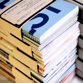
Bookbinding

I’ve
been working on some bookbinding. It’s a perfect task for a cold rainy
day. I put together a few journals, not all are listed on etsy yet.

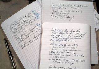
These
have a thick coverstock paper that is perfect for sketching, light
watercolor washes, collage, pen and ink work, as well as pencil. You can
throw a ton of material at this paper and it just keeps on going. There
are a generous 240 pages to these journals. They are FAT and can expand
even more to take in all of your collage work.

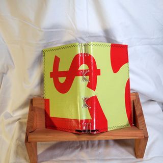
They
are bound with tough hemp, which can take a beating. I’ve omitted the
use of beeswax, which makes these journals 100% vegan! The covers are
made of old vinyl advertising signs stitched to cardstock advertising
signs. These signs are tough and ready to take anything you throw at
them. Don’t like the colors offered? This vinyl takes acrylic paint like
a dream, so go ahead, decorate them.

P6094954
P6094954
P6094954
P6094954
These
journals have all the same attributes as the above, but instead of
heavy coverstock they are filled with 18# vintage IBM green and white
dot matrix printer paper. One side of each sheet has green and white
lines and the reverse is white. These journals fare best with rollerball
and gel pens but can still handle items being glue sticked to the page.
Again, they are filled with 240 pages of this lovely vintage paper.
P6094973
P6094973
P6094973

10 of 30 in June

This
page was started by creating gray lines with a pentel pocket brush pen
in a 6×8 inch Stillman & Birn Epsilon sketchbook. The lines are J. Herbin Gris Nuage Ink in a Pentel Pocket Brush Pen
.

IMAG0716I
then used a pale pink Derwent Watercolour Pencil
to write an entry. I
was reminiscing about this girl I used to work with at the grocery
store, back when I was a florist. She used to wear prom dresses to work,
and she was a bagger. The kid was hilarious, she’d find a $20 1980s
prom dress at the thrift store and decide to wear it to work. So funny.
You look at the registers and there would be this kid in a puffy pink
prom dress, all satin and lace. Customers would ask her, “Is there a
formal tonight?” and she’d reply, “Nope, I just felt like wearing this.”
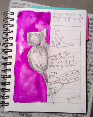
IMAG0717After
I was finished writing I flooded the page with clear water. I added
magenta to the left edge then allowed it to flow over the wet page.There were a few larger drops of water, I blew on them to create spatters and runs in the color.
IMAG0718

IMAG0718
I
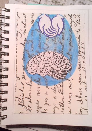
then colored a self portrait with blue watercolor. Then a brain drawing
with pink and purple watercolors. Once dry I cut these from their
backings and positioned them at various points on the paper. Once I
found a spot I liked, I wanted some watercolor drops around the brain to
add emphasis. I mixed up droplets of color and added them to the page. I
wanted them to drip so I blew on the drops through a straw.(I forgot to take pictures of thisstep.) After
allowing the drips and drops to dry I adhered the self portrait and
brain drawing.
IMAG0720
IMAG0720

The finished image is 5×7 inches and is available matted and ready for framing on etsy here.

Continue reading

9 of 30 in June

This
page was started by attaching a mask to a page in a 6×8 inch Stillman
& Birn Epsilon sketchbook I then flooded the page with red and
magenta watercolors. After that I let it fully dry. I used my Pentel
pocket brush pen loaded with Platinum Carbon ink to draw some waves. I
used a white china marker to accent the tops of the waves.

IMAG0714After
that I wanted to create some radiating lines from the heart areas of
the sheep. I used a ruler to mark off the radiating lines. I then filled
every other section with dark blue  watercolor crayon. I wet the
crayons and then scraped it off. I don’t like the effect.

I
had wanted to keep the sheep white, but I took the mask off too soon,
so I’ve got traces of everything I used on the page within the sheep..
IMAG0715

The finished image is 5×7 inches and is available matted and ready for framing on etsy here.