Author Archives: leslie

Open to Challenge

A few days ago I wrote a little post called “What is it?”
Basically asking what is art journaling. I’ve been asking this question on my
FB as well. I wrote it because I like the fact that my idea of art journaling
is constantly being challenged. I’m open to the challenges and thinking about
the different ideas others have about art journaling.
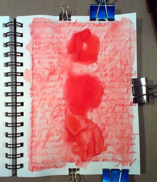
IMAG0432

I know that what I do is a little different from what
many of the people on my ning site do as their art journaling, and I’m okay
with that. In fact, I think it’s what makes the site so great. We’ve got people
just jumping off the scrapping ship and into the messy creative world of art
journaling. I like to see them have their creative muscles awakened and their
brains made active with art.
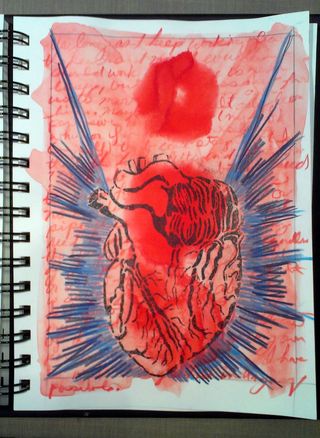
IMAG0433

Part of the reason I’m so open to the challenges and ideas
of so many different types of art journaling is that I think that the more
people who are creative and enjoy creativity the more likely we’ll see an
opening for creativity to become more valued in our society. Because, let’s
face it, outside of a few isolated pockets of art communities, most people will
tell you they don’t get art. Or worse yet, that they see no value in art. Which
makes me sad. What gives me hope is to see so many people (over 4600 as of this
writing) engaged in a practice that is about pure creativity.
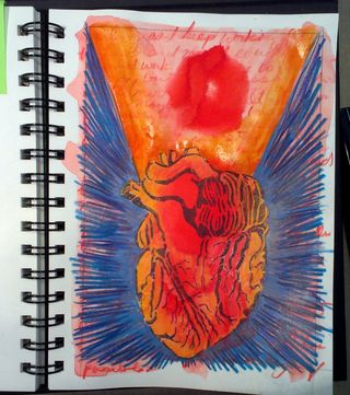
IMAG0437

Sure, I’d like to see more people doing the hard work of
journaling in their journal, asking themselves tough questions and then
striving to answer them no matter the answer, but for now I’ll take the win of
more people being creative with art.
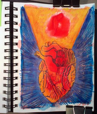
IMAG0434

What is it?

I have been asking myself, “What is art journaling?” a lot
lately. Mostly because things keep coming up on art journaling ning that
challenge my idea of art journaling.
IMAG0428Until recently I felt that art journaling had to include
paint, ink, or some sort of physical art making but several journalers on the
site have been doing digital art journaling. Digital art journaling is something
that until a few weeks ago I’d never have considered, but here we are and
people are loading digitally made pages to the group. Not a drop of paint or
ink involved.

When I first started out art journaling, nearly 15 years
ago, we made do or made our own stuff. Gluing in receipts and product packaging
was just a thing we did. Now you can buy special stuff to put in your journal.
IMAG0425Things have changed, a lot. Some of it is for the better, I
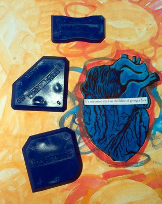
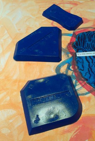
can buy gear shaped rubber stamps and masks now. Oh also nut and bolt brads,
how cool is that?
IMAG0429

I worry that you can buy so much pre-made stuff that the
core element of art journaling- that self-explorative aspect where you look
deep and hard at yourself in the pages of your journal is being lost to well-made
pre-planned layouts, pretty pictures, and pre-made ephemera that doesn’t speak
to your life except for the money you spent at purchase.

If we spend our journaling time worrying about making pretty
pictures and following directions for a planned layout are we art journaling or
scrapbooking with paint?
IMAG0426

Maybe these questions come up because I’ve never focused on
making pretty pictures, if a pretty page came up it was not on purpose or a
side effect of the collage and painting I did over my writing. In my journal, pretty pages
should be accidental not a predetermined outcome of art journaling.

Review: Dr Ph Martin’s Hydrus Watercolors

I’ve
been feeding my watercolor addiction with DR PH Martin’s Hydrus
watercolors. They are liquid colors made from watercolor pigments. They
come in a range of 36 colors that correspond to artist’s color names.
The colors are concentrated, vibrant, and blendable. Each glass bottle features a plastic eyedropper for precise measurement. They are all
between $7 and $10 depending on where you purchase them. So far I’ve
purchased 4 bottles a yellow, red, blue and turquoise. The colors I can
get from mixing these 4 shades is nice and they layer well.
IMAG0370
To
use the watercolors they seems to need to be diluted with some water to
get them to spread on the page well. This holds true for any paper,
high end watercolor to cheapo sketchbook. You can adjust the intensity
of the color by adding more or less water. A few drops is enough to
cover my entire 8.5×11 inch sketchbook spread in glorious vibrant
colors. The colors also seem to pop off the page.
IMAG0374
I’ve
used these painted extensively and haven’t yet made a dent in any of
the bottles. So while they are expensive at about $8 each where I buy
them, they are a good value. The color is so concentrated that a 30ml
bottle will last a long long time. These are definitely becoming a
mainstay in my art journal kit.
IMAG0375

An Adventure

I
had an incredibly long Monday and I can’t wait to share with you about
what and why, but I can’t, not quite yet. (How’s that for a teaser?)
Flickr_2013_02_18_02_22_08_MODE_1_1_NYC_2
I
had an appointment that I had to get to in Cambridge at 9am. Easy
enough, take the early train, take the T and then find a coffee shop and
people watch until 9. Easier said than done, though the lovely MBTA
decided to run a holiday schedule they didn’t put up notifications on
their website nor did their app show an alert. So I paid for tickets via
the app last night and got to the train station and the train wasn’t
running until an hour and a half after I got there… I waited in the
cold windy weather and then called C, who9 had already gone back to bed.
I hoofed it home.

It was so cold that my shoes were frozen and inflexible. Awesome.

Got in the car and drove to a T station and then rode the T into Cambridge.

What an adventure.
Flickr_2013_02_14_11_08_41_MODE_1_1_JAVA_2
I
got there with an hour to spare so I chilled in Starbucks. I know, I
was in Cambridge surrounded by 100 different local coffee places and I
went to Starbucks. It was safe and close enough to my appointment
without trekking to a new unknown place.

Not to worry I made up for it by hitting up an old favorite, Tealuxe on my way home.
Flickr_2013_02_18_02_19_36_MODE_1_1_MIAMI_2
My
appointment lasted much of the day and I think it went well, I’ll get
results in a bit. (Seriously can’t wait to write more about this
exciting thing.)

Review: Caran d’ache Metallic Watersoluble Pencils

These
pencils have a very hard lead that wears well but lays down a decent
amount of color for such a hard lead. Once applied they had a lovely
metallic appearance, until I applied water. All metallic shimmery
goodness disappeared when I used water to move the pigment. At that
point they became sort of dull dark colors on the page. I tried blending
them with other watercolors but to no avail. Even when I applied them
to a wet page the shimmer wasn’t there as it was when they were wet.

I
used these for a few accents here and there through my art journal.
They were great for a hint of metal here and there so long as I avoided
working with water over them.

Price
point on these is about $10 for 6 pencils. That’s a lot of money for a
pencil you can only use dry if you want the shimmer than should be there
and is a rather boring color once you hit them with water.

Article from Shambhala Sun magazine

I’ve
been trying to read more lately and a friend gave me a copy of last
months Shambala Sun*. It had a number of interesting articles in it but
one that I particularly enjoyed was called “What’s Your verdict?” by
Bonnie Friedman. While it was written with the writer in mind it also
applies to the artist.

The
premise of the article is that people tend to diminish their happiness
over success when it is finally achieved. So you achieve success and
allow yourself only a little happiness if any at all. This explains the
dull feeling people sometimes get after achieving success. As an
example, let’s say you have an art journaler you respect, you decide you
want to share work with that person (in their ning group) and you hope
that someday that person takes notice and says something good about
 your work. FInally it happens and for a fleeting moment you feel good
but you discount it by telling yourself, “Eh, it’s just one comment.”
Or, “What she said wasn’t that great.” even though something good
happened you let your inner critic diminish the impact.

Basically,
the idea of the article is a good one about your inner critic and how
to deal with it, which is a very Chapter 2 of JF365 type of thing. You
should check it out.

Review: Derwent Inktense Pencils

In
finally got my hands on some Inktense. I’ve heard nothing but great
things about them. Maybe because all I’d heard was great, I was left a
little underwhelmed.

First
the colors are not named after typical artist colors, so we’ve got
grass green and apple red instead of sap green or  alizarin crimson.
This causes me to look around more than I want to for a color I want. It
can also lead to some unfortunate color ,mixes. If I were to buy a tin
of these I’d have to do a test to see how each of the colors would mix
with one another, just so I would know what would make mud and what
would not. The colors are also very bright, jewel toned in hue.
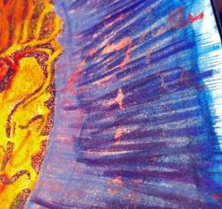
IMAG0321
The
good thing about these is that once you wet them, the color is set in
place. No matter of water or scrubbing will move them or blend them.
They layer really really well. I found it took way more effort to wet
the dry marks and move the wet color around than with other watercolor
pencils. In the end I tried a nylon bristled brush and was more vigorous
in my effort. Even with that effort I found the marks made as I drew
with the pencils stayed. if I were to use Inktense on a regular basis
I’d make sure to create a texture or pattern.
IMAG0327
I
probably won’t buy a tin of these pencils, maybe a few singles  of
specific colors. I can't think of a time when I’d use  them on a regular
basis where regular watercolors won’t do the trick. The price point on these is about $1.75 per pencil. They are also available in blocks form. Which I might like more than the pencils.
IMAG0329

Just
as an aside I’ve read on multiple forums and blogs that the inktense
are not lightfast, so something to consider if you are creating art for
the wall.

Vibrant Watercolors

PJ
made a comment about the luminous/vibrant color of my watercolors. I
thought I’d address that and consider a watercolor class in the future.

Watercolors are my go to tool for color in my art journal. I use them in a few specific manners to get bright vibrant shades.

First
let’s talk about the brands I use. I adore holbein, windsor and newton, cotman, and Dr PH Martins. I also enjoy using Sargent’s Watercolor
Magic liquid colors. As long as I’m working in my art journal I’m not
concerned with the colors being lightfast.

Secondly,
let’s talk about clean brushes. It’s important that you clear out any
color from your brush to get clean colors. Any spot of an opposite color
to the color you want will dull and muddy the color you are using. I
wash my brushes on a regular basis using plenty of soap. I like to use
generic shampoo as it generates a nice lather and works its way deep
into the bristles. I keep a couple of containers of rinse water on my
desk while I work, one generally is the dirty water container and does
the bulk of my rinse while a second is used to rinse the brush further.

Then
I prepare my colors. If I’m using dried or block colors I moisten them
in advance of use. I use either a spray bottle or a squeeze bottle to
add drops of water to the cake of color and I let it sit to soften the
color. As I work I add more water to lighten the color. If i’m using
tubed color I squeeze out a small amount and add water to it to create a
liquid. With liquid color I add a few drops to a palette and add water
as needed. Often times with tubed colors I’ll add the watercolor to a
cup with a lid and add plenty of water. This gives me a large amount of
liquid color that I can work with. Touching a wet brush to a dry cake of
color will only give a weak shade.

In
all cases I make sure my brush is clean before I pick up any paint or
dip into a cup. A small amount of blue or purple in the yellow will turn
it green or brownish, and take away from it’s bright color. If I’m
attempting to mix a bright secondary color I try small amounts of the
colors to create it. So if I’m looking for purple I add small amounts of
blue and red together away from their cups and being sure to clean my
brush.

One
of the hardest things for me to learn with watercolor is to USE the
paint and to not skimp. So if I’m covering a large amount of paper with a
single color I need to use more paint than I think I need. Also
watercolors ALWAYS dry lighter than when applied. When the paper is wet
my colors need to be darker than I want the end result to be. If the
color is just right when wet it won’t be when dry, I try and work a
shade or two darker than what I would like the color when dry. the great
thing about watercolor is that I can alway add another layer if I want
to darken the color.

So here are my tips for vibrant watercolors in a nutshell:

  • Properly wet and prepare your colors before you need them.
  • Clean brushes.
  • Use more paint than you think you need, remember that watercolors dry lighter.

Figuring Stuff Out

It’s
almost 1am and we’re in the midst of a blizzard, or so the weather
reports tell me. Well, that’s being a tad dismissive, we’ve got another
12 hours of snow to go, but so far I’m not seeing mountains and
mountains of snow. The wind is howling, snow is drifting and even my
dogs don’t want to go outside. Right now I’m regretting that 6pm cup of
coffee.
IMAG0393
I’ve
spent the day sipping hot hot tea in an effort to unclog my sinuses
which finally appear to be on the mend. i’m not sure if it’s the hot tea
or the buffalo chicken fingers I ordered from the local pizza place
that I should credit. Maybe it’s time, who knows. I’m starting to feel
physically better. My sleep cycle is all kinds of messed up. I’m awake
when I should be asleep and sleeping when I should be awake. Of course,
that 6pm cup of coffee that tasted oh so good as the snow
IMAG0395
I
spent some time reflecting on my art journals today while listening to
some good music. I flipped through the last year’s worth of my art
journals. I’ve got some good stuff recorded. I’m missing some notes I
took on business cards that held a lot of good class ideas. But overall,
I liked what I saw. I made a lot of progress artistically. My ability
to capture a lifelike and emotional portrait increased 10 fold. i’m
proud of the work I’ve done. I’m excited for the art show I’ll have in
August. This year holds a lot of potential for me.
IMAG0396
The
thing is, it’s all up in the air right now. I’m not sure how things are
going to land but I’m sure it’ll be in the way it should be for me.

The
last few days have been interesting in that it’s revealed some artistic
and art journaling truths to me that I had previously not know or had
ignored. These will be shared here over time.
IMAG0402