This
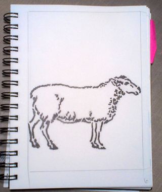
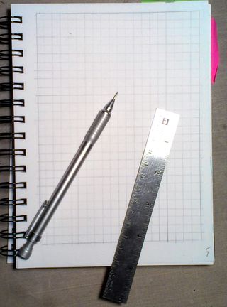
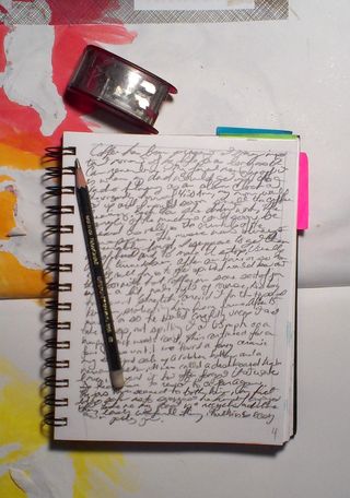
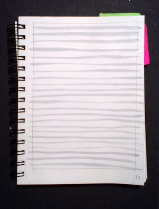
page was started by creating gray lines with a pentel pocket brush pen
in a 6×8 inch Stillman & Birn Epsilon sketchbook. The lines are J. Herbin Gris Nuage Ink
.

 I
I
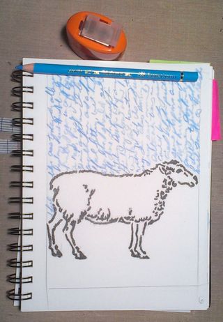
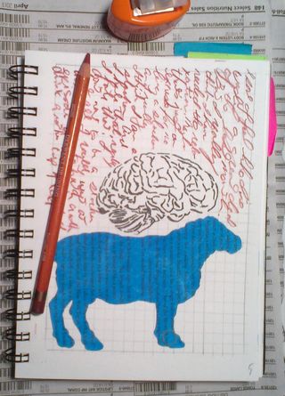
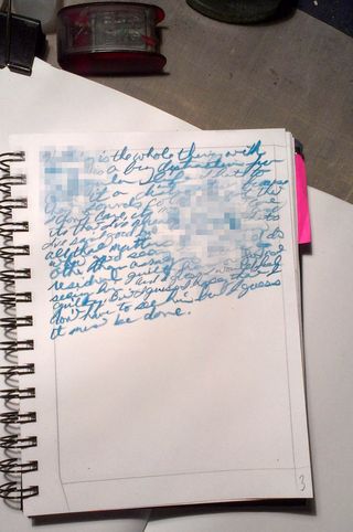
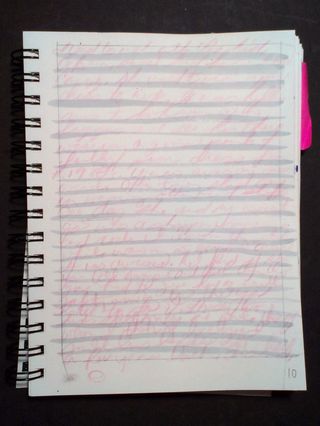
then used a pale pink Derwent Watercolour Pencil
to write an entry. I
was reminiscing about this girl I used to work with at the grocery
store, back when I was a florist. She used to wear prom dresses to work,
and she was a bagger. The kid was hilarious, she’d find a $20 1980s
prom dress at the thrift store and decide to wear it to work. So funny.
You look at the registers and there would be this kid in a puffy pink
prom dress, all satin and lace. Customers would ask her, “Is there a
formal tonight?” and she’d reply, “Nope, I just felt like wearing this.”
 After
After
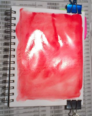
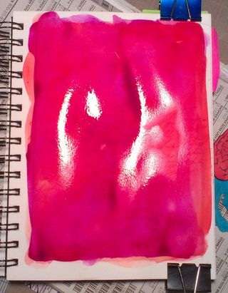
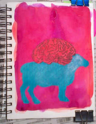
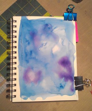
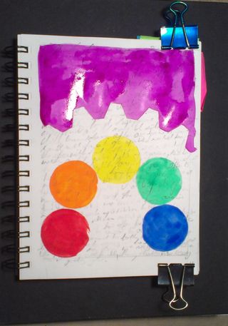
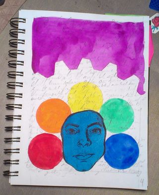
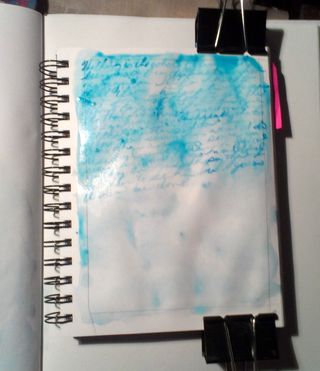
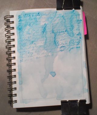
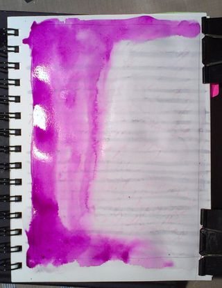
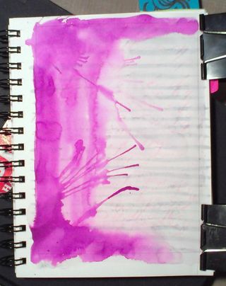
I was finished writing I flooded the page with clear water. I added
magenta to the left edge then allowed it to flow over the wet page.There were a few larger drops of water, I blew on them to create spatters and runs in the color.

I
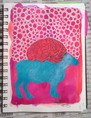
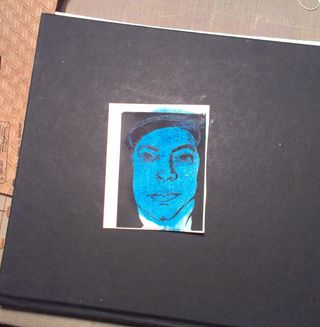
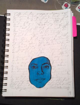
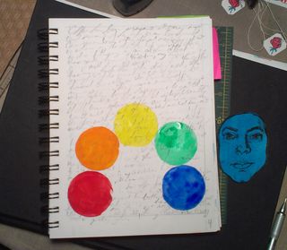
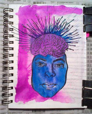
then colored a self portrait with blue watercolor. Then a brain drawing
with pink and purple watercolors. Once dry I cut these from their
backings and positioned them at various points on the paper. Once I
found a spot I liked, I wanted some watercolor drops around the brain to
add emphasis. I mixed up droplets of color and added them to the page. I
wanted them to drip so I blew on the drops through a straw.(I forgot to take pictures of thisstep.) After
allowing the drips and drops to dry I adhered the self portrait and
brain drawing.
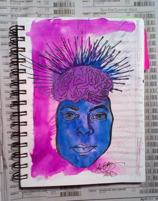
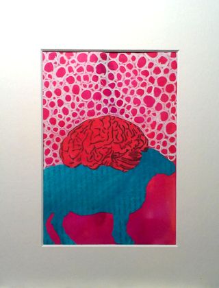
The finished image is 5×7 inches and is available matted and ready for framing on etsy here.