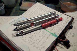
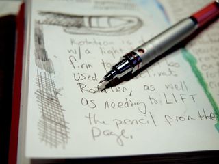
Every now and then I get a series of questions on Youtube and Facebook that warrant longer explanations via video. Here are the latest batch. Feel free to ask more art and art journal related questions in the comments.
Well both Tammy of DaisyYellow and Wendy of LateStartStudio have nominated me for the Versitile Blogger Award. *blush*
So, in no particular order, here are my 15 picks:
Now 7 things about me:
I've been putting up some sketching videos showing my process when I work in other materials like brush pen, pencil, pencil and acrylic and a variety of other things. Lots of portraits.
Check 'em out, thumb them up and share them!
A lot of people ask me how I get my overhead camera angle. I use a boom microphone stand with a gorrila pod clamped into the microphone mount. This instructable could be modified to be mounted to the left or right of your work and the camera mounted to the appropriate side of the mount shown, instead of on the very end of the mount. Not a hard modification for a perfect camera angle.
It's not a big secret I've been working on a new project with my friend Jane. The new project is called Put it on Paper and you can keep up to date on it here. We need to figure out if MagCloud is going to be the right place for us to publish our new project. so we figured we'd take all 3 issue of Art Journaling: It's ALL Good and offer all 3 issues combined. I finally got the combined zine up on MagCloud today. So far so good.
I decided to offer the zine in both a printed format and an e-zine. If you buy the printed issue you get the e-zine for free. The cost of the 3 combined issues in e-zine format is at a lower price than it was to buy them each individually.
You can go to the site and flip through and see what the zine looks like. I really think that using MagCloud will fix all of the issues we had with sales of the first zine- all those technical download glitches? Gone! You want it printed- here it is.* They'll ship it to you for a couple of bucks, just like a real magazine.
I'm excited to be using MagCloud for PioP and the old Art Journaling: It's all good! Follow the link below to buy a copy and to follow ComfortableShoes on MagCloud to be notified of when we load new content!
Art Journaling: It's ALL Good All 3 Issues
All 3 issues of Art Journaling: It's All Good in one fat 100 page download. All the art journaling goodness in one!
@sirensidyll wrote, "What motivates you to push the comfortable boundaries you're accustomed to and treading in the choppy waters of the unknown artistically?"
It got me thinking what DOES get me trying new things artistically?
My initial answer was a new color of a favorite material, and that's true nothing makes me happier than a fresh new color of watercolor or acrylic. I test it out and mix it with old standbys seeing what fresh new colors I can get, sometimes I mix up whole jars of the color to make perfect flat washes.
Other times it's a sketchbook in a size I haven't used in awhile. Like my old standby 3.5×5.5 inches(9x14cm) that I get every spring**. Or a new tool like those Pentel Pocket Brush Pens or the E+M lead clutch. Sometimes it's a blog post written by a friend or fresh discovery.
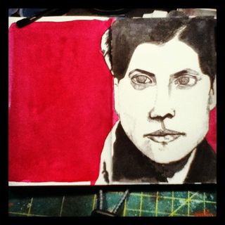
I realized I needed to dig a little deeper on this question, because the overwhelming first thing I do with all new materials? Search flickr's commons and find a friendly face and draw it. It's a great way to get to know a new material, find something you're comfortable with and draw it, it will tell you what that material can do.
The meat of the question was about stretching myself artistically and what triggers that stretch.
A relatively new phenomenon for me is drawing in coffee shops. I know that you all think I cut my teeth drawing in public, the truth is all through college I hated it, despised it. I enjoyed being with my classmates in class and talking to them but actively hated drawing in class. I always felt self concious about my skills, or lack of them. I thought that my friends my judge me based on my erasing lines and then redrawing them. I was not a sit out and about on campus drawing type of student, unless I knew that the spot was relatively secluded and I wouldn't be bothered- hence my many many drawings of the Stillwater River, drawn from the dock in the evenings during October, March and May*.
You might be wondering what was the catalyst for this change. It was to prove to myself I could do it. Force myself to see that no one really cared, and if they did they would look on in curiousity not judgement.
The truth is, that is exactly what I've found. No one judges me. Most people don't care and even fewer still look over my shoulder to see what I'm doing. Mostly children ask questions, "What 'cha doing? Are you an artist? I'm an artist too!"
Mostly the thing that stretches me artisticly is myself. I have something to prove to myself, and only myself. I can do it.
You can do it too.
Today instead of a true review you get a bit of a story and some pictures. I'm sure you can deal. Back in the early 2000's I took a figure drawing class. Having taken but one other figure drawing class I decided I needed a set of charcoal in various grades, becaase the set I had wasn't good enough. This is pre-cult of stuff. My coworker and friend Chris told me about this glorious place on I95 in Woburn called Charette*. It contained all things fine art related and was a wonderland of awesomeness. One sunny weekend day I made the trek down the ever dangerous I95, so it's really only crazy dangerous during the week and during rush hour, but don't let that detract from my story. I made my way out of the city and into the dangers of I95 and finally to the office park goodness of Woburn, MA. Only to get lost multiple times trying to find the grail, I mean Charette. I drove around the Office parks, all of which looked exactly the same except for different large block numbers, until I finally found a Dunkin Donuts. Where I begrudgingly bought a coffee (maybe a donut, it was a long time ago) and asked the woman, "Can you tell me where the Charette store is." She gave me some vague directions and after a few more wrong turns, extended waits at long lights I found the right turn and found, Charette.
It was a dumpy little store situated in a dumpy warehouse off the main road and the only indication was a crappy little sign. My coworker's promises of arty goodness seemed as though they would soon be dashed in gloomy office park craptasticness. That is, until I went inside. To the right of the large double door was a copy center and tot he left, art supply glory. I wandered around, my depleted budget crying at the site of Sennelier watercolor sets, sheets of arches hot press and enough fabriano to roll around naked on, I mean, on which to paint tasteful nudes. I wandered, and wandered, and wandered. Places like THIS were why I moved out of the woods and to the city, easy access to less expensive and expensive art supplies that were not grossly inflated in price.
In the end I walked out with a set of Create-a-color leads with a lead holder and a sketchbook. I hated the lead holder that came with it, it was triangular and I never took a liking to it, and ended up using my old charcoal set from college at the figure drawing class. Recently I was at A&C and came upon their loose leads, and thought, "I should dig that out, see if I feel differently about it now." I couldn't find any whole leads, just a few broken pieces, but I did find the holder. I bought a few new leads only to find that I still hated that damn holder. The leads are super cool, all kinds of hardness and charcoal and sanguine. They are just awesome.
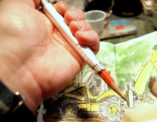
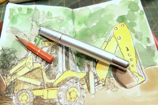
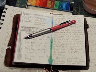
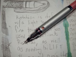
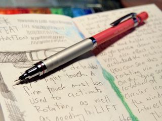
Jetpens started to carry a company called E+M who make a lead clutch in a variety of natural and brightly painted colors. I bought a deep blue color and it's lovely. Just a striking deep blue color that begs to be held and used. The clutch is sturdy and really clamps down on the leads, and the creat-a-color leads fit it perfectly, like they are made for it. The clutch is pefectly comfortable to hold and rests in my hand as if made for it. It's chunky and sturdy. It feels as though it can take a beating.
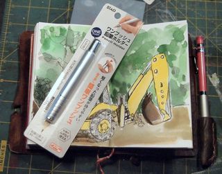
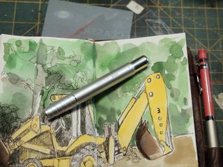
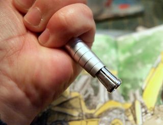
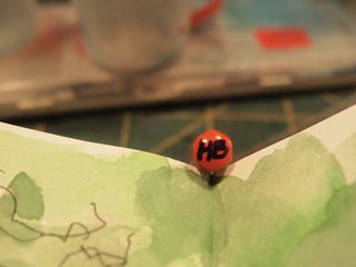
Another item I ordered at the same time is the E+M peanpole**, (heh) or their pencil extender. This time I opted for the bright orange red, which if you have ever driven a Volkswagen from before 2000, you will recognize as the pre-2000 Volkswagen red- a seriously bright orangey red that is striking. I won't lose this peanpole (heh) in my bag anytime soon. Volkswagen red holds a special place in my heart as the first car I learned to use an industrial buffer and buffing compound on was a 1984 Volkwagen Jetta in classic Volkswagen Red. The peanpole (heh) is identical to the General's #205 Pencil Extender, from the metal to the wood, the only difference is where they are made- General's is made in New Jersey and the E+M is made in Germany. The General's is not finished as well and the handle is fixed to the metal slightly crooked but it was 1/2 the price of the peanpole (heh.) Both are nice. All in all I can't wait to put these 2 items through their paces, they feel good and look good too.
I get a lot of questions about sketching from photos. I thought I'd share some observations on the idea.
The first thing I'll share with you is that size matters, the bigger the image the better. It's much easier to make something smaller in size than to make it larger (enbiggen). The quality of the image matters a lot. A really washed out or overexposed snapshot is very hard to work from.
For instance, the following image would be very difficult to sketch. First, the face is far to small to draw anythign accurate. Second, the face is washed out, it's an even smooth tone. NO wrinkles or points of reference are visible. It would be very difficult to translate this face to a drawing or painting.
The following image is better- larger in size and the face is not over exposed. It would work to sketch. There are lots of nice gray tones in the image and it would be easy to pick out dark and light areas to work. (Plus look at that crazy mustache!)
I've mentioned in Challenge! that I love working from the images in Flickr's Commons, and both of these images are from the set "Civil War Faces." There is a lot of history in that set and some amazing facial hair on the men.
When I sketch faces I start first by observing the image close, I make mental notes of where the darkest and lightest area are located. Then I make a light reference drawing and add layers of light gray to build up layers of shadow and end with the darkest darks. This drawing of "Modern Cowboy," shows my method.
This portrait was done in a 3.5*5.5 canson blue book. I started the sketch with a extra fine point fountain pen. This part of the sketch took roughly 5 minutes. I then added the light areas of shadow with gray ink in a Pentel pocket brush pen (PPBP). I added additional layers to create darker areas of shadow before switching over to a Kuretake #8 brush pen with black ink. After that I used sepia colored watercolor to color the background.
You can get a Kuretake #8 brush pen from Jetpens.com for about $13.50 it's a very nice brush pen, though much longer than the PPBP.