Category Archives: Inspiration

Working with Budget Art Journaling Supplies

It doesn’t make a lot of sense to buy all kinds of budget art journaling supplies if I don’t use them? Or show them in use. I’ve made a series of follow up videos using all the supplies I’ve picked up at Dollar Tree, Walmart, Target and 5 Below. NOt all the videos are live yet, but these are. Enjoy!

Link

Link

More to come!

Do you like these videos? Check out my ko-fi page and think about buying me a coffee. It helps me purchase supplies for these videos and keep the content flowing.

Budget Art Journaling Series

I’ve been working on my creative YouTube channel, attempting, seemingly in vain to remonetize it. One of the thing that was asked of me repeatedly and often before I stopped making videos, was, “How do I get started with art journaling without spending a lot?” I always answered this with the idea of buying one or two of a material instead of a giant set of them.

But I considered that there might be another option.

I thought about what I need to work in my art journal and I came up with these items:

  • A journal of some sort, a composition book works a sketchbook works
  • a black ink pen. I need black ink for sketching.
  • Something to add color- doesn’t matter what, this can vary
  • An adhesive for adding in ephemera and other collage elements.

I then decided to visit a few shops to see what I could get for $10, $20, and $25. Not big budgets but enough where you can get the basics if you shop carefully.

I visited Dollar Tree, Walmart, Target and 5 Below. The videos document what I chose to get with my money and then there are follow up videos using the materials in an art journal so you can see that I’m not just blowing smoke.

Here are the videos of the shops:

Link

link

link

The 5Below video is upcoming and in the rendering queue.

Like I Thought I was Going to be a Famous Artist

A friend of the blog wrote a few things to me awhile back. She wanted to divest herself of some supplies and I always accept supplies for myself or work. If they are supplies I’ll use, I use them, but I always let people know that anything I can’t or don’t use I will then take to work. (You can also donate directly to my workplace if you are so inclined, this person wanted to specifically give ME supplies.) This started years ago when I packed up some of my excess supplies and took them to a local middle school and did a post and video about it. I was never going to use them, and we all know that some supplies dry out or go bad. In my case I had some acrylic paint I hated, notebooks, and hundreds of pencils left over from reviews.

Anyway, this triggered a series of correspondence. In one of her letters she wrote, (I’m paraphrasing) “I don’t know what I was thinking, buying all these art supplies. Like I thought I was going to be a famous artist or something. I’m not and never was gonna be. What a waste of money.”

Friends that is a loaded statement.

As someone who has spent thousands of dollars on art supplies and other “useless” things, I feel that statement a lot.

I know I’ll never be a “famous” artist. Hell I’ll likely never be a well known local artist.

But I don’t know that I ever really wanted that. That’s a judgement from others. A toxic little tidbit I absorbed over the years- that to be a successful artist I needed to be in big galleries, have shows, get on the covers of magazines, and sell all my art. Be famous and jet set around the world, making and selling art. Drinking wine in galleries full of my art.

I think that is all mostly bull shit.

I think for those of us who are GenX/ Millennials and older that we were fed a line of garbage about what it means to be an artist. At the very basic core- we make art. But growing up, artists were portrayed as that list of stuff I wrote about above. Movies showed artists as rich guys who did all sorts of interesting things. Women swanned around gallery spaces with a flute of champagne chatting up people to make sales.

The hard work of making art wasn’t portrayed.

The often messy, ink and paint covered fingers… and most of my clothes. Walking around with my left hand stained in blue ink because I cleaned my ink pens and spilled ink on my hands… Or the tedious cleaning of the studio space. Or having to stop making art and move all the shit in my studio around so National Grid can come in and replace the meter and then my studio smelling like rotten eggs for a week.

None of the real part of making art gets shown.

But what of those of us who never want to sell their art?

What about the satisfaction of making art in a journal just for you? Just for a little peace of mind and self expression?

“Who do you think you are?”

The kids I work with repeat this, and I know it’s a thing their parents said to them. It’s a thing I heard on occasion growing up*. I’ve had friends tell me their partners have said this to them.

It’s one of the most toxic and low key abusive things a person can say to someone who is testing something out. There are so many ways a person can ask “What are you doing? Why are you doing this?” Without it bringing shame and humiliation?

When we repeat these thing to ourselves, we replicate the harm again and again. It sucks.

I wish I could remember the article where the researchers showed that when we talk badly to ourselves or repeat negative phrases- engage in negative self talk, that it’s more harmful than someone ELSE saying the exact same thing. It’s easy to discount someone else’s bullshit, but it’s much harder to discount your OWN bullshit.

I started practicing reframing my own negative self talk when I started therapy. It was a large part of my initial focus. Learning how to be nicer to myself was truly life changing.

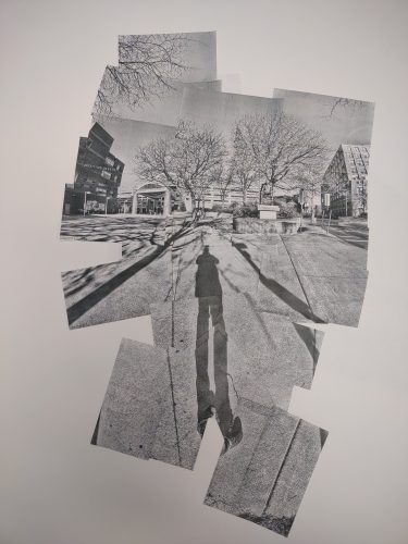
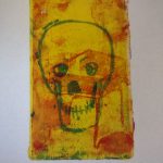
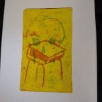
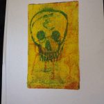
Art journaling and journaling isn’t done to share it on the internet or to become a famous artist. It’s done to self soothe, calm your brain, expand on ideas, explore thinking and thoughts, and solidify thinking.

FWIW If a partner asks you, “Who do you think you are?” That’s a big ole red flag.

Continue reading

Composite Images with the Thermal Instant Print Camera

I have written here on multiple occasions about my love for David Hockney’s work. I’ve been fortunately to see a couple of his shows when they’ve come to the east coast. One that stands out was when my friend Jane and I met up in Portland, Maine for an artist’s date and decided on a whim to go to the Portland Museum of Art. I don’t know if Jane knew there was an exhibit of Hockney’s work there or not but I was delighted to go into a relatively small room and see a number of his works, including a favorite, Pearblossom Hwy.

Done in 1986 he used a point and shoot 35mm camera to take multiple shots of the same scene. Which he then pieced together into a 48×64 inch collage. He’s also got a series of works done with a Polaroid arranged in a grid.

really interesting stuff.

My friend Erik went to a recent Hockney show and snapped a picture of Pearblossom Hwy and sent it to me said he wondered what I could do with one of the thermal printing cameras.

And hot damn, I set out to test out the idea. I wanted something more interesting than just a landscape. I headed to the Willows for one of my morning constitutional walks and thought I’d do something with one of the benches or buildings.

Instead I was presented with a ripe opportunity- someone had discarded a Little Tykes Cozy Coupe, in faded red and blue; at the recycle and trash bins. It was backed into the bin like it had been parked there purposefully and not illegally dumped. I decided this was weird enough to be my subject. So I set about snapping a whole range of photos, 5 up and 6 across. A total of 30+ images.

I learned a lot with those 30 images. First off, space my images out a lot more. And don’t move my feet, much. To keep things in the same perspective I tried to keep my hands at the same level and played with just tipping the camera.

Obviously I need to test this out some more. but what a really cool little range of images I got from one set of 25 images.


Later That Week: Further Explorations

I headed back out to the Willows to see if the Little Tykes Cozy Coupe was still next to the trash, and it was. What luck. I moved it back to the same spot where it had been. (It had been moved around.) I then set about to take more photos of the scene. I took what I learned- move the camera more between images and move to the sides and above more.

IN this image you can see I took many more images, probably close to 50 or 60. I did not use them all, but having more was better than too few. I also used this as an example and working piece to figure out some more stuff. More on that.

I also tried another scene, this one of a do not enter sign, and another of the parking area for Blue Bikes.


I think this telephone pole and fire hydrant is super cool and really shows how the camera can distort and tweak the image.

With this one I focused my attention on the do not enter sign and getting a clear image of that leads to distortions around it. There’s a metaphor there.

For the notes:

  • Take more pictures than you think you need or want.
  • Print some of the images, then print more as needed.
  • Use a glue runner or other film style glue instead of glue stick- glue stick tends to curl paper and not stick to the plasticky coating of the paper.
  • If you pick a focus point you’ll get distortions as you move the camera around, this can be very cool.
  • Use a heavy weight paper or put it in your journal.
  • The time stamp  can be very distracting in some areas of the image. I like it in most of the image so I work around it.

With this last image. I shot maybe 100 pictures but only printed 50 of them to start and printed more as I needed to fill in areas, but I REALLY wanted to play with the idea of perspective and distortion around the edges. So I really worked with keep my feet planted and moving my upper torso around to take the shots. I then realized I could keep one foot planted and ROTATE my other foot around it. I chose to keep my left foot planted and rotate around on the ball of that foot. This worked REALLY well at creating the warped perspective I was looking for. I think I could go back and fill in the empty areas with some more shots. Either way this piece is much larger than the others. The others are about 6″ square while this one is about a foot and a half high.

Anyway I really dig this.


This is the camera I have been using for this exploration. It prints a little more slowly but it’s black and doesn’t draw attention despite being pretty large when compared to the other cameras I have.

Links are affiliate to amazon. Bezos tosses me a few coins should you buy anything via my links. It’s not much but it helps to keep me in coffee. If you are interested in buying me a coffee and helping this blog stay up and running hit up my Ko-Fi page. I post there regularly and you get all of the posts here a week in advance. I also post some members only content for supporters. thanks for reading.

State of the Art: Open Minded Curiosity

It is important if you are an artist to have an open minded curiosity about the world, people, places, and especially your art. The minute you stop being curious is the moment you start to stagnate. My curiosity leads me down many paths. I like to learn about things unrelated to art and creativity but I also will do deep dives into specific artmaking activities.

Like gelli/gel/gelatin printing.

I’ve been watching every Yeates Makes video available. (And you should too!) Unlike many YouTubers he does everything DIY style- his own masks, stencils, and transfers. You won’t be surprised to find out that his DIY artsy aesthetic matches mine.

I’m a strong believer in the idea that commercial stencils and tid bits are there to jumpstart you. Sadly, I see a great deal of people getting locked into the use of commercial materials. I say sadly because the goal of every instructor should be to help the artists in their classes unlock and discover their creativity. * When an instructor gets bogged down and locked into the use of ONLY commercial materials through contracts and sales of said materials, well. I have some thoughts but this post isn’t about that.

It’s about the idea of systematically exploring a material.

One of the things I miss about my (some) old college classes was the idea that you should explore the materials completely.

This brings me back to gelli/gel/gelatin printing. I really want to know everything these plates will do when I use them, how far can I push them? And most importantly, what materials and tools will work with them to ensure my success when I do have an idea?

I picked up a 3×5 inch gel press awhile back, this creates a perfectly sized print on half a US letter sized sheet of paper. It’s also a perfect size for testing. It fits into my 6×9 sketchbook pretty well, and leaves room for notes. Perfect. I gave myself a few hours with the various materials and filled a few pages in my sketchbook. Below are a few pictures and my notes.


Let yourself play and explore all the materials you have around you, you never know what you’ll stumble onto that just WORKS for you and your style.

Some of these techniques were used in creating this art for my ko-fi supporter packs:

Continue reading

State of the Art: Product Labels

I can’t believe I’ve never posted here about my various product labels that I create. I was pretty sure I had posted about them but not even the g00gles can find those posts. I have posted about them on insta, so maybe I’m just confused.

When I make or cook certain things I make goofy labels for them. The labels are crudely rendered in Microsoft Publisher with clip art, various fonts, and thick outlines. The expectation is that they are imperfect and short lived- the label would wash off and be composted. I printed them on plain paper and adorned them with watercolors for a splash of color. I also printed some for coffee on plain paper sticker paper. These labels were expected to be torn through and disposed of when the coffee was finished.

I utilize black and white clip art from this site and others. Please read their faq. I like to start with images that fit my aesthetic- brains, skulls, skeletons, etc… I like things that look like etchings. Sometimes I make my own drawing and scan it in.

I drop the image into Publisher, resize it to the correct size for the label, add in a border ingredients and a name. My blueberry scorpion hot sauce was called “Blue Scorpion.” It had an old fashioned etching of a scorpion and sky blue watercolor splashed on it. While my pumpkin spiced ghost pepper sauce was called… “Basic Bitch.*” This had an etching of a large pumpkin, with the word bitch in tiny font hidden in a gray area. It had a splash of gold and orange to color it.

The cold brew coffee labels I made were a departure on a number of levels- I printed them in full glorious color on vinyl! The choice was made because I refill my cold brew bottles over and over again. So the sticker needs to hold up for a few washings. I added color only because I was able to do so. Had I not had access to a color laser printer I would have added color with acrylic paint or paint markers.

Before anyone comments, yes there is a misspelling in the decaf label. We just won’t talk about it okay?

Continue reading