Category Archives: Journaling

Inspiration and technique: Susan Cornelis: Soul Collage

I really really love Susan Cornelis’s work. She does some images of chickens that I simply adore, but I”m also a fan of her collages and sumi ink drawings/ paintings that she calls Soul Collages. It looks to be something of an automitic drawing process that involves sumi ink poured onto a wet page, manipulated with various tools and then collaged on with color added. It would be a great way to work out ideas, get inspiration and to work yourself out of a rut. This could easily be adapted to working in a spread of a journal- smooshing pages together to manipulate the ink. Reminds me of a rorshack test.

#4 Do a little every day

Even if all you do is go through your journal and randomly color pages, or doodle borders or even just scribble do something related to art every day. It can take 5 to 10 minutes but you should do something everyday. It's part of the process. Process is the most important part of art journaling. Once art journaling is part of your everyday habit you won't want to leave it behind.

Rule #3 Be Wary of the Sales Pitch, but don’t begrudge

Everybody wants to sell you something. You need 3 things to art journal:

  1. Yourself.
  2. A journal.
  3. Something to write/draw/paint with.

It's that simple. You don't need every product ever made, though they are fun. Some of the most beautiful journals I"ve seen are black and white or made with a ink and one other media. If you like color all you need is something simple, marker,watercolor, crayons, you name it and you can add color. You don't neede every rubber stamp, ink pad, re-inker, paint or marker ever made. Pick a few and go with them.

There are free tutorials online. There is nothing wrong with paying for a tutorial, hell classes are fun. But you don't need to know how to make a page just like someone else to make a great journal. All you need is you, a journal and something to make marks with. Anything else is optional.

Rule #2 Pages Don’t HAVE to be Pretty

That's right your pages don't need to be pretty. They can be ugly. You can leave them raw and "unfinished."  Your pages can be:

Dirty
Dark
Ugly
Nasty
Angry
Black
White
Plain

The finished page will be beautiful in some manner. If you don't like it you can always go back to it, reuse it, gesso over it, collage it into another page, glue the pages together and further manipulate the page. 

Make it yours but don't hold it to anyone else's standard of beauty. Don't compare your pages to other people's pages. They are yours.

Rule #1 Process NOT results

An art journal should be a safe place to explore feelings, ideas, art techniques, educations, your belly button and everything else in your life. In your art journal you should be free and feel free to do that. If you are focusing on the end product you lose the point of keeping an art journal and that is to explore all thatI listed above. What the page looks like at the end doesn't matter as much as getting it to that point and HOW you got to that point. Don't approach the page thinking of how it's going to look at the end. Start working on the page without thought.

Write.
Draw.
Paint.
Scribble.
Scrub.
Glue.
Do What feels right.
Do what feels wrong.

Try new things in your art journal. No one else needs to see it, unless you want them to. Be happy. Be sad. Angry. Melancholic. drunk. Introspective. Think about yourself. Your family. The world. Politics. Mass Media. Hysteria. Your friends. People you don't know. Think it out. Write it down. Draw it. Paint it. Doodle. Scribble. Wax. INk Stamp Charcoal. Scrub. Brush. Sand Emboss.

Try things.

Comfortable Shoes Studio’s Rules of Art Journaling

So I've been online  alot looking for blogs to link to, art on flickr to post here and watching videos on youtube. In this journey I've been bombarded with adverts for products, workshops, classes, etsy shops, how-to instruction and I've seen an overwhelming number of comments on blogs, youtube and flickr asking a simple question "How do I do this?" What was most concerning to me, other than the startling amount of consumerism that has moved into the art journaling blog-o-sphere and internet were the amount of tutorials on how to build up an image "just like so-and-so's" and also a lot of questions on those same blogs about how to do just that.

From my concern and frustrations I"ve come up with:

The Comfortable Shoes Studio 7 Rules of art Journaling.(TM)

They are as follows:

  1. Process NOT results
  2. Pages don't have to be pretty.
  3. Be wary of sales pitches. (but don't begrudge.)
  4. Do a little everyday.
  5. Any media/medium is okay.
  6. Look for inspiration everywhere.
  7. Rules should be broken.

I will over the next few days expound on each of these ideas in a full post. But this is borne of the idea that art journaling should be from inside, art journaling should be free and loose and about exploration. Technique can be taught but the end result should not be. When I was a budding art teacher my mentoring teacher told me that my duty was to shape and mold the kids to make their own art and that I should teach process and method but never the end. I take that idea to the art journals- i can teach people how to make them, how to fill them but I'm not going to tell anyone what to fill them with.

Back 2 School

It's that Time of year again, Back-to-School. Sigh. Growing up I used to look forward to the start of school. I admit to being something of a geek and school was solace from a long hot summer of farm work which would hit it's apex with the hot slog of August's blueberry harvest. School with it's routine of math, reading and social studies was welcome. Of course at the start of September I was happy to be doing anything but harvest blueberries. As another summer passes without my application to grad school I reflect on the fact that my partner, C is headed back to start her second year of law school.

I reflect green with envy. Yes, I wish that we were able to afford the 2 of us to go to school at the same time. We made a decision 2 years ago that it made the most fiscal sense for me to continue working while she applied for grants and scholarships for law school. While money is certainly tight we both see the rewards not too far in the future. I'm both sad and excited that next summer she'll work for 3 months and possibly make as much as I do in a full year of work. It's exciting to know that your life will change for the better in a short time, but sad that it's so far off, and sad that I'll continue to make the same wage. 

As we get ready for the start of school we both know that I'll be working 40+ hours a week and driving 10 hours. (My commute is 1 hour each way, longer on a bad day.) She'll be in class 2 days a week from 9am to 9pm and the other days she'll be studying and working. In short we'll fly by each other in the mornings and pass out next to each other until May. Because of this our lives need some preparation.

We do a few things like pre-pack single servings of chicken and beef in the freezer, keep the rice cooker out and buy more frozen veggies than usual. Its just not possible for the 2 of us to cook when we have as little time as we will during the semesters. This will allow us to cook fast food that is healthier than getting delivery. At the same time we're making lunches and taking them becuase it's #1 healthier and #2 cheaper.

I'm glad to say that after C finishes law school I'll be going back to school too, for what we're not sure but I've got 2 more years to figure that out.

What I’ve done with the Spray Ink

Holy crap balls. I love the spray ink.I love the spattered effect you can get when you press the sprayer down partially, I love the fine mist I get when I press hard, and the layered effect and mixing when wet. It's all very very cool. Experimentation is key to learning how to use these. I learned that the ink reacts differently on raw paper versus gesso'ed pages or pages with acrylic on them. The colors are transparent (except the black) so whatever is under them shows through. this can make for some very cool effects.

On thing I learned through trial and error is that alcohol based inks ALWAYs lift through my gesso (Liquitex basic brand) so I always get a ghost. So how to fix that? It would lift through progressive layers of gesso or acrylics too. I have a solution which I'll share at the end of this post. First I'm going to share some recent pages from my journal.

IMG_1454 

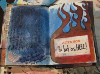
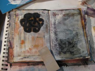
IN this image I had gesso'ed and painted the left page, the written on it in sharpie. The black was really sitting on the surface and less of the image than I wanted. So I sprayed it with purple and blue ink and a squirt of plain alcohol, Then moved the inks around. Here I learned that even fully dried acrylic and gesso will soften a touch when these inks are applied heavily. (the right side is the completion of my gesso over sharpie post)

IMG_1453 

This page doesn't use any spray inks but an over lay of watercolor crayons wet down and wiped off and sand papering. I was going for a  dirty look on this page- dirty to express my rage…

IMG_1455 

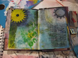
This page started out yellow-green. I used some Tim Holtz masks, I'll write more about these at the end of this post. I sprayed over them with green, blue and a touch of black spray ink. I also used some rubber stamps with embossing powder. On the right I took on of the masked out shapes and used liquid embossing paint and heated it until it bubbled, burst and dried. I then added some spray ink, watercolor crayons  and colored pencil to give the gear shape a distressed rusted up piece of metal look. The blue black background was too dark to write on, so I hit it with a thin fast application of gesso. No blending and applied with a bristle brush. I used a texture tool to make some marks and stamped on lines for writing and wrote on the gesso with bright green sharpie. I sprayed the sharpie with plain ink, a lot to soften the color and blend it with the background. Then I wrote my entry and sprayed that as well. I then overlay some green and blue spray ink and let it completely blend on the top layer.

IMG_1456 

This page started out with a burgundy acrylic base that had been coated with black and brown watercolor crayons and wiped down for a distressed look. I then hit some areas with sand paper to further weather the page. I've used Tim Holtz masks on this page as well. There are several collaged elements and lots of spray ink and gesso. You'll notice it's shiney… I'll get to that in a minute.

IMG_1457 

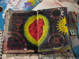
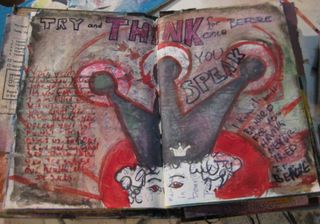
This page started out with a background that was bright red in the center and burgundy around that. I drew on an anatomic heart with sharpie. I used rubber stamps and embossing power around the perimeter. I masked the heart out with post it notes and then put down some Tim Holtz masks. I sprayed the background with purple, blue and black spray inks. I sealed around the heart ( more on this later) and then brushed some gesso and yellow to give it that mandala/ mary look. 

IMG_1459 

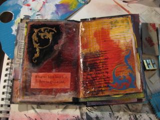
This page started out gessoed and with acrylic. The colors I can't remember but I think burgundy. I glued on my collage elements, added gesso and sealed the elements I didn't want to get colored with the spray. I sprayed  a variety of colors and then manipulated then with water, alcohol and a rag. I wrote with a sharpie. I used some sand paper, added some little punch outs and then sealed the whole thing.

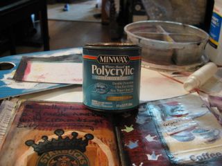
Okay so the sealant I'm using is something I had around the house, is pretty cheap, and is easy to use: Minwax Polycrylic. Yup. I had a can left over from a project I'd done a year ago and thought I"d give it a try. It looks like the acrylic varnish I have in a small squeeze bottle (that was a lot of money $4 for 2 oz), goes on milky but dries clear. I have semi gloss and it adds a nice shine to the page, the alcohol inks don't lift through it and can be scrubbed off of it with a little work and alcohol. Gesso sticks to it well, as to acrylic paints. Sharpie glides over it. The alochol inks if applied heavy lift while the polycrylic is wet but not once dry so you can see the kind of dragging muddy effect you can get in the next series of pictures.

Here's a pic with can, you can get it at Home Depot for about $5 for this half pint can (8oz).

IMG_1461 

Oh and the best thing about this stuff, is that as of yet, once it's dry, it doesn't seem to stick to itself. SO you CAN get gloss in your art journal without sticking pages!!!

IMG_1458 

This is the page after using a stencil with black spray ink, orange and yellow. I sealed some of the page and then brushed gesso over the whole thing. After it was dry I used my fine sand paper block to distress it and move through the layers a little. It will also give me a super smooth page to write on. While not glass smooth I could write on this page with a fountain pen with ease.

IMG_1460 

Okay a quick note about Tim Holtz masks. They come in super cool
shapes-cobwebs, music, nice french curves, flourishes and gears, didn't I just tweet about wanting rubber stamps with
gears? These masks will have to be close enough. I really like them.
But the glue holds really well to raw paper but not to paper with
acrylic paint on it or gesso. Also while made to work with alcohol inks
they really don't like to sit in it or swim in it. I ruined the glue on
one by dousing it in a heavy coat of spray ink when it was on a gessoed
page. 🙁 No worries I have spray mount and will fix it. But if you do
get some of these be aware that the glue doesn't like a lot of alcohol
AND doesn't stick well to gesso or acrylic. But the effects you can get are so cool. They aren't too expensive and are infinitely reusable, just pic up a can of spray mount when you buy them and save some heart ache.

Technique Video- Backgrounds

I hate working on a plain white page, even when I'm drawing I tend to go through my sketchbooks and tone my pages with watercolor or gouache. I like how it changes the texture of he page and leaves me with something more interesting than plain white or cream. Youtuber ricefz uses ink pads and brushes to create a soft toned background for journaling.

A toned background can also help get you past that scary "white background"syndrome so many of us have. I hate working on a plain page. The white page can be so intimidating, especially if you buy a really nice handmade journal. Last night I was starting on a journal that my friend Jen made for me. (Hardy Boys Salvaged book cover!!!) I was exhausted so I went through the first half of the journal and gesso'd the pages. Gesso is not a must do step for me. I like it but it limits the pens I cna use on the page- I find it's very rough on nibs and ruins them fast. So I stick to sharpies on gesso. I then went through the book with some colored acrylic (making memories brand- purchased on clearance) and added a touch of color to some pages, planned out an entry on one page but really randomly added color to the pages. After taht I added a touch more color to the page with my watercolor crayons. Mostly I added those becuase the acrylic tends to stick if I don't add something a little waxy to the top of them. So now I have a super cool journal about half filled with simply colored pages, ready for me to write and glue and pain in.


Happy Holidays

I hope everyone out there had as fantastic holiday week as I did. Sure I worked most of it at my DayJob but I spent a long weekend at my family's place in Maine. It was cold and crisp in coastal Maine but it was nice. I could have done without the snow while I was there but it was pretty. I also saw a dozen or so deer grazing in the fields, they were slightly wary but not overly so, on set of 4 didn't even mind when I pulled out of the driveway in my car, they watched me leave, their tails twitching, but they didn't stop eating for one minute.

I didn't make any books while I was there, nor did I work in my art journal. Instead I soaked in the pure wilderness of coastal Maine. I took some long walks around the farm and visited my family. I had a  quietly great time. I hope that everyone out there reading had a great time as well.

Upon my arrival back to Mass I've readied myself for listing a bunch of new items I'll post links as I list.