Category Archives: Review

Composition Book Round Up: Staples 2020

It’s been a few years since I did a proper round up of composition book reviews. I had a bunch of readers smash my Ko-Fi button and buy me a few coffees which means, REVIEWS. I have the best readers! Y’all rock.

This year Staples has 4 standard offerings when it comes to composition books- TruRed and Staples unbranded both poly and card covered.

All 4 offerings are made in India and feature solid tight stitching and a black paper tape along the spine. All but the Tru Red card covered book have 80 pages, with the TruRed card covered having 100 pages.

I have harped and griped about poly covered composition notebooks in the past, and my loathing remains consistent. These poly covers are not scored for easy bending nor are they particularly stiff to support writing out of hand. They are the worst of all things poly covered.

Both the new Staples and TruRed card covered books are covered in what I consider to be a disturbing trend of flimsy card covers. The covers are barely thicker than the flimsy paper inside and the card bends and folds in hand. Ugh these flimsy covers are so gross. They do protect the inner pages from harm well enough and even survive in my bag for the week or so it takes me to fill a comp book. To me, the flimsy card covers are inherently dissatisfying. Yes they do the job but they just feel… cheap.

Cheap is the name of the game when it comes to comp books, I mean it is a 50 to 75 cent notebook. But there is quality within the game as well. After all, we’re on the hunt for a book with great paper aren’t we?

Just look at this mess of non-repeating pattern. EDGES. Looks like Angelfire or Geocities back in 2001. Do better Staples!

Staples books are often plagued with design issues. The new TruRed cover label on both the poly and card covers is ugly. While it harkens to the old style of composition book cover labels, it simplifies it and slaps on a widely kerned label and the TruRed logo and 2 badly spaced lines. I can barely stand to look at it.* Look away, it is hideous. The  TruRed card cover has the marbling blown up to bold proportions, it’s rather large. Probably the better design choice over the atrocity that is the Staples book. Here you can see where they just copy and pasted the pattern but didn’t bother to create or buy a pattern with edges that allowed it to repeat smoothly. Oh no, Staples has the equivalent of a 1990s Angelfire background with visible edges and NO ONE BOTHERED to fix this before they made 900billion of these notebooks.

The covers are available in a wide range of bold primary and neon colors for the poly notebooks. The marbled card covers were available in primary and secondary colors.

So all around the Staples notebooks are ugly, but what about the paper? In 3 of the 4 books it is identical. The outlier is the TruRed card covered book.

The first 3 have silky smooth paper with college ruling and blue lines. The lines are neither pale or dark. They are printed tight without any spreading. The paper has a bit of tooth, but not a whole lot. Even with pencil these feel silky smooth. Surprisingly the paper handles even wet italic nibs with ease. I had tweaked a Wing Sung 3008 to write wet for sketching purposes and this silky smooth paper handled the intense amount of ink well. There is no feathering or bleed through. Since most comp books have 15lb paper, there is some show through but this paper is lovely. I was pleasantly surprised at the quality of the paper. The lines left behind are true to the nib size, so no feathering or ink spread.

The TruRed card covered paper has roughly all the same qualities as above with slightly more tooth for pencils. It feels great with everything. There was a bit of bleed in some areas with my very wet pens with some inks. Largely the paper is great.

Overall the bar has been set relatively high for paper quality by all the contenders from Staples. All four of these books are a decent value for the paper inside. Sure the covers are a mess of shoddy design and plastic and thin card but if we think that the paper is the important aspect, well, these have you covered at 50 cents each for a card cover or 75 cents for the poly covered.

Composition Book Round Up: Target Part 3

In this section we’re going to examine all the Mead books I was able to find at my local Target. In the past Mead books have ranged from down right awful to amazing. When you venture into 5 Star territory the Mead comps are downright nice. The standard Mead offerings I’ve found outside of Back-to-School Sales have been awful. The three I’m examining in this post have some range.

Let’s start with the Mead Five Star Fashion Poly Covered. This year’s was made in Vietnam. I found one in dark teal* with a metallic gold design. It kinda looks like pencils, or just triangles and lines. I love it. I hate poly covers, but of all the brands, Mead does a good job of them. Their poly feels slightly thicker. The score the spine so that you can actually fold the cover over on itself and it will lay flat, though with some effort. The cover design is cute as heck and the spine tape is gold to match the design and nicely textured and sized. 

Inside is filled with 100 sheets of smooth toothy paper. The stitching is tight and even. The paper feels great with pencils and pens of all types. It feathers and bleeds a bit with liquid inks but does well with gel and pencil. This isn’t going to be a book for the fountain pen crowd. It’s also not my favorite for pencils. It’s got tooth but not quite enough for my taste. I prefer a bit more for my pencils. Overall this is a great book for gel pens.

At $3.50 it’s rather over priced.

Next up is the Mead Five Star non fashion poly covered comp book. This one sports a textured design and some square pixelated design work. There are 100 pages. The pixelation design reminds me of 2002 for some reason. This one is made in Vietnam. This one boasts that the book with LAST ALL YEAR, GUARANTEED! This book was on sale for $2.49.

Again Mead does a great job with poly covers, scoring at the spine for flat-ish opening. The stitching is tight and even lending itself to opening with ease. The spine tape is thick, well textured and a nice size. This cover has a white lining 

The paper is smooth and toothy. It is better than the fashion version. The paper despite being smooth, has enough tooth for pencils. I really like this paper. It feels good with pencil, gel ink, liquid ink, and fountain pens. There is little show through or show through. This was the best of the Mead comp books.

The final Mead book is the Mead “We Mean Green” composition notebook. At $3.99 this was the most expensive book of the whole lot, in fact of all the composition books I bought this season. It has 90 pages. It was assembled here in the US of US and imported parts. So… 

The cover is a nice thick and stiff card. This is the least floppy of the notebooks available. The Spine tape is a bit on the narrow side but it’s a nice shade of white that allows you to see the print beneath it. I think it’s a nice design touch. The cover printing is super cute and available in green and blue. The matte design is very appealing to me. The warm shade of the card looks good with the ink. 

The stitching on  mine and most of those I saw on display was a bit off center. It’s a wider stitch than most of the books out there. The labeling reports that it is compostable, but it’s a polyester string, so not so much. 

The paper is a warm off white shade that is pretty nice. I could ONLY find wide ruled at my local Target. It feels smooth under fingers and when writing. It is great for pencil and gel ink. With any liquid ink- fountain and rollerball it is awful with feathering and bleed through. The pens feel good on the page but as soon as nib is put to the page it starts to feather and bleed. 

I’m not going to go too in depth here about my thoughts on stationery greenwashing, but I do know that young environmentalist Less would have been all over these notebooks. It is not clear how much of these books are made out of post consumer waste versus the industrial scrap that would have been “recycled” or put back into the paper vats as part of the paper making process anyway. If a paper is 100% pre consumer waste, it’s not really recycled IMO it’s process as usual. Okay i’ll stop here.

Clearly, the We Mean Green is only okay if you are only going to use pencil, ballpoint, or gel ink. 

This season’s Mead standout is the regular standard Five Star poly covered book. The big loser is the We Mean Green and being the most expensive of all the options you really pay for that green washing.

Composition Book Round Up 2020: Target Part 2

Target had a lot of options for comp books this season. I left the store with 9. Some are old favorites and some are new brands. I’m dividing this round up into several parts because, well 9 books are a lot to write about. I will also include here that my “local” Target was a shit show, which is to be expected in some part due to the Covidalypse, but also it was hard to find things and despite the state requirements to have a scanner every so many feet in the store, it took me forever to find one to scan each item for prices. Also whoever had set up the display had mixed all the wide and college ruled books… together in the same bins, so I had to search and search for college rule and in some cases never found any.

I decided to start this out with the regular Target offerings- Yoobi, Up+Up and Unison. These seem to be offered at my local Target every year, but not year round. 

Let’s start out with Yoobi. The paper inside is smooth but not slick. It has plenty of tooth. IN fact this might be a perfect paper for pencil. I love pencil on this toothy yet smooth paper. My HB pencils feel good and leave a dark line. Ballpoint and gel ink feels good and performs well enough on this paper. Roller and any liquid ink, well it’s not pretty. The line tends to spread and feather. Fountain pens exhibit show through and some bleed through. It’s not great.

The stitching is tight and sturdy. The spine tape is textured and a decent width. The covers are what make Yoobi books special. Every year they come out with new designs and wow are they cute. This year’s designs span from cute and fun to funky. I picked up a design featuring gold stars and phases of the moon. The moons are black and white on a lovely salmon background. The card covers are thick and stiff though not as thick as previous versions.

The Yoobi books are $2.50 each and have 100 pages. This is their regular price and I’m not sure they ever go on sale, though I find them in the clearance section often. WHen I find them in the clearance section I snap them up, because I love the covers. Since I write with pencil often these work pretty well for my writing needs, but if you are  a fountain pen user these are going to be a hard pass, the paper is just too feathery and bleeding for fountain pens.

Last year’s Target winner was Unison. This year they sport red, blue, yellow, green and black marbled covers. They have 80 sheets and are available in college and wide (YUCK) ruling. The covers are made of thin but stiff card. The taped spine is generously wide and nicely textured. The stitching is tight and well done in all the books I looked at. They are made in Vietnam. These are priced at 50 cents. THe covers are available in a wide range of shades- from your usual red, yellow, and blue with green and neon colors.

The paper inside is smooth to the touch of my hands but has enough tooth for pencil to do well. All my pencils felt good on the page. My gel and liquid ink pens all felt great. Fountain pens did quite well on this paper. I noticed zero bleed or soak through with  my wettest pens. Sheen showed on the page. 

This is still a great choice, no matter what you write with this paper performs well. There are a few areas of the marbled design where it’s clear that the design didn’t blend the edges of the pattern well, but overall, it’s marbled.

Next up we have the first of the Up+Up books- the Poly Covered. At 99 cents it’s expensive (IMO) for what you get. The poly cover is thin and floppy but scored for easy folding of the cover.  The stitching is tight and sturdy. The taped spie is appropriately sized and has a pleasing fabric texture. 

Inside you get only 70 pages of smooth paper. It is drastically different from the past pack of Up+Up comp books I purchased. This paper is downright… NICE! It isn’t great for pencil, but it’s not bad either. It lacks the level of toothiness I like but it’s not awful either. With a darker softer pencil this paper is decent. Where it shines is with gel ink. It feels perfect with a gel pen. It also feels good with a fountain pen. Though it does have some show through and spots of bleed where the pen sits for a moment too long. Overall this is a solid contender for decent.

Finally, for this section of the review we have the Up+Up card covered book. At 69 cents it’s not over priced, but really should be at 50 cents with the rest of the books, especially considering it has only 70 pages. These are made in Vietnam.

The cover is as basic as basic can be. Rather than the usual marbled covers we get one color with white labeling and lines. It’s available in red, yellow, blue, and green. I didn’t see any black covers. Odd. Why not the rest of the secondary colors? I like orange and purple. But this section of the display was a shit show of mess. The stitching is tight and even. The taped spine is wide enough and nicely textured. 

The paper is great. Mine worked better than the poly covered version of this same book. It was smooth yet toothy. Pencils felt great and left a nice dark line while fountain pens felt GREAT. The smooth paper is key here. The nibs glide over the surface. Also the wet inks stayed put and didn’t spread, feather or bleed. It doesn’t get much better than this.

In this section of the round up the Up+Up card covered and the Unison are in a tie. I might like how the Up+Up card covered performed a bit more, but the Unison is priced better and has 80 pages. 

Composition Book Round Up Target Part 1: The New Kids

This is the last Target round up, I’ll be tackling the Walmart offerings in my next few posts. These are the two new options available from Target. One is good, one is trash.

Let’s start with the positive review. I’ve read a lot about Top Flight composition notebooks being great. I’ve had a variety of experiences, most of them of the bleeding fountain pen variety. When I saw this Fashion Card covered Top Flight I had to buy it. It boasts 80  pages and a fun ecological message about bees on the cover. It cost $2.50. I could only find wide ruled at my local Target. (Why Target WHYYYYYYY!)

The cover is made of nice thick and stiff card. It is not floppy. The design work looks a lot like someone drew some lines and then slapped some stickers onto the page and then snapped a photo of it. It’s not bad but not good either. The spine tape feels a bit narrow and is mostly smooth. I don’t know why I prefer a nice textured tape on the spine but when the tapes are smooth, I don’t like it. The stitching is wide and pretty tight, though I did have to melt the thread because it was frayed and loose at the bottom edge.

The paper is great. Smooth but toothy. It felt great with all my pens. Fountain pens felt really nice and didn’t bleed. There is some show through but that is expected IMO for paper this thin. I really liked it with pencil too. Despite it being smooth it has excellent tooth, so pencils glide on the surface but also deposit plenty of graphite for a clean dark line. 

At $2.50 this is not a cheap book. It’s not expensive either. But when there are cheaper options that work very well, why bother with this, unless you like the fashion covers?

Finally, at the end of the Target offerings, we have the shoddy Jalapeno Paper Company composition notebook. These are made by Michael Roger, Inc; the same company behind Decomposition notebooks, but at a lower price. A little googling show that these are made specifically for Target. These are priced at $2.99 for 80 pages. It boasts being recycled and being 100% post consumer waste and being printed with soy inks. All of this sounds good.

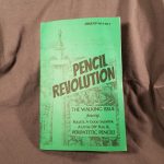
The cover design is what drew me in. There were a few really cute designs- and I struggled to decide between avocados and octopi. I ended up with octopi. The design has that Michael Roger feel. I posted a pic of these on insta and Johnny of Pencil Revolution and Erasable, immediately noticed the design feel of Decomposition notebooks. It’s not a rip off, it’s the same designer.

And frankly even with that, you shouldn’t buy this notebook. 

The wide ruled paper is utter trash. It’s got this slick glossy newsprint feel. It’s pulpy and soft while also being too crisp. It feels awful. I touched it in store and almost put it back. It just feels weird under hand. Then I put a variety of writing tools to it and even more yuck. Fountain pens immediately feathered and bled through. Writing on TP would be more enjoyable. Pencils slide across the surface there is an utter lack of toothiness. Even normally dark pencils look light and feel hard on this surface. Gel ink is the only thing that feel okay here. 

I cannot tell you enough to not buy this book. Get the Top Flight, hell get the We Mean Green for a buck more, it’ll serve you more.

Overall if we’re looking at value for the dollar, the best bet is the Up+Up card covered notebook. The various Five Star offerings are also quite nice but not the best value.

Review: Pencils.com Custom Pencils

I’m not sure if Pencils.com has historically had custom pencils available, but for a long time they had Blackwings available with their Pearl (balanced) core available in black or white with a custom imprint. Not long ago they announced a full range of custom pencils in a range of prices. They range from round screen printed to foil stamped on a range of pencils to stamped on natural raw cedar. The standard custom hex is $80 for 200 or $100 for 400 pencils, which is quite a decent bulk discount. Discounts show up at check out. I’m told there is another bulk discount at 1000.

This is a good time for me to be reviewing pencils. I’m working on a few different novels and recording the ideas in composition notebooks but also writing my first drafts with pencils and pens in them as well. I’ve churned through some of my pencil nubbins and put a work out on the samples Pencils.com sent me for review. I’ve worn each one down an inch or so in the weeks since delivery. Suffice it to say, that’s a lot of writing.

The least expensive is the round screen printed pencil. You get 432 pencils for just over $95. That’s 22 cents per pencil. This option has the largest amount of colors and fonts and lines of text, including a mascot option*. You can really customize your message. The sample version of this pencil was not cedar but linden/basswood and sharpened up well with a smooth HB core. 

The custom hex heading has 3 options. I’ll write about each.

The standard custom hex costs $80 for 200 pencils or 40 cents per pencil. It is available in 10 colors, with 7 color options for the imprint; this includes gold and silver. You get one line for text.The ferrule is cold with a pink eraser. The wood is cedar. The pencil is made in Thailand, finished in the US.

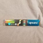
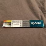
This is a solid pencil choice. The cedar smells great and sharpens well. The core is dark, mostly smooth with some grip on the page. It holds a point well on even the toothiest of pages and sharpens nicely without crumbling- in all of my sharpeners from the finicky Pollux to the Apsara long point to the brass bullet to my Dahle 133 to my Classroom Friendly. The lacquer while not thick is applied very well and nicely glossy. The imprints look good too. While I suspect I was sent rejects that were slightly off or not perfectly imprinted they still looked great. I particularly like the white on black imprint. I was sent a white pencil with a gold “Chaos Coordinator” imprint and it is great.

The raw cedar custom hex costs $110 for 200 pencils or 55 cents per pencil.The pencil is made in Thailand, finished in the US. This pencil is almost identical to the standard custom hex pencil, but with the added benefit of being raw cedar and with a black ferrule and eraser. The imprint is available in the same 7 colors as the above. I have one with a gold imprint and another with a green imprint and I have to say that I really like the color green on raw cedar. The wood is smooth and feels great in my hand. I suspect the core of this pencil and the standard are exactly the same.

The premium custom hex costs $250 for 200 pencils or $1.25 per pencil. It is available in black and white with 7 imprint options. The ferrules are slightly different than the standard- a smooth band instead of ridges, but still gold with a pink eraser. The lacquer is noticeably thicker and glossy when compared to the standard hex options. The cedar and core sharpen with all the above mentioned sharpeners perfectly. The pencil is made in Japan. 

This pencil is amazing. The core feels like a Palomino HB or Camel HB. That smooth graphite that glides over a page is evident here. There is a marked difference in the graphite between this pencil and the standard in core alone. Combined with the difference in paint and just wow. The camera doesn’t pick up the difference in ferrule colors but the premium is slightly warmer in it’s gold shade.

Some good with the bad here. The round pencils, while the best priced and well, round, were made with the worst core and the finish is less than stellar. The eraser is great and it holds a point well, but it’s very hard and light. It’s just not a great pencil. But the options of more text and little icons is awesome.

I’m not gonna lie, you all know how I love a raw cedar pencil and of these options, the raw cedar found its way into my hand more often than any other in this package. The blue black ferrule and black eraser are great and that smooth raw wood is fragrant and looks great. It’s grippy in a way that a matte finish can’t match. The core is good too, it’s not as great as the premium pencil but it’s darn good. It has just enough grip  on the page that you know it’s there, it doesn’t glide or skate over a page but it feels good on all of the various composition notebooks I’ve tested it on. That is across 5 brands with a variety of smoothness and tooth.

Obviously the premium is the best of the bunch. It’s a great pencil that feels like I’m using a Palomino HB, which is a favorite of mine. 

From the standard to the raw to the premium, you can’t go wrong with any of these options. Even the round isn’t bad, it’s just not the same quality as the other options. Head over to Pencils.com to get your own custom pencils.

Review: Pencil of the Week Zine

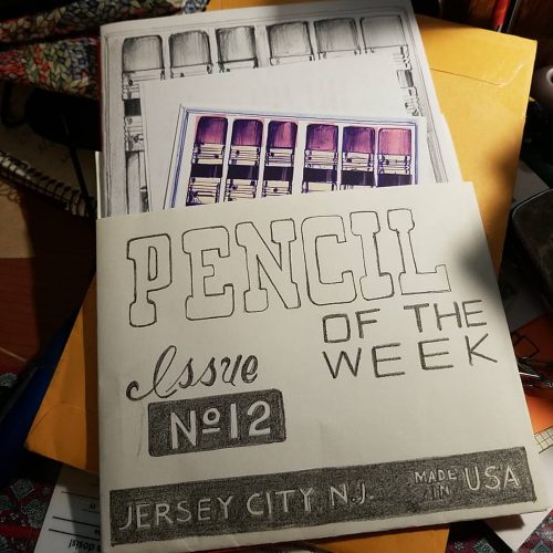
Ed Kemp writes the pencil review zine Pencil of the Week (PotW) with a wry and often laugh out loud sense of humor. The premise of the zine is easy, he picks a pencil at the start of the week and uses it while at work and seemingly also outside of work. He then writes up a blurb about the pencil and his week in a composition notebook. (I could be wrong on this aspect but composition notebooks are mentioned here and there.)

If you aren’t familiar with zines, well they are self published little magaZINES. They are usually photocopied onto regular photocopy paper. Occasionally the covers will be made of colored paper or even cardstock. Sometimes the covers have additional color hand applied.

PotW is no exception, the interior is black and white photocopied as are the covers. Though Kemp often adds spots of colored pencil on the cover and more rarely inside. The covers often reflect the interior of the reviews- a composition book cover, tickets and receipts, bubble answer sheets, and drawings of pencils. The little pop of color indicating the issue number works great on the black and white background.

Inside are photocopies of handwritten pages. Each review is written in a blocky all caps sort of printing, done initially in the pencil being reviewed. The exterior and interior of the pencil is examined. He generally writes about the imprint, the lacquer, the wood, the ferrule the effectiveness of the eraser, and the graphite. He will also examine how well it sharpens.

All of the above is done in Kemp’s easy going humor. His writing includes curse words, which as you know I adore, but if you have had issues with my use of the word shit on this blog, maybe skip this zine. He does use asterisks to avoid actually writing the words themselves, which I find funny.

There are now 8 issues of this zine and it has been around for 2 years. I find Kemp’s zine relaxing and humorous to read. You can find it at the link below. https://www.etsy.com/shop/TheWordDistribution

Review: Baronfig LE Squire Adrift

Since I’ve switched over to a “use the good stuff” mindset I’ve been burning through my pencils and pen refills. I’ve also stopped buying stuff. When Baronfig approached me about reviewing another limited edition squire, I wasn’t going to, then I saw the pics.

And if you’ve been reading this blog for awhile, you know I love teal. That blue green color of the 90s and my youth is my favorite. So I said yes.

And oh man, I love this pen.

It is a squire, so if you like a basic squire you will love this design. It is balanced and has a nice weight in hand. The nock is twisty and smooth. As far as Squire pens go, it’s well made, as usual. The packaging is awesome and has a fun little game to get a little treat.* I particularly love the glossy varnish on the package to make the bottle design shiny on the matte background. Perfect.

The design wraps around the pen, so when I roll the pen in my hand it captures the motion of underwater grass. The rolling patterns are great. The little fish, octopus, and turtle are lovely. I’m quite taken by the octopus.

I don’t think I can say anything bad about this pen. The color is just right for me. the wrap around pattern is great and I love looking at each of the little critters.

You can get one here.

Review: Baron Fig NYC Vanguard

Before I get into the nitty-gritty of this review, Dade and I sat down and recorded an episode of RSVP about the use of stationery in support of our other hobbies and activities. This has always been a core component of how I review but is especially important in this particular review.

I’ll start with the basics that you all know about BF. I love their cream-colored toothy paper that works just as well for pencils as it does for fountain pens and gel ink. It holds up to brush pens and colored pencils and feels great every step of the way. To boil that down- if you like dot grid and use almost any writing utensil it’s great. They use the same paper in the Vanguards as they do in the Confidants. Near paper perfection.

The vanguard is a 72 page stitched soft cover notebook. The cover stock is thick and textured. The stitching on this edition is black and sturdy. They do use back tacking to secure the ends, which is better and more secure than cutting the stitching but can leave an unsightly bundle of threads at the edges of the book. None of mine have this issue. Occasionally the stitching will be crooked or off-center, but all of mine were good.

The covers of this one have art created by Josh Cochran. The colors are subtle blends of CMYK to create a near monotone effect. I’m not sure if this is intentional but I enjoy the various shades created. The lines in the art are both thick and shaky at the same time, and folks, I am here for it. Inside the covers are printed with a softer shade of the exterior of the main color of the covers. The back cover features a little doodle in the same theme as the cover. They are cute and a fun little addition to the notebooks. There are 3 different designs for the covers one yellow, one blue-green, and one in pinks. They are all lovely.

After ripping this package open, shooting pics for this review, I immediately pressed what I term the “summer” or yellow notebook into use for my garden planning and seed starting log. I’ve made my way through about the middle of the book. It has been tossed around my bag, the truck of my car, and had copious plans scribbled into its pages. What I really love about the Vanguards is that they are just the right size for a small to medium-sized project. 72 page is just right. The size of the pages is just right, and the softcover format allows you to open the book up flat to spread your ideas out across 2 pages without an overwhelming lump in the middle.

What I have been really surprised about with this vanguard is that the cover has stood up to this kind of abuse and use. Normally most of my notebooks get tossed into my bag or onto a desk. They don’t get wet as I log hydroponic feedings or smudged with dirt as I fill seed starting pots. What is most impressive with this is that despite being a paper cover it cleans off nicely.

You can get these lovely little notebooks over at BaronFig.com

Review: Pen + Gear No. 2 Wood Pencils 12-pack Black

I write the bones of my review with the item in whatever journal I’m using at the time. It felt a little weird to write with this review in the Baron Fig Clear Plus journal. It’s a 5 cent pencil being reviewed in a nearly $30 journal. But this pencil performs more like a 50 cent pencil than a 5 cent pencil.

The Pen + Gear (P+G from here) pencil arrives in a hard plastic box, honestly, I’d prefer cardboard with a window, but this is a decent box. There is a bit of flex in the packaging which can contribute to cracked cores. I chose the package of black pencils, but there are now many colors and decorative features available. It is important to note where the pencils are made while making your selection. Those made in India are the pencils you want. The rest are not good. The made in India are made by Hindustan and are great pencils.

The paint on these pencils is glossy but thin. Some grain is evident through the paint. The wood it covers appears to be bass, linden, ash, or one of the many other pale-colored kinds of wood available for pencils. From the smell, it is likely to be bass/linden. It sharpens perfectly in every sharpener I’ve used, from the Classroom Friendly to the KUM Masterpiece to the M+R Pollux. The graphite takes a lovely point.

The graphite inside is smooth and dark. Much like most of the HB or dark pencils made by Hindustan. These are not super soft. In fact, their point retention is on par with many HB pencils. I used my several test pencils on several different types of paper- from the smooth paper in my work bullet journal, rough pulpy index cards, kraft paper, rosin paper, and in the Baron Fig Confidant Plus. It was silky smooth on all paper, but also the point survived longer than expected on all the papers. I filled an entire page in the Confidant Plus before feeling like I needed to touch up the point. 

The eraser… Generally speaking, erasers made by Hindustan are pink chicklets of disappointment. They rub the graphite around the page but not off, they melt into a sticky puddle atop the pencil. Not these. These black erasers are dust-gathering or sticky, and they actually work relatively well for erasers on pencils. I’m pleasantly surprised.

During the review period, which usually lasts about a week, I found myself reaching for this pencil over and over again. At the end of the week, I kept reaching for this pencil. It simply works and works well. I wasn’t sharpening it every 2 seconds, or pulling shattered cores from the wood. I didn’t fight with the sharpeners. Most importantly, I was able to use the same pencil throughout staff meeting at work without sharpening.

At $1.97 a 12-pack, these weren’t the cheapest Walmart pencils, but they are solidly good.

Review: Baron Fig Clear: Habit Journal Confidant Plus

When the Clear Journal was first introduced by Baron Fig I passed on it, thinking that I really didn’t need a purpose-built journal for bullet journaling. I’m in the camp that believes any journal can be turned into a bullet journal. I still believe that but when I was offered the Confidant Plus size (aka The Big One) I thought I’d give it a try. I’ve been itching for more space in a few of my journals and figured this would scratch that itch.

Let’s get a few things out of the way. This is a Baron Fig Confidant, but bigger. Same great paper. Same quality binding. Same quality fabric cover. If you like a standard Confidant you’ll like this special edition. I’ll get into the special bits later. But thus far, the standard stuff is all great.

The Confidant plus size is much larger than a standard-sized journal and larger still than a Confidant. It makes other journals look diminutive. This results in a journal that is more than a little bit heavier than the regular Confidant. So if you carry your journal around with you, this might be one you leave on your desk.

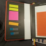
There are a few extra extras on this journal- a pair of ribbon bookmarks, which like all Baron Fig bookmarks are just smidge too short. (Hint to BF- if you are thinking of adding an inch, add 3) I have small hands and dexterous fingers grabbing one of these ribbons is a feat worth celebration. I love BF ribbons. They feel great when I can grab them.

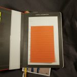
The end sheets in this book are gorgeous, as usual. The back features a pocket. Whhhhhat the what? BF included a pocket? I was shocked and happy. I love pockets in my journals. They house all sorts of stuff. This one won’t hold my ruler, as it’s a slash type pocket, but it will hold all the other garbage I shove in there. Slash type pockets are superior for stashing assorted papers to the typical envelope style pockets. Envelope style pockets allow for stashing of smaller loose things, AND rulers. But the slash is best for papers.

The final addition to this journal is an elastic. Baron Fig’s elastic when they use them, are awesome. Stretchy and soft but not loose. They hold the book closed in a snug way, but when not used just hangs out in the back of the book not catching on things. Because this book is a Confidant I often find myself forgetting that the elastic is there.

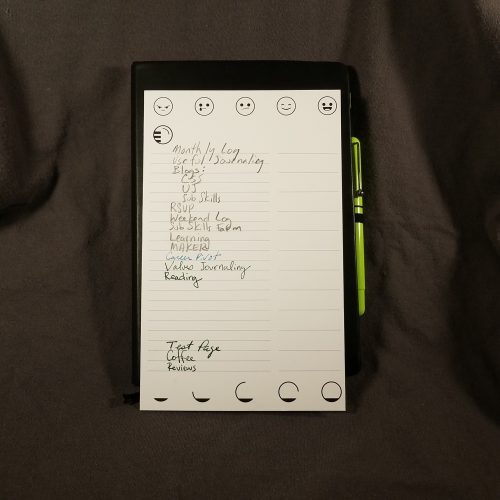
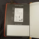
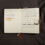
The lovely BF paper is printed with a few extras. In the front there are one line a day monthly pages. 12 of them. This is simplified with 1-31 and the months printed along the edges. Circle the month and then write on the day as normal. I like the layout and look of these pages. It is intended for you to ponder a single prompt or to keep track of the things you do in a month. The highlight reel. This is not how I use a journal but I see how it could be appealing. I tried it, and after a few weeks of boring entries; Dried pears. Made pear butter. Put bok choi into the cold frame. Checked ferments. I gave up on the highlight reel. I found myself wanting to use it like my regular bullet journal where I enter upcoming tasks and things- Cancel Hulu. Order water filters. So I did.

The notebook section is an upgraded dot grid that BF and Clear call “split grid.” The center of the horizontal and verticle is denoted with a + while the quarter sections are denoted with – or |. This saves you from needing to measure things out, just find the appropriate -, |, or + and make lines. I cannot explain to you how much I LOVE this format. It adds speed and flexibility to a bullet journal that makes setting up a new page fluid. I’m in favor of BF adding the split grid to all their Confidants.

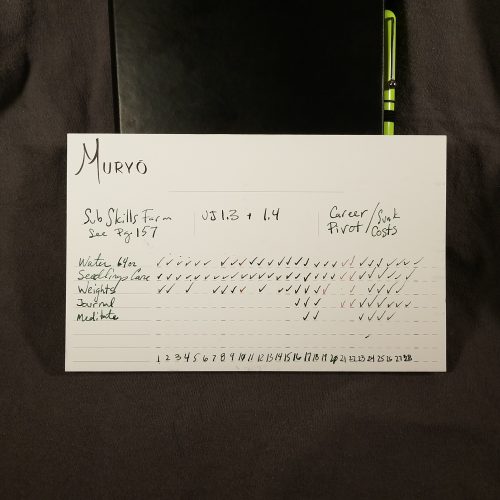
In the back are habit trackers. I’ll be honest, I haven’t found a use for these. The set up doesn’t seem to work with how I track habits. Or have in the past. I appreciate the idea, and have read Clear’s vision for these, but they simply don’t work for me.

The final section of the book is devoted to a few pages of a variety of productivity methods* and ways to use the habit track and split grid of the journal portion. All of these are useful tools and can help you to figure out your bullet journaling style.

Overall I love this confidant. I love the little additions and attention to detail. I adore the larger size. You can sit down at a desk and really noodle out some ideas in a way that I’ve always thought the smaller (roughly) 6×9” size sometimes makes limiting. I find myself reaching for this journal again and again. The black with copper accenting is gorgeous. The end sheets are lovely. That subtle blue split dot grid on the creamy BF paper makes me very happy. It melts into the background behind pencil and pen. I’d love this color on more BF Confidants.

The Plus size is $28, a mere $4 more than a LE Confidant. If you’ve been aching for a larger size this price is good. There are 208 pages. 32 of them are either black, text or other places where you won’t journal. In total the book are 176 pages usable for journaling.