Category Archives: Review

First Look: Baron Fig LE Vanguard Train of Thought

When BF sent out the “do you want this for review” email I almost said no. The exterior of the books looked really childish. Then I thought my nephew would really dig the trains on the exterior. So I asked them to kindly send me a reviewer set. Let me start this out by saying that in the interior of this notebook set sports BF’s lovely fountain pen and pencil friendly cream paper with a light gray dot grid ruling. I really love BF’s paper because it works so well with all my favorite writing tools. The stitching is done really well with white thread and is well centered and tight on my books.  The cover stock is lightly textured and feels nice in hand. The printing on these is matte finished. The exterior of these book features trains and clouds. They are childlike and playful with a dreamlike quality. The interior of the covers are the weird side of dreamlike and remind me of 80s era riffs on psychedelic imagery. The train and cloud theme runs throughout but with planets, aliens, and emojis. If these were done in neons we could call these, “That Day Lisa Frank Dropped Acid.” While they have that trippy quality I’m glad they didn’t go with neon shades and instead chose sedate groupings of analogous colors. This turns a bizarre illustration to the realm of fun without being too jarring to the senses. In a practical sense, these aren’t going to be something you bring with you to the boardroom or for professional meetings. One look at the poop emoji next to two aliens holding hands is going to raise the eyebrow of even the most lenient boss. These are strictly “for fun” notebooks. In that sense I love them. I always need more little notebooks for around the desk here at home and frankly if I were in school I’d love to use these, despite the odd looks some of my sedate professors might toss my way.

The Flagship Vanguards run $14 for a set of 3. You can get them over here at Baron Fig.

Here is where i”m going to go tangential on you. There is something really fresh and fun with all the things BF has been doing lately. Train of Thought is just one example where BF is shaking up the bring monotony of the stationery world. There are a hundred places where you can get a black grey, or white pocket notebook; hell even BF offers their notebooks in standard colors of black and grey. No I can’t take these into a stodgy board meeting but is that the target audience of these notebooks, or even the New School set? I don’t think so. I think Baron Fig is going after their core audience of younger professionals who might not be so concerned with what is considered “professional” in the traditional sense. I suspect a lot of people are going to loathe this set while many more are going to enjoy Lisa Frank on acid. I am in the camp who loves the idea of these despite working in an environment where my boss might tell me I can’t use them. Continue reading

Review: Piccadilly Essential Notebook Medium Ruled

The PIccadilly Essential Notebook (PEN) is a basic black journal. Some of you might want to call it a “moleskine knock off” but it’s probably been around at least as long as moleskine’s little marketing gem that makes everyone think that the moleskine is original (guffaw.)

Let’s talk about the basics- 240 ivory pages, smythe sewn, medium gray ruling, black satin bookmark, pocket in the back, elastic closure, and a hard “leatherette” aka vinyl cover. Like any smythe sewn binding the PEN opens fully flat for comfortable writing and will fold over onto itself for writing out of hand. Nifty. The belly band boasts that the PEN has acid free paper*.The paper itself is a nice warm ivory shade that I quite enjoy. It is easy on the eyes and a variety of colored inks look fantastic on its surface. Fountain pens feel great but have a tendency to feather and bleed. It’s too bad the paper isn’t better with fountain pens because my pens all feel fabulous on the surface of the paper. Pencil looks and feels amazing. The paper has a nice amount of tooth, so writing is effortless for a dark line. The pages don’t smear and smudge much either. Even my darkest pencils didn’t smudge. Ballpoint works well on the paper too. Interestingly gel ink responds much the same way as fountain pens. While the gel doesn’t feather it does bleed and show through.The same with rollerball.

Honestly, if you’d used a modern Moleskine these are almost identical enough that you can wonder if they are made in the same factory. The paper looks and feels the same- hell it even feather in the same bizarre way you see in moleskines. The only difference are the logo and color of the bookmark.

Piccadilly notebooks are only available at Barnes & Noble locations throughout the US. The Amazon sellers are… weird and sometimes the notebooks aren’t available or they range in price from $5 up to $50.  The MSRP is $15 but if you happen to be in B&N and look around the clearance section you can usually find them for $6 a book. I like them because at $6 they are cheap. Continue reading

Introduction to Kokuyo Campus Notebooks

Welcome to the first guest post on Comfortable Shoes Studio! I’ve asked some of my friends to write posts for the blog to introduce new voices. Big thanks to Hahna for kicking off the series! You can interact with Hahna via Facebook in the RSVP Podcast group!

A set of Kokuyo Campus Notebooks, Todai Series.

I never gave composition notebooks (comp books) much thought before I started reading Less’ reviews.  Didn’t use them much, but I do feel nostalgic when I see them.  They feel Very American with their no-nonsense stitching and the sturdy, 5-foot thick plywood covers that some sport.  Seems like they were field-tested and made to survive handling from jocks who could care less.  The empty class schedules, multiplication tables and grammar rules often printed on the insides also somehow seem hopeful and encouraging, as if the designers and companies are doing what they can to help kids get through their days.

i before e except after c, or when sounded as a as in neighbor and weigh.

To convert Celsius (C) for Fahrenheit (F): multiply by 9, divide by 5, and then add 32 or F = (C x 1.8) + 32.

Me, I tended to use crappy spirals or perforated glue bound books, but I also used a whole slew of asian stationery store notebooks, mostly for the My Melody covers. Though many were spiral bound, the ones I preferred to use were glue bound books.  They were mostly B5 size, which is 250 x 177 mm.  B5 is just a tad taller and a tad narrower than the standard American comp books which are 9.75X7.5 inches or 247×190 mm.

The B5 notebooks (purple) are a tad taller than the American comp book (orange).

The B5 notebooks (purple) are a tad narrower than the American comp book (orange).

B5 books are also usually thinner, with around 30 sheets per book, but sometimes they have more, up to 100 sheets.  Comp books, meanwhile, generally have 70-100 sheets.  Asian books are often glue bound, with no threads on the inside, but spiral books are also common.

Here two standard comp books (total 200 sheets, to the left) are stacked up next to five standard B5 notebooks (total 150 sheets, to the right).

Asian B5 books have thin and flexible cardstock for covers and inside they are ruled in a single color, most often at either 6mm or 7mm.  They also don’t have margin lines and I don’t think any ever have schedule grids, grammar rules or tables of any sort.

Typical ruling in a B5 book.  No red margins in sight.

Inside front and back covers are blank with no helpful multiplication tables.

Inside back cover, also stark white.  Ready for anything.

Comp books are hard (impossible?) to find in Korea, and I imagine that the B5s fill the void.  Like comp books, they are everywhere and come in a range of quality and price.  Lot of competition in the B5 notebook arena, but some of the most popular are the Kokuyo Campus notebooks. 

Kokuyo Campus Notebooks, Todai Series.  What’s shown is sold as a set of five 30-sheet books in the following colors: purple, blue, green, yellow and red.

Campus notebooks come in standard 6 mm or 7 mm rulings but here we have the Todai Series which features something slightly fancier than just plain rules: rules with tiny dots evenly spaced along the rule.  So not reticle, not dot graph, not graph and not grid + lines.  It’s dotted rule, or graph lite, as I like to think of it.  The lines and dots are a faint grey and unobtrusive when you write on it but are easy enough to see when you need them.  I love it.  But for those purists who think the dots are just too fancy for them, Kokuyo still offers plain ruled books as well, so fret not!

A close up of the dotted rule; it is also reflected in the design of the covers.

The Campus notebooks are ok paper for pens.  The papers are slightly thinnish and with some pens there is just a teeeeny tiny bit of ghosting.  I think most people would use both sides. Some ink pens might not allow it.  Luckily for me, though, I love my pencils and you can’t see pencil writing at all on the other side.  Yay for pencils!  

A small sample of pens, pencils and markers.

The teeeeeniest bit of ghosting.

Don’t use sharpies in the Campus books, unless it’s an emergency.

I love how discreet and slim the Campuses are; you aren’t committed to the usual 70-100 sheets per book like you are with American comp books. 

I’ve talked a lot of love for Campus, haven’t I?  There are a few cons.  First, they don’t completely lie flat, especially the first and last pages.  But I think that the pages lie extremely flat in between. 

First page opened.

Pages in the middle lie pretty flat.

Book abused and folded over completely.  Poor little fellow.

Also, I think that the glue is a big turn off for many people. 

Glued spine!  I love it and yes, glue turns me on.

Another minus: Kokuyo Campus books are $16.50 on JetPens per pack of 5 or $11 for the same 5 pack on amazon.  I know that in Korea, a single Campus notebook sells for around USD $1, so its definitely the importing that’s making them so pricey.  There’s a range in pricing to American comp books ($0.50-3.00+ for one), but you can find a decent one of 100 sheets for $1, or 1 cent per sheet.  Campus books are going to be 7 – 11 cents per sheet in America. 

All this can be yours for between $11 and $16.50.

Still, $16.50 for a five pack of notebooks isn’t ridiculous in the stationery world, where nerds regularly shell out $12 for 3 pocket notebooks.  So here at Chez Hahna, we still get ’em.

So there you have it, an overview of Kokuyo’s Campus Notebooks.  Why don’t you try a pack?  They’re my favorite! 

My happy place.

hahna lives in rural Illinois and is still trying to figure out what to be when she grows up.


Continue reading

Review: Palomino Blackwing Volumes Number 1

As I did with my review of the 73 I’m not reviewing the interior of the pencil, but the exterior. The balanced core of the Number 1 is the same core as the Pearl but perhaps with a few batch variants. I’ve not read any wild conspiracy theories about the No.1 being even slightly different than other Pearls, so we don’t need to explore that area. No in this case a Pearl is a Pearl.Starting in with the least different aspect of this pencil- it sports a shiny silver ferrule and a nice silver imprint. Like the 73 the No.1 has the new branding and font- little trees and the updated Palomino. It looks great on this pencil.Held in the silver ferrule is an indigo blue eraser. It’s meant to be the color of chambray shirts but is a touch too dark. I was disgruntled that it was far too dark, then I used it. The color changed and with each erasure I found that it lightened, I realized that like chambray, the indigo eraser lightened and became the light indigo color I associate with chambray. A brilliant design choice, though not readily apparent.The pencil itself is gray washed. The warm color of the cedar shines through the thin gray paint. I love and loathe it in equal parts. Part of me wonders if I have come so far from my roots that I can actually enjoy a faux weathered pencil? Am I so far gone from my heritage that this is okay to me? Then I stuff the stub of the pencil into the pocket of my Wrangler chambray shirt and I feel better about life.The biggest departure for this pencil is that it is round. I for one love round pencils. There are no pointy hex bits digging into my finger. I rotate it smoothly in tiny increments. I can sketch with it and build up wide points to create bold expressive lines. I love the round. Several people complained that their ferrules were not perfectly centered with the imprint. o_O I just can’t. If it bothers you, grab the pencil in one hand and the ferrule in the other and twist until aligned. First world problem solved.So the elephant in the room, the tribute. I decided to look up Guy Clark and wow, okay, maybe I’m too young, not cultured enough, but man, Clark’s music is the cure for insomnia. Great lyrics just boy, he had a boring voice. Not my cup of anything. So yet another white bro, though at least this guy sings the songs of the working class? I guess. In part, I feel like we’re getting back into the dudebros at Palomino making tributes to the guys they love. That’s fine, but frankly, I have not cared, at all, about virtually anything they have decided to make a tribute about. I feel like there is a total disconnect between the dudes in charge at Palomino and the folks who use their pencils. “I like these things so everyone else will too.” None of these things are universal. The 73 and the 211 seem to be the most widely received but I think that’s because their topics are wider than just the stuff a dude, who is about my Dad’s age, really digs. (One can make an argument for the 24 being well received but is that because of the new firmer core or because so many of us were forced to read Steinbeck in High School?)
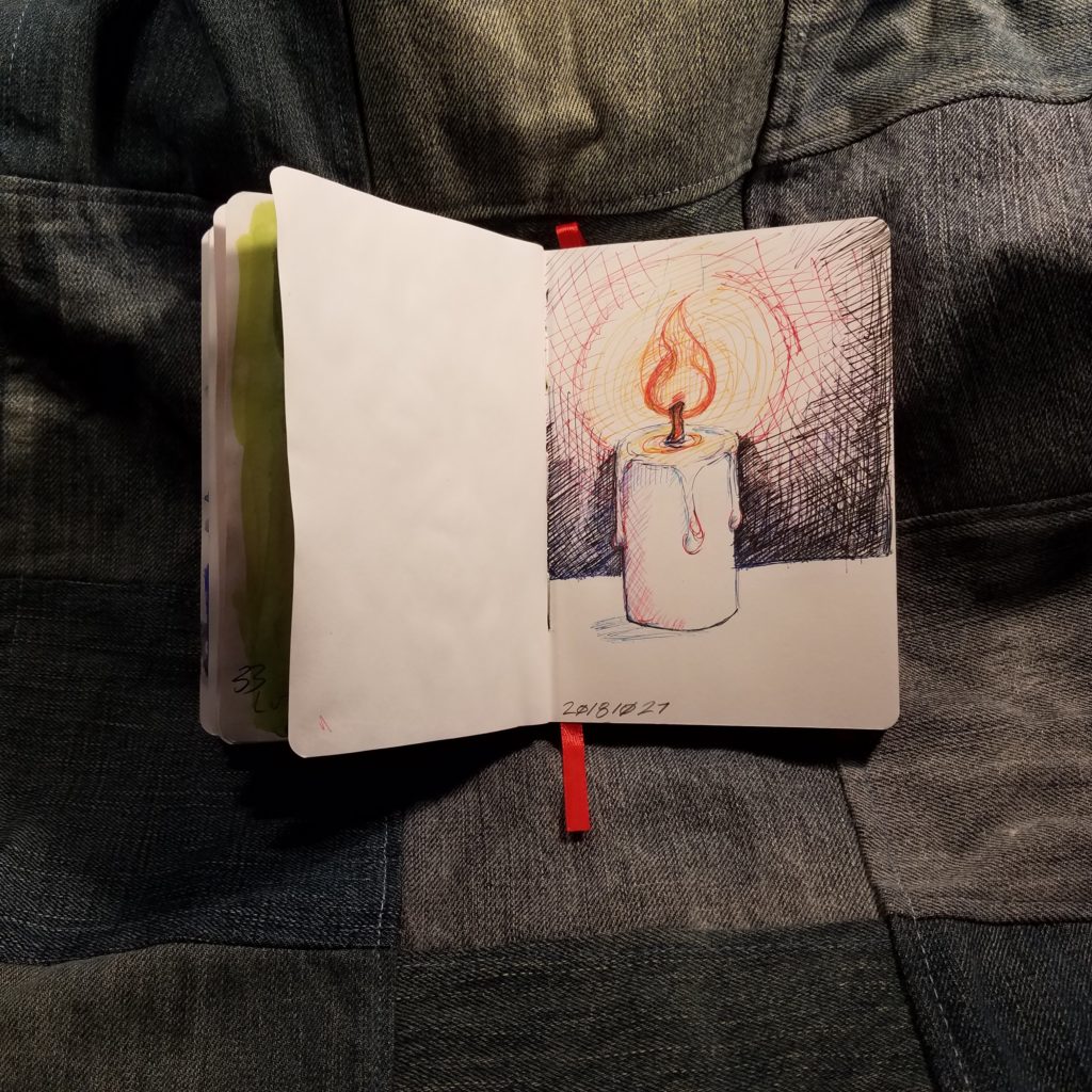
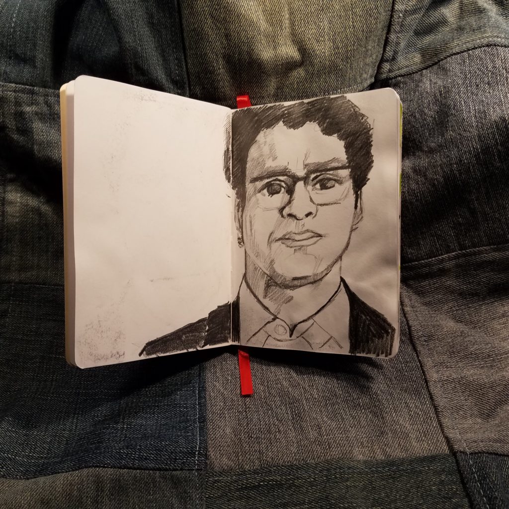
So here is a gripe that I have. I come from a working class background. I’ve spent my fair share of time doing hard physical labor and I always find it irritating when rich folks want to highlight the working class. I talked a bit in RSVP about how you could always tell if someone was rich or poor growing up, because the rich folks stained their houses gray, while the poor folks let their shingles weather naturally, because they couldn’t afford to stain or paint their shingles. While it is certainly nice to enjoy the aesthetic, it is another to mimic it out of a lack of understanding. Just go listen to me yammer on over here. For the dudebro who tone policed me, language warning, though it’s bleeped for sensitive ears.

So overall, I really enjoy this pencil. I love round pencils. I love the Pearl core. I like silver ferrules and imprints. I love the color blue. I’m warming up to the grey wash. I don’t care about Clark’s music at all and frankly I’m finding it easier and easier to divorce the tribute from the pencil and just enjoy the pencils. Get some at Jetpens. Continue reading

Review: Baron Fig LE Squire Spectre

If you have been listening to my podcast, RSVP, then you know how I feel about the BF Squire. The pen is perfectly comfortable. The weight is nice. Just heavy enough so I always know it is there, but not so heavy as to tire my hand. The size is perfect for my hand. The pen is short-ish, if you have really big meaty paws, this might not be the pen for you. The weight is toward the front of the pen for good writing balance. It feels wonderful. The twist mechanism twists the refill down just enough to expose the point without excess. I find myself fiddling with the twist mechanism in much the same way one might fiddle with a clicky nock. There is a slight gap between the nock and the body of the pen. It has been noted on other blogs that the pen should be seamless, but I see the slight gap as part of the aesthetic. The gap is perhaps .5mm. Though I tend to cart my Squire around in my pants pocket the anodized finish as remained perfect. Not one chip, ding, or scratch mars it’s surface. I would suggest that you NOT cart your Spectre in your front pocket, lest you end up ruining as many pairs of pants as I have. The motion of it rolling around in your pocket is enough to twist the nock, expose the point, and leave a nice large black stain on your favorite pair of camel colored khakis. Not only does this suck most of the ink out of an otherwise full cart, the refill never quite works the same. If you are wondering if the ink washes out, it does not. The Schmidt ink bonds quite well with cotton. The Schmidt refill works really well on the garbage paper at work, which is why it ends up in my pocket so often. It is also quite nice on Baron Fig’s paper. I quite like it in my Confidant journals.I find that the ink tends to bleed through on other paper- Write and Field Notes as 2 examples. The HP Laserjet I use in No Brand Notebooks handles it’s liquidy black ink just fine. If you are not a fan of the Schmidt cartridges you can buy many Parker style refills. Be careful though, many will not fit due to the super narrow opening at the tip of the Squire. Itoya and Monteverde refills both fit.As for the Spectre, I really dig everything about the pen. The little engraved ghost, the weight and feel. I was a little surprised at the color. Many of the images online show it to be BLACK the actual color is a deep dark purple black. The color is warm and looks a lot like graphite. I like the color but it was not expected. While I found the green of the Experiment too eye catching for my workplace the muted purple charcoal shade is perfect for work. It’s professional and flies under the radar and most people won’t peg this as “fancy pen.” The cost of the pen is $60, which makes this one of my more expensive pens. But any pen you refill is an investment. While my Pentel Alloy will likely break after a year of use, the Spectre will continue working for years and years of use. It should be noted that the pen does not have a clip or roll stop. The slightly narrower nock doesn’t keep it from rolling off a desk top. Because it is weighted toward the front, it will land tip first, likely ruining the refill inside. Baron Fig does offer a little pocketable leather case for the pen, which is a solid investment, if you intend to pocket carry. I quite love my Squires, I’m lucky enough to have an Experiment and a Spectre. They are solidly made and worth the investment. One of the great things about using a refillable pen is that you get to pick what refill you want to use- from Monteverde to Itoya to Parker to Schmidt you have plenty of choices here. Continue reading

Review: Canson Art Book Universal

Back in 2012 I offered a semi-review or a first look at the Canson Art Book One as a budget friendly offering for art journalers. The Canson Art Book Universal (CABU) is in the same series of sketchbooks but with a few differences. I won’t focus on the differences but what makes the CABU so great. I have the A5 or 5.5×8.5 inch size. The basic rundown of the CABU is that it has 224 pages of 96gsm (65lb) white paper. It is acid free, has no brighteners, and states it won’t yellow with age. The paper is smooth to the touch but has a nice tooth for pencils. The sketchbook has a classic pebbled faux leather grain coating over sturdy heavy boards. The corners of the cover are rounded but the book block is squared. The binding is a traditional Smythe stitch with heavyweight neutral grey end sheets. The back of the book has a nice roomy pocket and sports an elastic that was loose when I opened the package and has only gotten worse as the book has gotten older. I finally ripped the elastic off. Useless.Let’s talk about this paper, it’s lovely. The tooth is just right for sketching with pencils. The graphite glides over the surface. Though it is toothy it doesn’t grind the points down to a stump in moments rather, just the right amount is deposited no the paper and the points last well. Pencil feels amazing on this paper. It looks awesome too. The graphite seems to pop off the page, but shades well.

Fountain pens also fair well. Though there is a nice tooth to the page, it is very smooth when using a fountain pen. All mine felt great on the surface. My EF Eco was a tad bit scratchy but that pen is always a tad bit scratchy. All the inks that should exhibit sheen or glitter did, and whoa did they! Not one bled through either. Brush pens fair in much the same way- the ink looks great, the ink doesn’t bleed through.

One of my favorite ways of using the CABU is for mixed media and watercolors. The paper is great for collage  and though it cockles a bit it is great for watercolor washes. IN fact I really have slopped some watercolor in this book and it never soaks through. The colors sits on top of the paper similar to the way they react on hot press. Lifting colors, so long as you aren’t using a color that stains, actually works. Softening hard edges works nicely. This has become my go to for portraiture practice. The paper is really just lovely.As it is a sketchbook it is only available in blanks pages. If you want to use this for writing, you can download one of Ana’s writing guides, over here.

In short if you are looking for a sketchbook that pretty much does it all reasonably well, the CABU will fit that bill. True it isn’t available in lined or dot grid, but the paper is so good you won’t really care once you get a writing guide. Continue reading

Review: Ito-ya Helvetica Pencil

The Ito-ya pencil is made by Camel. Per CWPE the eraser was designed for Camel by Eiichi Kato. Most pencils with this sort of ferrule-free eraser experience are made by Camel. I’ve reviewed another Camel pencil here.

I love the look of ferrule-free erasers. That’s no different on the Helvetica pencils. All the erasers are black, no matter the color of the pencil. They are available in white, black, red, and gray. You can find mixed packs on Amazon. I purchased a 12 pack with 6 red and 6 black pencils. The paint is thick and well applied to a perfect satin finish. It’s not quite dull enough to call it matte but also not shiny. The black paint and eraser feel stealthy. TThe imprint is printed rather than debossed. On all the pencils the imprint is glossy black. It stands out quite well on all the colors, even the black on black it looks great. Very minimalist.

Inside the paint is nicely fragrant cedar, which sharpens up in any sharpener I own. Inside that lovely cedar is smooth dark graphite. The writing experience with these is silky smooth. The graphite is dark too. If you own the Camel 60 pencil the Helvetica is significantly softer and darker. I’d liken it to a B Misubishi 9850 or Nataraj Super Black pencil. That is to say, dark and smooth.

Honestly, when I bought these I didn’t put mine down until it hit Steinbeck stage, then I immediately sharpened up another. Though these are $15 for a 12-pack, they are so pleasant to use that I keep an eye on Amazon and keep them in my future to buy cart. I also like to include them in trades and pencil gift package.

Continue reading

First Look: Baron Fig LE Archer No.2 Pencil

With limited editions, my focus is on evaluating the aesthetics of the look and less on evaluating the internals. Viarco makes Baron Fig pencils. I’m not a huge fan of Viarco pencils, I find them to be a tad on the scratchy and gritty side for my taste. Which is BAFFLING because Viarco is capable of creating the smoothest and prettiest graphite as they do with some of their art graphite. Their Art Graph Sticks are creamy smooth brilliance. They are capable of SO much more.As much as I love the look of the Prismatics, the No.2 hits me in the feels. There is so much to love about this pencil. Part of what I love is that pencil nerds have been asking any of the makers of limited edition pencils to do something with a classic yellow school pencil. No one has delivered until now. Baron Fig not only nailed it, they hit it out of the park. This pencil is steeped in American school pencil tradition. They went with a matte but bright finish. The yellow  is bright or light chrome yellow versus the mid or dark chrome yellow we usually see on school buses and school pencil. It’s cheerful and put a smile on  my face. The green end dip and imprint are light chrome green. It’s also super bright. The color combination is classic. It calls out to Dixon’s Ticonderoga, General’s Badger or their Semi-Hex, and John Deere tractors.* the change in colors for pencils- the Ticonderoga uses foil in its imprint and a dusty shade of green on the ferrule. While the Badger sports green foil and a gold ferrule. IN contrast the No.2 has no ferrule at all, just a simple green end dip that perfectly matches the imprint. Unlike the budget pencils this has a thick application of the matte lacquer. Inside the matte lacquer is, for the first time, good old cedar.

The core on mine were mostly centered, though I had 2 pencils that were pretty off center in my dozen. I tested the No.2 out on a variety of paper from Baron Fig’s Vanguard and Confidant, to Write, to Field Notes, To No Brand Notebooks, and finally P+G index cards. The results were surprising. The 3 that I tested and used extensively for several days were much less gritty than the previous Archers I’ve used. As usual the archer’s perform best on Baron Fig’s own paper, the smooth yet toothy paper is optimum for gaining the darkest line with the least amount of effort. While smoother paper like the Write pocket notebooks forces the user to use much more pressure to get a good dark line.

For a pencil I wasn’t expecting to like but enjoyed quite a bit more than usual. The core is much more consistent and not gritty as in previous versions. The look is awesome and definitely reminds me of old school pencils. Thanks Baron Fig for the trip down memory lane. Continue reading

First Look: Baron Fig Vanguard The New Composition

Here’s what happened, I love my composition notebooks but I was frustrated with the often nasty paper inside. I thought, “You know who could make an awesome updated version of the composition book? Baron Fig.” I picked up my phone and called Joey and Adam and told them my idea. They told me it was great and awesome. That they’d read my obsessive composition notebook review, then let me know when it was going to happen. Okay, so that’s not really what happened, but it doesn’t hurt to think that maybe the guys over at BF read my obsessive reviews of composition notebooks. You know, where I harp on the amount of white to black in the marble and the size of the tape on the spine… I mean that probably didn’t happen either. But these Vanguards feel like the guys at BF crawled into my head and put all my thoughts about awesome composition notebooks into play. The ratio of color to white in the marbling is great, the black “tape” on the spine is almost perfectly proportioned for the size. I’m just so  in love with the cover style. They even fit my requirement that the spine is stitched. Inside is that great toothy but smooth enough for fountain pen paper. The Vanguard paper seems to be a tad thinner than the Confidant paper, but doesn’t feather with fountain pen inks. The flagship size is perfect for tossing into a bag, or if you must, the pocket of cargo pants. The only downside of these is that the cover is thin and not the stiff hearty cardboard comp books should be made from. Luckily they are a smaller size so the weight of the cover material is less important. These notebooks are a fun miniaturized twist on the larger traditional composition notebooks.  They look lovely with the Baron Fig No.2 pencils. Which I’ll review in their own post. Anyway, head on over the Baron Fig’s website to pick up a set.So some deeper fuller composition book analysis is needed here. Is this a comp book by my own standards? No. It is a good update on a comp book. It lacks a few things that I use to determine a true comp book- the size is too small (though there are mini and 6x9ish comp books), the spine is not taped, and finally the covers are soft and not card. It also lacks the standard generic label on the front. Even with all of that I love these. I’m glad they did this on the Vanguard and not a Confidant because this is the closest thing to a comp they offer. A marbled Confidant would not be in the tradition of comp books, in the same way that I cannot see the Kickstarted Comp as a composition book. I think that the Baron Fig Composition is a good modern take on the old school composition notebook.

Continue reading

Review Round: Bicolor and Checking Pencils Part 1

Welcome to the first in a series about every novelist and editor’s necessary evil- bicolor and checking pencils. In the past I’ve relied mainly upon red ink in a fountain pen to edit my own work. I chose the bloodiest looking red. I wanted the ink to pop off the page or to be fun to use, like J.Herbin 1670 Rouge Hematite. Often I’d just use whatever fountain pen was at hand. Most of the ink in my fountain pens seemed to be fine for the task of editing.

I understand that many students have an aversion to red ink on their page, associating it with negativity, for myself I always saw the use of red ink on my work as a method of getting better. That said, most of my professors in grad school used purple or blue ink for corrections- if they even saw the work on paper. Most corrected and graded in blue or purple on the computer.

Now that I’ve graduated and I’m beginning to make the first pass in editing my written work I find my needs are different. The first draft of my novel is written in graphite and I have to be able to find the edits as I move through the notebooks. For this color is important, much more so than when editing typed pages. There is something about the reflective nature of graphite, and perhaps, my horrible handwriting that makes it difficult to find black, blue, and green ink on the pages.

I digress, the entries:

Entry 1: General’s Red & Blue Crayon Pencil

I picked this monstrosity up at Bob Slate in Cambridge, MA. I admit that perhaps I was swayed by it’s bright reflective metallic coating. I thought it would be easy to find in my pencil case. I sharpened it up with my handy brass bullet only to find the core crumble away. I was able to edit only a few pages of my paper before it was a useless nubbin.

The red was pale and faded into my writing and into text. The blue was slightly more pigmented, but still weak and pale. The wax core caught and gripped the page rather than sliding across as I wrote. I tested it on a variety of papers- from my composition notebooks to cheap Staples recycled paper in warm and cool environments. Nothing made this pencil worth using.

I can’t get a picture of it because I hated it so much and there was so little left that I tossed it. Do you know how much I have to HATE a pencil to throw it away? A lot.

Entry 2: Musgrave Hermitage Old Version

Musgrave recently updated the core and coloration of their bicolor pencil, I have a new version on the way and will add that to my next round up. See this article for more info on how to tell the old from the new.

The red core is pale and lacks punch against graphite and ink. It is slightly better for making notes on printed pages but only slightly. The blue isn’t bad in terms of pigmentation. It is fine for making notes. These cores grab the paper in a way I find most unpleasant. Instead of gliding across the page it sticks. Thus I’m forced to use excessive pressure to get the pencil across the page. The color is good, the texture is lacking.

I suffer to use this pencil because they are dirt cheap, around $3.50 on pencil(dot)com.

Entry 3: CW Pencil Enterprise The Editor

A relatively new pencil by the pencil women at CWPE, The Editor has graphite on one side and red on the other. I really like this combination and I’d like to see more offerings like this. The pencil is made for CWPE by Caran D’Ache, so you know it is of great quality.

The red side is nearly perfect. The core is deeply pigmented and doesn’t shatter in use or sharpening. It doesn’t holds a point well. The core glides across every paper I’ve put it to. The color stands out against graphite, ink, and printed text. It feels great.

The graphite is quite hard and holds a point forever. I’d place it around an H or F. I wish CWPE had cone with a CdA B or 2B. I find the lead to be a tad too faint to use for regular editing. This is one of those cases where having only 1/3rd of the pencil as graphite would make sense.

Entry 4: Nataraj Red Checking Pencil

These pencils only have one color- red in the pencil. They are available in blue and green. The exterior is red with black stripes with a gold imprint. The end is dipped in red. The wood appears to be jelutong. A dozen is roughly $5 on Amazon.

The core is decently pigmented and stands out well enough against graphite, ink, and printed text. It is among the harder of the cores, it isn’t as smooth as the Editor, but it does okay. It grabs the page a bit but not so much to be unpleasant. I find that it is best on rough crappy paper and my composition notebooks. On nicer paper, like Kokuyo it is more grabby of the page.

Despite these being less pleasant than a few of the others I’ve listed, I find myself reaching for them again and again. Perhaps it is the combination of cheap and acceptability in my composition notebooks that makes them oh so useful for me.

Entry 5: Eagle Verithin Carmine Red Vintage

Despite my general rule of NOT reviewing vintage items, I’m including a vintage pencil in this round up. These  damn  fine pencils can be found on eBay and are in the $9 to $20 range. 

you’ll note that there are current Verithin pencils available. these are garbage and should be avoided. With this pencil, vintage is the ONLY way to go. You can go with Eagle or Eberhard Faber and get a decent lovely pencil, but once you get into the eraser capped version, they become junk. Once they hit Prismacolor years they’ll make you cry.

The vintage version is what all checking pencils must measure up to. The core is deeply pigmented, stands out stunningly on the page. It doesn’t matter what it’s editing- graphite, ink, or printed text, this red stands out. The verithin lead sharpens up to a needle fine point and holds it without shattering the minute it’s touched to the page. It then holds that point for ages and ages. It glides across nice paper and rough paper alike. This pencil just works well. I hold all other checking pencils up to it’s depth of color and feel on the page.

Entry 6: Mitsu-Bishi 7700

The core of this pencil is hard and holds a point well. The core is pigmented well but is so hard that getting a dark enough mark is difficult. It works best on toothy cheap paper with a good support behind the page. Paper that is thick and soft, or in a stack causes the pencil to make a pale mark. A good writing board between the sheets helps significantly. I also find that it works best when it isn’t sharpened to a needle point.

Though this pencil is pretty nice on firm toothy paper, I’m not a fan of this pencil. Largely because I can’t edit while the paper is in a stack.

Final verdict for this round:
Though the Verithin is the superior pencil, I find myself reaching for the Nataraj over it again and again. If the Editor had a better graphite I’d find that to be the superior pencil. I do balk at it’s $3 price tag. If I were editing like I was with my thesis the $3 price tag would cause me to pause as well. Let’s face it, the superior pencil is going to be a combination of usability and decent price. IN the heat of editing a novel one doesn’t really want  to worry about how much editing one’s own work will cost.

Continue reading