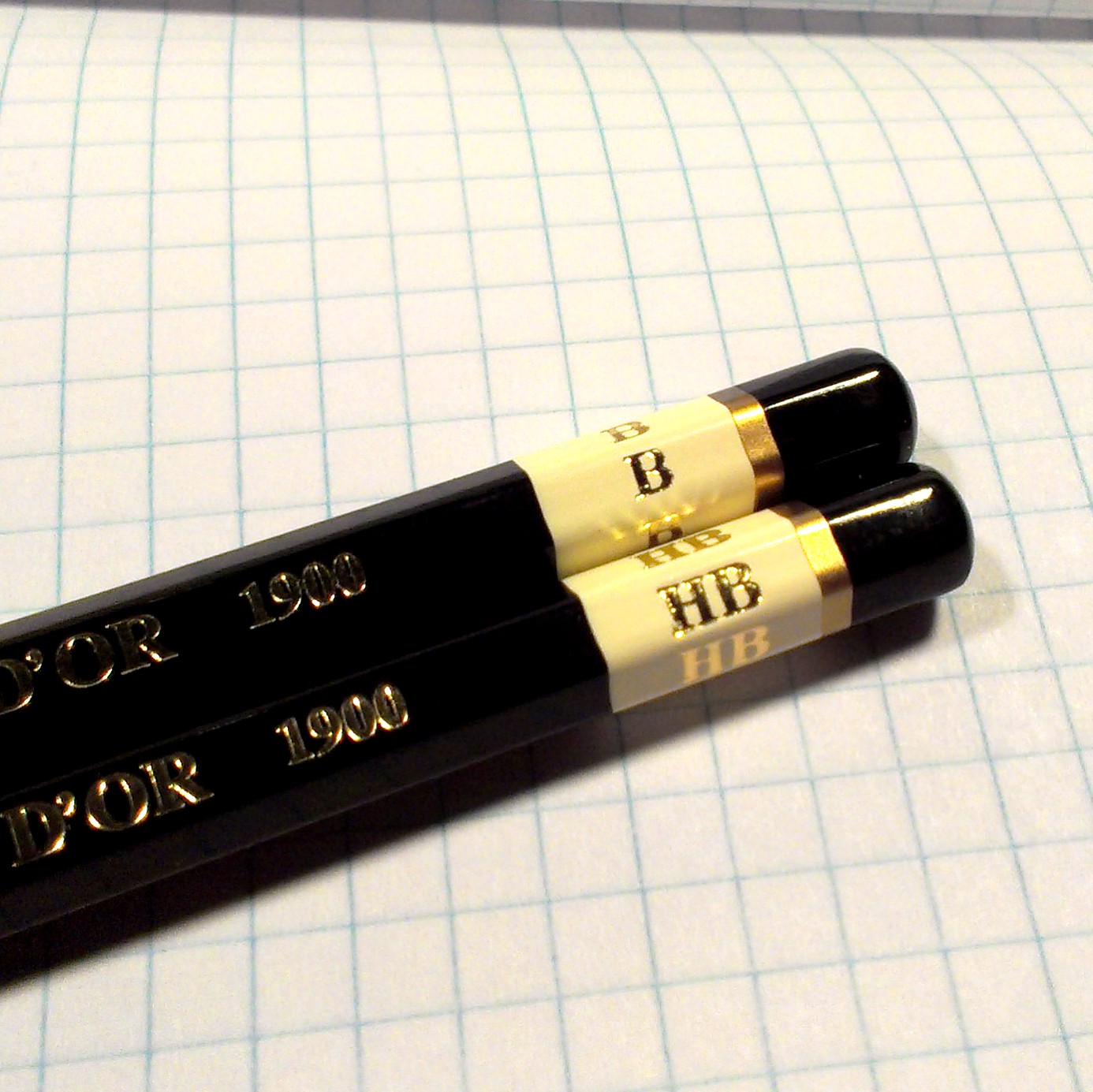
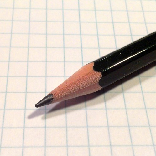
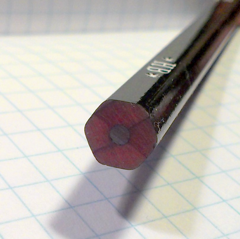
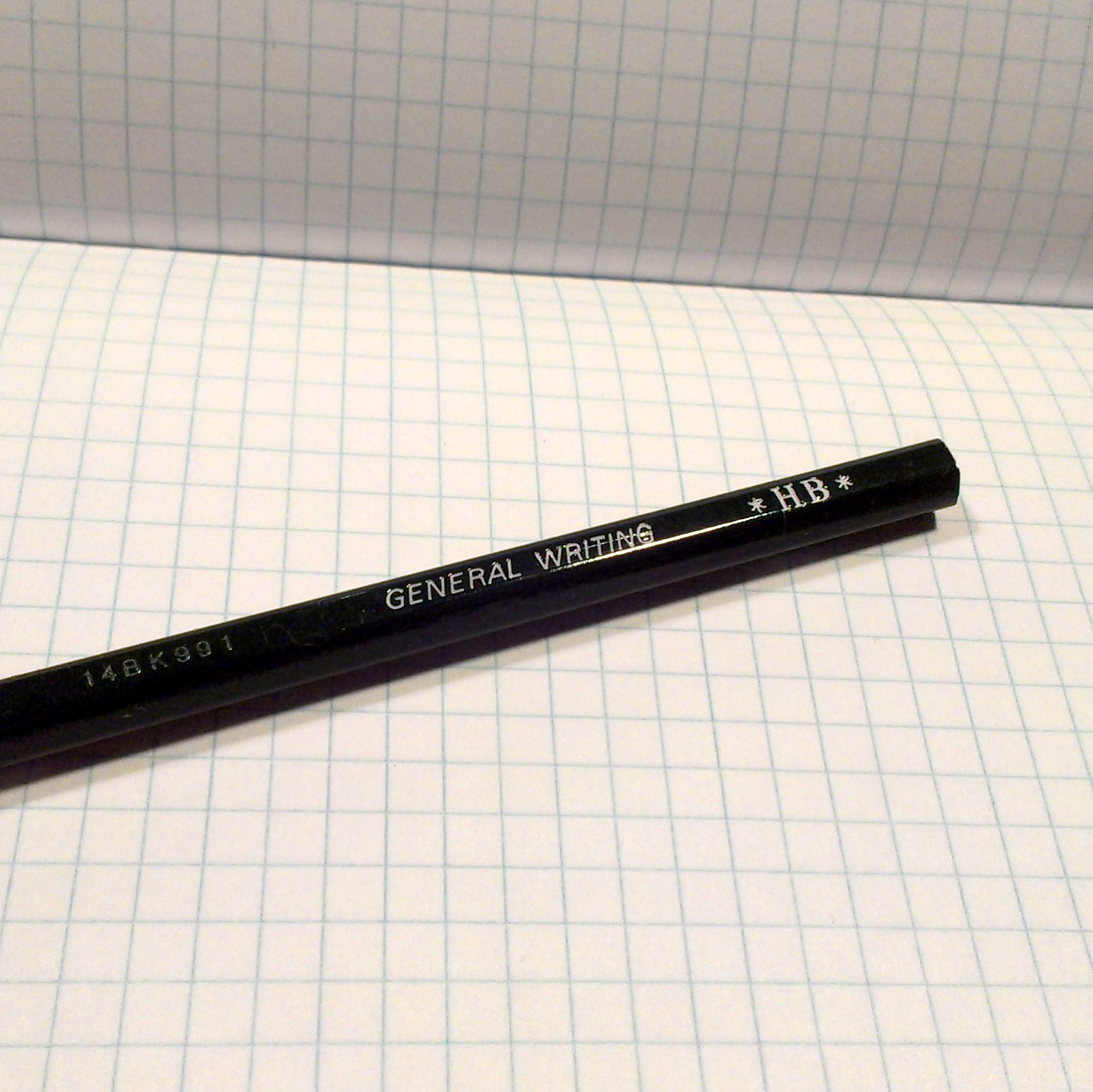
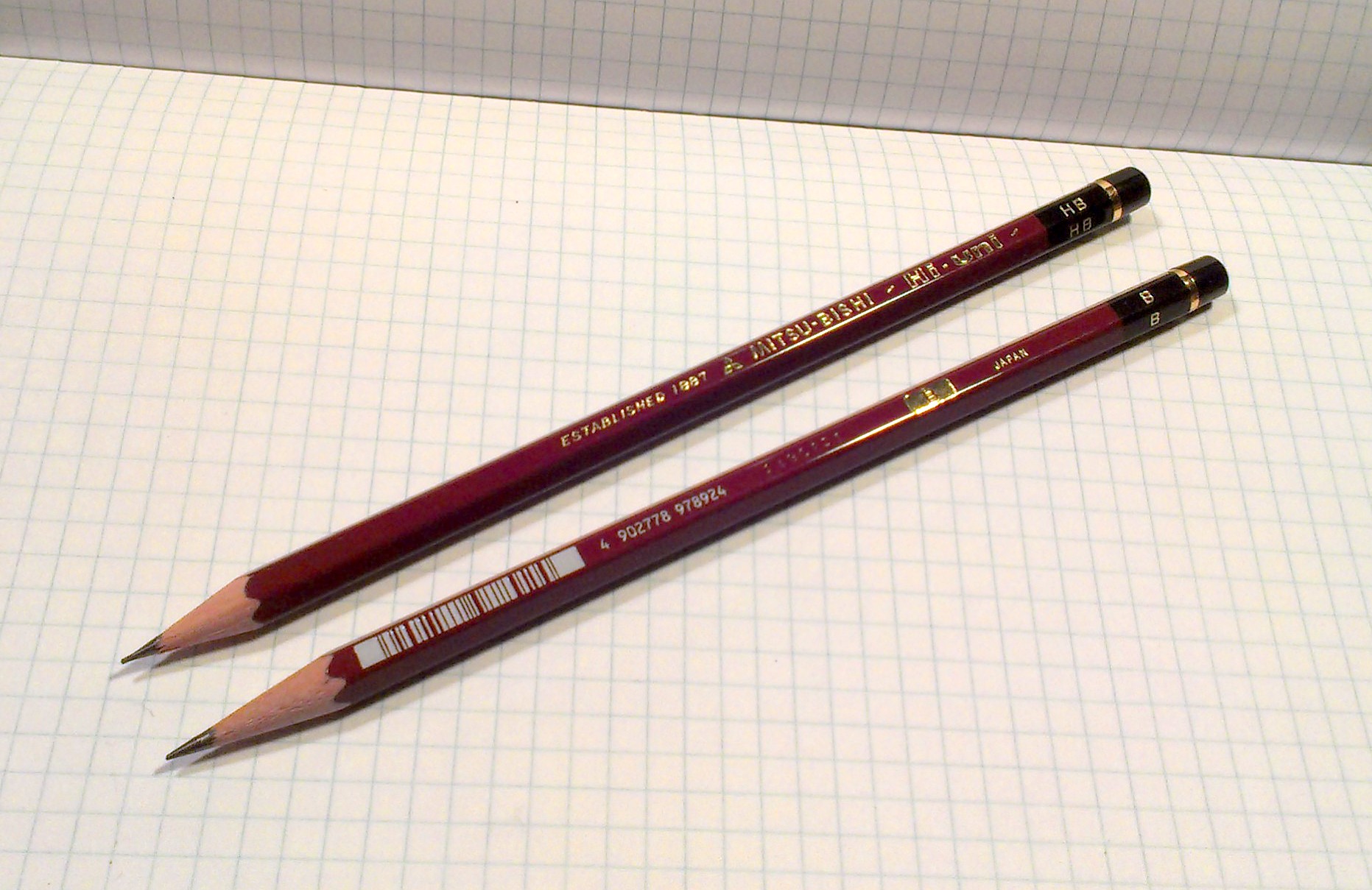
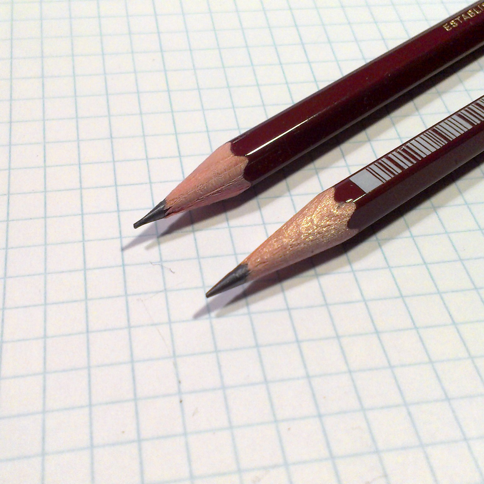
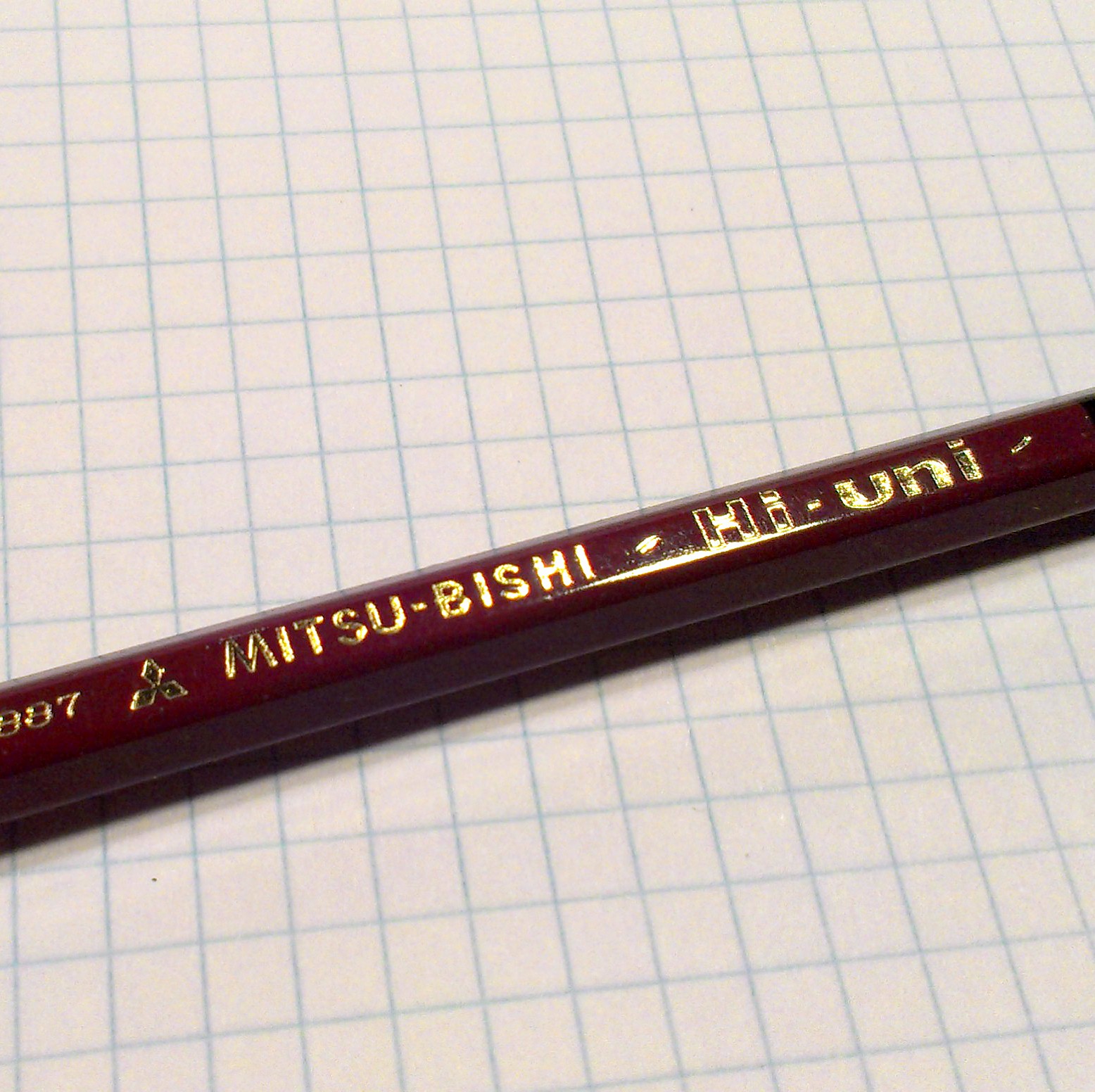
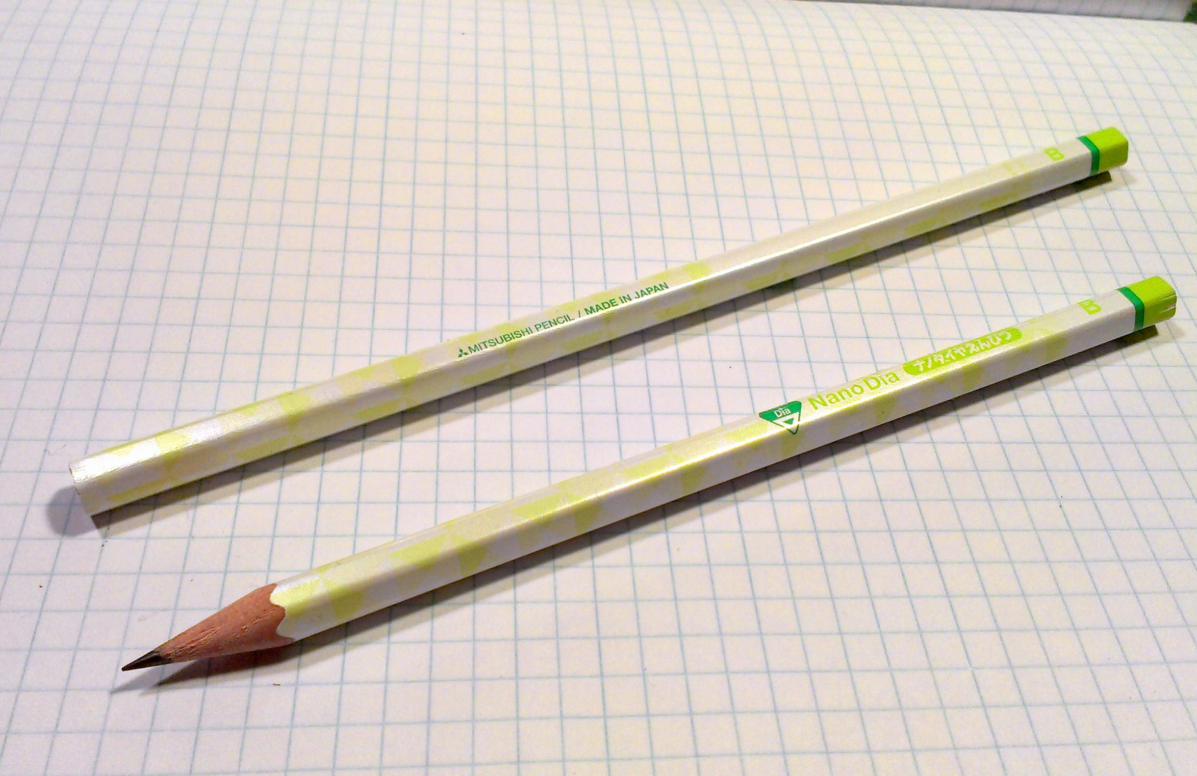
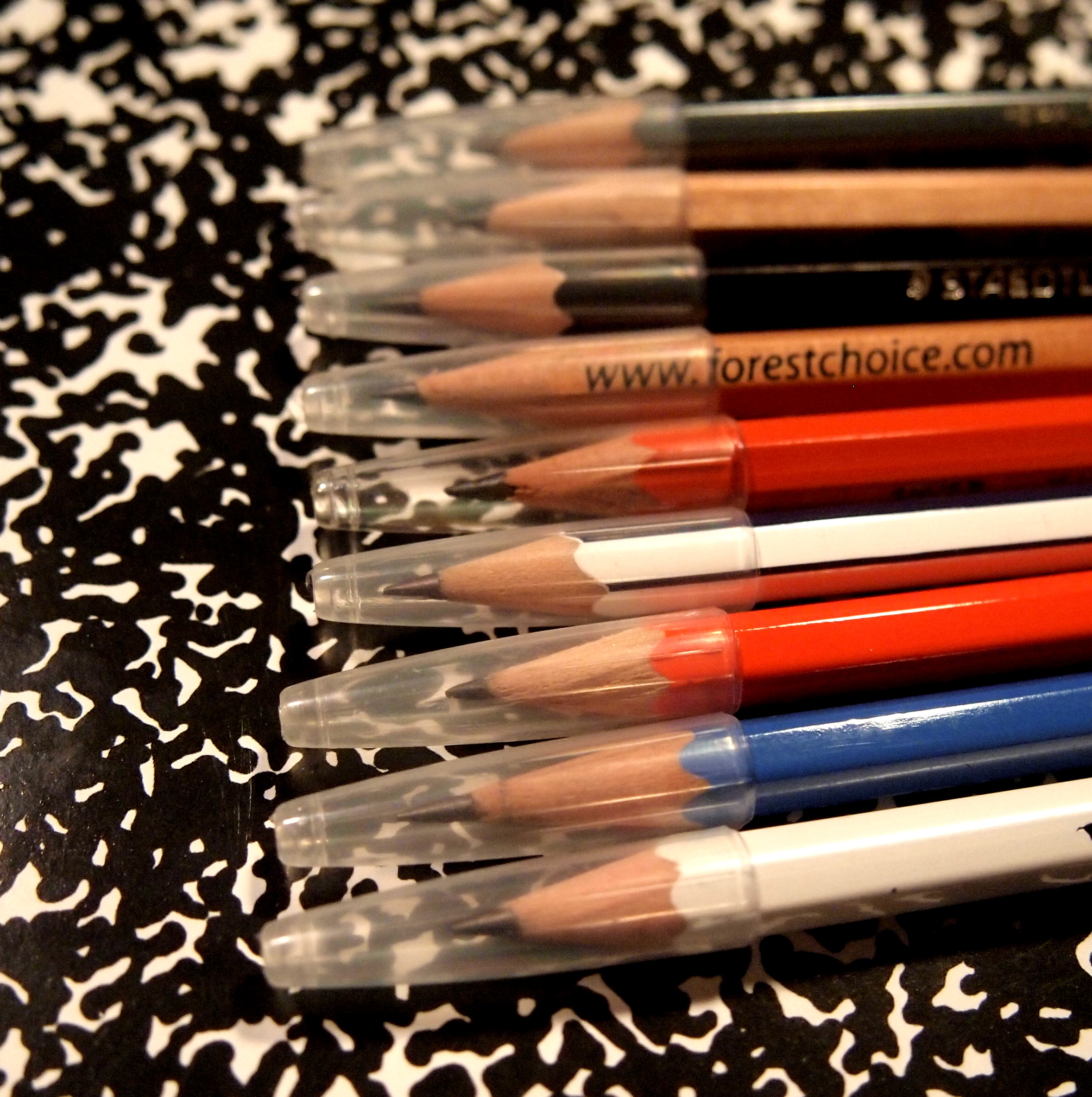
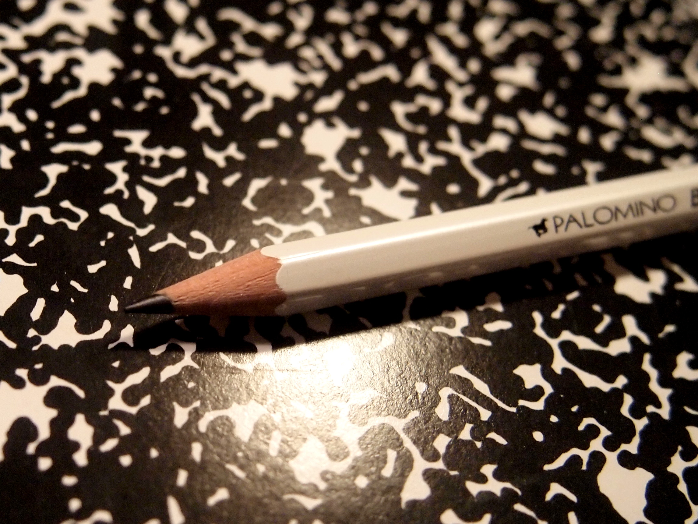
The Koh-I-Nor Toison D’ Or pencil is sharp looking with shiny black and cream lacquer and a gold imprint of the name and degree indication. I have a thing for black pencils, probably because they were hard to find when I was a kid. The gold foil imprint is sharp and well centered on the barrel of the pencil.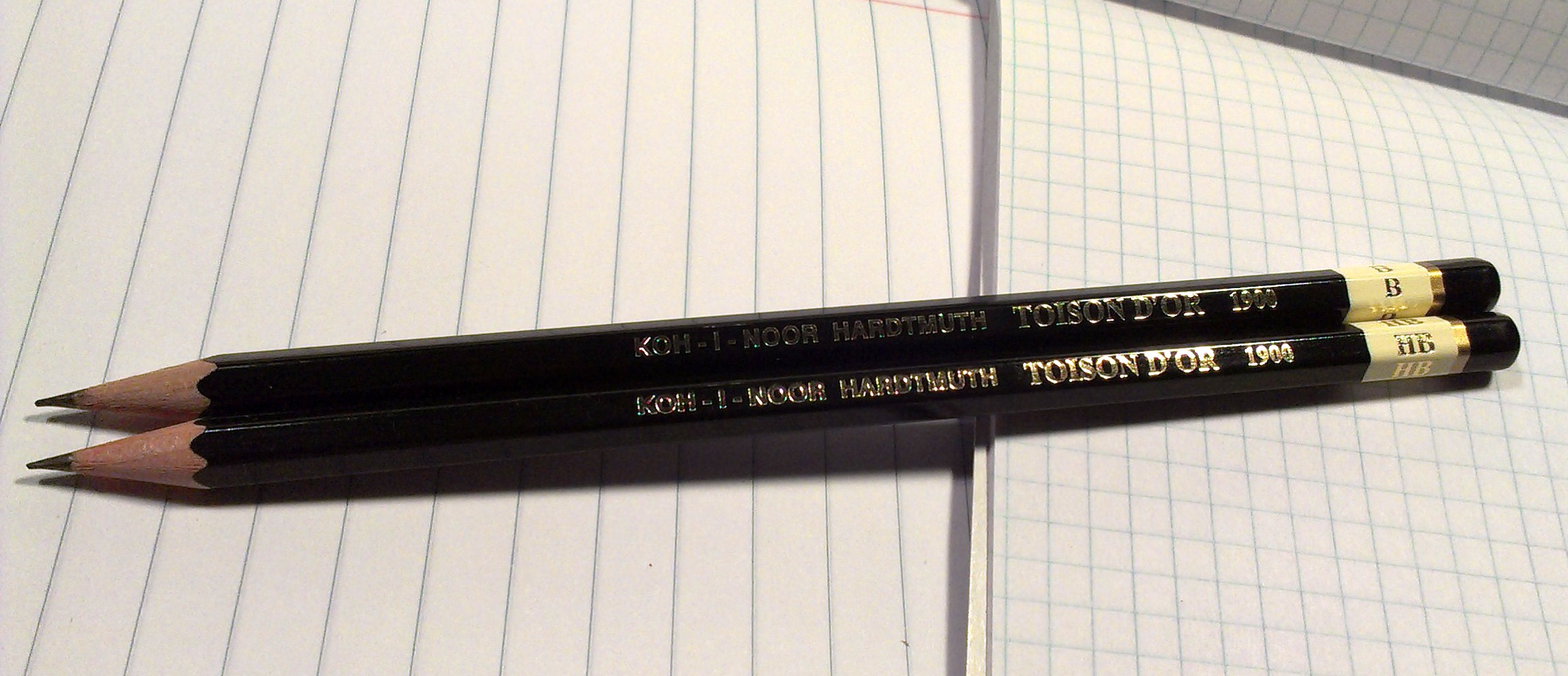
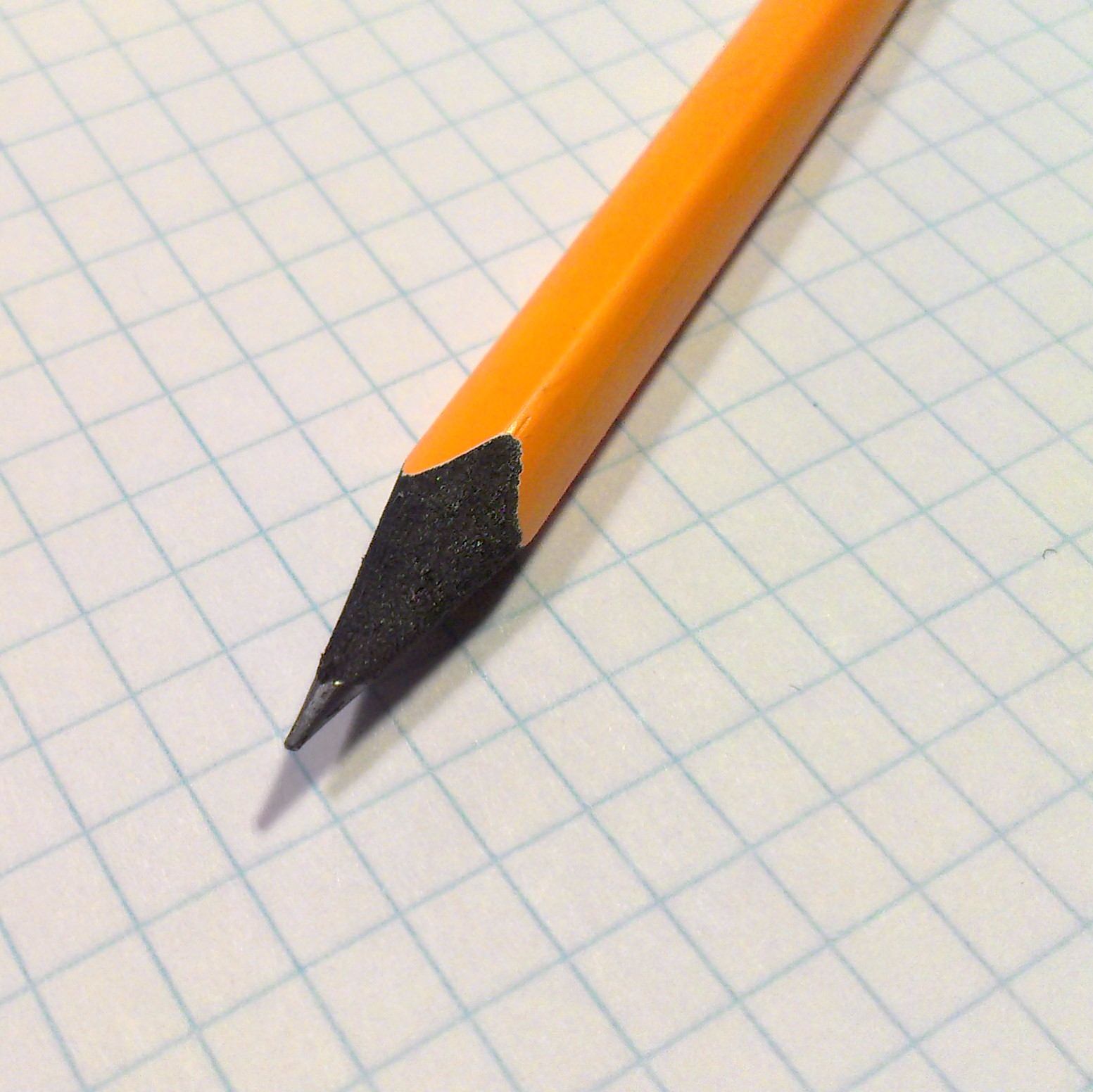
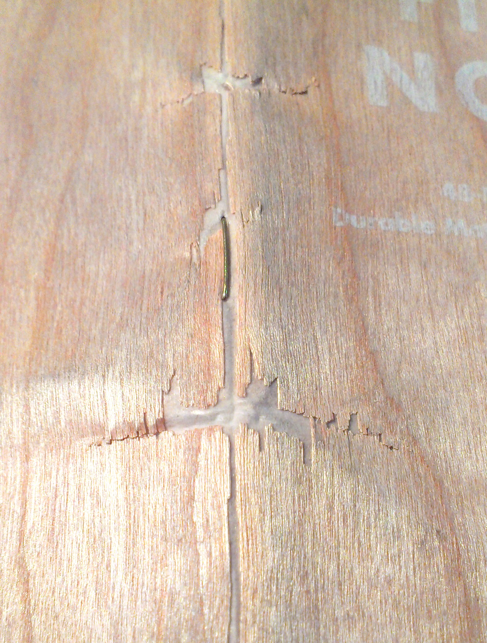
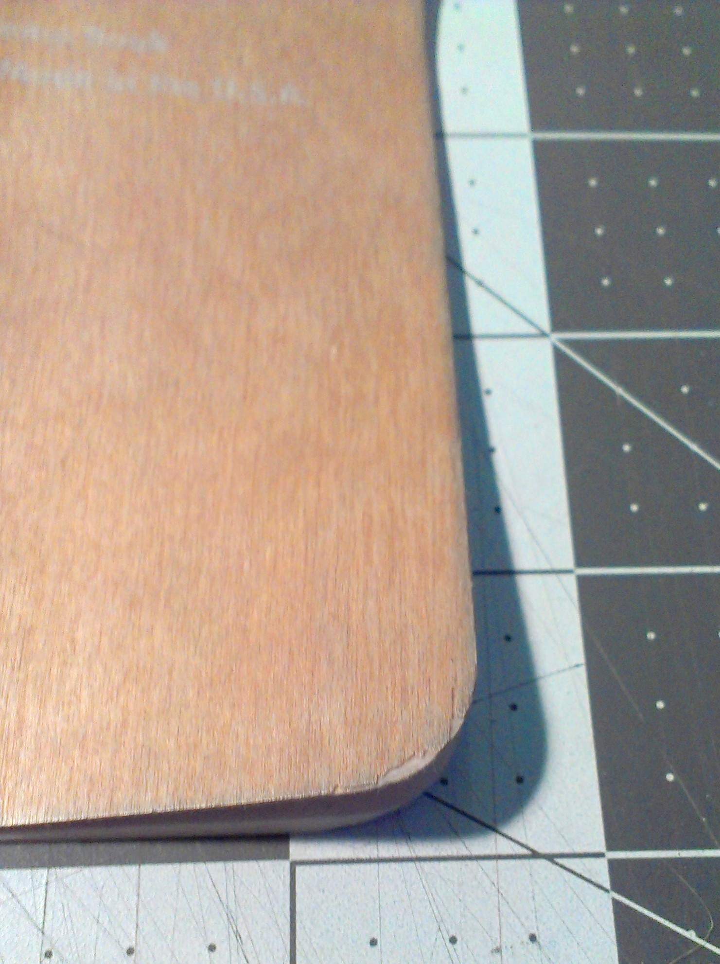
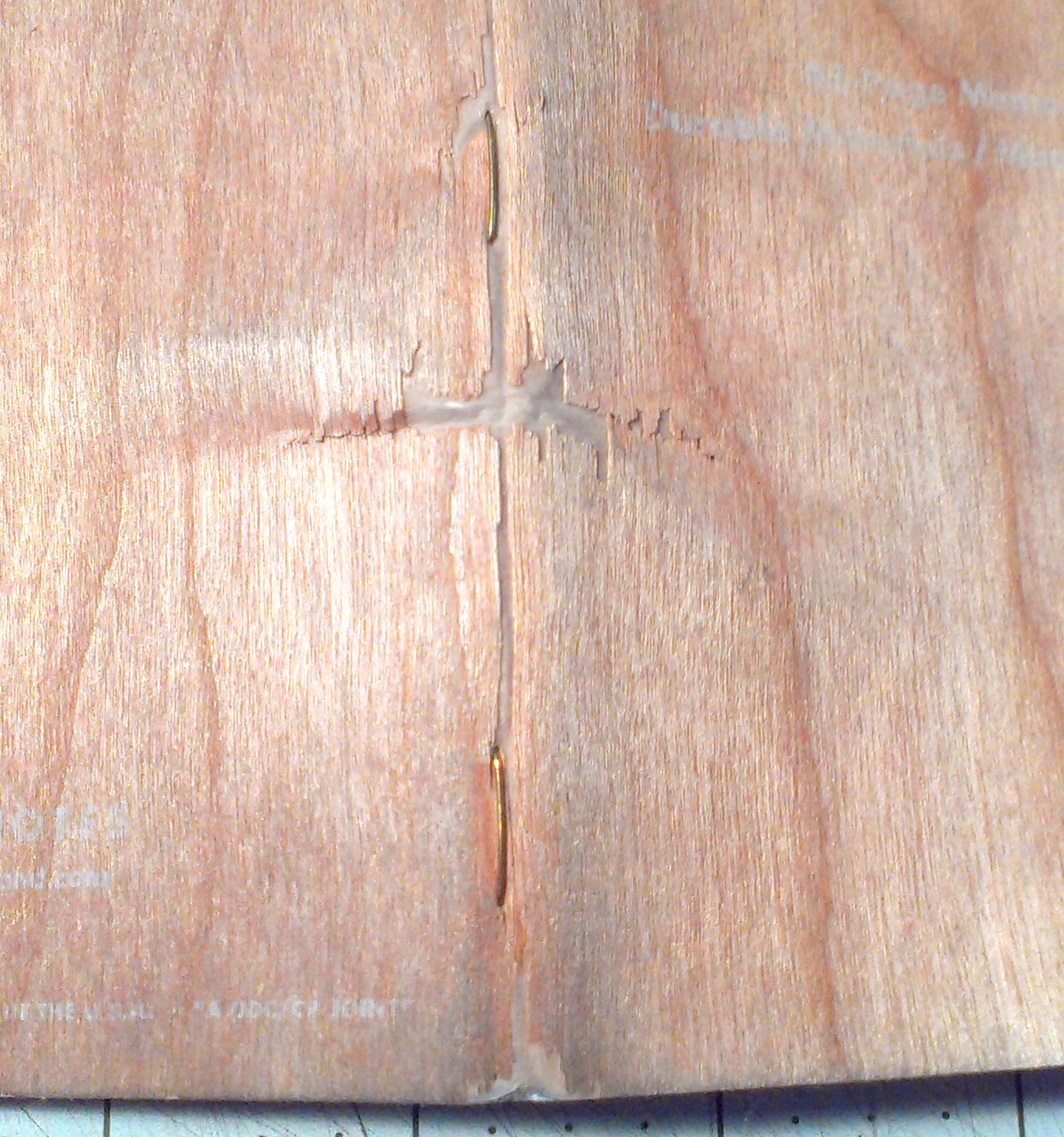
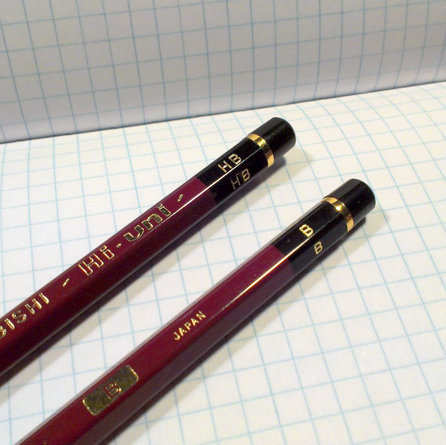
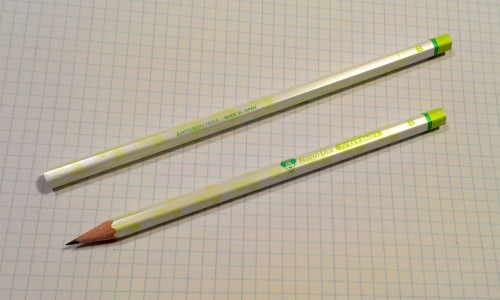
 I’m unsure of what kind of wood this pencil is made of, but it sharpens easily in my KUM ellipse sharpener. The core is narrow on the HB and B but it is appropriate for these grades. In use I found the “lead” to be a grade or two harder than other brand’s grade designations. I would grade the HB as an H or F in any other brand of pencils. The B would be an HB in other brands.
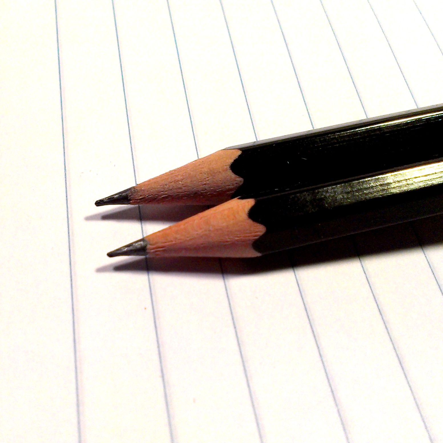
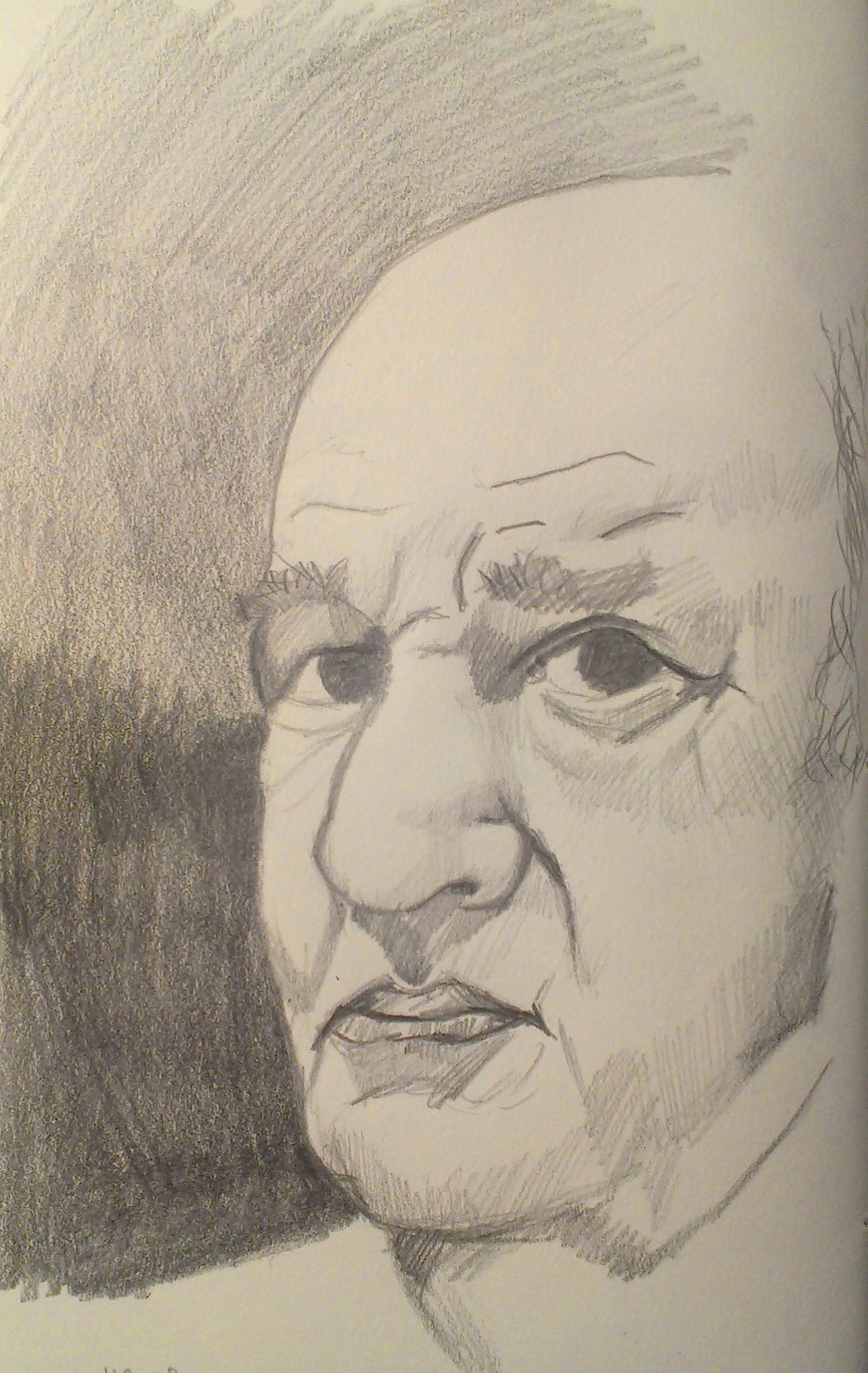
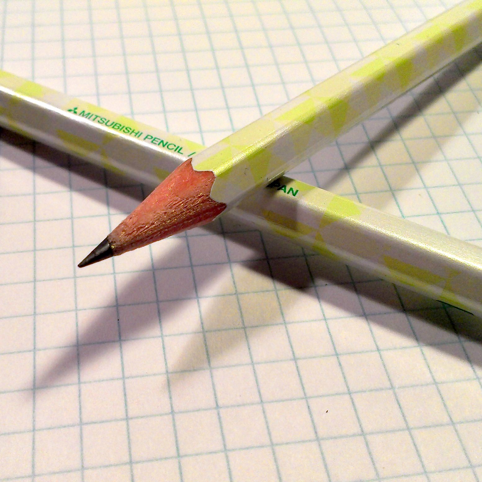
The HB pencil was very hard and scratchy. In fact, there was a piece of grit that didn’t write when I turned the pencils to that part of the point. Quite annoying. After sharpening the pencil there was less grit but it was still very light and smooth but occasionally gritty.
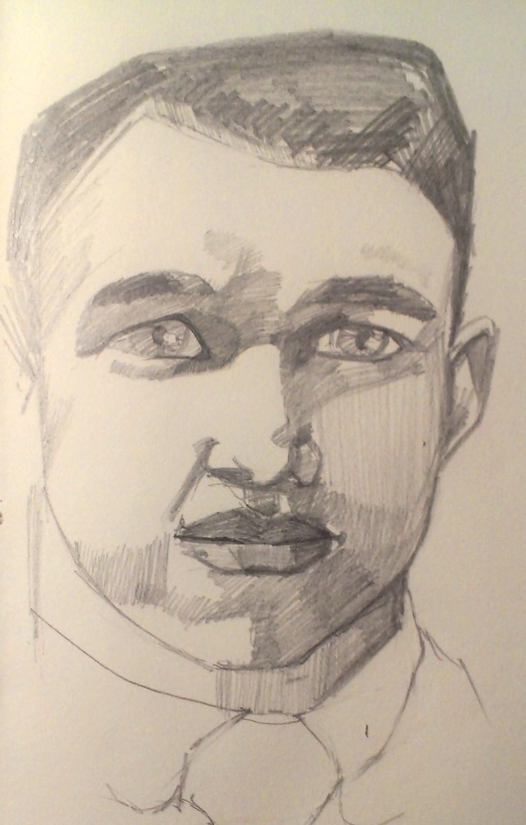
The B pencil was much smoother and the darkness and softness akin to an HB pencil. The core lacks the smoothness of say, a Palomino or even a Dixon Ticonderoga. If I were to use these pencils for writing, sketching or drawing I’d stick with this grade. This pencil was quite nice and even after repeated sharpening I didn’t hit any large pieces of grit like the HB pencil.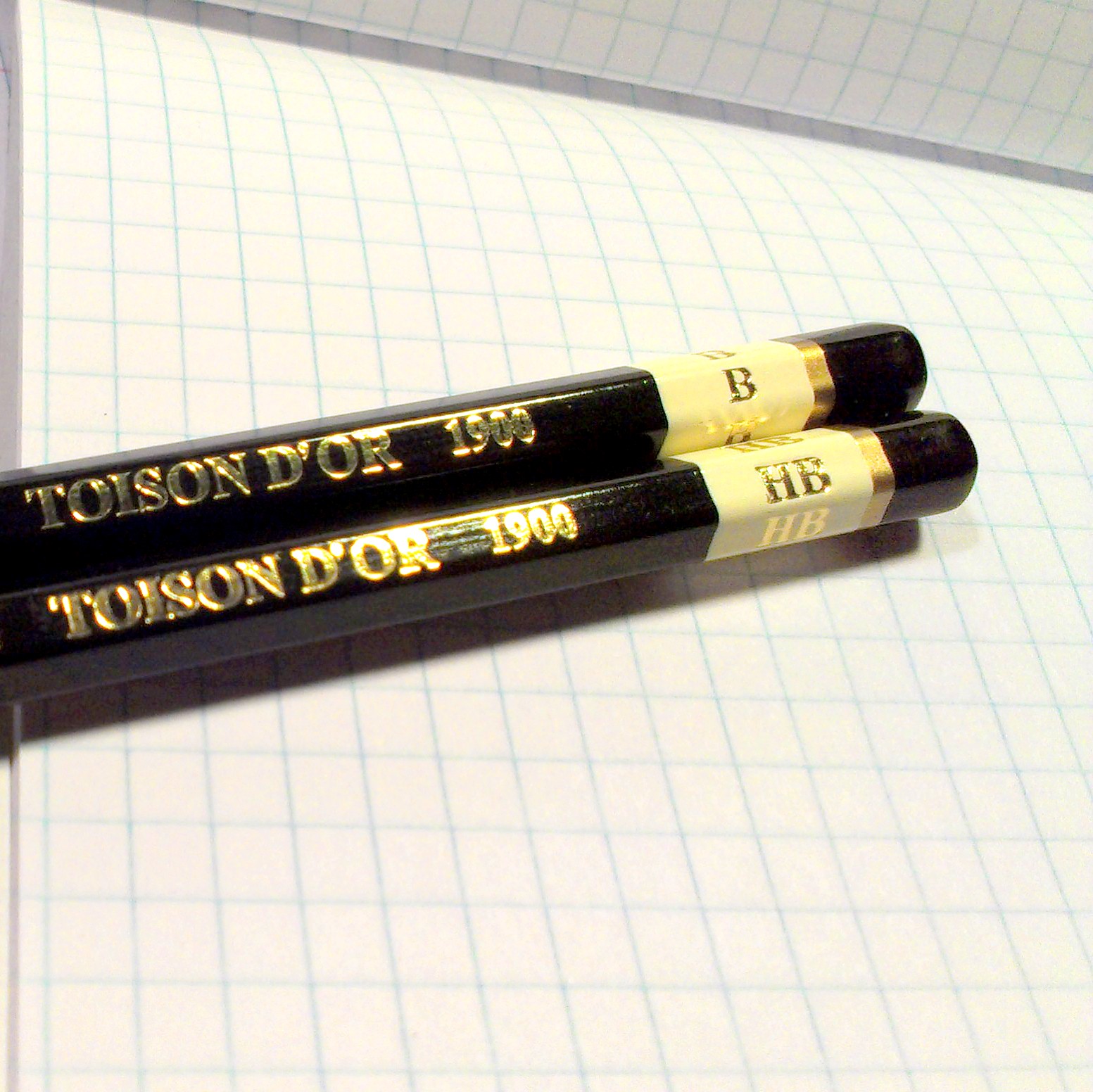 I found these to be a mixed bag in terms of niceness versus frustration. Large pieces of grit are something I don’t have a lot of tolerance for in my pencils. With a list price of $1.79/pencil I found the price to be a little high for the quality. For general sketching pencils I find the Staedtler Rally or Norica to be a better HB pencil at a much better price. Still lower in price the Palomino HB is a much better pencil. I know these are available all over the place as an art pencil and positioned as a value pencil. I can’t really recommend them as a good option for writing or sketching. Use them if you’ve got ’em but I wouldn’t suggest them as a new purchase.