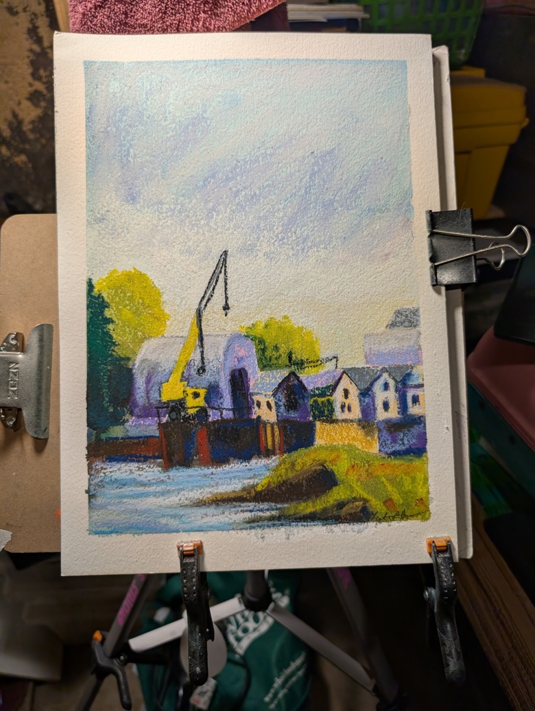
Walnut ink is a classic ink for many artists. We’re introduced to it in high school or college. It’s a deep warm brown color and available in liquid or crystalized form. It’s considered staining but not waterproof and is considered to be pretty lightfast. That is to say that the color is resistant to fading and color shifting when exposed to sunlight. It’s also an easy ink to make.
I want to acknowledge that walnuts are also a very traditional dye source and I gained a lot of info about making this ink from reading blogs and watching videos about making dye.
Also, the nuts have an odor. It’s not unpleasant but it is distinct. It’s vaguely medicinal, herbaceous, woody and nutty. It’s not unpleasant, to me, but it is strong. As I gathered my nuts I could smell it emanating from the bag. When I got home and opened up my pannier the smell hit me in my face. It was INTENSE. It was also intense when I was removing the husks.
Next thing to acknowledge- Black walnuts are probably the best bang for effort when making ink. My first batch used only 15 walnuts and produced about a cup of ink. That’s huge when compared to acorn caps. In terms of effort, it can be done with minimal effort as well. My second batch used about 40 walnuts and used cold soaking only and heat to reduce it and has produced even more ink. This does not adequately show how stained my fingers are from using the WRONG gloves.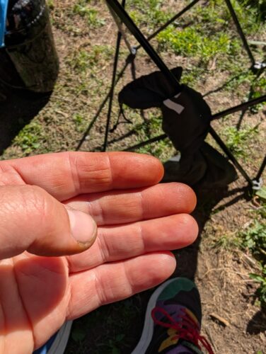
Let’s get into the process.
Materials needed:
- Rubber gloves
- Plastic bags
- Pot to cook in
- Something to stir with
- Essential oil with antifungal properties like clove or lavender
- Storage container
- Old clothes you don’t mind getting stained
Gather your nuts. Black walnuts are bright green when they drop to the ground and are about the size of a tennis ball. They are a native species of tree in much of the US. In my area they grow well and are prolific. There is some range in size but personally I’d skip the smaller nuts as the husks are hard to remove the husk. Gather them in a plastic bag. The husks start to release tannins and juices as soon as they are crushed and will stain everything and anything they touch. Crush them directly before dehusking.
Note: Probably 75% of my nuts had black walnut fly larvae in the husk. While a bit gross they do get caught in the strainer and are not in the ink or dye.
Remove the husks. Place your nuts on the ground* in a loosely tied plastic bag. Walk on them or figure out a way to give them a big of a crush. Put on rubber gloves. While wearing gloves remove the husks from the nut. While doing this break the husks up into smaller pieces. This aides in leeching off the tannins. I put my nuts into a large container with a lid and added water and then shook them to get any residual pulp off of them. I used this pulpy water as part of my water for steeping.
Steeping. Place husks into a pot and cover with water, then add in more water. I added about double the amount of water by volume as there are nuts. Example- For every cup of husks I added 2 cups of water. Bring this up to a boil. Reduce heat to a gentle simmer. Simmer for 15 minutes with a lid on. Let steep for at least an hour or overnight with a lid on. I let mine steep until it was cool enough for me to handle- about 2 hours.
Straining. Pour the liquid and sludge into a paint strainer bag, or several layers of cheese cloth or piece of old sheet. Squeeze out all liquid. Pour more water over the sludge to pull out all the good liquid. At this point I believe this liquid would get through a coffee filter. (I did NOT get a photo of this step as I was covered in juice and had on gloves.)
The steep and straining phase is where I think a lot of artists go wrong while making ink. In many of the blog posts and videos I reviewed, artists started the reduction process as part of the steeping process. The resulting thick liquid is harder to strain and clogs filters due to sugars and starches making the liquid very thick. In my testing I had really good results with straining before I reduced the liquid. So the steep and cook are suggested to do with a lid on. If you accidentally reduce the liquid down, add more water.
Yes, this increases the end cooking and reduction time but I think is worth it. My inks from this process has very few chunks and lumps.
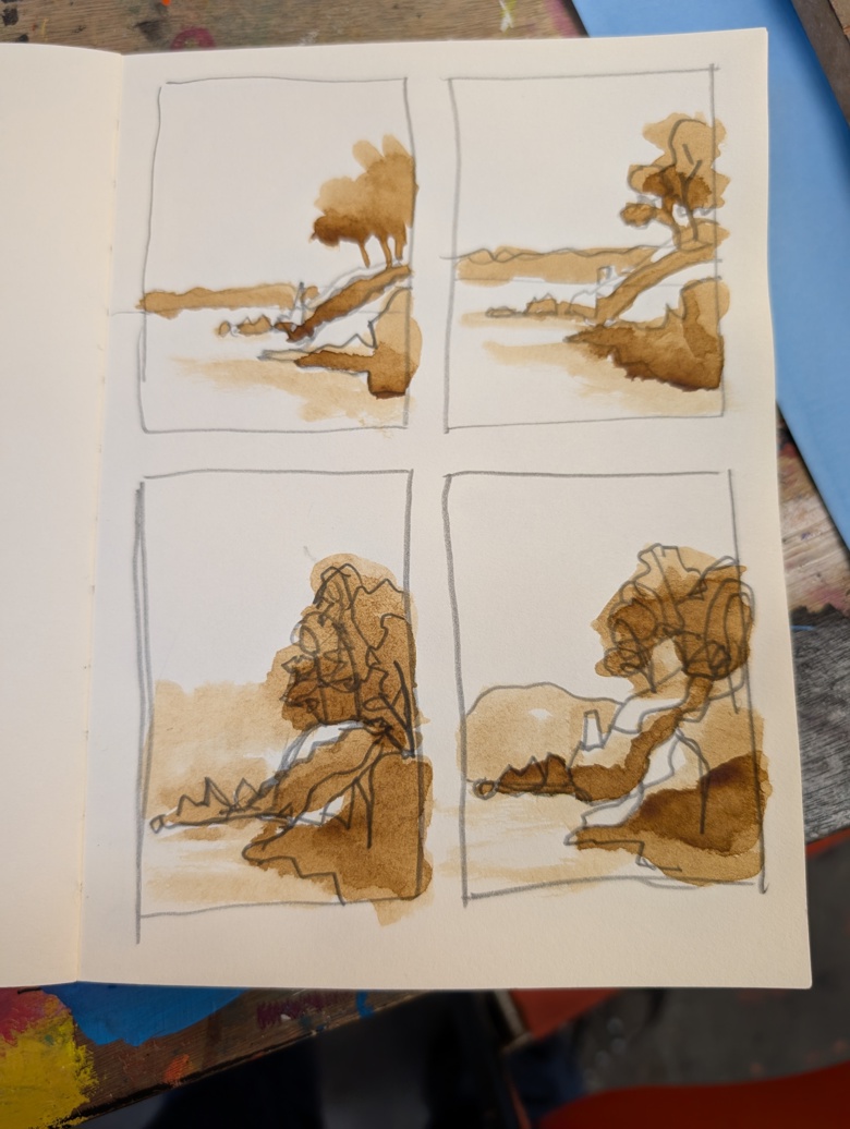
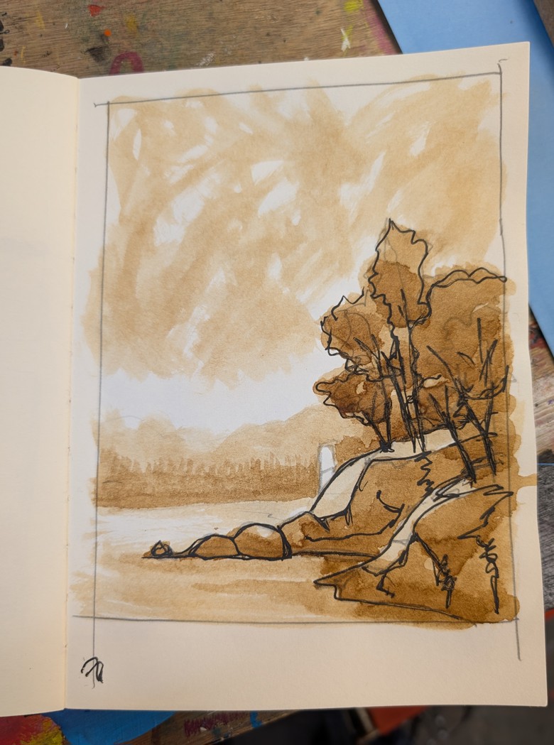
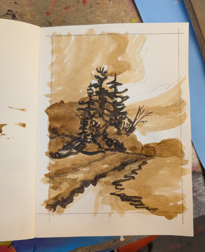
Reduction. Bring to a boil and reduce the heat to a gentle simmer. Let it simmer until it is reduced down by half and then start testing the color of the ink. I use a brush on paper rather than dipping strips of paper. The brush gives me a better idea of how the ink will look on paper when in a brush pen better than dipping. Test. cook. test. When the ink is reduce to about 1/3rd of the original volume watch it closely and keep adjusting the heat. Keep it at a gentle simmer! This is where things get tricky for me. I am always tempted to increase the heat or go do something else. The last 1/3rd is where things start to go faster. I test every few minutes. Test. Simmer. Test.
If you are sensitive to the odor of the walnuts when you are processing the husks, do this cooking stage outside. The medicinal odor decreases and gives way to something that is fruity, woody, and tea like. It is still very strong.
The consistency goes from watery to syrupy at this stage. The bubbles that form hold on longer and spatter when they burst. The foam is a deep rich brown almost black in color. The swatched color is deep and brown and lovely.
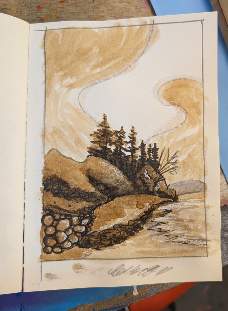
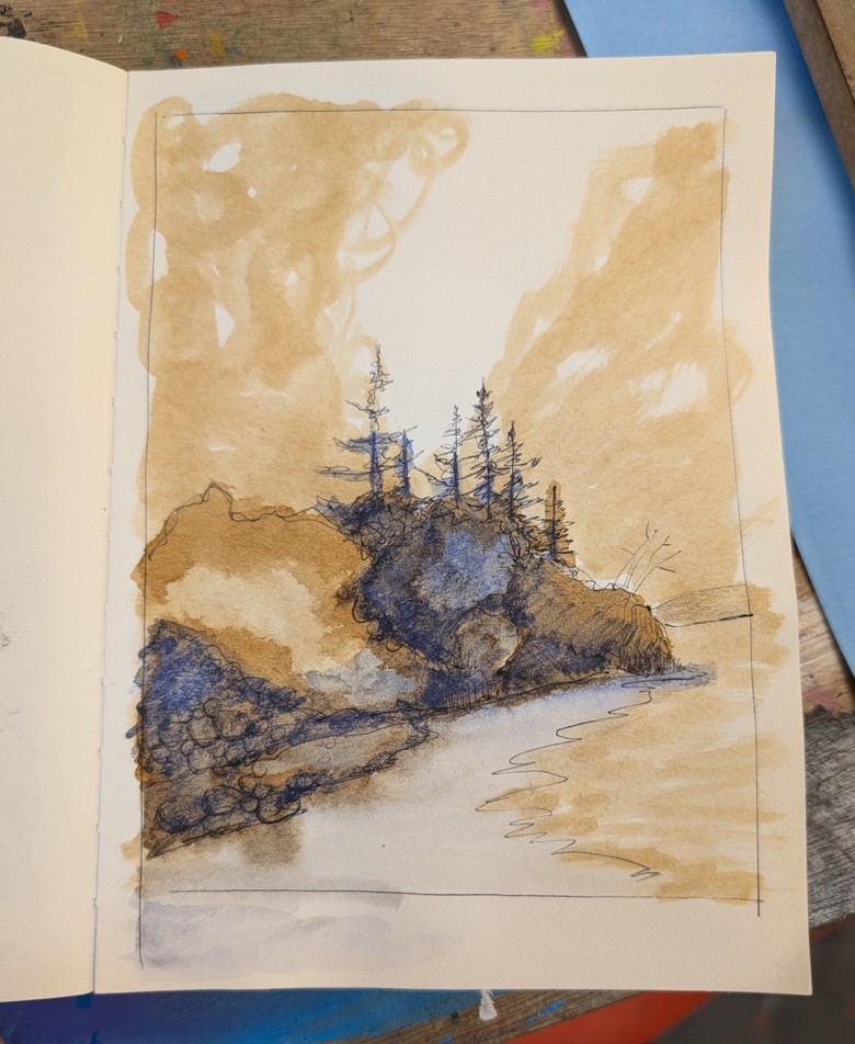
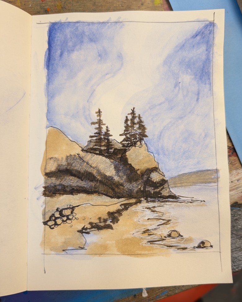
I let my ink reduce substantially, opting for something stronger that I can thin out with water if I want. The ink is dark and intense and I’m in love with it.
Additions. At this point you can add some alcohol which acts as an anti fungal but also changes the flow of the ink. Most recipes call for up to 10% alcohol. This will also impact how much ink is absorbed into paper or canvas as well as decreasing dry time.
Another addition is essential oil. I use lemongrass essential oil but clove or lavender or thyme is a good choice. These all have antifungal qualities that reduce the chances of mold. Mold will happen if you do not use an essential oil or alcohol as part of your recipe.
Finally is the addition of gum arabic. I believe that gum arabic is not totally necessary for this ink, I did use it in my recipe, but the walnut husks seem to have a fair amount of their own starches or pectin which do contribute to the thickness of the ink at the end. The starches could be crashed out of the solution with some bentonite clay, enzymes or other tool used in wine making for clarity. I decided to not attempt these but might in a future batch.
Some notes: I believe that a gentle simmer increases the quality of the ink and reduces the clumping that occurs at a high rolling boil https://smile-nw.co.uk. I strained my ink once- through a paint strainer. I did not need to strain it again. Not reducing the ink during the steep stage made my straining easier and more effective.
You can create an iron gall style ink by putting something rusty into the pot while cooking it down. The tannins react with the rust and create a black liquid and turns the rust into a hard black shell, very interesting. I did not do that with this ink yet. I really like the dark brown color. I have more nuts and easy access to them if I want to test out another batch with some rusty things.
Fermentation. I have noticed that a lot of the fiber artists who make walnut and other dyes have a long steep stage where the husks and nuts sit in the water for up to a month. I am pretty confident that this causes some fermentation to occur and reduces the amount of sugars in the resulting dye/ink. I may attempt a fermentation stage with another batch. While I don’t mind the sheen that sugars and starches give to my drawings I would like to see if I can reduce that. Sugars also increase the ability to rewet the ink when drawing, making layers and layer ink more difficult. The ink with a lot of sugars acts more like a liquid watercolor rather than ink.
*The amount of nut jokes i have made in my head while writing this up is not small.