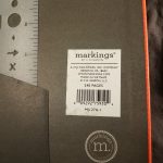
Y’all know I love an inexpensive notebook, and the Markings Bulleting Log Notebook fit’s the bill. This one qualifies because it was in the clearance bin which brought it down to well below $10. It’s usual price is around $15.
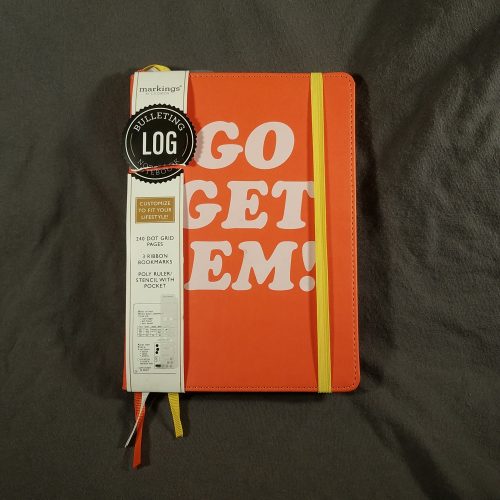
Markings Bulleting Log Notebooks with an orange cover
Imagine my surprise when I was in Walgreens* to get my kombucha** and I saw they were carrying the formerly Staples exclusive brand Markings by C.R. Gibson. If you don’t make a run through the stationery section of the drug store are you even a stationery fan? 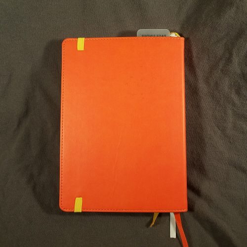
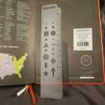
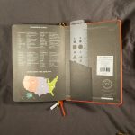
Anyway, Walgreens has been carrying the Markings journals for a while now. The prices are on par with other journals in the mass market range- anywhere from $10 to $20, but hovering right around $15 for most of the offerings. The Markings journals have a range of features- from dot grid pages to multiple ribbon place markers, to plastic rulers, to calendars across the top.
My first interaction with Markings journals was that the covers were sturdy black or dark brown vinyl with stitching around the edges. Classy and ready for the boardroom. The covers in Walgreens range from plain vinyl to mine- bright orange with a printed slogan, mine says, “Go get ’em!” Luckily I have a bunch of stickers to slap over that. It still has that classic edge stitching. The cover is sturdy with a hint of flex. It works well enough for writing in hand and opens flat for writing on a desk.
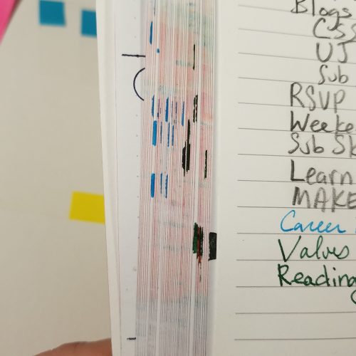
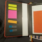
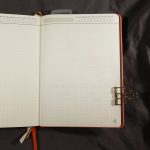
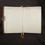
Mine sports 3 differently colored ribbon place markers, that were well heat sealed upon purchase but I hit them with a lighter to get the seal stronger. At the back there is a pocket and an elastic to hold the whole thing shut.
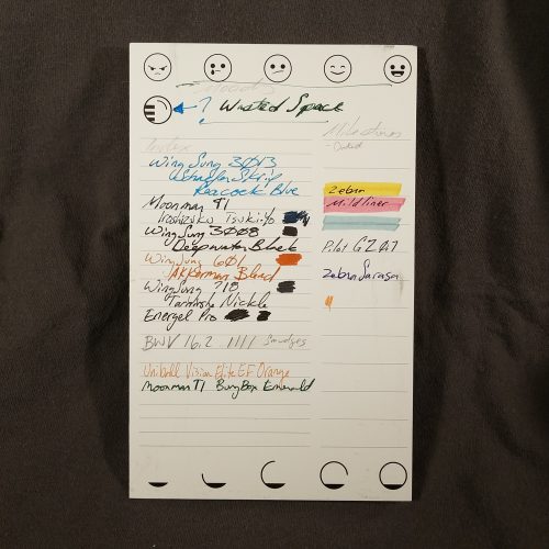
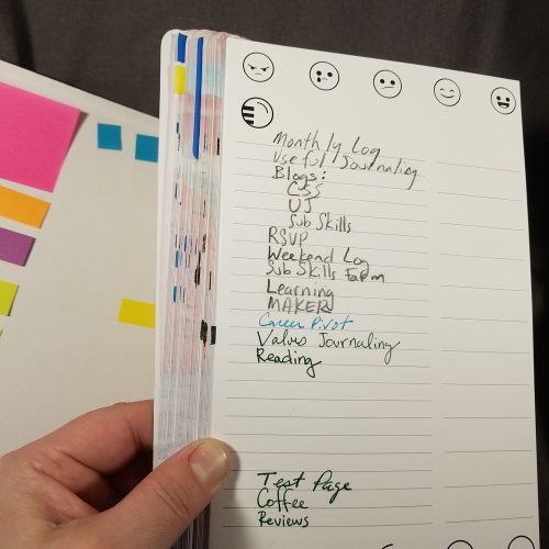
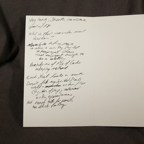
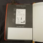
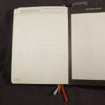
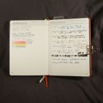
Inside are off white creamy colored pages with pale grey printing. You know how I love grey ruling, well this one isn’t super pale but stands out a bit. Better for low-level light writing than a few of my old journals.
Across the top is a large area to write in a topic label and a date bar. You circle the proper month, then the day. It’s not a bad system and one I’ve seen a few rubber stamps for on etsy. At the very bottom corner of the page is a grey circle, for numbering your pages.
I have to admit that in all the years I saw Markings at Staples I never purchased one. The paper always felt okay, but back when they would have appealed to me, I was firmly entrenched in Moleskine sketchbooks, with their thicker paper for my journaling. The Markings seemed too… parental and stuffy to me. Not this one, with it’s bright orange cover and cheesetastic slogan.
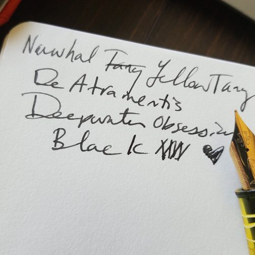
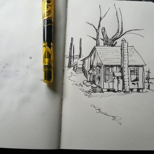
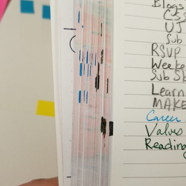
So how is the paper? Good. It’s smooth with a bit of tooth. Pencil is great on this paper and looks good on it’s warm creamy surface. Gel ink sings across the page. Highlighters don’t soak through, even with multiple passes across the same area! And fountain pen? Well, fountain pens perform really well. The page isn’t thin, but you can see darker colors in wide nibs through the page, but it doesn’t interfere with use of the reverse of the page. At 240 pages this is a chonky journal.
Overall, I’m pleasantly surprised by the Markings Bulleting Log Notebook. If you are running out of pages in your current journal and happen upon Markings by C.R. Gibson for a good price, it’s worth the cash, this is a great Every Thing Every Where Journal.
Continue reading →