Category Archives: Review

Review: Staedtler Metallic Norica HB Pencil

Staples had these up with a limited time exclusive sign. I’m not sure if that means that these pencils will only be available at only Staples for a limited period of time or if it means they’ll be available like some of the other exclusives I’ve seen from Ticonderoga where they are available at Target for a limited time period then everywhere later. I’m thinking of the Ticonderoga Stripes in particular, which were sitting next to these on the shelf. I didn’t buy these because they were an exclusive Staples item, rather because they had really pretty shades of metallic paint.

The 10-pack costs $2.99, which is pretty pricey in the land of Norica pencils. At 30 cents each these are among the most expensive Noricas available.

The package is a nice blister pack, though I do wish they were in a simple cardboard box, with a window instead. At least this is a good rigid package. Upon opening the package I found that some of the packaging printing had adhered to the paint of the pencils. I was able to scrape the stuff off with my fingernail and the paint underneath looked great. The lacquer is thinly applied but nicely metallic and glossy. The rough areas of wood are fully visible. The imprint is silver and well done. The ferrule is a simple silver job and on a few pencils had pushed up the paint around its base. Not too awful, but not overly pretty either. The white plastic eraser is nice and works really well.

Inside all that is linden/basswood wrapped around a smooth core. The pencil is very lightweight. I added a silicone gel grip to decrease my urges to death grip the thing. It is not as dark as the previous version but for a 30 cent pencil it is smooth and holds a point well, even on rougher papers.

I’m glad I bought a pack of them and they’ll likely get used, I’m a real sucker for metallics. These would make a great gift for a kid or adult interested in pencils.

These pencils were purchased with  Ko-Fi support!

Review: Pentel EnerGel Pro 0.7

I like Pentel EnerGel pens. We’ve got a box of the needle tip 0.5 at work and quite a few of them find their way into my desk after a trip to the supply cabinet.* I should do a full review of those too, since I’ve never done it

This is a good bold pen. That is my one quibble with this pen. Where UniBall and Zebra 0.7 tips lean a bit fine, Pentel has determined that their 0.7 tip shall actually be a 0.7 tip. Had I noticed the pack I picked up was 0.7 I’d have swapped it out for a 0.5. The line is fat and rich. The black is DEEPLY black and on the warm side. 

The ink is great.

The body of the pen is okay. It is all plastic with a shaped rubber grip and a chromed plastic tip and knock. The clip is metal. All logos are in silver printing. The pen feels okay. It feels about as substantial as a Pilot G2 or Zebra Sarasa but not quite as put together as the UniBall 207/307. I’m sure that doesn’t make a whole lot of sense to anyone who puts the 207/307 above all other gel pens, but it does to me.

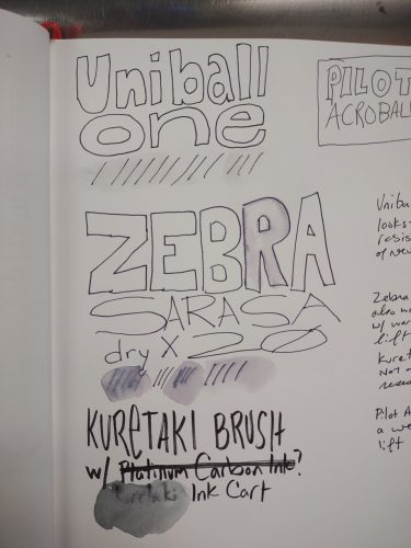
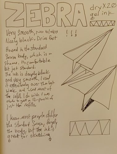
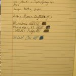
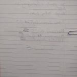
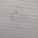
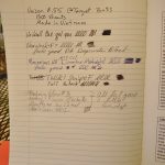
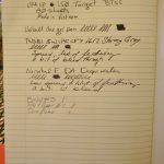
This is a doodler and sketcher’s dream pen. The ink bonds to the page and doesn’t lift or move once dry. That is the kicker, it takes between 10 to 15 seconds to dry on good paper (less on absorbent pages) and a good swipe of the heel of your palm over it and it makes a mess. I tested it with a few drops of coffee on an index card and even the hot coffee didn’t lift the ink. I’ve yet to test it with water colors but if coffee won’t lift it, I doubt most watercolors would. I will say if you use any pencil lines on smooth glossy paper that you’ll need to clean up after a drawing is rendered, be prepared to reink some lines. I found that EVERY eraser grayed the ink out immensely. You might be able to see that in some of these images. I’m not sure how well my camera picked up on this.

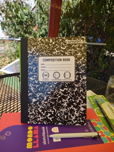
During a couple of meetings I doodled a composition book pattern onto a nice sheet of cardstock. I did notice a few things. First this was Neenah cardstock with a SMOOTH finish the pen felt great on it but on areas where I scribbled a couple of times the ink would lift itself or skip. I also noticed on areas where I’d used my fingers to fold the page, the ink would skip over my fingerprints. That said, areas where I scribbled, allowed the ink to dry, and then scribbled again, accepted more ink without skipping or hollow lines. I didn’t notice any blobs as I drained this pen dry.

One of the truly great things about this pen is that you can buy refills. They are listed as LRP7 and are $1.65 on Jetpens as of this writing. You can get 12 Energel Pro refills on the ‘Zon for about $13. As far as sketching and doodling pens, these are in my top 5 list for sure. IN terms of smoothness they are up there with the Sharpie SGel and waterproofness with the Unibal Signo. I might’ve ordered a 12-pack of refills right after writing this.

Continue reading

Review: Musgrave Harvest Professional 320 No. 2

Musgrave has two versions of the Harvest pencil, the standard and the Professional. The numbering is the same- they are both labeled the 320. The standard is available in numbers 1 and 2, while the Professional is only available in number 2. They both feature a sharp hex, golden yellow paint, and a gold foil imprint. Both have an eraser that works significantly better than the erasers of Musgrave past. So what is the difference?

Let’s start with packaging. The Professional arrives in a nice sliding box in brown, yellow and gold, that I love. It has a simplicity of design that hearkens to eras past while also capturing the feeling of a farm harvest. Musgrave has upped their packaging game on some of their pencils, and the Professional wins out. The standard arrives in that plastic bag. Again I really wish Musgrave would use a paper envelope instead of plastic.

The imprint is slightly different between the two pencils, both have gold printing, but the Professional is a little bolder and beefier. The standard is cased in what I think is basswood or linden while the Professional is cased in cedar. Both woods sharpen with ease in a crank or by hand. The standard has a gold ferrule with a burgundy band while the Professional is distinguished with a plain golden ferrule with some texture to the center of the band.
The cores are also drastically different. The standard features what I’d call a very nice but typical HB while the Professional features a darker smoother graphite though it is also labeled HB. Despite the graphite in the Professional being a tad bit softer it’s still got point retention to spare. I found myself writing several pages in my composition notebooks before reaching for a fresh pencil. Often I only get a page out of my favorite dark smooth pencils.

While the standard Harvest is an okay pencil, the Harvest Professional has won over my heart and it is a true writer’s pencil. The yellow paint is standard yellow but it’s a nice shade of yellow and not overly glossy and the gold imprint is done well. While I don’t love the sharp hex I find I don’t notice it as much as I used to. The creamy smooth graphite combined with terrific point retention is killer in the Professional. At $9 a box for the Professional, it’s a bit of a price increase over the standard’s $6, but it arrives in better packaging and is overall a significantly better pencil. Get yours here at Musgrave here.

Continue reading

Review: Baronfig LE Squire Liberty

Dade and I discussed this pen on the last episode of RSVP. We both questioned why it is made of brass and not copper like Lady Liberty herself. While I think a true tribute to Lady Liberty would be copper, this pen is not just about Lady Liberty but the entire concept of Liberty. We also discussed that some people missed that Baronfig is making a donation to Vote.org to help increase voter awareness in this voting cycle and for future votes. I see that as a positive.

Included is a small booklet highlighting important historical moments related to liberty throughout US history. The color scheme is simply black, white, and gold. It pops. Another insert is the Declaration of Liberty, a little piece of paper with a declaration of liberty for the owner of the pen to sign and date. On the back of the box it notes that this pen is made in the USA.
Let me get out of the way, I like Squires y’all know this. I’ve been killing it with an Adrift for months now, and before that used many LE over the course of years.* I love the twist mechanisms and the way they feel in hand. They are great for fidgeting. They are great for writing. They are simply great.

I am a quietly patriotic person, oftentimes the US has made me feel insignificant and less important, and occasionally less human, than others. My rights haven’t been respected. It took years of legal battles for me to get the same rights as others, and still, those rights are threatened. So when I saw a patriotic pen. I waited to say yes to the review. Perhaps this is the least patriotic I’ve felt, but also this is the most important that I’ve felt that the use of my tool of patriotism and liberty, my vote, is important.

I adore the change in packaging. It looks like this is more than the usual Squire LE. The packaging stands out, it doesn’t match the lightness and fun of the previous Squires. No, the Liberty is dead serious. As such opening the package and pulling that pen out of it’s box felt weighty, and perhaps that is why a brass version is better than a copper or patina green anodized pen body, because this pen is weighty. It seems a bit dramatic to say that such a weighty issue deserves a weighty pen, but it does. I really like that the lettering and images are on 2 sides of the pen.

Typically I have dry hands, and generally brass doesn’t make them smell, but WOW does my hand smell like brass today. If you have moist hands you may or may not notice that your pen will patina quickly. I’ll be using mine for a few weeks at least. (You’ll definitely see it in a few more reviews. Hint hint)

This is a terrific pen. You have to like brass and some weight to use this pen. If you like a lightweight pen this might not be the best choice for you. It is well weighted for my hands- I like a pen that is ever so slightly weighted to the front, and this pen seems to fulfill this requirement. This is an investment pen, it clocks in at $80. But again, if you’ve been a reader of this blog for any period of time, you know how I feel about investing in a reusable, refillable pen, do it. 

Continue reading

How Much of a Pencil Point Do We Use?

Subtitled: How much does collaring impact the writing experience?

Throughout this post I use the term “collared” from the David Rees book How to Sharpen a Pencil. While I find the book… silly, it is the easiest way to describe this effect and likely language than many people into pencils will understand.*

About a month ago I picked up a package of Tennessee Red pencils, quite a while after reading some folx harping on the off centered cores, and after I read a couple of the reviews on the Musgrave website I really wondered how much does the off center core impact the writing experience? Certainly we can all agree that aesthetically an off center core is unattractive, but does it really impact writing?

I’ve ordered and used many pencils from Hindustan from Marbled to Metallic to Trikones and they have some of the worst centering of any pencils I’ve ever laid eyes on. But truthfully, I cannot point to a time when a minorly off center core impacted my writing. Even some largely off center cores haven’t impacted my use of a pencil. The only time I’ve had a core impact my writing was a particularly egregious Dixon No.2 where the core was roughly 1mm from one side of the pencil.

My hypothesis is that minorly off center cores will not impact the writing experience. That only grotesquely offset cores will impact writing. That collaring while ugly, is less of an issue for use and is largely an aesthetic issue.

The experiment went as follows: I purchased 96 Pen+Gear pencils at Walmart. These were purchased with the understanding that they generally have many off center cores and I’d be able to pick a handful of terribly off center cores and some that were perfect and compare them visually. Then I’d use a small handful of them to test them in writing. For writing I would test them with 4 sharpeners: Classroom Friendly, Apsara Long Point Hacked, Dahle 133, and Alvin Brass Bullet.

Results were interesting.

Annoyingly, these 96 Pen+Gear pencils were the most centered of any Pen+Gear packages I’ve ever purchased! Only 31 of the pencils were off center, with 10 of those being visually really terrible, and not even one egregiously off center.

Visually, I found that even the most egregious of off center cores in my sample of 96 pencils did not have collaring that went to the point even when sharpened. One might argue that the Classroom Friendly minimizes the appearance of collaring, however I found that with the brass bullet the appearance of collaring was minimized, as was the impact of it in use.

So, yes, the collaring was visually unappealing. No matter how you look at them the collaring looked awful. My expectation was that my writing would be impacted, badly.

I selected the 5 worst of the collared pencils, slid them into a pencil cup and one additional near perfectly centered, nearly uncollared pencil to go into my cup. Each pencil was assigned a number. Measured and recorded. Then I used them to write to the point where I would sharpen. More measurements taken, and recorded. Then finally sharpened with another sharpener.

I measured each pencil point at sharpening from the highest point of the collar to the point, recorded that, then measured it at the end of the writing session. I also used my Vernier Caliper to measure the diameter of the point at the end of the writing session.

Results were interesting. I reach for a fresh pencil almost precisely when the pencil point  reaches 2mm in diameter, regardless of the sharpener used. After I completed my test I checked this with a Blackwing Diana and found the same thing, occasionally I would push the softer pencil a bit further and go to 2.5mm in diameter.

I only came with 1mm of the collar on a rare occasion and with 2 of the pencils, but I stopped use not because of the collar, but because I’d hit the 2mm diameter. I did not have a single instance of stopping use due to collaring.

My writing sample size was relatively small, 6 pencils, 5 of which most pencil fans would have called egregiously off center, but in the end had no impact on their use. I could pull the rest of the 31 terribly off center pencils and use them, but I have no doubt that there would be little change in my results. In my use of several hundred pencils I have only had one or two where the centering and collaring impacted my use.

So, if you have some “horribly” off center Tennessee Reds, feel free to send them my way, I’ll use them up. Continue reading

Review: Musgrave Pencil Sleeve

This is an amazingly simple product that is simply genius. At its most basic it is a folded up sheet of printed cardstock that holds 2 or 3 pencils. It doesn’t really get more complicated than that. They offer it in a simple tan cardstock in a set of 4 for $3. If you are a pencil gifter, this is a great way to give 3 pencils to a friend. It’s a neat tidy package.

Their new debate set of pencils are in a similar sleeve but one that has been printed with red, white, and blue.

Anyway, I think these are awesome, everyone should think about getting a package or two.

Continue reading

Review: Moonman T1 Fountain Pen

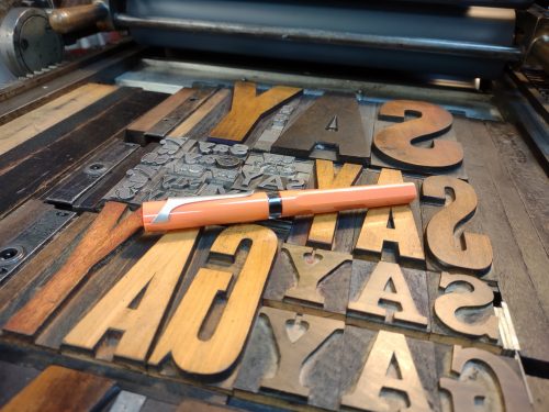
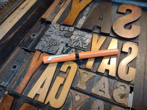
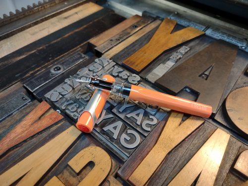
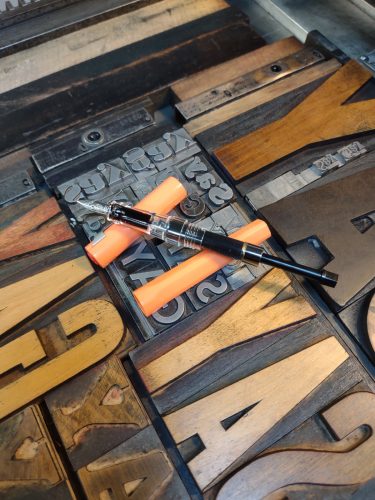
I’m revisiting my reviews of inexpensive pens from China. Now the Moonman T1 is much more expensive than some of the other inexpensive brands from China- namely Jinhao and Wing Sung, which have made some of my favorite cheapies. Moonman seems to up the design aesthetic and improve materials. This is my second Moonman and won’t be my last.


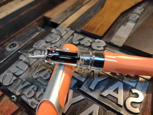
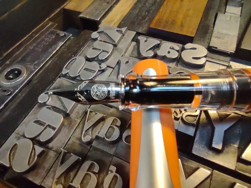
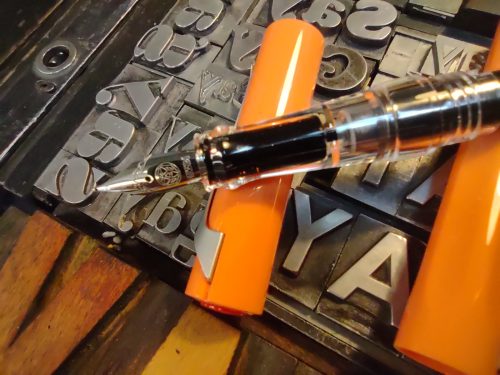
If you have ever wondered what would happen if you leave your Kaweco AL Sport and TWSBI Diamond in a drawer together for the night, well I have an answer for you, you’d get a T1. The cap is made of aluminum with plastic threading, the grip is aluminum and round, the body is clear plastic and smoothly round while the end cap and some of the insides are aluminum. The piston features a double rubber seal that is slicked with silicone grease. The nib is a larger size than I usually associate with Moonman. The nib is fixed to the body of the pen, while the grip forms a sleeve around it. Removing the grip and nib unit took some oomph. I think it had some glue to prevent this, but uh, not any more. It also had some silicone grease on the threads. After I cleaned it with warm water I regreased the threads and screwed it all together, snuggly, not too tight.


I’m out of practice reviewing fountain pens, but let’s just say this thing takes a great big gulp of ink. I filled mine with Iroshizuku TsukiYo, a favorite ink color that is a slightly muted tone of the same teal as the pen. The piston moves absolutely smoothly without catching anywhere. Like the TWSBI it doesn’t depress the whole way to the end of the section. I did not disassemble the piston mechanism, but it looks as though it uses a wrench much like the TWSBI.


Perhaps I should have tested the pen with a lesser ink but I have to say, this pen feels pretty good with a few little issues. The nib is stiff and with my heavy hand bounces a bit. I’ve been using it on some pretty rough composition book paper that is better with pencil than fountain pen and thought drags a bit, it feels pretty good. It doesn’t seem to have sharp or rough spots. It is a slightly dry writer, which is a surprise with this ink. If it continues past this fill I’ll modify the feed to be toward my preference of wetness.

On better papers this nib feels really nice. I’ve written a letter on Rhodia and used it in my work and home bullet journals. The results have all been really nice. On the Leuchtturm paper it glides and feels nice. Even in my no name home bullet journal it feels great.


The section is a nice size for my hand. It’s roughly the same size as a standard Sharpie. The slight flare at the base makes it feel grippy. I’ve discussed how I have dry hands so I tend to not find pens slippery, but it should be noted that the grip is made of metal and those of you with wet sweaty paws might find this slippery.

The body of the pen is nicely sized and fits my hand well. It can be posted but that makes it ridiculously long and top heavy, also, it posts to the end cap and we all know that can lead to dramatic errors. It arrived in a nice hard plastic box with a foam insert as far as packaging goes, this one is actually usable as a pencil or pen case. Once you slide that foam out, you have a nice hard bodied case to put your pen in to take to work or wherever you might go in their weird Covid Days.
My one issue with the pen is that it has some pretty sharp drops from the body of the pen to the grip section and end cap. It’s not a smooth drop. The edges feel a tad bit sharp. It doesn’t sit in a place that causes issues, but is worth a mention.


Overall I like this pen. I like the mash up of Kaweco Sport and TWSBI aesthetic with the addition of a piston fill. Mine was $29 on sale, they are currently going for $33. Most of the Moonman pens appear to be cartridge or eye droppers, so this piston fill seems a little different. I like it but I have to wonder if it is worth the price tag when you can get “better” brands for roughly the same price. The TWSBI Eco clocks in at roughly $30 and has a huge variety of colors and nib options and can be purchased through a number of totally legit sellers VS various resellers on eBay or Amazon. While I totally dig this pen, a TWSBI Eco is likely a better choice in terms of the company backing it up with a guarantee.

Musings: Using Up Collectables

I’ve written about using collectable pencils, pens, and paper in the past. I’m a combined collector and user of materials. I see the real value of a tool in its eventual use, and what it was used to make. My Field Notes have little value to me until I fill them with my thoughts. My various Baronfig and Blackwing pencils are just pencils until I whittle them down via my writing.

I went through a major office reorganization and clean out post Work from Home (WFH) and discovered a lot of stuff really. I have about 40 composition notebooks that are empty, a drawer full of journals to be used, I had 15 pencils cups full of pencils in various states of disuse. The end result was chaos.

Things had to change, largely due to space constraints- the office needs to be usable for both my partner and myself, but because my partner works from home the office needs to be largely useful for her, while my office needs are smaller- I need to get at my sewing machine, and my keyboard, and a spot to read. Having 15 pencil cups is ridiculous. Having boxes and boxes of pencils I’ll never use is also ridiculous.

I filled a medium flat rate box with pencils and pens. They’ll get donated to a school in the near future.

To avoid my urge to add more pencil cups to my desk I gave myself 1 dozen in a single cup, with the rule that I’ll sharpen them down and when I finish one, I’ll reach into a box and pull out one at random to replace it. I’m whittling them down as I write and fill composition notebooks.

As for pens. Well, I’m figuring that out. I mostly use ink at work but I also want to drain a few pens. I found a hoard of fountain pens that had slid into a drawer… still full of ink. They are soaking now, and I’ll get them clean and dry and I’ll figure out what I’ll do with them later.
I’ve realized through my somewhat compulsive collection of pencils, pens and paper (other stationery goods) that there are things I’m drawn to use and those that I just wish to look at for awhile. I’m drawn to use soft dark smooth writing pencils, inks with sheen, and things that feel pleasant in my hand. I like to use these on inexpensive paper that has been a good deal. I create value through the use of my materials. While they may have value to others while they are empty and collect dust on my shelves, I wish to create more value through their use.

Will I stop buying limited editions? Probably not entirely, but I’m definitely reducing my purchases and focusing on use. Inside each limited edition is the same core/paper as the regular editions, simply at a higher price and I have to determine how much the look of something pleases me over the regular edition.

Review: Musgrave Tennessee Red Pencils

Musgrave recently went through an upgrade to their web presence and added a few new pencils to their line up. One of these is the Tennessee Red. This upgrade included an upgraded website, and web presence in general. They hired a great marketing team to do this work for them, and really it has brought the formerly dated site and presence into a modern era, and even made their website usable! I’m happy to see a venerable American pencil brand embrace the future and make their products available for more people.

Let’s talk about the Tennessee Red pencil. First, the presentation. WOW. Old Musgrave packaging consisted of a thin plastic bag that is heat sealed shut, one clear side and one white side. It looked and felt, well cheap. The packaging for the Tennessee Red is lovely. It’s a sliding cardboard box that protects the pencils from banging about in shipping and looks stunning. The bright cherry red with white lettering is an immediate classic and eye catching. I love the sliding box and how it feels both retro and modern at the same time. Retro in that pencil packaging once looked like this and modern in that we haven’t seen anything like this on the market in a long time. Sure Blackwing used cleave for the Volumes but this is so simple and effective I can’t help but to enjoy everything about this packaging.

Nestled in the box are a dozen lightly but glossy lacquered natural pencils. I wish they were raw wood, but I can’t win every time. Even with the light lacquer you can smell the cedar as soon as you open the package. Once sharpened my whole office smelled of cedar. Amazing. The red imprint is perfect and sharp and has historic calls out with the little 3 star Tennessee logo and the new Musgrave logo. A golden ferrule holding a crisp white eraser completes the look. An added bonus is that the eraser? It works. Which has been a point of steady complaint over the years. They work well too.

Musgrave has stepped up their pencil game.

The cedar is red cedar and delightfully fragrant. It reminds me of the slats of cedar you can buy for your closet to deter moths. It is a tad dense and my duller sharpeners seemed to struggle with it but my classroom friendly and Apsara hacked did really well. I immediately sharpened 4 of them. The hex is a traditional Musgrave sharp, and I really do wish they’d gone with a soft hex, because I don’t love a sharp hex but there is so much to love about this pencil.

I suppose a review of these can’t be made without mentioning the centered-ness of the cores. There are a few off center cores, only one or two of mine were badly off center. The rest were fine and in what I would think of as well within usability limits. More on this point in a minute. Let’s talk about that delicious core. It’s dark. It’s smooth. With my long point sharpeners it’s perfect. It’s also great for sketching. I’d say this is a good multi use pencil, you can get some decent gradation out of it and as such wouldn’t need to carry a full pencil case for writing or sketching.

I love everything about these pencils, their imperfections in wood and centered-ness mean that I don’t feel precious with them. I want to sharpen them up. At $9 a dozen they aren’t cheap but they aren’t $30 a box either. I don’t feel guilt in chewing through these. These are pencil lover’s pencils not pencils for collectors. I mean sure go ahead and buy some for your collection too, but buy a pack to use as well. The silky smooth graphite cased in fragrant cedar brings back pleasant childhood memories of back to school shopping and school. That Musgrave went with a usable eraser (though I rarely use the erasers on my pencils) is an added bonus. The red imprint paired with the gold ferule and white eraser with that luscious pink tan wood is pencil perfection. Sure they need to work on core centered-ness, but I for one will support Musgrave with another purchase (or two) of these pencils.

I’m late to reviewing these. Check out Johnny’s review here and Anna’s here and Deon’s here.

Again this review is brought to you by supporters and readers of this blog who have headed to my Ko-Fi page and supported me one or two coffees at a time. The money gifted through coffee is used for some coffee but mostly buying more pens and pencils and stationery supplies to review. I appreciate each and every coffee purchased and gifted to me. I have the best readers!

Review: Musgrave News 600 Pencil

I’m not gonna lie, the News 600 is a favorite of mine. If you’ve had a chance to use a Eberhard Faber Ebony pencil before they were purchased and ruined by Rubbermaid, well this is as good if not better. A bold claim, but buy a pack and be impressed.

Let’s start with packaging. It’s that shitty plastic bag again. Clear on one side, white on the other heat sealed on both ends. UGH. I hate plastic for one, but also this offers zero protection for your pencils in shipping. So shipping packaging is important to keep them safe. Most places I’ve ordered these use a nice stiff mailer, and if you buy direct from Musgrave, you’ll get yours safe. I do wish that Musgrave would switch to a paper envelope or box for their pencils. Even if it had a window in it, it would be better for the environment than the crappy plastic bag. I can dream.

This round pencil is basic. That’s okay because this is a workhorse and you won’t care that it looks so basic, because it works. The exterior is a thin but even shiny black lacquer over what I believe to be basswood. The imprint is white and clearly printed. The letters are a mix of large and small. I like it. Simple and effective labeling. Easy to read.

The cores on all of mine were centered. It’s a slightly larger than average core and it sharpens well. I did find that the cores can snap, but I think that is largely due to the sharpener I was using. Though I’ll say it plays well with even my Pollux when it has a sharp blade. My hacked Apsara sharpener does amazing things to this pencil. The extraordinary long point produced pairs so well with this pencil that I fail to reach for any other sharpener.

The core is soft and dark. It’s great for a slick page, since it lays down loads of graphite with little pressure. This pencil with a light hand lends itself to long writing sessions, since it glides across the page with a silky smooth feel. When sketching you can create light lines with a deft hand or deep darks and bold strokes with more pressure. Because it is soft, it doesn’t retain its point well.

Overall if you are looking for a deeply dark silky smooth pencil for writing or sketching the Musgrave News 600 is a great choice. Just don’t expect it to hold a point for long when writing, when sketching it’ll make your day as that point wears down to the page.

Get some directly from Musgrave here.

These were purchased with funds from my Ko-fi supporters. Head on over to Ko-fi and slap that button and purchase some “coffee” for me. Not gonna lie, some of the funds do go for coffee, but most do go directly to buying materials for review. I can’t tell you how much I appreciate each and every coffee purchased. It takes about 2 to buy  a pack of pencils for review but it has opened up the realm of possibility for me to get more materials in here and test them out.