Review: Jinhao 602 Fountain Pen

Every now and then I get a surprise in the mail. Today I got a Jinhao 602 fountain pen, a gift from Christie. She suggest I review it, so I'm being dutiful and doing so.

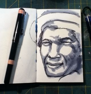
Pulling the pen out of the envelope I found it in a black flocked case. It felt rather heavy for it's size. The black paint is smooth, the gold colored trim is nice, even if it's gold (I prefer silver.) the grip section is oddly trimmed in brushed steel. It doesn't match the rest of the pen, even if it is comfortable. The pen is very slim measuring about 3/8th of an inch in diameter. It looks good.


IMG_0659
IMG_0660


The nib is steel but colored gold. It is hooded so only part of it can be seen. The nib is stiff, with no flex or bounce. It produces an even fine to medium line with good ink flow. It would be great for sketching. The nib offers a little feedback but it's not scratchy


IMG_0662


IMG_0662


The downside is that the cap does not post well, as this is a small pen it would be more comfortable if it were posted.

Overall this would be a very good pen for sketching, priced a little more than $5 you won't be heartbroken if it dies or you lose it. I was surprised at how well the pen wrote, it was remarkably smooth for $5. (Not as smooth as the Serwex Special I reviewed earlier.) Not a bad deal, head over to eB@y and search for one.

Unposted length: 4.5 inches

Posted: 6 inches Capped 5.5 inches 

Less than 1/2 inch in diameter.

Cost: About $5.50 shipping included on eBay.

A good value for the money if you like thin pens with fine nibs.

Unlike the Serwex Special I reviewed a few weeks back, this is not a candidate for abusing with India inks. The hooded nib means getting the feed out of the grip for cleaning is nearly impossible. India ink will gunk up this pen and render it unusable in short order. 

Continue reading

Chongolio on Youtube

I'm not sure how I missed these videos, but now that I've found him, I'm kinda in love. He offers nononsense BS free art journaling ideas and advice, and it's good. Oh He also uses some images of gears in his AJ. Watch them all, give him some thumbs up love and share his stuff.


Head over to his youtube to see the rest of his videos. Good stuff.

Watching some RSAnimate

Yesterday I met with a friend of mine, he's a terrific artist and we had a nice long chat over great coffee. During our talk we spoke of the TED talk about school killing creativity. When I got home I looked up the talk, it's a good one and linked below. You should watch it.

In some ways I think that our root fear of play and experimentation in our art and journals, where does it go as we age? We were all pretty creative when we were 5 and 6 and even 7. But at some point we all want to draw realistically (this is tied to developmental milestones) and I think get frustrated and quit. If you look at most kids at specific ages they all go through this. Some of us never get past the frustration.

The next video is about the paradox of choice. It's not directly related to art, but I think you'll see why I put it up here. I think we get into a mode of overwhelming choice when we walk into an art and craft store. It's why it's so easy for companies to shove crap down our throat when we don't really need or want it. Step 1: Overwhelm the consumer with too many choices and Step 2: Prey upon that and TELL them they NEED specific parts to create a project. Never-mind that you could unlock their creativity by teaching skills rather than spoon-feeding a specific project. But then unlocking creativity isn't as good for the bottom line as selling a specific project that requires the person buy items off a list. (Think #cultofstuff)


The final video, in which I think I could do an entire post about, is about the movement about staying positive, and that you can bring everything to you by presenting a positive front. Slap a smile on your face and everything you've ever dreamed of can be YOURS! I'm not afraid to say that sometimes my life and my brain are dark dark lonely places. Sad. I've got a relatively good life- a nice enough house, a car that runs, a lovely wife, a DayJob that pays my bills, and good health. Honestly, I've got it better than many people. I'm happy about that, I won't lie. But there are days when I hate everything about life. It's not wrong to say that sometimes, life isn't fair and life sometimes sucks. That's realistic.

I'm not suggesting we all let it hang out. No, I think we should be realistic in what our lives are like, it's not all sunshine and roses, sometimes it's dog crap on the floor and a flat tire on the highway or a bad day at the job. Not being honest about these facts of our lives is as ridiculous as always painting a smile on your face and pretending they don't happen. These dark spots are WHY I art journal. I pour the shit out onto a page and then turn it. I paint dark little scenes on watercolor paper and then pour ink on it. Denying these aspects of my life isn't honoring myself. Hiding it away doesn't make it go away. No matter how many pretty pages you paint in your art journal doesn't make everything alright.

The process is what makes things right not the product. It's okay to slather paint on a page and just turn the page and never look at it again, every page does NOT have to be finished. MOve on, just like your life moves on. It's the nature of an art journal that you move on. You grow as a person and grow in the art journal. Don't let false positivity hold you back from creating something that is wonderful because you are afraid to explore something that is not happy or perceived as not positive.


A Challenge for the Weekend

I'm not usually a huge fan of issuing challenges but here's one I can get behind:

This weekend make some art that is destined for the trash. Don't let anyone else see it or feel free to show it on the ComfortableShoesStudio facebook wall. But set yourself free and see what you learn from creating something without the pressure of making it pretty.

For one weekend make stuff that has meaning only to you.

For one weekend make marks on the page that please only you.

For one weekend mix your paints in colors that you are afraid of.

For one weekend use colors taht challenge you.

For one weekend make a page in your art journal taht you haven't planned out.

Scribble. Doodle. Write.

Do somethng in your art journal that you've never done before.

Set yourself free.

IMG_0626[1]

IMG_0626[1]

IMG_0626[1]

Draw for the Trash

Matthew Archambault of Drawing Tutorials Online wrote:

It's super important when drawing that you don't put too much pressure on yourself to draw for the museum wall. Draw instead for the waste paper basket and you too will have that care free attitude when it comes to drawing.

It's a point I've been thinking about over and over and over again for the last few months. A question I've asked myself repeatedly is, "Why do I enjoy sketching and drawing so much but many people I've met don't?" I think Matthew's point is exactly why. When I'm working in my art journal I'm not thinking about making great art or a finished page. I'm simply working on the page, a page isn't good or bad, it just is.

This is a drastic difference from the way I see many new art journalers approach their page. They want each page to be a perfect piece and get very discouraged when the page doesn't end up just as it is in their head. Putting pressure on yourself to create exactly what is in your head is a exercise in frustration and I think it's why so many people give up on art journaling and return to scrapbooking.

I always put an emphasis on process in my classes and on my own art. Process will eventually get you to the end result you seek, it isn't an easy or guaranteed path but it's rewarding.

IMG_0620

Some Observations: On Paper and Frisket

Iv'e been working on a variety of papers, settling on Canson's XL Watercolor paper, for a variety of reasons- it works well with the watercolors I'm using, it's cost is nice and it has a relatively smooth surface that my pens rather like. It's also got 2 sides, a right and a wrong, ot a front and a back; which ever way you prefer to call it, but I like the judgemental aspect of right and wrong… In this case. Any how.

One side has a little more tooth an grab to it than the other, this is the right side. The reverse side AKA WRONG is smoother. It also has less sizing… This affects a number of things- how ink and paint react with the surface. Less size means it's more absorbent.

This is good and bad.

It's bad when you use a mask. I applied a liquid frisket rather heavily to the surface of one of my paintings and the frisket grabbed to the paper so strongly it ripped when I removed it. Quite badly. It was crazy frustrating.

I went ahead with the mixed media piece anyway, knowing my paint would adhere the ripped pieces down and it would be okay, but I had to change my plans for color and other ideas for the image, and I know that the torn piece could come back to haunt me.

Additionally in my frisket/mask adventure I've found that the frisket REALLY doesn't like the spray inks. If the frisket is too thin the spray ink "leaks" through it. A total pain in the ass. So I've learned to put on one thin coat and then a heavier coat to seal it all up.

Journal Flip: Moleskine #4

Thisis Moleskine #4 I filled it up while I was in Buffalo, NY attending a funeral for a family member and shortly after. A visit to Buffalo is always interesting.


Anyway, the idiots have been thumbing down my videos again. It's driving me nuts. It just reminds me of the need to thumb OTHER people's videos up. If I like a video I always thumb it up. I figure it does something to restore some balance to the positivity of the world.

Anyway, go check out my vids and give them some love.


Weekly Round Up: Videos

I had a late night at the DayJob that prevented me from loading up all the videos I wanted to this week, but  it's a good change from the status quo and it also lets me change up my style of posting. I'm probably going to switch frm a daily video post to a 3 or 4 times a week post. I'm starting to do pieces that are much mroe involved and hav a lot of depth to them, as such I'm completing fewer per week, thus, not so many posts per week. I'm debating how I'm going to edit the videos, I'm not sure if I'll go longer with the video or keep them short and simple. I'll figure it out as I go along.


My YouTube Channel Name

Since it comes up pretty often, here is the offical story of my youtube channel's name.

I intended for it to be ComfortableShoesStudio just like this website. Seems easy right? Except YouTube only allows 20 characters in a name… I Typed in the full name and didn't look to see that it was right. Bad move. CSS is 22 characters long. YouTube dropped the I and O off the end. After signing up I stayed logged in and loaded my first few videos. Then I loaded a few more. 

6 months later I ended up signed out and couldn't log in. I requested my password to be sent to my email on file. It was then that I realized that I was signed up as ComfortableShoesStud. *Headdesk* At this point I'd already loaded up a bunch of videos and had a bunch of views, so I figured, screw it, leave it as is.

Lesson learned though, ANY time I sign up for something I check to make sure that everything is spelled correctly before hitting "Agree" or "Continue!"

Review: Fountain Pen Revolution Pen

I stumbled upon Fountain Pen Revolution while searching for a place to find a couple of inexpensive fountain pens made in India. The FPR is a site dedicated to the sale of such pens. At the time I found his site I also found that he was running a special I took him up on his offer and scored a fountain pen for $2.50. The special is no longer running but his prices are pretty reasonable. There are pens on his site for $6 plus $3 shipping. Not bad especially when you consider the review I'm going to give on this $2.50 pen.

The pen I was sent was a gray Serwex Special 101. It reminds me of the Noodler's Nikita Nib Creeper pen. Ever since I got my first Noodler's pen I sniff my new pens, I know weird, but not. The Serwex has a slightly different odor like engine grease and garage, or what plastic toys smelled like in the early 80's,* somewhat pleasant. Unlike the Noodler's which I likened to dog crap and diesel fuel. Along the side of the clear barrel is a gold foil imprint of the company name and product name. The cap has 2 cap bands which are silver. The clip is also silver and seems to be pressed steel. The jewel, which holds the clip to the cap is black. The gray cap itself is slightly mottled with a few streaks of darker gray here and there. The barrel is tapered and has what I call a cigar shape, though small.

IMG_0553
Not the sexiest pen I've ever seen but looks serviceable and good knock around pen.

Taking off the cap I'm greeted by a fine gold nib with a design and the words "iridium nib" pressed into it. There is no breather hole in the nib. The nib reminds me of the Noodler's Nib Creeper nibs.** I unscrewed the section from the barrel and found a few mould edges at the end, I scraped these off with an exacto, for fear they'd come loose with use. After rinsing the barrel and nib off I loaded it up with ink. For a smaller pen it holds an impressive 3+ml of ink. I loaded 2.5ml in it with a TON of room to spare.

IMG_0550
I loaded mine up, eye dropper style, with my sample of Iroshizuku Fuyu-syogun. Yes, I put the most expensive ink I own into a $2.50 pen. Why? I'm addicted to gray inks right now and I had a nearly full sample of this ink and wanted to use it. Plus, for the first time ever I had an ink that matched the color of the pen. Gray ink in a gray pen.

IMG_0552
I then proceeded to write out 2 full pages in my Exacompta journal. At first it was slightly scratchy, the feel of writing with this pen matched the feel of writing with a Noodler's Nib Creeper.The nib writes with a true fine and is rock hard, no bounce, no flex; it is friction fit into the section. It writes relatively wet and started up with a quick shake downward. I did notice that when I had some ink on the nib it seemed to blob there. After I cleaned the ink off it no longer creeped to that one spot.

At the end of the 2nd page of writing I noticed that the nib was much smoother than when I started. The flow of ink was perfect for me, slightly on the wet side (6/10) and the nib itself was smoother, and gliding over the paper. Given I was using a premium ink this was to be expected and I wonder what will happen when I put a less premium ink in it. All in all this is most likely to end up as my new gray ink sketching pen and will have a permanent spot in my drawing stable.

Given my love of cheap pens I'm going to have to say I like this pen, a lot. Yes it's cheap and will never perform as well as a $50 TWSBI 540 and it has one nib size available- fine and it's construction is okay. The real thing to think of here is how it performs, and in my opinion if you are looking for something like a Noodler's Nib Creeper or an inexpensive pen this is a good pen.

As an aside this pen is one you can COMPLETELY disassemble, meaning you can get at the innards to clean it… I have in the past abused fountain pens with India ink. This is a pen you could do that with as you can get at the feed and inside the section to scrub them with a toothbrush. Hmmm. Ideas.

The Serwex Special 101 is not in stock at FPR. They have a pen called the Serwex 77TR that looks identical to this pen EXCEPT that the clip and bands appear to be all "gold" plated. At $6 plus $3 shipping it's not a bad deal, especially if the pens write as well as this one does. You can check out the FPR on FaceBook as well. The way you order from FPR is to figure out what pens you want, make note of the name and color you want and send Kevin an email. He'll send you a total price. Then you paypal. Shipping is from India so it will take some time (3 weeks) to get to you, but the wait is worth it.

Continue reading