Review: Hero 98 Sponge Head Brush Pen

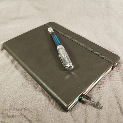
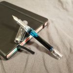
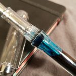
The Hero 98 is a basic looking metal bodied pen. It features a metallic paint job with black plastic accents and a silver clip. There is some writing on the side of the cap in presumably Chinese. (Google translate indicates that it says “Hero” and “Do.”) The pen is very light weight. It looks and feels cheap. I purchased it for $2.56 on eBay and it arrived roughly 15 days later.

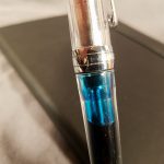
Inside the pen is a horrible aerometric filler. I filled this pen with Noodler’s Heart of Darkness and was able to get about 3/4 of a fill. Not bad in the world of cheap aerometric fillers. When I filled this with water I was able to get just over 1ml of water in, so perhaps there is about .75ml of ink inside. Bonus points for the blackout stealthy cover on the aerometric.

The grip section is made out of black plastic, with noticeable mold lines. I can feel them as I’m using this pen. The grip section is shaped weirdly and ends with a flair and another taper. Possibly for the sponge head to rest?

I referred to the sponge head in a livecast as “that maggot looking thing.” I still maintain that it looks like a maggot. The sponge seems to be made out of the same kind of sponge as makeup sponges. Which further grosses me out. The sponge is shaped like a teardrop. Flow is uneven and the tip dries out in use. Attempts to use this in a dry brush style were met with frustration. It gets too dry even for dry brush. Getting the ink to flow again means squeezing the aerometric filler, which I think we can call agree is an easy way to wear ink on your fingers. Well maybe, getting the ink to flow was a pain in the arse now matter what I tried. In the end I dribbled water onto the sponge and got the ink flowing.

The cap is not airtight so you go through the process of dribbling water and squeezing every time you want to use the pen. Very annoying. The clip is the best thing about the pen- it’s springy and give one something to fidget with.

The sensation of using this pen was not pleasant, at least not to me. Even when flush with ink the spong grabs and drags on the page- even with good art paper. On cheap copy paper the grab was even more distinct.

I don’t usually post negative reviews. I feel this is more of a warning than anything else. This is not a good pen for writing or drawing. It’s a great way to build up frustration tolerance because it just doesn’t work well. Avoid this garbage at all costs. Mine has gone into the recycle bin and trash*.

Review: Birmingham Pen Company Tarnished Nickel Fountain Pen Ink

The Birmingham Pen Company puts out an extraordinary amount of shades of blue, blue-black, grey, and black. They seem to focus on professional shades with their inexpensive inks. Tarnished Nickel is grey with a hint of warm blue.

The ink is well behaved on most paper. I really liked it on the cheap paper at work. It didn’t show through despite the paper being only 20lb. With my fine nibbed pen it didn’t bleed or even show through. The ink felt good on every paper- from garbage paper to the good stuff in my L1917 and BF Confidant. Lubrication was good and flow was great in even my most finicky extra fine nib. Line width was accurate to the pen. With garbage paper there was a hint of feathering, but not a lot.

There was a bit of shading but not a whole lot. The ink photocopies well enough. The ink responds better than I expected with the drip and wipe testing. As soon as water hits the ink the warm black aspects lift and move. What is left behind is a cool but legible line. I would not expect this to survive a washing machine but it would survive tea or coffee being spilled on it.

This ink can almost be confused for a washed out black but it is a little more complex than just grey. It has great character, despite this, it isn’t exactly eye-catching or something that many people would notice. It is something that a fountain pen fan would notice.

In case you haven’t noticed I really enjoy this ink. It’s subtle and works great on a variety of papers. Even better, the ink is inexpensive.

Review: Sailor Jentle Yama-Dori Fountain Pen Ink

I picked this ink up ages ago via a sale on Amazon. It is a favorite ink of mine, and leans too green and teal for it to be considered professional. That is to say, that I don’t think that I can get away with signing paperwork with this lovely ink. That said, I think it deserves to be reviewed.

I’ve used this in most of my pens over the years. It works well in most pens and better yet cleans out of them with ease. It does not seem to stain any of my demonstrators. It is nice in a fine to broad nib. It wetter flowing nibs the ink looks dark blue-green and has a red sheen. In even the finest nib I found it to give a smooth feel, it is nicely lubricating.

It is generally a well behaved ink, working well on nice paper and decently on junky paper. On garbage paper it is not prone to feathering or bleeding. On nice paper you get a lovely red sheen. Dry time on better paper is slower, around 7 seconds with a fine nib. On garbage paper it dries in under 5.

This ink isn’t going to survive the wash. In my wipe test it smeared all over. The drip test left blue ink migrated with little semblance of the lines left.

The ink performed well on most paper. That said it didn’t do well on Field Notes*. I had plenty of bleed and show through in that book. It did really well in a standard Story Supply Co book. Of course it does great in my Baron Fig Confidant and L1917. Clearly i like this ink. I purchased a full bottle. This ink is readily available from most vendors who carry Sailor inks. You can find many other reviews of this ink on most review blogs. It’s a  great ink.

Review: Poluma Dotted Grid Journal Notebook

This nondescript notebook was listed near the bottom of the price range for my inexpensive dot grid journal search in the depth of Amazon. At $5.99 it is decidedly inexpensive. The price also fluctuates from $9.99 down as low as $4.99. Gotta love Amazon. (Or not.)

So this book has all the usual bells and whistles of a basic notebook- hard vinyl cover, pocket in the back, ribbon place marker, and an elastic. It’s stitched and glued with a standard Smythe sewn binding. The vinyl cover has a nice fake leather imprint and has a bit of give giving the cover a bit of grippiness over the slipperiness of a L1917 or a Moleskine. The front and rear end sheets are basic and lighter than the inner pages. The pocket feels cheap and pulpy, though it will likely survive the life of the book. The ribbon is standard nylon and heat sealed. The elastic is appropriately sized and tight to the book. The size is narrow A5 or Moleskine sized.

So far so good.

The inner pages are dot grid on cream paper and are ruled at 5mm. There are 128 pages. They are not numbered. The paper is thick, smooth with a hint of tooth. In testing the paper felt great with fountain pens, gel, ballpoint, roller ball, and every other pen I used. Pencils felt good too. There is just enough tooth for pencil to leave a legible line but not smudge or be eaten by the paper. The only ghosting and bleed I had was with multiple layers of highlighters. Fountain pen was especially nice on this paper. The lines were true to nib size and there was no feathering at all.

The binding looks and feels solid. It folds over on itself and opens flat and closes back tightly, even without the elastic.

The paper performance stands up. The downside of this journal is that it doesn’t have numbered pages or an index, but honestly those are so easy to set up that It is hardly something to point out as a detraction. There are only 128 pages which means you might fill this up in a month or two depending on your bullet journaling habit and practices.

Overall, if I was looking for a plain black journal for bullet journaling I’d consider this one. It’s made well enough and has good paper. The leather imprinted vinyl feels good in hand.

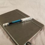
Review: Wing Sung 618 Fountain Pen

I purchased the Wing Sung 618 via a seller on eBay for $11.90. It arrived in my mailbox roughly 14 days after payment.

The packaging for this pen is the showy Wing Sung knock off of a Lamy Safari box inside a wrap of bubble wrap and a bubble mailer. The whole thing is very secure feeling. The box arrived undamaged and the pen in excellent condition.

With any pen I buy I clean it with water and test the fill capacity. This holds roughly 1.3ml of ink, not bad but not an ink tank. The piston mechanism locks and unlocks by pulling on the blind cap and then twisting. I didn’t realize this at first and immediately unscrewed the piston from the pen body. Oops. I realized what I had done pretty quickly and looked at the listing to find some “instructions” on how to use the filling mechanism. THe instructions aren’t great but I was able to figure it out.

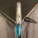
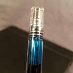
I’ve grown to like the locking mechanism. The piston works smoothly and easily sucks in the fill of ink. I purchased the translucent model and this includes a clear feed, so as I filled the pen the ink is visible throughout the process. Very cool.

My nib was a tad scratchy but was easily aligned and smoothed. Ink flow is great. The hooded nib is fantastic for forgetful notetaking. I can leave it uncapped on my desk for 10 minutes or so and come back and it’ll still write. I do find the section a bit too narrow and the thread to sit in a funny place. For most people this won’t be a problem, and it’s not a problem for me, it’s simply noticeable.

The cap is sturdy and screws on tightly and looks to be nearly airtight around the nib, you can see the sleeve push against the cap when tightened. The cap posts deeply but throws the balance off for my hand, but for people with larger hands this won’t be an issue. For my tiny lady hands the pen feels good unposted and is of a nice length. The clip is diminutive and the worst part of an otherwise nice pen. The arrow clip is done poorly and looks and feels cheap. While it holds onto my shirt nicely it does catch on the stitching and has torn a stitch on a favorite chambray. The clip is awful.

The look of the pen is a mash up of a variety of pens. It looks a bit like the PArker 51/21, the TWSBI 5XX series, and an assortment of others. Sometimes it feels like Wing Sung takes all the pens from other brands and mashes them together. Sometimes this works really well, and others, not so much.

This isn’t a bad pen, but it is underwhelming at $11.90. I do seem to have a  thing for hooded nibs now, especially the clear versions. Overall this pen writes really well and has a neat locking piston, but it’s just not mind blowing.

Review: Montblanc JFK Limited Edition Fountain Pen Ink

Montblanc JFK is a limited edition ink released in conjunction with a limited edition pen. It can be found in a variety of places ranging in price from $16 to $30 with an average price seems to hover around $25 for 30ml.

The ink is navy blue and doesn’t lean green or too purple. Rather it is a warm dark blue. The color is dark and has no shading that I noted in any of my use or testing. It photocopies spectacularly well. In some instances, it may be hard to tell that this is blue instead of black on the page.

I found this ink to be fabulous on all the papers I’ve tested it on, from the nice L197 and Confidant pages to the garbage paper at work. I noticed that it didn’t spread or feather on anything. There was little to no bleed through or show through on any paper. Dry time was as expected- longer on nice paper, roughly 7 seconds and shorter on lesser paper, around 5 seconds. This ink made even scratchy pens and garbage paper feel good, the lubrication and flow are fabulous.

Overall this ink is perfectly professional and looks lovely on most paper. The warm paper in a Baron Fig Confidant really works well with this ink. Most of my testing was with a fine nibbed pen but in a medium, it really looked especially wonderful. Overall if you are looking for something professional with a bit of character that works really well on a lot of different papers, this might be the right ink for you.

Review: Baron Fig Limited Edition Pencil Oracle

With most limited edition (LE) pencils I review the outside and direct you to a review of the core. Given the variability of the Baron Fig pencil’s cores in the past, I’m going to tell you about the core on this pencil.

The variability of the core of these pencils is almost legendary. The first pencil was a true HB, the second a shattered 2B, and then back to HB but with a heap of grit. The pencil maker in Portugal* can’t seem to get the pencils to be an even true HB. Most of the other LE Archers have some grit in them. I sharpened 3 of these to get a feel for the core. I picked a pencil that had a centered core and the other 2 I purposefully chose uncentered cores. I sharpened with my Classroom Friendly and the Masterpiece after. I did attempt to use the Pollux but it shattered the cores and made a mess of the centered pencil. I have no such problems with the Masterpiece.

Testing consisted of me reworking the outline of my current novel and attempting to figure out why the ending I have doesn’t work. I used a Teen Vogue composition notebook and wrote up some character studies and a loose outline of the beats of the novel. In all, I wrote probably 25 pages, many of the lines crossed out, in the comp book. I also took notes in a Field Notes Snowblind for some audio testing my cohost and I did on Sunday. I made notes in the same pocket notebook for my weekly meal prep. I also used these in my L1917 to make note of the recipes I used and to log my Kombucha observations in my Bullet Journal.

All in all, I was pleasantly surprised at the cores. They are a true HB but I’ve yet to encounter large pieces of grit or other unpleasantness. I grabbed a couple of other LE Archers and tested those side by side, the No. 2 and Element and found grit. The Oracle has a pleasing grab on the page as it lays down graphite. It’s not silky smooth like a Blackwing or Mitsu-Bishi or even a General’s Cedar Pointe. It grips the page. The point retention is fantastic, only need a touch up after a few pages in my comp book and after 3 in my L1917. This is a pencil that does spectacularly with rougher paper, like a Confidant or a composition book.

Despite being a true HB in hardness it is nicely dark, leaving a nice dark grey line with moderate pressure.

The packaging for the Oracle is gorgeous, as usual. The coloring is graphite grey, ash grey, and mustard yellow. The decorations seem to be inspired by playing cards and tarot cards. On each side near the dipped end is an answer, roll your pencil and whatever is up is your answer. Fun. Each side is adorned with playing card suits plus a moon and crystal ball. All this in pale ash grey on deep dark graphite grey. The pencil is matte finished and always has some shinier bits due to rubbing in the packaging during shipping.

In the past, the exterior of the Baron Fig LE Archers has always been gorgeous, but it was wrapped around uneven graphite filled with grit. This is the first time I’ve used the Archer and actually enjoyed the core. Really, the main difference is that there isn’t any grit. I don’t get these bits that leave snags and gouges in my paper. Overall I really like this version of the Archer, and I always did enjoy asking the Magic 8 Ball questions. Get yours over at Baron Fig.

Review: Artfan Dot Grid Journal Notebook

The Artfan “Dotted Bullet Grid Journal” is another Amazon offering that has frequent price fluctuations. I purchased my copy for $5.99 but I’ve seen it as high as $9.99 and as low as $4.99. There are multiple color offerings but mine is dark teal.

The Artfan has all the bells and whistles of a L1917- hard vinyl cover, 2 ribbon placemarkers, pocket, elastic, index, and numbered pages. It also arrives with a label tucked into the center of the book.

The images of the Artfan show a belly band but the book arrives in a plastic sleeve sans belly band. Which is fine so long as you aren’t planning on gifting the Artfan. The plastic envelope feels cheap.

Inside the book are 4 index pages and 124 numbered pages. A total of 128 pages. The paper is cream colored with grey dots at 5.5 mm ruling. It is thick and smooth. Most of my fountain pens and inks responded well to this paper. They felt really nice on this paper. There was enough tooth for pencil as well. It didn’t do well with brush pens but did surprisingly well with highlighters and mildliners.

The ribbon bookmarks are thin and in two colors. They are lengthy enough to be useful and are heat sealed. I quite like the color matching of the ribbons to the cover. The elastic closure is tight without being too snug. It can be stretched the traditional manner or diagonally. The vinyl cover is smooth with a bit of imprinted grain. The only logo is at the bottom center of the back cover.

Of the cheap depths of Amazon this is one of my favorites. The color is a great shade of teal, the elastic is secure and the pages are numbered. The paper is great too. If you put this into your cart and wait there will likely be a price change. It fluctuates often and will drop down to $5.99 for a day or two then bump back up and then down again.

Review: Lamy Blue-Black Ink

Lamy blue-black is a classic blue black ink. It is readily available from almost any place that sells pens- from Amazon to Goulet to brick and mortar shops. Pricing is affordable and around $13 to $15 for 50ml.

On the page it looks like a blue gray, sort of stormy sky like. It is smooth with decent flow. There is no shading in the pens I used for testing. I did not notice a sheen with any paper. I don’t think this is a highly lubricated ink, but my pens felt smooth enough. It’s not going to make a scratchy nib feel like butter, but paired with a good nib it feels nice. Dry time on all papers was good- under 7 seconds on the nicest paper.

In the drip and wipe tests this ink did poorly. The drip test left little behind- lines were barely visible and color migrated. In the wipe test it performed better but not great. This ink will not survive the washing machine.

It feels good in my L1917, Confidant, and on cheap paper at work. It did okay in my Field Notes and much better in my Story Supply Co. If you want to use it in a Moleskine with a fine nib, it’s not going to be a great choice. I found lots of bleed through in my Moleskine.

I like this ink for professional settings. It’s not exciting but it’s very professional. No one is going to stop and ask you “What ink are you using?” with this ink. Ultimately when it comes to “professional” shades that is what we’re looking for- flying under the radar.

Review: Minimalism Art Classic Notebook

This notebook pops up in every search I’ve made for dot grid notebooks and journals. At $9.95 it fits my criteria for cheap. Like many of the Amazon selling brands you can find that certain colors are less expensive than others, the chrome yellow was $9.95 though other colors are slightly more expensive. This brand has a deal where you can buy a 3-pack of these notebooks for $22.99. Which is a pretty darn good deal.

This notebook features all the bells and whistles you might associate with a classic journal- elastic, ribbon page marker, and a pocket in the back. These are all well done with the elastic being just the right size so that you can close the regular manner, use it as a bookmark, or use the Bullet Journal elastic trick (link Carroll video.) The pocket is gusseted with white satin and paper. The ribbon is generously long and heat sealed. All of this is done perfectly in my book.

The size of this notebook is narrow A5 or Moleskine A5. That is to say 5×8.3 inches.

The covers are hard. They are covered in classic vinyl that has a slightly squishy grippy feel. They aren’t as squishy as a Rhodia Webby but softer than a Moleskine. The feel is premium. The logo is minimalist and featured on the bottom of the back cover.

The binding is the classic Smythe stitching that is associated with most notebooks of this style. The combination of this flexible stitching and the cover style allows the notebook to open completely flat with little work. The notebook will also fold over on itself for writing in hand.

The cream colored paper is 100 gsm and slightly darker than a Leauchtturm1917 (L1917) but about the same shade as a Baron Fig Confidant. There are 192 pages, and they aren’t numbered. The dots are small and dark gray. They are 5 mm apart, which is a standard ruling. The dots aren’t dark enough to interfere with writing but don’t quite disappear behind the writing. What I like about this darkness of ruling is that I can write in lower light levels than with the L1917, where I find the dots too pale.

The paper performance is surprisingly great. It has just enough tooth that pencils perform really well without smudging. Gel, rollerball, and ballpoint all glide over this paper without an issue. The subtle cream color makes some colors really pop. The real stand out here is how well it responds to fountain pen inks. All the inks and nib combinations performed really well without bleed through, feathering, soak, or strikethrough. Inks with sheen show off on this paper.  The only thing to soak through was a triple application of highlighter.

Overall, this is a great deal. The combination of great paper, fun colors, and sturdiness makes this a go-to notebook one I’ll purchase again and again. The company has also released a “premium” line with slightly different branding and numbered pages. Thus far, this is the cheap notebook to beat.