Review: Hero 616 Standard “Bobby Launch”

Bobby is an eBay seller who seems to primarily focus on fountain pens and other office supplies. Shipping took 15 days from the date I ordered. The cost of this little pen was a whole $1.39.

The pen arrived swaddled in bubble wrap and inside a yellow bubble envelope. The pen was inside a plastic sleeve with cheerful red, white, and blue printing.

The pen outside of the plastic sleeve looks small and inexpensive. The stainless steel cap has lines engraved vertically. This version of the 616 has a brass clip. The plastic of the pen body is dull and flat. A little polishing might help bring out the shine.

The brushed stainless steel cap friction fits for capping the pen. Mine is secure but it would be easy to not cap it tightly enough and have the cap wiggle loose. The cap also friction fits for posting. I found that it posted deeply and securely. The cap and pen are so lightweight that the balance wasn’t affected at all. I find this pen MORE comfortable when posted.

It should be noted that, in my testing, I carried the pen clipped to the placket of my shirt and neither the clip nor cap, ever came loose. However, while traveling to and from work I had it along with other pens, inside a hard shelled case. On more than one occasion I knocked my bag over or dropped the case. Upon opening the case the cap had wiggled loose from the pen. I would not carry this pen in the pen pocket of a bag or anywhere the cap could wiggle loose. It is certainly not a pocket pen, despite its diminutive size.

The nib is hooded and also gold toned. Mine arrived misaligned with the hood and the feed. A little work pushing and pulling aligned everything. Once inked the pen was a tad bit scratchy, so I ran it over my buffing stick. Ten minutes work gave me a pen that feels great.

This pen is an aerometric filler. I’ve used the Pilot aerometric refill and that works well. The Hero aerometric is a piece of garbage. The small tube inside isn’t long enough and the feed not set up to work properly, so every squeeze pushes out all of the ink. Testing this filler with water I was able to suck in about 1ml of water. Once dried and inked I was only able to get the damn things to suck up a little over half a fill of ink.

I also managed to cover my hands with ink. Sadly I have 2 more aerometric fillers that I need to review and each fill pissed me off. I will never order another cheap aerometric filler for review, but you’ll need to suffer through 2 more reviews of them.

Overall, this pen is quite nice. The hooded nib once aligned and tuned writes like a dream. Like all hooded nibs, dependent upon ink choice, it just writes and writes well. It’s an easy pen to like, it is, after all, a rip off of the classic Pilot 51/21. Sadly, they weren’t able to get the aerometric filler to work well. I’ll probably adapt mine to work with a standard piston type converter, but that’s a kludge I’ll share later. If you want to read about the original that this is riffed from check out Parker51.com it’s a great resource.

Review: Taotree Dot Grid Notebook

My gold standard notebooks for bullet journaling are Baron Fig Confidants. The combination of heavy covers and near perfect paper make them a notebook I reach for every time I need a notebook. That said, they lack some features that most bullet journalers look for when selecting a journal. The gold standard for most other people is the Leuchtturm 1917 (L1917), which features great paper, an elastic and a pocket over the Confidant. The larger issue with these notebooks is the cost. At $20 each, they are a pricey investment, particularly if you are just testing out bullet journaling.

I mulled this over and decided to troll the depths of Amazon to find less expensive journal options with dot grid paper. Of course, you can bullet journal into anything, I might suggest a lovely 50 cent composition notebook.

Trolling Amazon for dot grid journals gave me many offerings. I looked specifically for those with hardcovers, elastics, and ribbons. Less important for me are the added features of the L1917- page numbers and index. I then looked for notebooks selling for around $10USD.

The first purchase is the eloquently named “Taotree Dot Grid Hard Cover Journal Notebook.” At the time of this writing, it is priced at $8.99USD.

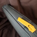
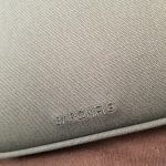
The cover I chose is bright chrome yellow- a bright orange-yellow that is reminiscent of farm-raised egg yolks or school buses. The covering is vinyl imprinted with a leather texture. It has a soft feel, slightly squishy, in a way that makes the notebook grippy and not slippery. The elastic matches the exterior and is the right length. The company name is imprinted on the bottom center of the back cover.

Inside the ribbon bookmark matches the color of the covers and elastic. The ribbon is woven and heat sealed. It had a generous overhang of several inches. You can grab the ribbon to open the book. In the back of the book, there is a cream colored pocket, with satin gussets allowing it to open wider than is feasibly useful.

There are 144 smooth cream-colored dot grid pages. The paper is boasted to be 100gsm. The dot grid is printed in a medium grey color at a 5mm distance. The grey is dark enough to be seen even after writing but it’s not obtrusively dark. It fades behind most inks. The pages are Smythe sewn and done well. The stitching is tight and secure. The spine in use is well glued. The whole book opens flat and can be folded over onto itself.

The size of this notebook is about 3mm shorter and 6mm wider than an L1917. This is often called “Narrow A5.” Let’s just call it what it is, “Moleskine A5.” I like this size you might want a true A5, like the L1917.

I didn’t have a lot of expectations for paper performance. I braced myself for feathering and bleed through. I was pleasantly surprised by the exceptional performance of this paper. Gel, ballpoint, and rollerball all performed exceptionally well. Pencils are great on this paper. It’s smooth with enough tooth to hold the graphite without smudging.

The real surprise is how well it performed with fountain pens. Most of my testing was done with fine and extra fine pens, and a medium thrown in here and there. Most inks performed well, except for known poor performers and a few surprises. Most of my inks performed flawlessly.  Those that feathered tended to have more show through and occasional bleed through.

The 5mm dot grid has 25 x 41 dots, which rules off well for a future log or other habit trackers.
The bottom line? This isn’t a bad book to consider for bullet journaling. At $9 it’s not a huge investment but it’s got the bells and whistles of the more expensive notebooks. The paper is good enough but has occasional issues with liquid inks. It is thicker than the L1917 but doesn’t perform as well as the Baron Fig Confidant. It has 144 pages, which means you’ll be buying a new book soon. That said, if you aren’t sure about bullet journaling, this smaller size and lower investment is a good deal. I like this journal, I plan on using after I fill either my personal L1917 or my work Confidant.
Review: Wing Sung 601A

The Wing Sung 601A is yet another riff on the venerable Parker 51 or 21 pen. The design is classic and often reproduced. The 601A takes the classic pen and mashes it up with another classic, the Schaefer Triumph. The effect is a bit off-putting at first, but in the end, I like the look.

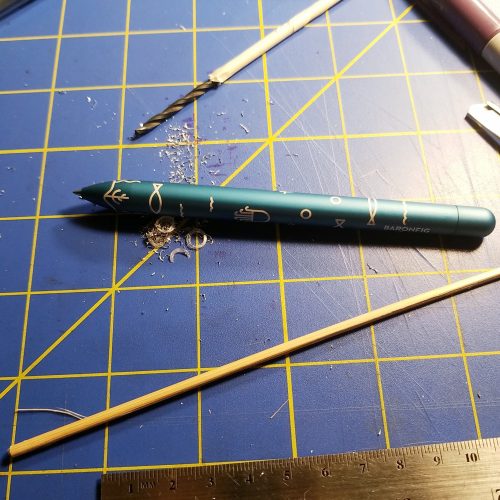
The pen is made of some sort of plastic and is well made. Initially, I could not see the seam line between the blind cap and the body of the pen. There are no mold lines visible on my pen. I ordered what they described as indigo and received a dark teal pen. I received the right color, their naming of the color is off a bit. The brushed stainless steel cap looks great and slides easily onto the pen.

The metal cap is friction fit for capping and posting. I found mine to cap securely but it is just a friction fit. While posting I did find that it posts securely and quite deeply. The cap is a tad heavier than I’d like for posting. It seems to throw the balance off a tad. Folks with larger hands will find this one postable.

The vacumatic filling system took a few tries to get a full fill but once I figured it out, it worked well. I inked this pen with Pilot Jentle Yama-dori. It matches the body of the pen quite well. The ink is visible through the ink windows of my pen, which work well enough.

The writing experience with this pen is different. Immediately upon inking I wiped the nib off and wrote in my usual manner, in an attempt to determine if there was any flex or bounce I pressed down with light pressure. The tines flexed outward and never bounced back. I managed to spring the nib with minor pressure. I was able to bring it back with the use of pliers and some work. We’ll return to this topic in a bit.

When it writes, this pen writes beautifully. The nib is silky smooth and lays down a wet line that manages to capture the characteristics of the ink perfectly. This pen feels wonderful in my hand. I reach for it again and again. Only to be disappointed. It will write then not write as the tines spread themselves wide open. I’m left with skipping ink and barely there lines. Sigh. I’ve ordered a replacement nib to see if I have better luck.

At $14.23 (not the current price) this is my most expensive pen ordered to date. It is a shame that it has a bum nib. My plan is to order a package of replacement nibs and see how it responds to a new nib. If this were a standard nib, the replacement would be easier. I could order one from Goulet or Fountain Pen Revolution and have it here in days. Sadly it’s the weird knockoff Triumph nib and thus I’ll need to wait for the delivery from China.

Overall, this is an ok pen, don’t get the Triumph and 51 mashups, get the hooded nib version. You’ll be happier for it.

Review: Robert Oster Fire and Ice

This is another ink a lovely stationery friend sent me a sample of, and I don’t remember who sent the ink. Lesson learned. All new samples are getting labeled.

This ink is similar to Oster’s other sheening inks- highly saturated, loads of sheen, lots of color. It’s well lubricated and has a great flow- so long as you continue to write, but lay that pen down for more than a few seconds and it slows to a stop and needs some coaxing to flow again. The ink is also well behaved on almost all of the paper I’ve tested it on- including the garbage paper at work. On cheap paper it doesn’t feather but it does have some bleed and show through. Like other inks with sheen that excess ink can transfer to the opposite page of a notebook.

Dry time is better than expected for an ink this saturated. It was less than 7 seconds on good paper and less than 5 on cheap paper, and on garbage paper it was dry in 3 seconds. Like many darker saturated inks, this one also photocopies very well.

In my spill and wipe test the ink tended to blur the moment the water touched the page and smeared even more as I wiped the ink away. In the drip test the color spread and lifted and soaked around the test area. The lines were blurry and barely legible. I would not expect this ink to survive a trip through the washer.

The color of this ink is a greenish blue. I wouldn’t call it teal but it leans closer to that than it does to purple. It is pretty professional. I have come to really like the Robert Oster inks. Like many saturated inks they seem to have some flow issues if you leave a pen uncapped, but overall seem to behave well even on the worst of paper.

Review: Organics Studio Santiago Bay Blue

My friend and RSVP Co-host Lenore sent me this bottle as it didn’t flow well for her. I have not diluted this ink or added anything to it. I don’t know that Lenore added anything to this ink.

This shade of blue reminds me of well washed and broken in denim. It’s a standard shade of blue with decent shading. I’ve tested this in several pens and found that it flows well. I find it to be decently lubricating and smooth on most papers. It’s great in my nicer notebooks and okay on garbage paper. It isn’t the most well behaved but it isn’t bad either. I didn’t notice any excessive feathering or spread.

The ink has pretty standard dry times at just under 10 seconds for good paper and less than 7 for garbage paper. It has decent water resistance in the spill and wipe test. The drip and sit test showed plenty of migration of the color with a legible line left behind. I would not expect this ink to survive the washing machine.

It is a perfectly professional shade of blue. Sadly the big downside of this color is that it doesn’t photocopy well. The darker, shaded areas of letter photocopies well, but the lighter top parts of letters looks faded in most of the tests I made. In a pen with wet flow this could be mitigated. I quite enjoy Organics Studio inks. They do have a tendency to be dry in my pens, but the newer inks seems to have left that behind. I’ve had good luck with the newer inks.

Review: Kaco Green Retro Fountain Pen

Kaco is a new player in the eBay cheap fountain pen market. Their pens tend to be slightly more expensive than the Jinhao and Wingsung that are more often found. The added price comes with a better presentation.

The black plastic envelope is full of foam. Shipping took longer than typical, about 21 days due to the holidays. The Retro arrives in a very sturdy translucent white case. The pen is in a stiff molded tray along with a converter and two international small cartridges.

I ordered the “green” color which is a bright light teal. The color is cheerful and pops out of the sedate tray. The plastic is injection molded and though there are no visible mold lines, you can see the injection points on both the body and the cap. They are placed in locations that make sense and are somewhat hidden.

The bright cheerful color and plastic type screams school pen. The plastic doesn’t feel cheap, it feels sturdy. The nib is a buttery smooth nail. No work needed either, it was that good out of the box. There isn’t a hint of bounce or flex here. The hooded nib keeps things moist and writing. I was able to leave this pen uncapped and open in my bullet journal for at least 15 minutes. When I picked it up to make more notes, it wrote and was back to the usual flow in seconds.

The pen fits my hand and feels good posted or unposted. The cap posts deeply and securely. The cap posts deeply enough that it still feels balanced when in use. The clip is simple- stiff springy wire with a small plastic ball at the open end. IT slides onto my shirt easily and stays put. The clip is surprisingly secure. Depending on your color the clip is an opposite color of the body. It’s a smart little pop of color.

Overall I wasn’t sure what I was getting into with Kaco. The retro is a lovely school style pen that I was able to write with effortlessly. It worked well with my personal writing style and methods of bullet journaling.

I wasn’t sure what to expect when I ordered the Kaco, but I ended up pleasantly surprised and happy with my purchase. The bright pop of color is joyous and the hooded nib writes smoothly on everything I threw at it- from L1917, Baron Fig, to the cheap office paper we use at work. At $10.17 this isn’t the cheapest of the cheap pens but it has a great presentation and really just works right out of the box. I could give one of these as a gift and feel good about it.

Review: Organics Studio Nitrogen

I was gifted a sample of this ink from a friend. I should have labeled the tube when it arrived but I thought I would be able to remember who sent it. I can’t remember which of my wonderful stationery friends sent this ink.

Organic Studio inks come in 55 ml bottle for $14. The inks are super saturated and several websites suggest that you can dilute the ink with distilled water 8 parts ink to 1 part water. The saturation leads to intense amounts of sheen. The base color of this ink is a warm shade of deep blue. It doesn’t lean purple. The sheen on this ink is red and intense. On the right paper the sheen shows up on nearly every line. It sheens on lesser paper.

Surprisingly, the ink is relatively well behaved even on most of the garbage paper I’ve used at work. Flow is great and the ink is lubricated. The nib skates across the page with this ink. If left uncapped and unused for any period of time it starts hard. Dry time is slow on good paper, roughly 10 or more seconds. On garbage paper dry time is slightly better at 10 seconds or less.

The ink is not even close to water resistant. In the droplet and wipe test the saturated ink smeared all over and lifted the ink that wasn’t dribbled on. The drip test revealed that all the ink had lifted and left behind a shadow of the initial lines. This ink would not survive a trip through the washer. It barely survives the drips. A large spill would leave your page blue and your writing gone.

I really like this color, the color is professional looking though the sheen might leave some folks scratching their heads and wondering if this is blue or red? It photocopies well enough. Price is low enough that it doesn’t seem silly to use this at work.

This ink was provided to me as a gift, free of charge, with no intent from the gift giver other than a hope that I would enjoy  the ink. Any links in the review are to vendors who sell this particular ink, they are not affiliate.

Review: Pelikan Edelstein Tanzanite Cartridges

This ink is a great dark blue black that is a nice cool grey. It reminds me of Payne’s Grey watercolors, which for me is a very very good thing. Payne’s Grey is a favorite convenience color of mine.

I’ve had the opportunity to use this ink in several fountain pens and it has had a smooth even flow in every pen. The ink is well lubricated and feels great on good paper and garbage paper at work. In pens with greater flow it has a red sheen, which is lovely against the deep grey shade.

Dry time seems pretty standard for inks with good flow, just under 10 seconds on good paper and around 7 seconds on lesser paper.

In the drip test the ink lifts almost immediately and spreads out. In the dribble and wipe test (meant to mimic spilling and subsequent clean up) the ink smeared and made a mess. This is not an ink that will survive the washing machine. I doubt it would survive a hot tea or coffee spill.

Overall this is a perfectly professional blue black ink that performs well on most paper. Sadly it won’t survive spills, but if being considered as an ink for work, this matters little. It’s not the cheapest ink around, but it is a solid performer for a cartridge pen. It is also available ink bottles for folks who use a converter or piston filling pen.

Review: De Atramentis Deepwater Obsession Black

I picked up a bottle of this from Jetpens well over a year ago. The 30ml bottle cost $15. The price is neither the highest or lowest I’ve ever paid for a bottle of black ink.

The ink comes in a squat  cylindrical bottle with a flair at the base and the top. The lid reminds me of Diamine’s 50ml glass bottle lids. The label for the bottles is basic looking.

The black itself is nicely dark on all the paper I’ve tried. It doesn’t grey out when I write. There is no shading to speak of though I wouldn’t call this ink saturated. The flow is even and decently lubricated even on garbage paper. The ink is well behaved even on fibery absorbent paper. The ink photocopies incredibly well.

The ink responds well to drips and spills but isn’t waterproof. With a drip and wipe a few seconds later the ink smears but leaves behind legible lines. Even with a lengthier soak the lines are still visible though significantly blurred. I did not test with detergent or with a lengthy soak, but I would not expect this ink to survive the washing machine.

The combination of it being nicely dark, well lubricated, and well behaved on a variety of garbage paper makes it my go to ink. I load most of my pens up with this first then test with other inks later. It’s a great black ink.

Review: Akkerman Binnenhof Blues

My new DayJob allows for blue or black ink* and I’m in search of inks that work well in my various pens, look good on nice as well as crap paper, and photocopies well. I’m looking for professional looking black and blue inks.

My RSVP Co-host, Lenore, sent me a package with a bunch of Akkerman ink samples and a few other inks. I’ve used a bunch of the inks for doodles and writing, but the Binnenhof Blues was a color that I hadn’t touched, until now. I filled my CaliArt Ego with the sample. I used it during my first full week at the new job. While in training I used it on the unknown paper** the main office uses for photocopies, my Baron Fig Vanguard, and my pocket notebook. The ink performed well on all papers*** with minimal feathering and bleed through.

For purposes of photos for the blog, I used the ink on a Baron Fig Strategist 3×5 card, Yoobi 3×5 card, and a Staples Stickies note. I’ve included an image from my Leachturm 1917. The dry time on good paper is slow but on copy paper, it was around 3 seconds, so not bad. I don’t do swatches but I did several layers of ink with a pen. It took 7 layers of scribbles for the ink to soak through. Though fibers lifted from the Strategist after 4 layers. On cheaper paper, it does have a tendency to bled through, though not badly. Thinner papers have some show through, but I didn’t have an issue in my L1917 or Confidant.

Performance of this ink is good on most papers. It photocopies well enough. I quite enjoyed this in my bullet journal and my work planner.

It isn’t waterproof though it does show some resistance. I did a droplet and wipe test. The wipe test showed some smearing but the lines are legible both after the wipes and droplets have dried. With the soak/droplets, the ink showed significant migration. I have no doubt that this ink would not survive the washing machine.

This isn’t a unique shade of blue. It’s been noted by many other and better reviewers that this is Diamine Saphire ink in a fancy bottle. It is a lovely shade of blue-ish purple that reminds me of most blue inks out there. If you want a sedate well behaved blue ink that doesn’t stand out- Akkerman Binnenof Blues is a great choice. Despite the fact that it is a shade of blue available in many forms- from ballpoint to gel to other brands of ink, I like it. There is something about blue-ish purple that I really enjoy. While it is obviously blue it is also warm-ish and in the right warm light could read as purple.

If you are looking for a nice, well behaved blue-purple ink this is a good choice. Maybe buy the Akkerman for the fancy bottle then refill it with Diamine?