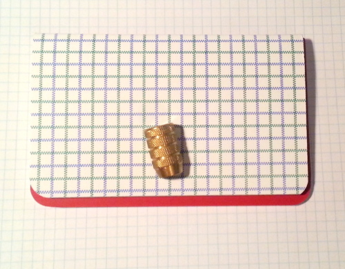
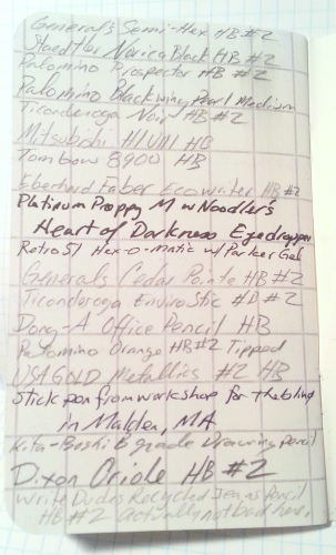
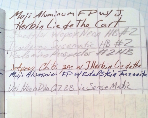
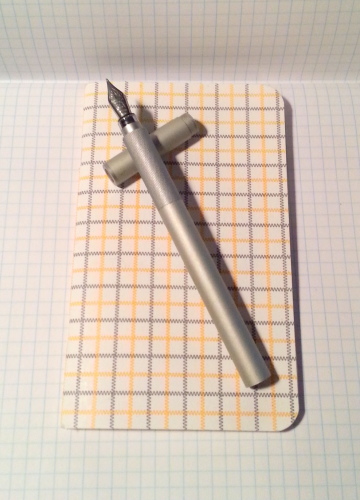
I picked up a 2-pack of OrangeArt’s pocket sized tattersall letterpress printed notebooks at Black Ink in Harvard Square awhile back. The 2-pack was $8.50, so pretty pricey.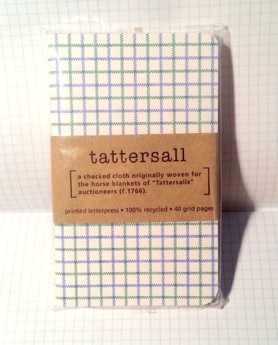 Each notebook has a cover and pages that are letter press printed with a tattersall pattern. Basically zigzag lines in a large grid pattern. The covers are printed in 2 colors while the interior is a nice shade of gray. The interior paper is nice, toothy enough for pencils and smooth enough for fountain pens. Fountain pens perform reasonably well on this paper, with a little show through and hardly any bleed through but for where I rested my pen a second too long. I used 3 inks in my testing, Pelikan Edelstein Tanzanite, J. Herbin Lie de The, and Noodler’s Heart of Darkness. All were in medium or fine nibbed pens that run wet. I had no feathering or widening of the lines. With the finest of pens the paper made them feel scratchy, but not bad enough to stop me from writing. Pencils performed admirably on this paper. I was able to use my soft dark Palomino Blackwing (“original”) as well as my harder lighter Mirado Black Warrior to good effect. The paper was toothy enough to pull off a decent amount of graphite but not so toothy it felt like I was writing on a cheese grater. Pretty much just right.
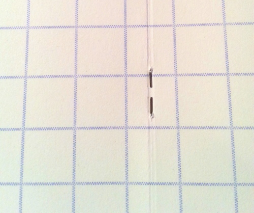
 The book is held together with 2 standard staples. This works reasonably well. I did not subject this to a stress test as this book was my at-home journal and even there lived in a leather cover. The cover is letterpress printed in 2 colors on white. The cover paper is not much heavier than the interior pages and feels flimsy. It is the worst part of the whole book. While pretty, this cover simply isn’t going to hold up to much abuse or pulling in and out of a back pocket. This is a paper cover that necessitates a case for any use out and about.
 The 40 pages take fountain pen and pencil well. This notebook has 8 less pages than other pocket notebooks that are cheaper. The ruling is also odd. It is a gray version of the exterior printing but without the cool letterpress imprint*. The ruling is super wide, about double the width of a Word notebook and most other ruling. It measures in at 13mm. Super wide. i was able to fit 2 lines of writing into one line. I find this annoying. the ruling is also thick about .5mm. even though it’s gray it shows up under all my writing and remains very noticeable. They are available without the ruling. If I were to buy these again I’d look for them with blank pages.
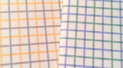
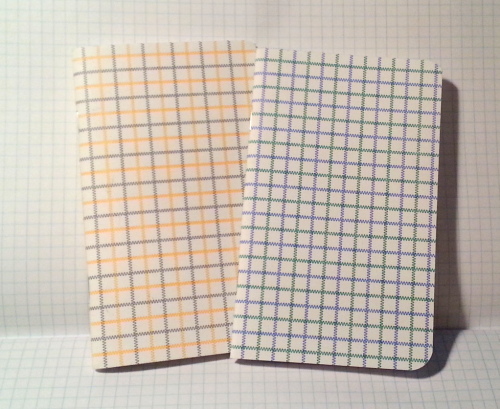 Overall these are very pretty pocket notebooks and wonderful if you use a case/cover for your books. If you use fountain pens you will be pleased with the interior paper, and likewise for pencil. They are higher priced than Field Notes or Word notebooks, but boast letterpress printed covers and interior pages. Worth it if you like letter pressed items and want something a little different from the standard fare.
Tag Archives: graphite
Review: Classic Eraser Round Up
Over on the Erasable podcast they spent an entire episode on erasers. The episode focused on erasers from the perspective of writers and lacked the perspective of an artist.* This highlighted to me the major differences in how artists and writers use erasers and why they use them.
An overwhelming favorite of the podcast were the Pearl erasers, which are now available in the classic pink but also in black and white. The pearl series of erasers feature a gritty removal mechanism that artists tend to avoid as it can damage the delicate surfaces of your art paper, but removes graphite quickly and pretty cleanly while writing. And if you are pressing hard while writing the Pearl erasers can press down the surrounding paper fibers and get down into that groove and get that graphite out. Great for writing, not so great for drawing.
When it comes to using erasers for drawing or shading, there are so many options out there that it’s confusing. What do you use and when do you use it? This post is about a few classic erasers that you’ll find many art teachers recommend.
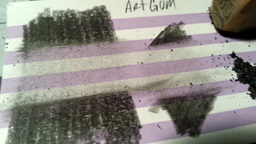
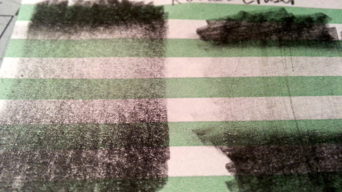
All of the images show Design Drawing 3800 4B and a General’s Semi-Hex HB/#2 swatch on color lined 3×5 card. The Semi-Hex was chosen for it’s grittiness and ability to leave scratches in the paper, to demonstrate how the soft erasers have issues with getting into these grooves. The 4B was to demonstrate how the pencil can be pushed into the fibers of the paper. Also included in the first image is the pile of eraser crumbs created via erasing.
Let’s start off with the classic Art Gum Eraser. It’s tan and can be purchased in a variety of sizes for cheap money. when you use ity you’ll notice that it is also crumbly and makes a mess of crumbs across the page. It does an okay job of graphite removal but it really does a better job with charcoal. It also doesn’t have any grit to speak of so it doesn’t abrade the paper like the Pearl erasers. It is however pretty stiff so I can dent your page.
I recommended this one to my former students mostly because it was super cheap but also for it’s great work with charcoal pencils. 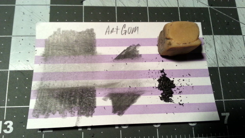
 Next is the standard kneaded eraser. These are made by a bunch of brands and can also be found in soft, medium, and hard varieties. though most varieties are medium (IMO) and are not labeled. If you aren’t in an art store you will not find the various “hardnesses.” Even most art stores simply carry one style. Many stores also have their brand label of kneaded erasers. In the past kneaded erasers were always gray. Now you can find them in blue, yellow, and other colors.
To use a kneaded eraser you stretch and pull it until it is soft and pliable. You can form it into shapes to make erasures on your page. My favorite shape is a teardrop, the pointy end can be used for details while the larger rounded end can clear away larger swathes of graphite. These can be trickier to get the hang of than similar block erasers, but once mastered they are great. You would use these on almost any drawing paper where you want to clean off graphite or charcoal without damaging your expensive paper. They leave no trace behind so generally, even after erasing your paper will react to watercolors just the same as before you erased. If you have pressed into your page, this eraser will not get that graphite out. This is a delicate eraser meant to remove delicate marks. However with work it will get a paper close to clean.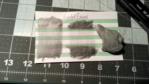
 The final classic eraser we should discuss and is always on every art supply list I’ve ever received is the Staedtler Mars Plastic (SMP). While white plastic erasers are now everywhere** the Mars Plastic is the original. The SMP is suggested because it’s soft enough that it doesn’t damage paper but also can clean the paper really well. Unlike the Pearl erasers it has no grit but works really well. It was originally designed for designers to remove graphite from blueprint films, it removed graphite cleanly and easily. It tends to tear if you hold it too far back from the working end, and the paper sleeve helps to keep it from breaking but also to keep it clean. It was able to be cut into shape and used to get tiny small details, which was always fantastic for detailed drawings.
It was always outrageously expensive but has gone down drastically in price over the last 15 years. Which is really great for the art students out there. I tended to go through one of these, if not more in a school year, as I sketched out ideas, added ink, and then erased my lines later. It never worked as well with charcoal as it did with graphite but still did okay. It was also available in a click stick format. But that is for another round up.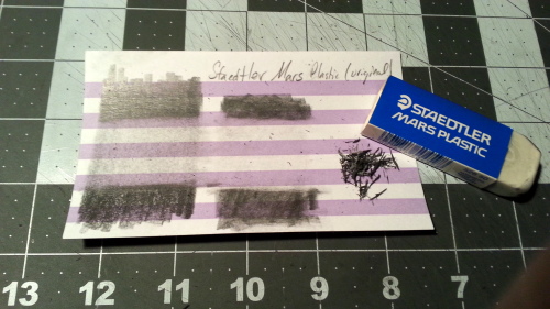
 These three erasers were on every art supply list I received in college and later I often recommended them. Over the years I’ve gotten rid of the art gum in favor of other styles but recognize it’s usefulness.
