Back in 2012 I offered a semi-review or a first look at the Canson Art Book One as a budget friendly offering for art journalers. The Canson Art Book Universal (CABU) is in the same series of sketchbooks but with a few differences. I won’t focus on the differences but what makes the CABU so great.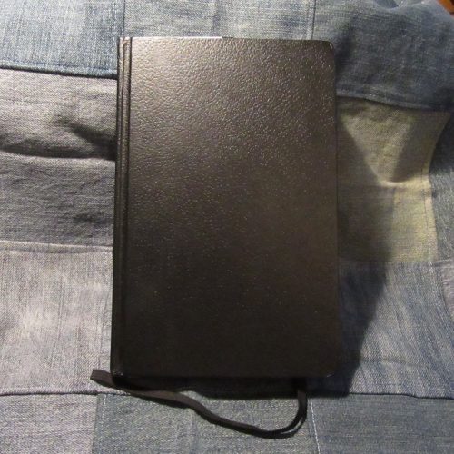
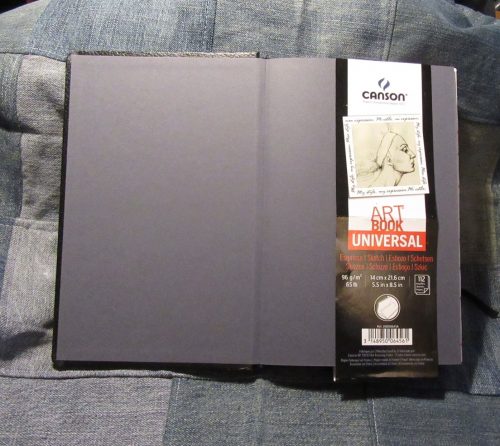
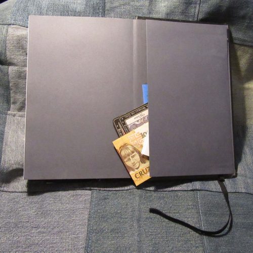 I have the A5 or 5.5×8.5 inch size. The basic rundown of the CABU is that it has 224 pages of 96gsm (65lb) white paper. It is acid free, has no brighteners, and states it won’t yellow with age. The paper is smooth to the touch but has a nice tooth for pencils. The sketchbook has a classic pebbled faux leather grain coating over sturdy heavy boards. The corners of the cover are rounded but the book block is squared. The binding is a traditional Smythe stitch with heavyweight neutral grey end sheets. The back of the book has a nice roomy pocket and sports an elastic that was loose when I opened the package and has only gotten worse as the book has gotten older. I finally ripped the elastic off. Useless.
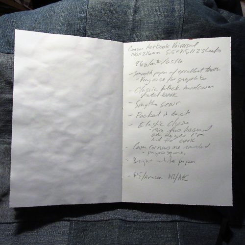 Let’s talk about this paper, it’s lovely. The tooth is just right for sketching with pencils. The graphite glides over the surface. Though it is toothy it doesn’t grind the points down to a stump in moments rather, just the right amount is deposited no the paper and the points last well. Pencil feels amazing on this paper. It looks awesome too. The graphite seems to pop off the page, but shades well.
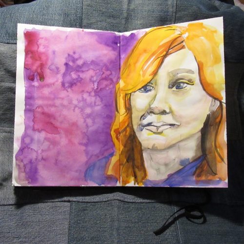
Fountain pens also fair well. Though there is a nice tooth to the page, it is very smooth when using a fountain pen. All mine felt great on the surface. My EF Eco was a tad bit scratchy but that pen is always a tad bit scratchy. All the inks that should exhibit sheen or glitter did, and whoa did they! Not one bled through either. Brush pens fair in much the same way- the ink looks great, the ink doesn’t bleed through.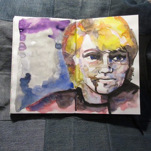
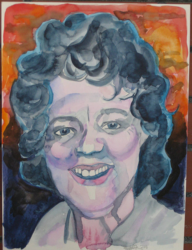
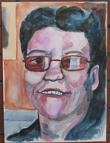
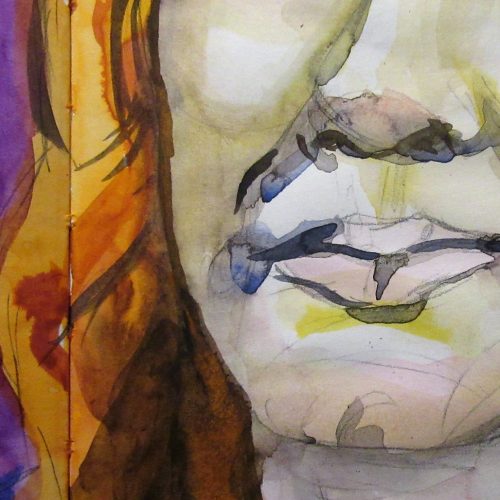
One of my favorite ways of using the CABU is for mixed media and watercolors. The paper is great for collage and though it cockles a bit it is great for watercolor washes. IN fact I really have slopped some watercolor in this book and it never soaks through. The colors sits on top of the paper similar to the way they react on hot press. Lifting colors, so long as you aren’t using a color that stains, actually works. Softening hard edges works nicely. This has become my go to for portraiture practice. The paper is really just lovely.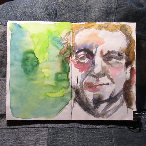 As it is a sketchbook it is only available in blanks pages. If you want to use this for writing, you can download one of Ana’s writing guides, over here.
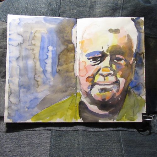
In short if you are looking for a sketchbook that pretty much does it all reasonably well, the CABU will fit that bill. True it isn’t available in lined or dot grid, but the paper is so good you won’t really care once you get a writing guide. Continue reading