Tag Archives: sketchbook

Review: B&N Bargan Bin Piccadily Sketchbook

This weekend I picked up a bargain priced sketchbook at B&N for about $5. I thought it was a no name brand that B&N often sell. When I got it home I realized it’s a Piccadilly branded journal.

The list price on this sketchbook is $12.99; I got it for $4.99. Less than half price. I noticed that B&N didn’t have ANY of these on the regular shelf. So I’m thinking these are only ordered for the cheapie racks. Which is fine, at $5 this isn’t a bad deal but for $12.99 not worth the money.

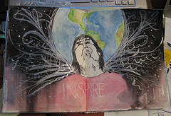
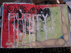
I tested this with a variety of inks in a variety of pens. I did a little sketching to see how the paper would respond and I did my usual of an ink and water wash.

Anything with a larger than a fine tip feathered and bled through the paper. There was a TON of feathering especially in my medium tipped and wet writing Pelikano. My extra fine and fine pointed pens did okay, regardless of the ink. I tested both sides of the paper and there is no right/wrong side, the sides have the same finish throughout the journal. The paper is very smooth. I wouldn’t want to use a pencil on this paper as it’s just too smooth and pencil would smudge all over the place.

Ink mix0019
As for water on this paper, it could be done but it’s not recommended, a very light wash caused major cockling (wrinkles) that never eased out of the paper. I also noticed that really heavy application of ink caused the same issues. Anywhere I used a heavy layer of ink it not only bled through the paper but also to the page underneath. Anywhere there was heavy ink use the fibers of the paper lifted and were picked up by the nib of the pen.

Ink mix0018 The Pros:

  • Good value at $5
  • Paper is smooth
  • Bright white paper
  • Great sturdy hard cover
  • Sturdy double coil binding

Cons:

  • Feathering with any ink
  • Bleedthrough
  • Fiber lifting
  • No water due to cockling
  • EF and F nibs or pencil only

Overall I’d say this is a good sketchbook for someone looking for something cheap that they can do a lot of throwaway sketches in or just to take some notes. This little journal probably wouldn’t stand up to a lot of the abuse that art journalers would toss at it. Even if you gesso’ed the pages the paper is just not sturdy enough. It’s too bad, because this is a really good looking little sketchbook, and comes in a lot of good sizes and with lined paper too which has a lot of different options for covers.


Review: Moleskine 6×9 Sketchbook

This sketchbook contains 80 roughly 110lb plain cream colored pages. They are contained within plastic covered hard black covers. The plastic is imprinted to look like leather. This sketchbook is very often suggested for people started out in art journaling.

The paper is stiff and smooth. It’s good for writing and drawing. I find that the paper has a coating that repels wet media like watercolors, which it absorbs but gives a blotchy appearance. It does the same with some inks. It can be quite a pain in the rear. I’ve found that if I got through my sketchbook and spritz the pages with a little water so they are evenly damp and then allow them to dry before working in watercolor or ink the blotchiness is minimized.

The paper responds favorably to pitt and zig pens. They remain perfectly black and don’t show any blotchiness. The paper is also heavy enough to support many layers of collage and acrylic paint. When working with wet media it’s best to be aware that the paper will cockle and remain wavy even after it dries. I like the wavy paper but most don’t.

The heavy weight paper does not show strike nor bleed through except when using sharpies and copic markers. Fountain pens do just fine on this paper. Some fountain pen inks get blotchy.

The sketchbook has a great form factor with its smooth hard black covers, pocket in the back and elastic closure. I can’t say that the paper would be a reason to recommend it. The pages can take abuse but if you erase too much or scrub the pages with a brush you’ll end up will pilling of the top of the paper. I’ve read reports of the spine breaking on these sketchbooks but I’ve abused the heck out of mine and never had a broken or damaged spine, and I’m not gentle with my sketchbooks and journals. The price however is quite prohibitive at $18 for 80 pages.

If you are looking for a sketchbook that handles a variety of media relatively well, with a nice hard cover, at a ridiculously high price this is a good sketchbook. There are others similarly shaped and sized that will work as well at a lower price.

 INterested in purchasing a moleskine sketchbook? Follow this link, it was the best price I could find on them:


Review: Canson XL Watercolor Pad

I picked up a Canson XL 30 sheet pad of CP 140# watercolor paper a few months back with the intent of comparing it to my favorite inexpensive paper, Strathmore 140# CP 400 series. It compares well.

First off, it comes in a glue bound pad which is good for bookbinding not good for art journaling. To me a glue binding is temporary and won’t last, I abuse my art journals and thus this pad would absolutely not hold up to my use. The paper folds in half easily and without cracking. This is a bonus if you are intending to make your own sketchbook or journal. The grain of this paper is along the short side, which again, is perfect for binding.

The paper is thinner and softer in feel to other 140# paper, specifically the Strathmore. It’s still stiff, but is not quite as stiff as cardboard. The cold pressed paper is textured more on one side than the other. The Canson CP is significantly less textured than most other CP papers I’ve used, and I’ve used a lot. The reverse size is significantly smoother than the front. You can feel and see the difference in texture. The amount of sizing is different too. The differing texture and sizing means that when binding you either let the different textures face each other OR you pull the pages out and face them together.  It’s an extra step in binding that makes an art journal more pleasurable, versus getting into the journal and realizing each facing page responds to pen, ink, and watercolor differently. I find that annoying.

Ink mix0013
Ink mix0013
 The paper handled ink like a dream. Even my fine and extra fine pointed fountain pens floated on its smoothish CP surface. Noodler’s bullet proof ink bonded with it well and other inks gave me a wonderful watercolor effect. The pages handled watercolor crayon like a dream and scraped acrylics like it was made for it. I noticed even with repeated brushing and scribbling layers of ink no pilling or pulling up of fibers. Either side handled them well. The reverse and smoother side was much more absorbent, so an even pull of credit card scraped acrylic got less coverage but was decent. The paper is heavy enough that I did not notice any wrinkling. Watercolors of course gave a cockling effect that soon relaxed as the paper dried.

Ink mix0015

Ink mix0015
This is a budget friendly pad of paper. I purchased it on sale for around $7; regular price is around $13 for the 11×15 in size. It’s not a bad price, especially for a pad that is easily folded up for making an art journal. I found it on Amazon (see below) for $4.59 in the 9×12 size, which is not bad at all. I was unable to find the 11×14 on Amazon but did find it on the Blick site for about $7.


Continue reading

Some more stuff for the upcoming year- Reviews

Part of what I want to add to this blog is a series of reviews. I’d like to review journals, products, books and other items one might use in journaling; both art and written.

I’m developing a format for reviewing journals and products associated with journaling. Obviously journals will have their paper reviewed in terms of suitability for wet/dry media as well as how that paper holds up to the abuse of mixed media. I think that a good art journal needs to also have pages that can be written on with a variety of tools- sharpies, fountain pens, pencils and other markers. I’ll address such things as strike through, bleed through and warping. Obviously this sort of journal review will be vastly different from how paper reviews are done on blogs that focus solely on one aspect of journaling. I have passed over paper that people adore on other sites and adored paper that some people despise.

So I invite people to contact me if they’d like to have their journals and sketchbooks reviewed. Each review will be linked to the seller’s site with plenty of contact info.

I’ve got a ton of products that I used and, sadly some I don’t use. I’m going to reach into my tool kit and evaluate some of these products. The perspective will be that of a mixed media artist. Can I layer the product? Does it stand up to uses the manufacturer suggests and doesn’t suggest? Is it useful? Is the price acceptable or outrageous? 

I’ve got a deep bookcase and I’m going to pull some of the stuff off the shelf, not just new books but older books and review them. I’ve been doing this in part for the zine, but I’ve focused on new books. I want to help people build up a book shelf of their own with books that are really useful resources for art journalers.

The reviews will start in January/ February and I’ll be hopefully be able to do one each week.

My hope is to make this blog more of a resource than it already is.

Anyone who is interested in having their product reviewed can email me: leslie(dot)herger(at)gmail(dot)com

Traveling with your Art Journal: 2 Videos

I've been working on my travel journal for my upcoming (no fun) trip to Maine. I'll be up there for almost 2 weeks. I don't usually take my acrylic paints with me and I know that I'm not going to have the time I often have to work on the pages with watercolors. I like to work on colored pages so I've gone through and I've collaged into the journal random images from Mother Earth News, Wine Enthusiast and some collage papers. I've gesso'd the pages then used thin acrylics to color each page. After that Iused watered down acrylics in 3 colors to tone down and grunge up the pages. I'll be doing a whole video on that soon.

Anyway, here are the videos!

When I finish filling this journal I'll be doing an art journal flip video. I may try to do some process videos too. I'll have my cameras with me when I'm traveling, so we'll see.

nanojoumo #3- inspire


nanojoumo- inspire
Originally uploaded by lessherger

I had to think to myself what inspires me, then I had to think what doesn't? This is my way of thinking about that.

I sketched out the globe behind the figure first and then sketched in the image of the face, uplifted and with a smile. The next time I decide I want to draw a face on the fold punch me in the throat.

I used my ink brush (fine koi water brush filled with india ink) and inked in the face, body and around the world. I used watercolors to add color to the world and deliberately left the face black and white. I colored in the "shirt area" with watercolor pencil. Using a brush I filled in the black background with india ink and a brush. I spritzed the shirt area with water to allow the ink to run down it.

I hit all that with my drier and dried it out. I then used my gelly roll pen to add some fine line doodles and swirls. I used a brush with liquatex silver ink to add more depth and then added some white acrylic to add more swirls and doodles.

You can't see how awesome and neato the silver ink is in the pictures. Also the curve in the face distorts the face more than it is in reality and makes the whole thing look kinda weird in the photo. I'm not overly happy with it as a finished piece, but I tried to make this a little less complex than the last few images I did.

nanojoumo- purity


nanojoumo- purity
Originally uploaded by lessherger

I get a kick out of all the online "purity" groups. SO when the word purity came up for nanojoumo day 2 I had to lampoon it. The purity "logo" was put online as a purity card for a church group. It looks far cooler here than it did on the card. I pulled the card in to MS Publisher, reversed it and resized it to be about 8×10, i then printed it off onto a sheet of transparency film. I put it on the right side of the film this time and used a great deal of matte medium to transfer it to the pages.I had to cut it into 2 pieces to get it on, and I'll tell you the fold was a beast. the original logo was clearly going for a "urban and graph" feel. So the tendency of the transfer was a perfect medium to really take it there. I then outlined the letters with my pentouch pen, pressed down to get dribbles and runs. While that dried I looked at hundreds of images of scantily clad women bent over various objects, and quite frankly there are things that can't be unseen. Just the very act of attempting to find the image for the right corner has left my brain irreparably damaged. The things I do for art. I found the perfect picture, of a woman, scantily clad washing a car. I wanted the legs to frame the corner, so I first drew the leg for the right most side in soft pencil, added the crotch area and then the left leg. Next was to mix up some white person flesh tone and layer it over the drawing. I added her thong and it's all set. I blocked in some green coloring to set off the legs. Then I mixed up some gesso really thin and used a liner brush to spatter it on the page…

Maybe not the most pure purity page, but it's exactly what popped into my head when I first saw the word as the prompt.

Art Journaling Technique: Grunge Backgrounds

This video is about how to make a cool grunge textured background. I looks like peeling billboards and paper. Easy to do. You need the following to create this back ground:

  • gesso
  • acrylic paint
  • Glue (PVA)
  • Watercolor crayons, pencils or paints
  • Spray inks (optional)
  • Sanding Sponge or sandpaper
  • Magazine with glossy pages.


Technique Videos

 Below you’ll find a list of art jouranling technique videos available for FREE on youtube, Vimeo and Blip.

This is a list of peeps I’ think make videos without too much bull
shit. You won’t need to fast forward through half the video to get to
the techniques being shown, listen to minutes of inane babbling before
you get to the real thing your there for. IN no particular order and
with commentary:

  • MIllande.
    Her videos kick serious butt. She focuses straight away on technique.
    It’s all how to and what to do with a serious focus on real techniques
    and not expecting you to create in her exact style. Information without
    BS. She does do classes but she does a ton on youtube.
  • Willowing.
    Some BS* but a lot of video of her making art. A lot of videos of her
    making art in journals. She shows her techniques. She also does online
    classes.
  • SamanthaKira.
    She’s occasionally a little long winded and occasionally she gets into
    scrapbook mode but her videos are filled with technique and little to
    no BS.
  • TheOneMinuteMUse The one minute muse has videos that are all about 1 minute in length to give you some ideas to start creating.
  • GaryReef gary
    reef is not technically an art journaler but he has hundreds of videos
    up on youtube all about art and making art, and he makes some of them
    in his underwear. 
  • ArtCentrix Not cute art. Love that. No BS either. The techniques are pretty clearly detailed and shot.
  • TheArtJournal. No BS here either, just video of the artist working
  • Mystele All art technique and watching her paint. No BS. Some talking but it’s about ART.
  • Rhomany’sRealm Some BS* but good videos of her making art, and generally positive videos about art journal keeping. She does do some classes through Willowing’s Ning site.

If you have any links to a youtuber without the bull shit leave a
comment and I can add it to the list. I”m going to make this a “page”
that will be links on the left of my blog all the time.

*On this page I mean BS to mean that there is talk, not the style of BS that got me started in making this page which is negativity and a general LACK of art discussion or technique or simple pimping of one’s art classes.