Earlier on twitter I started a series of tweets with the hashtag #trollz. It was juvenile and to me, funny. Ricë said it was too negative. I was attempting to get a group of people talking about the recent rash of trollz in the art twitter-verse. I ended up encouraging people to tweet about a more positive bend with the hashtag #realfriends. It got some conversation going.
I have written before about how I think internet issues should be handled, like adults and “behind the scenes.” Etsy calls the public outing of a person “naming and shaming.” I had a recent interaction with an Etsy seller, who I shall not name*, that was negative. In fact I left my first negative feedback on Etsy, ever, in years of purchases and sales, I’ve never left negative feedback. Selling me something and then never shipping it, is a reason to leave negative feedback.
What I did, I propose all people do if they are cheated on Etsy, eBay, or another sales site. Handle it appropriately; first file a claim with PayPal. I pay for everything online with my paypal card. Why? I can file a claim in all of 2 minutes no matter how I use it. It’s easy, painless, and fast. I keep an eye out, if I don’t get my purchase within 2 weeks, I write in my planner when 30 days is up. At the 15 day mark I contact the seller and try and resolve thing privately. If I still do not get satisfaction or I’ve been assured that the product has been shipped, I contact the seller again at 30 days. At this point I give them an ultimatum, give me a tracking number in 24 hours or I contact paypal and file a dispute.
I don’t back down. I draw a line and I stand behind it. If I don’t get a tracking number I file a dispute with paypal. I’ve had to do this twice, and in each instance I’ve gotten my money back in 24 hours.
What I don’t do is make public tweets, defamatory comments, or anything that could be libelous or slanderous. I try and keep in mind that most of the people I deal with online are real people, trying to make a living just like me. When I’m a happy customer I talk about those instances, I rave about great customer service and FAST shipping. I make positive tweets, face book posts, and blog posts. What I don’t want to do is tear people down, I want to build up the people that are doing a good job and send them more business. **
In my personal dealings I never want people to think of me as a troll, it is to me perhaps the absolute worst insult one can throw on the internet. Trollz ruin internet fun and activities. When a troll enters the chat you are on high alert, worried about the inevitable contrary attacks on some little comment. If you say you love something they hate it and disparage it. They call you names, make fun of your appearance, and send you private messages in the hopes to get you going. They make empty threats and say nasty things. Internet drama is a drug for them and they feed off of it, they are addicted to the high of making others feel bad. For a moment the delight of making someone’s day a little worse builds them up. The problem with any addiction is its need to be fed, constantly, as the addiction grows the need for the high grows and soon enough all the troll does is seek a new thrill. It’s a sad spiral.
I suspect and hope that this post will be the last post you hear from me on the subject of trollz. I’ve gone through and blocked them all and won’t look at them again. I suggest you do the same, they aren’t worth your time.
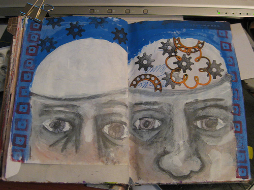
Continue reading →