The Blackwing One Step Durable Point Sharpener does an okay job, but if you want to carry it as pocket bling, well, you have to understand that it is a lot like carting around a salt shaker full of graphite dust in your pocket.
It turned everything in that pocket a lovely shade of silver gray, and my fingers came away with a dusting, and the graphite leaked through and onto my thigh. UGH. C’mon!
I decided I needed to cork it up. I’ve cut two little plugs. One from a wine cork that feels fiddly and works well enough and one from a pink pearl. you cannot pull an eraser from any average sized pencil, a semi-jumbo or jumbo could be whittled to fit.
I sat with a craft knife and whittled the edge of eraser down and plugged the hole. Now I can carry around the BWOSDPS in my pocket and not get dusted with graphite. Sweet.
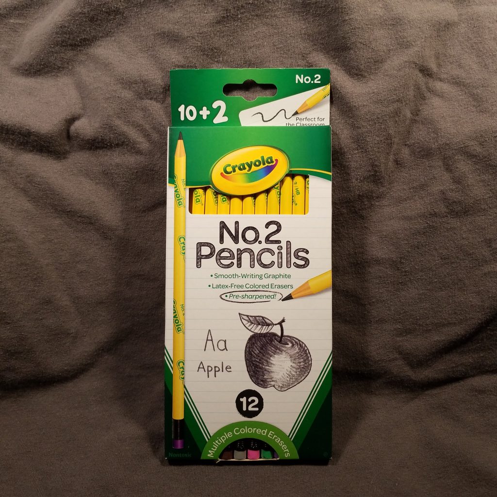
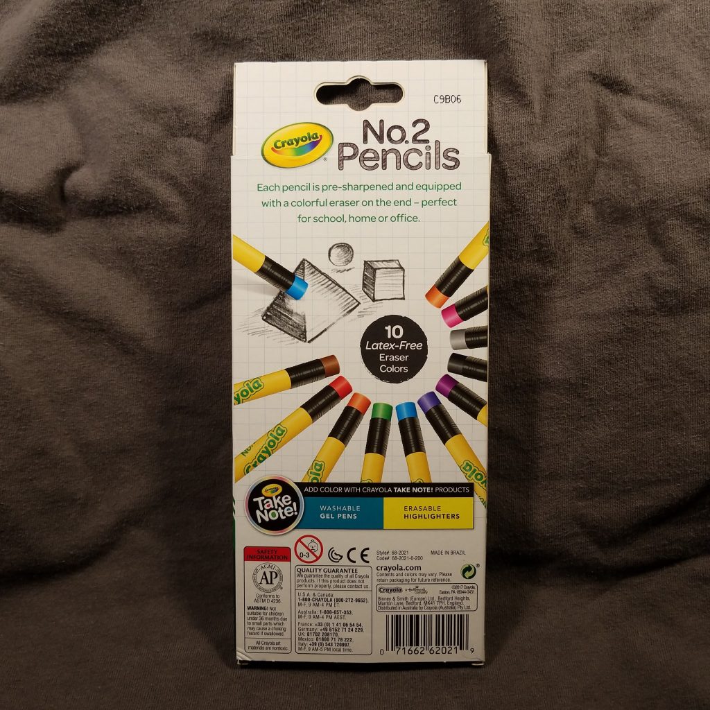
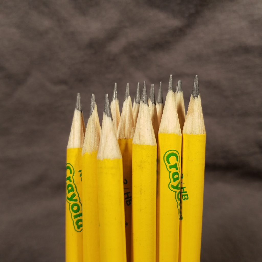
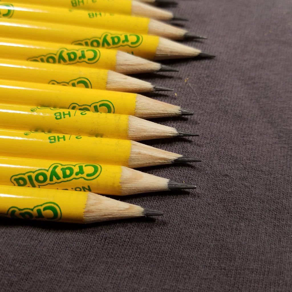
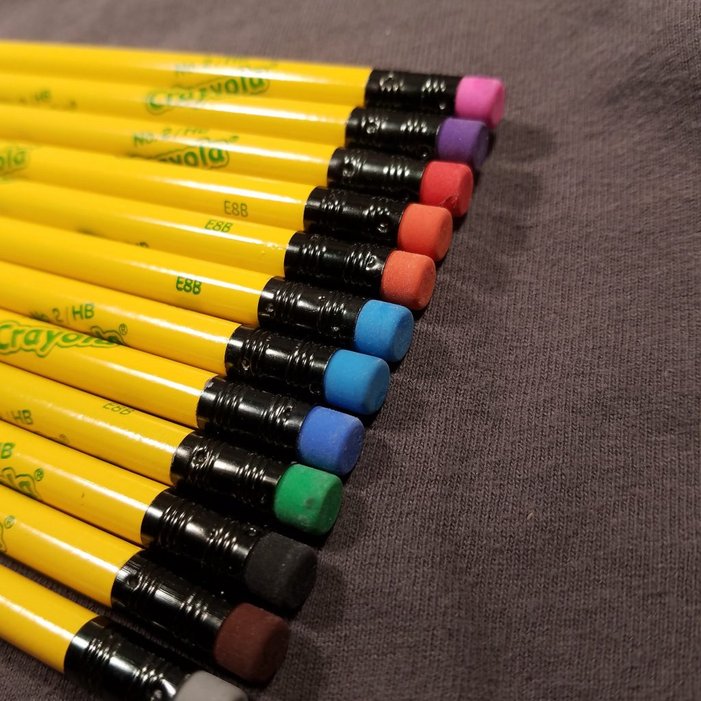
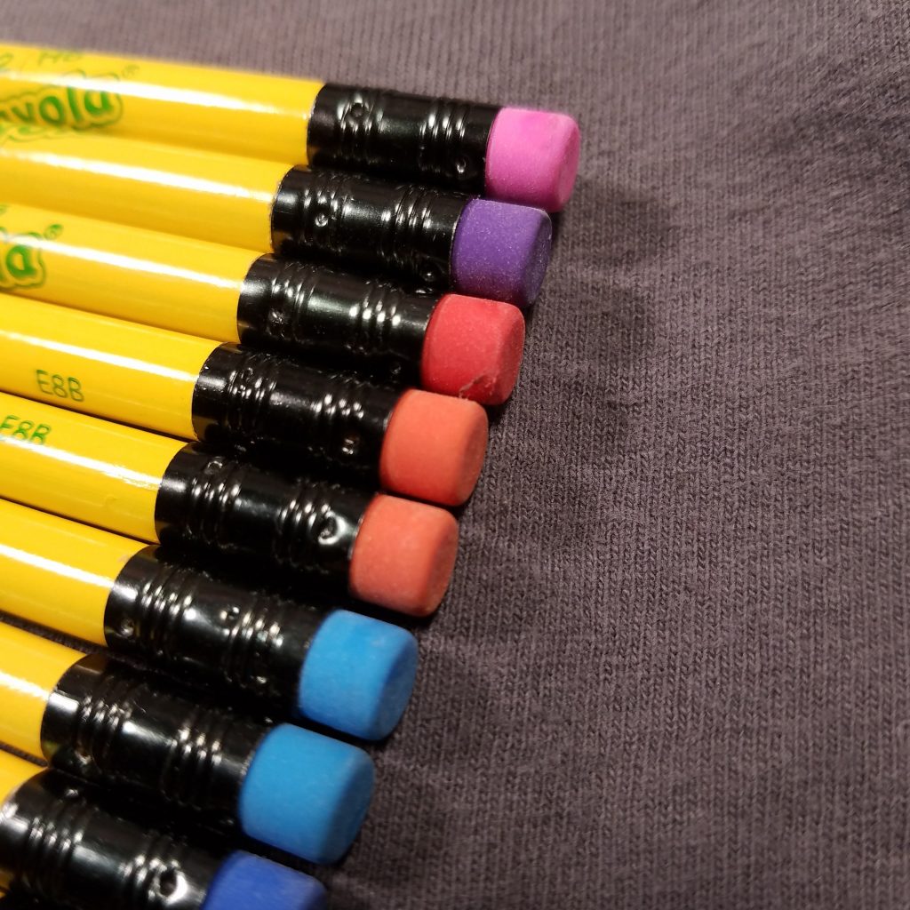
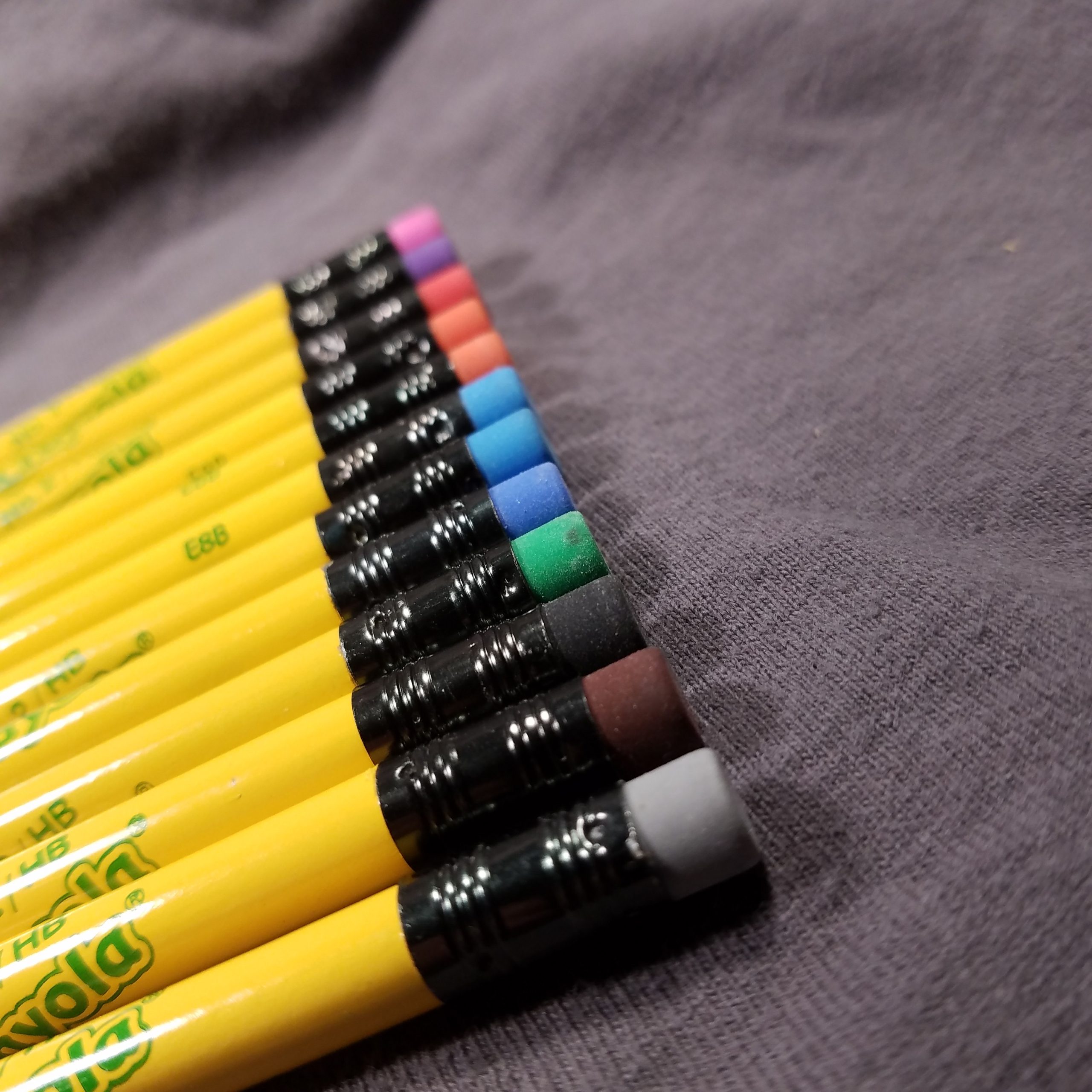
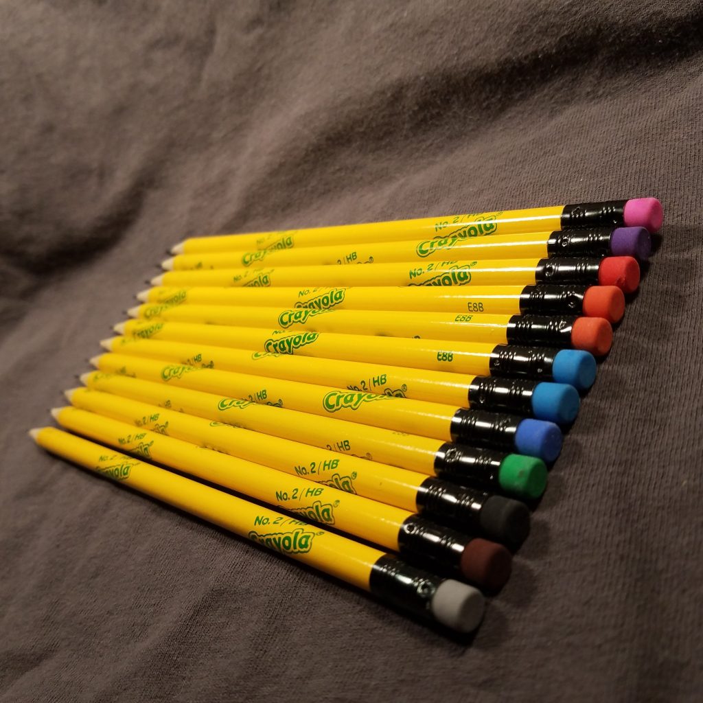
I had never seen Crayola graphite pencils so when these popped up on my Amazon suggested items page, I hit buy. For $4.99 I received 12 round pencils in a decent cardstock box. The pencils are round and painted bright yellow with green lettering, a black ferrule and a colored plastic eraser. The lacquer is thick and glossy, and evenly applied.
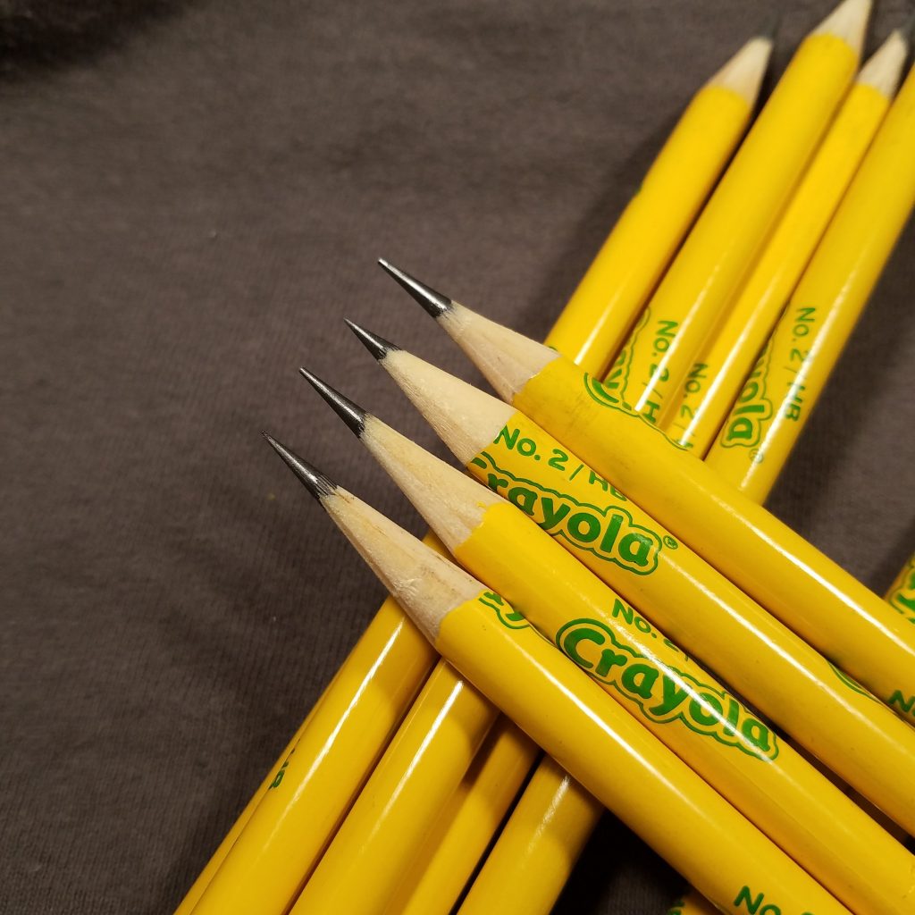
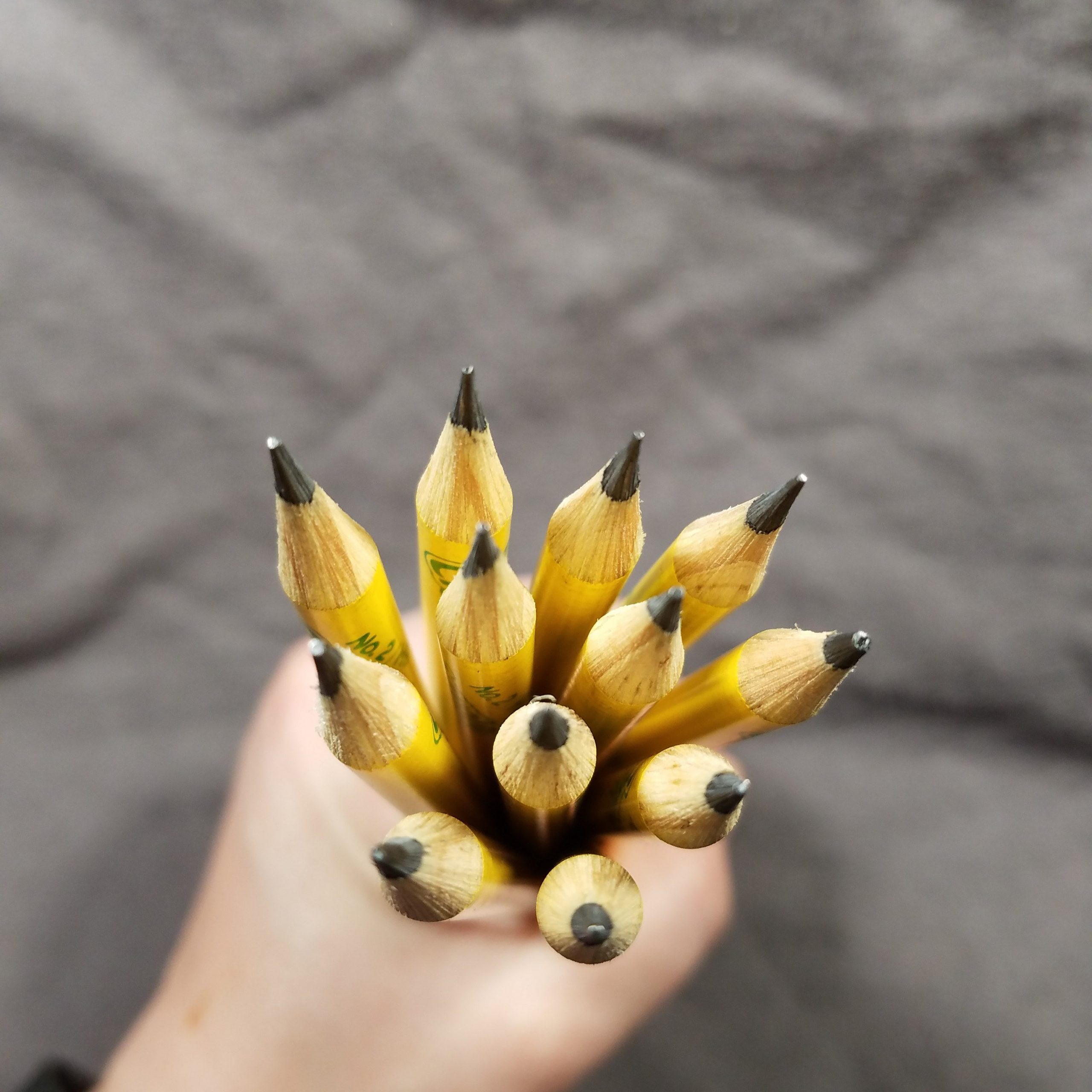
The graphite is dark and smooth. I really like writing with them. A nice long point sharpener lets these write for pages with a nice dark line. The sharpener aspect of these is the downside. They don’t perform well with most hand sharpeners. They are made of what smells like pine. When I use handheld long point sharpeners the wood does not respond well. It grabs the blade and resists sharpening. The graphite sharpens up beautifully every time.
When I use a Deli 133 or my lovely Classroom Friendly sharpener this pencil is great. If I have to sharpen with my handheld sharpeners it’s not great. It’s a shame they used this terrible wood for this pencil. Sadly it ruins a rather nice pencil.
These were purchased with funds from readers! Folx smashed that ko-fi button on the right sidebar and gave me a bunch of coffees so I could buy more pencils, pens and paper to review! If you find my reviews helpful consider giving me a coffee or two and feel free to drop some comments or feedback!
It has been quite a long time since I reviewed an eraser. The standard to which I hold ALL erasers to are the Sakura Foam and Sumo. These two soft sticky erasers work so well that I rarely reach for another brand or style. Remember when I say sticky, I mean that the dust is self clumping not actually sticky in tactile feel.
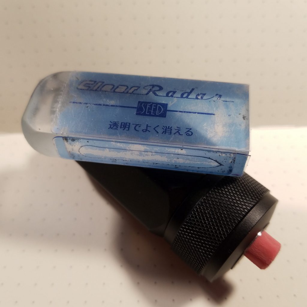
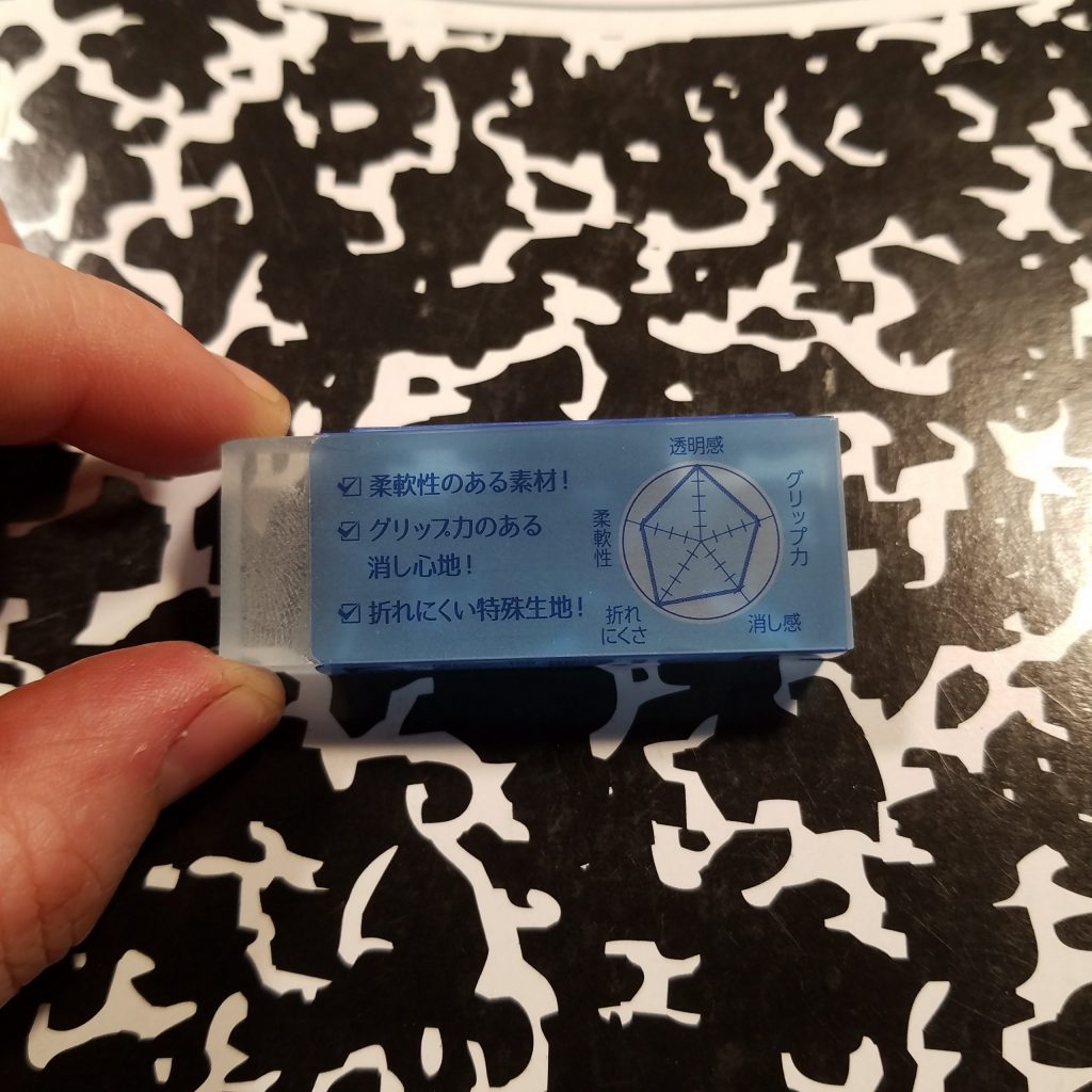
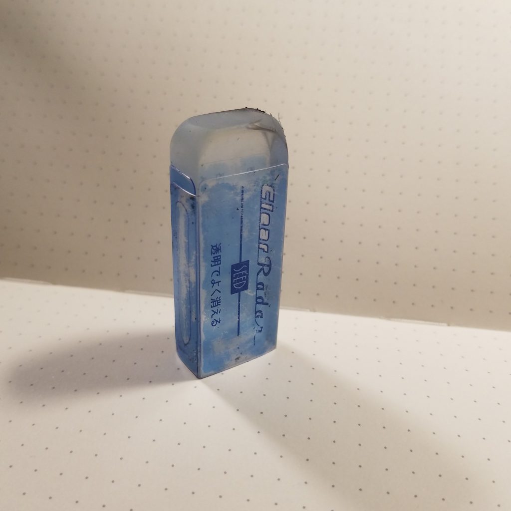
The idea of a clear eraser intrigues me. And the Seed Clear Radar is clear, though not perfectly. The cut edges of the eraser are not clear and once you eraser with an edge that bit becomes frosted, which admittedly is neat. Usually erasers arrive in a little card sleeve, the Clear Radar as a plastic sleeve with pale and dark blue printing. It’s pretty, at first. After a bit of pocket carry, it develops a patina. The eraser picks up a lot of stuff from dust to bits of graphite. It arrived dusted with talc or something of the sort but to get my pics I wiped that off, whatever it was dusted with kept it from sticking to the plastic sleeve. I suspect this might be why it has a plastic sleeve, though I’d prefer a card sleeve.
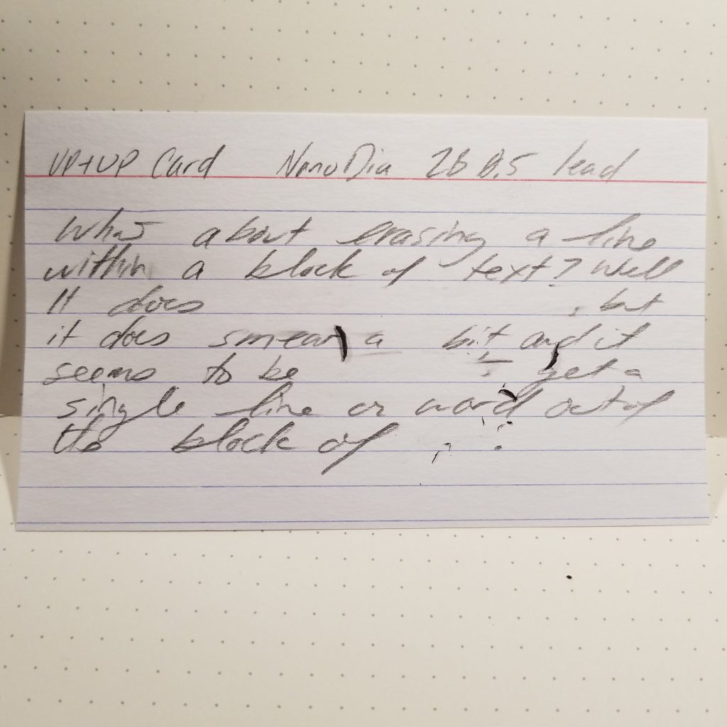
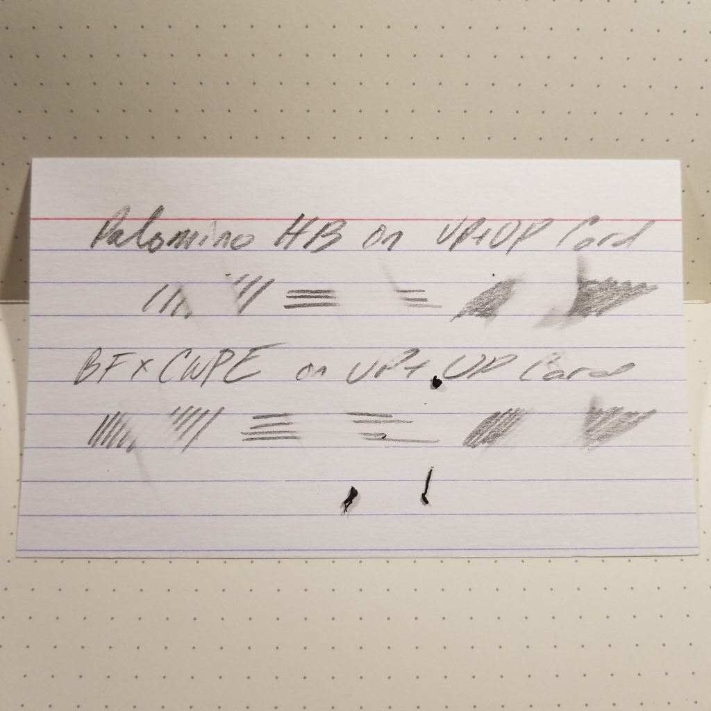
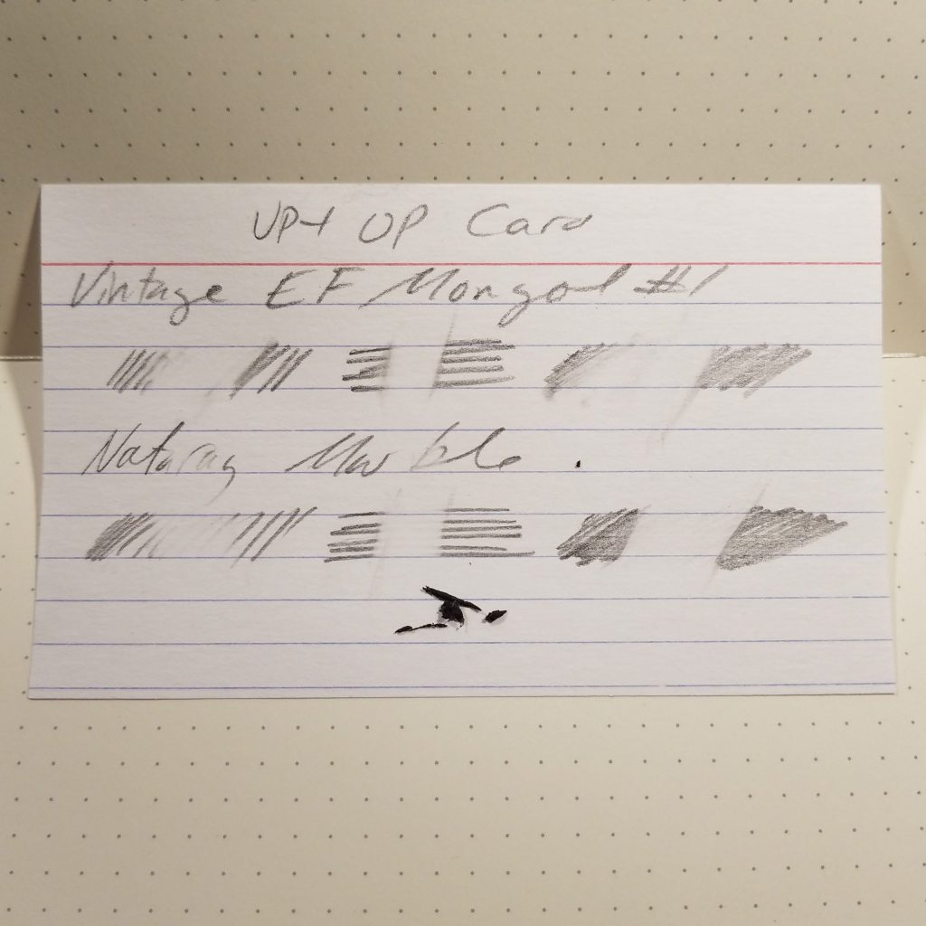
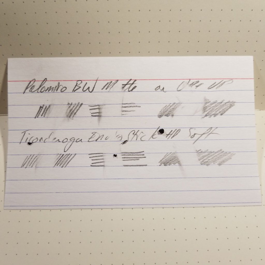
How well does it work? Both well and not well. You’ll note that in the pictures the softer darker pencils such as the palomino HB, Vintage EF Mongol #1, and Palomino MMX all have smears of graphite around the very cleanly erased portion of the lines. The eraser smears things about before grabbing every bit of graphite from the paper. These Up+Up cards are rough with loads of nooks and crannies for graphite to hide, the Clear Radar pulled the graphite out. For erasing in text it’s difficult if there isn’t a sharp edge. I also notice that the eraser works much better after a bit of erasing, so it needs to be warmed. This isn’t unusual when it comes to sticky or clumping erasers.
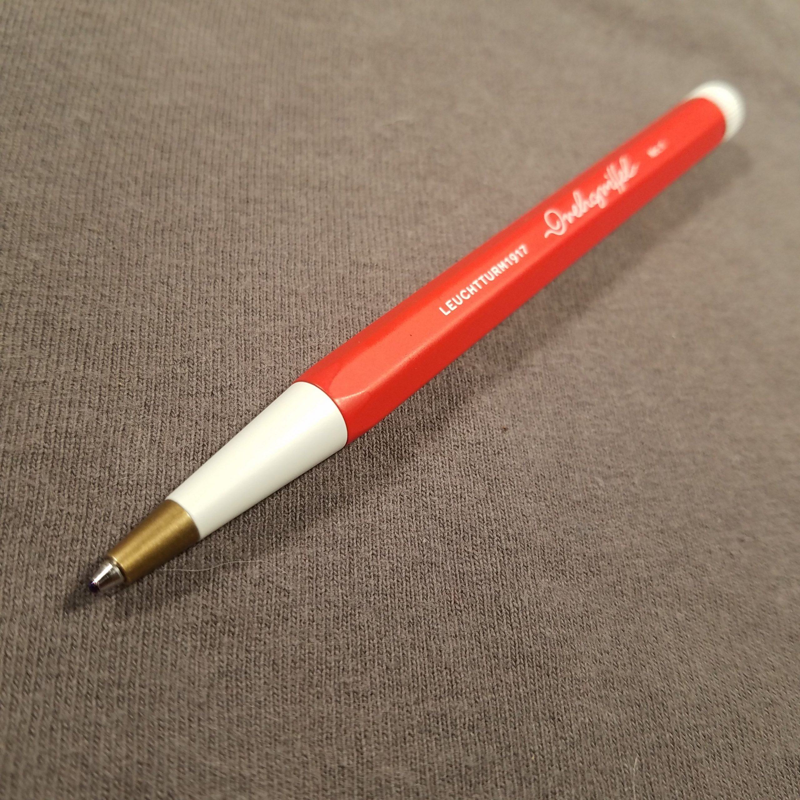
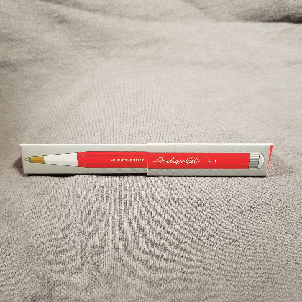
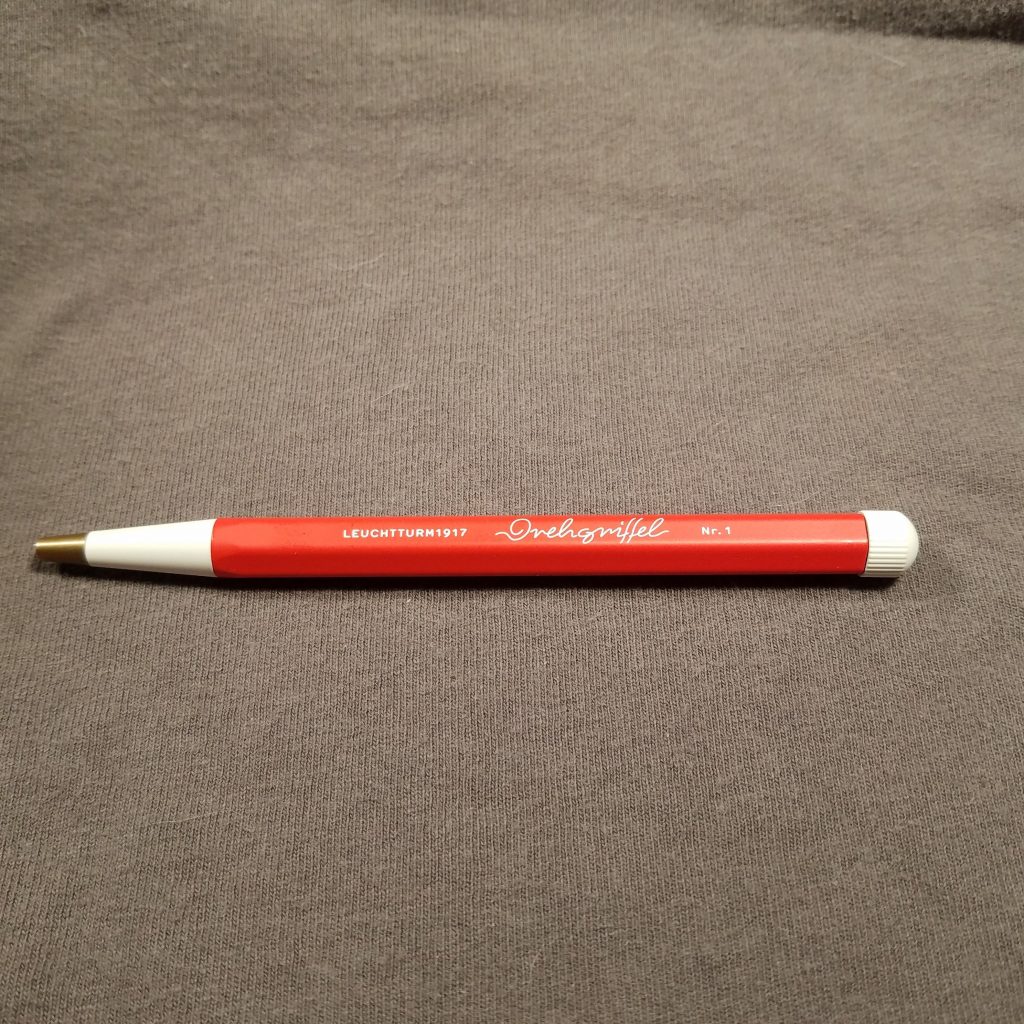
My friend told me she was ordering from L1917 and that she was getting a pen, asking me if I’d seen them yet. I had not and wow did I want one. I had the last $25 from recent Ko-Fi coffees and I decided that the Der Drehgriffel would be mine.
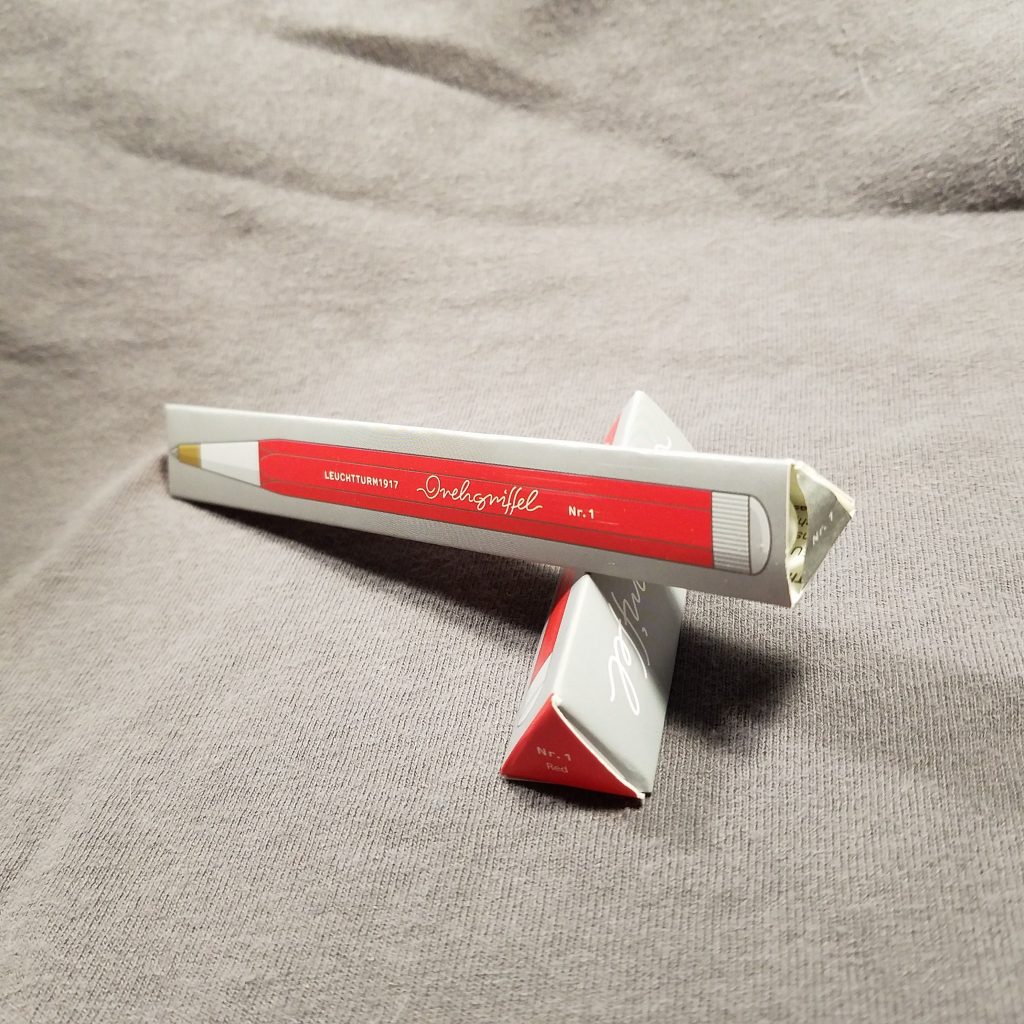
The big question with a pen like this is what kind of refill would it take and what color would I order. I chose the red my friend ordered the denim color. Both are stunning. The muted colors are lovely but I like my bright VW red pen. It’s matte finish is smooth in the hand and surprisingly grippy for a painted metal pen. The logo and name are screen printed onto the barrel and feel slightly raised when I run my fingers over them. The contrasting cream is a nice touch. The hex barrel is rounded at the points, so it doesn’t hurt to use.
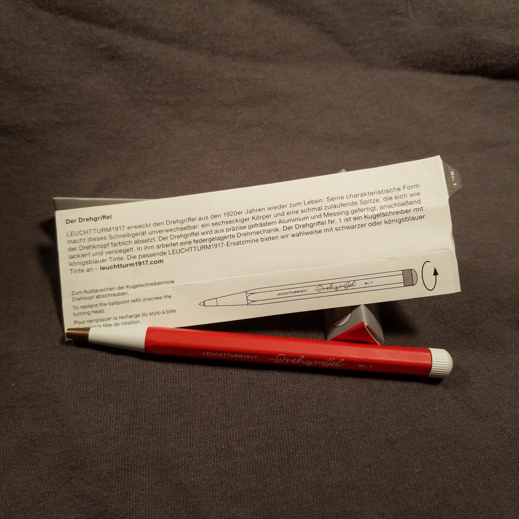
At the very tip of the pen is a brass insert that holds the refill in place snuggly, so there is little play as you write. The brass at the tip serves to bring the balance of the pen ever so slightly forward, increasing the comfort of a compact pen. This is not a big pen and it’s relatively lightweight. I suspect most of it is made of aluminum while the innards of the twist mechanism is made of a combination of metal and plastic. Set inside the barrel are a couple of threads one at the tip end the other in the middle area of the pen where pieces screw in. These look like they are press fit and glued into place. Care should keep them in place for the long haul
The grippy twist mechanism can be twisted in one hand and is a springy fidget, that would be as annoying as clicking a click nock over and over. It’s smooth and makes a satisfying click as it snaps into place. I like it a lot.
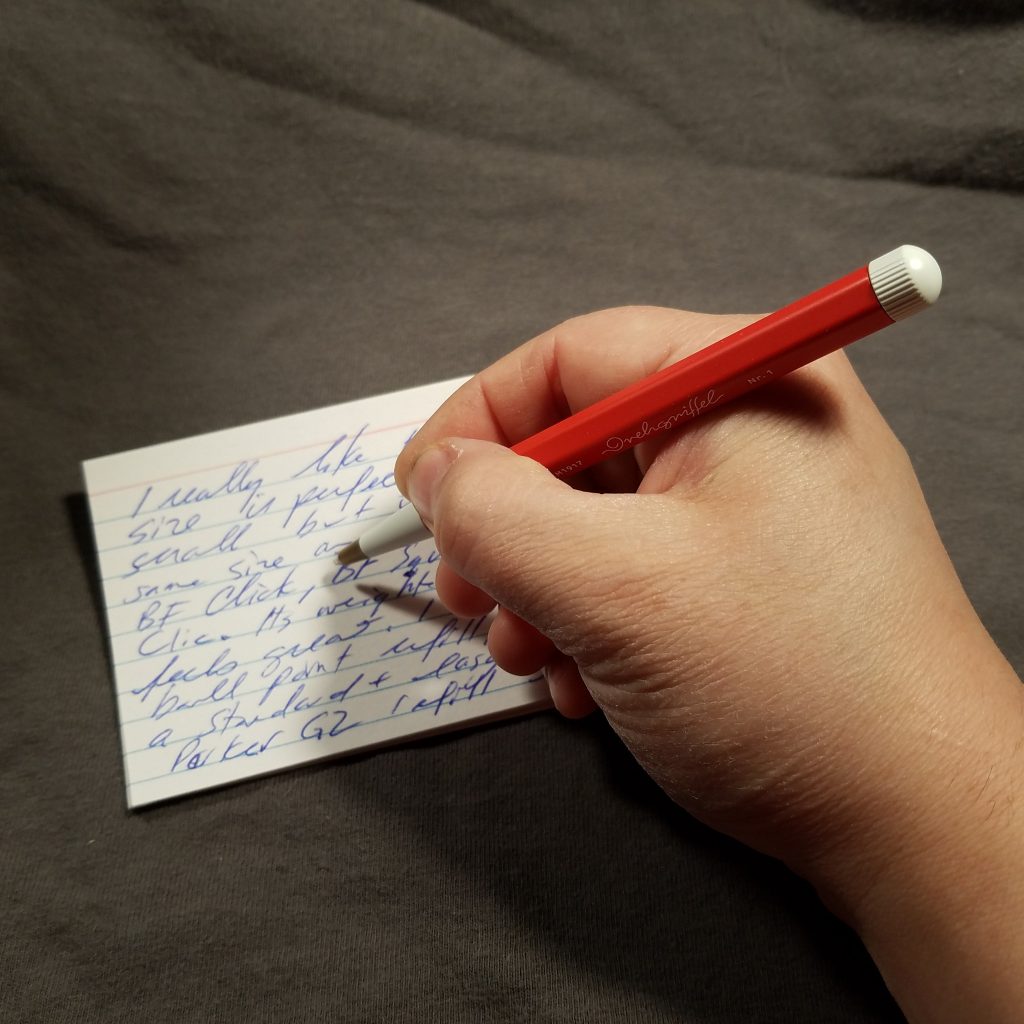
Inside the Drehgriffel takes a standard parker G2 refill. You can get rollerball, gel, and ballpoint refills just about anywhere from Amazon to Staples. I’ve picked up a pair of my favorite blue-black Monteverde gel refills in fine for this pen and I am prepared for the improvement over the ballpoint. I will say that the Schmidt EasyFlow9000 (rebranded for L1917) is a solid smooth efficient rollerball. It’s nice, but I like gel ink.
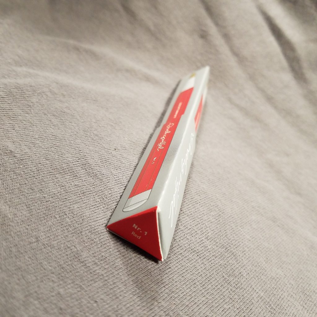
I’m not a packaging keeper, but I adore the minimal recyclable packaging. Other than the small plastic circle holding the packaging closed it is 100% paper and thus went 100% into the recycling.
The twist mechanism also doesn’t seem to twist in my pocket, and yes, I’m dumb enough that after ruining 2 pairs of my favorite work pants that I dumped the pen into my favorite jeans pocket and into a pair of chinos JUST TO TEMPT fate. But not ink spots in my pants or lines drawn onto my wallet. So I’m lucky I guess. The pen also didn’t suffer from banging around with my Kershaw Chive. So that paint job is pretty sturdy.
So this is a $25 pen. It is an investment, I’ve written at length about why one should buy a refillable pen. It is not simply an environmental thought, there’s a certain amount of friendship that you build with a tool you use for a long period of time. They develop patina and wabi-sabi and a uniqueness that is yours. Your hand becomes familiar with the tool. I will say that der Drehgriffel is a great addition to any pen lover’s toolkit. You will want to use it again and again.
These are a favorite of mine. I buy a few packs every back to school season. They are cheap at 49 cents a pack of 100 and are available in lined, graph, and blank. Plus I’ve seen neon and pastel shades. These are no where near the best, but they are serviceable.
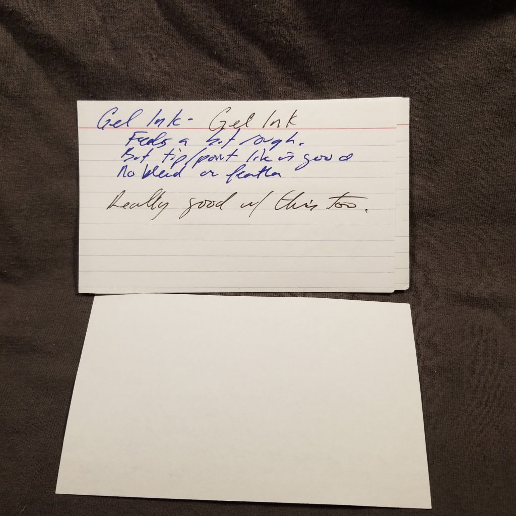
So what do I like about them? They have nice tooth for graphite and work well with gel pens, they do okay with some fountain pen inks, but not great. The printing is tight but the blue lines are super thin and barely there. You know how I love a ruling that disappears.
The worst aspect about these? They are thin and floppy. I could chop up cheap printer paper and have a heavier “card.” These are 3×5 sheets of heavy paper.
These are responsibly sourced (so they claim) and are made in the USA.
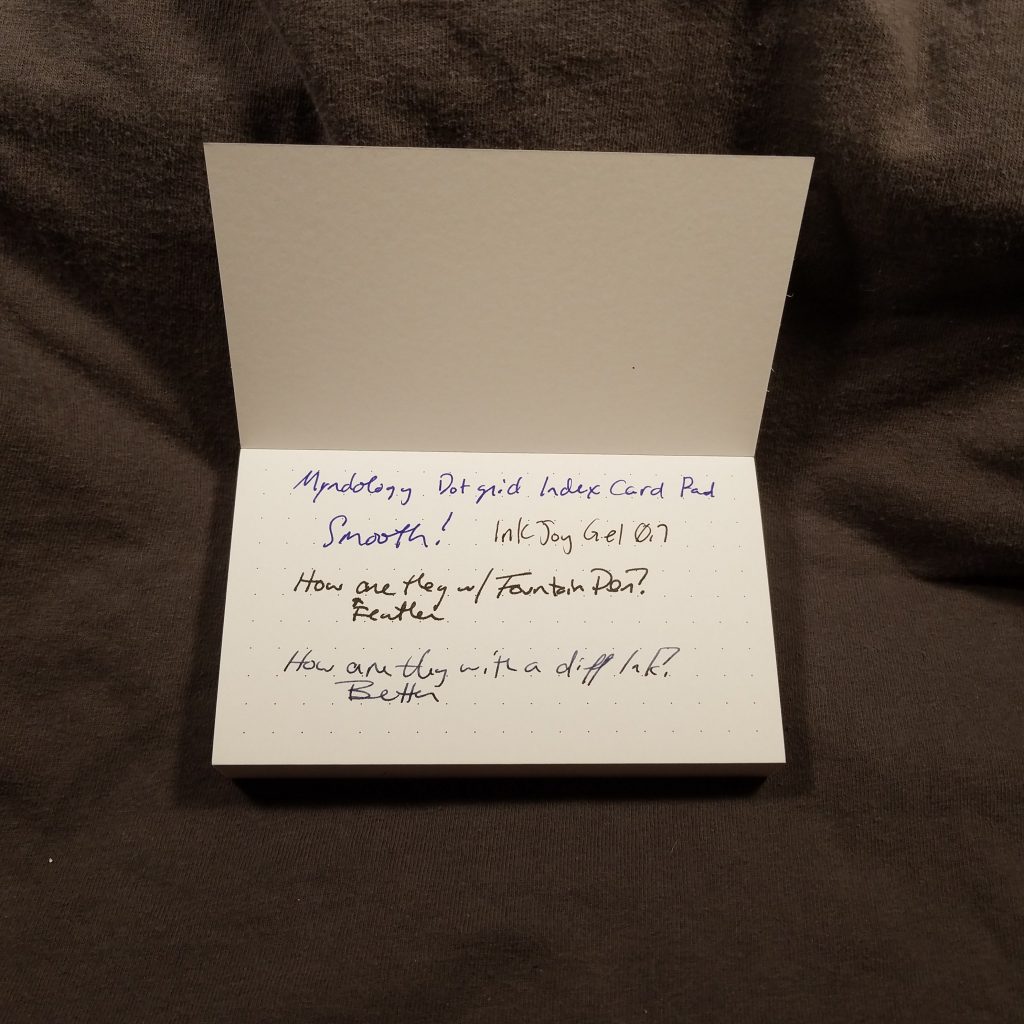
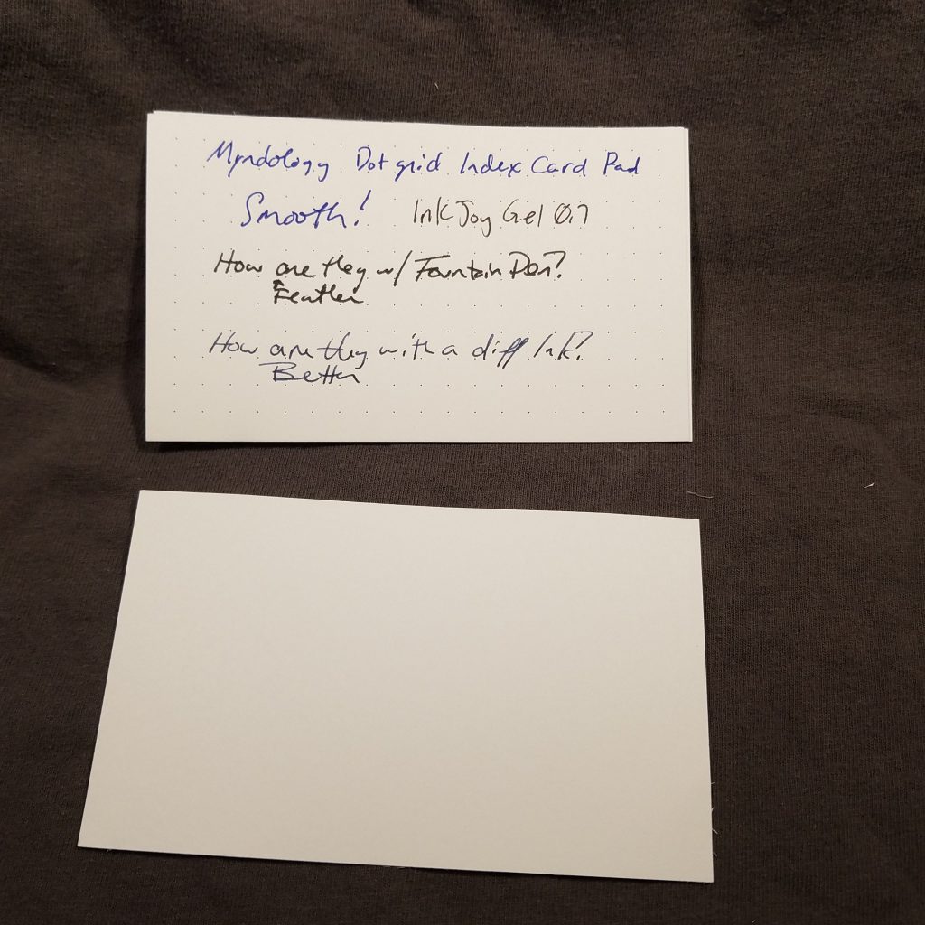
It is well established how much I love an index card. I love cheap and expensive alike. I also love a dot grid card. I’ve printed my own with middling success. When I saw the Myndology cards at Walmart, I had to get a pack. These are also made in the USA.
These cards are padded, that is they are stacked onto a backing with a cover sheet and then glued at the top with a thin bead of plastic glue. This holds the cards together and safe from harm. These do tear off mostly cleanly. Sometimes padded paper is left with a bit of glue at the top of the sheet or tears as you remove them. These cards tear from their glue cleanly and any excess is easily removed.
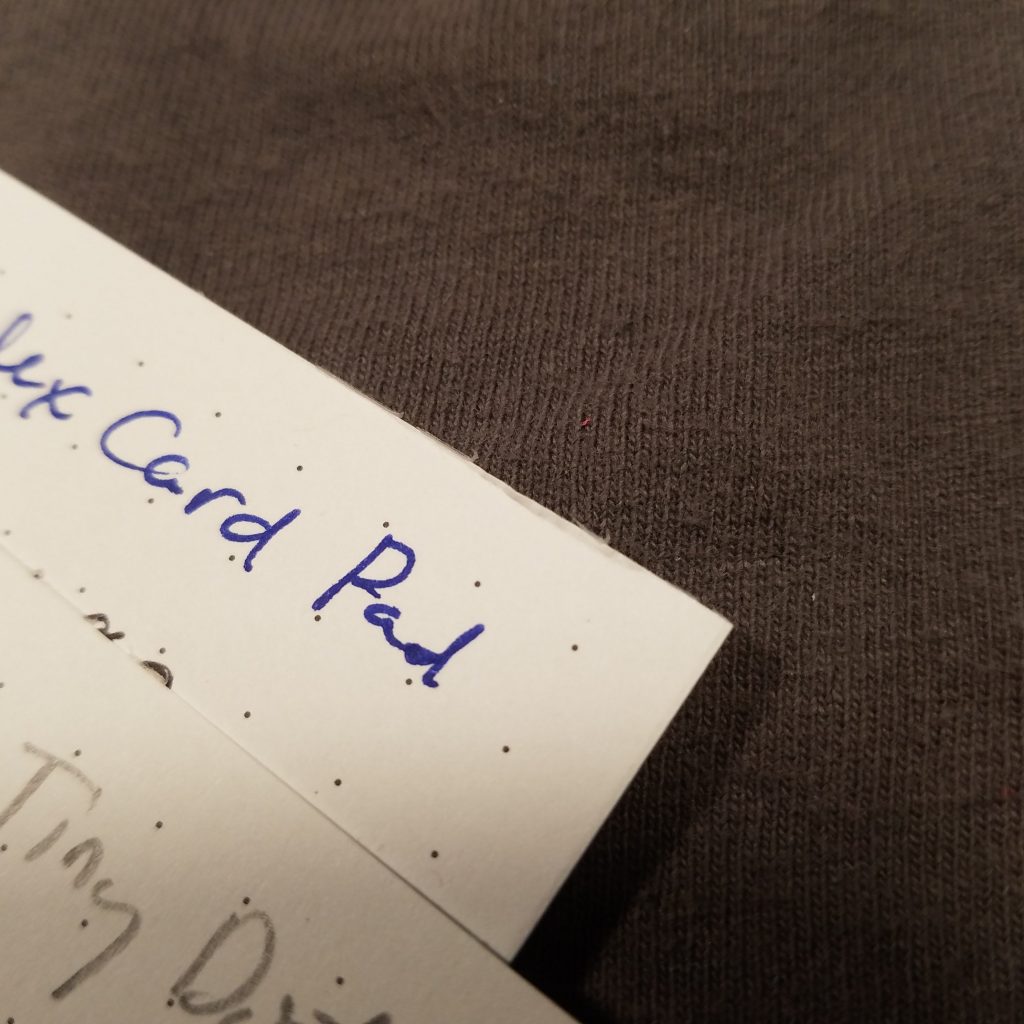
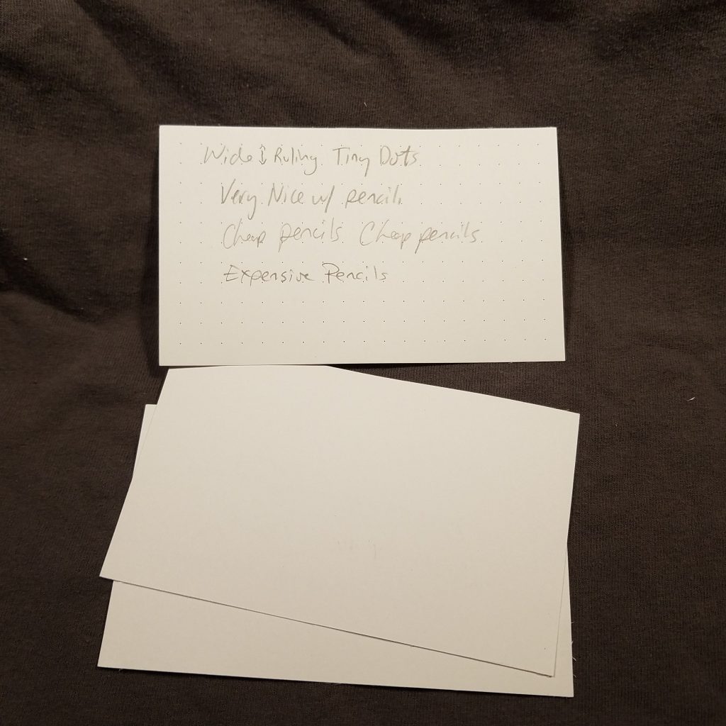
The cards are bright white and smooth but toothy. They aren’t particularly heavy weight, and there isn’t any weight information about them on the package. The dots are dark gray and spaced ¼ of an inch or 6mm apart. The dots are TINY. Due to the width of the spacing the dots do disappear despite being somewhat too dark. (I do prefer a pale dot that disappears behind both pencil and ink. The back of each card is blank.
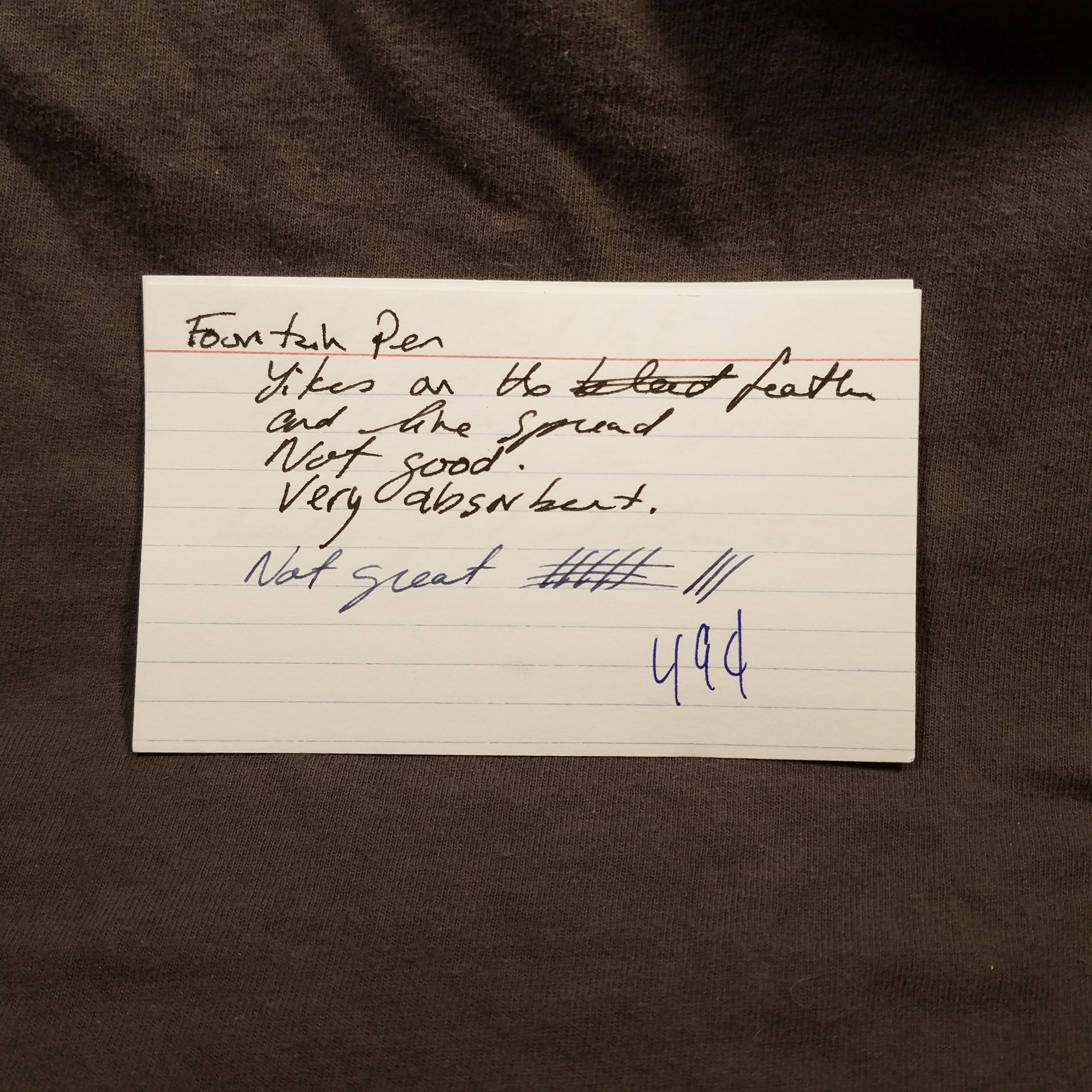
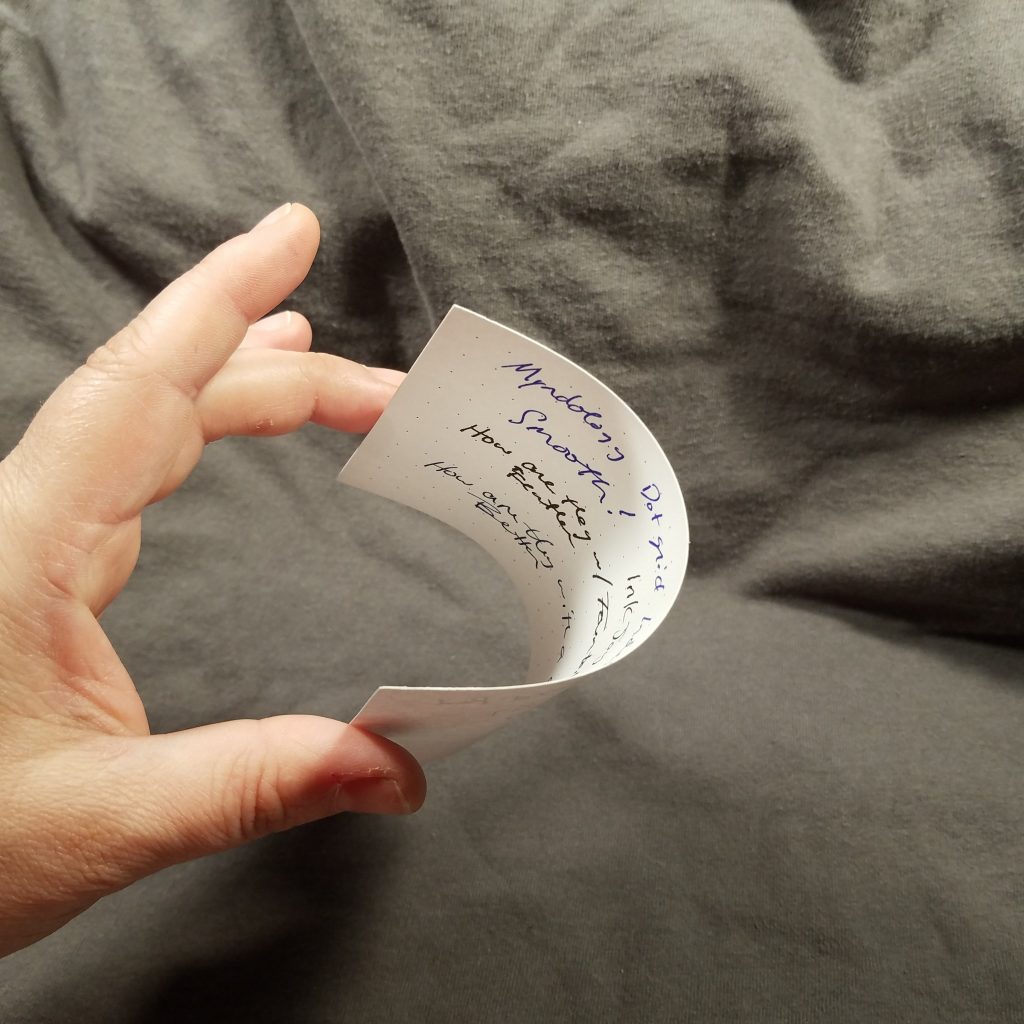
The card has a nice tooth for pencil and is smooth enough for a fountain pen. Fountain pen performed admirably on the page, there wasn’t any feathering or bleed through and lines were true to nib size. In fact all my writing tools performed well on this paper.
The pack costs $1.97 for only 75 cards. 3 cents a card. That is pretty pricey especially when we look at other cards on the market.
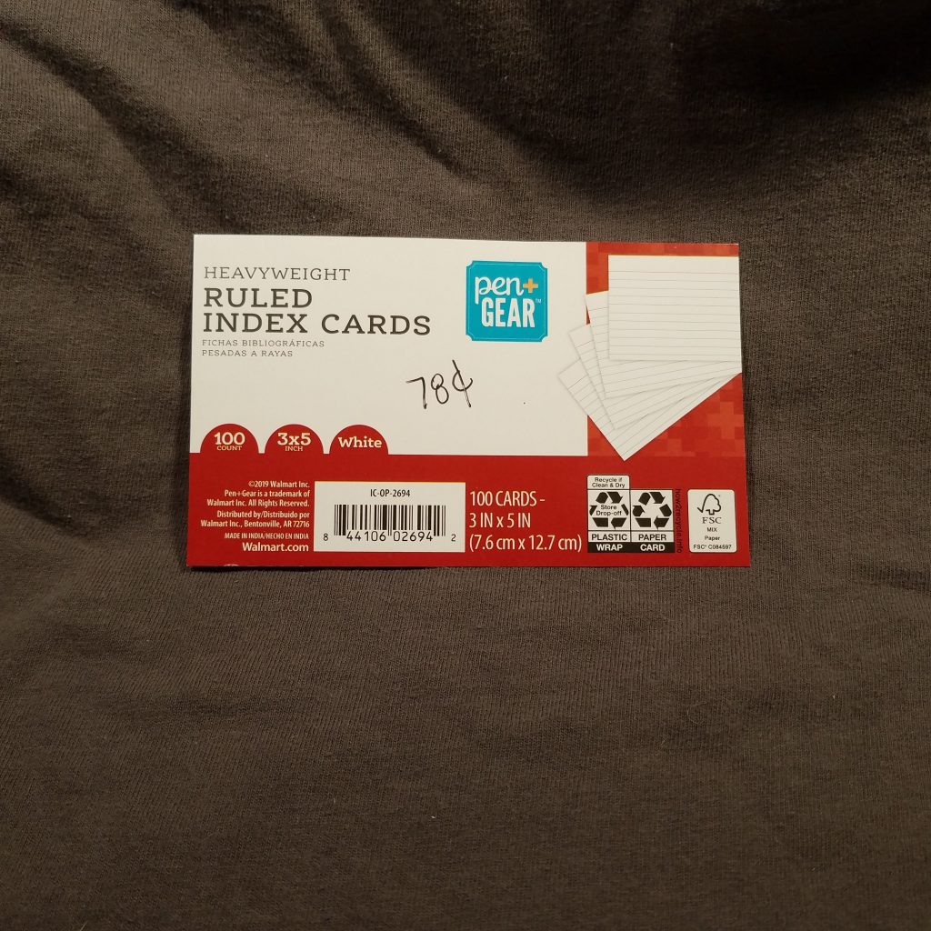
This package of 100 cards cost a whole 78 cents. In the past the P+G regular cards were great with a whole variety of materials. How do these stack up? (ugggghhhhh) Surprisingly, or not, well.
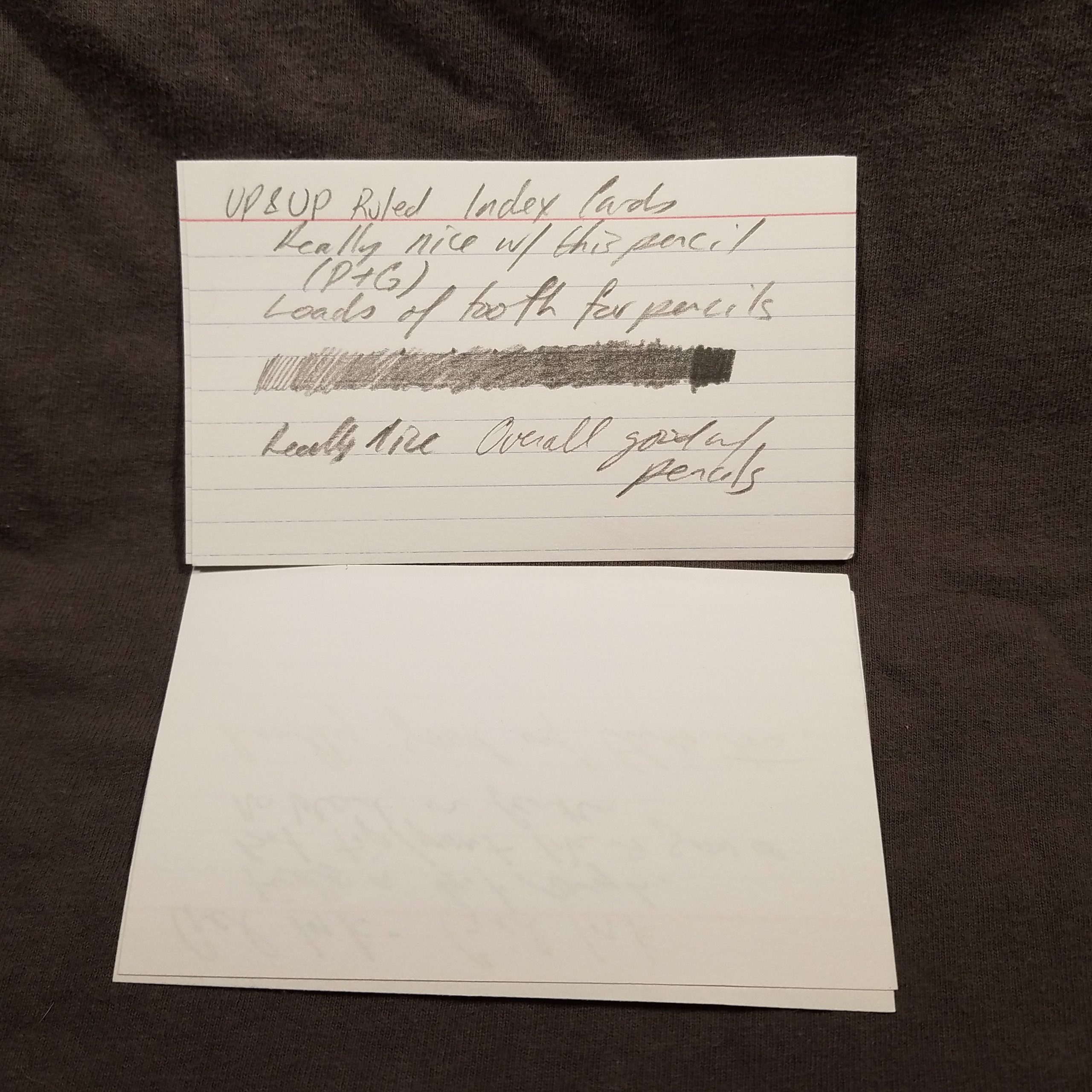
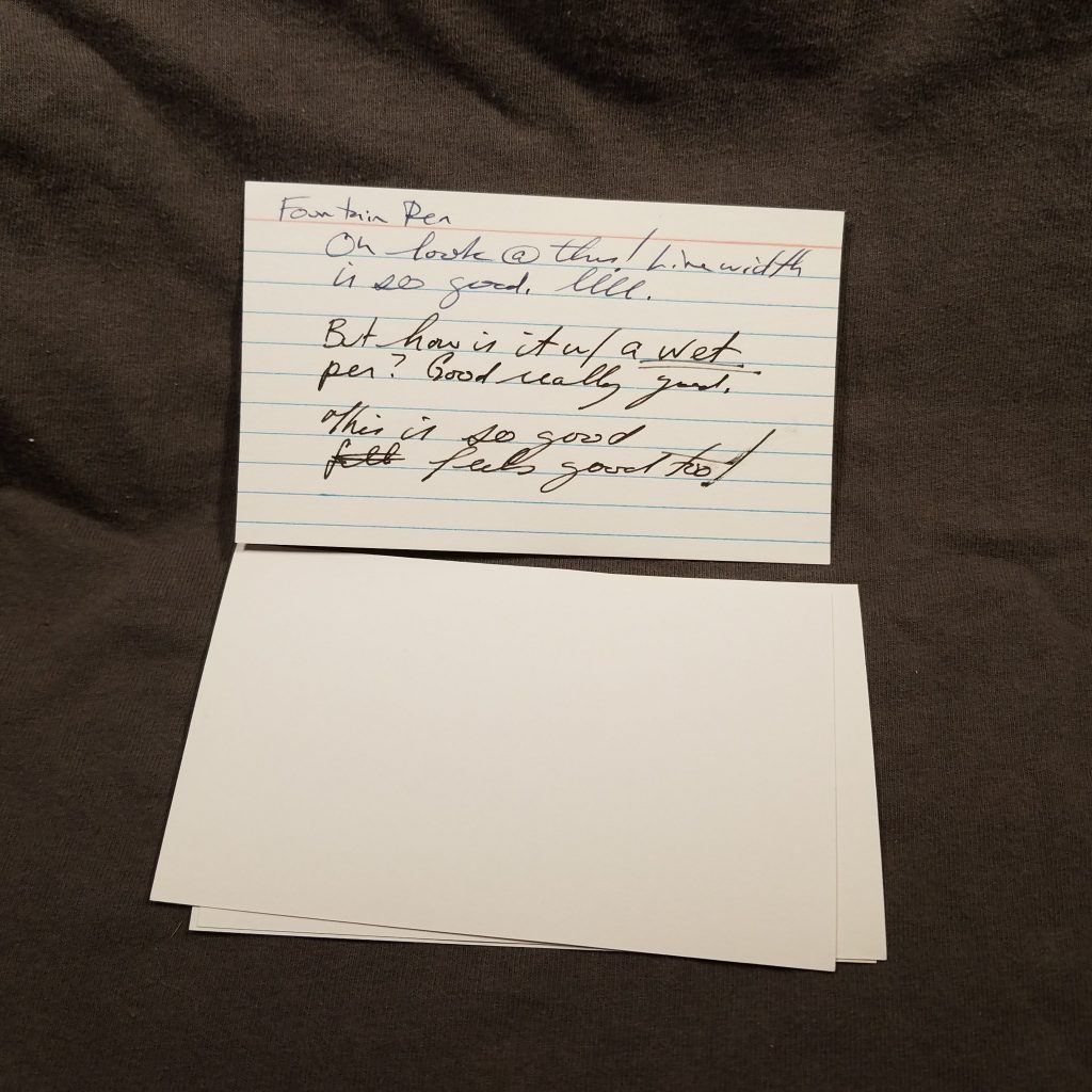
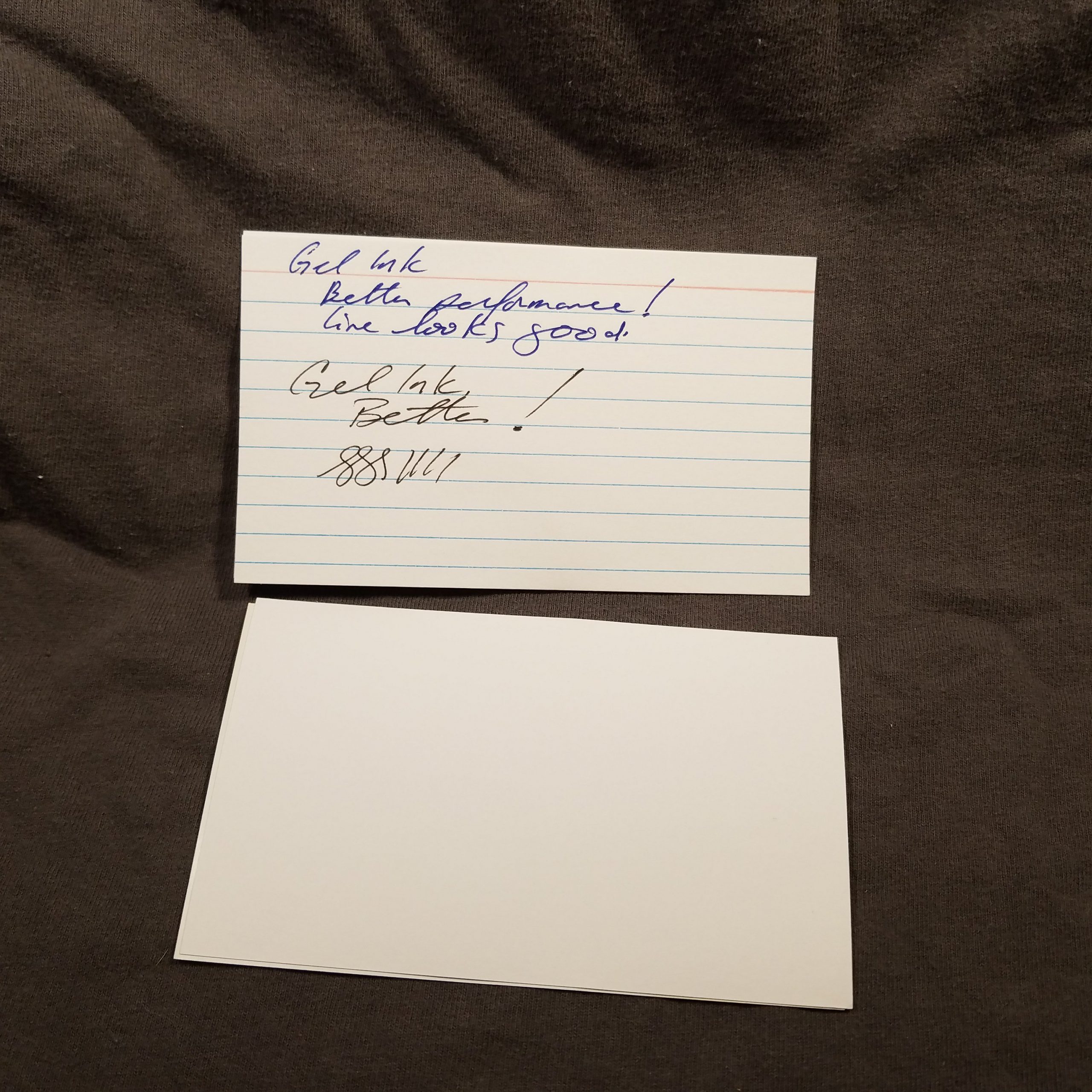
Let’s start with the good. These cards are thick. They are card not thick paper! WOW. It’s been years since I’ve seen a real card index card.* The card is a nice bright wide. They respond really well to everything from pencil to fountain pen to gel ink. No feathering or bleed or show through, just solid performance. Oh before I forget, they are GREAT with pencil too, loads of tooth for HB leads to look good.
The worst part about these cards is that the ruling is a little bright and thick for my taste.
At 78 cents for 100 of thick actual heavyweight cards? Deal. Sure you have to go to Walmart to partake but…
If you are from Maine, you know Reny’s, if you are not from Maine, you probably don’t. Unless you’ve spent a vacation in Maine. For those not in the know, Reny’s is a small chain of department stores in Maine. They deal in an odd assortment of name brand and cheap off brand stuff. Some of the stores sell canned goods. I love Reny’s but it feels like a knock off of a name brand store. That said, they have great deals on good boots, sneakers, and coats.
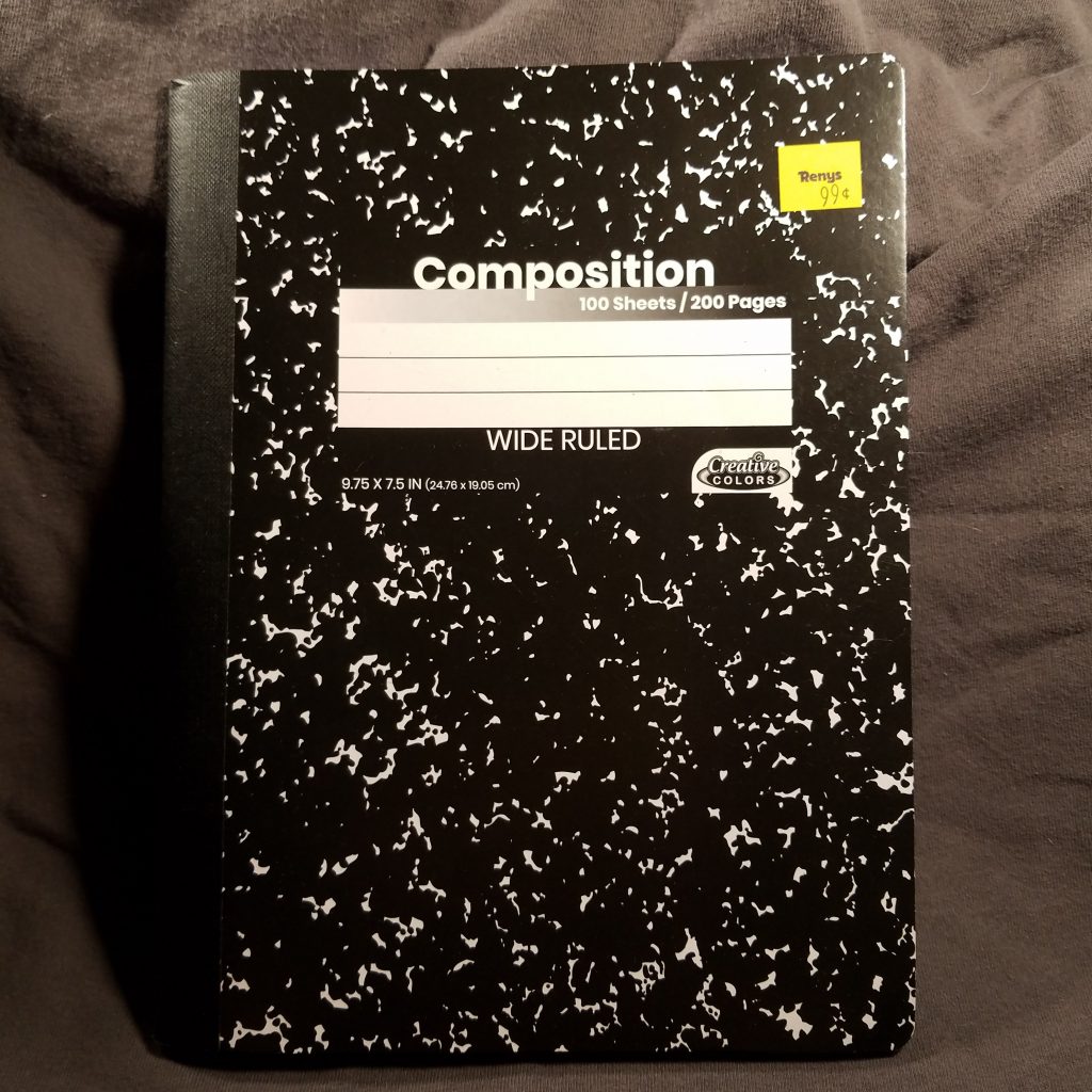
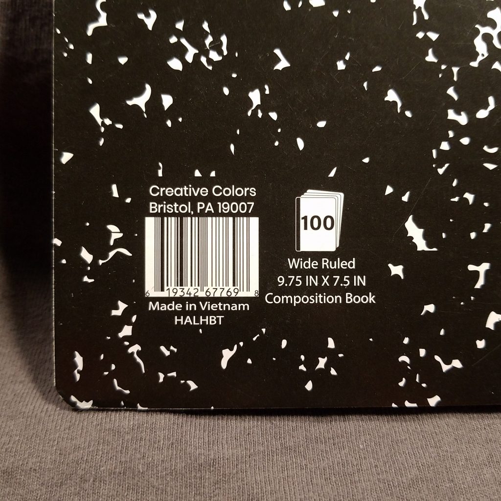
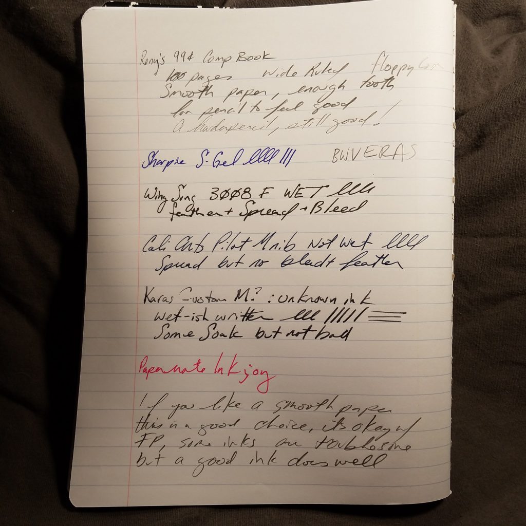
Wonderful reader Lisa, sent me a pair of these classic composition notebooks. They sell for 99 cents. Each book has 100 wide ruled sheets/pages. The ruling is pale and disappears behind writing. The covers are classic marbled. The marbling has less white space than is typical,but there is enough that you can tell it is a marbled pattern. The spine tape is well proportioned to the cover and has a nice texture. The interior stitching is tight and even.
The interior paper is smooth and feels great with everything I threw at it. It responded well to most everything except a particularly persnickety ink that doesn’t like anything. It has enough tooth that pencil felt good. Gel ink was great as was ballpoint.
Overall, if you live in Maine or are in Maine and need a comp book, this is a good option. It is unclear if they have college rules, but you know, any port in a storm. At 99 cents and probably not far from that on a regular week, these aren’t a bad deal.
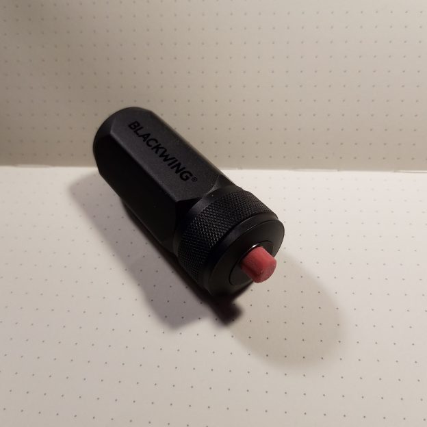
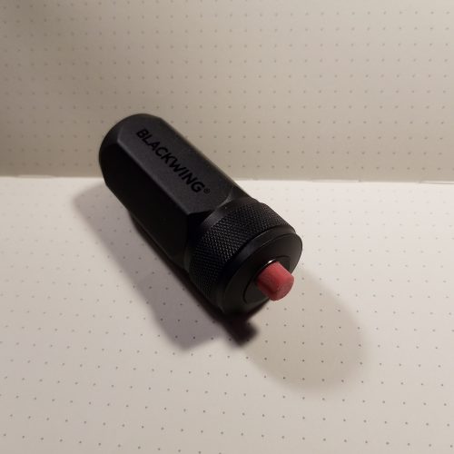
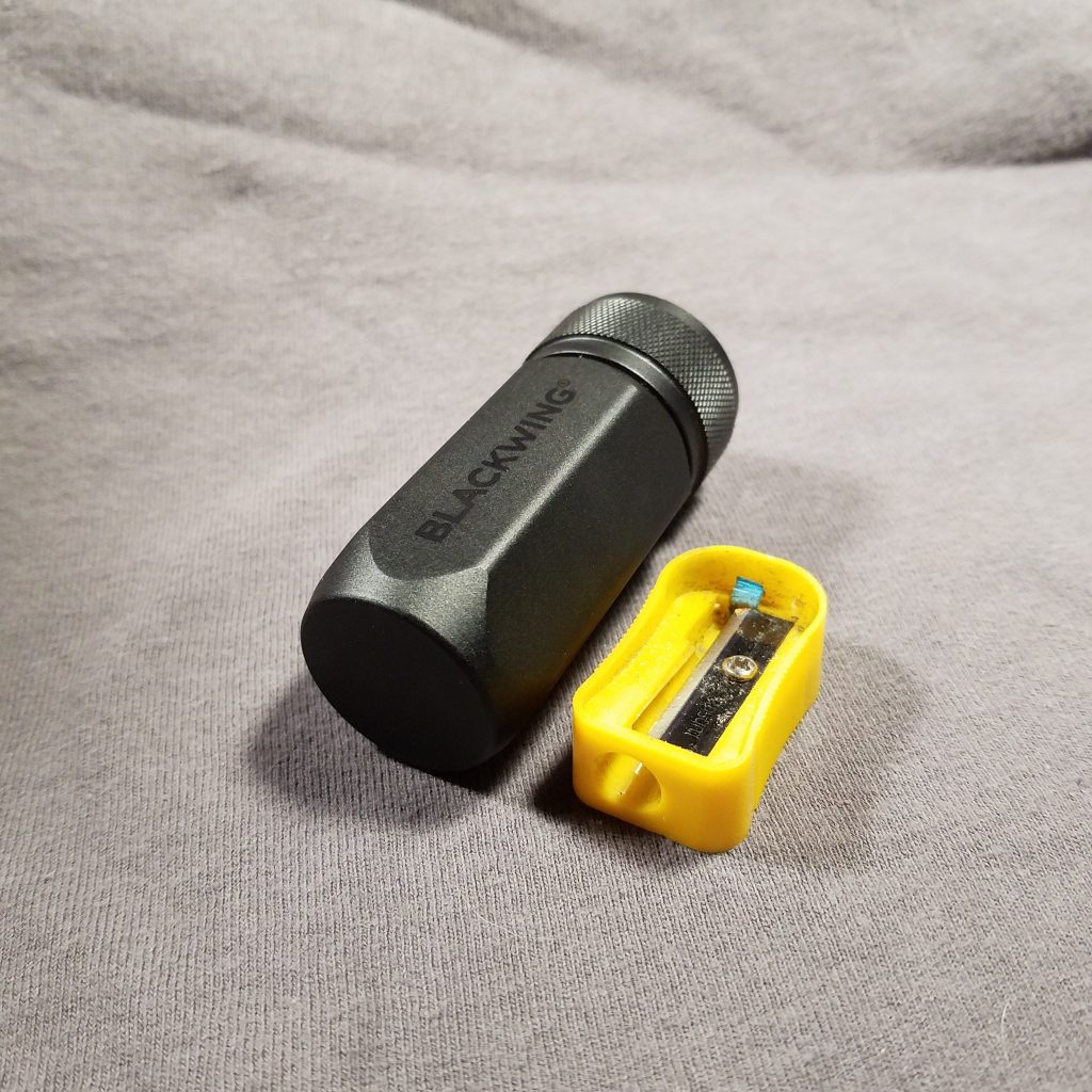
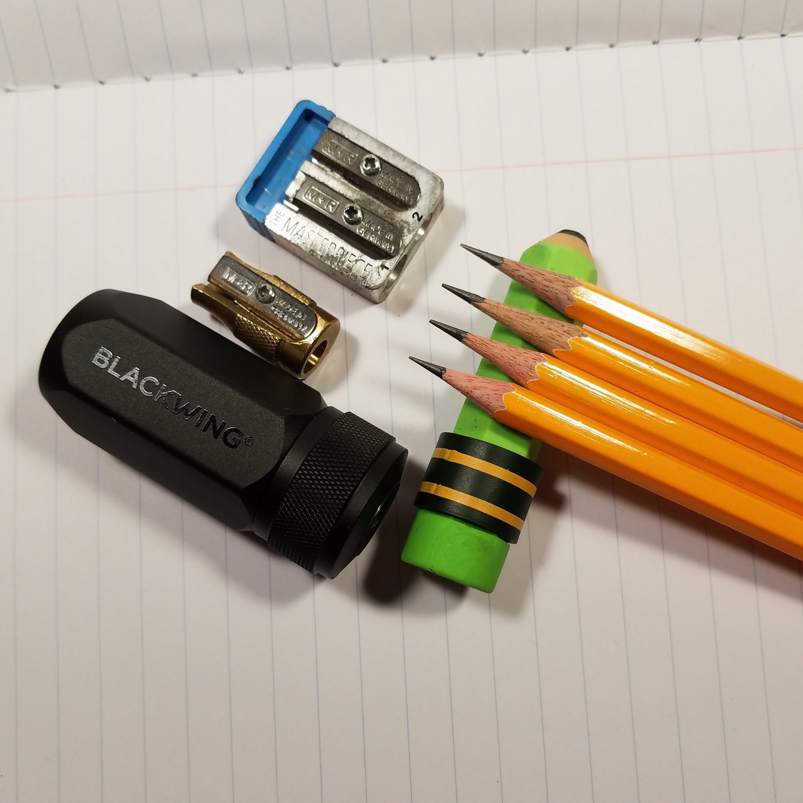
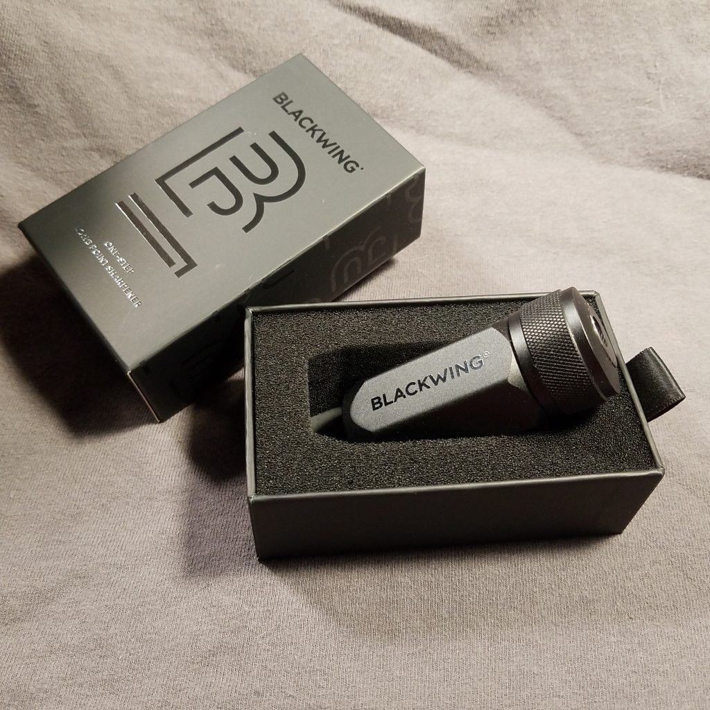
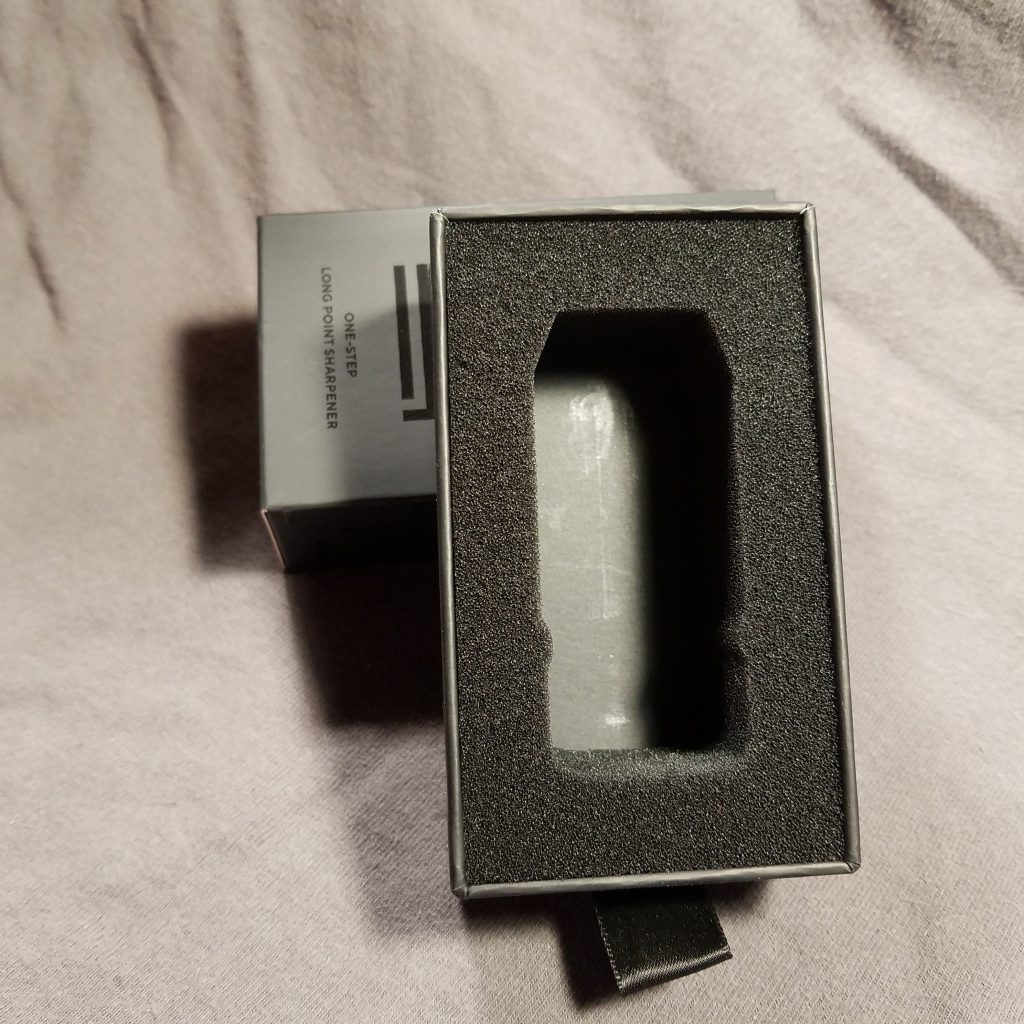
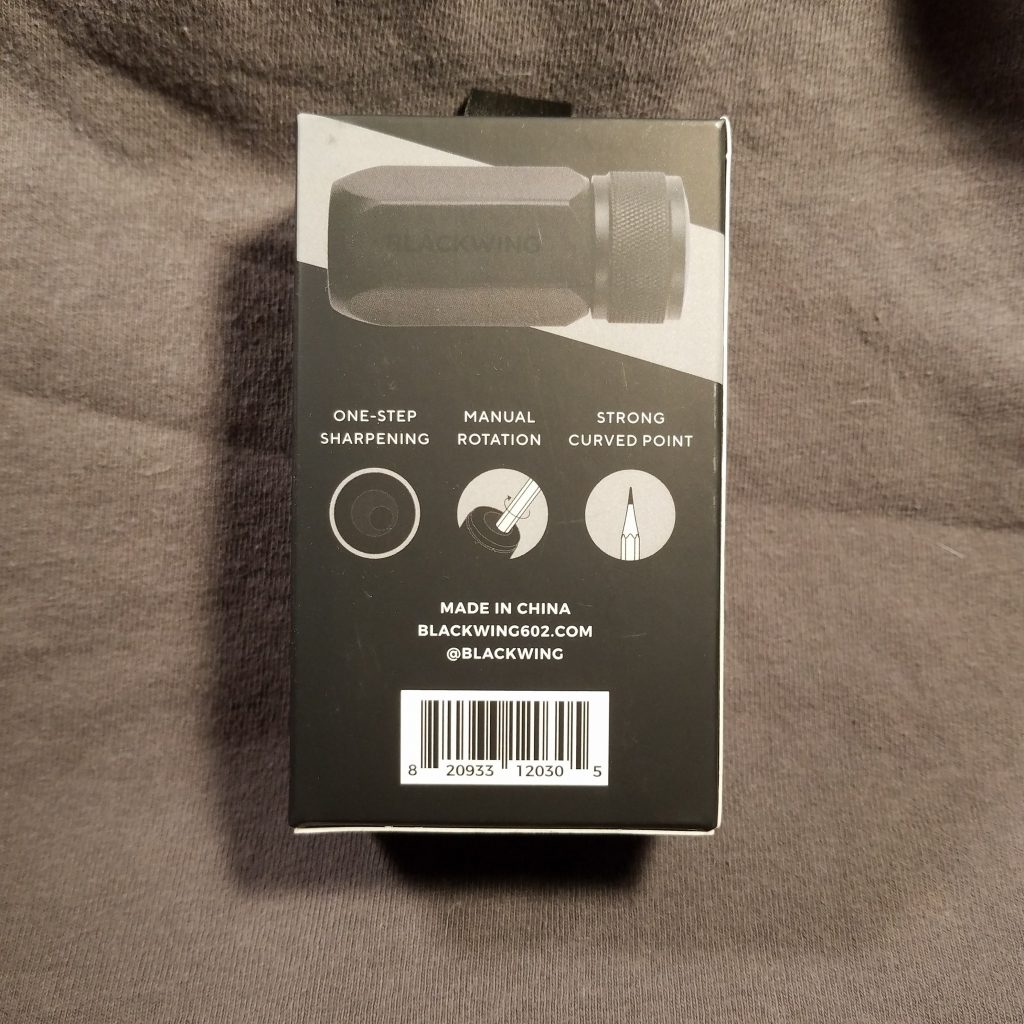
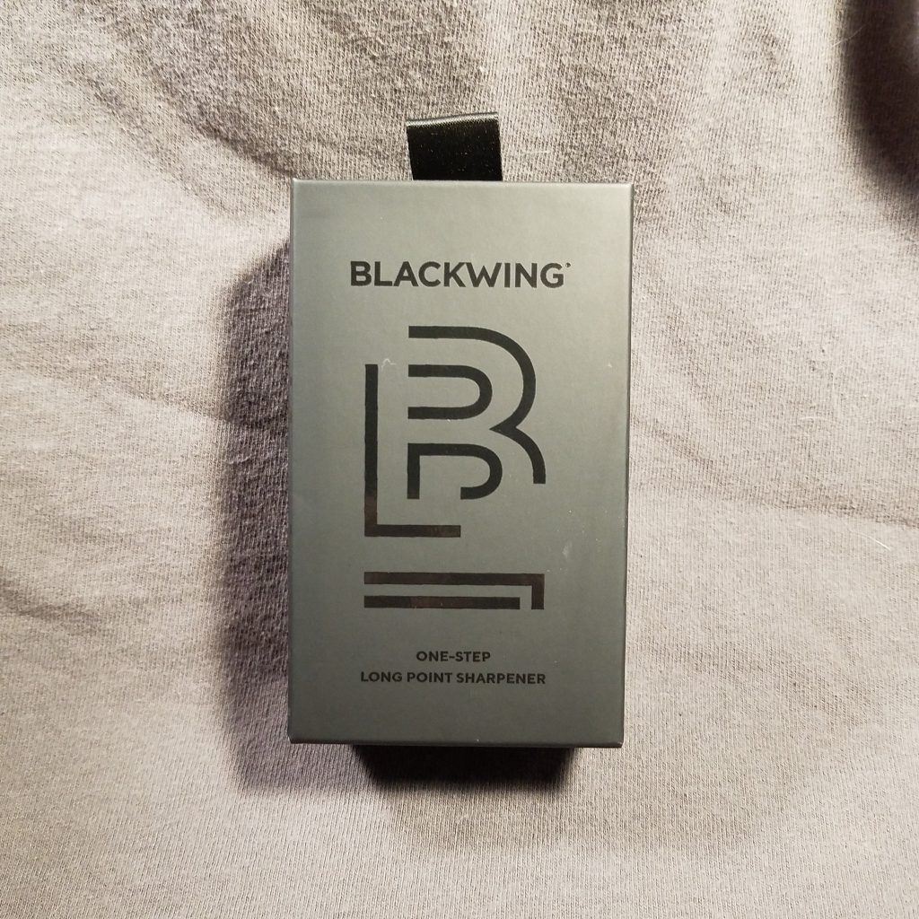
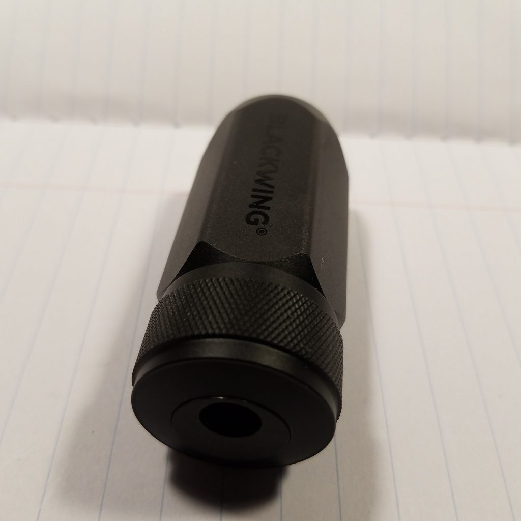
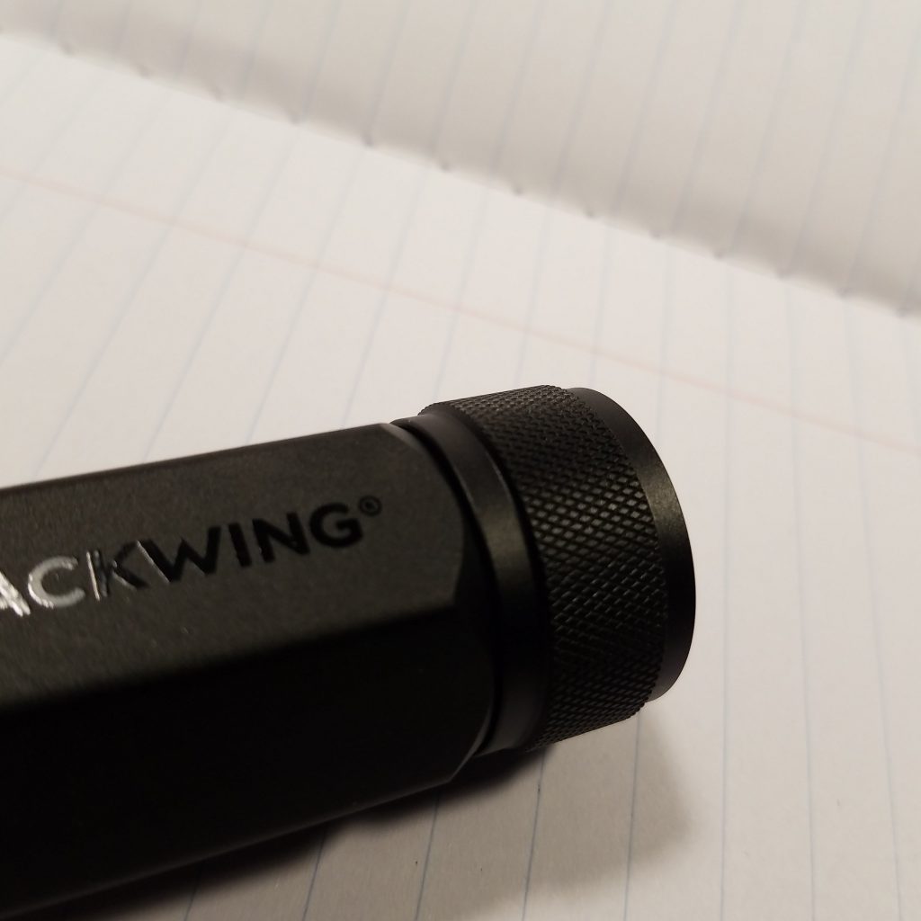
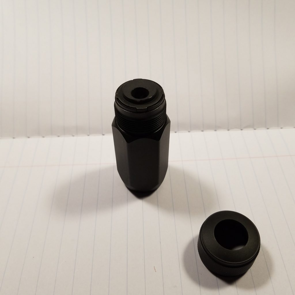
This is a sharpener I never felt I needed to order. Yes, it’s pretty. Can anyone really argue that it isn’t? Hex and knurled and machined it’s all the things I love in a pencil or pen. It’s solid feeling and weighty in hand. The matte black finish looks great. It is desktop or pocket bling.
That solid feeling makes me think of fidget toys and other detritus made to carry about with you that have no other purpose than to weigh down the pocket or to play with when thinking. I’ve always been a fan of having a dual purpose fidget tool- a pencil sharpener or eraser makes a great option. Even better is a mint tin that contains a sharpener- as it can have some weight but also have something moving about inside. The BWOSLPS combines the shavings collection and sharpener all in one.
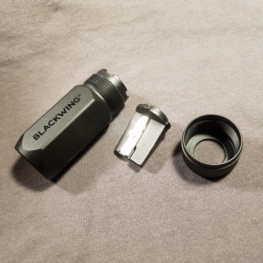
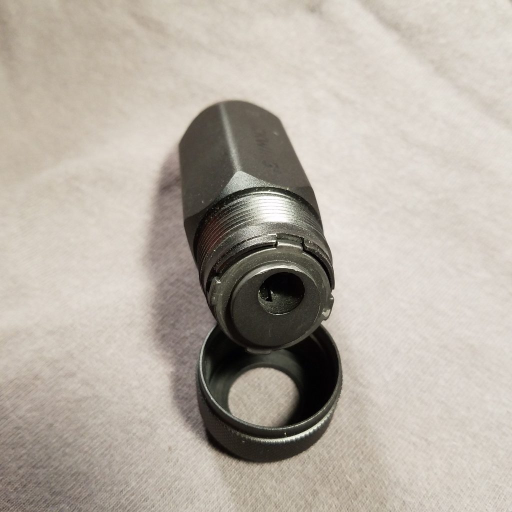
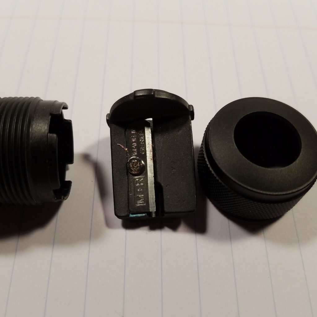
How does it work? If you get a good one, great. If you get a bad one? Awful. (Check out Brad’s review here.) This reminds me of the Pollux when it first arrived on the US shores, ahh so long ago in more innocent times. The sharpener often didn’t work due to blades dulled by shipping the sharpeners loose in a large box. Sometimes a stropping revitalized dulled blades and sometimes it didn’t. Like, Brad, I got a bad one. While my blade was sharp and didn’t break points it sharpened to a stumpy concave point. I contacted Blackwing directly and they sent me a replacement blade. If this weren’t a $20 sharpener I’d fiddle around with it and attempt a scrape of the paint. But this IS a $20 sharpener and as such it should JUST work. More on this in a moment.
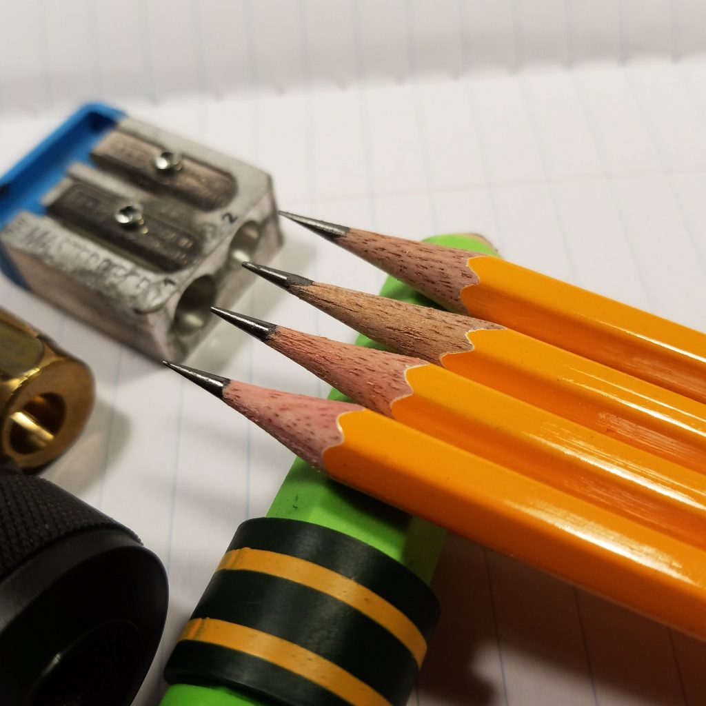
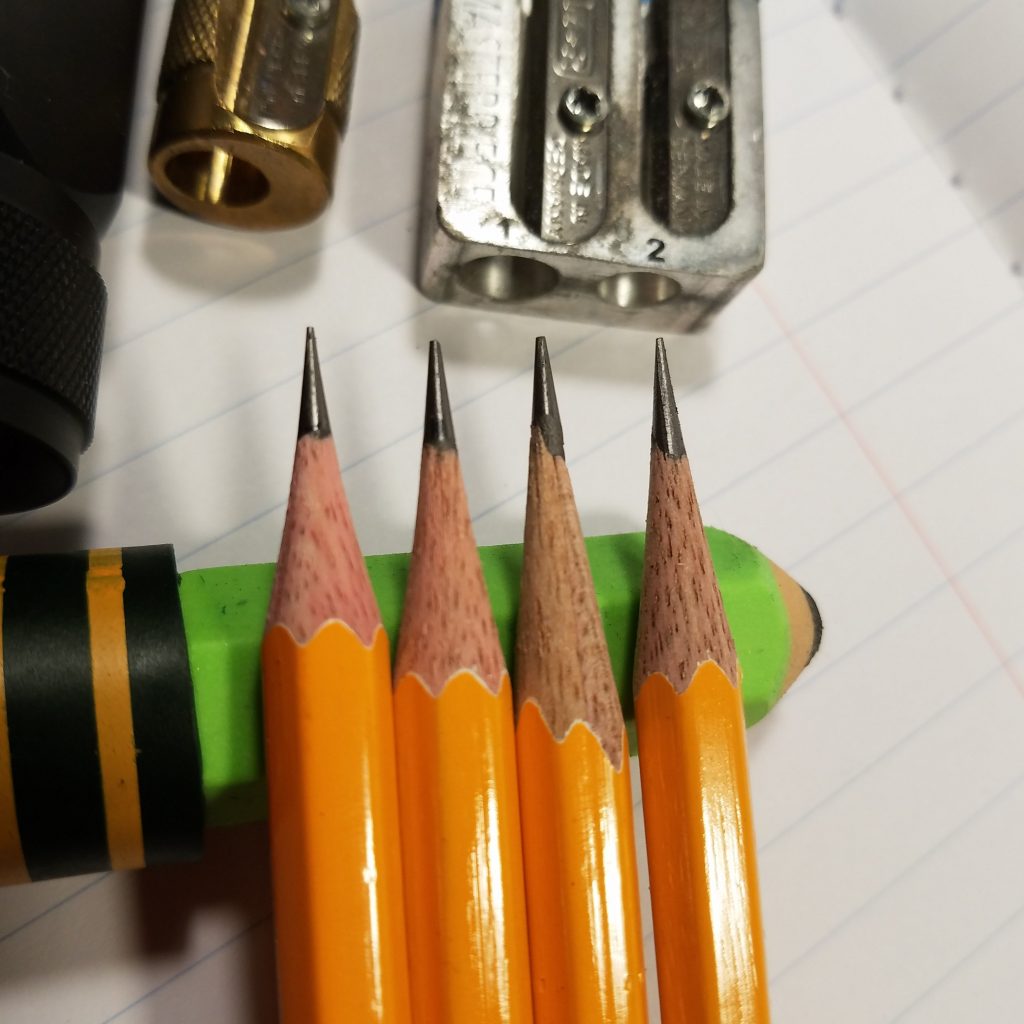
Single hole long point sharpeners can be an exercise in frustration . The BWOSLPS is one example. The KUM One Hole or Stenographer is another. When the KUM Stenographer was painted it was a piece of junk, but a $1 piece of junk. So scraping the paint off from under the blade was a worthwhile hack. It turned the $1 sharpener into something worth using. The Pollux is another example which I won’t harp on here. When they work the concave point is a joy. You get an extraordinarily long writing point that is lovely to behold. When they don’t work graphite shatters and wood is torn. A dull long point blade is a nightmare that destroys pencils.
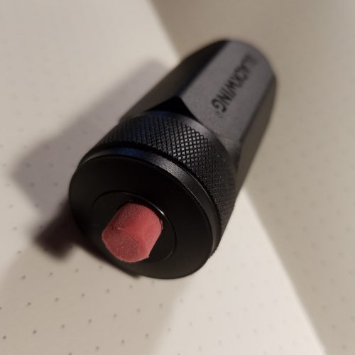
The greatest difficulty of any concave long point sharpener is a dull blade and so many makers of them push their release before replacement blades are available. Blackwing is no exception to this. New blades aren’t readily available and those installed in the sharpeners are shoddy. Mine arrived with a lump on one end and unable to produce a long point. I received my Blackwing Branded replacement blade (it is the same blade size and shape that used for the KUM Masterpiece) and it works substantially better. The new blade does the job. I’ve said it before and I’m going to say it again, EVERY high end sharpener should ship with 2 or 3 extra blades. Blackwing could slice a small slot into their decorative box and accomplish this with ease and style.
But the point? I don’t know what I was expecting, but it was more. I’ve grown to love the Pollux’s lengthy concave point and the many pages I could write with it. Heck I even adore the Apsara long point. Or the point produced by the Classroom Friendly/Carl Angel 5. This point is shorter than those mentioned above. It’s kinda stumpy. That said, once I fiddled around with it I achieved a decent point that does not shatter like many long points. This is s sturdy and long lasting point. It is not quite as long lasting as other mentioned points, but I got nearly 2 composition book pages per point. Not bad.
Dare I say it? This might be the long point sharpener for short point fans. Perhaps they should call it the Blackwing One-Step Durable Point Sharpener.
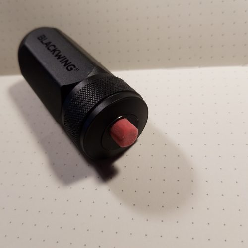
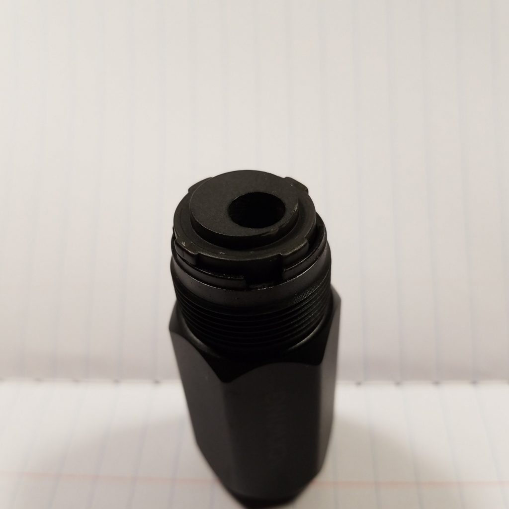
I know I said I wasn’t going to hack or mess around with the sharpener, but I had to. No I’m not scraping paint, but I did add in a few paper shims at the point end in an attempt to make it more convex and stop the point from becoming a needle, and it worked. It takes it from a meh sharpener to an okay one. About 3 tiny slices of Post It note stacked gave me a nice long point that I like.
Is this a nice sharpener? Yes. Is it impressive? Sure, it’s well made and feels lovely. Is it necessary? Well no, not even a little bit. Like the Pollux, it’s a bit fussy and can be annoying. A Masterpiece produces a more even point, though not concave, but just as long. I like it. I think it’s lovely. But would I spend another $20 on it? Probably not. I guess I just don’t see it as $20 good. But then I’m also the person who glued a Apsara long point sharpener into a medication container and usually carries my sharpeners in a pastilles tin.
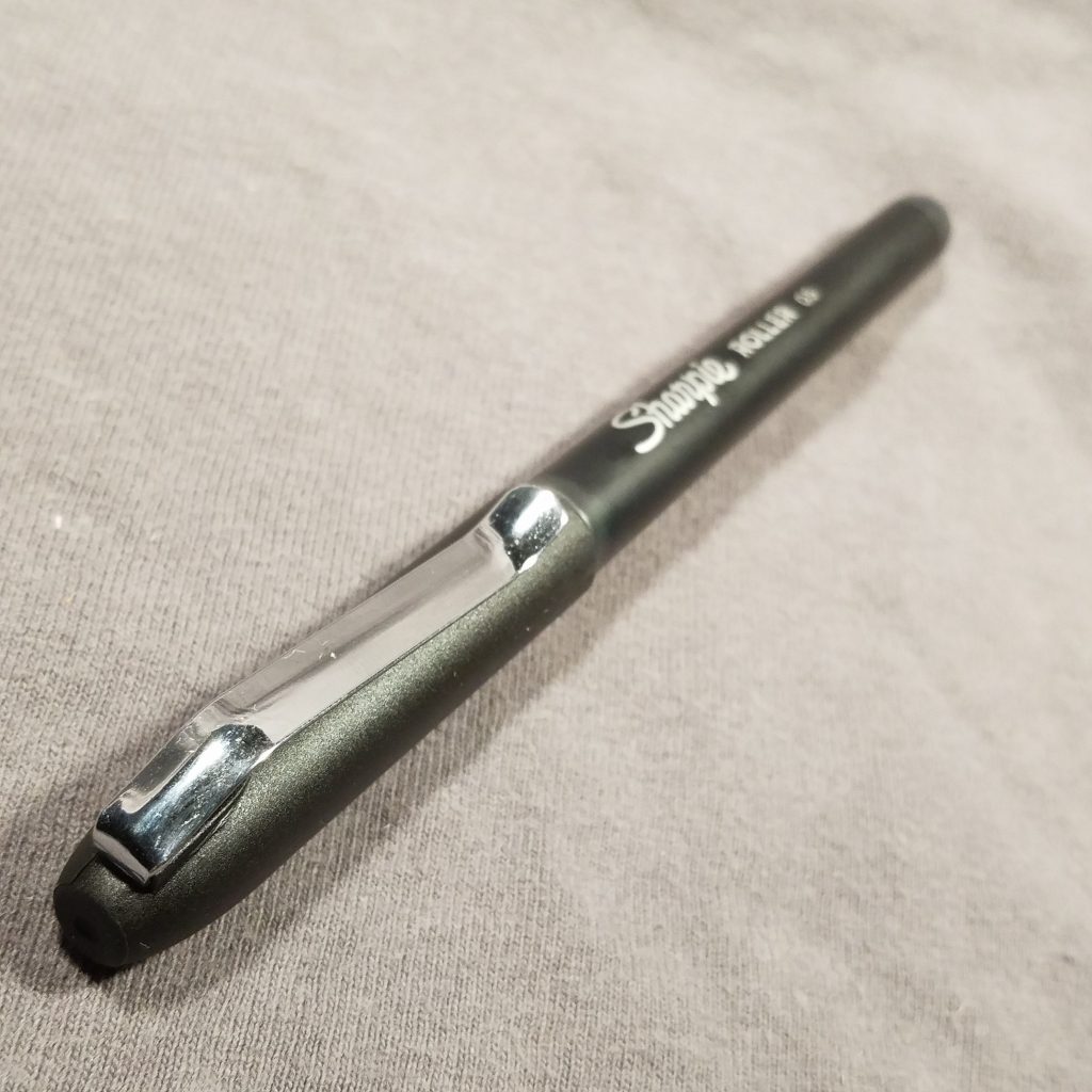
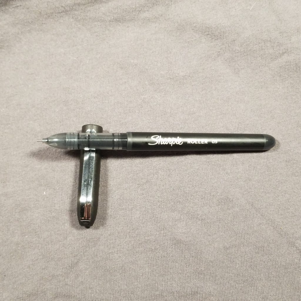
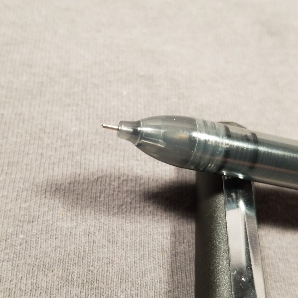
This pen has liquid ink and flows as such. Ink flow is good and the ink doesn’t seem to feather or cause issues on many papers. Which is an issue for roller ball pens. The liquid ink is not always well behaved.
This ink is smooth and flows well. It is smooth and feels good. I was able to use a highlighter over the ink without lift or feathering.
The cap is solid matte balck while the body of the pen is semi translucent matte black plastic. Despite this you cannot see the ink inside so you cannot monitor your ink levels. The cap sports a sturdy metal clip that is springy and holds itself to whatever it’s been clipped to. The cap closes and opens with a satisfying snap. IT posts deeply and securely when it’s time to write.
Overall, I like this pen. It feels good in hand and it writes well. It’s comfortable and has a professional capped pen feel. I expected it to feel cheap, kind of like the original Sharpie pen felt a little cheaper than other pens in the same price range. I liked this pen for sketching as well. the ink flow was great, no skipping or blobs or even errant unevenness. I prefer the S Gel ink, but this is a good choice for liquid ink in a fine 0.5 tip.