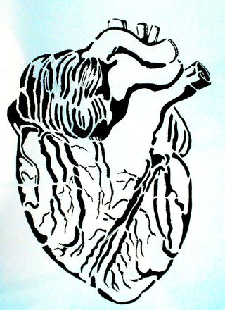
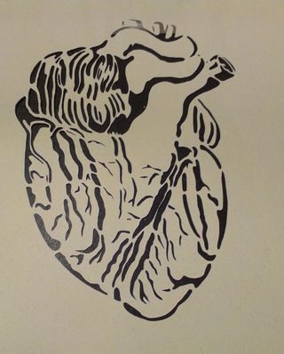
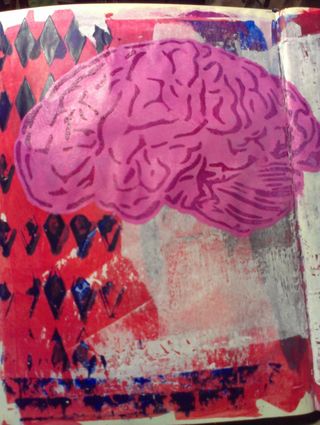
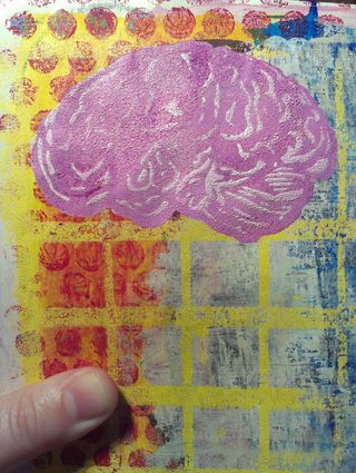
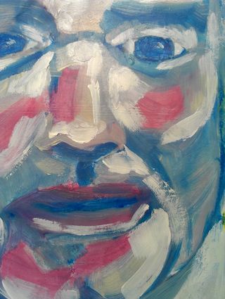
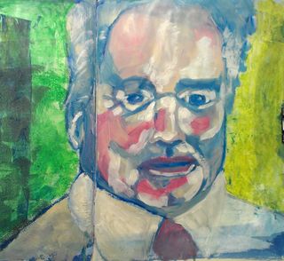
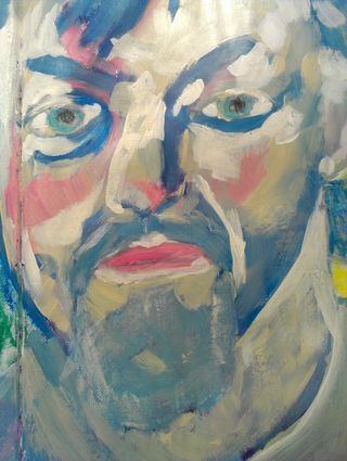
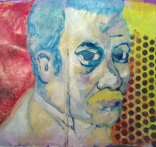
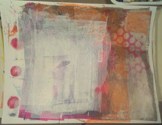
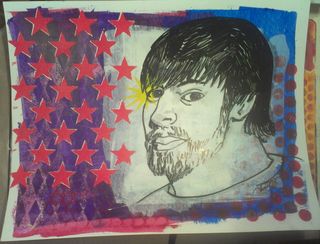
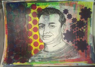
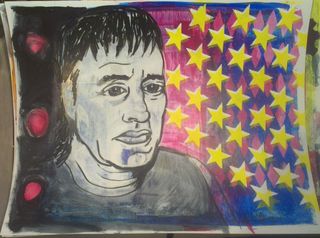
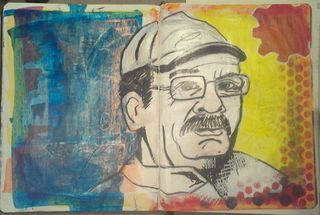
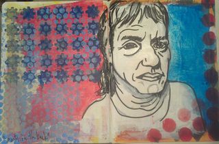
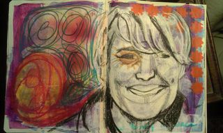
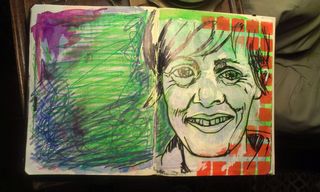
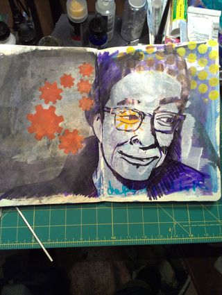
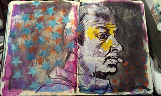
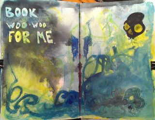
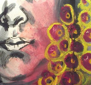
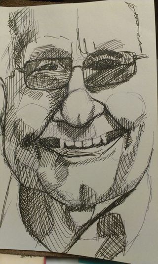
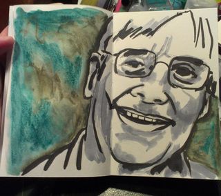
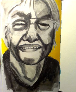
I've not done this in a few weeks. I've been feeling a little off my photo game. I've been looking for new inspiration. So here you go.
Author Archives: leslie
Decay
There is a certain amount of beauty locked into decay, trapped with it is always a large amount of sadness. As I travel around the area where I grew up I’m able to see the struggles of keeping things standing. One of these days i’m going to need to travel with my camera or a pochade.
Last year the Beehive Collective raised $10,000 to repair and renovate the park overlooking the Bad Little Falls in Machias, Maine. The Bad Little Falls park is one of my favorite spots in Machias and sadly the kickstarter campaign ended before I could give. They repaired the guard rails, a dancefloor and installed 2 gazebos where bands can play. One day a year the park is lit up and is lively. I’m happy to see that the Beehive was able to save one of my favorite places in DownEast Maine.
I’ve been fascinated with buildings that are crumbling. Sad to see them start to cave in and be destroyed. Nature takes her toll on the construction of man. The barn I grew up with, my father had a concrete floor poured in before I was aware of such things. Growing up we swung on ropes from one side to the other, lifted ourselves far too high above the cement floor with block and tackle attached to our belts, and built forts in bales of hay.
It’s been close to 20 years since the barn has been used for anything useful. A thick mat of wild grapes grows before the door, which was last accessed 5 years or so ago. It remains locked both with a chain and padlock but through mother nature’s frost cement is heaved in such a way that the doors will no longer open more than a few inches.
My happy memories of this place beg me to see it repaired but my brain tells me that this barn will eventually return to the earth as so many other buildings in the area have gone before.
Inspiration from Other Places
I bought my ukelele back in 1999. I purchased the cheapest uke I could find at the local music shop, Ted Coles in Salem, MA. Ted Coles is no longer in business and there is no wonder why. I had the worst customer service I’ve ever encountered in there, and never went back. The ukelele cost about $35, with no case and no instructions. I managed to find a VERY beat up case on eBay for about $5 and a bunch of instructional books at Borders. I love how beat up the case is, but I think it’s time I paint it and make it 100% mine.
The uke has served my horrible playing skills well. It sounds about as good as I play, which is to say, pretty horrible. I have no rhythm and I’m tone deaf but I enjoy plucking away at its strings and generally enjoying the sounds the uke makes.
I’ve had it stored at my parent’s place for the last 5 years or so, why I don’t know. It always seemed to miss being packed with me as I came home. Now it’s here with me and I hope to draw it a few times, and play it a lot.
Willingness
I’ve been thinking a little more on the whole haters gonna hate concept. I think it is borne of fear and a been there done that attitude. After all we’ve spent much of our lives being told that if it has been done before there is no reason to revisit it.
What if we all took that attitude?
Nothing would be tried again and we’d stagnate.
Just because something didn’t work for one artist doesn’t mean it won’t work for another. Time and place can make all the difference in success.
My chipin was 106% funded in 48 hours. That’s some wild support. Would that have happened for everyone? I don’t know. I’m sure that my results can be replicated by anyone with drive and ambition.
You must be willing to succeed.
You must also be willing to fail.
The difference in the two poles is what you do to make them happen.
Portrait Process
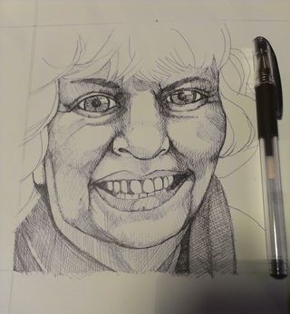
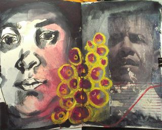
A friend recently contacted me about creating a couple of trading card portraits as a gift for his daughter. After a little discussion and finding out who he wanted me to draw, I accepted the challenge. The real challenge for this commission was to have a realistic image that still retained my style. Keeping my style was the hard part. I tend to shy away from photo-realism because I can't put my mark on the image and it falls flat for me.
It was also important to get a good idea of where the light and shadow fell on the faces and the general shape of the face itself. I started off with a few simple sketches done with the sharpie brush markers.
With realistic faces the important part is to get the eyes right. So I studied them. I did detailed sketches of the eyes, making notes of where I was off. Being self critical was very important in this stage. One I started to work on the card sizes errors would lead to doing the job over again.
I started the cards with a light HB pencil sketch made with a mechanical pencil. This gives me a guide of where I want my ink to go. This lets me move an eye to the right or left if needed and move the nose closer to the eyes and to shrink the mouth.
I then blocked in my first layer of ink with a 0.18 Uniball Signo Bit. it's light-fast and waterproof ink is a perfect first layer. I allowed this ink to dry for a full 3 hours before I used a kneaded eraser to remove in the pencil line. While I find the Signo ink to dry quickly I was taking no chance of ruining the pieces.
After the pencil was removed I went into the image with a 0.28 Uniball Signo DX black ink pen. Again, it's light-fast and waterproof ink is a nice deep black shade that let me build up my layers of ink precisely and easily.
At this point the image is almost completely finished. I used the 0.38 Uniball Signo DX to add the darkest areas.
Before adding the watercolor I sat on the finished image for 24 hours. I wanted to be happy with every aspect of the image before I finished it with watercolor. Since these are a pair if images to be gifted to the same person I wanted to be sure they matched. Doing a little research into my subjects showed they were both architects who used a lot of steel and concrete in their work. I mixed a large puddle of Holbein watercolors, far more than I'd ever need to finish these images, in a shade of blue grey midway between slate and concrete. The color complements the images well. After allowing the images to dry completely I cut them from the parent sheet.
The final step will be to place each card into a trading card sleeve and carefully construct a presentation sleeve out of cardboard.
If you are interested in having me create a custom trading card sized portrait for you, please see this page or consider buying into my chipin campaign here. I'd be happy to work with you to create a treasured momento.
Ruts
People get entrenched in the art establishment, afraid to take a chance on something new or different from what they already do. Instead they want to tear down anyone who thinks differently or works outside the box.
I’ve been told already that my personal experiment is worthless, been done before, and has little value.
Sigh.
It’s hard to brush all this off and tell myself that these people don’t get it and are stuck in the mud of their own thinking. Or this. Seth Godin calls this lizard brain thinking. I prefer to call it tethered thinking. It’s where a person is so attached to a particular idea or system of doing things that they are unable to see outside of the circle of their tether. Around and around in a circle they go never reaching out further than the length of their tether. At the perimeter of the circle is a rut so deep that even should they get off their tether surpassing the rut would be difficult.
No one ever said shaking up the system was going to be easy or comfortable.
The tether and rut are what we’re up against.
I’m asking for your help to push me over my own personal rut.
You can do it here.
Help Me Make Time for My Art
My Chipin campaign has reached it's goal, 100% funded in about 48 hours. I've got 13 more days to go on the campaign itself. Here's my plan, i'm going to leave it active. If I earn another $100 I'll be able to take a 2nd day and spend it doing nothing but art. Add that to the already long weekend and I've got a 4 day stretch of nothing but art all the time. The rewards for anythign over the initial goal will be the same.
Also everyone who has bought in is truly awesome.
Last month I worked on the 34 ATC as Thanks project and it gave me a goal to work toward. It was pretty exhilarating to work toward the goal of finishing 34 cards over a short period of time. My goal was to finish them as fast as I could. And I did. I realize that I work really well towards a self imposed goal, even if it weren’t on paper and just floating around my noggin. It made me wonder what would happen if I worked toward a goal that was set in stone.
Review: Sharpie Brush Markers
I purchased a few Sharpie brush tip markers to play around with after trying the prismacolor brush markers a few weeks back at the Sketchbook Project. For $1.50 each they were a great way to get my Jetpens order over the $25 mark for free shipping. YAY!
Out of the envelope they look a lot like any other Sharpie, a little chunkier and with some grooves on the cap. The end is hollowed out and there is a ring around the end of the marker. This lets the cap click onto the marker when you post it. Smart. Without posting the marker I found it a tad short to use. Posted it was just right. The markers are light weight.
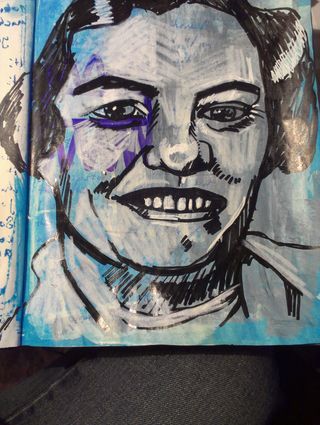
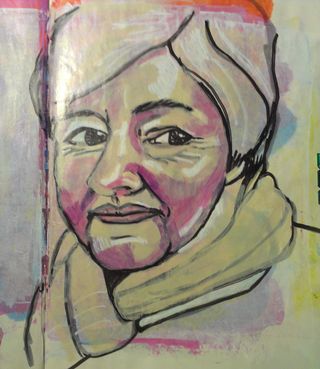
The marker tip is short, relatively stiff, yet pretty responsive at the tip. It’s not as springy as a Prismacolor or Copic brush tip but it does the job. I did a few quick sketches with the markers in my Stillman and Birn Beta sketchbook. The paper is a slight cold press finish. The Copic and Prismacolor handle this paper without complaint, the Sharpie is already looking fuzzy. I will admit to being less gentle with my brush tip markers, but in my opinion that’s exactly what these cry out for. Instead of drawing with brush tip markers I try to paint with them.
So that brings me to my next round of inspection, layering. Copic and Prismacolor markers are designed to layer over one another to build up color, so it’s much like working with watercolors. Sharpies tend to stand on their own. Each layer of color turns the tone darker and darker, without subtle shading. Sharpie brush markers are best for bold expressive shouts of color. Finding a Sharpie brush marker in yellow proved to be an impossible task, unless one buys the set of 12. *sigh* So I bought a Copic sketch in yellow.
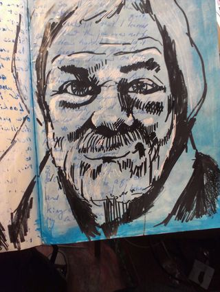
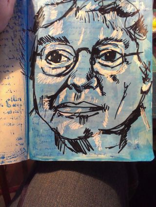
These will write on just about anything, just like a regular Sharpie. They do seem a tad juicier than regular Sharpies, so might be a good choice for acrylic paint. Just be aware that if you write over gesso with these you’re pretty much going to scrub that brush tip. I found these really fun for fast observations and sketches. The 2 sketches I’ve shown here took all of 10 minutes each. These brush tips really allowed me to lay down a lot of color fast. You’ll notice there isn’t a lot of subtlety though. Sharpies lay down bright bold lines and lots of ink.
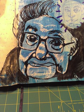
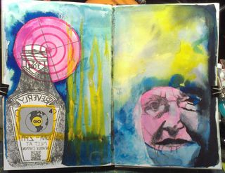
These are a great choice for someone who doesn’t want to invest in Copics or Prismacolors but wants that brush tip marker experience, they just need to be away it’s not going to be quite as good. Keep in mind they are probably not lightfast and are certainly not archival. Get them online at Jetpens.
Fence
I've written about this fence before. I adore it. If I had money I'd buy the empty, yet cared for, house that it surrounds, just for the fence. It's really something. Old school wrought iron. Heat, hands and hammers touched this and coaxed it into shape. This is from when craftmanship meant something.