Category Archives: Journaling

Versatile Blogger Award X2

Well both Tammy of DaisyYellow and Wendy of LateStartStudio have nominated me for the Versitile Blogger Award. *blush*

image from daisyyellow.squarespace.com
So, in no particular order, here are my 15 picks:

  • Diana Trout– For her no nonsense and down to earth approach to art journaling, refreshing!
  • The Journal Junkies– These guys are up my alley with an approach to art journaling that is fresh and process based.
  • Millande– Her videos are lovely and inspiring, check out her seed journal series WOW!
  • Traci Bunkers– I love what she does with tradiational photography and with paint, great stuff.
  • Jazmin- Sirensidyll I adore what she does in her journals and her approach.
  • Tammy of DaisyYellow– Rules smules, I read her daily
  • Sketchings & Jottings– Not just one artists work but a collection of great stuff all over the net.
  • Doodler's Anonymous– Great inspiration on an irregular basis.
  • Sketchbob– Highly creative, his journals inspire me.
  • JournalArtista– Paula is amazing and motivating.
  • RightBrainPLanner-Follow her on INstagram for some photo goodness
  • NoPenIntended– This feeds my addiction love of pens.
  • ArtJournaling.ning.com I love to head over and check out all the stuff people add on a daily basis
  • CraftyMoira– Moira is a great teacher, writter and full of inspiration, I lvoe her daily face drawings she's been doing.
  • Chongolio– Great guy with great advice for art journalers, very inspirational YT videos.

Now 7 things about me:

  • I'm from Maine, I grew up on the coast about an hour and a half from Canada.
  • I've never been  lobster fishing, though I have been on a friend's lobster boat. I also fell off his boat, at the dock, mainly because a friend pushed me off the boat. I feel into the bait grease slick. In case you don't know, lobster bait is rotting fish.
  • I'm an adventurous eater but I used to be vegetarian. My college roommate are still shocked when they hear me talk about cooking meat of any kind.
  • I'm an accomplished cook, who enjoys complicated recipes.
  • I started blogging in 2000. My first blog was done anonymously and thankfully the server it was housed on had a catastrophic failure and burnt to a crisp.
  • I have horrible allergies to pollen and dust.
  • I've been making art since I could hold a crayon.

Photos in my Art Journal pt 2

Check out Jasmin and Traci's posts.

I use the cameras to capture the things I see that spark my imagination or creativity. When I see something that captures my eye, I whip the iPoo out and snap a picture. In the summer I take a long walk with the intent to capture my surroundings. I use each of the cameras with a different purpose in mind. Mostly though I shoot pictures for the fun of it, I don’t know if they will end up in a journal or in a blog post.

With my iPoo I use several apps they are as follows: Hipstamatic, Instagram and Camera+. I use Camera+ and Hipstamatic most often. I enjoy the randomness of Hipstamatic and conversely, the control Camera+ gives me. I’ve been giving myself a little challenge using Hipstamatic which you can read about here. Most of the challenge is teaching myself to see for the camera and through the camera. I’m shooting the same subject 5 days a week and it’s a challenge to make the image new and interesting without relying on the app to do it for me.

image from www.flickr.com

With my PEN2 and point and shoot I transfer images to my computer using Picasa. I also use Picasa for minor edits- color correction, contrast, and switching the image to black and white if I’m looking for that. Most of the images I take with these 2 cameras are used pretty much straight out of the camera or switched to black and white. I don’t change much with them. Normally I up the contrast and increase the saturation of the images. If I need to do anything more intense, I use GIMP, which is a freeware Photoshop knock off.

P8302632


Ultimately with the PEN2 I’m a fan of Straight Out Of the Camera (SOOC) photos. I’ll crop them to size but the ultimate goal is to capture an image with the camera that will look, when printed as I attempted to capture it. For me the PEN2 is for clear contrasty images and the iPoo is for fun artsy images. With the PEN2 I was able to buy an inexpensive adapter (around $20 on eBay) and put vintage lenses on it. I chose Canon lenses because there were a lot on eBay. But I could have gone with vintage Russian lenses or Nikons or even old video lenses. Adapters rock my world and vintage lenses really give the modern camera a whole new feel.

 P9153010

The iPoo is a fixed focus camera, meaning it has one lens and that's it… Except that you can get some great stick on lenses for the iPh0ne and iPoo. These little lenses come with a stick on ring that attaches to the iPoo and the lens then attaches with magnets. These little adapters are a ton of fun. They aren't high quality but they change the focusing ability of the camera. My favorites are the wide angle and the macro lenses.These little add ons can be found on eBay for pennies or you can get one of better quality on PhotoJojo.com. I also have that adapter ring on my cell phone's camera, I refer to my cell phone as the "kinda smart phone."

Ultimately the best camera is the one you'll use.

 Check out Jasmin and Traci's posts.

Journal Photography

Call this a Blog Circle, Jazmin, Traci Bunkers and I decided we’re all write on the same subject this week. Our topic for the week is: Using photography and photos in our art journals.

I’ve been talking to Jazmin aka Sirensidyll about how we both use cameras in our art journals. The more I talked to her the more I realize that my cameras are an integral part of my art journaling process. I have a camera in my bag pretty much everywhere I go. Here’s a brief overview of the cameras I use:
My iPod touch
A Canon Ixus 1100
and a Olympus Pen PL2 with a variety of vintage lenses

IMG_0903

In the past, before I got the iPod touch I used my Canon Ixus point and shoot more often than I do now. It was small and I could slip it into my bag and take it anywhere. My Canon P&S takes great clear pictures. Now that I have an iPod touch 4th generation I’ve got a smaller camera I can take anywhere. The photos it takes are not as good as the Canon but it does a pretty good job. Additionally I can download a bunch of cool apps for my iPod that adapt and change the appearance of the image. I take one of these 2 with me everywhere.

IMG_0825

In the summer I take my Olympus Pen PL2 with me almost everywhere. I purchased a few vintage lenses and an adapter so that the old manual lenses can be used. The old fashioned and antique lenses lend a different look and coloration than modern lenses. With the vintage or new lenses it takes sharp crisp photos with great color.

I use the iPoo for 90% of my image (not accurate mathmatically.) It’s so small and portable that I forget I’m carrying it. I don’t worry about dropping it, well much, and it doesn’t weight me down. Sure, it doesn’t have fancy lenses but it captures ideas as well as a thumbnail sketch.

IMG_0902

Something that is unusual about photography,  at least for me, is that I didn’t start taking pictures until I was in my last year at college. For that last year, I used disposable point and shoot cameras that I took to the local pharmacy for development. It wasn’t until I was 22 that I got my first “real” camera, a Canon ELPH, and it took bright crisp and clear images. I still have that camera, though I never use it. Shortly after that I got my first digital, and HP something or the other, a 1.2 mega pixel brick, and by brick, I mean it was brick sized, shaped and weight. After using that camera to it’s death I graduated to a Canon Digital ELPH and kept it for years.

IMG_0907

Wednesday we’ll all talk about what apps and programs we use to manipulate our images. Check out Jazmin and Traci's posts on their blogs.

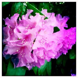
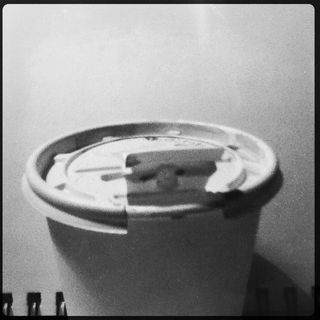
All images in this blog post were shot with my iPoo touch 4th gen I'll talk about the apps I use in the next post. (I refer to my iP0d as the iPoo to avoid attracting attention from the spam brigade.)

in practice: tell it to the page

The DayJob has a book club. We get to chose one of 3 books and then convene over dinner at a nice restaurant. I suppose that the goal at that point is to talk about the books but since I never go to the dinners I don’t really know the actualities of what occur, mostly though, I think people get drunk*.

image from www.flickr.com

Anyway. The memoir I chose irritated me. About half way in the writing style changed and the author wrote about something that irritated this crap out of me. Already the author wasn’t a very like-able character but this one aspect of her life bugged the crap out of me. She went on for pages explaining the whys and hows of what she’d done but it still… Irritated me. Begrudgingly I made my way through the last 100 pages of the book. Everything about the end of the book bugged the shit out of me. From that one point on, the author seemed arrogant, self absorbed, and annoying. Even at the end of the book I’m left irritated.

image from www.flickr.com

When I first got to that irritating passage I started to tweet about it, thought better of it, and wrote in my journal instead. I realized that what I was about to tweet would need more explaining than 140 characters. It didn’t belong on twitter or facebook. My incoherant rage directed toward an, at that point, faceless, author, didn’t belong online. It would have been far too difficult to explain.

The end point of this story is that sometimes we all need to just settle down and tell it to the page.

image from www.flickr.com

Continue reading

Challenge!

I’m pretty stoked to tell you all about the Challenge! group on AJ Ning. I’ve asked a group of my arty friends to help me out by being Hosts. Each month a new host will introduce the Challenge! Each Challenge! has 3 parts: Images, Colors, and Material. Depending on the host, you might get images they shots, copyright free images from Flickr’s Commons.

The images are meant to give you some inspiration. You don’t have to draw them, or even use them as collage fodder for your journal. You could be inspired by them to write about them, or doodle a new pattern, or even, write about how much you hate them.

The colors again, are meant as inspiration. You can use one or all of them in your art journal. You could do a whole page in one color, or 2 or 3. You could try and mix the colors. There are so many options with color it’s amazing. What about staining paper?

The material challenge is the cult of stuff aspect, use it up! If you have it in your stash, use it up! Test it out, use this Challenge! to try it out in multiple ways, learn how to use that one material in every way possible. Try it, test it!

Each Challenge! will lasts 2 weeks, then the next will start. We get each host for a month!

Picture

tell it to the page

You don't see all of the stuff in my art journals or sketchbooks. Some of it I keep for me.

It's private.

My every thought does not need to be shared.

Some of the stuff in those pages is dark. Some of the stuff in my head is dark. It's not pretty. It'll never be pretty. I'm not talking about it being grungy and dark so it doesn't fit the rampant aesthetic of pretty in art journals. No. That is not what I mean.

Rage isn't pretty.

Hate isn't pretty.

Confusion isn't pretty.

None of that needs to be pretty when I'm thinking it through. It's not for you.

It was never meant for you.

The beauty of an art journal is that you can close the cover.

Meditate on the rage/hate/confusion and move on with your life.

No one needs to know.

That's okay.

After you spew your issues to the world and the drama queens and gossip vultures strip you bare, leaving your bones to bleach in the sun what do you have?

Your art journal and a heavy heart.

Tell it to the page.

More #DoNotPin Garbage

So pinterest has released a small snippet of code that you can embed in your website/blog that blocks the pin it bookmarklet. This is good news. I was really worried I was going to have to watermark all my images here on the old blog . I was really not interested plus, I think it looks like butt. However, it leaves my thousands of images on Flickr vulnerable to being pinned. I really wish that Flickr woudl take a more proactive approach toward it's members who would like to be protected from tumblr and pinterest, especially since it's so damn easy.

Instead I'm headed to Flickr and finding my most often pinned images, there are a few dozen of a journal I shot back in '08 that get pinned and tumbled, you'll probably recognized them. Each one is getting a discreet little "ComfortableShoesStudio.com" The pain in the ass of this is that I have to open each one up on picnik to edit. Picnik is slow. It means I'll be scouring pinterest looking for my images (if I can bring myself to do it.)

I really think that pinterest should have a one click "hey this violates my copyright" button, no forms, just a click. It should be easier.

Here's one of my images I've had to ruin with a watermark:

image from www.flickr.com
oh and another:
image from www.flickr.com

First Round: Ink Fade Testing (lightfast)

At the end of December I was wondering if my inks were lightfast, or not. I was wondering given that I’ve done a great deal of drawings with these inks, mostly sketches in my art journal and I was considering venturing out toward finished art with inks. I want to be sure that the art that I sell lasts longer than it takes me to create it. Art lives in very different circumstances from sketches, ie in full light and on the wall. My sketches stay in sketchbooks or live on the walls only when I’m contemplating.

Now, the middle of the winter in the Northeast US is a terrible time to test the light fastness of anything. We’ve had a pretty mild winter with plenty of sunny days.  I took all of my inks with my glass dip pen wrote their name on a sheet of paper twice and scribbled a roughly 1cm high line the width of the page.

Over the weeks I noticed that a few inks immediately changed color and some immediately faded.  Others didn’t show any changes until the last week or so of the test.

P2203817

The winners in terms of not changing color at all:
Noodler’s Black, Noodler’s Heart of Darkness, Noodler’s Luxury Blue

The near winners, or those that show little fading:
Noodler’s Eternal Brown, Diamine Chocolat Brown

Faded, but not badly:
Noodler’s Nikita

Terrible fading, losing a component of the color, color shifting, marked change in color and intensity:
Private Reserve Sonic Blue(withing a week), J.Herbin Bleu Nuit (within a week), Noodler’s Fox Red (within a week), Omas New Gray, Noodler’s Lexington Gray

Showing a color shift, and is truly darker than before, though not the same color:
Private Reserve Electric DC Blue

P2203818

So what does this all mean? Not much in terms of journaling and writing. I’ve looked at some of my sketches from a year or so ago using J. Herbin’s Bleu Nuit, Noodler’s Red Fox, and PR Sonic Blue and can’t see a difference. It takes time in the sun for much of these changes to take place and most of the issues won’t affect anything in a closed journal. I won’t stop using these colors for sketching or journaling anytime soon, but I will stop using the fugitive colors in finished art work.

Don’t Pin MY Stuff #donotpin

Pinterest. Sigh. I've written about how much I dislike Tumblr and Pinterest due to finding a ton of unattributed images on both sites. That was way back in September of last year.

And now this article created a firestorm on twitter this afternoon. (search for #donotpin on twitter)

My feelings on Pinterest (and tumblr) can be articulated as follows:

  • Pinterest should link back to the creator DIRECTLY
  • Attribution should never ever be stripped.
  • They should only create a thumbnail of the image, not store a hi-res image.
  • Their weak section in ToS "you either are the sole and exclusive owner of all Member Content that you make available through the Site, Application and Services or you have all rights, licenses, consents and releases that are necessary to grant to Cold Brew Labs the rights in such Member Content, as contemplated under these Terms" is complete bull shit and probably won't hold up in court should an artist be damaged by their website. After all they know how their users USE their produt- to pin stuff that doesn't belong to them. If you pin my stuff without my permission (without attribution) then you have damaged me.

Every click on either of the 2 services that should come here is a damage. I know my pics on flickr have been pinned and shared on Tumblr. Imagine my surprise at finding my art journal pages shared without attribution? Shocking, only not, when you start to follow an image around the service. One person pins it, another pins from their pin, and another and another. After the 3rd click you stop looking for the original page out of shear frustration. How many sales have been lost to good honest artists and craftspersons to the vortex that are these 2 sites. I'm not suggesting that  they shouldn't make money off their service, but they should be more fair to the artists and crafts people who are really the driving force of their site.

This quote gets at the heart of why I hate pinterest so much, "If someone pins a photo on Pinterest, they've created a competing version of the image, which could siphon image search traffic away from the source site." (Link to original article.)

Pinterest and Tumblr may just drive me toward watermarking my photos, though I hate watermarks. It's the only way for me to drive traffic to my blog if someone steals an image.  So, you know, don't pin my stuff.