Category Archives: Review

Back-to-School Sale Composition Book Round Up Part 2

My last post was incomplete. I’d only been able to get books at Target and Staples. This week I went to two of the three the local Walmarts. One had not one composition book and was a wreck. The other Walmart was also a wreck but they had composition books. All are standard size (9.75X7.5 inches or 247x190mm) and college ruled.

Entry 1: Norcom Fashion Covers Made in Colombia 50 cents

The so called “fashion covers” feature patterns in white and some fashion color. In the case of these there were light teal, salmon pink, and a few other colors. These were also available in awful tacky metallic animal prints. UGH. These were the least offensive of the “fashion” covers. I chose teal and white.

The cover is printed onto thin cardstock. It is not quite as floppy as a poly cover but almost. The card is sturdy enough that the notebook might survive a semester in a backpack but I doubt a whole school year. There is a rather thin strip of textured paper tape on the spine. The width of the tape is proportionally off. It looks wrong. The front cover has a label area, which I greatly appreciate. It is pretty generic looking. Good job on that Norcom, you nailed what a comp book label SHOULD look like.

Inside the 100 sheets have light blue ruling that disappears quite well. The paper is nicely smooth but has enough tooth to be great for pencil. Ballpoint, rollerball, and gel ink all did great too. Fountain pens feel great on the page but spread and feathered all over. Even fine nibs bled through. If this didn’t do so well with pencil I’d say avoid it at all cost.

Entry 2: Mead Five Star Poly Cover Made in Vietnam $1.97

Why try another Mead 5Star when the one from Target was good? Well first this one is $1.97 and the copyright date is different. The Target version is 2016 while Walmart’s was 3013. Does it matter? Yeah.

The cover is the same as in the last entry. Thicker and stiffer than most of the other poly covers in the race. The stitching is well done. Repeat the last entry.

Until you get to the paper. It is slightly more absorbent and you don’t get the super sheen with fountain pens. I also had some bleed through that I didn’t have with the Target 5Star. The price is better but you’ll have to dig through the boxes to find some from 2016. I checked but found none, all at this Walmart were from 2013. They were great for pencil and the rest of the pens. Well, except for the firehouse of a Papermate InkJoy I tested. That had issues with bleed through where the letters crossed themselves.

Entry 3: Pens+Gear Poly Composition Book Made in India 67 cents

This is the first Pen+Gear* product that I can tell you to avoid. Get their made in India pencils and index cards but avoid this composition notebook at all cost.

Why? Let’s start with the cover. Yes it is poly, the thinnest floppiest poly I’ve yet to pick up. The textured fabric tape on the spine is far too narrow completely throwing off the look of the book. Normally I’d be super pleased that they actually used real fabric tape instead of textured paper, but not when a wider application of paper tape would look right but also do the job of protecting the area where the spine will flex properly. Further the spine is poorly stitched. It is not centered on the spine but folded oddly. The top half of the notebook has wider pages than the second half.

Inside there is an odd 80 count of sheets with bright blue ruling. It’s bright and thick and will never recede into the background. The paper is crisp and holds up well to fine fountain pens. Wider nibs tend to bleed but feel great on the page. Ballpoint, rollerball and gel all do okay. Pencils slip and slide. The paper lacks tooth. I had to really work hard to get graphite onto this paper.

The label doesn’t peel off easily. It left a sticky mess.

I really disliked the Pen+Gear offering. It’s not good enough with fountain pens to justify buying for that purpose and it is just so terrible with pencil that it goes into my do not buy list.

Entry 4: Norcom Neon Ink Splatter Made in Colombia 50 cents

The paper in this is essentially the same as the previous Norcom offering. The cover, other than a different “fashion print” this one straight outta 1988 with neon ink splattering, is the same as well. It sports the same too narrow textured paper tape and thin card cover.

Norcom has another meh offering. It’s not bad at 50 cents- especially for fine or ef fountain pens, and pencil.

Entry 5: Studio C Pattern Play Collection Poly Cover $1.96

This entry sports a poly cover printed with a variety of patterns in a variety of colors. I picked out dusty blue in squared swirls. The classic front cover label is circular. The poly cover is as thick as the Mead 5Star cover but lacks the interior printing. The spine is taped with metallic textured paper tape. The width of the tape is generous and looks appropriate on the cover. The poly cover is translucent and to protect your work inside, they have placed a plain sheet of white paper with the traditional school info printed on the inside. It is a nice touch.

The ruling is bright blue and disappears behind most of the sample writing I did.The paper doesn’t feel particularly smooth, until you run a fountain pen across its surface. Then the pen dances and slides in the most wonderful way. Even better, there was no spreading, no feathering, no bleed through and loads and loads of wonderful sheen. This notebook performed as well as the Mead card covered from Target. My inks all look amazing on it. Also, pencil feels wonderful. There is enough tooth that the pencil slides perfectly and looks nicely dark. I didn’t have to work to get the graphite on the page.

The Studio C was a very pleasant surprise given how disappointing I was with the rest of the Walmart offerings. It’s not the greatest value, at 1.9 cents per sheet it’s in the middle of the road of expense. The Target Mead card covered is still a better value at about 1.2 cents a sheet. But the price difference is negligible when you compare the 100 to 70 sheet offered in each notebook.

If you don’t write with fountain pens and you stay in the realm of gel, ballpoint, rollerball, and pencil the Norcom have fun covers, and some ugly stuff too. At 50 cents a notebook it is a good value.

I have to say, avoid the Pen+Gear notebook at all cost. The paper is terrible, binding shoddy, and poly cover flimsy and floppy. It is garbage.

Continue reading

Review Franklin-Christoph Pocket Notebook Cover Indigo Linen

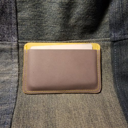
The Franklin Christoph pocket notebook cover in indigo linen is a luxurious looking pocket notebook cover. The packaging is gorgeous and unfolds to reveal the cover. The indigo colored linen reminds me of raw denim and feels like a well worn in pair of jeans. The front cover has a Franklin Christoph logo dead center. The back cover has a tiny Franklin-Christoph logo along the bottom edge.

The cover arrives with one Franklin-Christoph pocket notebook inside. The cover perfectly fits the Franklin-Christoph pocket notebooks. It also fits Field Notes, Word notebooks, No Brand Notebooks, Story Supply Company, and many other brands of pocket notebooks. I found I was able to fit two pocket notebooks into the cover. It holds them well and still closes easily. There is no notebook overhang or hang out with two notebooks inside.

Like many fabric pocket notebook covers that the cover itself is somewhat floppy. Unlike a leather cover which is given heft from the leather itself, the fabric must be supported. Between the layers of indigo linen there is some sort of cardstock inside. If you plan to continue using the Franklin Christoph pocket notebooks this won’t be a problem. Because the cover perfectly fits their pocket notebooks. If, like myself, you plan on using other brands of notebooks inside. You may find that the cover is a tad too floppy. My solution was to cut a piece of cardstock that is about 7 and a quarter inches wide and three and a half inches tall. This gives the cover a little more heft than it does without. 

Once I added my little sheet of cardstock the cover is perfect and holds my two notebooks together, slides in and out of my pocket with ease and looks fantastic.. If you have someone who doesn’t want to carry leather around with them and once a cover this might be the perfect notebook cover for them. It conforms to your pocket ie your buttcheek and is lightweight and looks fantastic. If  you’ve been wanting a nice cover but not wanted to carry animal skin, the FC notebook cover is a great looking option. It’s lovely in hand and in looks. I added a  Leuchtturm1917 pen loop to mine and it is a wonderful pocket carry.

Continue reading

Review: Staples Number 84 Rubber Bands

Maybe like me, you love the Field Notes “Bands of Rubber” but balk at the cost of them. Maybe you’ve looked at a variety of options, and maybe you’ve even order a pound of the wrong size. Or maybe you learned that the FN Bands o’ Rubber are the same thing as #84 rubber bands and are available at just about any office supply store. Yeah, maybe you are a bit smarter than I am. I’m late to the game.

I’ve taken to calling the #84 rubber band the “Rubber Bundler*” an I’ve got one wrapped around my wallet holding cash, one around my F-C pocket notebook cover, another around my pencil case as extra security. I’m finding all kinds of uses for these simple sturdy rubber bundlers. Best thing? A quarter pound, or roughly 52 rubber bands is  about $4 with tax. Sure they aren’t black, just plain old natural crepe rubber, but they do the job.
You can also get a different brand in black on Amazon or a full pound of the crepe rubber.

Continue reading

Back-to-School Sale Composition Book Round Up

This is a very image heavy post!
I decided to head to back to school sales and pick up a few composition notebooks to update my old best of Composition Notebook review. I go through a lot of them writing my drafts, so I have room in my budget to spend the money to buy during the sales, because for the most part comp books are around 50 cents at Back To School Sale time. All are college ruled. Unless otherwise stated these are all the typical size for comp books:9.75X7.5 inches or 247x190mm.

Entry 1: Generic Made in Taiwan 51 cents (Target)

Target’s entry has thin flimsy card covers graced with a marble pattern that has bled together so much as to have little white space. It has a black textured paper tape spine. Beneath the tape it is stitched. It does have a nice oval shaped Composition label on the front cover that looks absolutely generic. I kinda love it.

Inside are 100 sheets or 200 pages of thin smooth paper. In my testing I found it worked well with pencil, rollerball, ballpoint, and gel ink. Fountain pens bled through but didn’t feather until I started to use wet nibs paired with inks that tend to feather. With fine and extra fine pens it did okay. With any darker colored ink the verso of the page won’t be usable as the show through is intense.

What sets this comp book apart from the pack is the smooth paper. It is smooth yet toothy enough that pencils were superb on its surface. Point retention is phenomenal even with soft dark pencils like the Glimo Super Black. Smudging was minimal.

Entry 2: Staple’s Made in Brazil 50 cents

The latest iteration of the venerable favorite has thin flimsy card covers. A definite downgrade over past years. The marbling is splotchy and evenly distributed between white and whatever color cover you purchase. It isn’t very marble-y. The label area is rectangular and rounded over. Rather boring. The spine has a black textured paper tape over it.
Inside are 100 sheets/200 pages of thin bright white paper with a dark purple-blue ruling. The ruling is far too dark and never receded into the background.Even with thick black ink it stands out. Gross.
Testing proved that this toothy paper did well with the usual round up of pencils, rollerball, ballpoint and gel inks. It was shite with any fountain pen. Even the thinnest and stingiest of nibs feathered and bleed with the best behaved of ink. Wet thick nibs soaked through to the page beneath. The verso of the page is unusable with any liquid or hybrid ink. Even some of my gel inks tended to show through. What a  mess.
What an abysmal fall from grace.

Entry 3: The Mead Poly Cover Made in Vietnam $1 (Target)

I’ve had very bad luck when it comes to Mead comp books in the past. This year’s is far different than the past iterations. There are 70 college ruled sheets, though they are also available in wide rule. The poly cover is thin and rather floppy. The tape is gray textured poly. The cover has lines printed on the fore edge but no other design. The typical label area lacks anywhere to write your name or other information. This is a sad oversight.

Inside the 70 college ruled sheets feature very thin pale blue lines that recede into the background of every ink. I’m in love! The paper is thin and crisp. It’s not slick feeling but it performs remarkably well with every pen and ink combination I’ve used. My wet pens and inks glide over the surface and feel wonderful. Better yet, there is no bleeding, feather or soak through. No, I even get sheen on this lovely paper. There is show through, but that is to be expected from paper this thin and crisp.

I find it shocking that I have a Mead contender for best Comp Book of 2017!

Entry 4: Mead Card Cover Made in Vietnam 79 cents (Target)

Repeat everything I said about the Mead Poly cover here. No Feathering, bleed through, or feathering. Loads of lovely sheen, even from my EF pens.

The covers are decently sturdy card, and at least at the Target where I purchased my sample they had 2 patterns- one for wide and narrow lines. The patterns consist of stripes made of vertical lines roughly the height of the lines inside the book. Clever. They were offered in a rainbow of colors with textured paper tape over the spine. Sadly this also lacks the classic front cover label area.

The big downside of this paper is that because it doesn’t absorb liquid ink, it takes quite awhile for that ink to dry, resulting in smudging.
Not only do I have 1 but I have 2 contenders for best comp book from Mead. Shocking.

Entry 5: Mead Five Star Poly Cover Made in Vietnam  $2.99 (Target)

In another shocker, repeat all the good stuff from the last two Mead entries and it applies here. The paper is great. There are 100 college ruled pages in the 5Star. It features a classic textured black paper tape along the spine. Mead skips the classic front cover label area.

These poly covers are among the toughest of the poly covers. Though they are still floppy, they are less floppy than others. The interior of the cover is also lined with white poly so that the contents aren’t on display. Further, it features some of the classic composition notebook interior goods- class schedule and conversions.

Comparing this to the other Mead offerings, this is not a great value. The paper is wonderful and the poly cover sturdy but not enough (to me) to justify the increased cost  over the other poly cover.

Entry 6: Up & Up Card Cover Made in Mexico 5 for $4/80 cents per book (Target)

It is tempting to return these and cash in on the Target 100% satisfaction guarantee. Yes they are that bad. The poly cover is thin, flimsy and floppy. The paper taped spine features glue squeezed out of it’s edges. Unlike most of the comp books written about thus far which have stitches at roughly 10mm, the Up &Up is stitched at 15mm.

The paper is bright white with pale blue ruling. The positives end there. Every fountain pen I used feathered and bled, even dry extra fine nibs using dry well behaved inks. Blotter paper is less absorbent. The only thing that works okay on this paper are ballpoints and pencils. Even pencil doesn’t feel that great on the paper. It lacks tooth to get a decent line and what graphite does get onto the paper is pale and smudgy.

This goes on my do not buy list.

Entry 7: Greenroom Decorative Card Cover Made in Vietnam $2.50 (Target)

Here is another comp book with only 70 pages. The paper is cream colored with brown ruling. The lines are actually tiny dots. I really adore this ruling and wish that I had better things to say about the actual paper. This paper feathers and bleeds with every fountain pen used. Gel ink also feathers and bleeds. Unlike our last entry, pencil feels good on this paper. Rollerball and ball point are also quite nice, so there are a few more options for use than the Up &Up.

The very pretty card cover is very thin, very flimsy and as floppy as the poly entries. It will not survive carting around in a book bag for long. A spill will spell the end of this comp book. The textured paper tape is well applied and looks good with the lovely printing of the cover.

Entry 8: Yoobi Card Cover Made in Vietnam $2.29 (Target)

The Yoobi comp book is a venerable contender and little has changed since the last time I purchased one- the covers are sturdy and thick, printed with one color or a fun pattern. The textured black paper tape is well applied. The front cover features a large block where you can label your notebook with your name and other info.

Inside are 100 college ruled sheets. The ruling in this year’s is pale and thin. I like it. The paper is smooth but not too smooth. It’s toothy enough for pencil but not so toothy that it eats up your graphite. Fountain pens fair less well than in the Mead notebooks but fine and extra fine do really well.

Though the Yoobi books aren’t the greatest value at full price, they are a great cause. Plus they go on clearance often enough that you can usually snag some decent deals in the middle of the winter.

Which is the winner here?That really depends on your final use of these notebooks. If you are a fountain pen user you can’t go wrong with the Mead card covered available at target for 79 cents. The paper is phenomenal for everything tested for this review. I was able to see sheen even with my finest fountain pens. Nothing bled or feathered. The per page price was 1.13 cents a sheet. While this isn’t the cheapest, it’s squarely in the middle of the road. If you are planning on using pencils or ball points (looking at you Bic Cristal lovers and folks who put the Fisher Space refill in friggin’ everything) you really can’t go wrong with the Staples 50 cent composition notebooks. At 0.5 cents per page these represent the cheapest of the cheap. Sadly they no longer fair well with fountain pens or liquid inks. Finally if you want a solid writing experience, fun covers, and a good cause, the Yoobi books are a good choice.

There are two here I’d avoid at all costs. Sadly the pretty Greenroom notebooks are just far too expensive at 3.5 cents per sheet to have paper that performs so poorly. Though the Target Up &Up brand is on the low end of cost at 0.8 cents per sheet the performance of the paper is abysmal and the shoddy stitching will likely give out before the poly covers have a  chance to break down.

This series of mini reviews reaffirmed something I’ve know for a long time; I hate poly covers. They are floppy, you can’t write in hand or even in your lap. The plastic won’t break down for ages. The brighter the poly cover the more likely you are to be able to see through to your contents. They add unnecessary cost to a product that should be inexpensive. Here let’s put it into “print:” poly covers are garbage. Continue reading

Review: Franklin-Christoph 1901 Mixed Grade Pencils

For those of you not as obsessed with stationery as I am, Franklin-Christoph (FC from here) is a fountain pen company that prides themselves on making their amazing pens here in the USA. When I saw that they were set to offer pencils, well, I contacted them for a pack for review.

F-C has confirmed that these pencils are manufactured for them by Musgrave, which can be good and bad. Many of the Musgrave produced and private labeled pencils are pretty good. Hell the SSC pencil is among my favorite round pencils for writing. The only Musgrave pencils with mixed grades are their Unigraph pencils, a pencil that I can only say is terrible. In fact they were so terrible I chose not to review them. Comparing the two seems inevitable

The first reviews that I’ve read about the FC 1901 were just as I’d feared- pretty terrible. They have all the usual issues we associate with pencils manufactured by Musgrave- thin blotchy paint, uneven imprinting, ferrules or caps set poorly, and like the Unigraph, cores that are barely discernable from one another. They also feature a sharp hex. Some people  like this some hate it. I’m indifferent. The sharp hex doesn’t bother me. For more detail on the looks read the linked reviews.

The packaging is gorgeous. The cardstock box is cut and folded well and it has a lovely F-C logo imprinted. It’s a gorgeous color too. Could the box be a harbinger of good tidings? Not likely, given the previous reviews.

I’m not reviewing these as a pencil for writing but rather from the direction of an art pencil. For writing they are fine, ugly but fine. In art looks matter less than the performance of the pencil. After all I’m pretty happy to use a variety of General’s pencils for drawing and they also feature shitty paint and bad imprinting. Their cores are significantly better, or at least the majority of the Kimberley and Draughting pencils I’ve used aren’t gritty.

So how do the F-C pencils perform?

Surprisingly good. The cores are silky smooth and really pleasing  to use. That said the HB and B are nearly identical in tone and feel. While the 2B and 4B are also nearly identical to one another. The step between B and 2B is not steep, though it is enough to be noticeable. In my testing on hand Book travelogue paper and HP laserjet 24LB paper I could barely feel the difference in grades let alone see them. The smoother the paper, the less of a difference I could see and feel. In fact on the smooth HPLJ24lb I couldn’t tell the difference between grades in feel or looks. I only noticed the difference on rougher paper. These pencils do a good job on rough paper

Curious, I tested them on rougher and tougher paper- some kraft sketch paper that is closer to grocery bag than it is to drawing paper. Again, the pencils did a great job, the various grades performed better. Though still the HB and B, 2B and 4B felt too similar to say they were different.

My final verdict on these is that for writing or drawing on rougher paper with loads of tooth, these are pretty decent pencils. Yes, ugly and poorly finished, but the graphite is silky smooth and decently dark. No the grades don’t differentiate enough, but if you think of HB and B as the same and 2B and 4B as the same, well, you get 2 grades of dark pencil. For the price, well, they aren’t a value. I like them well enough that I’m tossing them into my on the go sketching kit where they’ll be used up pretty quickly on the rough sketch paper for which they are best suited.

Continue reading

First Look: Baron Fig Limited Edition Confidant Raspberry Honey

The Baron Fig LE Confidants have fresh covers wrapped around quality innards.Their newly updated paper stock is thick, has some tooth, is decent with fountain pens, pencils, gel, rollerball, ballpoint, and other inks. There is minimal bleed and show through. Feathering? The new Baron Fig paper doesn’t even know what feathering is, bro! The dot grid pattern is pale enough to fade into the background, which I adore. The book block is Smythe sewn and done well- I have no glue creep or loose stitches in mine. The creamy off white paper is great for long writing session and journaling. This paper is great and I love it.

They have changed up their limited editions a little bit, in this box there is an included booklet with a short 16 page illustrated short story called… Raspberry Honey. The illustrations from the story adorn the box and the end sheets. Which is a lovely touch. The cover of RH is brick red or as BF calls it maroon. The color is dark enough that dirt and dust won’t mark it up easily. It will gather cat and dog hair, so if like me you have light colored dogs, well, all that hair will show. The cover is debossed with little bees all over. They are precious and tactile. It is a really different cover from the previous Metamorphosis edition. And I love it. I love feeling the little bees under my fingertips but know that they aren’t felt when I write on the pages of the notebook. The color on this one is hard to photograph. I tried my best to capture it, but you know every monitor is different. It looks good on mine.

Sadly, the ribbon book mark is still about an inch and a half too short. It is a lovely shade of pink that reminds me of raspberries and cream, or rosé.

You can get one at Baron Fig’s Website here.

Continue reading

Review: The Classroom Friendly Sharpener

The Classroom Friendly Sharpener (from here on out, CFS) is a sturdy metal bodied sharpener with a guide that grips your pencils and draws them into the sharpening mechanism. It is sold by ClassroomFriendlySupplies.com As you turn the handle the pencil is gently pushed further into the blades until it has a fresh perfect point. Then it stops via an ingenious auto stop mechanism. Check out the video that demonstrates how the guide works.

The sharpener arrives in a sturdy outer cardboard box, with some paper packaging and big air pockets. Inside that is a sturdy plastic box that perfectly holds the CFS. The sharpener and clamp are inside their own cellophane baggies. The box is unbranded and has no stickers, just a few well placed bits of tape to hold the box closed. The sharpener itself is also remarkably free of garish branding. Rather the shaving bin has a tiny print of the website and the top has a  single small sticker with the website. Simple and clean branding.

My version is sky blue, with a shiny chrome faceplate and crank, with black plastic grips. The roomy shavings drawer is clear plastic. As a test to see how much the bin will hold, I sharpened 16 pencils- 8 from a factory point to CFS point and another 8 from unsharpened to CFS. I could have easily have sharpened another 4 pencils but felt the bin was pretty full. That is plenty of shaving capacity for a desk or a classroom. The clamp works well enough and securely holds the sharpener to my desk.

In use the crank rotates smoothly and the blades cut cleanly and fast. It took just a few rotations and few seconds to take an unsharpened pencil from flat to super pointy. Let’s talk about that point because it’s awesome the CFS point is the best bang for your pencil sharpener buck around. At less than the price of a M+R Pollux you get a similar point that lasts and lasts while you write. It’s slightly convex, and long. I love this point

The great thing about the CFS is that it works on expensive Blackwing Volumes, less expensive General’s Cedar Pointe #1, inexpensive Nataraj Trikone, to the el cheapo Wally World Casemates, and even the horrible pox upon the house of Dixon the unnamed #2 Dixon. It doesn’t care about the price of the pencil or what it is made of- it just grinds off the wood and shapes it to a perfect convex long point meant for ages of writing.

And, yeah, it’s pretty quiet.

The one complaint that I’ve read about this sharpener is that it leaves teeth marks on pencils, tiny little holes. If this bugs you, you can use the Welfle Method of wrapping a post it around the area where the teeth with grip the pencil, it’ll still get plenty of grip on the pencil, but not leave the holes. Or you can be like some of us and embrace the pencil as an ephemeral tool that you destroy to create art. Whatever floats your boat, maaaan

An additional positive of the CFS is that you can buy a fresh blade when yours dulls. This is awesome. The company makes these easy to find and easy to buy. Lose your clamp? Break your plastic shavings bin? They have that covered too.

Continue reading

Review: Nataraj Marble HB Pencil

This is marbling done right. I really adore the look of these pencils. They range from cool shades of pink to hot red and yellow with a bit of blue interspersed. The swirls are lovely and again range from big swooshes of color to tiny thin whorls and peaks. There are occasional bubbles that mar the surface of the lacquer but for the most part mine are smooth and well done. There is no seam to overlap because these pencils are actually marbled.*

In my 50 pencils, or half a tub of them, I had a few that were warped, but mostly mine are straight and well done. Cores are about as centered as I’d expect for any pencil made by Hindustan- that is to say, a handful of my 50 are off center with a few of those really off center, but are totally usable. The white end dip is pretty well done, though they do occasionally crack, but I’ve yet to see that in this batch.

When you order a bucket of these, depending on the vendor, you may get graphite dust all over the pencils. It’s ugly but pretty easily cleaned using either a wet wipe or hand sanitizer or electronics cleaning spray on a microfiber cloth. The graphite wipes right off. The graphite won’t harm you and it never seems to get on my hands from the pencils I haven’t bothered to clean.

The graphite in these is a nice smooth HB that reminds me of the Apsara Beauty “Dark Writing” core, and I suspect it is one and the same. Thus far in this batch, the handful of pencils I’ve sharpened are consistent. I’ve bought a few in the past that seemed harder and lighter. That said, these have a really nice core.

End point? These are nice pencils that are cheap as dirt when you order them via Amazon. You get 100 for about $25. You can order a handful on CWPE or hit up The Curious on Facebook to get fewer. If you order the bucket of 100 expect a few to be warped, a handful of cores to be off center, and maybe some cracked end caps.

Continue reading

Review: Palomino Blackwing Volumes 73

It is difficult to review the Blackwing Volumes (BWV) limited edition pencils. The various stories don’t do a great deal for me as I see them as marketing. Divorcing the pencil from the sales hype is a bit of a chore. Add to that the core is one of 4 from the Palomino Blackwing line- soft, balanced, firm, or extra-firm. The wood is always Cal-Cedar so really with a Volumes edition we’re evaluating the paint job, because I don’t think anyone out there would pretend that the Blackwing pencils aren’t quality. So you review the paint job and perhaps the story.

There is always some wild speculation that the core is just slightly softer/harder than the core Palomino tells us is inside. Of course Palomino/Cal-cedar is notoriously tight lipped about the whole thing and any difference can only be attributed to batch variation, or wishful thinking.

I digress, back to the fancy paint job on the 73. The cobalt blue paint is a stunner- bright and cheerful without being garish. The white imprint is perfectly done. The silver ferrule holding a white eraser looks fantastic with the blue and white.

The raised topographic printing looks awesome and feels great. It lends a grippiness to the pencil that I really enjoy. The only quibble that I have is that the seam where the print meets itself is  doesn’t match up. The seam is really obvious and rather unattractive when compared to the rest of the well designed pencil. It seems (LOL) like a poor design choice, but which also makes me think that perhaps the machine used to print on the pencils can’t do a seamless design.

The white eraser is a huge improvement over previous BWV erasers. It actually works and it’s is dust gathering/ sticky. I want these in all colors and for all my Blackwings, please.

I love the new paint job on the soft core Blackwing. It’s pretty, tactile, and the new eraser is sharp. The BWV aren’t a great value at $25 a package but they are pretty and nice. They also donate money to music education, so that’s a bonus.

Continue reading

Review: Yoobi Journal

The Yoobi Journal is available in 2 sizes and styles: The vinyl covered 12.7×20.95cm or 5×8.25 inches which retail for $6 and the paper printed 8.5 x 6 inches and retails for $7. This review is for the vinyl covered version, though I’ve used both and the interior is the same.

The Yoobi Journal is just another vinyl covered journal/notebook. It breaks no new ground in the category of Moleskine knock offs. It’s got a hard vinyl cover with matching elastic and generously long place marking ribbon. The ribbon is heat sealed to prevent fraying. The corners are rounded. It lacks a pocket, but that is no big loss for a journal meant for writing. There is a 3mm overhang on all edges. They are available in a range of colors and prints- aqua, blue, pink, purple, white, and black. Sadly, they aren’t yet available in the new Yoobi color of coral.

Inside is a book block that is smythe sewn. In some of the signatures there is glue creep along the stitching, but I’ve seen worse. It bears mentioning. There are 160 pages of off white paper. The lines are thin and gray. The ruling is 6.5mm and does not go to the edge of the page. There is a 1cm gap around the page and a generous header..The color is pale enough to disappear behind my writing with most colors. If you’ve been reading this blog for awhile you know that this pleases me greatly. The paper is smooth but has enough tooth to be very nice with pencil. It does okay with extra fine and fine fountain pens, but those gushing mediums and broad nibs are going to soak through. The EF and F did have a tendency to show through but not bad enough to be a deal breaker. These really shine with pencil, rollerball, ballpoint, and gel inks.

The cover is able to be folded over onto itself for writing in hand. The covers are stiff enough that this is comfortable. The notebook does lay flat on a desk even when first opened.

It has the bonus of being inexpensive even at full retail. If you are patient, you will end up finding them on clearance for half price at Target or even the Yoobi website. I have picked up all of my Yoobi Journals for $3 each. This is a great value. This is a budget journal that is serviceable and tough. That vinyl cover stands up to abuse. I’ve been carting one around in my backpack and abusing it for months now and you’d barely notice the wear.

Continue reading