This pen came free with my Pentel Pocket Brush Pen, I wasn’t expecting much from it, honestly I thought it looked like “just another rollerball.” These are available from Jetpens, Amazon, Blick and other assorted places all over the net. Blick’s seems to offer the best price on the 4 pack of sizes, and you’re probably going to want to test these out yourself after you read my review.

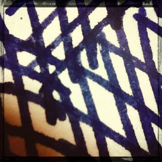
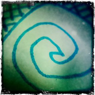
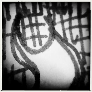
So, yes, it’s a rollerball. It’s an ultra fine point rollerball with a tungsten tip. The 04 tip is fine, very fine, much thinner than any .05 tip I’ve seen. It’s close in size to the fine sized RapioCraft pen. The ink is VERY black and crisp. The edges hold up well even when writing across damp sections of the page. It doesn’t spread. It will spread if you add water to it when it’s still wet. Once dry this ink is waterproof, even on acrylic. It dries relatively quickly on paper but takes a LONG time to dry completely on acrylic. It writes well over acrylic, not quite as well as a regular cheap-o Bic but well enough that I’d use it again.

It comes in sizes from .03 up to .08, with the .07 and .08 sizes more difficult to find. The pens also come in 4 packs of sizes .03- .06. I could see a 4 pack of these becoming a regular writing, drawing and sketching tool. It comes with a cap or as a retractableThe various websites make the following claims: acid free, archival, light fast, waterproof (true), and fade resistant. I can’t address the rest of the claims but I can say that it is waterproof.

I’m definitely impressed with this pen. I’ll be buying more of these to have in my sketching kit as well as my art journaling kit.