Carbon black paints deserve posts of their own so I’m writing a post with some details. I read an artist bloviating that lamp black is an inferior black for ink and paint, and honestly I couldn’t disagree more.
I’m starting this off by writing about lamp black. If you are familiar with sumi or India ink you are familiar with lamp black.
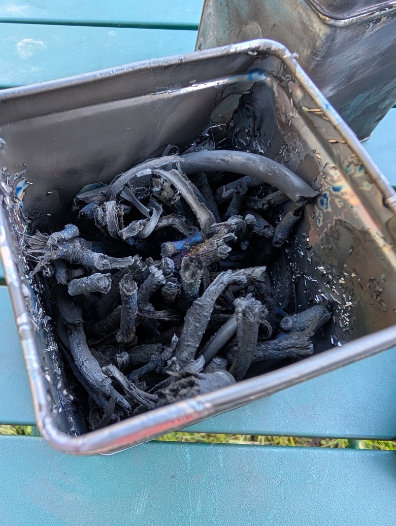
You create lamp black pigment by creating some sort of smokey incomplete burn of a burnable material. That black soot you get on the bottom of your pans when camping? Technically lamp black. I’ve seen a variety of videos on making lamp black- one guy makes it with fat wood he orders online. Most folx use an oil lamp.
I make mine with a simple oil lamp using strained used cooking oil. My lamp is made of a glass jar with a tiki torch wick held in place with some titanium bar stock I had on hand. The wick needs to be held in place and this can be achieved with any sort of metal wire. It needs to hold the wick in place while not pinching the wick. If the wire pinches the wick too much it will starve the flame and the flame will attempt to jump below the pinch point creating a possibly fire hazard.
Anyway, you want to create a sooty incomplete burn so you want to make sure that the wick is technically too long. Mine is about an inch too high.
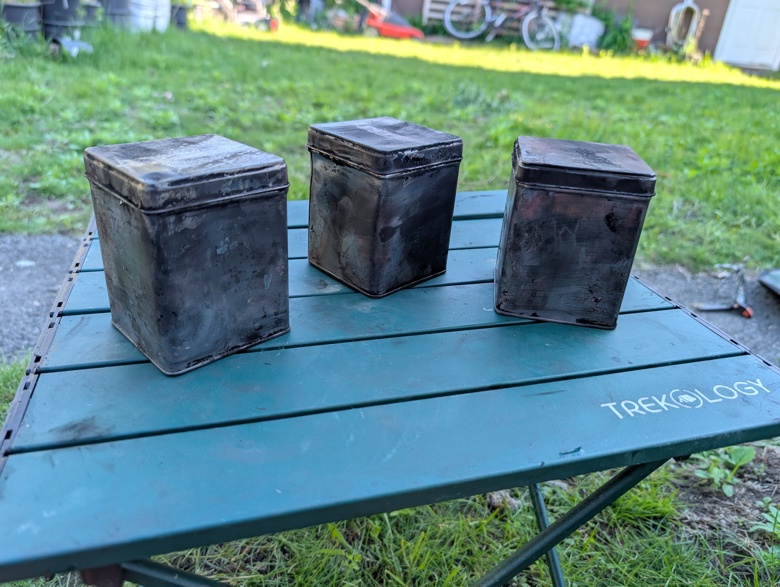
In my glass jar I put used cooking oil. We collect our cooking oil in an old can for disposal and I took some of this oil, strained out chunks of food and water and poured it into my jar. The wick starts to pull the oil up quickly. I let mine sit for about a half hour to get it fully saturated. While this was happening I found a few supports to hold a metal bowl over the flame. The flame needs to hit the bowl to gather the soot.
Then you wait. The bowl should be turned periodically so that the metal doesn’t overheat. If the metal gets too hot, the soot won’t stick. I burned about an ounce of oil and collected a teaspoon or two of lamp black. It is best to make lamp black outside in an area protected from wind but is also well ventilated.
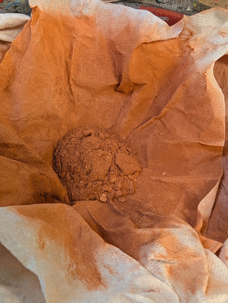
The lamp black scrapes off the pan with an old business card or clothing tag pretty easily. I scraped mine into the middle of my pan and then dumped it on my glass mulling surface. In order to get it to stop blowing everywhere I attempted to spray it with water. The spray shot soot everywhere. What a mess.
The lamp black is slightly greasy and the particle sizes are extremely fine. They clump together to form tiny lightweight little floating pieces that leave a greasy mark where ever they land.
Lamp black (and in my experiments all types of carbon black) requires the use of a degreaser for it to mull properly. I used rubbing (isopropyl) alcohol, but I’ve read about folx using vodka. I suspect that soap would work as a rewetting agent as well as a degreaser for proper incorporation. I used a smaller amount of watercolor medium* than usual and ended up adding more and using plenty of water to mull it. Mulling was short and sweet once I added in the alcohol.
I have read that you can reduce the amount of grease/oil in your lamp black by heating the soot up until it glows red hot. I did not find that this reduced the grease/oil when I tried it.
It does not require levigation to remove large particles, there just aren’t any.
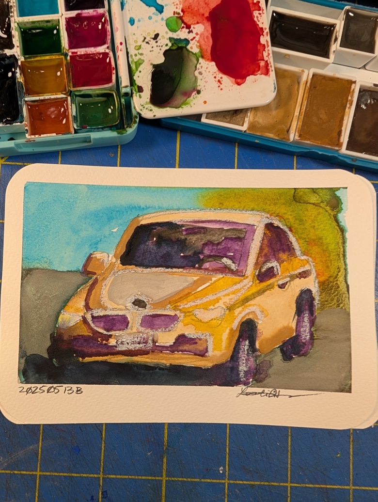
Lamp black gives a very low yield of the most delightful deep rich black I’ve seen. From the amount of lamp black I collected, I created 1 half filled full pan of color. It also dries up into near nothingness with cracking. This might be a issue with my particular watercolor medium but I’ve only had issue with cracking with some of the colors I’ve mixed.
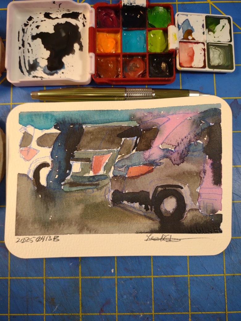
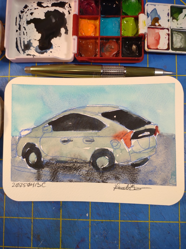
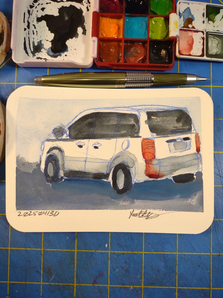
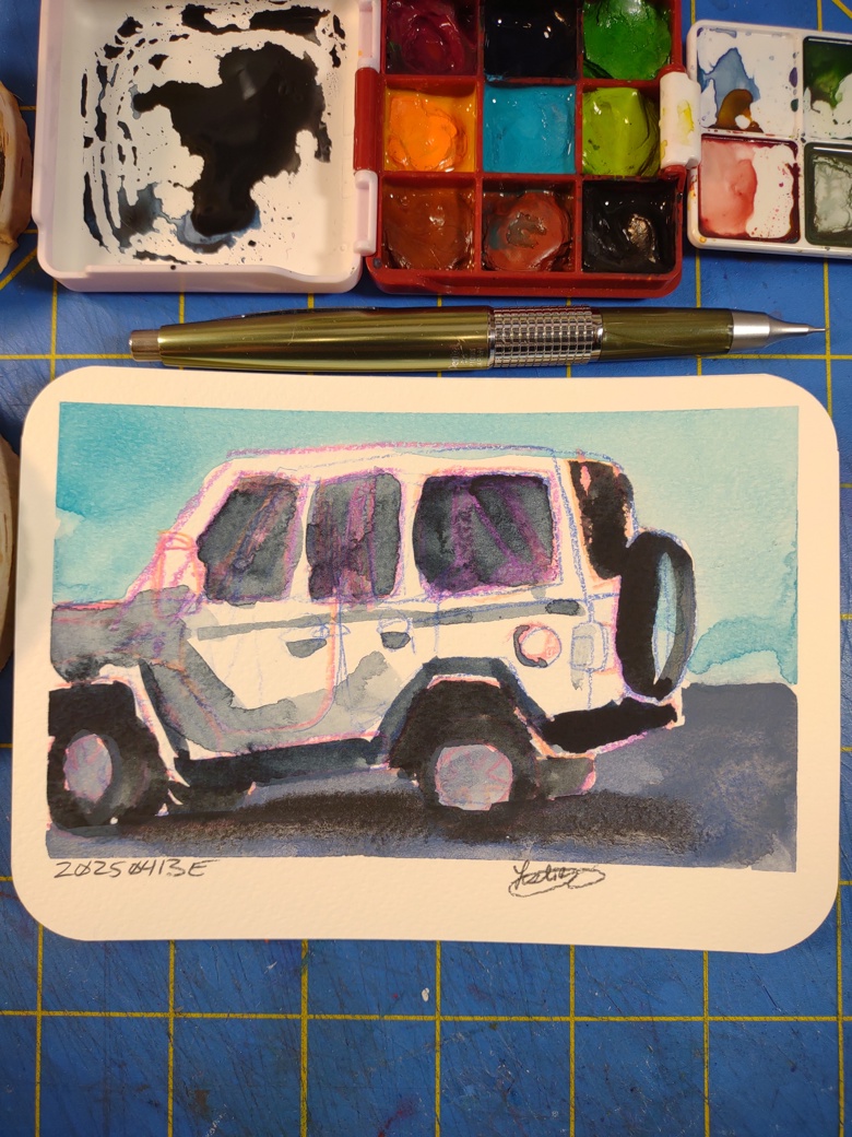
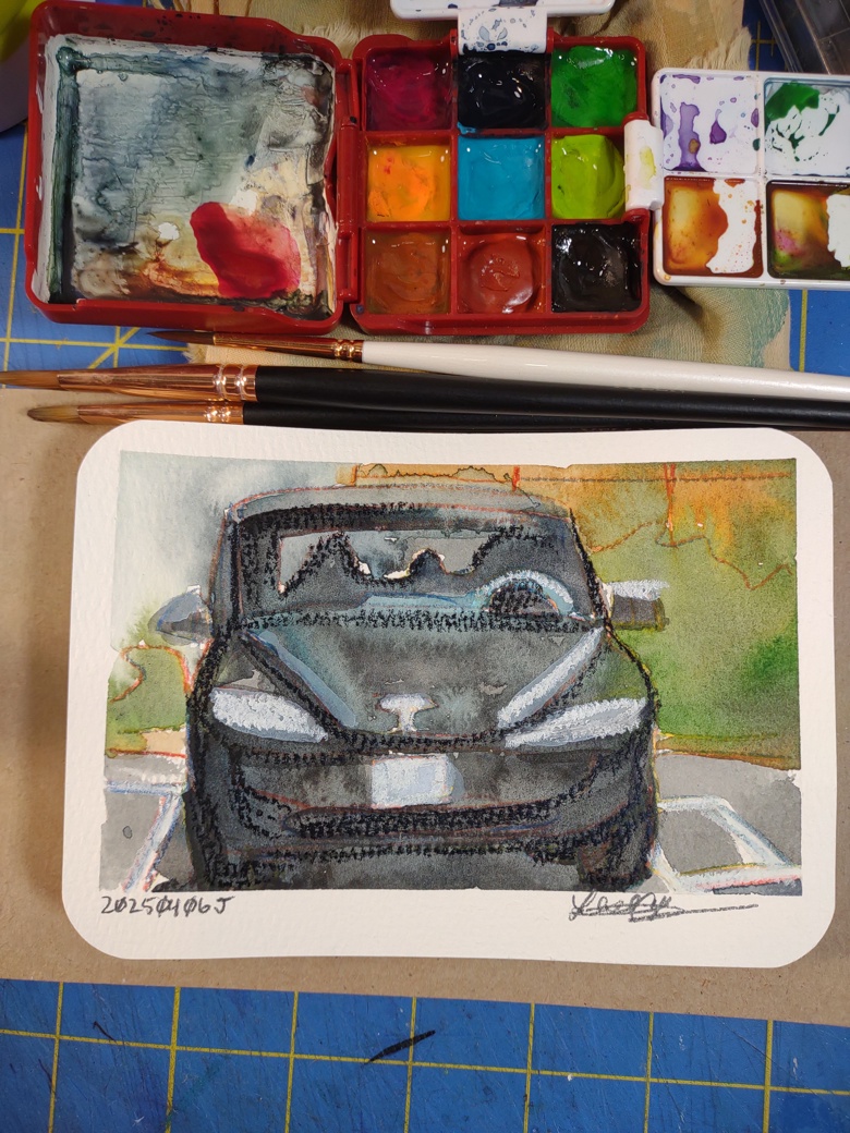
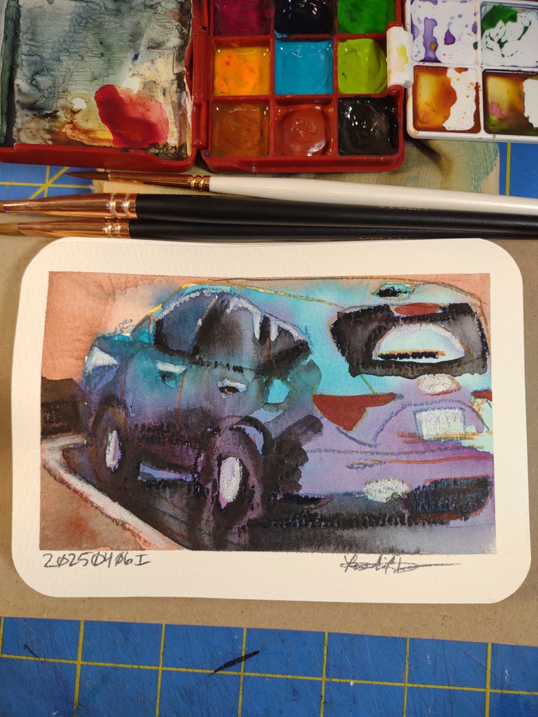
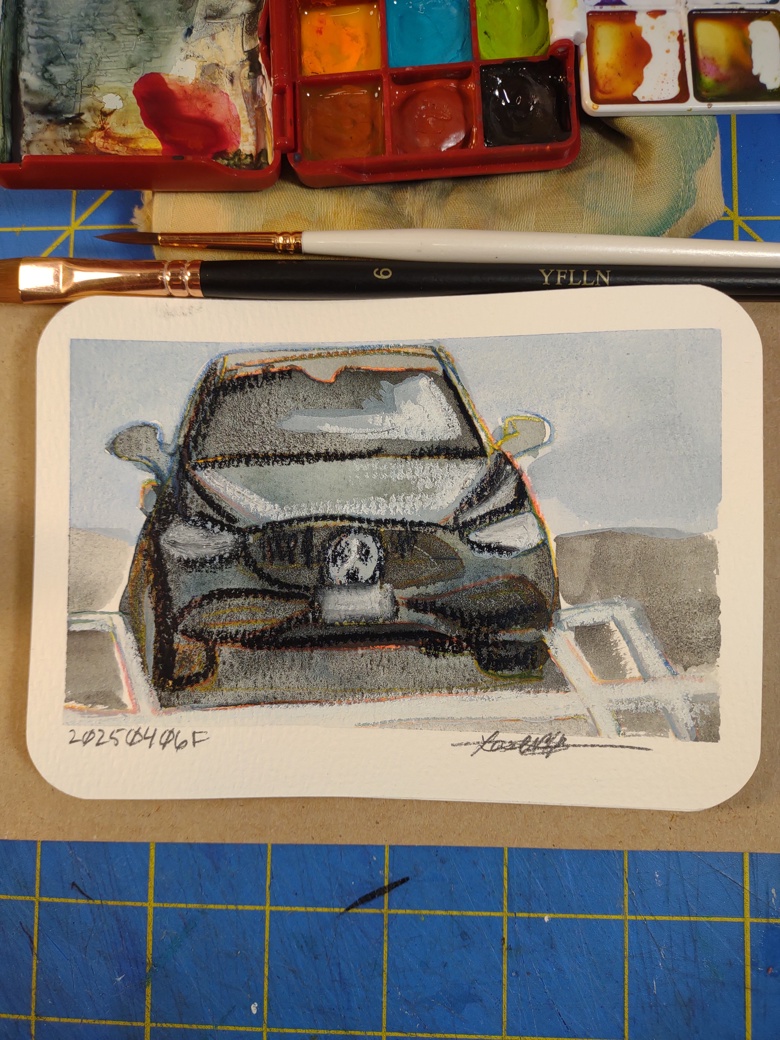
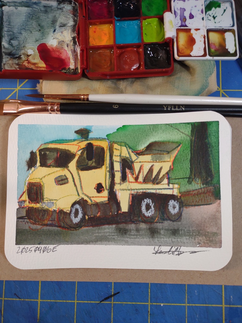
It’s hard to describe this lamp black watercolor- it’s deep it’s dark it’s rich and even. It rewets wonderfully and has a lovely flow. It’s that inky black I look for when I think black. It’s a perfect deep dark. 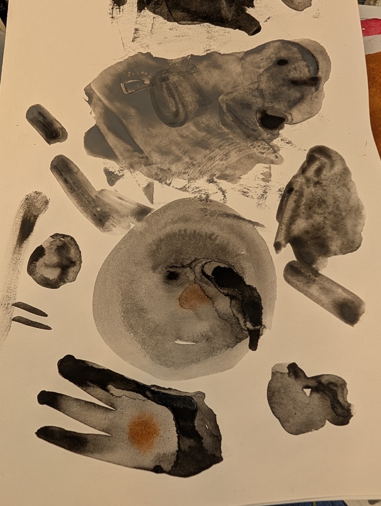
The downside is that it is SO DAMN messy. The stuff flies all over the place and when it lands and is touched it leaves a greasy dark mark. It requires a spray to get it cleaned up, and good god if you use a rag that has any lamp black on it, you smear it everywhere.
This mulls so easily it’s virtually not needed. Once the degreaser is added it really does mix into the medium with ease. I think I could easily mull directly in my small mortar and pestle. I will say that once it’s on my glass it is such a small particle size that it sinks into the frosted areas and won’t come out easily. I lost a lot of the pigment to the mulling process. Which is why I want to mix directly into my mortar- I will lose far less to the surface area.
Making lamp black isn’t hard but it is a pain in the arse. The real question is if it’s distinct inky black color is worth the mess and for me it is.
*The watercolor medium deserves it’s own post.