Author Archives: leslie

Some Observations: On Paper and Frisket

Iv'e been working on a variety of papers, settling on Canson's XL Watercolor paper, for a variety of reasons- it works well with the watercolors I'm using, it's cost is nice and it has a relatively smooth surface that my pens rather like. It's also got 2 sides, a right and a wrong, ot a front and a back; which ever way you prefer to call it, but I like the judgemental aspect of right and wrong… In this case. Any how.

One side has a little more tooth an grab to it than the other, this is the right side. The reverse side AKA WRONG is smoother. It also has less sizing… This affects a number of things- how ink and paint react with the surface. Less size means it's more absorbent.

This is good and bad.

It's bad when you use a mask. I applied a liquid frisket rather heavily to the surface of one of my paintings and the frisket grabbed to the paper so strongly it ripped when I removed it. Quite badly. It was crazy frustrating.

I went ahead with the mixed media piece anyway, knowing my paint would adhere the ripped pieces down and it would be okay, but I had to change my plans for color and other ideas for the image, and I know that the torn piece could come back to haunt me.

Additionally in my frisket/mask adventure I've found that the frisket REALLY doesn't like the spray inks. If the frisket is too thin the spray ink "leaks" through it. A total pain in the ass. So I've learned to put on one thin coat and then a heavier coat to seal it all up.

Journal Flip: Moleskine #4

Thisis Moleskine #4 I filled it up while I was in Buffalo, NY attending a funeral for a family member and shortly after. A visit to Buffalo is always interesting.


Anyway, the idiots have been thumbing down my videos again. It's driving me nuts. It just reminds me of the need to thumb OTHER people's videos up. If I like a video I always thumb it up. I figure it does something to restore some balance to the positivity of the world.

Anyway, go check out my vids and give them some love.


Weekly Round Up: Videos

I had a late night at the DayJob that prevented me from loading up all the videos I wanted to this week, but  it's a good change from the status quo and it also lets me change up my style of posting. I'm probably going to switch frm a daily video post to a 3 or 4 times a week post. I'm starting to do pieces that are much mroe involved and hav a lot of depth to them, as such I'm completing fewer per week, thus, not so many posts per week. I'm debating how I'm going to edit the videos, I'm not sure if I'll go longer with the video or keep them short and simple. I'll figure it out as I go along.


My YouTube Channel Name

Since it comes up pretty often, here is the offical story of my youtube channel's name.

I intended for it to be ComfortableShoesStudio just like this website. Seems easy right? Except YouTube only allows 20 characters in a name… I Typed in the full name and didn't look to see that it was right. Bad move. CSS is 22 characters long. YouTube dropped the I and O off the end. After signing up I stayed logged in and loaded my first few videos. Then I loaded a few more. 

6 months later I ended up signed out and couldn't log in. I requested my password to be sent to my email on file. It was then that I realized that I was signed up as ComfortableShoesStud. *Headdesk* At this point I'd already loaded up a bunch of videos and had a bunch of views, so I figured, screw it, leave it as is.

Lesson learned though, ANY time I sign up for something I check to make sure that everything is spelled correctly before hitting "Agree" or "Continue!"

Review: Fountain Pen Revolution Pen

I stumbled upon Fountain Pen Revolution while searching for a place to find a couple of inexpensive fountain pens made in India. The FPR is a site dedicated to the sale of such pens. At the time I found his site I also found that he was running a special I took him up on his offer and scored a fountain pen for $2.50. The special is no longer running but his prices are pretty reasonable. There are pens on his site for $6 plus $3 shipping. Not bad especially when you consider the review I'm going to give on this $2.50 pen.

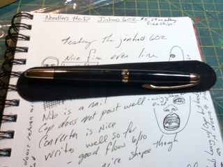
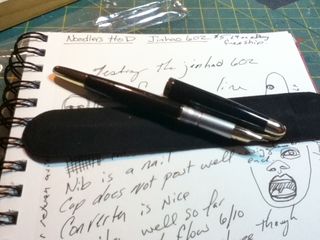
The pen I was sent was a gray Serwex Special 101. It reminds me of the Noodler's Nikita Nib Creeper pen. Ever since I got my first Noodler's pen I sniff my new pens, I know weird, but not. The Serwex has a slightly different odor like engine grease and garage, or what plastic toys smelled like in the early 80's,* somewhat pleasant. Unlike the Noodler's which I likened to dog crap and diesel fuel. Along the side of the clear barrel is a gold foil imprint of the company name and product name. The cap has 2 cap bands which are silver. The clip is also silver and seems to be pressed steel. The jewel, which holds the clip to the cap is black. The gray cap itself is slightly mottled with a few streaks of darker gray here and there. The barrel is tapered and has what I call a cigar shape, though small.

IMG_0553
Not the sexiest pen I've ever seen but looks serviceable and good knock around pen.

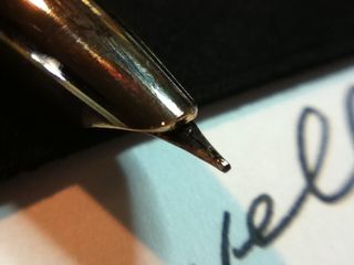
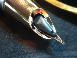
Taking off the cap I'm greeted by a fine gold nib with a design and the words "iridium nib" pressed into it. There is no breather hole in the nib. The nib reminds me of the Noodler's Nib Creeper nibs.** I unscrewed the section from the barrel and found a few mould edges at the end, I scraped these off with an exacto, for fear they'd come loose with use. After rinsing the barrel and nib off I loaded it up with ink. For a smaller pen it holds an impressive 3+ml of ink. I loaded 2.5ml in it with a TON of room to spare.

IMG_0550
I loaded mine up, eye dropper style, with my sample of Iroshizuku Fuyu-syogun. Yes, I put the most expensive ink I own into a $2.50 pen. Why? I'm addicted to gray inks right now and I had a nearly full sample of this ink and wanted to use it. Plus, for the first time ever I had an ink that matched the color of the pen. Gray ink in a gray pen.

IMG_0552
I then proceeded to write out 2 full pages in my Exacompta journal. At first it was slightly scratchy, the feel of writing with this pen matched the feel of writing with a Noodler's Nib Creeper.The nib writes with a true fine and is rock hard, no bounce, no flex; it is friction fit into the section. It writes relatively wet and started up with a quick shake downward. I did notice that when I had some ink on the nib it seemed to blob there. After I cleaned the ink off it no longer creeped to that one spot.

At the end of the 2nd page of writing I noticed that the nib was much smoother than when I started. The flow of ink was perfect for me, slightly on the wet side (6/10) and the nib itself was smoother, and gliding over the paper. Given I was using a premium ink this was to be expected and I wonder what will happen when I put a less premium ink in it. All in all this is most likely to end up as my new gray ink sketching pen and will have a permanent spot in my drawing stable.

Given my love of cheap pens I'm going to have to say I like this pen, a lot. Yes it's cheap and will never perform as well as a $50 TWSBI 540 and it has one nib size available- fine and it's construction is okay. The real thing to think of here is how it performs, and in my opinion if you are looking for something like a Noodler's Nib Creeper or an inexpensive pen this is a good pen.

As an aside this pen is one you can COMPLETELY disassemble, meaning you can get at the innards to clean it… I have in the past abused fountain pens with India ink. This is a pen you could do that with as you can get at the feed and inside the section to scrub them with a toothbrush. Hmmm. Ideas.

The Serwex Special 101 is not in stock at FPR. They have a pen called the Serwex 77TR that looks identical to this pen EXCEPT that the clip and bands appear to be all "gold" plated. At $6 plus $3 shipping it's not a bad deal, especially if the pens write as well as this one does. You can check out the FPR on FaceBook as well. The way you order from FPR is to figure out what pens you want, make note of the name and color you want and send Kevin an email. He'll send you a total price. Then you paypal. Shipping is from India so it will take some time (3 weeks) to get to you, but the wait is worth it.

Continue reading

Honesty, Authenticity, Truthiness and Resonance

When I was in school everyone talked about wanting to make "honest work." The new buzzword for honest work is "authentic." We could spend days over glasses of red wine and mugs of coffee (as we did in college) talking about what this means. In the end it all boils down to, "I want to make work that resonates deeply withing myself and has deep personal meaning." End of story.

Or is it?

I think the truth of all the discussion and thinking on these topics is that essentially we're afraid of what we put on the paper/canvas/board/ or in the journal. Many of us make work and hide it away. It's why the art journal is so perfect, at the end of your art session you close the covers and never ever have to confront what you made again. Simple right? Except you're missing out on a  prime piece of the art journal process- learning from what you've put down and thus from yourself.

I think that fear is why we also buy into what the industry pumps out for us. It's far easier to follow the industry's recipe for success than to forge our own path and style.

Maybe the real question we need to ask ourselves is, "How do we move past the fear and into creating our work? How do we learn from ourselves to create work that resonates deeply?"

It's this hard work that an art journal is intended and supposed to help us explore. If you never look back at your pages and be critical of them (without gessoing over them) and learning from those pages what are you missing out on. If you focus on nothing but making pretty pretty pages I think you're missing out on a very important part of art journaling.

Here's a challenge: Go through your art journal, either the current journal you're working in or a recent one. Use a sharpie, write on the margins of a page what you'd change on that page. If you are too chicken you can use a post it note. If you get bold, draw right on top of the page with your sharpie.

Out of the Can Thinking

I've been watching some old episodes of Julia and Jacques Cooking at Home on Hulu. I grew up watching Julia Child on PBS. PBS being one of the few channels that came in and was approved for me to watch. I credit a lot of my enjoyment of cooking to both my Mom and ravenously watching Julia Child's shows.

One of the things I notice as I watch J&J:CaH is that Julia rambles on quite a bit about how Americans are afraid of their food and how the diet industry is winning out over taste. Secretly, I could watch these shows over and over again.

Julia has a good lesson for us, and it applies to art. We can't let the industry win in dictating what we want and how we want it. Child's recipes for successful tasty dishes included fresh and basic ingredients combined in ways to create layers of food, she poo-poo'd using canned foods and already made stuff. She stated over and over, "It's not hard, the recipe is a guideline!" Art and art journaling are no different. We should be demanding the basic ingredients and supplies we need to make our art and not canned supplies. After all it's not hard to customize and create your own stuff if you only

Dede and Eveline are a prime example of taking a recipe and making it their own and taking it to entirely new heights. Dede put out a challenge to Eve that she make Tim Holtz's 12 Tags of Christmas without using his voluminous list of supplies. Eve took up the challenge as did Dede. their results are nothing short of spectacular. Out of the can thinking at it's finest.

The art and craft industry responds to demands, but as it's a big slow and lumbering machine full of people all trying to get the NEXT BIG IDEA and thus the next big paycheck. The lumbering machine hears about art journaling, tries to figure out what it is, there are big IMPORTANT meetings in board rooms to try and figure it out, there are more meetings in board rooms, and hapless cogs in the machine are sent off to investigate ART JOURNALING. They know nothing about it, they watch a few youtube videos, read a few blogs, and maybe a few of the more intrepid cogs join AJNing. They take some notes, maybe even dabble in a little art journaling and finally something like the Smash Book is born.

Now, thousands of people will be introduced to Art Journaling via the SmashBook. It might even be a decent product, but it's not what I consider a true art journal. It's an interesting concept and an interesting way to finally grab hold of a potential market. Hey, it's even got it's own special glue stick, color coordinated tabs, and a hundred other things to buy to go with it. ARGH!!!

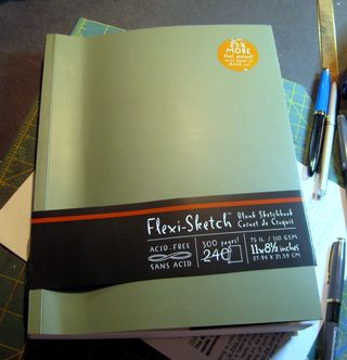
Go simple, buy yourself a sketchbook, a cheap one, a few markers, maybe a cheap set of acrylics or watercolors, and start splashing shit around on the page. Try stuff, watch some videos on youtube get a few recipes but for goodness sake don't be afraid to only use it as a guideline.


Weekly Round Up: Videos

This week's videos are late because I had an Art Adventure on a super warm winter day! Cappuccino, breakfast sandwiches, walking around the city of Salem, and of course sketching. (Also planning for a new secret project or two destined to hit awesomeness this coming summer.)

So here you go this week's videos:


Journal Flip: Moleskine #3

I started this journal the spring before I found out that a family member was going to need emergency open heart surgery and have her aeortic valve replaced. I found out that August and the surgery occured in November. Not long after finding out I ordered a new journal, the happy summer drawings and paintings didn't seem to fit with the down and somewhat sad theme that seemed to pop up.

I've never bothered to go back and fill the remaining pages. I don't think it would fit with the journal. Sometimes it's time to simply move onto a new journal and start fresh. It's okay to simply move on.


Papers I’ve Been Using

I've been testing out a variety of papers for my automatic drawings. I'm not being very scientific about this, just trying things out with my style of working. I have done a large amount of them in a Canson Universal Sketchbook. It's a great sketchbook, the paper is sturdy and accepts light washes with ease. The paper cockles when I use more watercolor. With ink it's perfect.

Papers I've Been Using

So I taped down some pieces of Canson XL Bristol. I like this for ink too, in fact of all the papers the ink really pops off this page. It's bright white and after watercolors dry the paper is smooth and flat. It's really great but I didn't like how watercolors behaved on it's surface. It was absorbent and dried very fast.

Papers I've Been Using

Next up I tried another Canson paper, Montval, not or rough watercolor paper. It's one of my favorites with watercolor. I love the nooks and crannies of it's rough surface, it makes watercolors blend in amazing ways. Ink also looks great on it, but the pen tends to skip across it's surface. It's a little harder to draw on than the other papers. When it dries, it's perfectly flat.

Papers I've Been Using

Papers I've Been Using

I think what I'll end up using is a cold pressed watercolor paper. The hard part with this whole thing is that I never know what I'm in the mood for, I let these images grow organicly and the end result is that I never know if I'm going to cross hatch the hell out of an image or flood the page with watercolor, so I need something that can handle both.