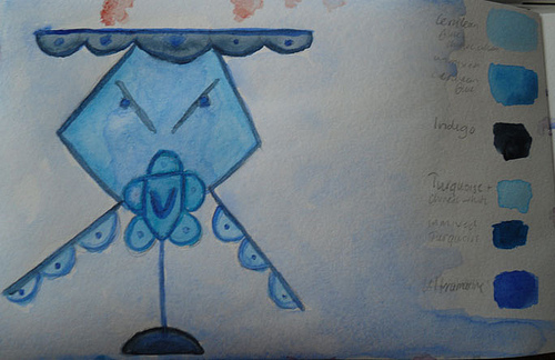
Author Archives: leslie

The Real Wordy Weekender: I *AM* Not a Brand

I am not a brand.

I am an artist.

I paint.  

I draw.

I write.

I bind books.

I’m passionate about the things that are important to me: equal rights for all, sometimes politics, love, fairness, people being treated properly, and the list goes on. I’m not afraid to voice those opinions. I’m usually pretty direct about this fact. I don’t often mince words. I don’t see the point. I also don’t see the point in letting stuff build up until I can no longer tolerate it. I used to do that a lot and it got me nowhere. I’ve found that while it’s difficult the best things I’ve done are those where I’ve been the most direct.

I am not a brand.

I am not interested in protecting my brand. I don’t even get what that means*. I’ve gotten where I am today by being me. I’m honest. I’ll give the shirt off my back to the people I like and if I am forced I’ll give the people I don’t like my socks. I’ll forgive most transgressions after some time has passed. I believe in honor and integrity. I’ll stand up for people even if I don’t like them.  I confront issues head on, once I’ve vented and figured out a way to word it properly.

I am not a brand.

I am an artist.

I don’t believe in art world competition. I think artists, by and large do best by working together in a collaborative manner. I learn from you and you learn from me. When I teach classes I expect those people to come out of that class, take the information and add themselves to it. I ask only that they not publish exact documentation of what is in the class- ie please don’t publish my PDF files or videos. The art made in the class is the possession of the artist. The knowledge they gain is a stepping stone into bigger and better things. 

As a teacher I expect that all my students eventually surpass my skill. I’m not arrogant enough to think I’m the end all with art journaling. In fact I think that there is plenty of room out there for all of us who teach art journaling. We all fill a different niche. I don’t do “pretty girls” with their head tilted at unnatural angles or lead workshops on The Artist’s Way. No there are other people out there who do it better. I’ve done my fair share to help promote other sites, here on my blog, through the art journaling ning, and within the pages of the zine Art Journaling it’s all good.  Why? Like I wrote above I believe strongly that we work better as a team and as a collective. What I won’t do is participate in some sort of internet pissing match over who is the best because we all fulfill specific roles in the community. We all have our own specific space.

I am not a brand.

I am an artist.

I got an email telling me that someone (and others) thinks I’m hurting my “brand” by being me. You see if you think that you don’t get it, or me. It did make me think, which is good. The conclusion that I came to is that I can’t be anyone but me, trying to be something else would lose the honesty and integrity I’ve built this blog around. I will continue to be me.

I am not a brand.

I am an artist.

I paint.  

I draw.

I write.

I bind books.

Continue reading

Less Wordy Weekender: Lesson Learned

I got an email a couple of days ago; it was one of those messages that made me think. First it really made me angry because of the context. Words I’d had with someone were taken out of their true context, warped and suddenly a molehill became a mountain. So it goes. The thing that came of this is that it made me think, and think long and hard.

I’m sarcastic. I’ve been sarcastic my whole life. I look for the humor in things to make it easier for me that often translate to sarcasm. It’s not something I am interested in changing.  Sometimes I try and mask my negative emotions- anger and sadness with sarcasm. It comes off as negativity, and yeah it is. I took a look at some of the stuff I’ve been taking part in and the people I’ve been talking to and realize I’ve been feeding into negativity. I’ve let people manipulate me into saying things I don’t necessarily want to share. In a way I’ve fed the internet trollz. I may have done it behind the scenes but I still fed the drama seekers.  I look back to the attack here on my blog and see that after that, it was as if I opened the door to the drama, and then forgot to close it when I started to get back to business as usual. I had a lot of people who rallied around me, and that was great but a few people who rallied around me used it as an opportunity to get past my usually high guard and then use what I say in private against me.

In the future I’ll certainly be more careful of whom I trust with conversations I intend to be a private.  I chalk this up to a lesson learned.

So I've been thinking that I should, as Connie says, Just Paint!

Flickr Find: Lootsvele’s Interpretations

I'm really digging the rainbow of colors on these future journal covers by lootsvele. These could easily cover any journal but I love how these are personalized.

I generally leave the covers of my art journals plain and save the color for inside. I'm now starting to toy with the idea of decorating the outside. I used to do that with all my journals when I was a teen. Ideas…


Interpretations-Covers back and front

Review: B&N Bargan Bin Piccadily Sketchbook

This weekend I picked up a bargain priced sketchbook at B&N for about $5. I thought it was a no name brand that B&N often sell. When I got it home I realized it’s a Piccadilly branded journal.

The list price on this sketchbook is $12.99; I got it for $4.99. Less than half price. I noticed that B&N didn’t have ANY of these on the regular shelf. So I’m thinking these are only ordered for the cheapie racks. Which is fine, at $5 this isn’t a bad deal but for $12.99 not worth the money.

I tested this with a variety of inks in a variety of pens. I did a little sketching to see how the paper would respond and I did my usual of an ink and water wash.

Anything with a larger than a fine tip feathered and bled through the paper. There was a TON of feathering especially in my medium tipped and wet writing Pelikano. My extra fine and fine pointed pens did okay, regardless of the ink. I tested both sides of the paper and there is no right/wrong side, the sides have the same finish throughout the journal. The paper is very smooth. I wouldn’t want to use a pencil on this paper as it’s just too smooth and pencil would smudge all over the place.

Ink mix0019
As for water on this paper, it could be done but it’s not recommended, a very light wash caused major cockling (wrinkles) that never eased out of the paper. I also noticed that really heavy application of ink caused the same issues. Anywhere I used a heavy layer of ink it not only bled through the paper but also to the page underneath. Anywhere there was heavy ink use the fibers of the paper lifted and were picked up by the nib of the pen.

Ink mix0018 The Pros:

  • Good value at $5
  • Paper is smooth
  • Bright white paper
  • Great sturdy hard cover
  • Sturdy double coil binding

Cons:

  • Feathering with any ink
  • Bleedthrough
  • Fiber lifting
  • No water due to cockling
  • EF and F nibs or pencil only

Overall I’d say this is a good sketchbook for someone looking for something cheap that they can do a lot of throwaway sketches in or just to take some notes. This little journal probably wouldn’t stand up to a lot of the abuse that art journalers would toss at it. Even if you gesso’ed the pages the paper is just not sturdy enough. It’s too bad, because this is a really good looking little sketchbook, and comes in a lot of good sizes and with lined paper too which has a lot of different options for covers.


Wordy Wednesday: Sometimes, I Miss Maine

Many of the friends I grew up with have moved all over the world, few of us remain in DownEast Maine or even the area of the country where we attended college. One is in Germany, another in Phoenix, AZ; still another is in Thailand, and others are scattered through out the US. My friends don’t seem to be as tied to place as I am.

I was reminded of this when a friend posted to FaceBook that she missed developing her own photos and was looking for a place where she could use the dark room. Well, I know a place and a person, not far from where she lives and gave her some contact info.

I lived in Maine and for the most part the same 300 mile radius for 24 years. Sometimes I miss it, intensely, deeply, and with longing. Some of the best moments of my life occurred in those 300 miles; my first kiss, college, painting the rugged coast, friendships that have lasted through years, and miles and miles of hiking.

Occasionally I have moment like tonight where all I want to do is sell my house, quit my job, and move back to that rugged coast, because, damn I miss it. The coast here in Massachusetts is just not the same. There is something to be said about the rugged and craggy coast of Maine and that something causes you to miss it intensely.

All that aside, finding a job is difficult so I stay here.

Technique Tuesday: Faces and Gears

I've written about how faces and gears show up in my work. I was interviewed over here a while back and one of the images she used was a gouache on board that is, what Eveline refered to as "classic" Less style. And it's true. It is. Bright colors, gears and faces.

This is another riff on that same theme, 2 faces and a page of gears.

In this case I carved a rubber stamp for the gear and used a few dicuts as other gear type things. The faces are drawn in pencil, acrylic used to blend them and the dicuts are colored with ink before being glued to the page. Over all this is a very simple page but very much me.


nanojoumo- collection

Wordy Weekender: Loving Kindness Week

The troll attack on the blog (and on others) and the eloquent rebutals spawned loving kindness week. A few kind souls got the ball rolling on a UStream-a-thon, art journal pages, and blog posts. The love was felt through out the Art Journaling world and something really special came of this week. As the week comes to an end and I've gotten more loving kind emails than I've gotten in a long time I'm amazed at the power of being loving and kind to our fellow human beings. I'm a little overwhelmed. A couple of people are sending me artwork, and I can tell you right now it will be framed and hung over my desk, a place of honor as I sit here daily.

Here are some links to those people who participated in Loving Kindness Week.

JellyBeansDesign

IKerriLove

Magic Bartender

Tammy Ozuna

DeDe of Inkwell Studio

Beth_Snyder

DarcyW

 Deina

 Art Journey

Eveline

Thursday Review: Pelikan Pelikano Fountain Pen

I like to draw with fountain pens. Now that I’ve discovered the joys of Noodler’s inks (a full post on those coming up soon) I have felt the need to buy a few more pens. I own now a mix of around a dozen pens, of which I keep 6 inked at all times. It’s a bit much. When I’m sketching I find I reach for one pen over and over again. That pen is my Pelikan Pelikano medium point in blue. I keep it inked with a blue or a blue black ink at all times.  There is nothing special about this pen. It’s an inexpensive school pen that lays a nice medium line and a lot of ink. It’s comfortable and easy to clean.  I’m not worried about breaking it or tossing it around because it was pretty cheap.

The important parts about this pen for you to know is that it has a medium point steel nib, it is what is referred to as a “wet” writer, in that when it puts down a line of ink it’s generous in the amount of ink in that line. This means my blacks are truly black and I can blend those lines with a wet brush.  The steel nib is stiff and doesn’t have much line variation but can be abused. I’m not gentle with this pen. I tend to have a heavy hand and it takes that abuse and keeps on writing.

The body of the pen is translucent frosted blue plastic. It’s not gorgeous and it’s not ugly, like most school pens it’s functional. You don’t want to have a pen your classmates will steal, they won’t steal this one. The cap is brushed steel or aluminum with a plastic clip. The pen isn’t going to win any design awards but it works. This pen is a cartridge or converter pen. I hate cartridges and I’m not overly fond of converters, each holding 1ml of ink, sometimes less. That’s not a whole lot of drawing for me. I converted this one to what is called an eyedropper pen by using outdoor grade silicone caulking to plug the 2 vent holes in the end of the body. The body now holds 3ml of ink, which is a whole lot of sketching and drawing.  While not a difficult job it was a tad fiddly to do but has held up for several months of sketching and drawing. Alternately someone could refill the cartridges with a syringe.

I’ll tell you about a couple of other go to pens I use for drawing soon.

Here is a picture I drew using this pen and a few others as well as a brush pen.


Another wine bottle in inks