Author Archives: leslie

Interesting Things 20180831

Eyeballs

Digging into my silly obsession with productivity information. This is an interesting take on logging your ideas and ideas. All it takes is a pen and a notebook.
I was wondering what Big Dick Energy meant, so I looked it up. This is probably the least… explicit article I could find about BDE.

I never really thought about where bullet journaling originated. It seems to be the love child of the GTD, 43 Folders, and Patrick Rhone’s dash/plus system. Either way, they are all just complicated lists with added symbols.

Ever feel like the art world is full of it right up to their ears? Read this woman’s takes on her toddler’s paintings and laugh… or cry.

Ear holes

Writing weighty topics on Writing Excuses is a lovely discussion on writing people who are different from you.

Review: Up&Up White Index Cards Target

At a glance:

  • 100 cards
  • Thin flimsy stock
  • Rough texture
  • Pale, thin ruling
  • 49 cents during back to school

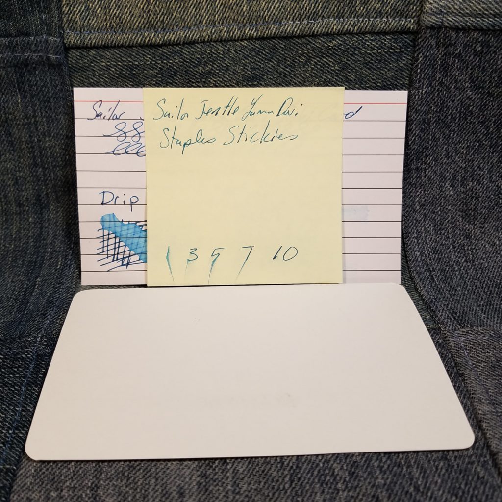
These index cards are difficult to call cards as they are made of the thinnest cardstock I’ve ever handled, you can almost see through them. They are floppy but crisp. They are a strange feeling. The texture is rough, similar under my fingers to construction paper, but not as pulpy. They are difficult to describe.

Despite the thin rough feel, these cards respond well to everything I”ve used on them. Fountain pens feel great and ink POPS off the bright white card. Inks with sheen show an awesome amount of sheen and glitter ists right on the surface having a brilliant gleam. Gel inks glide over the surface and pencil feels great too.

The cards are a bit toothy for pencil but didn’t seem to chew up my softer pencils in use. If you need a card for your Baron Fig Archers they felt like butter on these cards.

Overall if you are looking for a card that doesn’t soak up your ink like blotter paper, this is a good choice. I had no bleed through but they were thin enough that using both sides might be questionable. At 49 cents and fountain pen friendliness, these are a good deal.

Thinking: 100 Days Projects

There are a lot, and I do mean a lot of projects that people sign up to do online, from 30 Days of something to NaNoWriMo to 100 Days Projects. I have trouble completing any month-long projects that I sign up for let alone 100 Days projects. Yet here I am at 33 days into a 100 days project. I’ll surely have more pointers at the end of the project but let me share what I’ve learned so far.

Break the rules– The rules of 100 Day project state that you work on something every day for 100 days. I can’t do that and know I can’t. It’s not possible for me to work my DayJob and then come home and do something every night. I work late on Wednesdays and I know that I cannot work on my project on that day. So I double up on a day when I work late.

Don’t beat myself up. Because I know that I’m not going to be able to work on the 100 Days stuff on Wednesday night, I also allow myself to not work on 100 Days stuff when I’m stressed out or very tired. Because I’ve built in some flexibility I don’t beat myself up for taking off a needed night.

Accountability– Despite building flexibility in, I need to hold myself accountable for catching up on days when I can. This means that often times I’m doing double duty on Saturday and Sunday. I do 2 items on those days. Or try to. Go back to not beating myself up.

Thus far I’m very much enjoying the 100 Days Project. I’m learning a lot about watercolors- how the various colors respond in use and with one another on a variety of papers. I’m learning which of the colors granulates, how they merge with one another on the page as well as when mixed in a pan. Anyway, the 100 Days projects are a great way to learn about a material in depth, and it’s worth the effort. Just remember to be flexible and not to beat yourself up when you need to skip days, then catch up when you have time.

Review: Mitsubishi Uni*Star 2B Grade Pencil

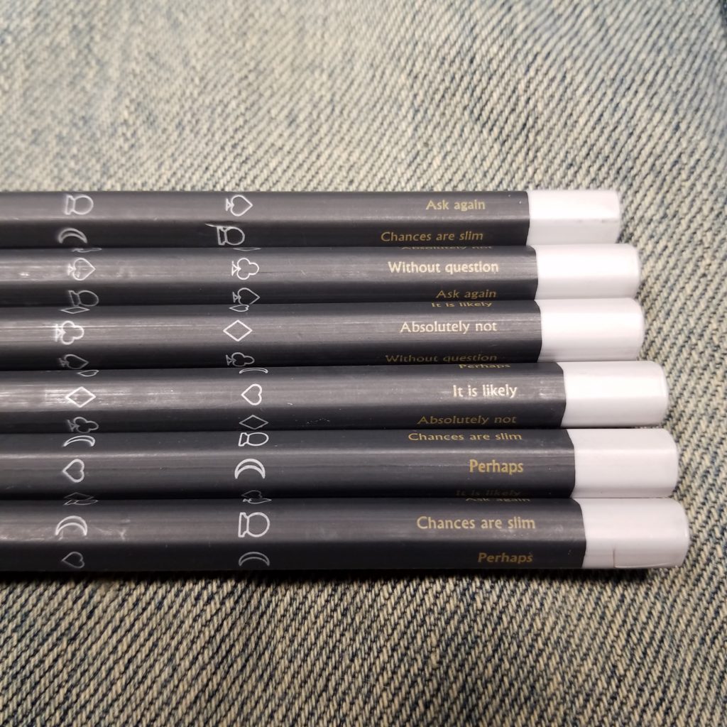
Mitsubishi Uni line of pencils is among the best available. The Hi-Uni are amazing pencils, for sketching and writing; they sport thick lacquer and a nice end cap. Uni is great with the slightly less fancy finish. The Star line is the student grade line.

I picked up a 12 pack of the 2B Uni*Star on a whim, they weren’t expensive but not cheap either. I wasn’t expecting much the photos on Amazon looked… shady. What arrived was a basic cardstock box with 12 pencils. I sharpened one up and found cedar cased in a thin but glossy lacquer, sharp gold imprinting, and an end dip. Overall the presentation wasn’t bad but not on par with the other Uni line of pencils.

The pencil sharpened up easily in the Classroom Friendly and with the Pollux. The core is thin but well centered. The core itself is smooth but not silky like the Hi-Uni, or many of the other Mitsubishi pencils I’ve used. It’s merely nice. It holds a point well for a 2B pencil. It’s also nicely dark. It’s a good cheap choice for regular sketching.  All of the usual things you’d note for a 2B pencil are there: slightly smudgy, dark, doesn’t hold a point super well.

As far as student grade pencils go, this is a good 2B pencil at a decent price point. Just over $7 and free shipping. It compares well to the Palomino Pearl of 602 and is a good replacement for them if you are looking for something cheaper but still nice. Is it as good as my beloved Nanodia? No, but it is not far from them.

Get it here.

Continue reading

Review: Monteverde Gel Ink Refills

I like gel ink. I want to use gel refills in all my pens, when possible. Unfortunately, many gel refills don’t fit pens like the Baron Fig Squire and Click, or Parker Jotter. Either the tip portion is too thick or short, or the body of the refill is too thick for the body of the pen. Enter all the Parker style refills that use gel ink. Monteverde is just one option.

Monteverde refills are available just about everywhere from Staples to Walmart (online to Amazon and every fine stationery store. The prices seem to fluctuate wildly. I picked up a 2-pack in the clearance section for 50 cents, but normally a 2-pack is about $8 at my local Staples! I found 5-packs on Amazon from a variety of sellers for about $14. Clearly, online stores are the winner when it comes to offering up Monteverde refills.

The gel refills are available in a vast variety of colors, mine are blue. The next package I purchase will be blue-black, but they offer purple, green, red, teal, black etc… The blue is lovely. The gel ink is smooth on all the paper I’ve used, including the finest cheapest paper we use at work. The ink has flowed smoothly from the moment I took the little waxy blob off the tip to the point I drained the refill.  

These are great refills, but not the cheapest. They range from $2.80 to $4 per refill. To me the price is comparable to the regular Squire refills and they have the performance of gel ink on cheap paper which I’ve bloviated about before this post, but gel ink on the crap paper at work works better than liquid. End of story, these are a great refill and worth every penny to me. You won’t be unhappy with a Monteverde P44 (Parker style) refill. Continue reading

Interesting Things 20180817

Eyeballs

Warren Ellis does the author mailing list right. Sort of like getting an accumulation of interesting things in my email once a week. Perfect.

Man the 70s and 80s were a rough time for paternity. Also, Jobs was a shit heel.

Ear holes

Truth in advertising. People are hungry for truth.

Starting around minute 19 own your own content. For real people, own it.

Zig Zag is a lovely podcast. I don’t get half of what they talk about but listening to the hosts explore what it is like to create a fresh business as women is amazing. David writes in and says some typical grousing about women laughing and being themselves and Manoush shuts that BS down. Sick burn, get David some ice for that buuuuuuuuuuuurn.

Some people are just evil and the world is a trash fire.

Review: Composition Notebooks at Walgreens  2018

As of this writing, Walgreens had a very slim selection of notebooks out. Their typical boutique versions were not yet available, so I might update this post with additional brands.

Wexford Composition Notebook

  • 80 pages
  • College ruled
  • Well stitched
  • Standard marbled pattern
  • Sturdy covers
  • Classic pale blue rules
  • $1.99 at regular price 99 cents on sale

This isn’t a showstopper. It is standard in every feature, from cover to marbling to stitching. The cover is thicker than the new average and you can write in hand with the notebook folded over upon itself. They do not offer fashion covers in this brand, just standard colors with marbling.

The pale blue ruling is standard and fades into the background of all writing tools. All writing tools faired well upon its surface. In fact, it was one of the smoother papers available. All my fountain pens felt lovely on its surface. They didn’t quite skate but did feel lovely. Which is great because the paper handled all liquid ink with ease. Inks with sheen have loads of sheen visible and glittery inks glitter.

This is a great book if you can’t find other composition notebooks in your area. At 99 cents on sale, it’s not winning the price competition but the paper is lovely.

Continue reading

Review: Baron Fig Squire LE Bolt

Anyone who reads this blog knows that I love the Baron Fig Squire. It’s a solidly built pen that performs well and feels great in my hand. The lightweight aluminum body isn’t so light that you don’t know that it is there but not so heavy as to tire your hand. Overall if you are looking for a great pen body, the Squire is a lovely addition to your pen carry.  

I’ve reviewed the Squire fully in the past so I’m not going to go into the nitty gritty details. Today I’m just going to discuss the new limited edition, Bolt.

The Bolt has a simple lightning bolt icon inscribed into one side and a simple Baron Fig on the opposite. The color of the Bolt is a bright harvest gold, the color of autumn leaves at Halloween. The anodized coating nearly glows in the right lighting. It’s bright but not garish. Did Baron Fig figure out the perfect shade of yellow? I think so.

I’ve said it before, yellow is far from my favorite color, but this pen, I reach for it almost as often as I reach for the Experiment. The gold colors stands out among my pens and the little lightning bolt icon reminds me of Harry Potter. Maybe I’ll pen my own fantasy novel with Bolt as inspiration.

Review: Composition Book at Target 2018

Target has a lot of offerings and I didn’t purchase everything. They only have the Up&Up books available in a 5 or 6 pack I might check back after payday and pick them up. But last year’s Up&Up were beyond terrible.

Yoobi 2018 Designs

  • 100 pages
  • College Ruled
  • Sturdy covers
  • Standard blue ruling

This year’s Yoobi covers are awful. I do not like the designs they offer at all. Last year’s were so fun and vibrant, these are yawn-worthy.

Which is fine, the only reason you’ll buy a Yoobi composition notebook this year is if you use a ballpoint or pencil. They were terrible with EVERYTHING else I put on the paper. Any liquid ink feathered and bled through. Even gel ink had significant show through. Pencil is lovely, as the paper has plenty of tooth.

Mead Composition Book

  • 70 pages
  • Classic blue and red ruling
  • Well stitched
  • Decent cover stock
  • 77 cents during back-to-school

After many years of mediocrity and terrible paper, Mead seems to have a better paper supplier because this is year 2 of great paper for Mead.

The paper isn’t silky smooth but it’s nice and fountain pens respond really well. All sheening inks sheen. There wasn’t any soak, bleed or show through. The paper is thin but both sides are usable. All other inks and pencils felt great on this paper.

Overall this is a fabulous composition notebook. It should be noted that I have not seen this version on the shelf at my “local” Target outside of back-to-school season.

Unison Graph Paper Composition Notebook

  • Standard marble covers
  • 100 pages
  • Pale blue 5 per inch rule
  • Oversized- 10×7.825 inches
  • 52 cents at Back-to-School Sale

I’ve never included graph version of comp books in my roundups in the past- most stores don’t carry them or they are significantly more expensive. Despite this being the WRONG size I grabbed one, after all, it was only 52 cents.

I’m glad I gave it a chance. I was shocked when my pens and inks skated over the pages with not a suggestion of feathering or bleed through. Inks with sheen had a load of glorious sheen and glitter if there was glitter. This paper is superb for liquid inks. It isn’t glassy smooth, but it is darn nice.

Pencil and ballpoint and gel are all great on this paper too. There is just enough tooth for a pencil to feel great.

Bottom line is that if you are a fan of graph paper and fountain pens and pencils this is a superb comp book, you’ll just have to ignore that it’s about a quarter inch too big on all sized. I have not seen these on the shelf outside of back-to-school season.

Unison Composition Notebook

  • Standard marbled covers
  • Covers are a tad flimsy
  • 80 sheets
  • Well stitched
  • 50 cents during back to school

These sport a standard pulpy card cover which doesn’t feel overly sturdy but feel okay. There is more oomph to them than other brands. The marble is standard but looks stretched to me. The taped spine is black and pretty standard. There are no fashion covers available. Stitching is sturdy and solid.

Pens feel great on this paper. Everything feels great on this paper. Fountain pens don’t quite skate but it’s smooth. The paper performs flawlessly with everything I put on it. From my Organics Walden to J Herbin Hematite to Akkerman Van Huysu’s Sap Green it all looks great. The Walden sheens wonderfully and the Rouge Hematite has enough gold glitter to make a child smile. Pencils feel good too, there is just enough tooth that pencils are dark but you don’t need to sharpen at the end of every line. Gel ink slides over the page and looks awesome.

Despite the slightly thinner cover, the paper combined with the 50 cent price tag means these are the books to beat this year. If I were to stock up on one brand of a composition notebook, it’d be the Unison.

Review: Composition Books at CVS 2018

I decided to change up how I’m doing my review roundups of the comp books this year. Instead of big mass roundups, I’m dividing them into the stores where they were purchased. This should mean I’ll have a large grouping of reviews (Staples, CVS, Walgreens, Walmart, etc…) instead of 2 or 3 large unwieldy slow loading reviews. So saddle up, as the second installment we have CVS.

When I stopped by CVS this time, they were just setting up their Back to School display, it wasn’t fully fleshed out and nothing was yet on sale. Their sales are usually pretty terrible so I’m not holding out for the prices to get much better.

Studio C “Good Vibes” Collection

    • 100 Pages
    • Sturdy Cover
    • Well stitched
    • Classic pale blue ruling
  • $3.49 at regular price

Let me start off with the good about this comp book- the paper is superb. It doesn’t have the smoothness of last year’s but it holds its own. All my pens performed flawlessly. From fountain pen to ballpoint to pencil, everything felt great on the paper. All my inks that sheen has fabulous Tomoe River level of sheen, and not a speck of bleed or feathering. There is just enough tooth that pencil feel awesome but doesn’t get ground to a stump when writing a line. The pale blue ruling fades to the background. Overall this book is a winner. Getting one at a discount price will just be gravy on an already superior composition notebook.

The bad part of these is that this year’s selection is tacky AF. I’m sorry but some of the covers were terrible. I picked out a bright glossy pineapple design which was the nicest on the shelf. The rest were awful. We’ll see what Walgreens has to offer. Last year’s cute woodland creatures were the best.

Ustyle or Continental Accessory “Animal Attraction” Collection

    • 80 pages
    • Sturdy cover
    • Sturdy stitching
    • Pale warm brown-gray ruling
  • $3.49 at regular price

The paper in this comp book is stunning and a surprise. Last year’s version of the UStyle comps was awful, like toilet paper soaking ability. But this year’s has a silky smooth paper that responds well to even my worst ink (Looking at you RK Verdigris) Inks that sheen, have an amazing sheen and every nib feels smooth and buttery on this paper. Not quite skating like on Tomoe River, but smooth and very nice. Pencil and all of my other pens felt lovely on the page. Not one ink or pen exhibited feathering or bleed through. Despite the paper being thin, you could use both sides of the page! I really dig the pale warm brownish gray ruling. It’s different but not so off that you give it a lot of attention, just different enough to be noticed. The covers are thick and sturdy enough that you can fold it over on itself and write in hand. Overall this is a killer comp book.

The one downside is the covers, some of the designs were quite nice, case in point the gold foil elephants on a navy background that I scored. Alongside that were plenty of awful animal prints with garish gold foil elements.

These two brands don’t represent the best deals of the composition notebooks available, but they represent some of the best paper available. If you keep an eye out for the sales CVS offers you will certainly end up with some great deals on these. Keep an eye out for their clearance section after BTS is done often my local CVS* often has things on ridiculous clearance prices as soon as the “season” is over.

Continue reading