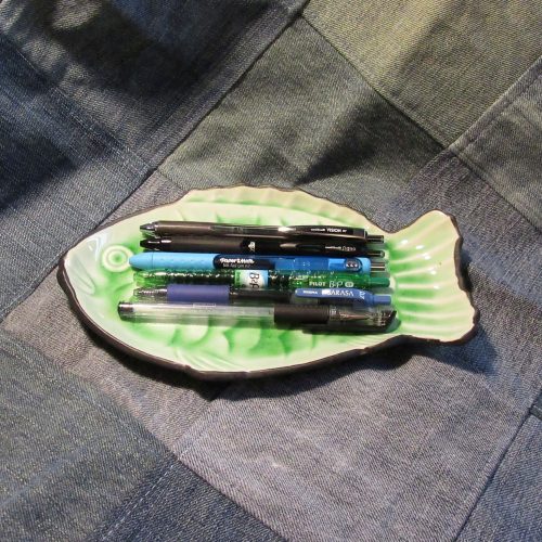
The Pilot Kakuno is a student’s or beginner’s fountain pen, with a focus on children. As such it is available in a wide variety of colors with standard fine and medium nibs generally available here in the US. Along with that, Pilot has chosen to only import some of the colors available to the US market. My Kakuno is an import clear version and has an extra fine nib. The shiny steel nib has a cute smiley face with tongue out on the top.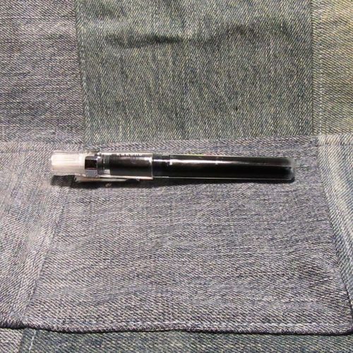
The EF nib is made of steel and with a small amount of smoothing is silky smooth on good paper. It skates across my Baron Fig Confidant as I create my Work Bible* I also find it quite nice in my pocket notebooks from Field Notes to Write to Lodestone. It also feels pretty decent on the crappy paper at work. Despite the nice feeling of the nib on the various paper, the papers all respond to the ink as one would expect for that brand. The EF nib is needle thin with a hint of bounce which is nice. It doesn’t create much variation in the line but it feels good as I’m writing.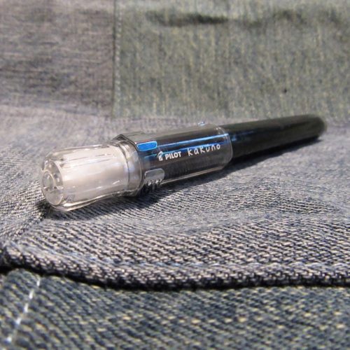
The grip section is subtly triangular shaped while the rest of the pen is hex shaped. The clear plastic is extremely light weight. Empty it comes in at 11.3g. With a cart it comes in at 12.5g. It’s not a big pen but it isn’t tiny either. The body of the pen is roughly the same size as a Lamy Safari but the cap is slightly smaller. It can be used unposted comfortably or posted without the weight being thrown off. I really like the weight and size of the pen- I can write for long periods without hand fatigue that I get from heavier pens. The Kakuno is great for long writing periods.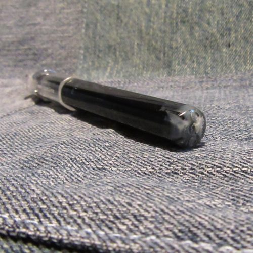
Because the pen is hexagonal and roughly the same diameter as a Kaweco Sport I wondered if the Kaweco clip would fit. I ordered one of the older style, plain clips rather than one that has the Kaweco logo emblazoned on the clip. I chose silver so it would match the steel nib. The facets don’t match perfectly but it is snug on the cap. It is a functional addition to the pen, as I need a clip for my DayJob.
IN the several week’s I’ve been using this pen it has survived being clipped to the plackets of my work shirts and being tossed into the pockets of my work pants. The snap on cap stays put and has yet to fall off. The plastic of the pen body has not yet cracks or shown any wear. Despite banging around in my pocket with my wallet, pencil sharpeners and can tabs (don’t ask) the pen hasn’t developed any scratches as of yet.
Despite it being an EF pen the ink flow is good and you get a decent amount of ink on the page. This is both good and bad. Like with the gel pens I’ve written about this means I’m blowing through ink carts very quickly. I’ve been using at least one a week, more often nearly 2. Certainly this can add up in cost it accumulates more frustration for me in terms of plastic waste. I prefer to use a converter but it is not realistic that I refill from a bottle at work. A cartridge I can swap on the fly as I work. I’ve taken to refilling my carts. I’m also looking at filling the holes on the back of the pen body so I can convert to eyedropper.**
Anyway, the Kakuno with an EF nib is great for crappy paper and even better on nice paper. The price for the opaque colors is about $11.75 while the clear is around $12.50 on JetPen. I really like it for my workplace The smiley face puts a smile on some of my client’s faces and can insert some levity into an otherwise difficult situation. It works great on crappy paper and feels good in hand. For the $12.50, the Kakuno is a great little pen.
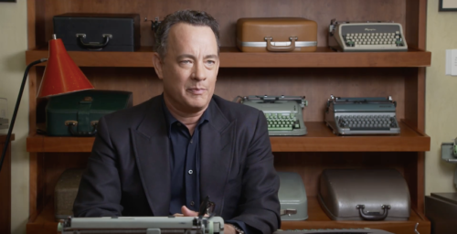
 Looking at the poster, with its flaming sheet of paper sticking out the top of a vague, blue 1970s machine, one might think the movie was about the men in the four boxes at the top. Tom Hanks is arguably the most famous typewriter collector in the world, but he doesn’t feature that heavily in the film; John Mayer, David McCullough, and Sam Shepard are far more prominent, perhaps because the typewriter plays a bigger role in their creative endeavors. But these celebrities are not the focus of the film. They are more akin to hype men, expounding on the typewriter’s beauty and longevity while the rest of the movie focuses on its namesake: a tiny shop in Berkley, California that repairs, restores, and resells vintage typewriters.
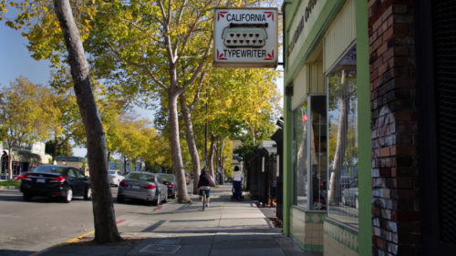
 Herb Permillion, the store’s owner, his daughters, and repairman Kenneth Alexander keep things running four days a week. It’s almost enough to validate the “small businesses are the backbone of the American economy” platitude politicians spout right before they vote to tax the hell out of them. I found myself pausing and searching eBay throughout the film because of the way Ken talked about a particular bell sound or how his fingers danced over a machine as though he’d built it himself. This family of do-or-die typewriter aficionados lives and breathes the clicks and clacks of yesteryear and it is impossible to not get swept up in their genuine love for these objects.
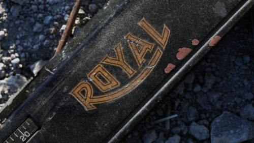 Some might say a documentary about people repairing typewriters wouldn’t be very entertaining (I beg to differ), so when the cameras aren’t inside the shop, they’re pointed at the men and women who collect or make their living from typewriters. When Tom Hanks talks about one of the over 200 typewriters in his collection, it’s like watching Jay Leno discuss a rare car in his garage. You can’t help but smile and feel the warmth of his admiration for them. 1776 author David McCullough writes all his books on an old Royal in his backyard writing shed. Silvi Alcivar is a “poet on demand” who composes short verse on her red Royal Custom III in subway stations and at street fairs.
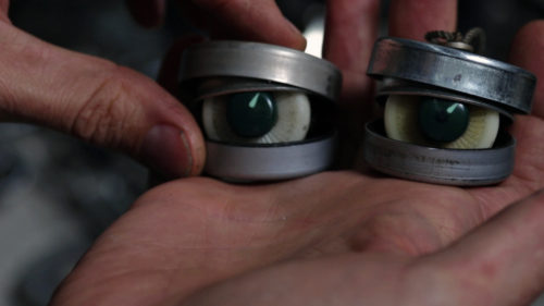
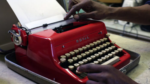 Not all featured are writers and poets, though. Jeremy Mayer creates amazing sculptures of animals and humans out of old typewriter parts. I couldn’t help but cringe at his prying apart old Selectrics and Coronas to construct fingers and cheek bones for his skeletal people. When a film is dedicated to the preservation of such beautiful machines, seeing someone mangle them to feed their Frankenstein-like need to create feels like watching a person make wallpaper from torn-out Bible pages. Mayer’s work is fascinating in a macabre kind of way.
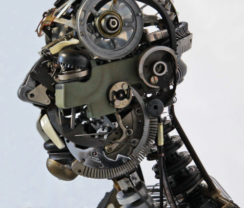
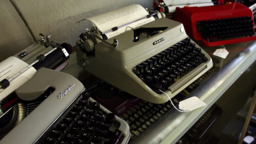
 Regardless of how each individual uses (or abuses) typewriters, every single person in California Typewriter has a different and unique reason for why he or she enjoys them, be it the sound, or the joy of an analog lifestyle, or the satisfaction of putting actual words on an actual page. This is what’s most inspiring about the documentary: everyone in it is different, just like every typewriter is different. The bells chime in different tones. An Olympia has a crispier “chunk” than a Smith-Corona. Keys are spaced and shaped differently, and each of those characteristics is something to either entice or repel a potential owner. One person makes sculptures with parts while another makes music. One types non-fiction in a shed while another types poetry in public. The typewriter can be a symphony and a work of art, and while different people may use it in different ways, its purpose is clear: to create.
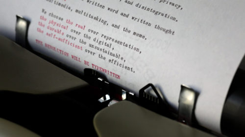 After watching the film, I felt compelled to drop a fresh sheet of paper into my own Smith-Corona and start a new short story. My words hit the page like gunfire. Sure, it was nice to slow down and get away from the notifications and dings of new email, but more than that it was fun. Typewriters are fun. Typing on a typewriter is fun. Fun is something not talked about when writing on a computer or even by hand. One is mundane, the other a chore (I’m failing NaNoWriMo by hand and it is less than amusing). The people of California Typewriter, both the shop and the film, embrace the fun side of the tools we take for granted. Their enjoyment is almost better than the footage of all the beautiful typewriters they surround themselves with. Almost.
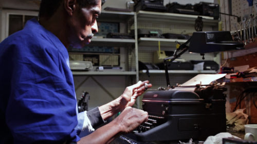
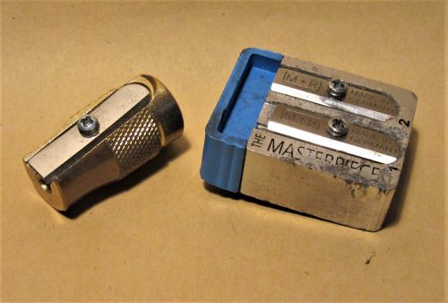
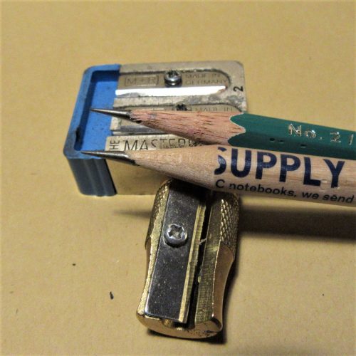
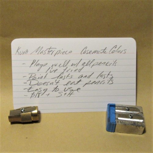
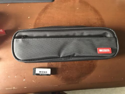
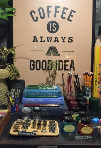
 Practically speaking, I try to get the most out of what I do have by using it, using it and using it some more! There are a few things that I carry around with me on a regular basis that get a lot of use. First, is my little Klimt tin, which houses my most-used erasers and a traveling sharpener.
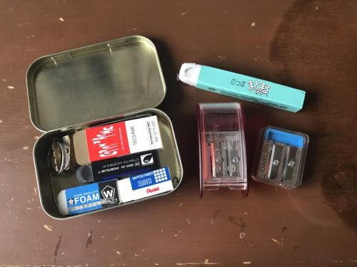
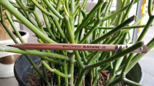
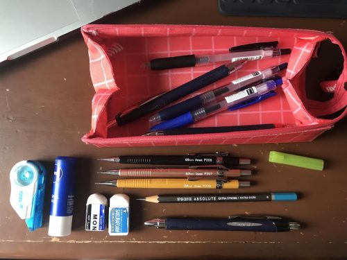 While as a medical student, we aren’t able to use pencil very often (we are required to use pen or submit typewritten work for the most part), my favorite use of pencil lies in my quiet daily life, in journaling, making grocery lists or my bullet journal. I have a special pencil case that I use when I travel along with my notebooks that can fit even an unsharpened Blackwing and has extra pockets where I can keep a Ziploc and a sharpener, for long point sharpening while traveling! My favorite notebooks are my A5 bullet journal (no brand traveler’s notebook), the Olive Edition by the Traveler’s Company used for journaling and my September Leather Field Notes size bought off Amazon for my notebooks that carry lists, brain dumps and speaker’s notes for the debate team that I train.
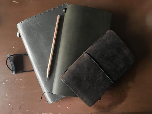
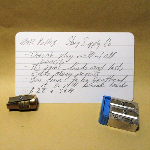
 All in all, when asked to describe my process and collection and myself, as a lover of stationery, I label myself as an appreciator—both a user and a collector. I find my collection to be large for someone who didn’t have to spend too much and I love, love, love trades because they not only allow me to get to know others within the pencil and stationery community, but they expose me to pencils and other paraphernalia that I would otherwise not have known without the kindness and knowledge of others. So maybe I can’t yet afford the renowned Pollux or snag a vintage Eberhard Faber Blackwing, but with my kind of SABLE, I find that I get to go on an adventure every single day.
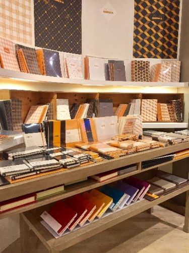
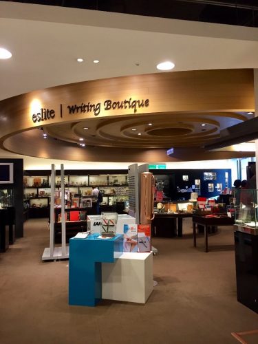 In my mad rush to find some pencils, I first stumbled across the “Writing Center” (pictured below) which mostly carried fountain pens and fountain pen related ephemera. They had these gorgeous Caran D’ache pencils—a set of four for $30 USD, which I had to pass on, but a quick trip upstairs landed me with some well-priced single Caran D’ache pencils, a cool store brand notebook, and an Agatha Christie novel I hadn’t read yet.
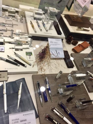 The store is a must for lovers of washi tape, as I felt like I couldn’t walk ten feet without bumping into another selection of (admittedly not cheap) beautifully designed tape. I also found this huge table of Rhodia products, half of which I hadn’t seen before. The store also carried Leuchturrm, Midori, and Moleskine products.
 The day I set out to hit the rest of my stops, it was pouring rain (yikes!) I’m pretty sure I ruined by shoes, but my love for stationery won out, and I found some real gems!
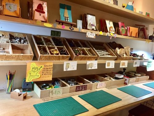 PINMO PURE
 I was about to leave when a jar of pencils caught my eye. In this magical jar I found some loose Palomino Blackwing 602s, a couple of Pearls, an older MMX with the gold stripe (which I snapped up), a vol. 1138 (!), and three vol. 24s (!!!) I rushed to pay for my purchase, constantly glancing around me making sure that no one was going to take my treasures away from me.
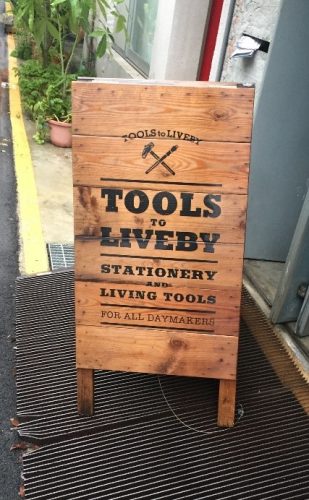 TOOLS TO LIVE BY
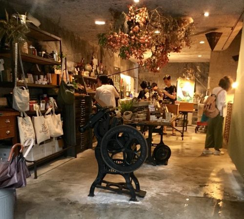
 They had a myriad of Japanese pencils as well as American pencils including loose Field Notes pencils (both the round ones and carpenter), Rhodia pencils, Palomino HBs, and a couple of loose Guy Clark editions too (which I happily picked up). They had some individually wrapped (!) Pitch Black Field Notes. They also had a really amazing selection of high quality (and priced) “Tools to Live By” branded items from delicate and surprisingly heavy scissors to beautifully thin metal rulers.
 CONCLUSIONS!