Category Archives: Review

Review: Jinhao 51A Tiger Sandalwood

This pen took 21 days to arrive on my doorstep after ordering via a seller in China on eBay. The 51A cost $3.98 with free shipping. Packaging was a simple plastic sleeve over the pen and a thin lightweight bubble wrap envelope. I was surprised it arrived in one piece.

Inside the envelope and sleeve is the pen. I ordered one of the wooden versions, there are several. I particularly liked the visible graining on the “Tiger Sandalwood.” I have no idea if this is really sandalwood or not, but it looks great. The wood arrives dull but smooth. Nothing a little work can’t fix.

The nib is a standard Jinhao fine number 5 nib. Mine have all been smooth from the first inking to the last and this was no different from the other Jinhao pens I’ve ordered. I’ve watched and read a few other reviews that report this having a metal section, mine is plastic. Though there are brass threads inset into the wooden body of the pen.

The cap is brushed stainless steel with a sturdy clip. The clip features a large ball at the end, which I think looks great. It also clips securely to notebooks and shirts alike. Despite being a friction fit, when capped the pen is secure. The cap also posts securely and deeply. I find that the pen is balanced when posted and feels good. It also feels good when unposted.

This is a cartridge or converter pen, and mine arrived with a Jinhao converter already installed. After washing the pen, I filled it with Akkerman Van Vermeer Ceruleum Blauw. Flow is acceptable and it lays down a decently wet and smooth line. The pen doesn’t dry out when left for a few days.
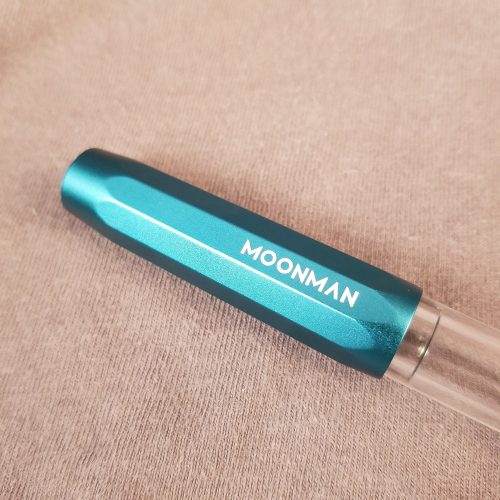
I wanted to bring up the shine and visibility of the grain but keep the feel of the wood. I rubbed silicone grease into the pen, let it absorb and then buffed off the excess. I’m not sure you can tell the difference in the photos but in person the difference is amazing. The wood is satin, the grain pops, and it still feels like wood. The silicone grease isn’t slippery or tacky, the wood has absorbed most of it, it has left a nice tactile shine on the pen. A hard wax would give a similar shine for the same amount of work.
This pen is also available with a hooded nib.

Like the Kaco Retro I reach for the pen again and again. It’s the right size for my hand, clips securely to my shirt, and feels amazing. The balance and weight is great. The wood is a perfect fidget. The updated clip and cap really brings a nice feel to the classic Parker 51 or 21 riff. At less than $4 each you can afford to buy a hooded nib and classic nibbed version, just for giggles.

Review: Hero 616 Big Size or Doctor Fountain Pen

Bobby is a seller on eBay who focuses on inexpensive fountain pens and other office supplies. He sells under the name Office_Supplies_Pen. This pen cost $2.35. It took 15 days from date of purchase to arrive on my doorstep.

Compared to the standard sized 616, externally I notice little difference. The cap and body are identically sized. With the cap off the section is the same size as well. The hooded nib is the same as well.

The cap is also a friction fit for capping and posting. Again I like it posted better than unposted. This cap actually wiggled loose inside a pen case. Fortunately not enough to leak but it was annoying. The cap secures itself with springy steel fingers inside the cap. I used a kitchen skewer to reach into the cap and pull the fingers that hold the cap on out, so they would be tighter when the pen is capped. It is a quick fix that anyone can do that actually works quite well. The clip is diminutive and seems too small for the size of the cap. That said it is springy and secure on my shirt and in a pocket.

The difference is inside, the aeromeric* filler is significantly larger. With the outer case of the filler off, you can see that the sac is significantly larger. I cleaned my pen with water and filled it with water. I measured the resulting fill, it held 1.25 ml of water. I was able to get about half that amount of ink into the pen. Meanwhile, I managed to cover my hands with ink. I hate cheap aerometric fillers.

The nib on mine was misaligned with the body of the pen and the feed. Once I got it into alignment I found that it was scratchy and not very nice. I swapped it out with another Hero nib and suddenly wow. The plastic arrives with micro scratches all over the plastic. Some time with a cloth and polish would probably solve this issue, but who has the time for it? At $2.35 I wasn’t expecting perfection anyway.

Ink flow is great, in a sweet spot, it’s not too wet not too dry. I’ve got this one loaded with Sailor Sky High, which admittedly is a nice lubricated ink but it all works together to feel great. The pen is about the right size in hand and feels good both posted and unposted. The balance is nice either way. It posts deeply and securely.

I don’t dislike this pen but I’m not wowed by it either. It’s an okay everyday user pen. It’s cheap and writes great, once you get one with a good nib. With eBay you take a chance of getting a garbage nib, but when you get a good nib**, they are decent writers. I’d avoid the aerometric filler version and go for those with a piston or cartridge option. If I’m comparing it to other cheapish pens out there, the Kaco Retro is also a Parker 51/ 21 riff but performs much better. It’s is also a cartridge or converter pen.

A big issue that I notice with this pen is that it tends to dry out between uses, even if it only sits for a few hours capped. I’ve attempted to seal the cap with some E6000 to mixed results. Personally if I’m going to recommend one of these PArk 51/21 knock offs it’s going to be the Kaco Retro, it works better and works reliably with every ink I’ve put into it. When these have a good nib in them they are pleasant but don’t blow my mind.

Review: Color It Dot Grid Journal


My gold standard notebooks for bullet journaling are Baron Fig Confidants. The combination of heavy covers and near perfect paper make them a notebook I reach for every time I need a notebook. That said, they lack some features that most bullet journalers look for when selecting a journal. The gold standard for most other people is the Leuchtturm 1917 (L1917), which features great paper, an elastic and a pocket over the Confidant. The larger issue with these notebooks is the cost. At $20 each, they are a pricey investment, particularly if you are just testing out bullet journaling.

This A5 notebook has black and white covers intended to be colored with permanent markers, allowing the buyer to customize it fully. It measures 5.8×8.2 inches, or real A5, just like the Leuchtturm 1917 (L1917). This notebook cost $9.99 at the time of purchase.

It has all the expected bells and whistles of the L1917- elastic, ribbon bookmark, hardcovers, and a pocket in the back. The pocket feels soft and pulpy but the gusset is covered in satin cloth.

The toothy off white pages are reported to be 80gsm. Every page is perforated. In testing, it took some work to remove them- folding along the perfs, then tearing. The dots are dark and are ruled at a wide feeling 6mm. I actually prefer the slightly wider ruling in this book.

The paper itself is okay. It has a lot of issues with fountain pen inks. Many of inks soaked into the paper and bleed through to the back side of the paper. The lines looked true to nib size for the most part, with a few notable exceptions of the lines feathering quite noticeably. Some inks spider webbed from the line. The paper was very nice for pencil. The toothy page does well with HB pencils and has enough tooth to grip softer graphite and hold it. Smudging was minimal.

The bottom line? I picked up this book because of the composition book style cover. It looks great, this caused me to miss the fact that it has perforated pages. This is a good journal if you stick to pencil, gel or ballpoint. Stray away from those media and welcome bleedthrough and feathering. I’d stay away from this one if you are adventurous in your media use.

No links in this one.

Review: Taotree Dot Grid Notebook

My gold standard notebooks for bullet journaling are Baron Fig Confidants. The combination of heavy covers and near perfect paper make them a notebook I reach for every time I need a notebook. That said, they lack some features that most bullet journalers look for when selecting a journal. The gold standard for most other people is the Leuchtturm 1917 (L1917), which features great paper, an elastic and a pocket over the Confidant. The larger issue with these notebooks is the cost. At $20 each, they are a pricey investment, particularly if you are just testing out bullet journaling.

I mulled this over and decided to troll the depths of Amazon to find less expensive journal options with dot grid paper. Of course, you can bullet journal into anything, I might suggest a lovely 50 cent composition notebook.

Trolling Amazon for dot grid journals gave me many offerings. I looked specifically for those with hardcovers, elastics, and ribbons. Less important for me are the added features of the L1917- page numbers and index. I then looked for notebooks selling for around $10USD.

The first purchase is the eloquently named “Taotree Dot Grid Hard Cover Journal Notebook.” At the time of this writing, it is priced at $8.99USD.

The cover I chose is bright chrome yellow- a bright orange-yellow that is reminiscent of farm-raised egg yolks or school buses. The covering is vinyl imprinted with a leather texture. It has a soft feel, slightly squishy, in a way that makes the notebook grippy and not slippery. The elastic matches the exterior and is the right length. The company name is imprinted on the bottom center of the back cover.

Inside the ribbon bookmark matches the color of the covers and elastic. The ribbon is woven and heat sealed. It had a generous overhang of several inches. You can grab the ribbon to open the book. In the back of the book, there is a cream colored pocket, with satin gussets allowing it to open wider than is feasibly useful.

There are 144 smooth cream-colored dot grid pages. The paper is boasted to be 100gsm. The dot grid is printed in a medium grey color at a 5mm distance. The grey is dark enough to be seen even after writing but it’s not obtrusively dark. It fades behind most inks. The pages are Smythe sewn and done well. The stitching is tight and secure. The spine in use is well glued. The whole book opens flat and can be folded over onto itself.

The size of this notebook is about 3mm shorter and 6mm wider than an L1917. This is often called “Narrow A5.” Let’s just call it what it is, “Moleskine A5.” I like this size you might want a true A5, like the L1917.

I didn’t have a lot of expectations for paper performance. I braced myself for feathering and bleed through. I was pleasantly surprised by the exceptional performance of this paper. Gel, ballpoint, and rollerball all performed exceptionally well. Pencils are great on this paper. It’s smooth with enough tooth to hold the graphite without smudging.

The real surprise is how well it performed with fountain pens. Most of my testing was done with fine and extra fine pens, and a medium thrown in here and there. Most inks performed well, except for known poor performers and a few surprises. Most of my inks performed flawlessly.  Those that feathered tended to have more show through and occasional bleed through.

The 5mm dot grid has 25 x 41 dots, which rules off well for a future log or other habit trackers.

The bottom line? This isn’t a bad book to consider for bullet journaling. At $9 it’s not a huge investment but it’s got the bells and whistles of the more expensive notebooks. The paper is good enough but has occasional issues with liquid inks. It is thicker than the L1917 but doesn’t perform as well as the Baron Fig Confidant. It has 144 pages, which means you’ll be buying a new book soon. That said, if you aren’t sure about bullet journaling, this smaller size and lower investment is a good deal. I like this journal, I plan on using after I fill either my personal L1917 or my work Confidant.

Review: Wing Sung 601A

The Wing Sung 601A is yet another riff on the venerable Parker 51 or 21 pen. The design is classic and often reproduced. The 601A takes the classic pen and mashes it up with another classic, the Schaefer Triumph. The effect is a bit off-putting at first, but in the end, I like the look.

The pen is made of some sort of plastic and is well made. Initially, I could not see the seam line between the blind cap and the body of the pen. There are no mold lines visible on my pen. I ordered what they described as indigo and received a dark teal pen. I received the right color, their naming of the color is off a bit. The brushed stainless steel cap looks great and slides easily onto the pen.

The metal cap is friction fit for capping and posting. I found mine to cap securely but it is just a friction fit. While posting I did find that it posts securely and quite deeply. The cap is a tad heavier than I’d like for posting. It seems to throw the balance off a tad. Folks with larger hands will find this one postable.

The vacumatic filling system took a few tries to get a full fill but once I figured it out, it worked well. I inked this pen with Pilot Jentle Yama-dori. It matches the body of the pen quite well. The ink is visible through the ink windows of my pen, which work well enough.

The writing experience with this pen is different. Immediately upon inking I wiped the nib off and wrote in my usual manner, in an attempt to determine if there was any flex or bounce I pressed down with light pressure. The tines flexed outward and never bounced back. I managed to spring the nib with minor pressure. I was able to bring it back with the use of pliers and some work. We’ll return to this topic in a bit.

When it writes, this pen writes beautifully. The nib is silky smooth and lays down a wet line that manages to capture the characteristics of the ink perfectly. This pen feels wonderful in my hand. I reach for it again and again. Only to be disappointed. It will write then not write as the tines spread themselves wide open. I’m left with skipping ink and barely there lines. Sigh. I’ve ordered a replacement nib to see if I have better luck.

At $14.23 (not the current price) this is my most expensive pen ordered to date. It is a shame that it has a bum nib. My plan is to order a package of replacement nibs and see how it responds to a new nib. If this were a standard nib, the replacement would be easier. I could order one from Goulet or Fountain Pen Revolution and have it here in days. Sadly it’s the weird knockoff Triumph nib and thus I’ll need to wait for the delivery from China.

Overall, this is an ok pen, don’t get the Triumph and 51 mashups, get the hooded nib version. You’ll be happier for it.

Review: Robert Oster Fire and Ice

This is another ink a lovely stationery friend sent me a sample of, and I don’t remember who sent the ink. Lesson learned. All new samples are getting labeled.

This ink is similar to Oster’s other sheening inks- highly saturated, loads of sheen, lots of color. It’s well lubricated and has a great flow- so long as you continue to write, but lay that pen down for more than a few seconds and it slows to a stop and needs some coaxing to flow again. The ink is also well behaved on almost all of the paper I’ve tested it on- including the garbage paper at work. On cheap paper it doesn’t feather but it does have some bleed and show through. Like other inks with sheen that excess ink can transfer to the opposite page of a notebook.

Dry time is better than expected for an ink this saturated. It was less than 7 seconds on good paper and less than 5 on cheap paper, and on garbage paper it was dry in 3 seconds. Like many darker saturated inks, this one also photocopies very well.

In my spill and wipe test the ink tended to blur the moment the water touched the page and smeared even more as I wiped the ink away. In the drip test the color spread and lifted and soaked around the test area. The lines were blurry and barely legible. I would not expect this ink to survive a trip through the washer.

The color of this ink is a greenish blue. I wouldn’t call it teal but it leans closer to that than it does to purple. It is pretty professional. I have come to really like the Robert Oster inks. Like many saturated inks they seem to have some flow issues if you leave a pen uncapped, but overall seem to behave well even on the worst of paper.

Review: Organics Studio Santiago Bay Blue

My friend and RSVP Co-host Lenore sent me this bottle as it didn’t flow well for her. I have not diluted this ink or added anything to it. I don’t know that Lenore added anything to this ink.

This shade of blue reminds me of well washed and broken in denim. It’s a standard shade of blue with decent shading. I’ve tested this in several pens and found that it flows well. I find it to be decently lubricating and smooth on most papers. It’s great in my nicer notebooks and okay on garbage paper. It isn’t the most well behaved but it isn’t bad either. I didn’t notice any excessive feathering or spread.

The ink has pretty standard dry times at just under 10 seconds for good paper and less than 7 for garbage paper. It has decent water resistance in the spill and wipe test. The drip and sit test showed plenty of migration of the color with a legible line left behind. I would not expect this ink to survive the washing machine.

It is a perfectly professional shade of blue. Sadly the big downside of this color is that it doesn’t photocopy well. The darker, shaded areas of letter photocopies well, but the lighter top parts of letters looks faded in most of the tests I made. In a pen with wet flow this could be mitigated. I quite enjoy Organics Studio inks. They do have a tendency to be dry in my pens, but the newer inks seems to have left that behind. I’ve had good luck with the newer inks.

Review: Kaco Green Retro Fountain Pen

Kaco is a new player in the eBay cheap fountain pen market. Their pens tend to be slightly more expensive than the Jinhao and Wingsung that are more often found. The added price comes with a better presentation.

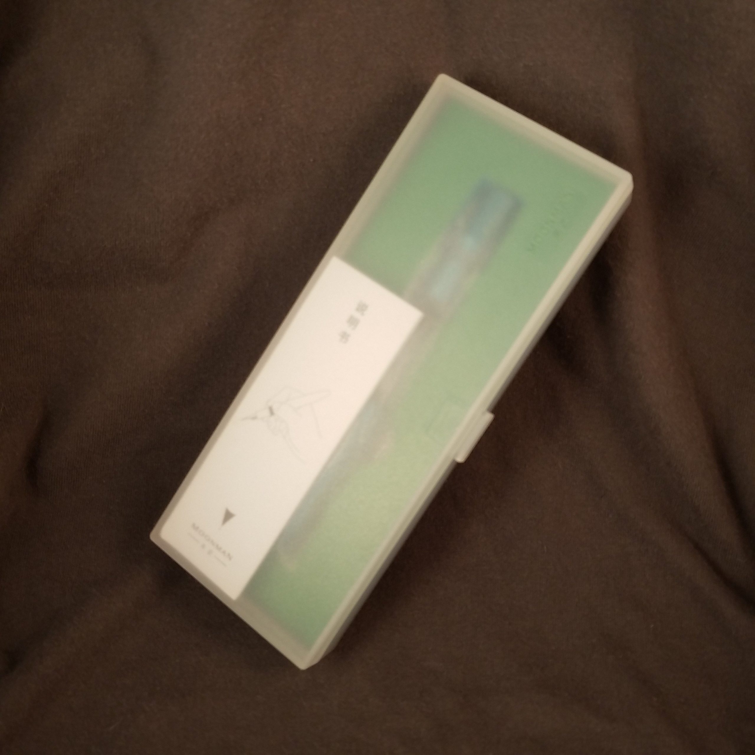
The black plastic envelope is full of foam. Shipping took longer than typical, about 21 days due to the holidays. The Retro arrives in a very sturdy translucent white case. The pen is in a stiff molded tray along with a converter and two international small cartridges.

I ordered the “green” color which is a bright light teal. The color is cheerful and pops out of the sedate tray. The plastic is injection molded and though there are no visible mold lines, you can see the injection points on both the body and the cap. They are placed in locations that make sense and are somewhat hidden.

The bright cheerful color and plastic type screams school pen. The plastic doesn’t feel cheap, it feels sturdy. The nib is a buttery smooth nail. No work needed either, it was that good out of the box. There isn’t a hint of bounce or flex here. The hooded nib keeps things moist and writing. I was able to leave this pen uncapped and open in my bullet journal for at least 15 minutes. When I picked it up to make more notes, it wrote and was back to the usual flow in seconds.

The pen fits my hand and feels good posted or unposted. The cap posts deeply and securely. The cap posts deeply enough that it still feels balanced when in use. The clip is simple- stiff springy wire with a small plastic ball at the open end. IT slides onto my shirt easily and stays put. The clip is surprisingly secure. Depending on your color the clip is an opposite color of the body. It’s a smart little pop of color.

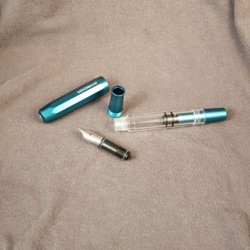
Overall I wasn’t sure what I was getting into with Kaco. The retro is a lovely school style pen that I was able to write with effortlessly. It worked well with my personal writing style and methods of bullet journaling.

I wasn’t sure what to expect when I ordered the Kaco, but I ended up pleasantly surprised and happy with my purchase. The bright pop of color is joyous and the hooded nib writes smoothly on everything I threw at it- from L1917, Baron Fig, to the cheap office paper we use at work. At $10.17 this isn’t the cheapest of the cheap pens but it has a great presentation and really just works right out of the box. I could give one of these as a gift and feel good about it.

Review: Organics Studio Nitrogen

I was gifted a sample of this ink from a friend. I should have labeled the tube when it arrived but I thought I would be able to remember who sent it. I can’t remember which of my wonderful stationery friends sent this ink.

Organic Studio inks come in 55 ml bottle for $14. The inks are super saturated and several websites suggest that you can dilute the ink with distilled water 8 parts ink to 1 part water. The saturation leads to intense amounts of sheen. The base color of this ink is a warm shade of deep blue. It doesn’t lean purple. The sheen on this ink is red and intense. On the right paper the sheen shows up on nearly every line. It sheens on lesser paper.

Surprisingly, the ink is relatively well behaved even on most of the garbage paper I’ve used at work. Flow is great and the ink is lubricated. The nib skates across the page with this ink. If left uncapped and unused for any period of time it starts hard. Dry time is slow on good paper, roughly 10 or more seconds. On garbage paper dry time is slightly better at 10 seconds or less.

The ink is not even close to water resistant. In the droplet and wipe test the saturated ink smeared all over and lifted the ink that wasn’t dribbled on. The drip test revealed that all the ink had lifted and left behind a shadow of the initial lines. This ink would not survive a trip through the washer. It barely survives the drips. A large spill would leave your page blue and your writing gone.

I really like this color, the color is professional looking though the sheen might leave some folks scratching their heads and wondering if this is blue or red? It photocopies well enough. Price is low enough that it doesn’t seem silly to use this at work.

This ink was provided to me as a gift, free of charge, with no intent from the gift giver other than a hope that I would enjoy  the ink. Any links in the review are to vendors who sell this particular ink, they are not affiliate.

Review: Pelikan Edelstein Tanzanite Cartridges

This ink is a great dark blue black that is a nice cool grey. It reminds me of Payne’s Grey watercolors, which for me is a very very good thing. Payne’s Grey is a favorite convenience color of mine.

I’ve had the opportunity to use this ink in several fountain pens and it has had a smooth even flow in every pen. The ink is well lubricated and feels great on good paper and garbage paper at work. In pens with greater flow it has a red sheen, which is lovely against the deep grey shade.

Dry time seems pretty standard for inks with good flow, just under 10 seconds on good paper and around 7 seconds on lesser paper.

In the drip test the ink lifts almost immediately and spreads out. In the dribble and wipe test (meant to mimic spilling and subsequent clean up) the ink smeared and made a mess. This is not an ink that will survive the washing machine. I doubt it would survive a hot tea or coffee spill.

Overall this is a perfectly professional blue black ink that performs well on most paper. Sadly it won’t survive spills, but if being considered as an ink for work, this matters little. It’s not the cheapest ink around, but it is a solid performer for a cartridge pen. It is also available ink bottles for folks who use a converter or piston filling pen.