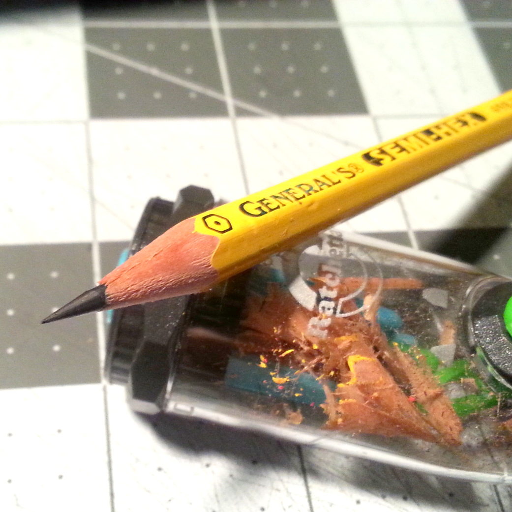
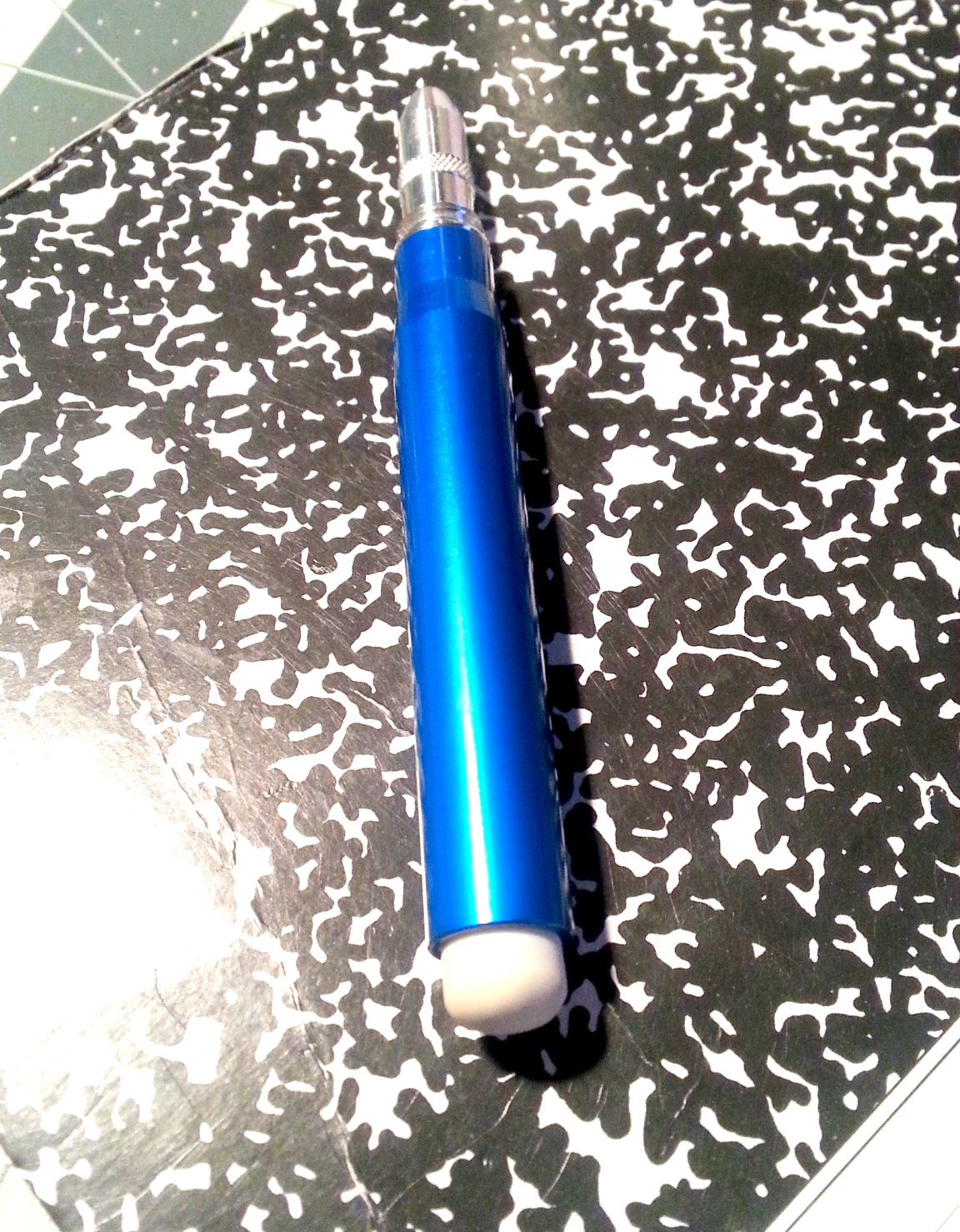
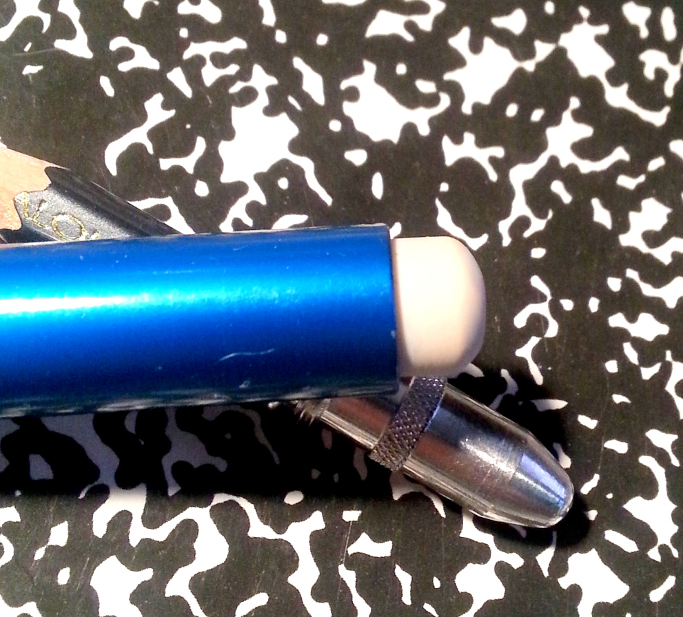
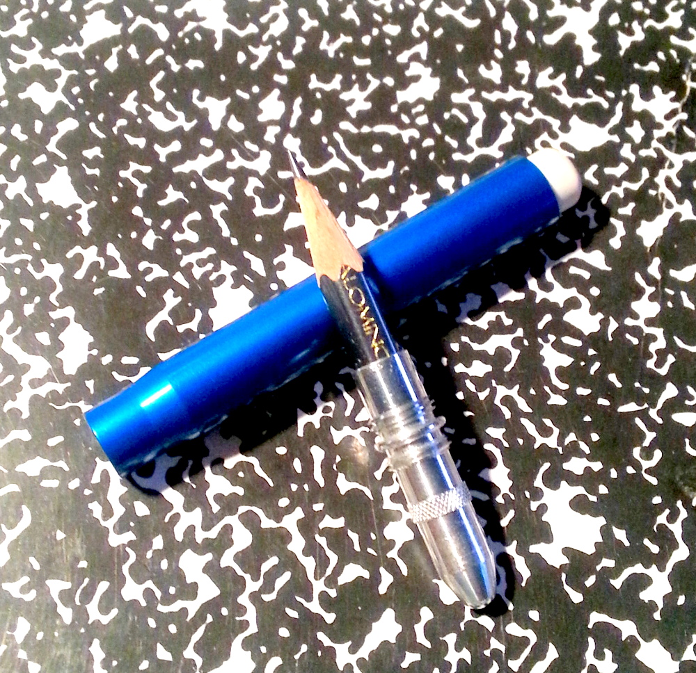
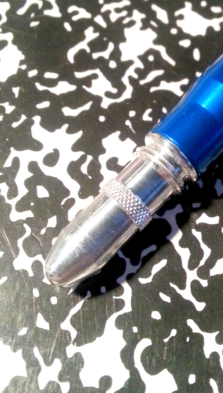
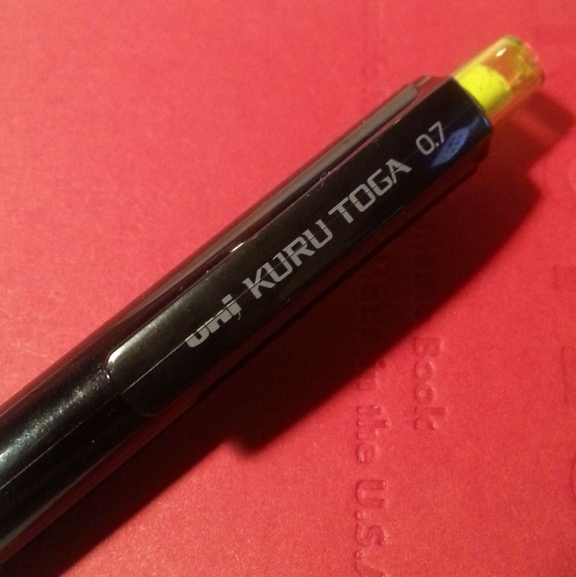
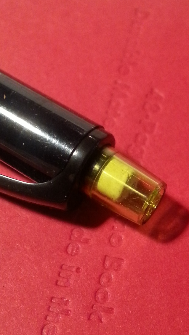
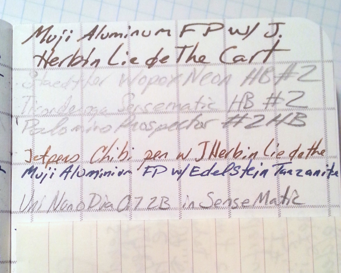
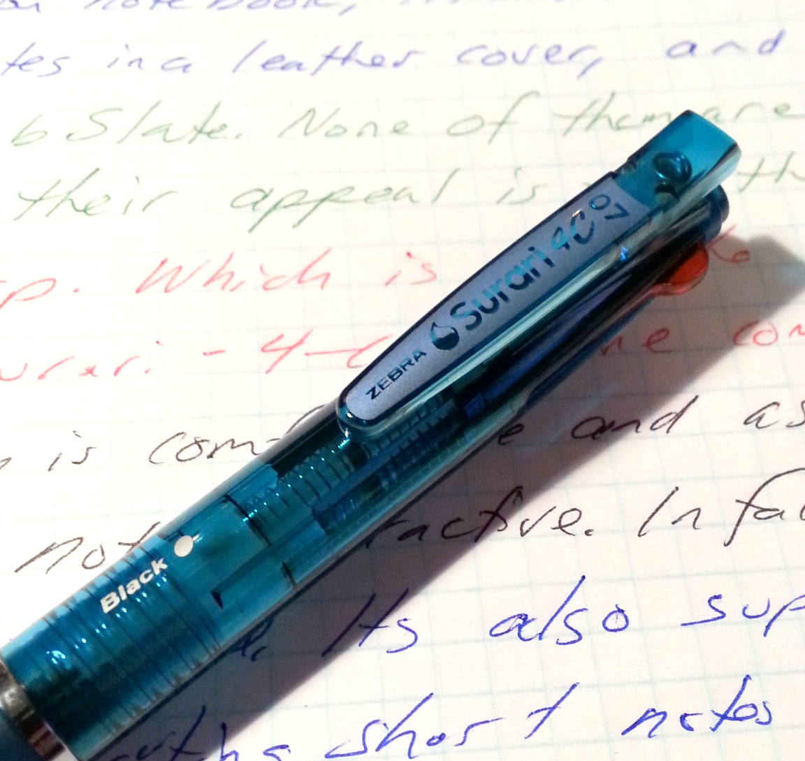
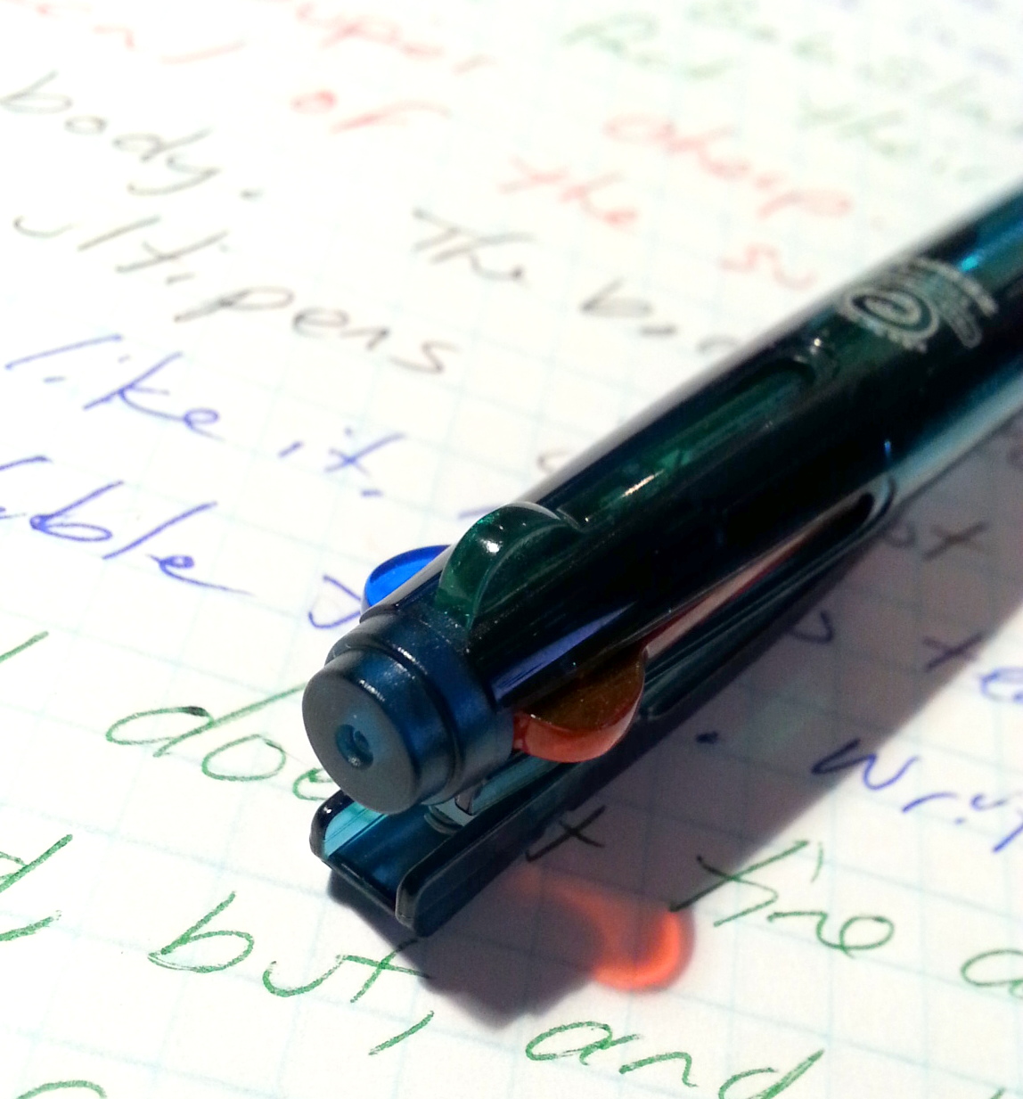
I really don’t understand the love of the Zebra Surari. I want to love it. The body of this pen is sharp- pretty in a way most multi-pens are not. It’s got smooth lines and it feels really good in the hand. I was able to get mine in a nice dark teal, it’s a fantastic shade. It’s also available in other colors too. The knock is smooth and snaps into place with a satisfying click. The tip has minimal wiggle and wobble. If that were the review, it would get an A+ and we’d move on, sadly, I used this pen for a a couple of weeks and that is where this pen starts to fade.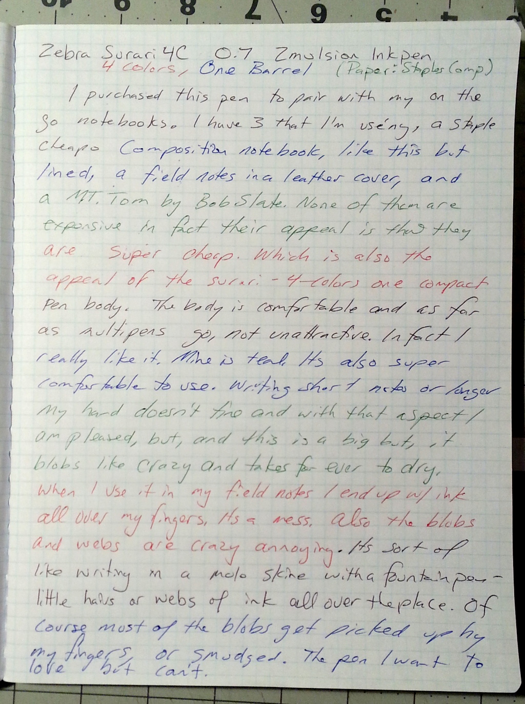 I purchased this pen specifically to be on my on-the-go in-my jacket-pocket pen to be paired with my Field Notes, my mind dump Mt Tom, and to use the red or green ink to highlight something important. And for the occasional highlighting it does just fine. The issues arise when I use it for something more lengthy than a couple of words. That’s when the blobs and, for lack of a better description, webs begin.
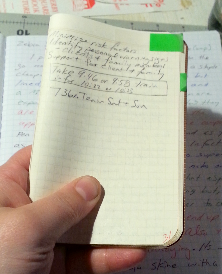
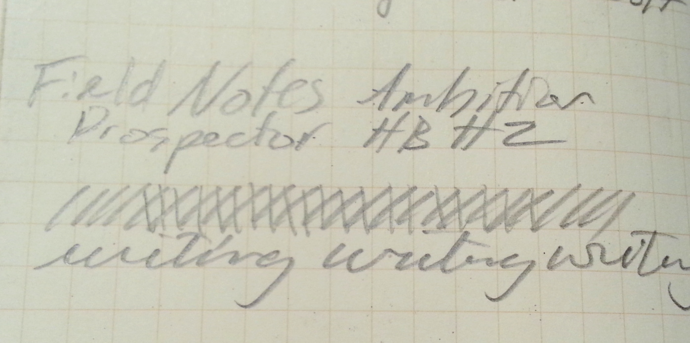
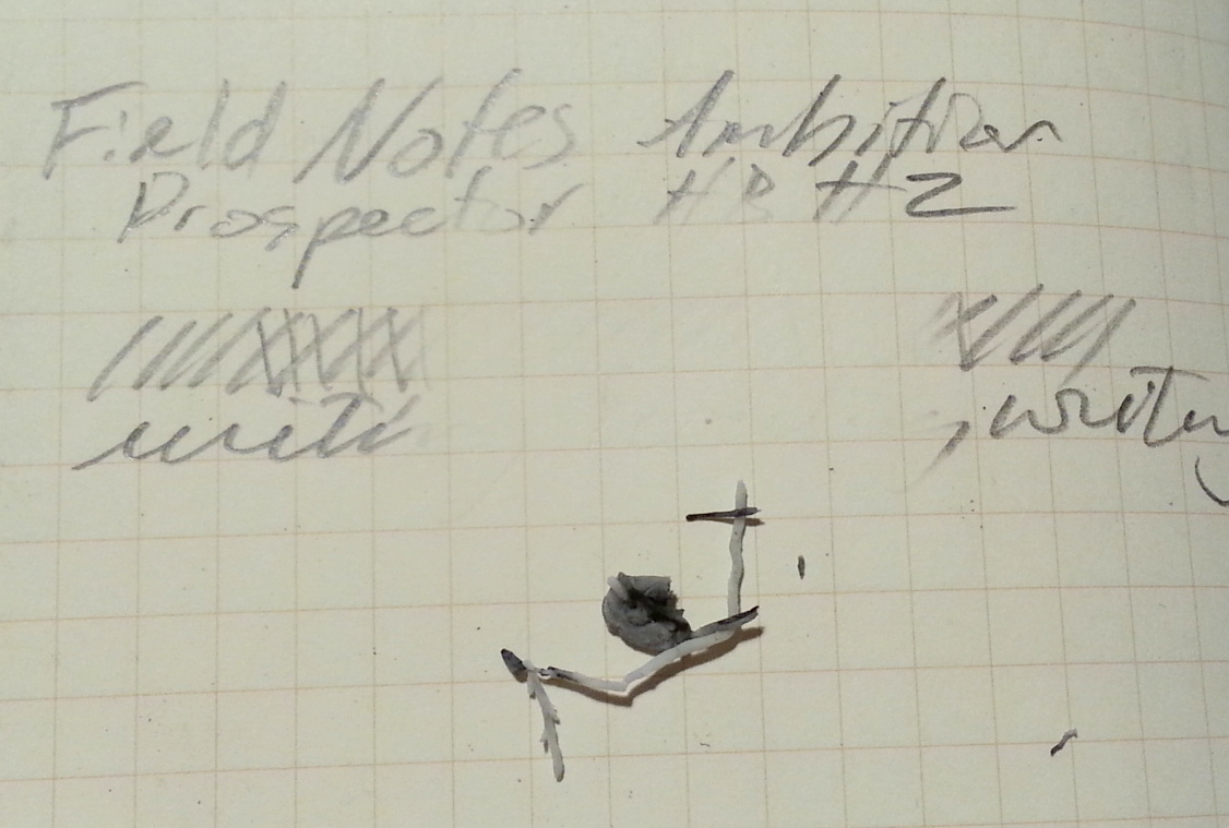
As I write with this pen it blobs and from those blobs, as I move from letter to letter, and word to word, tiny strands of the ink stick to the tip and are stretched across the letters. These strands stick to the paper and are ugly. The blobs are bad enough, but the webs are even worse. It makes my already crappy cursuscript look even more horrible.
Let’s discuss the drying time. It’s horrible. When I use my Field Notes I fold it over on itself and sort of hold it with my thumb on the page I’m writing on, and move my thumb around to stabilize the notebook. I suspect this is how most of hold them. Sometimes my thumb is under the stuff I’m writing and others it’s over it. When I’m placing my finger on top of the writing it picks up the ink, even if it’s a few minutes old. I also found that this occurs on any paper. Usually all my pens dry in record time on the Staples comp books- they are so absorbent that they dry things fast. Not so with the Surari. I did a brainstorming session of about 15 minutes and found that at the end my fingers were still picking up ink from stuff I’d written at the beginning. I thought that maybe this was simply a one off incident, but then I noticed that it also happened in my Field Notes and my Mt Tom notebook.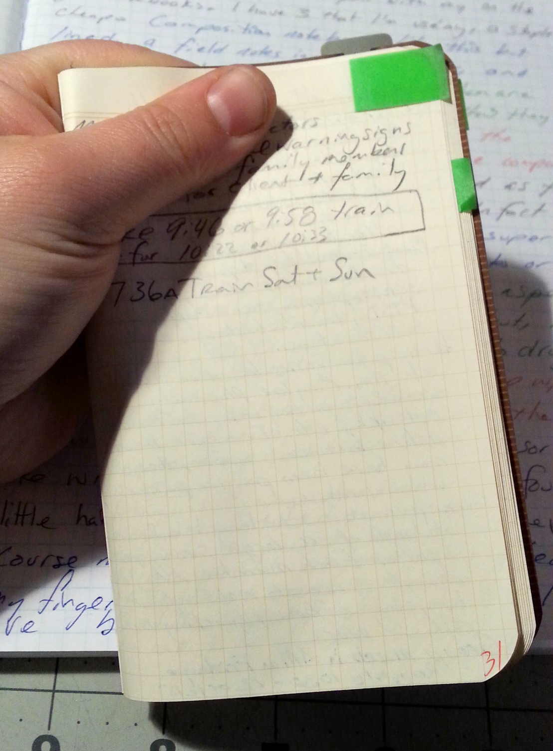
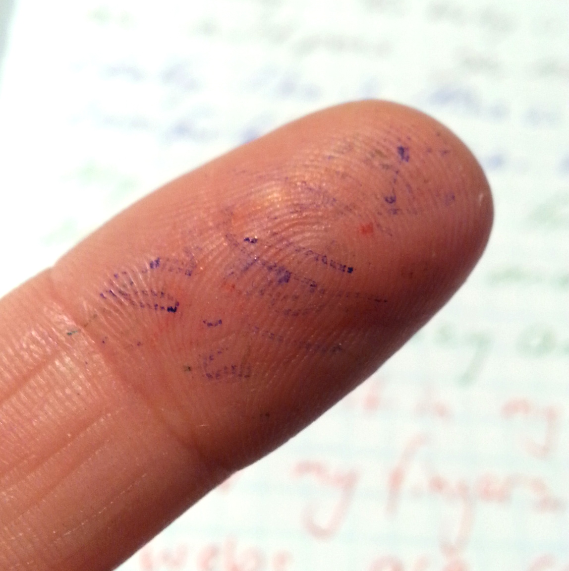
If I want ink on my fingers I’ll use a fountain pen.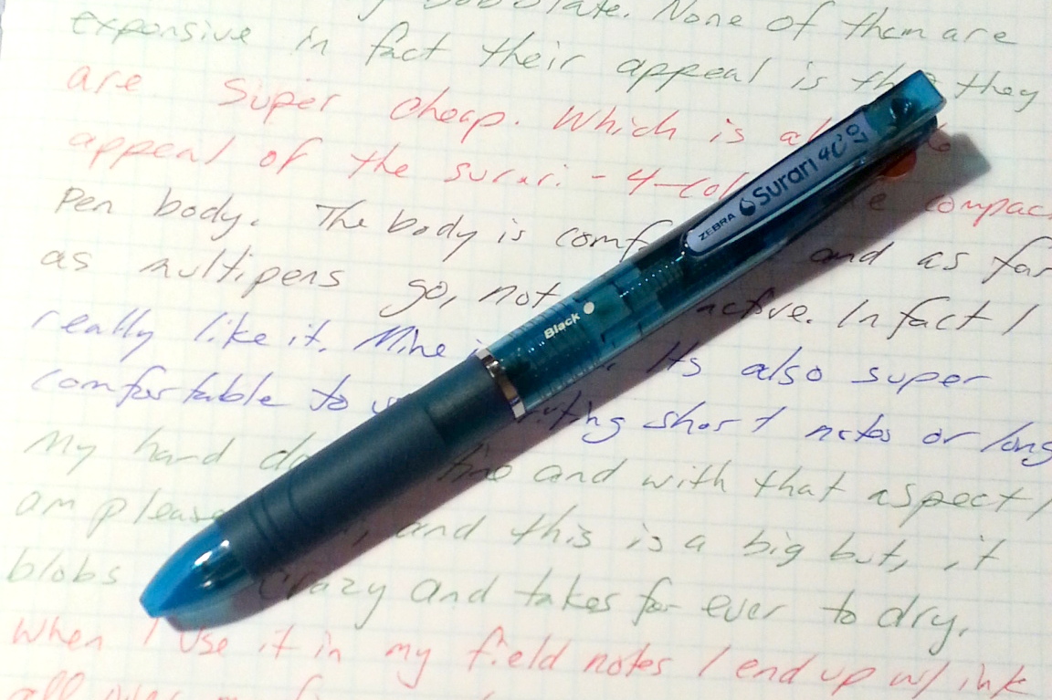
The Surari is a really good looking pen that blobs and doesn’t dry quickly enough for my needs. I really don’t get the fervent love for this pen that I see in every review on the net. They mention the blobs, but in passing as if they “aren’t that bad.” They are bad enough that I found them annoying and frankly I LIKE pens like the BIC crystal and the BIC 4-color. I would use the BIC 4-color over this pen on any day. I don’t care how smooth this pen writes. It makes a mess of my ingers in all 4 colors.