Originally uploaded by h e i d i b u r t o n ☁
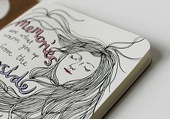
Love these simple pages of faces with quotes.
One of the other sketchbooks I received from Exaclair was the Clairfontaine Graf It pad. I’d seen these on several occasions at Artist & Craftsman and passed them by due to the cover being… well, kinda lame*. In addition to the plain black grainy text and images, each cover is made with various colors of card stock that folds behind the staple bound pad. The back is supported with sturdy heavy chipboard. Each page is microperfed for easy removal. The perf is sturdy enough that you can turn the page and it won’t tear out, unless you want it removed, it stays. The pad is often sold on American websites as “6×8.” That may be the outer dimensions of the pad but the actual sheet size is 5.75×7.5 inches. There are 80 sheets in each pad.
I did my usual battery of tests on this paper and it withstood them all. I have to say that this paper is amazing. Though it’s only 90g (41lb) it’s super sturdy and accepts a lot of media without issues. It takes some serious effort to get stuff to soak through. When I say stuff I mean ALL the stuff I’ve tossed at it. See the pic below.

With watercolor it accepts the color well. The paper cockles as is expected with paper this thin. I find this to be a great paper to experiment with techniques and color. It responds well to puddles of water as well as thin washes. Color stays true and doesn’t get muddy on the page.
While drawing with ink I was able put down multiple layers of ink without cockling and bleed through. Heavy layers that would have bleed through many other heavier papers did not bleed through on this paper. Noodler’s black bonded with the paper well enough that I didn’t worry about it lifting much with my water brush. Colors seem to pop off the page.
I did try gessoing the page but I don’t see the point as the paper is tough enough to survive most stuff without the gesso. I also scrapped acrylic paint over the page to see how it would work, and it worked just fine. This paper is also amazing for pencil. It has just enough texture and tooth that pencil feels really good on it and it hold a lot of graphite, so darks are really dark.
My final verdict on this pad is that it’s great. The paper is awesome. The format it’s served in is where it is lacking. I hate perforations (my own little quirk.) I prefer a pad that allows the pages to stay together. The staple binding is crap for keeping stuff together, I made a little folio out of a USPS priority mailer to keep my drawings together. For art journaling it would be a great pad to do drawings in and then cut out and glue into your regular art journal. The paper is thin enough that if you draw a face and cut it out the edges won’t be all that noticeable.
The pad is pretty cheap. I found it online for $4 to $6 the larger size is pretty reasonably priced too at around $9. These are prime pad for binding into a sketchbook. If this came bound like a moleskine or a Rhodia Webbie I’d buy it. I know that the reason this pad is so inexpensive is that its bound inexpensively, 2 staples straight through to a sturdy backer. I like this paper a lot, in fact the next time I’m at Artist & Craftsman I’ll be picking up another one of these in another size. Perhaps I’ll bind the large size into a nice art journal!
Amanda Palmer and I are around the same age, okay so I’m a FEW years older than she is… Not my point. She wrote this blog post about what she thought success was when she was 11. Like so many things that she has written over the years it made me think about what I thought success was when I was 11.
Art wasn’t even on my radar.
I was a geeky kid, my nose stuck in books, a pen in hand and did well in school. I’ll be honest with you, I thought I’d be a scientist working in some lab doing research of some important nature. This idea made my parents very happy. My only goal was to not live in DownEast Maine. In my 11 year old head scientists lived in Boston or New York, or some big distant city. Also, in my head I never worried about money, somehow I thought scientists made lots of money.
I remember in high school my friend asked me, “What do you want to do when you get old, you know study in college, and do for the rest of your life?” I remember that the phrase “the rest of your life” struck fear in my mind and I drew a blank. I realized that though I loved science, I really didn’t want to do it for the REST OF MY LIFE.* I blurted out “art” because it was truly the only thing that through the course of my life I’d been good at and enjoyed. I could see myself doing art everyday and not getting bored. After hastily blurting out art, I added “or write, I like writing.” Even then my only goal was really to go away to college and get out of DownEast Maine.
At that point in my life that’s all I wanted and felt I needed to be successful.
So I went away to college got my degree and… Returned to teach.
When I look back that was probably the most unsuccessful I’ve ever felt in my life. I returned to the place I’d worked so hard to leave, for a job. After that I told myself I’d never go someplace I hated for a job. So over the years I’ve worked a variety of jobs that have little to do with what I deem I need to do to be successful in what I ultimately really want to do with my life- art. I’ve pursued them for health insurance, rent, and an assortment of other things. In some cases I’ve taken jobs to make ends meet and cover expenses that art just doesn’t, yet.
So I’ve set myself a new goal, to not have a DayJob after the next year passes. I want to make ends meet through art. I know it will be hard but I think that if I “put my weight into it” I can make it happen.
I never managed to get the images up for my Webbie review. So I'm putting them up here (and probably in the actual review.)
You can see here how the page takes watercolors and then ink over the watercolor.

And here you can see where I scraped the acrylic and painted on some gesso and then layered ink and watercolor crayons over the top.

I wasn't kidding around when I said I was having a hard time putting this journal down. I have 2 more I need to review and I really don't want to stop using this beautiful thing. I guess I'll have to fill it!
I gave up watching TV over a year ago. I started to watch a few things on Hulu, here and there with sporadic intervals of watching everything at once. About 3 months ago I hadn’t watched anything for close to 3 months. I sat down with a hot cup of tea, my lap top and pulled up my queue in Hulu. I had a serious bunch of Sons of Anarchy. I really enjoyed the last few seasons and the first few episodes of this season. Anyway. I watched on episode and I found myself getting up and doing stuff I like I do with movies I don’t get into. Then a really violent scene came up that involved some torture and I realized I couldn’t watch it.
I turned it off. The violence turned me off. I had no interest in watching it at all.
I deleted it from my queue. I haven’t looked back. I realize I prefer comedies, light hearted stuff, and adventure. I really enjoy shows like Warehouse 13, quirky and funny it explores mythical stuff from history and literature in an intelligent way.
Since I’ve turned off the TV I find myself more open to ideas and thought and the real world inspires me more.
Without TV my world is a little brighter. I’m so glad we turned off the “boob tube.”
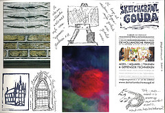
Sketchcrawl
Originally uploaded by Caatje's Artsy Stuff
Really love these Sketchcrawl pages. I really enjoyed the Sketchcrawl I participated in last year. I'll have to do more this year!
I’ve bought a bunch of different watercolors from Grumbacher Academy to Winsor & Newton. My favorite travel watercolor set is a Cotman 12 pan set. The colors wet easily and lay down nice saturated colors. It was a great value to get 12 half pans of color for around $20.

I’ve since focused on purchasing tubes of color to replenish emptied tubes and adding a few extras. I’ve tried to buy a few different brands. If you’ve got an AC Moore or Michael’s near you, getting a tube of Winsor & Newton Artist watercolors with a 40% off coupon is a pretty good deal.*
My usual rant with any art material is that you get more out of artist’s grade than student. Why? They tend to have more pure pigment and less filler and that means you get more color out of a 5ml artist grade tube versus a 15ml student grade tube.
I’ve purchased a few tubes of Holbein watercolors at Artist & Craftsman as they’ve been having a sale. The 15ml tubes are a little pricier than the usual 5ml tubes of Winsor & Newton colors that I buy but it’s also 3 times the amount. The colors are intense.
The first time I sprung for a tube of W&N artist grade watercolor I was shocked at how much more intense the color was than Cotman and Academy colors. I was also surprised at how easily my damp brush picked up a lot more color than with Cotman. The “rewetting” ability of W&N over their own Cotman student grade colors was surprising and delightful. Creating an intensely colored wash was much easier than with my cheaper colors.
Now that I’ve discovered Holbein I’m feeling the same way about them as I did about my W&N artist grade colors. I feel like I’m getting more bang for my buck out of these slightly more expensive tubes of really intense color. So far I’ve bought a tube of indigo, turquoise blue, and sepia. All 3 colors perform flawlessly and wonderfully on everything I’ve tried them on so far. The Holbein turquoise blue is a very different shade than the Cotman turquoise. Since I rather like the color of the Cotman turquoise I may end up buying a new tube of it, but I have to say that I’ve been quite spoiled with the Holbein paints.
That being said I also tried out a tube of Van Gogh watercolor. These are larger sized tubes of color that are considered student grade. The VG colors had something going for them- they rewet on a palette like nobody’s business. A swipe across a dried out blob of red oxide brought up a fully loaded brush of intense color. These tubes are moderately priced around $4 a tube and come in sets. I’ve not tried their pan colors but the tube color is very well behaved and an excellent value.

I followed a link to an art journaling blog where I saw yet another female artist in a tutu. Afterward I tweeted the statement, “To be a mixed media artist do you need to wear a tutu? Or even like them? NO!”
To be blunt, I don’t get tutus. They are made out of plastic scratchy material, the same stuff the exfoliating bath poofs are made of and I can’t imagine they are comfortable.
I’m not saying I’m down on it, I just don’t get it.

What I wear doesn’t define me as an artist. My clothing isn’t a statement. I’d rather my art make the statement. I’m a jeans and t-shirt kind woman; I like cotton, wool and other natural materials. I look for comfort while I create. I don’t need something outward to help me find my inner creativity. I know that some people enjoy costumes*and perhaps that is what the tutu is about. Using costume to find that inner well of creativity, capturing lost childhood insight, or perhaps these ladies really enjoy wearing a tutu. It is not my place to yuck your yum, but I can say that I don’t get it
I also have to wonder, other than Salvador Dali, would you see a male artist wearing something like a tutu? In part I’m somewhat uncomfortable with the idea that female artists have to dress up and play a part to sell their art. Peddle their wares like a carnie, “Win your lady a stuffed teddy bear here!” “Strong man competition, ring the bell, win a prize.” “Hooooot sausage and peppers, fried dough, cold lemonade”
Tutus and tiaras, 2 things you’ll never catch me wearing.
A technique that I’m asked about on a regular basis is how I get that watercolor effect with my ink drawings. First I start out with a regular ink drawing like the one below. If I know I’m going to use this technique I try and use inks that don’t dry waterproof, eternal or bulletproof.

The next step is to use a waterbrush to pick up ink and move it around on the page. It takes a little practice to get the “right” amount of water and ink to get the value/tone you want but after you get the feel of it, it’s effective.


Sometimes OI forget that art isn’t just about locking myself away and creating it’s also about interactions with people and places. I went out with an old friend this weekend, had a few beers at a favorite watering hole and then walked Salem Common and talked. We happened to go out on the night of the super moon. So we both took obligatory pictures.
And here’s mine!