Custom Portrait Commissions

By  now you are all well aware that I enjoy creating portraits. I’ve worked really hard to have my own style but retain a sense of realism. I’m excited to now be able to work on commissioned portraits. If you are interested in having me create you a portrait please email me.

More information:
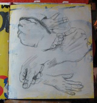
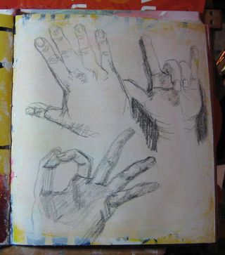
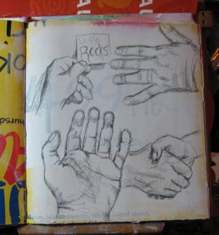
I work in a style that is very me, so be sure you have browsed the gallery of my art  to be sure you like my style. I work in black ink and create sensitive cross hatching to create areas of shadow. The background of the portrait will be painted in one or two colors, which you may leave up to me or specify. If you have me working on a portrait of your daughter and her favorite color is violet I’ll mix a shade of violet and have you okay it.

As the work progresses  I’ll email you progress shots and include you in the process as much as possible. If I’m able to do so I’ll record the process and create a video. When you see the finished piece you won’t be surprised but simply overjoyed.

I like to keep my pricing reasonable. The prices are based on size and materials used.
Pen and ink with single color watercolor background on acid free archival paper, single portrait:

  • Trading Card: $20
  • 3×5: $35
  • 5×7: $55
  • 8×10: $80

All sizes except the trading card size are matted and bagged in a KrystalSeal bag. The trading card size will arrive in a standard trading card sleeve. All pieces will come with a certificate of authenticity.

Email me here.

P7294648
P7294648
P7294648
P7294648
P7294648

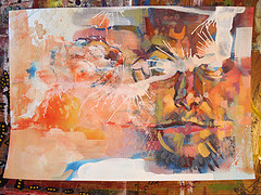
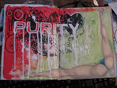
I also create unique one of a kind portraits in mixed media. The background is a combination of collage and acrylic paint with sketching and writing within the layers. In the area I would like to create the face I scrape an ultra thin layer of white paint, on which I draw the portrait. The portrait is drawn in a variety of colors. You can request that I work bright and I’ll use a bright color to start the portrait instead of gray. The image is built up of layers of gray, white and black. Around the portrait I’ll layer more stencils and more layers of bright acrylic paint. I may add a variety of other media to the portrait if I feel it needs more texture or particular pops of color. These portraits are 11×14 in size, come with a 16×20 mat and ready to be framed in a standard size frame. Each will also arrive with a certificate of authenticity. These portraits are $75+shipping.

IMAG0176
IMAG0176
IMAG0176

Process Process Process

Part of what I really like about my current sketchbook/journal are the edges of where the layers of paint are visible. I really wanted to capture that on some wood panels for finished pieces of art.

I started with some gesso board panels, these are used for painting or making scratchboard. I'm painting on them. I have both lightly textured and smooth. They are 5×7 in size.

I started by randomly laying down red, yellow and dark green paints. I let this dry and then I put a VERY thin coat of gesso over the whole thing. I let that dry and I began with the layers of color. My goal was to get the edges uneven and layered looking like in my sketchbook. I used lots of colors and layers to get the look. 

IMG_2298
IMG_2299


  • IMG_2300
  • IMG_2300
  • IMG_2301
  • IMG_2302
  • IMG_2304
IMG_2304


At the last layer of color I scraped some white paint over the center of the panel, so that the magenta paint would show through the layers of gesso. I then used my ROUGH brush to scrub the magenta on to the panel.

IMG_2306

The final step was to  put 2 rough thin layers of gesso onto the panel.  First with the brush strokes left to right, the second with strokes top to bottom. The final very thin layer was left to right and brushed on softly with minimal brush strokes. I brushed to the edge of the panel with dry brush strokes.


  • IMG_2307
  • IMG_2308
  • IMG_2309
IMG_2309


Here's what the  final panels look like. They will be ready for some portraits in a few hours. The layers of paint need time to harden before I hit them with a pencil. Check out the edges on these, I'm pretty happy with how they came out. THOUGH I htink this effect would be easier with some larger panels. I looked to buy a few 3 packs but ACMoore doesn't carry the gesso board anymore, so I'll be looking at Michael's the next time I get a 40% off coupon. I also looked at Home Depot to see if they carried the small masonite/hardboard panels like they used to and I couldn't find anything but the 4×8 foot panels.

IMG_2310
IMG_2311
IMG_2312
I swear the colors on these are much more intense in person.

Twitter Hand Experiment Part 3

I had a very long week at the DayJob. (I mean that in the best possible way lots of good stuff, but very tiring.) Sp my usual Friday routine is to come home, change into arting clothing and get to work at my easel. I started out but right after the first drawing I knew I needed a nap. So I hunkered down and crash for an hour or 2. Honestly I was never able to get into the groove for a significant amount of time.

I sat at my easel filled a page and got up. Normally I'm able to sit back down and get right back to it. You can see in my drawings how on each page I start out rough and work my way to the groove again and again.

To say the least it was frustrating, but I hope that this is not a pattern of events that will occur every week. I'm alright with taking a nap but not the never getting into a groove

The pics:

IMG_2294
IMG_2295
IMG_2296

Twitter Hand Experiment Part 2

I ended up getting tons of pics from people to draw. I'm working on the grainy and smaller pics first doing groups of hands on single pages. the first page you can see I was a little stiff and not getting the images well. The second page I got a little more warmed up and by the 3rd page I'd really got them down. I'm already feeling more comfortable drawing hands.

I figured that drawing the less detailed hands would be easier but in fact I think it's probably a hard things to start with because I really have to focus on the shape of the hand and if I get the angle of the thumb wrong it really just doesn't look right. I have to look at the negative space, the stuff around the hand and all that fun stuff. 

I'm making my way through the stack faster than I'd have expected.

Anyway, you're really here for the pictures so here they are:

IMG_2291

You can see that I'm a little awkward with my lines and shading in these hands, the fingers are too long, or too short, angles are off…
 
IMG_2292

This page I got a little better, a little looser and things started to come together.
 
IMG_2293

And here the shadows match up with the images the lines are right. I'm feeling more comfortable with the hands already.
 

Twitter Hand Experiment

I've written before about how important I think social media is for artists. It lets us connect with our friends and also fans. Early this AM I got kind of bummed about my difficulty with drawing hands so I set up a bunch of tweets about how much my hand drawings sucked and how I wanted people to tweet me pics of their hands. This am I had the brilliant idea of seeing if I could get someone who's art I really enjoy to tweet me a pic of her hands. So I tweeted at Amanda Palmer (Dresden Dolls, AFP, Evelyn Evelyn) this tweet and a little bit later she tweeted this back at me. My friends were already tweeting pics at me but after that I had a deluge of hand pics. I encouraged people to follow me because after I draw their hands I'm going to tweet photos of them. I followed everyone who tweeted a photo to me.

This is one of the more awesome experiments I've done with twitter. I've got a massive stack of prints of hands and a massive archive of hands to draw, and guess what? I'm going to draw them all.

You can draw along with me, I'll put up links below for some of the hand pictures so you can draw them too.

Links to the tweet with links to the pics in no specific order:

@craftjunkie

@lifeartdreams

@AmethystWax

@David973

@Monalinski

@msaester

@firrantello

@amandapalmer

@marykae

@springaldjack

@innistowinnis

@lydiaruth77

@iamanch

@ardentiaars

@zeeby

@mroseriddle

@bobschumaker

@artmodelandrew– this guy has a whole series of hand pics all sorts of poses!

@jupiterlullaby

@imcrook

@ginamieczkowski

@rocketrobby

@evelinetimeless

@emerson_street

@nightcsi

@badpatient

@lastwordy

@Emerson_Street

@blade21292

@poeticdreams

If there are more I'll update the list, feel free to draw along with me, as I draw them I'll post them.

Technique Tuesday: nanojoumo- purity


nanojoumo- purity
Originally uploaded by lessherger

This was a NaNoJouMo prompt. I'm working in an 8×8 inch journal with Strathmore 400 series drawing paper inside. The paper is 90lb. I started out by gessoing the page lightly. I used a soft brush so as to leave few brush strokes.

I then used red acrylic in the upper left of the spread. I then googled the word purity to get some inspiration> For whatever reason when I think of purity I think of the absence of it. I also think of purity groups and… Well I find them hilarious. I won't go into it here, this is neither the time nor place, back to technique.

I found a particularly bad example of a "purity card." It was clear to me that someone's mom had made it in MSPaint. The design work is terrible. I pulled it up into GIMP and began my changes. I cleaned out the word purity and darkened some of the lines as well as cleaned up some of the other junk in the design. There was no making it much better than it was. I then printed it via laser printed to some transparency film. I knew it would give me the true "grunge" look the original artist was looking for and had failed miserably to attain.

I slathered on some gel medium and crossed my fingers, transfers are tricky at best and one this size was a lay it down and hope for the best kind of thing. I began burnishing the image with my bone folder. It transferred better than expected with some of the smaller areas not transferring well at all. The main part of the image transferred perfectly.

I then googled the image in the lower right, a woman bent over with little to nothing on. The best source for this sort of image? Car websites, apparently this is a favorite pose. It took some searching to find a "decent" image to draw from. I quickly sketched the image in pencil I intended the image to be black ane white but didn't like the way the legs looked in bl&w, so I added some color and shaded them in purple tones.I filled in the white gesso area with some green watercolor crayon.

After everything had dried I used a white paint pen to outline and fill in the word purity. I wanted it to pop off the page. I then added some water to gesso to make a runny paint. I allowed this to drip of each of the letters. I loaded up a large liner brush with the gesso and spattered it over the page… I allowed the paint to drip off the brush in several areas creating drops and splattered blobs of paint.