Review: Composition Books at CVS 2018

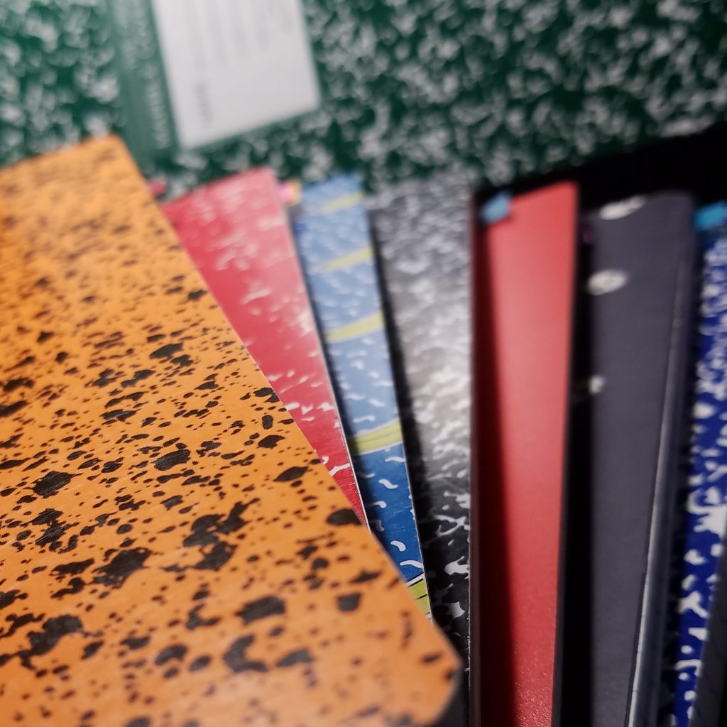
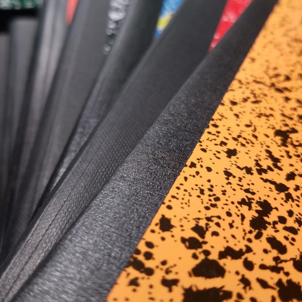
I decided to change up how I’m doing my review roundups of the comp books this year. Instead of big mass roundups, I’m dividing them into the stores where they were purchased. This should mean I’ll have a large grouping of reviews (Staples, CVS, Walgreens, Walmart, etc…) instead of 2 or 3 large unwieldy slow loading reviews. So saddle up, as the second installment we have CVS.

When I stopped by CVS this time, they were just setting up their Back to School display, it wasn’t fully fleshed out and nothing was yet on sale. Their sales are usually pretty terrible so I’m not holding out for the prices to get much better.

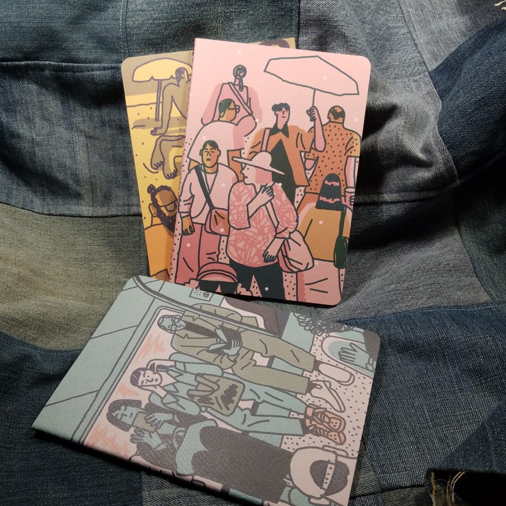
Studio C “Good Vibes” Collection

    • 100 Pages
    • Sturdy Cover
    • Well stitched
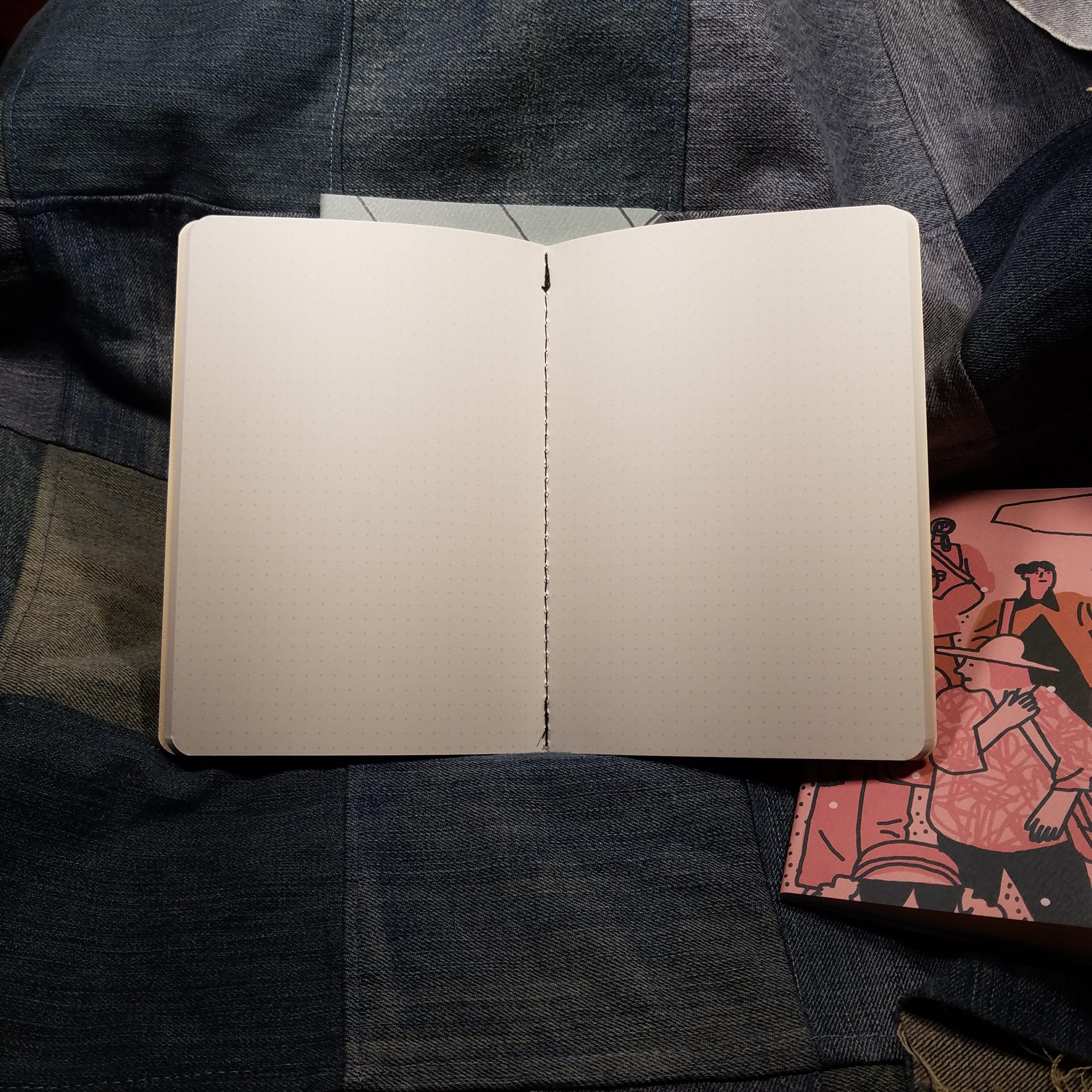
    • Classic pale blue ruling
  • $3.49 at regular price

Let me start off with the good about this comp book- the paper is superb. It doesn’t have the smoothness of last year’s but it holds its own. All my pens performed flawlessly. From fountain pen to ballpoint to pencil, everything felt great on the paper. All my inks that sheen has fabulous Tomoe River level of sheen, and not a speck of bleed or feathering. There is just enough tooth that pencil feel awesome but doesn’t get ground to a stump when writing a line. The pale blue ruling fades to the background. Overall this book is a winner. Getting one at a discount price will just be gravy on an already superior composition notebook.

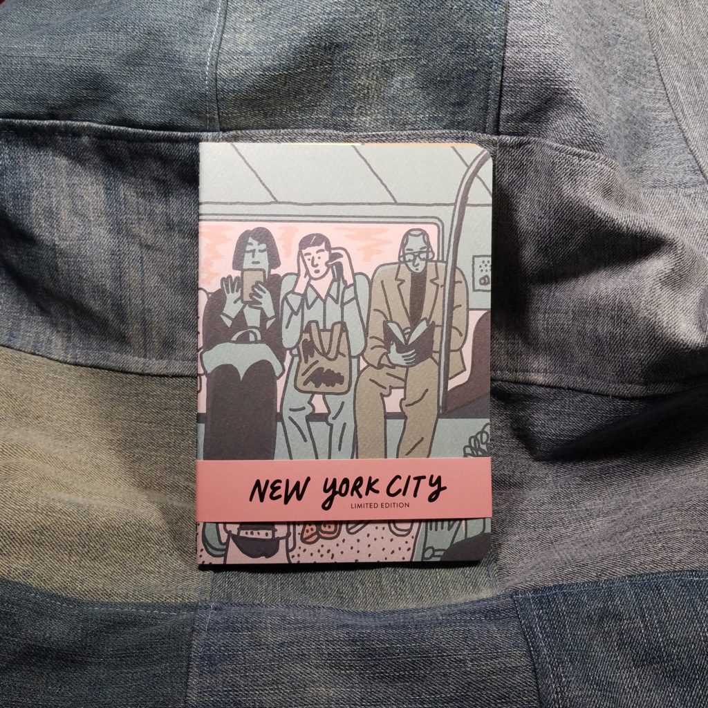
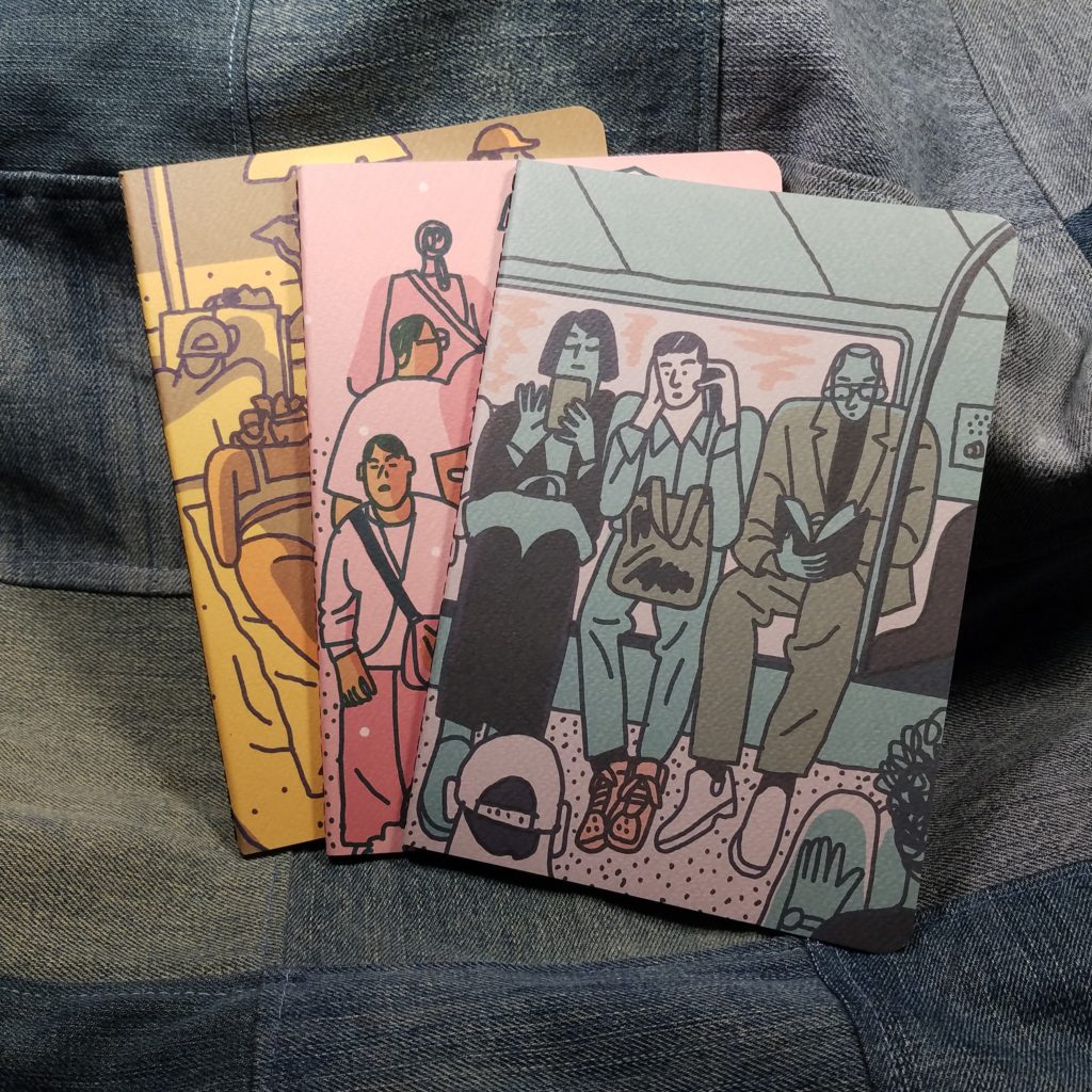
The bad part of these is that this year’s selection is tacky AF. I’m sorry but some of the covers were terrible. I picked out a bright glossy pineapple design which was the nicest on the shelf. The rest were awful. We’ll see what Walgreens has to offer. Last year’s cute woodland creatures were the best.

Ustyle or Continental Accessory “Animal Attraction” Collection

    • 80 pages
    • Sturdy cover
    • Sturdy stitching
    • Pale warm brown-gray ruling
  • $3.49 at regular price

The paper in this comp book is stunning and a surprise. Last year’s version of the UStyle comps was awful, like toilet paper soaking ability. But this year’s has a silky smooth paper that responds well to even my worst ink (Looking at you RK Verdigris) Inks that sheen, have an amazing sheen and every nib feels smooth and buttery on this paper. Not quite skating like on Tomoe River, but smooth and very nice. Pencil and all of my other pens felt lovely on the page. Not one ink or pen exhibited feathering or bleed through. Despite the paper being thin, you could use both sides of the page! I really dig the pale warm brownish gray ruling. It’s different but not so off that you give it a lot of attention, just different enough to be noticed. The covers are thick and sturdy enough that you can fold it over on itself and write in hand. Overall this is a killer comp book.

The one downside is the covers, some of the designs were quite nice, case in point the gold foil elephants on a navy background that I scored. Alongside that were plenty of awful animal prints with garish gold foil elements.

These two brands don’t represent the best deals of the composition notebooks available, but they represent some of the best paper available. If you keep an eye out for the sales CVS offers you will certainly end up with some great deals on these. Keep an eye out for their clearance section after BTS is done often my local CVS* often has things on ridiculous clearance prices as soon as the “season” is over.

Continue reading

Review: Composition Notebooks at Staples 2018

Staples comp notebooks are the venerable OG when it comes to cheap composition notebooks. So they rate a look despite disappointing performance in the last few comp book roundups.


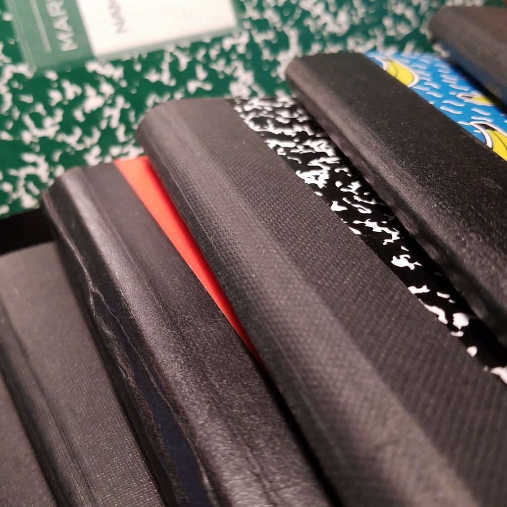
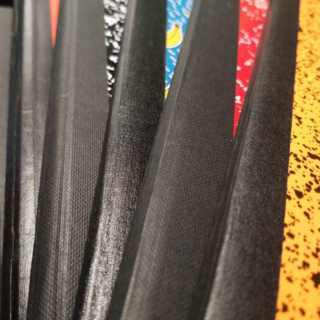
I picked up 2 of the 50 cent comp books, one made in Egypt and another from Brazil. Like in past years, the books made in Egypt sport a crisp squared spine while the Brazil books are rounded. The marble pattern is similar across both colors, a relatively even amount of color to white ratio. They are both stitched well with roughly ¼ inch stitches in the center. The taped spine is nicely textured and well glued down. I’d like to see a slightly more generous amount of tape at the edge, but that’s merely personal aesthetic.


The covers are thin flimsy cardstock, it feels pulpy and cheap. This has been a consistent issue over the last few years. The covers are floppy and don’t feel like they’d last a quarter let alone a semester. These will require a cover for protective purposes and support.
The paper in each is slightly different. I’ll start with the Brazil notebook. It performed the best of the two with fountain pens, despite being the best performer, it still performed dismally- loads of bleed and soak through and ghosting. The Brazil paper is smooth and feels good with Fp, and there wasn’t any feathering. In fact, Oster ink had sheen, but no other sheening inks exhibited sheen. Gel ink ghosted heavily. I did not like the Brazil paper for pencil, it didn’t have enough tooth and pencil marks smudged terribly.


The books from Egypt performed best with pens, despite being smooth they had enough tooth for pencil. The page was absorbent and fountain pen feathered, bled, and soaked through to the next page. Gel and liquid inks soaked through as well. If you alternate among your writing tools, this is a terrible choice in a notebook.


Despite the Staples comp books being a venerable OG they are played out and it’s time to retire them from new purchases, there are many other options out there for a good performer across all writing tools. Avoid the Staples comp book, for the second year in a row.

Continue reading

Review: Staples Quick Dry Gel Pen 0.7

Back-to-School sales are upon us, and this stationery lover is in heaven. A great side of the BTSS is that this is a time when companies like Staples push out their knock-off versions of more expensive well loved stationery items, in this case, I believe these are a challenge to Paper Mate Inkjoy Gel pens.

I’ve mentioned that the Inkjoy looks like an adult “toy” and in comparison the QDGP is Spencer’s gifts version. It reminds me strongly of the Papermate gray FlexGrip pen we used to get in the 90s. With the exception of the incised lines of the FlexGrip, this pen is nearly identical to the 90s version of the capped pen. His school me loved the rubberized barrel and fiddling with the incised lines in the grip.

Adult me took one look at the pen and thought, “Basic.” Then I wondered what the hell the design team was thinking. Shiny silver nose, matte rubberized body, colored translucent clip and knock section, then finish it off with a shiny silver knock. The diameter of the pen is thick and about the same as the Inkjoy. They are incredibly lightweight you can barely feel them in hand. The clip is next to useless. The nock delivers a satisfying click and is nicely springy feeling.

The colors are lovely, saturated and sharp on all the paper used. The color of the ink doesn’t match the body of the pen. Particularly the light blue pen body- the ink is closer to teal. The purple is very dark. The red is dark red and not pink. The orange is the only one that is the right shade. The experience of writing is a little less positive. The tip is a tad scratchy on several of the pens in my package. In particular the bright green and the blue were quite scratchy. The colors are water soluble even after drying for an extended period of time. I doubt that they are lightfast.

Inside the body of the pen are standard gel refills. I noticed that the scratchy pens had air bubbles near the tips and no amount of shaking and flicking of the pen moved that air bubble. We’ll see if use moves it and if the pen gets better after the bubble is moved.

Honestly, I’m not sure how I feel about these pens. I really like the orange and red color, and the light blue pen’s teal color is great, but if 2 out of 5 pens are meh is the package worth the cost at $5? When these pens work these are great basic gel pens that would work well for bullet journaling on a budget. (They are ugly though.) Continue reading

Review: Baron Fig X Caroline Weaver Elements Limited Edition Archer Pencil

It’s been a while since I’ve reviewed the core of the Archer pencils. In the last few iterations of the pencil, I’ve felt decidedly meh on the core. Viarco, the company that crafts the Archer for BF seems to have a great deal of QC issues resulting in shattered cores, grit, and other issues with the pencils. The last batch the Number 2 was quite nice and I loved the eye-popping color scheme.

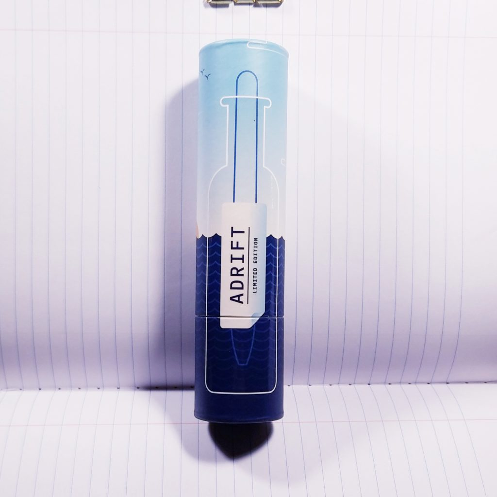
Elements is a different beast. This design could not be more different than the previous. The colors are muted pale shell pink and a sedate warm gray. The satin finish is lovely, though I think a full matte would have worked better with this sedate color palette. The wavered line between the gray and pink is lovely but doesn’t seem to match the general perfectionist aesthetic of BF. It feels like an inattention to detail rather than an intentional allowance in the process of dipping these pencils.

The tiny icons representing the various elements of a pencil hearken back to alchemy along with the design on the box that dissects a pencil into its various parts. I love the image on the package and the various lines and icons labeling the parts. The only icon that doesn’t make any sense for this pencil, is the icon for foil. There isn’t any foil on this pencil, so why have an icon for it?

The wood is cedar and smells stunning upon sharpening. It sharpens well with every sharpener I’ve used- Pollux, Bullet, Masterpiece and the ever chewy, Classroom Friendly. It held a point moderately well on most paper, including the Strategist card pictured in my images. I’ve used them in my pocket notebooks, cheap paper at work, and in a Confidant. Thus far the grippy grittiness I associate with Viarco pencils is more even and I have yet to feel like I’m cutting into the paper as I write.

Overall, this design looks lovely but has a few oddities. Like that icon for non-existent foil and the choice to use a wavy hand dipped a line in the middle of a tight design.  If you want a sedate pencil with grippy graphite this is a good choice. It doesn’t quite glide over a page but grabs the paper. It seems as if Viarco has gotten, at least with my package, some of their QC issues under control. These pencils will not be for everyone, particularly if you like silky smooth graphite or eye-popping color, look elsewhere.

Continue reading

Review: BIC Gelocity 0.7 Gel Pen

My wife picked up a 12-pack of these cheaply from Amazon a few weeks back. As we generally do with stationery supplies, she shared a pen with me. I immediately took it with me to work and put it through the ringer. My results are reported below.

As I’ve shared before a gel pen that lasts more than a week at my DayJob is a winner, the Bic Gelocity lasted for a week and a half. The ink flow is smooth and consistent without skipping. I did find that I’d get a blob here and there when I’d filled out a full page of forms. Blobbing was minimal and didn’t smear. I suspect the few moments of blobs would make this a non-starter for lefties. The ink does dry very quickly, within a second or two on the cheap work paper and a little longer on better paper.

I found the black ink nice and dark. I have not tested it for lightfastness. I did a wash of water over some lines and there was minimal lifting. With a longer dry period, there was no lifting of the pigment. As a result, this could be a contender for a great sketching pen for urban sketching.

I found the contoured rubber grip to be comfortable. The pen design itself is pretty benign looking reminding me of many other retractable pens- from the Zebra Sarasa to the Pilot G2. The clip design is useless. After a day of use, it was falling off the placket of my shirt, falling into my shirt and onto the floor. Annoying on many levels. An attempt to bend the clip back into a tighter configuration saw the brittle plastic snap. Even more annoying.

Overall, this is a great pen if you are working on an absolute shite paper at your workplace. The ink doesn’t sink super deep into the page, but it also doesn’t smudge once you write. The black is deeply dark and photocopies and scans like a champ. The nice flow means you can doodle for days and not feel like you are running out of ink. The refill absolutely drains to the last drop too. This is a great pen for cheap paper and doodling.

You can find them at Target, Amazon and other retailers.

Continue reading

Review: The Curios Pencil by Apsara

The Curious is a shop run by Suraj Singh on Facebook. He specializes in pencils and pens made in India. You purchase by messaging him, asking him for the price list, then sending him a request with the items. You get a general idea of the cost from the price list. Prices are cheap, but shipping is not. That said his prices are fair and comparable to everything I’ve seen on Amazon, and in some cases better. Depending on how many items you order from him you get your items packaged in bubble wrap and inside a plastic case.

I ordered 50 of “The Curios” pencils and a few others. The case is a nice hard translucent plastic that seals shut with two tiny clasps. The 50 Curios pencils arrive with 5 Apsara Long POint Sharpeners, a decidedly nice cheap plastic sharpener. Cost varies for person to person based off your address. The cost for me to an East Coast US address was $33.50, and that includes shipping and handling, with tracking from India. Suraj was quick to ship and kept me updated with shipping info.

It took awhile for the pencils to get here, a little less than a month. They were well packaged and safe in the plastic box.

Inside the box were 50 pencils, as requested. The pencils had cores that were, kinda centered. None of the pencils in my package were horribly centered or unsharpenable, but some were pretty off center.

The pencils appear to be made of basswood or linden. They are coated in a thin clear lacquer that is glossy and well applied. The imprint is well applied on most of my pencils, off-center on a few, but not enough to complain. The ferrule is a rose shade of gold and holds an Apsara white eraser. All the usual complaints about Apsara erasers apply here, they are ok but not exciting.

Inside the pencil is smooth and dark for an HB, it is darker and smoother than the Apsara Marbled, but not as soft as the Super Dark or Extra black pencils. They hold a point for a long time and are great for writing.

These are a lovely pencil for the price. You get a slightly more even product than purchasing the Apsara Marbles, for a little more money. I’m a fan of lightly varnished naturally colored pencils and Apsara pencils in general, so these tick a lot of boxes for me. I see them as well worth the cost. If I wanted to cut costs, I’d buy a buck of the Marbles on Amazon and have a similar writing experience.

Find Suraj on Facebook here.

Continue reading

Review: Aquabee Co-Mo Sketch

I picked up the Co-Mo Sketch 30 sheet pad on a whim at The Art Mart in Portland, Maine several years ago. Back then it went for $5.73, or roughly 20 cents a sheet. What I can find online is comparable in price.

The paper is toothy and has a lovely evenly rough texture. It is a perfect sketching paper for pencil, colored pencils, and even thicker nibbed pens. I did a quick sketch with a medium nibbed fountain pen to good results. The paper shines with the addition of watercolor washes.

The cover touts it as good for light washes. Well as you can see in the videos for my #100daysproject, I’m hitting that paper with a lot of wet sloppy color. It handles it like a champ. It does cockle and wrinkle as I use it, but it evens out as the page dries, resulting in a decently flat page at the end. When overlaying and lifting a lot of color from the wet page the paper can pill a bit, but overall the paper handles the wet sloppy color I throw at it with ease. The bright white 80lb/130gsm paper is sized well enough that the color looks sharp on the page. Pencil layers onto the toothy paper to create light lights and deep darks. Pencil erases cleanly with little effort.

Overall this is a great multimedia paper that is affordable. I want a journal made of this stuff.  

Continue reading

Review: Staedtler My First Norica Jumbo Triangular HB Pencil

The name of this pencil is a mouthful. This is a jumbo triangular pencil, if you’ve used other large diameter pencils, you’ll like this one. This is a full jumbo, but triangular. It’s fat in hand. I sharpened mine with the Dahle 133, which puts a vampire staking point onto any jumbo pencil. The MFN didn’t disappoint what a lovely point. It sharpens well with the Dahle but also the small hand sharpener, just not to the vampire killing point.

The finish on the MFN is average but glossy and blue. The same shade as the not-US version of the standard Norica. Inside is the 2014 Norica core. It’s thick, smooth and dark, everything we loved about the early days of the Norica. It holds a point for a long time and looks great on every paper I’ve put it on.

Overall this is a lovely, if hard to find pencil. I cannot find them on Amazon or from a reputable dealer online. I purchased mine at Bob Slate in Cambridge, MA so if you are looking for them they are 95¢in their loose pencil display.

If you find a good online source for these pencils, post it in the comments!

Continue reading