Tag Archives: draw

Review: Rhodia Webnotebook aka Webbie

Stephanie of RhodiaDrive hooked me up with Karen of Exaclair, the American importer of several very fine French made stationary products so I could do some reviews. I received a box in the mail and I felt like a kid at Christmas. There is nothing quite like opening up a box of sketchbooks to get my heart racing, well pen products would be a close second. Anyway, one of the products contained in that wonderful box was a Rhodia Webnotebook. It’s the larger size, 5.5×8.25 inches (I14x21cm) with blank cream colored pages. There are 96 sheets or 192 pages.

When I first opened the covers the color reminded me of oak tag; creamy, warm and lovely. The paper is 90g (roughly 24lb) which seems kind of thin when you’ve been working on 140lb watercolor paper for the last few months. When I ran my hand over it felt glassy smooth. Clairfontaine paper is known for this feature and is sought after by people who use fountain pens.

The cover is black with the Rhodia logo inset into the center of the front cover. Like all notebooks of this style there is an elastic to hold the whole thing shut. The plastic/vinyl of the cover is soft, like fine leather. I have a journal made of deer hide and the feel of this pleather rivals its softness and feel. I handed the journal to someone to check out and she actually said “Ooohhh, that feels nice that feels really nice, what is it?” Like, leather the cover does show greasy fingerprints, unlike leather those greasy fingerprints wipe off with a damp rag. Yes, I tested this by eating French fries at my desk and picking up the journal and having to wipe it clean.

Continue reading

Review Redux: Canson XL Watercolor Pad

I reviewed the Canson XL Watercolor pad a few weeks back, mostly with inks and scraping of acrylic paint. I determined through that use that it would be #1 a great paper for binding into a journal #2 great for watercolor crayon and acrylic. I didn’t put it through its paces with watercolors.

I did this weekend.

I use a variety of watercolors from Holbein to Academy. This paper holds the colors true. For a cold pressed paper the paint absorbed just enough to dry quickly but allowed for easy lifting of color when needed. Some “student grade” watercolor paper sucks. Its cockles, it’s as absorbent as a paper towel, which is not the case with this paper. It’s good stuff.

Check out some of the images below, all are done on the XL watercolor paper. Vibrant saturated colors throughout.

Zura Beth facebook face experiment

@JournalChic facebook face experiment

I can without reservation recommend this paper for watercolors. It’s cheap enough for throwaway sketches and nice enough for finished work.

Thursday Review: MiquelRius Grid Notebook

MiquelRuis 300page Grid Notebook with Red vinyl cover

I bought this notebook 4 or 5 years ago while searching for a Ciak brand notebook. As a notebook snob and a bookbinder I find this book to be just MEH.

First it’s perfect bound- glue with no stitching. Eventually with hard use pages will fall out. It’s just a matter of when not if. Perfect binding is simply not sturdy enough for the kind of abuse I put my notebooks and journals through. I will say that I’ve been carting this notebook around for 2 or 3 months and it’s held up pretty well so far. Also due to the binding and thickness of the book, it will not open completely flat while writing, which is a nuisance.

The pages are 15 to 18 pound in weight and very thin. Almost every pen I own strike through (is visible on the reverse side) and 90% bleed through. This means I can only use one side of each sheet of paper. So that drops the 300 pages of the book down to 150 usable surfaces. So even if I wanted to brave the non-flat writing surfaces of the left side of the notebook, I could barely read what I wrote. Additionally some of the inks I own feather like mad on this paper. I’m talking about relatively well behaved inks like Diamine Chocolate Brown.

The paper is very smooth and has the best light pale blue grid I’ve ever seen. It’s what drew me to the brand in the first place. After looking at a dozen or so gridded notebooks, I fell in love with the pale blue of this grid. It’s pale enough to blend into the background and not interfere with the writing when you are referring back to your writing. The pen glides over it. It’s not as smooth as Rhodia or Claifontaine paper but its way better than Moleksine paper. Ink is better behaved on the right side of the MiquelRuis paper than moleskine paper. The paper definitely has a right and wrong side for fountain pen use. One side is smooth and the other has a little more tooth to it and grabs the tip of the pen ever so slightly.

The format of the book I purchased is great- at 6×8 inches I’m finding the page size perfect for writing and recording thoughts and sketches. The size is good for slipping into a book bag.The 300 pages is a tad on the heavy size for every day toting about but if it were the only notebook you were to carry it wouldn’t be bad. They come in 100 and 200 page counts as well.

Would I buy another one of these notebooks? Probably not. The bright vinyl cover is nice but doesn’t speak to me the way a leather cover does. The paper’s lovely pale blue grid is about the only thing I really like about this notebook. Using both sides of the page is important to me, using just one side seems very wasteful to me. I prefer a stitched notebook for durability. I have to mention that pale blue grid again; it’s why I keep reaching for this notebook. This would be a good gift idea for the vegan writter on your shopping list. They also offer a host of recycled vinyl options that I'd like to see.

I purchased mine about 5 years ago at Barnes and Noble. I notice that the brand is no longer listed on their website. When I purchased this particular note book it was the last one on the shelf. It cost $10. You can buy these notebooks at the miquelrius website here.

Pros:

  • 300 Pages
  • Sturdy Vinyl Covers
  • Cheap $10
  • Great pale blue grid
  • Mostly fountain pen friendly o n the right hand pages
  • Smooth paper is nice for writing

Cons:

  • 300 pages are heavy
  • Almost all my pens and inks exhibit strike through and bleed through
  • Not good for a wet nib
  • Can only write in it- sketching would result in horrible bleed
  • Forced to write lightly
  • Perfect bound- not very sturdy
  • Won’t lay flat when writing.

Some inks that did well on the paper:

Noodler’s Bulletproof Black, Eel Blue, Walnut, Beaver, Eternal Brown and anything BUT Herbin Bleu Nuit in an EF nib.

Review: Canson XL Watercolor Pad

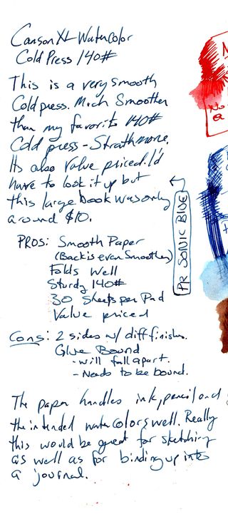
I picked up a Canson XL 30 sheet pad of CP 140# watercolor paper a few months back with the intent of comparing it to my favorite inexpensive paper, Strathmore 140# CP 400 series. It compares well.

First off, it comes in a glue bound pad which is good for bookbinding not good for art journaling. To me a glue binding is temporary and won’t last, I abuse my art journals and thus this pad would absolutely not hold up to my use. The paper folds in half easily and without cracking. This is a bonus if you are intending to make your own sketchbook or journal. The grain of this paper is along the short side, which again, is perfect for binding.

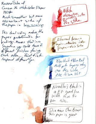
The paper is thinner and softer in feel to other 140# paper, specifically the Strathmore. It’s still stiff, but is not quite as stiff as cardboard. The cold pressed paper is textured more on one side than the other. The Canson CP is significantly less textured than most other CP papers I’ve used, and I’ve used a lot. The reverse size is significantly smoother than the front. You can feel and see the difference in texture. The amount of sizing is different too. The differing texture and sizing means that when binding you either let the different textures face each other OR you pull the pages out and face them together.  It’s an extra step in binding that makes an art journal more pleasurable, versus getting into the journal and realizing each facing page responds to pen, ink, and watercolor differently. I find that annoying.

Ink mix0013
Ink mix0013
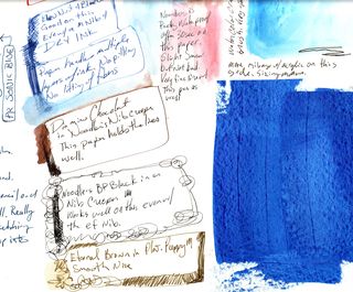
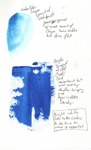
 The paper handled ink like a dream. Even my fine and extra fine pointed fountain pens floated on its smoothish CP surface. Noodler’s bullet proof ink bonded with it well and other inks gave me a wonderful watercolor effect. The pages handled watercolor crayon like a dream and scraped acrylics like it was made for it. I noticed even with repeated brushing and scribbling layers of ink no pilling or pulling up of fibers. Either side handled them well. The reverse and smoother side was much more absorbent, so an even pull of credit card scraped acrylic got less coverage but was decent. The paper is heavy enough that I did not notice any wrinkling. Watercolors of course gave a cockling effect that soon relaxed as the paper dried.

Ink mix0015

Ink mix0015
This is a budget friendly pad of paper. I purchased it on sale for around $7; regular price is around $13 for the 11×15 in size. It’s not a bad price, especially for a pad that is easily folded up for making an art journal. I found it on Amazon (see below) for $4.59 in the 9×12 size, which is not bad at all. I was unable to find the 11×14 on Amazon but did find it on the Blick site for about $7.


Continue reading

Wordy Wednesday: Creative Commons; with attribution, non-commercial

In my world, copyright's purpose is to encourage the widest participation in culture that we can manage – that is, it should be a system that encourages the most diverse set of creators, creating the most diverse set of works, to reach the most diverse audiences as is practical.- cory doctorow

The above quote got me thinking about copyright, people stealing my designs, and the wide open world of the internet. Last weekend, most of you may have missed it, as I failed to announce it, I opened my entire flickr stream up to Creative Commons(CC), Attribution, non-Commercial. I had the setting previously to All Rights Reserved. I read this article with the above quote this AM, about a week after making the decision to go creative commons with my photos. I've also made the difficult decision to set my blog, back to the first entry on blogspot to the same creative commons as the flickr set.

This has been something I've been mulling over for months. I see the internet and thus my blog and photos as communication. I've always seen the important part of them is as a tool of communication. By setting my flickr to "all rights reserved" I forced people to ask permission before blogging one of my photos, or worse yet, forcing them to make the choice between asking permission and just not blogging one of my images. Over the last year I've seen how foolhardy that is, first hand.

Over the last year I've featured a lot of artists here on my blog from flickr. I've been forced into the same choice I've forced people into- ask permission or not blog. I'm ashamed to say, I've made the choice to NOT blog more times than I can count. I started out with the whole idea of the feature from flickr to showcase some of the work that makes my heart pitter patter, things that bring both enjoyment and inspiration into my life. When you go "all rights reserved" the viewer entranced with your image is forced to ask you permission to post your images. Flickr takes away the easy access. I'm forced to go from the awe and inspiration phase into thinking about business before I hit "post." Instead I hit "send flickr mail" and type up a quick email asking permission. More often than not I get no response. So after sending several hundred "Hey can I post your pic?" emails I quit.

I quit because a blogger asking an artist's permission to use their art- with attribution and a link back to the original image with a paragraph about WHY the blogger loved the image wasn't enough to get a response from most people. I have my flickr mail set up to send me an email. I can read the email and decide if I want to respond with a yes or no. I'm willing to bet from the utter lack of response I've gotten when I asked permission that most people don't have that set up. Or people just didn't care about getting their work posted on someone's blog.(Even with hundreds of readers a day!)

The real question is why would any artist want to shut down an avenue for more people to hear about and see their work? The more eyes on your work= the more potential sales. The more people talk= the more sales. To me allowing people to easily blog my images is a win-win situation. They write about my work and people see it= win. If someone wanted to use my images to illustrate a blog post, they can easily do that, all they need to do is link back to either my blog or the original image in flickr. Again, I see this as a winning situation.

Recently one of my favorite artists went from easy access sharing to no access. I was looking through her flickr stream and found a whole host of images I was considering posting with a week devoted to her work. When I went to set up the posts, I was shut down. I was no longer able to use the flickr "post to blog" option, nor was I able to use the "embed image" option. The artist had shut down all options to share her work with others. I was and remain baffled. This is an artist who has had several shows of her work and is well establish and until 3 weeks ago, allowed open sharing of her images, with attribution as long as there was attribution, which I had always given. I have to wonder why someone would do something like that.

On one of Hazel Dooney's recent FB updates I wrote that I felt people should have more access to artists and their work. CC is one way to do that.

Of course, there are always people who are going to steal your stuff. It's the nature of people, the internet, and commerce. Like it or not we're in a commercial business (like it or not art, writing, and images are commodities) and we have a choice- let people steal or take control of our commodities and sell to people what people steal from us. I, for one, am tired of people stealing my designs. So, I will continue to make and design my stuff but I'm going to open a lot of it up to the CC and see what happens. Make anything I create for yourself but start to sell and we'll see what happens. This isn't tricky legal territory. You can read all about the CC here and educate yourself in it, it's less complicated than you think. It also puts the screws to the people who would take your hard work and rip you off.

I tweeted that I was frustrated that people had essentially stolen my pen slip design and were offing the product at a premium price. I'll be honest it's frustrating to use my creativity and come up with an idea that is immediately ripped off. Eventually I gave up on making the pen slips I'd been handcrafting in my basement, individually with care and attention to each one. I gave up becuase I felt I couldn't compete. I see now exactly how misguided I was by giving up. People will always buy the original from the original. There lies my big mistake. Should I start up on production again, it won't seem like I'm the original, no I'll seem like a copy cat, though I've got images in my flickr pool dating to way back in 2006. Giving up was the worst idea I've ever had. I've been kicking myself about it every day.

When I realized that I was doing the exact same thing I hated on flickr, I knew I had something to fix. I looked through flickr and figured out how to make the change and made the best CC licensing choice for me. Should you want to use one of my images in a commercial manner, email me. We can talk, but if you want to feature me on your blog, that's easy, now! Use the flickr share option and share away!
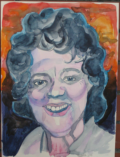
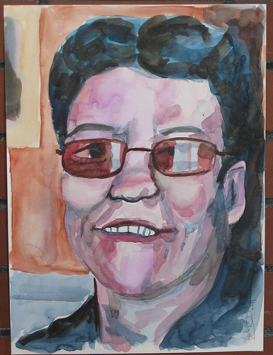
Art Habit part 1

I’m making a commitment to write more. Partially so my writing gets better but also because I’m working on a book. I’ve mentioned Art Habit once or twice before but this is my first public commitment to making it work. InkyGirl.com has 3 challenges on her blog, one of them is a challenge to write 500 words a day. When I’m focused on writing I can easily churn out 1500 words in an evening. When I’m not focused I write nothing. Goal setting is supposed to be good for success so I’m setting a 500 words  a day goal. Will I keep it? Who knows. I hope so. I suspect it’ll be an easy goal as 500 words is just a few paragraphs and about a decent blog post.

I can never keep to NaNoWriMo as it’s the busiest month of the year in my retail job. I’ve signed up nearly every year and failed every year. This year was no exception. I started and I’ve got about 10 to 15,000 words of Art Habit written. I’ve got another 10,000 or so stewing in my head and in various manners in various journals and I’ve given myself a commitment that in 2011 I WILL finish Art Habit. It WILL go into publication in 2012. That is my commitment to myself. This is something I’ve been working on for years, it’s been stewing in the back of my mind since 1998. Every year I’ve given up on it, put it further and further to the back of my mind and told myself that it can’t, won’t, and shouldn’t happen.

This is the effing year I MAKE it happen. This is the year I’m taking a sabbatical from my DayJob, working on an art show, a book, my blog and all the stuff that is important to me.

So let me tell you a little bit about Art Habit. It’s about making and keeping an Art Habit, how I’ve managed the screw up my Art Habit over the years, how I’ve shot myself in the foot, repeatedly year after year, and how I finally found my niche, my place and the ability to keep my Art Habit alive and strong. It’s my story, with some questions in there for the journaler and artist. It’s an exploration and I’m inviting you along to see what has worked and what hasn’t worked. It’s poignant and heartfelt. I’m going to let it all hang out and see what happens. Honesty is good. Hopefully you’ll enjoy the story.

I plan on sharing excerpts as I write here on my blog, I invite you to share with me, in the comments, your thoughts, feelings and stories. I invite you to share with your friends my words via your blog. I want you to muse on my writing in your journal. This is a personal journey I’m sharing but I’m inviting you along.

I can tell 2011 is going to be a spectacular year.

Continue reading

Traveling with your Art Journal: 2 Videos

I've been working on my travel journal for my upcoming (no fun) trip to Maine. I'll be up there for almost 2 weeks. I don't usually take my acrylic paints with me and I know that I'm not going to have the time I often have to work on the pages with watercolors. I like to work on colored pages so I've gone through and I've collaged into the journal random images from Mother Earth News, Wine Enthusiast and some collage papers. I've gesso'd the pages then used thin acrylics to color each page. After that Iused watered down acrylics in 3 colors to tone down and grunge up the pages. I'll be doing a whole video on that soon.

Anyway, here are the videos!

When I finish filling this journal I'll be doing an art journal flip video. I may try to do some process videos too. I'll have my cameras with me when I'm traveling, so we'll see.

Art Journaling Technique: Grunge Backgrounds

This video is about how to make a cool grunge textured background. I looks like peeling billboards and paper. Easy to do. You need the following to create this back ground:

  • gesso
  • acrylic paint
  • Glue (PVA)
  • Watercolor crayons, pencils or paints
  • Spray inks (optional)
  • Sanding Sponge or sandpaper
  • Magazine with glossy pages.


Technique Videos

 Below you’ll find a list of art jouranling technique videos available for FREE on youtube, Vimeo and Blip.

This is a list of peeps I’ think make videos without too much bull
shit. You won’t need to fast forward through half the video to get to
the techniques being shown, listen to minutes of inane babbling before
you get to the real thing your there for. IN no particular order and
with commentary:

  • MIllande.
    Her videos kick serious butt. She focuses straight away on technique.
    It’s all how to and what to do with a serious focus on real techniques
    and not expecting you to create in her exact style. Information without
    BS. She does do classes but she does a ton on youtube.
  • Willowing.
    Some BS* but a lot of video of her making art. A lot of videos of her
    making art in journals. She shows her techniques. She also does online
    classes.
  • SamanthaKira.
    She’s occasionally a little long winded and occasionally she gets into
    scrapbook mode but her videos are filled with technique and little to
    no BS.
  • TheOneMinuteMUse The one minute muse has videos that are all about 1 minute in length to give you some ideas to start creating.
  • GaryReef gary
    reef is not technically an art journaler but he has hundreds of videos
    up on youtube all about art and making art, and he makes some of them
    in his underwear. 
  • ArtCentrix Not cute art. Love that. No BS either. The techniques are pretty clearly detailed and shot.
  • TheArtJournal. No BS here either, just video of the artist working
  • Mystele All art technique and watching her paint. No BS. Some talking but it’s about ART.
  • Rhomany’sRealm Some BS* but good videos of her making art, and generally positive videos about art journal keeping. She does do some classes through Willowing’s Ning site.

If you have any links to a youtuber without the bull shit leave a
comment and I can add it to the list. I”m going to make this a “page”
that will be links on the left of my blog all the time.

*On this page I mean BS to mean that there is talk, not the style of BS that got me started in making this page which is negativity and a general LACK of art discussion or technique or simple pimping of one’s art classes.