Tag Archives: journal

Review: ScribbleSheets Orange Opal Edge Journal

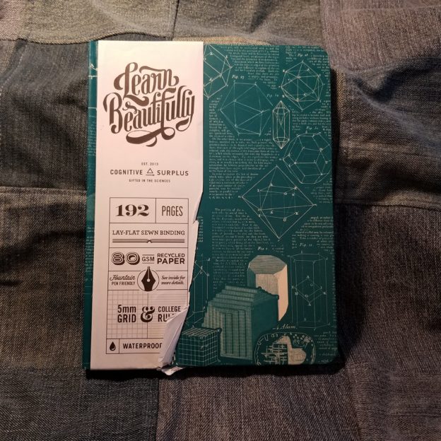
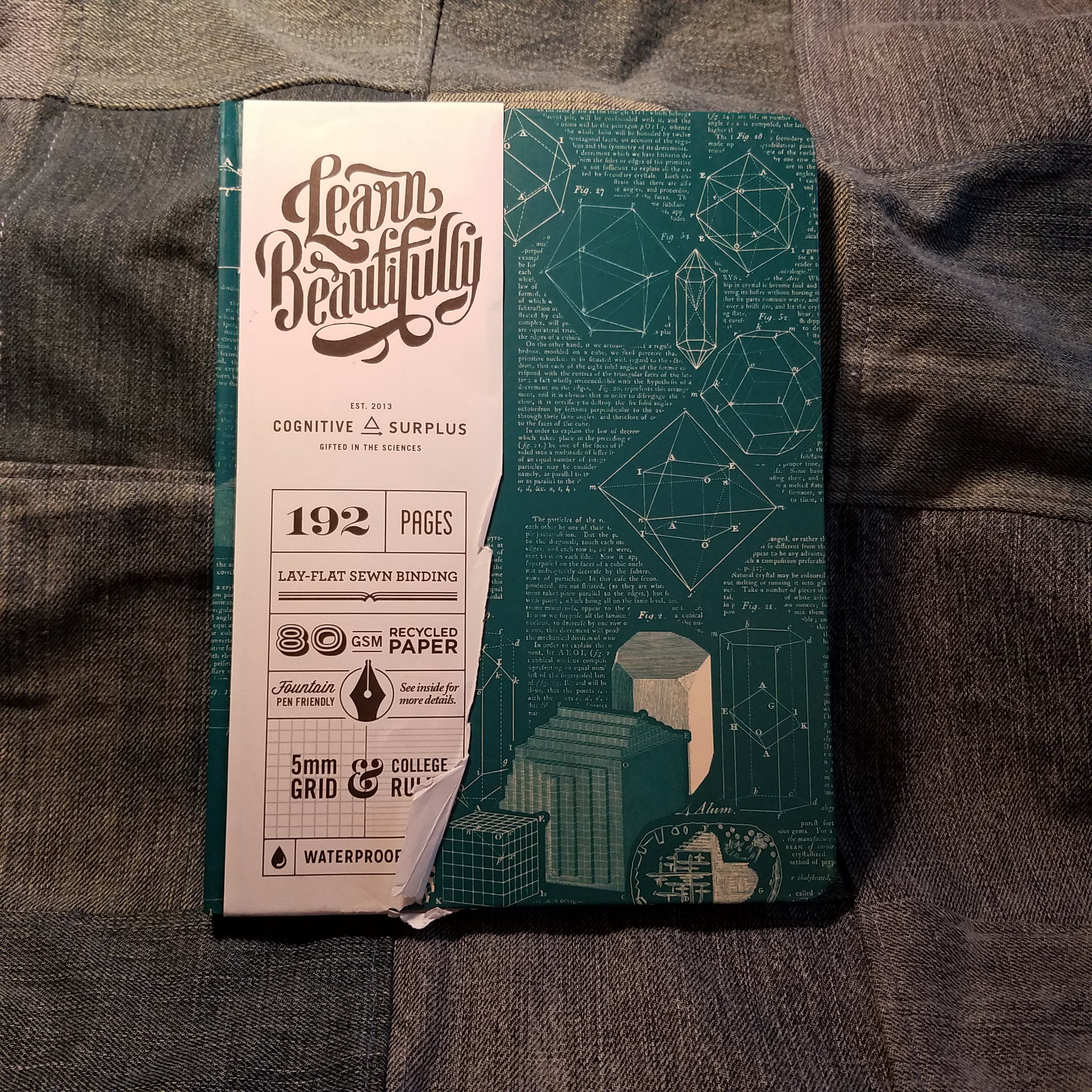
ScribblSheets popped up in most of my social media feeds and I admit I was quite taken with the pretty edges. I reached out to the company and requested a copy for review, I’m really glad they said yes. Shipping was delayed due to the current state of the USPS, but wasn’t as bad as some of the other things I’ve ordered recently. The journal was packaged in a bubble mailer and within that a crisp cellophane wrapper.

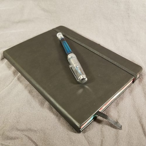
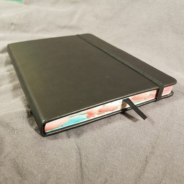
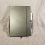
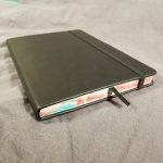
At first glance the ScribblSheets Orange Opal Edge journal looks like a standard moleskine style journal, and in many ways it is. It measures 8.25×5.75 inches or 21x14cm also known as A5. It includes a sturdy elastic and a generously long narrow ribbon. The ribbon arrives heat sealed but I hit mine with a lighter just to get that seal a bit extra.

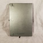
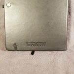
The covers are black vinyl or what everyone is calling vegan leather these days, and I won’t rant on the disingenuous nature of the idea of vegan leather. It’s plastic, and vinyl at that. It’s a nice vinyl and feels grippy and slightly squishy. On the lower back cover the ScribblSheets logo is debossed. It’s small and tastefully done.

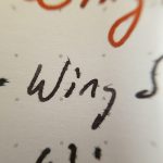
The back cover sports an elastic loop for a pen, it’s large enough to accommodate a fountain pen, mine is currently holding my Wing Sung 3013. But It’ll hold a Preppy snuggly. It will not hold a pencil. I find that it’s a tad narrow and my pen flops around a bit, but in my Lihit Lab Bag in Bag it’s fine.

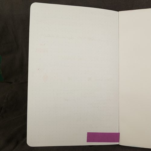
The inside back cover lacks a pocket, but I added a little slash pocket of my own. Inside there aren’t any markings at all. No logos, no square or lines to write your name or address. I used a ruler and added mine own in pencil then cleaned it up. Easy. There aren’t any page numbers either.

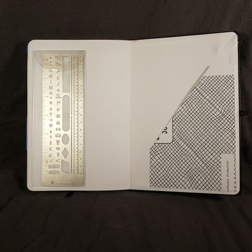
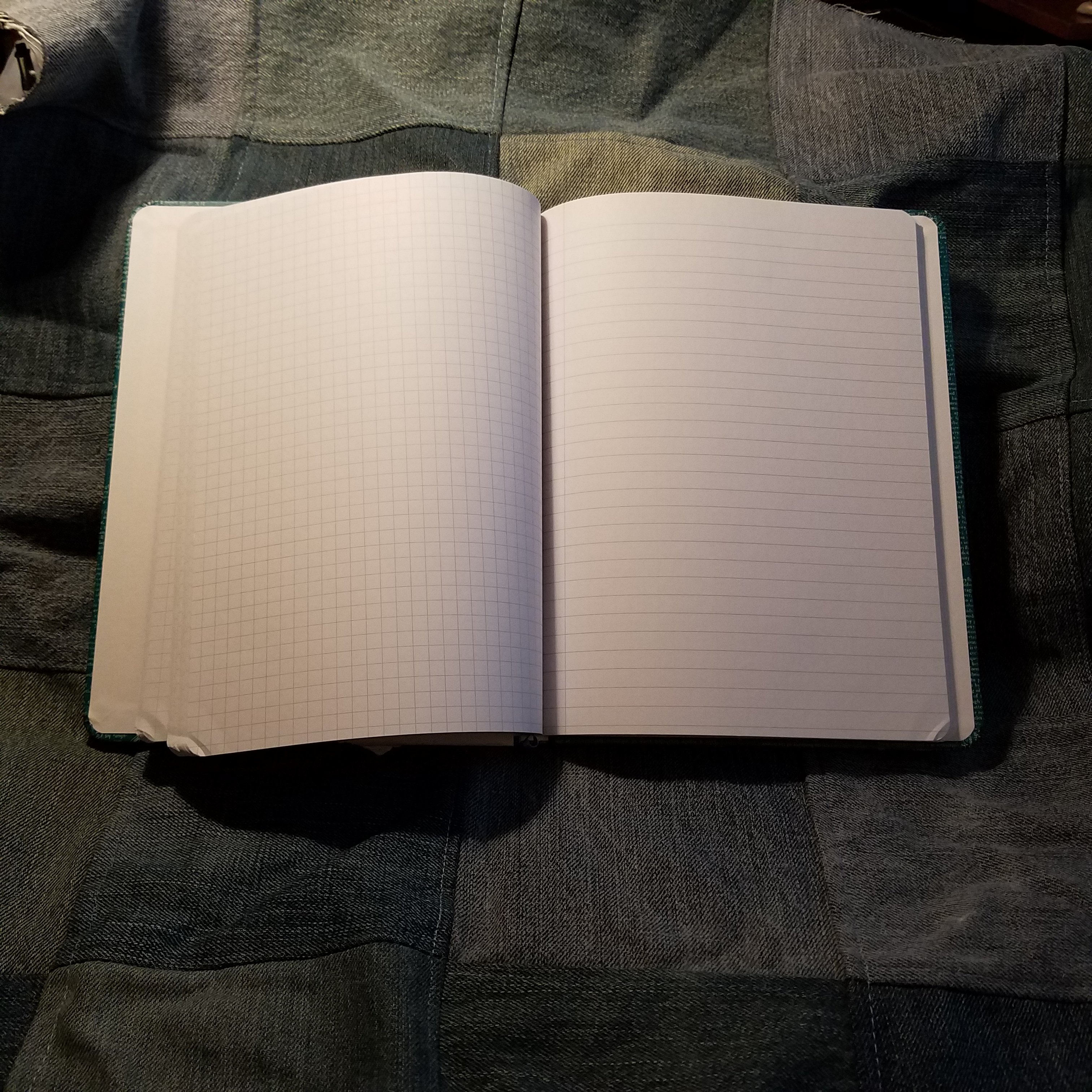
The grid is perfect. It’s the palest grey imaginable, so it completely disappears behind your writing no matter the color. I love it. At 5mm it’s a perfect distance for my writing. Each page has 40×28 dots per page. It’s a good number for a bullet journal- enough spots for a monthly log and more than enough for a day’s task list. My Peter Pauper ruler works perfectly with this grid size.

The paper is amazing with pencil, it’s got just the right amount of tooth for an HB like the Musgrave Harvest Pro or even the firm core of the Blackwing Eras. I also really like it with ballpoint and gel inks.

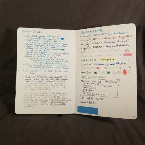
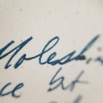
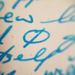
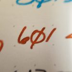
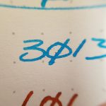
The paper does okay with finer nibs and well behaved fountain pen inks. You’ll be able to see in the images some long fibery feathering that reminds me of the old moleskine paper. But then it does fine with other inks and nibs. Generally, thus far I’ve been sticking to my Wing Sung 3013 loaded with Shaeffer Skrip Peacock Blue. It has been doing really well with this ink.

Now, let’s talk about the Orange Opal edge on this journal. It’s incredibly pretty. I’m not sure how they get the edge colored, I’m assuming that it is some sort of printing process, what ever it is it’s great. The colors are lovely and soften as the journal is opened. I really love the pattern and how it looks. It’s a nice touch on a nice journal.

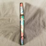
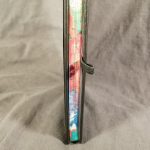
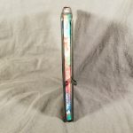
Inside there are 160 pages stitched in using the Smythe (the same as the moleskine) style. They lay flat and the pages stay open. I had a few loose stitches in the start of my journal, but it didn’t impact my use. I had absolutely no glue creep between signatures or at the stitches. The block of the journal is affixed to the covers well. Like most journals the spine is stiff at first but then opens flat and is flexible.

Overall I really like the ScribblSheets Orange Opal Edge Journal. With 160 pages I’m not looking at more than 3 or 4 months use before I have to start a new journal, but I like starting a new journal. At $16.99 it’s not cheap but the pretty edge is a nice design element, and while the insides are sturdy and useful, that edge makes this journal stand out. It’s a pretty element that might seem a little frivolous at first, but it’s an understated design element that only the keen observer of your bullet journal will notice, but I notice every time I open up the journal. I like that.

This isn’t going to be your fountain pen journal, but the journal you use on the go with a pencil or gel pen, maybe even a Bic Cristal.

Continue reading

Review: Cognitive Surplus “The Hypothesis” Hardcover Notebook

Cognitive surplus designated this a notebook but it functions quite well as a journal.

The nitty gritty:

  • 7×9 inches
  • Hardcover, with a waterproof coating
  • 192 pages of 80 gsm paper
  • Pale gray ruling, graph on the left, lines on right; available in different ruling online
  • Fountain pen friendly paper, with medium or smaller nibs
  • Designed in Portland, OR made in China
  • Lengthy gray ribbon page marker.
  • $18.95 at Bob Slate in Cambridge MA, and in their online shop

I picked up the Crystallization cover because it has geometric shapes on a dark teal background. They have many other cover options in many other colors in their online shop. I particularly like the Planetary Motion, Neurons, Models of the Universe, and Brain Anatomy. The designers at CS have a great sense of color and design. They mix old-timey scientific drawings with text and color in a way that I find particularly interesting.

The cover is smooth and not quite slippery in hand. It has a satin finish that has gotten burnished with use and shows a few spots of shine as I’ve pulled it in and out of my bag. I’ve been a bit… rough, with it and it’s showing the consequences. The burnishing is barely noticable.

Inside I found the signatures of the book to be securely stitched and glued. I did not find any glue creep or loose stitching in my book. The block is cut cleanly and square. It is fitted into the cover well. The whole thing opens flat on desk or in hand. The covers are stiff and solid, allowing the book to be used for writing in hand. It even folds over onto itself well. Surprisingly well considering that the binding utilizes a piece of card across the spine, a practice which I find usually interferes. IN this case it is done well enough that it doesn’t interfere at all.

The paper is decently smooth with most of my finer nibbed pens. I only noticed feathering with ink that has general issues with bleed through, the majority of my inks were well behaved and looked great. Inks that sheen exhibited a great deal of sheen. Glittery inks glittered. I did not note any ink spread. Nib size is true on this paper. All other inks performed well on this paper- grl, rollerball, and ballpoint were all fabulous.

The paper also has excellent tooth for pencils. It’s at a great amount for even softer darker pencils. I found that my soft dark pencils held a point quite well. My harder pencils also performed well on this paper. They put down a decent amount of lead to the page and smudging is minimal. Pencil felt superb to me on this paper.

Overall, I love the designs on the covers and the paper is great. The size works well for notes or journaling. It’s just a smidge smaller than a composition notebook so fits in most backpacks and messenger bags with ease. the cover is sturdy and allows for writing in hand. At $18.95 these aren’t cheap, but they are a solid choice for a journaling splurge or gifting to your favorite stationery fan.

No affiliate links today. I bought this book with my own cash money and no one influenced my review. But hey if Cognitive Surplus wanted to hit me up with review copies of their other books I’d be down to review the rest of their line. They have POCKET NOTEBOOKS with their colorfully printed covers!!!

Review: Yoobi Journal

The Yoobi Journal is available in 2 sizes and styles: The vinyl covered 12.7×20.95cm or 5×8.25 inches which retail for $6 and the paper printed 8.5 x 6 inches and retails for $7. This review is for the vinyl covered version, though I’ve used both and the interior is the same.

The Yoobi Journal is just another vinyl covered journal/notebook. It breaks no new ground in the category of Moleskine knock offs. It’s got a hard vinyl cover with matching elastic and generously long place marking ribbon. The ribbon is heat sealed to prevent fraying. The corners are rounded. It lacks a pocket, but that is no big loss for a journal meant for writing. There is a 3mm overhang on all edges. They are available in a range of colors and prints- aqua, blue, pink, purple, white, and black. Sadly, they aren’t yet available in the new Yoobi color of coral.

Inside is a book block that is smythe sewn. In some of the signatures there is glue creep along the stitching, but I’ve seen worse. It bears mentioning. There are 160 pages of off white paper. The lines are thin and gray. The ruling is 6.5mm and does not go to the edge of the page. There is a 1cm gap around the page and a generous header..The color is pale enough to disappear behind my writing with most colors. If you’ve been reading this blog for awhile you know that this pleases me greatly. The paper is smooth but has enough tooth to be very nice with pencil. It does okay with extra fine and fine fountain pens, but those gushing mediums and broad nibs are going to soak through. The EF and F did have a tendency to show through but not bad enough to be a deal breaker. These really shine with pencil, rollerball, ballpoint, and gel inks.

The cover is able to be folded over onto itself for writing in hand. The covers are stiff enough that this is comfortable. The notebook does lay flat on a desk even when first opened.

It has the bonus of being inexpensive even at full retail. If you are patient, you will end up finding them on clearance for half price at Target or even the Yoobi website. I have picked up all of my Yoobi Journals for $3 each. This is a great value. This is a budget journal that is serviceable and tough. That vinyl cover stands up to abuse. I’ve been carting one around in my backpack and abusing it for months now and you’d barely notice the wear.

Continue reading

Review: Sennelier Aqua-Mini 8 Half Pan Set

The 8 color half pan travel watercolor set from Sennelier is a fantastic deal on on great watercolors. Getting 8 half pans for less than $20 is a steal, so this set is well worth the asking price, with a few caveats and work you’ll have to do to make the set useable.

The colors included are fantastic and useful for just about any urban sketching adventure. Unlike less well planned sets, this one includes the ever useful Payne’s Grey rather than black. The other colors are: primary yellow, French vermillion, cinereous blue, French ultramarine, pthalo green light, sap green, burnt umber. These colors have their limits. Obviously there is no cool or true red, so there is no mixing a decent purple, but overall it is a very useful set of colors.

First the big issue is that the tin and insert that the colors are packed in is not quite useless but really not great. The insert is made of flimsy white plastic that I cannot imagine would stand up to much use. It’s not bad, and it might last the life of the pans, it’s just not all that useful. Using the colors in it means the plastic moves around quite a bit. Annoying.
sennelier mini
To fix this issue I moved my half pans from the flimsy insert to Schminke empty half pans**. Useful.

The tin the set is housed in also has a few issues. First the lid has that cute little viewing window, which makes the lid, normally used to mix paints on, useless for that task. You could go about painting it or cutting a piece of Yupo to fit*. But that is way more work than it is worth and it won’t sit flat for mixing, so color ends up under the Yupo. . The next issue is that the tin is about ¼ inch deeper than most mint tins. This makes fitting a brush in a little more work.

I abandoned the tin and placed my pans of color into a new tin. I’m using a Thayer’s lozenge tin- it’s square, fits my hand well, and is just deep enough to hold the pans well. I use a little ball of plastic tack to hold each pan in place. It works well, and allows me to pick and chose what colors I’d like to include in my tin for that outing.

Sennelier watercolors are a great choice for someone looking for good watercolors that wet easily. Some people dislike them and others love them. I’m a fan of them for their good colors, relative affordability, frequent sales, and amazing rewetting; simply touching a wet brush to the pan results in a decent load of color.

For roughly $18, getting 8 half pans is a steal.

Oh, it comes with a tiny little joke of a brush. It holds a point well but it would really only be useful for working on something smaller than an ATC or ACEO. The handle is far too short to be useful. If you can figure out a useful way of extending it, let me know in the comments.

Continue reading

Review: Sargent Watercolor Crayons

I'm a huge fan of watercolor crayons I've tried a number of brands but keep coming back to Caran D'Ache. Why? They are creamy, loaded with pigment, and move with water excellently. They are however pretty pricey at just over $1 a crayon that can add up. When I saw the Sargent Watercolor Crayons I wanted a pack immediately. I couldn't decide between the 8 or the 12 pack. Eventually I went with the 8 pack. They were reasonably priced at $6.67* at Artist & Craftsman.
IMAG1211
IMAG1211They are in a cardboard matchbox sliding box. No fancy tin here. You'll haveto excuse the paint that I got on the box, I had to use them to review them, and that included doing some of my usual watercolor crayon techniques.

The crayons themselves at first are a little stiff, I think the outer layer of crayon has dried out a tad. Once I used them for a few minutes and wore off the outer layer these crayons perform really well. I was really really surprised at how well they performed for inexpensive watercolor crayons. After the initial dried layer the crayons goes onto the page smoothly and looks like any crayon. The color is nice and deep so long as you put enough crayon on the page. The darkness of color can be controlled by how much crayon you lay down on the page. Color lightly- get light color; color heavily and get dark color.
IMAG1214These really surprised me in how well they lifted and moved around with water and a brush. They really needed very little water and brushing to move around well and blend with one another. Really really impressed with their ability to move once wet. Unlike the Staedtler watercolor crayons these moved while wet like Caran D'Ache.
IMAG1210I'm very impressed with this realtive newcomer to the watercolor crayon market. They perform really well for any art journaling need and are signifcantly less expensive than  the Caran D'Ache. Are these archival and lightfast? Probably not. I've not yet tested them. But like any student watercolor it's not likely. They do match the Sargent Watercolor magic liquid watercolors. So color-wise they match, allowing easy mixing across materials.

While I didn't purchase the 12-pack with a "free" brush I did look at the brush, flopping around loose in the cardboard box… It didn't look like it was a very high quality brush, but it would be useful for washes. It certainly looked like whatever point may have been on the brush was long gone. I don't know why manufacturers that include a "free" brush in a box of something haven't learned to put a small dab of rubbery glue to hold the brush in place to prevent damage. Common sense might cost the manufacturer some money.

A new addition to my review will be looking at the material's potential for use in my future art therapy practice, I'll keep it at the bottom of my reviews so people who aren't interested can ignore it, and those who are can find it easily. These watercolor crayons could be used with children or adults with success. They work as well as the "big" brand but at a much lower cost. Meaning, they can be purchased in a plentiful quantity that the client will never feel they are running out of materials and lending a sense of freedom to their use. If giving a client a new box is important, that can be done because the cost of these crayons is low. The crayons are non-toxic. There is, of course, the typical concern that one might have when giving "children's" supplies to adults.

Continue reading

Review: Sharpie Brush Markers

I purchased a few Sharpie brush tip markers to play around with after trying the prismacolor brush markers a few weeks back at the Sketchbook Project. For $1.50 each they were a great way to get my Jetpens order over the $25 mark for free shipping. YAY!

Out of the envelope they look a lot like any other Sharpie, a little chunkier and with some grooves on the cap. The end is hollowed out and there is a ring around the end of the marker. This lets the cap click onto the marker when you post it. Smart. Without posting the marker I found it a tad short to use. Posted it was just right. The markers are light weight.
P8104693
The marker tip is short, relatively stiff, yet pretty responsive at the tip. It’s not as springy as a Prismacolor or Copic brush tip but it does the job. I did a few quick sketches with the markers in my Stillman and Birn Beta sketchbook. The paper is a slight cold press finish. The Copic and Prismacolor handle this paper without complaint, the Sharpie is already looking fuzzy. I will admit to being less gentle with my brush tip markers, but in my opinion that’s exactly what these cry out for. Instead of drawing with brush tip markers I try to paint with them.
P8104698
P8104698
So that brings me to my next round of inspection, layering. Copic and Prismacolor markers are designed to layer over one another to build up color, so it’s much like working with watercolors. Sharpies tend to stand on their own. Each layer of color turns the tone darker and darker, without subtle shading. Sharpie brush markers are best for bold expressive shouts of color. Finding a Sharpie brush marker in yellow proved to be an impossible task, unless one buys the set of 12. *sigh* So I bought a Copic sketch in yellow.
P8104694
These will write on just about anything, just  like a regular Sharpie. They do seem a tad juicier than regular Sharpies, so might be a good choice for acrylic paint. Just be aware that if you write over gesso with these you’re pretty much going to scrub that brush tip. I found these really fun for fast observations and sketches. The 2 sketches I’ve shown here took all of 10 minutes each. These brush tips really allowed me to lay down a lot of color fast. You’ll notice there isn’t a lot of subtlety though. Sharpies lay down bright bold lines and lots of ink.
P8104695
P8104695
These are a great choice for someone who doesn’t want to invest in Copics or Prismacolors but wants that brush tip marker experience, they just need to be away it’s not going to be quite as good. Keep in mind they are probably not lightfast and are certainly not archival. Get them online at Jetpens.

Another Midori Traveller Notebook Knock Off Idea

I wanted to add 2 more journals to my MTNKO. I saw a blog post somewhere, I cna't remember the blog that added a additional pockets to the notebook through the use of a rubber band. I decided to use that idea to add 2 more notebooks. I wanted to have my general idea notebook, a notebook for PioP and another sketchbook. To do this hack you'll need the following:

A medium length thin rubber band or a loop of the elastic you used to make you MTNKO

2 Notebooks

Slide the rubber band through the center of one notebook then the other,so they are attached spine to spine. Slide one notebook under the notebook already in your MTNKO.

Here's a helpful video of the process.


State of the Weekend: An Everything Journal

I was given another glimpse into just how powerful art journaling can be last night. I had an idea for Put it on Paper, something that I had rolled around in my brain once before and pushed off as not possible and not a very good idea at the time, but I’d made note of it in my art journals, made some doodles and wrote it down.

I quickly flipped through the last 2 journals where I knew the info to be, tabbed those pages with a little Post it flag, and then used my iPoo Touch to snap some pics, shelved the books and took the info with me, in my pocket. I sketched out a quick idea in my art journal of what I thought this idea could look like and emailed it to Jane. As I relaxed into bed, I reviewed the pages on my iPoo and made some fresh notes and doodles about the content of the proposal.

How amazing is it that I can carry 4 journal’s worth of info in my pocket? I read somewhere that someone scanned their notebook pages into their computer and used a specific program to make them searchable. How cool is that?

If you have an art only journal consider carrying an everything art journal with you everywhere, it will prove itself to be indispensible in short order. (Check out a variety of pockete sized notebooks for this, or make your own pockeet noteboook using my tutorial here.)

Make Your Own Pocket Sized Notebook

Making your own pocket sized notebooks is ridiculously easy. Once your materials are gathered it really takes about 15 minutes to sew up 3 or 4 of these. If you've been buying Field Notes or Moleskine Cahiers you will save $9.99.

Here are the materials you'll need:

Awl/push pin
blunt needle with a large eye
thread- you can use Linen or Embrodery floss, or any thin sturdy thread made of a natural material
bee's wax, a block or candle
ruler
paper that you'd like inside cut to the size you'll need
cardstock for the cover


To figure out how wide to  cut the width of your pages and cover use this simple formula final (folded) width multiplied by 2 plus 1/4 inch So if I want my page to be 3.5 inches the formula works out as follows: 3.5×2+.25=7.25inches. You trim off the last .25 inch when the notebook is finished.

More on the Break

I took a  bit of a blog writing and reading  break the last month. It was an unintended consequence of having the flu, then allergies and then the DayJob needing me to adapt my schedule. I realize I do this pretty frequently. I stop reading everything I can get on my screen and mindlessly wander Hulu in search of some mindless entertainment. I look at this as time for my brain to get calm from its typical go-go-go NorthEastern work ethic. Normally I wake up thinking and go to bed thinking. Non stop.
IMG_1187
Except during this typically brief sojourns from reading and writing blogs. It’s like my mind says to me, “Screw you, I CAN’T GO ALL THE TIME. I need a DAMN break. So I’m taking it now, even if it isn’t convenient for you.” And, so, my brain takes a break, greedily sucking up X Files and Grimm episodes and taking a break from things like, that fountain pen class which I’ve been researching and writing for too many months, or one of the million other things I’ve got going.
IMG_1197
Somewhere in the middle of all of it, I beat myself up about not working on the stuff that drives me, but then I realize this is part of my process. I need this time to creatively recuperate. My brain needs downtime from my art just as we all need downtime from our DayJobs. It’s just how it is.

I write this to encourage you to take the downtime you need and so you don’t beat yourself up about it.

IMG_1132