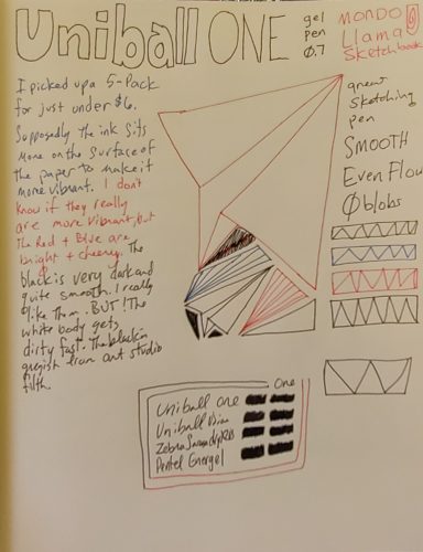
I am starting this review with this disclaimer, this review is full of my opinions on a number of matters, which include a review of the pen in question but also the company’s behavior in recent months.
Let me start with this, I’ve historically really liked TWSBI. Their pens, like Diamond, the VAC and Micarta fit perfectly into my aesthetic. I like demonstrators and the rough look of the micarta are just perfect. I own 4 TWSBI pens, 5 now, and I like them all. They fit me. That said, the Swipe is likely to be my last TWSBI purchase for quite some time.
Through reading various blogs and listening to The Pen Addict I learned that TWSBI had written to sellers of their pens, that also sell Narwhal pens, to let them know that they feel that Narwhal had stolen/copied their piston design. My understanding is that they then let these sellers know that if they continued to sell Narwhal pens, that TWSBI would no longer allow them to sell their pens.
I dislike this on so many levels. Sellers/vendors are just trying to make ends meet. I don’t know what the margins are on pens, but I see TWSBI as a middle sized fish in the pen pond. Narwhal is a tiny fish. Sellers are going to keep selling the pens that bring in the most money- since TWSBI likely outsells Narwhal, the effect of their letter on Narwhal is going to be disaster for the smaller company. Buyers would be forced to buy Narwhal pens directly from Narwhal and whatever sellers who decide to tell TWSBI to go to hell.
Listen to and read the various post I linked to above, but the issue TWSBI is really pushing here is that Narwhal has copied their filling mechanism. But do you really have a moral leg to stand on when you have modeled your filling mechanism on Pelikan’s?
From a sales standpoint it makes sense for sellers to stick with TWSBI.
As a buyer I want to have all the options and I strongly dislike it when someone tries to limit those options. I also dislike when one company tried to put another company out of business. When companies try to put other companies out of business through strong arming vendors, get over yourself. If your product is good, it’ll stand up on it’s own. No need to pull this kind of pseudo legal chest thumping nonsense. TWSBI pens are good pens. So are Pelikan pens. As are Narwhal pens. I wrote it in my review, Narwhal isn’t breaking new ground with their pens, but they are making decent pens. And hell while Moonman/PenBBS are smashing together styles from other companies, their pens function solidly.
Rise above.
It is my sincere and honest opinion that TWSBI has delved into unethical business territory in an attempt to drive Narwhal out of business. I don’t like it at all. I will not buy another TWSBI pen until TWSBI backs off this nonsense. I also have to wonder if this is legal? I mean, good lord, imagine if Pelikan decided that if a pen store carries Lamy that that store cannot carry Pelikan? It is preposterous and ridiculous when you change the brands involved. TWSBI really has their head firmly wedged in their butt cheeks on this one.
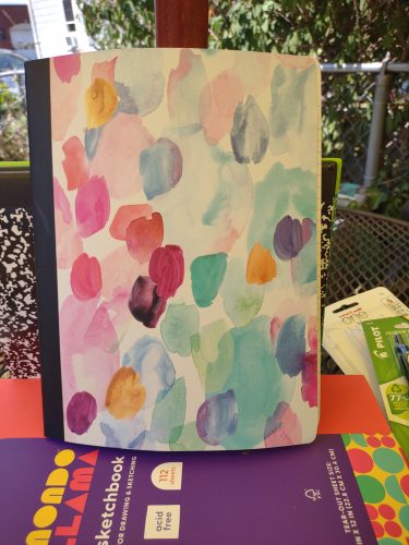
So why review the pen at all? In part to include my little rant, but also I bought the pen with Ko-Fi fund to review. So I want to fulfil my obligation to my readers, but I also feel I should inform you about TWSBI and their shenanigans.
To start I like the pen, mostly. 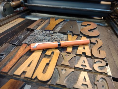
So what I like? The color is killer- coral, or salmon pink. It’s the perfect millennial pink that I love so much. If you’ve known me since high school, you’ll remember that this was the color of my prom dress. Think pink with a hint of orange. 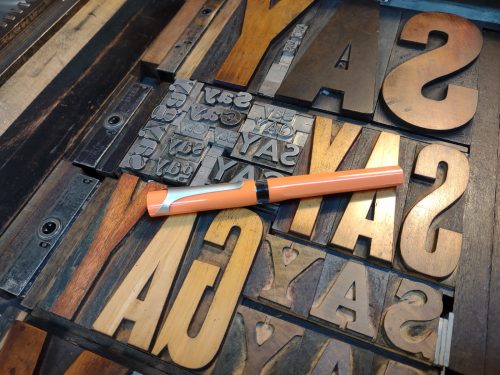
The ink window is nice, especially with the spring inside. I like the way the ink sloshes around the spring. When the pen is uncapped, the grip section is also clear, allowing you to see the ink in the feed. 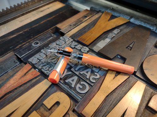
Despite the hard clear plastic of the grip, it feels nice in hand and I don’t find that my hand slips when I’m writing and sketching for long periods of time. The light weight is super comfortable and enjoyable.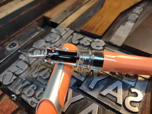
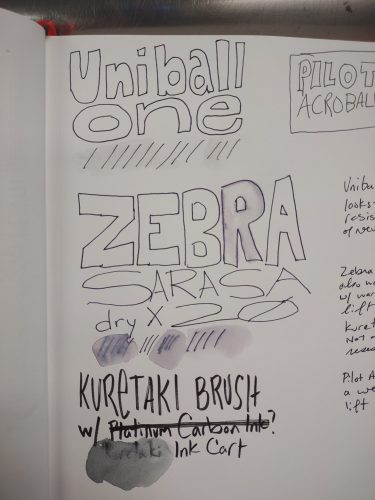
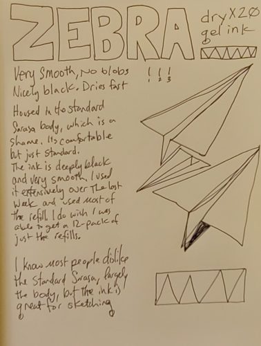
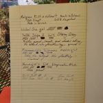
The nib is a typical TWSBI- hard as a nail with a smooth feel as I write and sketch. It isn’t buttery smooth or glassy, but just nice. I like it on all of the papers I’ve used it on so far. The feed is right in the middle- not wet nor is it dry. It lays down enough ink that I’m happy with the darkness of the line.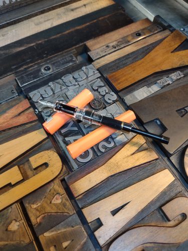
The clip is the major downside of this pen. It feels a bit cheap, and is very tight. I tend to carry my pens in the chest pocket of my flannel shirts, and this pen sits very high when clipped in place. When I clip it to the placket of a shirt it hangs out way to far. I cannot tell if it is painted or a textured finish, but I carried a painted wooden box at work, and it left gray marks allover the painted finish where the clip rubbed. Yet, I do not see any damage to the clip.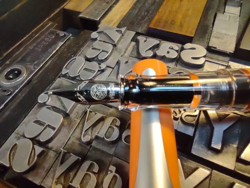
Filling the pen with the spring loaded converter works well enough. I did find that I have to dip the pen multiple times to get a good fill. This means depressing the partially filled spring loaded cart down partially and then redipping the pen. It was a bit messy but effective. Included in the packaging is a regular twist style converter and a cartridge with a spring to hold it in place. Nifty.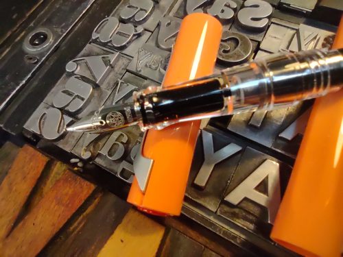
The mold lines are cleverly hidden in the edges of the facets of the pen body. Those on the cap and grips are visible and textured enough that I notice them, through use I’ve worn them a bit smooth. (Also a note to self, pick up hand lotion for the studio. I should not be able to smooth rough mold marks with my finger tips!)
Overall I am quite impressed with the Swipe. At the under $30 price point it’s a solid and fun colored pen. I enjoy the color, feel, and even the twitchy spring loaded fill system. I love the bright fun coral pink color. It’s bright and cheerful. Continue reading →