Category Archives: Review

An excuse to buy…. More ink!

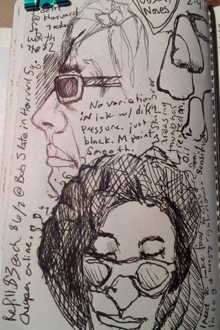
Christie’s highlighter* broke so I used that as an excuse to order a few samples of ink and a full bottle of Private Reserve Electric DC Blue. Private Reserve is another American ink company that seems to specialize in colorful saturated inks. I’ve been impressed with all of the samples of ink I’ve purchased enough that I’ve gone on to purchase 2 different shades of blue- Sonic Blue and the Electric DC Blue(EDCB.)

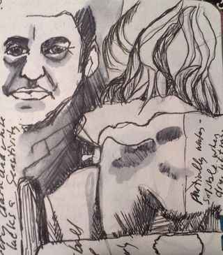
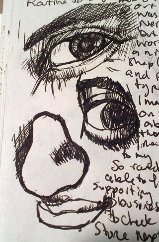
The sonic blue borders on teal but is really a lovely saturated blue black ink. It’s sedate enough for pages of writing and sketching but interesting enough that people will wonder what shade of ink it is but also professional enough no one will judge you on your ink choice. I’ve been using this as a sketching ink for a few weeks.

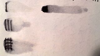
Way back in the dead of winter I ordered a sample of the EDCB. Right off the bat I was in love. It’s a dark midnight blue that in a wet writing pen with the right paper has a red sheen. It is amazing. Not only do the dark areas of a sketch look deep and dark but they also pop with a mesmerizing red. I have to say I’m a sucker for the red sheen. I’ll see if I can get some pics of this, it’s amazing.

I also purchased a sample of Noodler’s Bay State Blue. How could I NOT buy a sample of one of the most controversial blue inks in history? Preliminary results? Meh. It’s a nice solid bright blue with a hint of magenta in some light and on some papers. Maybe it’s because I’ve got it loaded into a EF Noodler’s Nib Creaper pen but I really don’t see what the hub bub is all about. It’s bright and it’s blue and there are ten tons of controversy surrounding the ink. The worst truthful controversy is that it doesn’t mix with other inks and it stains pens and possibly sinks. The only thing I can report about is that yes, it does stain skin, I got a small amount on my fingertips and well, they are stained, but it’s no worse than any other ink.

I’ll get a proper review of the inks up at some point with a few pictures.

Continue reading

Review Redux: Piccadilly Sketchbook

I’m one to admit when I’m wrong, and my initial review of the Picadilly sketchbook, while accurate was incorrectly negative. I have grown to adore the Piccadilly sketchbook precisely for all the reasons I hated it. It’s worthless paper and cheap construction are in this case benefits. Sure the paper is about as absorbent as toilet paper and drawing on it with ink is a cockling nightmare and too much ink will soak through. That absorbency forces me to work fast, loose, and with little care.

THAT is exactly what a sketchbook should be- worthless until it’s filled. The inexpensive nature of this sketchbook is what makes it perfect for sketching. It’s $6 (or was it $5) give me little pause when I simply turn the page when I hate a sketch or it doesn’t turn out right. I flip the page and move to the next. I leave the bad behind and start working on something better. If I only spend 5 minutes on  a page, who cares? The sketchbook has 100 pages of crappy paper. Move on.

I’ve filled dozens of sketchbooks over the years, some with great wonderful paper, stuff that was a joy to work on. Stuff that came out to 50 cents or more per page. I’ve filled my hand bound journals with expensive and cheap paper.

This little sketchbook in its inexpensive glory caused me to work with abandon and that is it’s secret perfection.

Review: Marseilles Studios Sketchbook

I like cheap, who doesn’t? When I was in college a decent black sketchbook was expensive. I used to seek out plain black spiral bound sketchbooks for my notes, ideas and sketches. A favorite was Utrect 6×9. Small enough to be shoved into a bag, inexpensive enough I didn’t mind taking class notes in my chicken scratch or testing out materials on its pages. All in all they were what a sketchbook should be- inexpensive enough to not care too much about its safety but something that eventually became precious and meaningful through its use. To this day I still look for plain black spiral bound sketchbooks, though I loathe spiral bindings and detest perforation.

While thrifting I headed to my local Ocean State Job Lot. It’s a surplus and salvage store where you can find brand name irregulars to junk from closed out stores. Sometimes you hit a massive score and sometimes you find nothing. One of the interesting things that they always carry is a line called Marseilles Studios. This line of cheap art supplies includes: brushes, paints, canvases, pads of paper, easels and the ubiquitous spiral bound black sketchbook in a variety of sizes. Given that they are based out of Providence, RI a selection of super cheap art supplies is not surprising as it's also the hometown of RISD.

I purchased the 9×12 inch sketch book for a total of $4.99 plus tax. Inside are 80 off white 65# acid free pages. The covers are black textured plastic that looks nearly identical to the cover of a moleskine. The covers are hard and pretty stiff. I did manage to damage a corner by tossing the bag into the car rather roughly. The spiral binding is somewhat weak as well, as that dented with the toss. This is a minor gripe. Keep in mind my dislike of spirals. (Compared to the Picadilly spiral this is noticeably softer and warps more easily.)

The paper is textured. Visually it looks pretty rough for fountain pen use, but while there is feedback with the nib. It wasn’t unpleasant using a pen simply noticable. An interesting thing to note is that there was no feathering on this paper, with any ink, even the less well behaved inks I adore, like Noodler's Nikita. I was rather surprised about that as absorbent toothy paper usually feathers all over the place. With pencils this paper was great. The toothiness of the page really allows for deep darks and light lights. I tested a few watercolor washes on the page. The paper is VERY absorbent. I was able to blob watercolor on the surface but blending or lifting after putting it to the page wasn’t happening. The color soaks in and stays put. The color is not intense because of the absorption of the page. While using the page the paper did cockle, like crazy. As it dried the cockles relax and aren't noticable.

I didn't test it but can tell that the page would take gesso

The pages are perforated for easy removal. BAH! I hate perforations. They have no place in a sketchbook! The good and the bad should stay! One good thing about these perforations is that they aren’t very good. When I was tearing the test page out it simply tore at the rings rather than at the perfs. So I won’t be losing any pages to the perforations.

I’m nearly finished with the Picadilly sketchbook* and can’t wait to put this one through it’s paces. Hell for $4.99 you can’t really go wrong. I was only able to find it online from one vendor and as I don’t know the site I’d rather note link to it. Using your Google-Fu I’m sure you’ll find the same vendor as well as others.

Ink mix0035

Continue reading

Review Redux: Canson XL Watercolor Pad

I reviewed the Canson XL Watercolor pad a few weeks back, mostly with inks and scraping of acrylic paint. I determined through that use that it would be #1 a great paper for binding into a journal #2 great for watercolor crayon and acrylic. I didn’t put it through its paces with watercolors.

I did this weekend.

I use a variety of watercolors from Holbein to Academy. This paper holds the colors true. For a cold pressed paper the paint absorbed just enough to dry quickly but allowed for easy lifting of color when needed. Some “student grade” watercolor paper sucks. Its cockles, it’s as absorbent as a paper towel, which is not the case with this paper. It’s good stuff.

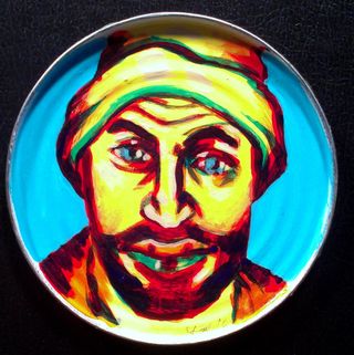
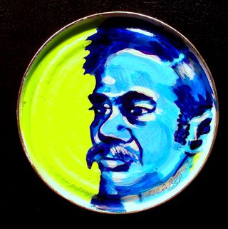
Check out some of the images below, all are done on the XL watercolor paper. Vibrant saturated colors throughout.

Zura Beth facebook face experiment

@JournalChic facebook face experiment

I can without reservation recommend this paper for watercolors. It’s cheap enough for throwaway sketches and nice enough for finished work.

Review: B&N Bargan Bin Piccadily Sketchbook

This weekend I picked up a bargain priced sketchbook at B&N for about $5. I thought it was a no name brand that B&N often sell. When I got it home I realized it’s a Piccadilly branded journal.

The list price on this sketchbook is $12.99; I got it for $4.99. Less than half price. I noticed that B&N didn’t have ANY of these on the regular shelf. So I’m thinking these are only ordered for the cheapie racks. Which is fine, at $5 this isn’t a bad deal but for $12.99 not worth the money.

I tested this with a variety of inks in a variety of pens. I did a little sketching to see how the paper would respond and I did my usual of an ink and water wash.

Anything with a larger than a fine tip feathered and bled through the paper. There was a TON of feathering especially in my medium tipped and wet writing Pelikano. My extra fine and fine pointed pens did okay, regardless of the ink. I tested both sides of the paper and there is no right/wrong side, the sides have the same finish throughout the journal. The paper is very smooth. I wouldn’t want to use a pencil on this paper as it’s just too smooth and pencil would smudge all over the place.

Ink mix0019
As for water on this paper, it could be done but it’s not recommended, a very light wash caused major cockling (wrinkles) that never eased out of the paper. I also noticed that really heavy application of ink caused the same issues. Anywhere I used a heavy layer of ink it not only bled through the paper but also to the page underneath. Anywhere there was heavy ink use the fibers of the paper lifted and were picked up by the nib of the pen.

Ink mix0018 The Pros:

  • Good value at $5
  • Paper is smooth
  • Bright white paper
  • Great sturdy hard cover
  • Sturdy double coil binding

Cons:

  • Feathering with any ink
  • Bleedthrough
  • Fiber lifting
  • No water due to cockling
  • EF and F nibs or pencil only

Overall I’d say this is a good sketchbook for someone looking for something cheap that they can do a lot of throwaway sketches in or just to take some notes. This little journal probably wouldn’t stand up to a lot of the abuse that art journalers would toss at it. Even if you gesso’ed the pages the paper is just not sturdy enough. It’s too bad, because this is a really good looking little sketchbook, and comes in a lot of good sizes and with lined paper too which has a lot of different options for covers.


Thursday Review: Pelikan Pelikano Fountain Pen

I like to draw with fountain pens. Now that I’ve discovered the joys of Noodler’s inks (a full post on those coming up soon) I have felt the need to buy a few more pens. I own now a mix of around a dozen pens, of which I keep 6 inked at all times. It’s a bit much. When I’m sketching I find I reach for one pen over and over again. That pen is my Pelikan Pelikano medium point in blue. I keep it inked with a blue or a blue black ink at all times.  There is nothing special about this pen. It’s an inexpensive school pen that lays a nice medium line and a lot of ink. It’s comfortable and easy to clean.  I’m not worried about breaking it or tossing it around because it was pretty cheap.

The important parts about this pen for you to know is that it has a medium point steel nib, it is what is referred to as a “wet” writer, in that when it puts down a line of ink it’s generous in the amount of ink in that line. This means my blacks are truly black and I can blend those lines with a wet brush.  The steel nib is stiff and doesn’t have much line variation but can be abused. I’m not gentle with this pen. I tend to have a heavy hand and it takes that abuse and keeps on writing.

The body of the pen is translucent frosted blue plastic. It’s not gorgeous and it’s not ugly, like most school pens it’s functional. You don’t want to have a pen your classmates will steal, they won’t steal this one. The cap is brushed steel or aluminum with a plastic clip. The pen isn’t going to win any design awards but it works. This pen is a cartridge or converter pen. I hate cartridges and I’m not overly fond of converters, each holding 1ml of ink, sometimes less. That’s not a whole lot of drawing for me. I converted this one to what is called an eyedropper pen by using outdoor grade silicone caulking to plug the 2 vent holes in the end of the body. The body now holds 3ml of ink, which is a whole lot of sketching and drawing.  While not a difficult job it was a tad fiddly to do but has held up for several months of sketching and drawing. Alternately someone could refill the cartridges with a syringe.

I’ll tell you about a couple of other go to pens I use for drawing soon.

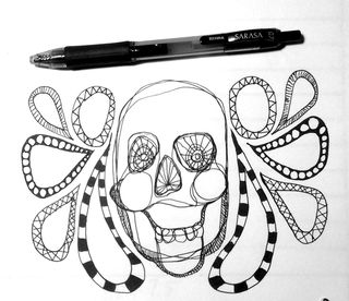
Here is a picture I drew using this pen and a few others as well as a brush pen.


Another wine bottle in inks

Review: Noodler’s Flex Pen December 25th Edition

The pen I’m reviewing today is something I bought on a lark used off the Fountain Pen Network’s for sale page. I have to say that the Noodler’s Flexible Nib pens have been well marketed and sought after by many pen enthusiasts. Especially those like me, who are interested in pens on the lower end of the spectrum of price. This pen fits that bill. Its suggested retail price is $14. Noodler’s has come out with several special edition pens; the flex nib that I purchased is the December 25th red and green edition. I purchased mine used for $10, shipping included. It’s a piston filled pen that hold 1ml of bottled ink.

IMG_2741
IMG_2741
IMG_2741
IMG_2741

It’s a nice cheery red color with marbling throughout. The marbling is supposed to be green but I notice little if any green in the marbling. The nib is steel and an unusual design. It does not have a vent hole, instead it’s got a very deep channel cut into the feed that allows a lot of ink to flow. It’s labeled as a flexible but most users report that it’s a semi-flex given the amount of pressure needed to flex the tines. The nib reminds me of a crow quill dip nib. It starts as an extreme hairline point that I’d label as a double extra fine. Flexed fully I’d call it a double broad.  With normal writing or sketching pressure I’d say it writes a fine line.

While I was writing I found that my traditional cursive, learned way back in 3rd and 4th grade adapted itself well to the flexed down stroke with this pen. It made it look old fashioned and could be useful for meditative and mindful journaling. There are a lot of tutorials out there for scripts that use a flexible nib. Writing with this nib is NOT the easiest thing ever. In fact I’d say my forearm got quite a workout. I’ve decided that to better learn how to use this pen I’m going to start filling out all the forms at work with the pen, in script. I figure that using it across the day will make life more interesting, give my forearm a break and exercise throughout the day. I’ll also get a lot of practice in USING the pen.

For the artist the place where this pen really starts to sing is in sketching. Flexed it’s not going to keep up with a rapid pace, but the hairline is great for putting down a few delicate lines and then regular pressure gives you a nice fine line. When flexed it gives a nice solid line that is great for shading. I tested it out on a variety of papers. This pen lays down a HEAVY line of ink, especially when flexed frankly you’ll need to find a sketch paper that can handle the flow. Papers that worked well: watercolor paper, better quality drawing paper, Bristol, and heavier sketchbook paper.  Using this nib on gesso’ed paper is going to cause issues. Gesso is gritty and gritty surfaces grind down nibs. Writing on gesso will ruin this nib (and most) fast.

Some images of the various papers:


  • Ink mix0025
  • Ink mix0021
  • Ink mix0022
  • Ink mix0023
Ink mix0023


Here’s my verdict for a $14 pen it’s a lot of fun and worth the money. I have pretty strong forearms and hands and I found using this pen tiring for writing. If you have a light hand this pen will be very difficult for writing use. For drawing this pen really shines in its flexible line width. It does take some practice to use but it’s enjoyable and creates a really dynamic look. It’s comparable to a crow quill dip pen in line variety and it less likely to shatter with heavy handed pressure. It does take a heavy hand for writing to get the full flex out of it. It’s a very adaptable little pen as you can adjust the ink flow pretty easily. (Goulet pens is planning on doing a how to video on this and I’ll link it up when it hit.)

I found the slower pace forced by this pen great for meditative thoughtful writing. It took some practice to get something decent, well that’s something we can argue, but passable.

The major con of this pen is how slim it is. I might try fitting the nib into a pelikan body and see if it’s more comfortable. The flex forces a less relaxed grip and less comfortable writing style that I’m accustomed to, but then again, you aren’t really meant to write for 3 hours with this thing. The second con of this pen is that it holds only 1ml of ink, which is the same amount as a cartridge, and yes I did measure it. I’ve gone through 2 fills of Private Reserve Sonic Blue ink.


Review: Moleskine 6×9 Sketchbook

This sketchbook contains 80 roughly 110lb plain cream colored pages. They are contained within plastic covered hard black covers. The plastic is imprinted to look like leather. This sketchbook is very often suggested for people started out in art journaling.

The paper is stiff and smooth. It’s good for writing and drawing. I find that the paper has a coating that repels wet media like watercolors, which it absorbs but gives a blotchy appearance. It does the same with some inks. It can be quite a pain in the rear. I’ve found that if I got through my sketchbook and spritz the pages with a little water so they are evenly damp and then allow them to dry before working in watercolor or ink the blotchiness is minimized.

The paper responds favorably to pitt and zig pens. They remain perfectly black and don’t show any blotchiness. The paper is also heavy enough to support many layers of collage and acrylic paint. When working with wet media it’s best to be aware that the paper will cockle and remain wavy even after it dries. I like the wavy paper but most don’t.

The heavy weight paper does not show strike nor bleed through except when using sharpies and copic markers. Fountain pens do just fine on this paper. Some fountain pen inks get blotchy.

The sketchbook has a great form factor with its smooth hard black covers, pocket in the back and elastic closure. I can’t say that the paper would be a reason to recommend it. The pages can take abuse but if you erase too much or scrub the pages with a brush you’ll end up will pilling of the top of the paper. I’ve read reports of the spine breaking on these sketchbooks but I’ve abused the heck out of mine and never had a broken or damaged spine, and I’m not gentle with my sketchbooks and journals. The price however is quite prohibitive at $18 for 80 pages.

If you are looking for a sketchbook that handles a variety of media relatively well, with a nice hard cover, at a ridiculously high price this is a good sketchbook. There are others similarly shaped and sized that will work as well at a lower price.

 INterested in purchasing a moleskine sketchbook? Follow this link, it was the best price I could find on them:


Thursday Review: MiquelRius Grid Notebook

MiquelRuis 300page Grid Notebook with Red vinyl cover

I bought this notebook 4 or 5 years ago while searching for a Ciak brand notebook. As a notebook snob and a bookbinder I find this book to be just MEH.

First it’s perfect bound- glue with no stitching. Eventually with hard use pages will fall out. It’s just a matter of when not if. Perfect binding is simply not sturdy enough for the kind of abuse I put my notebooks and journals through. I will say that I’ve been carting this notebook around for 2 or 3 months and it’s held up pretty well so far. Also due to the binding and thickness of the book, it will not open completely flat while writing, which is a nuisance.

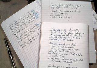
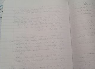
The pages are 15 to 18 pound in weight and very thin. Almost every pen I own strike through (is visible on the reverse side) and 90% bleed through. This means I can only use one side of each sheet of paper. So that drops the 300 pages of the book down to 150 usable surfaces. So even if I wanted to brave the non-flat writing surfaces of the left side of the notebook, I could barely read what I wrote. Additionally some of the inks I own feather like mad on this paper. I’m talking about relatively well behaved inks like Diamine Chocolate Brown.

The paper is very smooth and has the best light pale blue grid I’ve ever seen. It’s what drew me to the brand in the first place. After looking at a dozen or so gridded notebooks, I fell in love with the pale blue of this grid. It’s pale enough to blend into the background and not interfere with the writing when you are referring back to your writing. The pen glides over it. It’s not as smooth as Rhodia or Claifontaine paper but its way better than Moleksine paper. Ink is better behaved on the right side of the MiquelRuis paper than moleskine paper. The paper definitely has a right and wrong side for fountain pen use. One side is smooth and the other has a little more tooth to it and grabs the tip of the pen ever so slightly.

The format of the book I purchased is great- at 6×8 inches I’m finding the page size perfect for writing and recording thoughts and sketches. The size is good for slipping into a book bag.The 300 pages is a tad on the heavy size for every day toting about but if it were the only notebook you were to carry it wouldn’t be bad. They come in 100 and 200 page counts as well.

Would I buy another one of these notebooks? Probably not. The bright vinyl cover is nice but doesn’t speak to me the way a leather cover does. The paper’s lovely pale blue grid is about the only thing I really like about this notebook. Using both sides of the page is important to me, using just one side seems very wasteful to me. I prefer a stitched notebook for durability. I have to mention that pale blue grid again; it’s why I keep reaching for this notebook. This would be a good gift idea for the vegan writter on your shopping list. They also offer a host of recycled vinyl options that I'd like to see.

I purchased mine about 5 years ago at Barnes and Noble. I notice that the brand is no longer listed on their website. When I purchased this particular note book it was the last one on the shelf. It cost $10. You can buy these notebooks at the miquelrius website here.

Pros:

  • 300 Pages
  • Sturdy Vinyl Covers
  • Cheap $10
  • Great pale blue grid
  • Mostly fountain pen friendly o n the right hand pages
  • Smooth paper is nice for writing

Cons:

  • 300 pages are heavy
  • Almost all my pens and inks exhibit strike through and bleed through
  • Not good for a wet nib
  • Can only write in it- sketching would result in horrible bleed
  • Forced to write lightly
  • Perfect bound- not very sturdy
  • Won’t lay flat when writing.

Some inks that did well on the paper:

Noodler’s Bulletproof Black, Eel Blue, Walnut, Beaver, Eternal Brown and anything BUT Herbin Bleu Nuit in an EF nib.

Review: Canson XL Watercolor Pad

I picked up a Canson XL 30 sheet pad of CP 140# watercolor paper a few months back with the intent of comparing it to my favorite inexpensive paper, Strathmore 140# CP 400 series. It compares well.

First off, it comes in a glue bound pad which is good for bookbinding not good for art journaling. To me a glue binding is temporary and won’t last, I abuse my art journals and thus this pad would absolutely not hold up to my use. The paper folds in half easily and without cracking. This is a bonus if you are intending to make your own sketchbook or journal. The grain of this paper is along the short side, which again, is perfect for binding.

The paper is thinner and softer in feel to other 140# paper, specifically the Strathmore. It’s still stiff, but is not quite as stiff as cardboard. The cold pressed paper is textured more on one side than the other. The Canson CP is significantly less textured than most other CP papers I’ve used, and I’ve used a lot. The reverse size is significantly smoother than the front. You can feel and see the difference in texture. The amount of sizing is different too. The differing texture and sizing means that when binding you either let the different textures face each other OR you pull the pages out and face them together.  It’s an extra step in binding that makes an art journal more pleasurable, versus getting into the journal and realizing each facing page responds to pen, ink, and watercolor differently. I find that annoying.

Ink mix0013
Ink mix0013
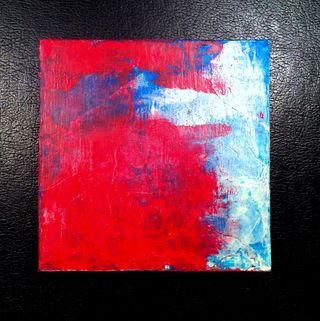
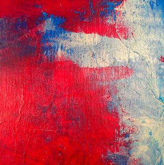
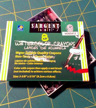
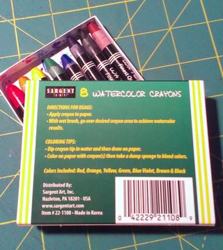
 The paper handled ink like a dream. Even my fine and extra fine pointed fountain pens floated on its smoothish CP surface. Noodler’s bullet proof ink bonded with it well and other inks gave me a wonderful watercolor effect. The pages handled watercolor crayon like a dream and scraped acrylics like it was made for it. I noticed even with repeated brushing and scribbling layers of ink no pilling or pulling up of fibers. Either side handled them well. The reverse and smoother side was much more absorbent, so an even pull of credit card scraped acrylic got less coverage but was decent. The paper is heavy enough that I did not notice any wrinkling. Watercolors of course gave a cockling effect that soon relaxed as the paper dried.

Ink mix0015

Ink mix0015
This is a budget friendly pad of paper. I purchased it on sale for around $7; regular price is around $13 for the 11×15 in size. It’s not a bad price, especially for a pad that is easily folded up for making an art journal. I found it on Amazon (see below) for $4.59 in the 9×12 size, which is not bad at all. I was unable to find the 11×14 on Amazon but did find it on the Blick site for about $7.


Continue reading