Category Archives: Review

Review: things that make me go Meh

 When I started doing reviews on here I debated the smarts of posting negative reviews. I have to tell you, there are things I don’t like. There are tools that I hate and will never use again nor recommend to my friends but they are few and far between. I decided to do a round-up of stuff that made me go, meh. These aren’t bad things they just aren’t stuff I’m raving to my friends about. You may have different feelings.

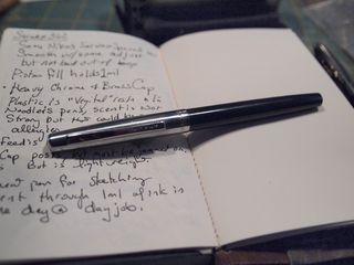
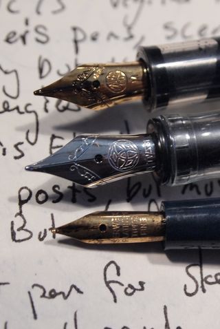
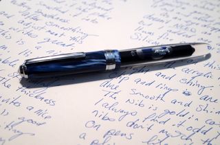
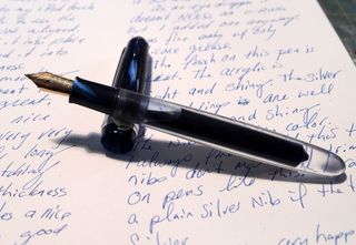
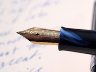
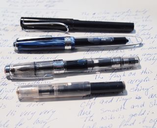
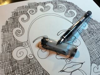
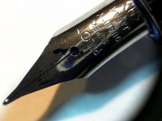
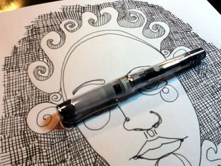
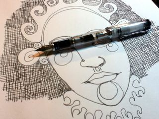
Noodler’s Nib Creeper Fountain Pen

The nib is fine to extra fine with no other option other than flex. You have many color options including clear. The colors all have that vegetal resin smell that to me, frankly it smells like fecal matter. I have read several reviews that this offensive odor is not offensive to all people, I happen to be of the group of people, like those that think cilantro tastes like soap, that think this stuff smells awful.

The pens themselves are nothing special, a rebranded Indian (Dollar)made pen that sells for less without the Noodler’s branding. They are light weight and feel pretty cheap. They hold 1ml of ink, almost exactly, and lay a wet even line. There is a tendency that if you are writing fast for the nib to dry out and will require a dangerous shake to get ink to flow.

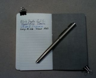
Noodler’s Luxury Blue Ink

This is a blue that is nothing to write home about. It’s blue, like a ball point pen and it flows. It’s not special. It does dry mostly waterproof. I found that in EVERY pen I used it in there was a tendency for nib creep. Which is just messy.

Don’t get me wrong, it’s a nice enough blue but for a 1oz bottle at the regular 3oz prize I’d rather get another blue that I like.

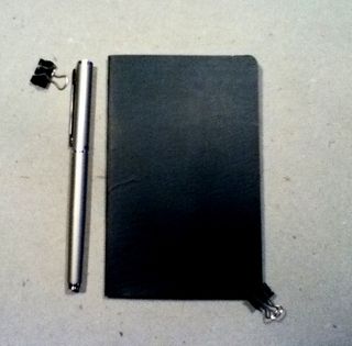
Moleskine 3x5in Graph Notepad

I bought this. Yeah, I have a drawer full of moleskins I was given for doing a giveaway on my blog years ago and I bought this because it had GRAPH paper in it. I love the look of the moleskine; the lovely black covers, the great bindings, the pocket and the place marker. I love everything BUT the paper. This paper sucks. Even my EF pens filled with well behaved inks soak through its paper, everything feathers on it and well, MEH!

Strathmore Visual Journal Bristol 3×5 size

Sturdy spiral binding and very sturdy covers filled with nice paper should make this a winning journal. I just can’t seem to bond with it. It’s nice, just not for me.

Sanford Peel-off Magic Rub 1960 Eraser Stick

I used to buy these in college for detail erasing. They were the only stick erasers available then and did its job well enough. I saw one at Artist& Craftsman and picked it up. It’s just like a Magic Rub but in stick form. It’s soft and is prone to smudging stuff. Magic Rub Erasers are not a favorite of mine for this reason. It will also lift some ink and smudge that too. Meh.

Mio Paper 146×87 mm Campus blue label

This is one of the most expensive notebooks I’ve ever bought. I picked it up on jetpens because I’d heard the MIO paper was amazing for fountain pens. Guess what? It’s is, smooth, perfect for writing and nothing soaks through it but the wettest pens and there isn’t even a hint of feathering at all. Ink DOES take forever to dry on it and smudges even when the ink looks dry. The cover is cool with subtle texture and coloring. It’s small enough to slip into a back pocket, purse, or where ever. This is another one of those notebooks I should love but I haven’t bonded with and thus it sits in a drawer mocking me for the money spent on it.

Sharpie Pens

I don’t like ‘em. I bought a couple of packs of them when they first came out and liked them for quick notes but they seem to dry out fast and I break the tips and they are too fine for me. It’s okay, everyone else loves them.

So that's my round up of stuff that makes me go meh.


Review: Pilot Parallel Pen 6mm

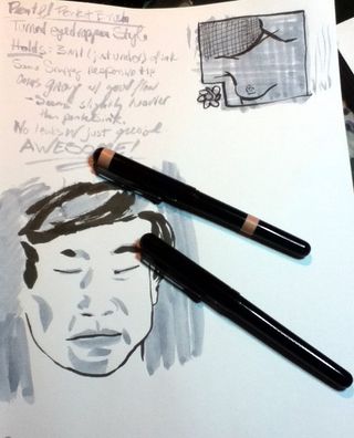
I’ve been looking for a pen that would let me lay down a wide swath of ink without dipping a brush into my ink bottle. I’d seen the Pilot Parallel pens for sale through John Henry Booksellers but I haven’t placed an order with them in awhile. On my latest perusal of the GouletPens.com site I noticed they were carrying them for $10 each. That is a great price. I decided on the 6mm pen for the widest line of ink possible.

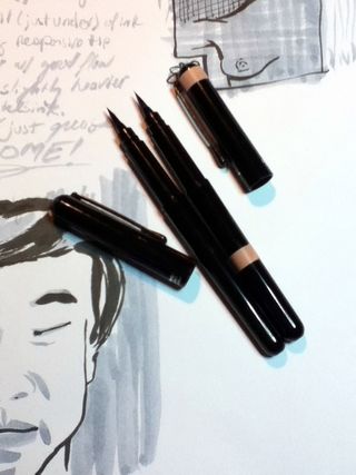
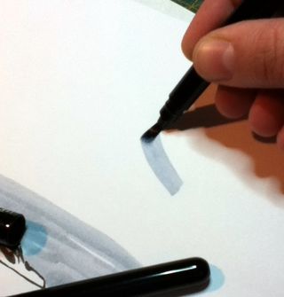
The way this pen works is like a fountain pen with a feed that flows between 2 sheets of thin springy steel. You can use the full flat side of the pen for a wide stroke or the corners for a very fine line. The pen feels a lot like a brush and lays down a very wet line. The fine line is very fine and adds a lot of versatility to the pen.

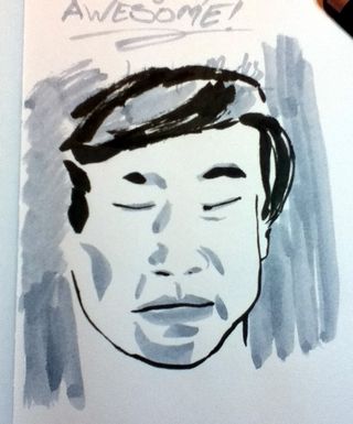
So far I’ve done about a half dozen drawings with the 6mm pen and frankly, it makes me want them all. It’s easily one of the most versatile pens I’ve used in a long time. It lays down a wide wet line of ink that covers anything well. The pen is really great especially when you look at the fact that it was only $10. Essentially it’s like getting a extra fine pen and a 6mm in one pen. In short it’s a good value.

Here are some examples of what I’ve done with this pen.


  • Ink mix0055
  • Ink mix0051
  • Ink mix0047
  • Ink mix0049
  • Ink mix0050
Ink mix0050

The negative aspect of this pen is that it feels really cheap. Its pearlized gray plastic is light and is very slick in the hand. The grip area is also very smooth but clear. The cap is a funny shape and does not post. The corners of the nib do tend to lift fibers and can get blocked. They provide a special cleaning sheet that does a good job of cleaning the nib.

I’m not sure if the pen is a good candidate for turning into an eye dropper due to the threads. There is a gap on one side. I’m not sure that silicone grease would fill it well enough. I will try this and see what happens.

I got mine from GouletPens but it’s also available from JetPens and Pilot’s online store.

Review: Clairefontaine Graf It Pad

One of the other sketchbooks I received from Exaclair was the Clairfontaine Graf It pad. I’d seen these on several occasions at Artist & Craftsman and passed them by due to the cover being… well, kinda lame*. In addition to the plain black grainy text and images, each cover is made with various colors of card stock that folds behind the staple bound pad. The back is supported with sturdy heavy chipboard. Each page is microperfed for easy removal. The perf is sturdy enough that you can turn the page and it won’t tear out, unless you want it removed, it stays. The pad is often sold on American websites as “6×8.” That may be the outer dimensions of the pad but the actual sheet size is 5.75×7.5 inches. There are 80 sheets in each pad.

I did my usual battery of tests on this paper and it withstood them all. I have to say that this paper is amazing. Though it’s only 90g (41lb) it’s super sturdy and accepts a lot of media without issues. It takes some serious effort to get stuff to soak through. When I say stuff I mean ALL the stuff I’ve tossed at it. See the pic below.

Ink mix0044
With watercolor it accepts the color well. The paper cockles as is expected with paper this thin. I find this to be a great paper to experiment with techniques and color. It responds well to puddles of water as well as thin washes. Color stays true and doesn’t get muddy on the page.

While drawing with ink I was able put down multiple layers of ink without cockling and bleed through. Heavy layers that would have bleed through many other heavier papers did not bleed through on this paper. Noodler’s black bonded with the paper well enough that I didn’t worry about it lifting much with my water brush. Colors seem to pop off the page.

I did try gessoing the page but I don’t see the point as the paper is tough enough to survive most stuff without the gesso. I also scrapped acrylic paint over the page to see how it would work, and it worked just fine. This paper is also amazing for pencil. It has just enough texture and tooth that pencil feels really good on it and it hold a lot of graphite, so darks are really dark.

My final verdict on this pad is that it’s great. The paper is awesome. The format it’s served in is where it is lacking. I hate perforations (my own little quirk.) I prefer a pad that allows the pages to stay together. The staple binding is crap for keeping stuff together, I made a little folio out of a USPS priority mailer to keep my drawings together. For art journaling it would be a great pad to do drawings in and then cut out and glue into your regular art journal. The paper is thin enough that if you draw a face and cut it out the edges won’t be all that noticeable.

The pad is pretty cheap. I found it online for $4 to $6 the larger size is pretty reasonably priced too at around $9. These are prime pad for binding into a sketchbook. If this came bound like a moleskine or a Rhodia Webbie I’d buy it. I know that the reason this pad is so inexpensive is that its bound inexpensively, 2 staples straight through to a sturdy backer. I like this paper a lot, in fact the next time I’m at Artist & Craftsman I’ll be picking up another one of these in another size. Perhaps I’ll bind the large size into a nice art journal!

Continue reading

Review Redux: Rhodia Webbie

I never managed to get the images up for my Webbie review. So I'm putting them up here (and probably in the actual review.)

You can see here how the page takes watercolors and then ink over the watercolor.

Ink mix0045
And here you can see where I scraped the acrylic and painted on some gesso and then layered ink and watercolor crayons over the top.

Ink mix0046

I wasn't kidding around when I said I was having a hard time putting this journal down. I have 2 more I need to review and I really don't want to stop using this beautiful thing. I guess I'll have to fill it!

Review: Rhodia Webnotebook aka Webbie

Stephanie of RhodiaDrive hooked me up with Karen of Exaclair, the American importer of several very fine French made stationary products so I could do some reviews. I received a box in the mail and I felt like a kid at Christmas. There is nothing quite like opening up a box of sketchbooks to get my heart racing, well pen products would be a close second. Anyway, one of the products contained in that wonderful box was a Rhodia Webnotebook. It’s the larger size, 5.5×8.25 inches (I14x21cm) with blank cream colored pages. There are 96 sheets or 192 pages.

When I first opened the covers the color reminded me of oak tag; creamy, warm and lovely. The paper is 90g (roughly 24lb) which seems kind of thin when you’ve been working on 140lb watercolor paper for the last few months. When I ran my hand over it felt glassy smooth. Clairfontaine paper is known for this feature and is sought after by people who use fountain pens.

The cover is black with the Rhodia logo inset into the center of the front cover. Like all notebooks of this style there is an elastic to hold the whole thing shut. The plastic/vinyl of the cover is soft, like fine leather. I have a journal made of deer hide and the feel of this pleather rivals its softness and feel. I handed the journal to someone to check out and she actually said “Ooohhh, that feels nice that feels really nice, what is it?” Like, leather the cover does show greasy fingerprints, unlike leather those greasy fingerprints wipe off with a damp rag. Yes, I tested this by eating French fries at my desk and picking up the journal and having to wipe it clean.

Continue reading

Review: Quo Vadis Bookmark

This week’s review is a little different. I’m reviewing, drum roll please, a bookmark. Wait, don’t go away. I promise, it’s a special book mark, so special in fact that it’s simplicity made me over look it when I opened my box of goodies from Exaclair.

IMG_2810

The Quo Vadis bookmark is a 5x 1.75 inch piece of cardstock coated in plastic with a brown and tan elastic loop attached. Non-descript and utilitarian in appearance as some of the best ideas are. The brown and tan is not pretty, a nice black elastic loop should be something they consider on their next run.

Simply you hold your place with the bookmark and loop the elastic around your journal to hold it shut. Ridiculously easy and remarkably efficient.


  • IMG_2811
  • IMG_2812
  • IMG_2813
IMG_2813


You know how I said my miquelrius notebook was going to fall apart before I was finished with it? Way back here? Well it is, and I’m not even half finished. This bookmark holds it together, with ease. It also holds all the stuff that I’ve stuffed it within it. Nothing falls out. The elastic is remarkably secure, adapts to a variety of journal sizes and is cheap. You can get one here on GouletPens.com* for $1.50. I’ll be ordering a bunch with my next order. Brian even did a little video on them here.
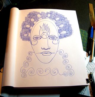
Seriously, if you are ordering ink or paper, add one of these little wonders to your cart, you’ll thank me later.

Read another review of them here.

Continue reading

An excuse to buy…. More ink!

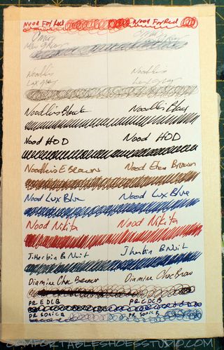
Christie’s highlighter* broke so I used that as an excuse to order a few samples of ink and a full bottle of Private Reserve Electric DC Blue. Private Reserve is another American ink company that seems to specialize in colorful saturated inks. I’ve been impressed with all of the samples of ink I’ve purchased enough that I’ve gone on to purchase 2 different shades of blue- Sonic Blue and the Electric DC Blue(EDCB.)

The sonic blue borders on teal but is really a lovely saturated blue black ink. It’s sedate enough for pages of writing and sketching but interesting enough that people will wonder what shade of ink it is but also professional enough no one will judge you on your ink choice. I’ve been using this as a sketching ink for a few weeks.

Way back in the dead of winter I ordered a sample of the EDCB. Right off the bat I was in love. It’s a dark midnight blue that in a wet writing pen with the right paper has a red sheen. It is amazing. Not only do the dark areas of a sketch look deep and dark but they also pop with a mesmerizing red. I have to say I’m a sucker for the red sheen. I’ll see if I can get some pics of this, it’s amazing.

I also purchased a sample of Noodler’s Bay State Blue. How could I NOT buy a sample of one of the most controversial blue inks in history? Preliminary results? Meh. It’s a nice solid bright blue with a hint of magenta in some light and on some papers. Maybe it’s because I’ve got it loaded into a EF Noodler’s Nib Creaper pen but I really don’t see what the hub bub is all about. It’s bright and it’s blue and there are ten tons of controversy surrounding the ink. The worst truthful controversy is that it doesn’t mix with other inks and it stains pens and possibly sinks. The only thing I can report about is that yes, it does stain skin, I got a small amount on my fingertips and well, they are stained, but it’s no worse than any other ink.

I’ll get a proper review of the inks up at some point with a few pictures.

Continue reading

Review Redux: Piccadilly Sketchbook

I’m one to admit when I’m wrong, and my initial review of the Picadilly sketchbook, while accurate was incorrectly negative. I have grown to adore the Piccadilly sketchbook precisely for all the reasons I hated it. It’s worthless paper and cheap construction are in this case benefits. Sure the paper is about as absorbent as toilet paper and drawing on it with ink is a cockling nightmare and too much ink will soak through. That absorbency forces me to work fast, loose, and with little care.

THAT is exactly what a sketchbook should be- worthless until it’s filled. The inexpensive nature of this sketchbook is what makes it perfect for sketching. It’s $6 (or was it $5) give me little pause when I simply turn the page when I hate a sketch or it doesn’t turn out right. I flip the page and move to the next. I leave the bad behind and start working on something better. If I only spend 5 minutes on  a page, who cares? The sketchbook has 100 pages of crappy paper. Move on.

I’ve filled dozens of sketchbooks over the years, some with great wonderful paper, stuff that was a joy to work on. Stuff that came out to 50 cents or more per page. I’ve filled my hand bound journals with expensive and cheap paper.

This little sketchbook in its inexpensive glory caused me to work with abandon and that is it’s secret perfection.

Review: Marseilles Studios Sketchbook

I like cheap, who doesn’t? When I was in college a decent black sketchbook was expensive. I used to seek out plain black spiral bound sketchbooks for my notes, ideas and sketches. A favorite was Utrect 6×9. Small enough to be shoved into a bag, inexpensive enough I didn’t mind taking class notes in my chicken scratch or testing out materials on its pages. All in all they were what a sketchbook should be- inexpensive enough to not care too much about its safety but something that eventually became precious and meaningful through its use. To this day I still look for plain black spiral bound sketchbooks, though I loathe spiral bindings and detest perforation.

While thrifting I headed to my local Ocean State Job Lot. It’s a surplus and salvage store where you can find brand name irregulars to junk from closed out stores. Sometimes you hit a massive score and sometimes you find nothing. One of the interesting things that they always carry is a line called Marseilles Studios. This line of cheap art supplies includes: brushes, paints, canvases, pads of paper, easels and the ubiquitous spiral bound black sketchbook in a variety of sizes. Given that they are based out of Providence, RI a selection of super cheap art supplies is not surprising as it's also the hometown of RISD.

I purchased the 9×12 inch sketch book for a total of $4.99 plus tax. Inside are 80 off white 65# acid free pages. The covers are black textured plastic that looks nearly identical to the cover of a moleskine. The covers are hard and pretty stiff. I did manage to damage a corner by tossing the bag into the car rather roughly. The spiral binding is somewhat weak as well, as that dented with the toss. This is a minor gripe. Keep in mind my dislike of spirals. (Compared to the Picadilly spiral this is noticeably softer and warps more easily.)

The paper is textured. Visually it looks pretty rough for fountain pen use, but while there is feedback with the nib. It wasn’t unpleasant using a pen simply noticable. An interesting thing to note is that there was no feathering on this paper, with any ink, even the less well behaved inks I adore, like Noodler's Nikita. I was rather surprised about that as absorbent toothy paper usually feathers all over the place. With pencils this paper was great. The toothiness of the page really allows for deep darks and light lights. I tested a few watercolor washes on the page. The paper is VERY absorbent. I was able to blob watercolor on the surface but blending or lifting after putting it to the page wasn’t happening. The color soaks in and stays put. The color is not intense because of the absorption of the page. While using the page the paper did cockle, like crazy. As it dried the cockles relax and aren't noticable.

I didn't test it but can tell that the page would take gesso

The pages are perforated for easy removal. BAH! I hate perforations. They have no place in a sketchbook! The good and the bad should stay! One good thing about these perforations is that they aren’t very good. When I was tearing the test page out it simply tore at the rings rather than at the perfs. So I won’t be losing any pages to the perforations.

I’m nearly finished with the Picadilly sketchbook* and can’t wait to put this one through it’s paces. Hell for $4.99 you can’t really go wrong. I was only able to find it online from one vendor and as I don’t know the site I’d rather note link to it. Using your Google-Fu I’m sure you’ll find the same vendor as well as others.

Ink mix0035

Continue reading

Review Redux: Canson XL Watercolor Pad

I reviewed the Canson XL Watercolor pad a few weeks back, mostly with inks and scraping of acrylic paint. I determined through that use that it would be #1 a great paper for binding into a journal #2 great for watercolor crayon and acrylic. I didn’t put it through its paces with watercolors.

I did this weekend.

I use a variety of watercolors from Holbein to Academy. This paper holds the colors true. For a cold pressed paper the paint absorbed just enough to dry quickly but allowed for easy lifting of color when needed. Some “student grade” watercolor paper sucks. Its cockles, it’s as absorbent as a paper towel, which is not the case with this paper. It’s good stuff.

Check out some of the images below, all are done on the XL watercolor paper. Vibrant saturated colors throughout.

Zura Beth facebook face experiment

@JournalChic facebook face experiment

I can without reservation recommend this paper for watercolors. It’s cheap enough for throwaway sketches and nice enough for finished work.