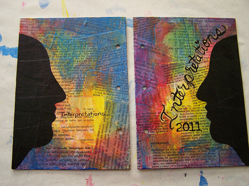
Not So Wordy Wednesday

It’s wordy Wednesday again! How the time flies. I’ve been sick, yet again, some sort of sinus thing and I managed to catch a company policy manual with my face. Needless to say I’ve been feeling a little under the weather and foolish.  Paper cuts on the nose will do that to you, every time.

I’ve been in a rut.  There I said it. I haven’t written in about 2 weeks. I’ve done some art but it hasn’t held the kind of feeling that I usually get from it. Instead it’s been flat, lifeless, and without passion. Add to that my weird sinus issue seems to be back, after only a week of it being gone and well I’m making excuses. My face and sinuses hurt, though I suspect the book to the face only did minor damage and really the issue is with my sinus issues.

Excuses. Really I need to let them go and get back to doing what I do. Writing and art needs to be something I stop avoiding, well I’m not avoiding I’m simply too tired after a full day at the DayJob to really get anything done.

I can’t wait for spring, this cold snow filled winter really has been hard.

Word Power Blah Blah Blah

I went on a tirade on twitter about the word tribe. I was annoyed because I’d followed a link to a link to a link for a blog that referred to paying members of an online group and advertisers as their “tribe.”  It rubbed me the wrong way.  Is that the real meaning of tribe? Or is it that language has changed so much over the last few years that it’s okay to refer to people who pay you for a service rendered as part of your tribe?

Words have meaning, words have power, blah de frickin’ blah. I’d like to go out on a limb and suggest that misusing a word or phrase has power too.  I’m not suggesting anything about being political correct.  It’s about how people misuse words, sometimes on a daily basis, and not bothering to actually learn the actual meaning of the word in question. My problem here is willful ignorance not the lack of political correctness. It’s the fact that the writer, a term I’m using loosely here, didn’t bother to use dictionary.com or even pick up a dictionary and look up the term before labeling her customers and clients as her tribe. It is clever marketing, if somewhat ignorant and insulting to the reader*.

I often see this trend online. One marketer** will decide to appropriate a term for his/her use and stick to it over and over and over, creating their own meaning and the people that read their blog, books, and articles eventually come to associate that meaning with the word.  This mutability is what makes language so fascinating and beautiful.

I will continue to stick to my meaning of tribe that states that unless you are Micmac I’m not a part of your tribe. Otherwise, I can be your supporter, client, customer, and even in your network.

Continue reading

Flickr Friday: My to do lists are a mess


My to do lists are a mess
Originally uploaded by featherbed


While this isn't my to do list (Follow the link below the image for more great pics) I am a to do list keeper. Mine are less pretty than this mess, I write in my chicken scratch with whatever pen comes to hand, they are multi-colored barely legible lists of things like "Don't forget the TP. Pick up milk. We need dish detergent. Find the broom*"

*True story, I can't find our "in the house" broom. No idea where I put it. Its driving me nuts.

Thursday Review: MiquelRius Grid Notebook

MiquelRuis 300page Grid Notebook with Red vinyl cover

I bought this notebook 4 or 5 years ago while searching for a Ciak brand notebook. As a notebook snob and a bookbinder I find this book to be just MEH.

First it’s perfect bound- glue with no stitching. Eventually with hard use pages will fall out. It’s just a matter of when not if. Perfect binding is simply not sturdy enough for the kind of abuse I put my notebooks and journals through. I will say that I’ve been carting this notebook around for 2 or 3 months and it’s held up pretty well so far. Also due to the binding and thickness of the book, it will not open completely flat while writing, which is a nuisance.

The pages are 15 to 18 pound in weight and very thin. Almost every pen I own strike through (is visible on the reverse side) and 90% bleed through. This means I can only use one side of each sheet of paper. So that drops the 300 pages of the book down to 150 usable surfaces. So even if I wanted to brave the non-flat writing surfaces of the left side of the notebook, I could barely read what I wrote. Additionally some of the inks I own feather like mad on this paper. I’m talking about relatively well behaved inks like Diamine Chocolate Brown.

The paper is very smooth and has the best light pale blue grid I’ve ever seen. It’s what drew me to the brand in the first place. After looking at a dozen or so gridded notebooks, I fell in love with the pale blue of this grid. It’s pale enough to blend into the background and not interfere with the writing when you are referring back to your writing. The pen glides over it. It’s not as smooth as Rhodia or Claifontaine paper but its way better than Moleksine paper. Ink is better behaved on the right side of the MiquelRuis paper than moleskine paper. The paper definitely has a right and wrong side for fountain pen use. One side is smooth and the other has a little more tooth to it and grabs the tip of the pen ever so slightly.

The format of the book I purchased is great- at 6×8 inches I’m finding the page size perfect for writing and recording thoughts and sketches. The size is good for slipping into a book bag.The 300 pages is a tad on the heavy size for every day toting about but if it were the only notebook you were to carry it wouldn’t be bad. They come in 100 and 200 page counts as well.

Would I buy another one of these notebooks? Probably not. The bright vinyl cover is nice but doesn’t speak to me the way a leather cover does. The paper’s lovely pale blue grid is about the only thing I really like about this notebook. Using both sides of the page is important to me, using just one side seems very wasteful to me. I prefer a stitched notebook for durability. I have to mention that pale blue grid again; it’s why I keep reaching for this notebook. This would be a good gift idea for the vegan writter on your shopping list. They also offer a host of recycled vinyl options that I'd like to see.

I purchased mine about 5 years ago at Barnes and Noble. I notice that the brand is no longer listed on their website. When I purchased this particular note book it was the last one on the shelf. It cost $10. You can buy these notebooks at the miquelrius website here.

Pros:

  • 300 Pages
  • Sturdy Vinyl Covers
  • Cheap $10
  • Great pale blue grid
  • Mostly fountain pen friendly o n the right hand pages
  • Smooth paper is nice for writing

Cons:

  • 300 pages are heavy
  • Almost all my pens and inks exhibit strike through and bleed through
  • Not good for a wet nib
  • Can only write in it- sketching would result in horrible bleed
  • Forced to write lightly
  • Perfect bound- not very sturdy
  • Won’t lay flat when writing.

Some inks that did well on the paper:

Noodler’s Bulletproof Black, Eel Blue, Walnut, Beaver, Eternal Brown and anything BUT Herbin Bleu Nuit in an EF nib.

Wordy Wednesday: Personal Blogs

I’ve been reading a few personal blogs. One is the blog of a woman I went to college with but didn’t know, after all UMaine was a big school, we played high school softball against each other, that is not my point. I’ve been reading these highly personal blogs of people I don’t know well that detail things like the personal aspects of their lives, their kids, intense situations and frankly they occasionally make me uncomfortable. They give lots of details, location and photos of their homes, pictures of their kids, and a lot of family life details.

You see, I used to keep a blog similar and I had a stalker. Having a stalker isn’t fun, it’s pretty scary and getting things finished can be hard. I’m lucky in that my stalker* lived 3000 miles away from my then location. I’m much more careful with giving out details online. I don’t post pictures of the exterior of my house, and certainly not one where you can see the street number. I only post pics of my office and my studio.

I feel uncomfortable in the same way I used to feel when I read perzines. Stuff needs to be shared but sometimes it’s too much. A blog isn’t a diary, scrapbook or art journal it’s a public place, where people of all persuasions can read and comment or worse yet read but not comment. They can download your pictures, figure out where you live, find your eBay auctions and soon enough know where you live. A few miscreants ruin the internet for the rest of us.

On the good side of it, it’s fun to see that my people are the same, similar interests, and family life seems to be alike.  It’s comforting to see that people grow age and mature into better people and raise kids with values. Now that I’ve affirmed that I’m mostly normal I’m going to cut back on my reading, I feel creepy.

Continue reading

Technique Tuesday: A To Do List and Watercolor

This journal is made of strathmore 140# watercolor paper with a cold pressed finish. On these 2 pages I wrote with Rapidocraft pens and then washed watercolors over the top. ON the right side you can see a working to do list, items written on and crossed off as I planned for my vacation. This is the way I keep a lot of my art journals.

image from www.flickr.com

Review: Canson XL Watercolor Pad

I picked up a Canson XL 30 sheet pad of CP 140# watercolor paper a few months back with the intent of comparing it to my favorite inexpensive paper, Strathmore 140# CP 400 series. It compares well.

First off, it comes in a glue bound pad which is good for bookbinding not good for art journaling. To me a glue binding is temporary and won’t last, I abuse my art journals and thus this pad would absolutely not hold up to my use. The paper folds in half easily and without cracking. This is a bonus if you are intending to make your own sketchbook or journal. The grain of this paper is along the short side, which again, is perfect for binding.

The paper is thinner and softer in feel to other 140# paper, specifically the Strathmore. It’s still stiff, but is not quite as stiff as cardboard. The cold pressed paper is textured more on one side than the other. The Canson CP is significantly less textured than most other CP papers I’ve used, and I’ve used a lot. The reverse size is significantly smoother than the front. You can feel and see the difference in texture. The amount of sizing is different too. The differing texture and sizing means that when binding you either let the different textures face each other OR you pull the pages out and face them together.  It’s an extra step in binding that makes an art journal more pleasurable, versus getting into the journal and realizing each facing page responds to pen, ink, and watercolor differently. I find that annoying.

Ink mix0013
Ink mix0013
 The paper handled ink like a dream. Even my fine and extra fine pointed fountain pens floated on its smoothish CP surface. Noodler’s bullet proof ink bonded with it well and other inks gave me a wonderful watercolor effect. The pages handled watercolor crayon like a dream and scraped acrylics like it was made for it. I noticed even with repeated brushing and scribbling layers of ink no pilling or pulling up of fibers. Either side handled them well. The reverse and smoother side was much more absorbent, so an even pull of credit card scraped acrylic got less coverage but was decent. The paper is heavy enough that I did not notice any wrinkling. Watercolors of course gave a cockling effect that soon relaxed as the paper dried.

Ink mix0015

Ink mix0015
This is a budget friendly pad of paper. I purchased it on sale for around $7; regular price is around $13 for the 11×15 in size. It’s not a bad price, especially for a pad that is easily folded up for making an art journal. I found it on Amazon (see below) for $4.59 in the 9×12 size, which is not bad at all. I was unable to find the 11×14 on Amazon but did find it on the Blick site for about $7.


Continue reading