Eyes:
A little off topic but if you want to watch a mystery/cop drama with loads of layered information given visually Bosch is amazing. (It’s gritty and at times gory.)
Ear Holes:
Podcasts about romance novels, 45 of them!
Eyes:
A little off topic but if you want to watch a mystery/cop drama with loads of layered information given visually Bosch is amazing. (It’s gritty and at times gory.)
Ear Holes:
Podcasts about romance novels, 45 of them!
Eyeballs:
Grinding your own nibs to italic. Fun and not as hard as I thought.
Duchamp is always a lot of fun, sometimes creepy fun.
Interesting social commentary. Art is political, no matter how much folks think we should shut up about politics.
Ear Holes:
Getting characters wrong, diaspora, and stereotypes. Great ep of Writing Excuses.
Art Heals by Shaun McNiff was my “filler quote” book in graduate school. It is a collection of his writings on art therapy. If you are able to filter through the copious amounts of woo woo and heaps of frou frou* there is a great deal of good stuff within the covers. I chose chapter 7, Aesthetic Meditation for my focus this week. It hinges nicely with a new class I’m developing that uses what McNiff describes as “creating a dialog with the image.”** In the McNiff (and other expressive art therapists who use the studio art approach) approach one looks at their own art, and talks to it, creating a conversation with the image, and allowing themselves to create a story about around and from the image. What is aesthetic mediation? In short it is a way of looking at art and more expansively at the world around you in a mindful meditative manner. When engaged in this sort of viewing you are engaging all of your senses and making yourself almost hyper aware of what you are looking at. In addition to really deeply looking you also make yourself aware of all of your senses and focus on what you notice. You are immersed in the object.
This is not an easy state to be in, McNiff likens it to sitting meditation, which is a practice one develops over time. One simply doesn’t sit down and begins meditation for an hour*** they work their way up to it.
Further what McNiff explains in this chapter is that we can use our finished images to contemplate and relax ourselves. How many of us have opened up the pages of our art journals, caressed the lumpy bumpy pages and remembered that sense of release as we created the page? I know I have, over and over and over again. Not only are my art journals a place to release pent up feelings but they are also a place to return and contemplate my day and relax myself.
While many of McNIff’s articles are written with the therapist in mind, many in this book are not. If you are an art therapy student this is a great book for filling out those papers where you need a few extra lines to get you up to the page requirement. He’s got a quote or thought for every art therapy need.
Next week I’m going to reflect on the book “Wabi-Sabi” by Leonard Koren.
Hi Everyone,
Change is inevitable but we are a fortunate group. Ning, the company we use to host Art Journaling has raised it’s prices but we are paid for the next year so we are good on Ning until June 2017. another group I am a member of cannot afford the price hike and is shuttering at the end of October.
This is the second major price hike, where the group went from free to a reasonable price, to expensive (and why we run a yearly fundraiser) to now absolutely outrageous. The price went from $239/year to $588/year, more than doubling for next year. My frustration with this price hike has much to do with the fact that Ning has made little to no improvements in the years since the last price hike, so we are getting double the cost with zero improvements. Ning made plenty of promises after the last price hike, and lost many groups, particularly those like AJ Ning, but we persevered.
While we have a year to decide the fate of Art Journaling, right now I feel that the best choice is to move the site to a new host and using a new software. I’m leaning toward WordPress social media site but I’m open to other ideas, so long as it is less expensive than $588/year. I do not want to make a HUGE change like this without your input, as always because this is a community site, movement matters little if it is not done without YOUR thoughts, ideas, and feelings taken into account.
Please head to the site and join the group “Movement and Change” to discuss the option and feelings around this potential change. http://artjournaling.ning.com/group/movement-and-change
I have a little heart ache over the idea of moving from Ning, but I also feel like together we can make AJ Ning continue to be amazing and a resource for all the new and old art journalers alike. Again, even if you decide not to head over to AJ Ning (I really hope you do) I appreciate all the input, ideas, and art we’ve shared over the years. Please join in on the discussion and share your thoughts.
MUCH LOVE,
Leslie aka ComfortableShoes
Last week we saw the brouhaha over the University of Chicago’s anti-trigger warning letter, the Tattooed Professor’s response, and generally a great deal of posting that miss the point about trigger warnings.
The big problem that I had with UC’s letter was that it was based on a fallacious understanding of what trigger warnings are, and follows that bad understanding to a rather silly conclusion that amounts to the dean stomping his big toddler foot and shouting, “We don’t support trigger warnings, you big babies!’
The Tattooed Professor explains what trigger warnings are in perhaps the most understandable analogy possible- they are the academic version of movie ratings. To which no one seems to argue anymore, though I must admit that I remember a time when ratings were argued against.
Here’s the thing, what is so wrong or even bad about putting content information into a syllabus? The professors should know the content of the readings (and other materials) they are assigning students to read, so adding a blurb at the start of the assignment for the day that states, “This reading contains the following: graphic descriptions of domestic violence/suicide/homicide/rape/assault/etc. PLease see the professor, privately, if this is a problem.” Or some such explanation. In some cases simply having the warning is enough for someone to prepare themselves to be reading about their particular trauma and be able to complete the assignment.
This links really well into the SSS reading I chose last week. Johnson writes specifically about dominant groups (in this case professors) being able to dictate what is considered normal in their sphere of influence and power (Ivory Tower BS/College Campus) and that when this power dynamic is shaken, the dominating group will fight back (UC Dean). Watching this play out on facebook has been interesting. I have friends who are professors and friends who could care less about college, and some of both groups have been calling the recent groups of college students “cry babies” and “wimps” due to the desire for trigger warnings and safe places. Interestingly, most of those who respond in such a way seem to think that the desire for trigger warnings is a way for students to get out of work, but in the cases where I’ve seen trigger warnings offered there was always an alternative text or option for reading. Kids aren’t getting out of work by requesting trigger warnings, in some cases they are making more work for themselves. All that is beside the point. The point is that trigger warnings are a cultural shake up in an area that has seen a lot of destabilization in recent years (adjunct unionization, fewer faculty positions, and lower pay all around weeee) so those who are in power want to keep their precious power.
I see this as a good thing for students and universities. Anyone else miss the 90s, when politically correctness meant being kind to your fellow humans, and not the BS that has been assigned to it today?
Occasionally I watch a few videos on the Youtube* and this one guy kept popping up as someone I should watch, RixCanDoIt. His videos are pretty good, and in the pencil videos he makes reference to his “MB grading” system. He’s thoughtfully provided a video on this MB grading System.
Upon watching I had a few thoughts. First I think it is a great idea to create a personal system to help you compare pencils to a personal standard.( More on this point in a bit.) Secondly, I don’t think that using shading is an accurate way to compare light/darkness while writing, for drawing yes, writing not so much. (more on this point later) Finally, using the lightbox behind the shaded area is not useful because it merely shows you how much graphite is on the page instead of how dark it is.
Creating standard references is a fantastic idea and tool to take the blind subjectivity out of “How light or dark is this pencil?” However, if someone were to come over, sit at my desk and create a sample to reference against my set of standards they would get entirely different results. There are a range of reasons for this. First when creating a sample with shading, this is a skill I’ve practiced, so I’m able to get very light layers of graphite built up, not everyone is able to get that effect with their pencils. So My HB reference sample is going to be lighter than someone else’s and darker than others. So even though I’ve created a standard sample to compare new samples against, it will be different than another person’s. It would be disingenuous for me to suggest that my sample is a perfect sample. That can’t be done.
My second point is that when you shade you use very light pressure and add as little graphite to the page as possible to build up shades of light and dark. So you are trying for a light even layer. This is not how people write or even sketch (draw yes, but that is another conversation.**) When writing we tend to use a variety of pressures and hold the pencil is a very different way then when drawing and shading. I wanted to create a standard that would mimic these varieties of pressure. As I was thinking about this- could scribbles do it? Yes, but there isn’t an effective way to control scribbles, but one can control cross hatching.
I created two standards of reference- one shaded and one crosshatched using Staedtler Mars Lumograph pencils. Partially because in my mind this is what I compare everything to and also because I had a set on hand. I created the standards on 8×10 HandBook FlexiBook paper. The paper is a dull white, non reflective, toothy and good with pencils. I also hate it so using it for samples suits my purposes. For individual samples I cut 3×3 inch squares of the FlexiBook paper and create a roughly 1 inch square in the middle. I trim this down to a small strip of paper and the graphite runs up to the edges making it easy to compare the sample to the standard.
To visually compare the sample I lay the new sample against the standard. I look at it and if need be squint and let my eyes unfocus. This way I’m not looking at the sample or the standard and I’m better able to see if things are similar.
So my results are mixed. Some of the pencils are the same when shaded or when crosshatched, but I found quite a few that were a grade darker in crosshatched instead of shaded.
Is this a useful tool? Yes. I’ll be adding it to my testing of new pencils. I’ll probably do both the shading and crosshatching but maybe not all the time. What I found most useful was comparing pencil to pencil. Interestingly my comparison of the Blackwing Volumes 24 to the Palomino HB confirmed my initial idea that they are nearly identical in darkness- both in the shading and crosshatching test. Now these tests tell me nothing about point retention, smoothness, or other somewhat subjective things with the use of a pencil. Now to devise a standardized test for point retention…
Every now and again I go through my various art supplies and test them to see if they are lightfast. Here in the US, it is now unusual to find ink or stationery supplies that are highly acidic, but lightfast? Well that is a whole other ballgame. I conduct tests of the majority of my fountain pen inks, colored pencils, watercolors, and other art tools. Why? Just because it’s archival doesn’t mean it’s lightfast. Whaaaat? It’s true archival has nothing to do with lightfastness or lack of it. Archival is a museum term that used to mean that the item in question is reversible to museum archivists and that it does less to no damage to the substrate. Typically, this has nothing to do with the item in question being lightfast. Though, archival is bandied about with marketing as if it means lightfast as well as acid free.
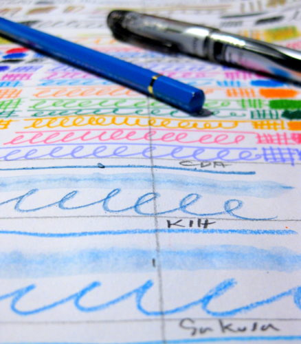
I’ve ranted and raved about acid free and to a point, archival, now being little more than a ridiculous marketing term, when the more important item to focus on is lightfastness.
What does lightfast mean? That when exposed to sunlight the color and shade of the item in question, be it paper, ink, or other pigmented item, doesn’t shift or change. That is to say, exposure to sunlight, or light, does not change the color of whatever has been used to make the artwork.
Does lightfastness mater? Only if you decide to make art for sale, or for yourself, that you plan to hang on the wall. If you don’t plan on making art for anyone but you and you intend for it to stay within the confines of your art journal, then no, lightfast matters little.
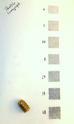
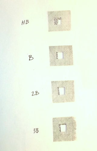
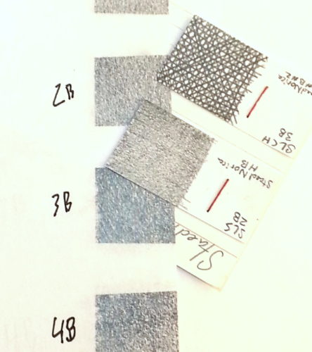
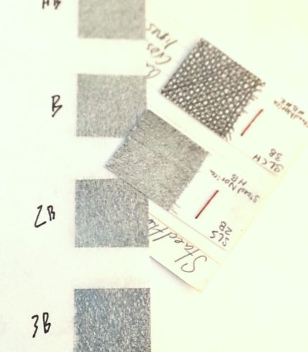
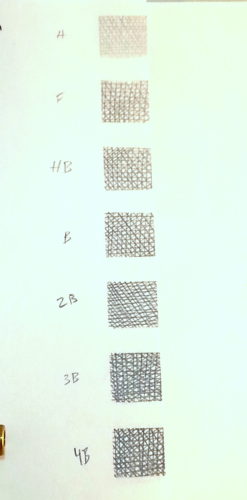
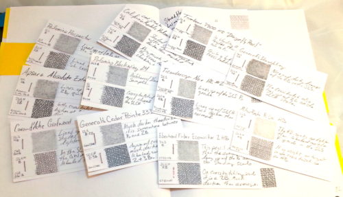
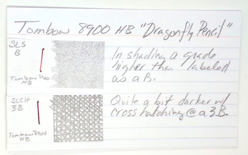
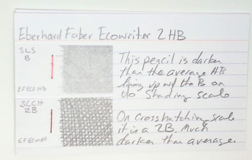
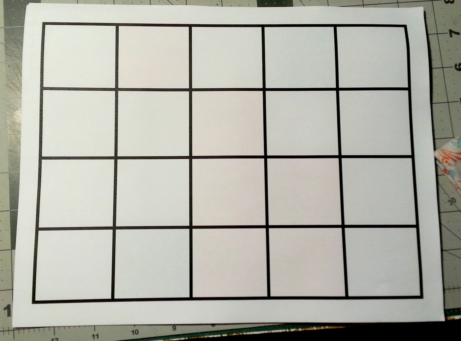
How does one test for lightfast? I have a sketchbook in which I divide a page into 2 columns with a number of rows that span both columns. The number of rows depends on what I’m testing. Generally, I make each row about 1 inch high. I use graphite pencil, as graphite is lightfast.
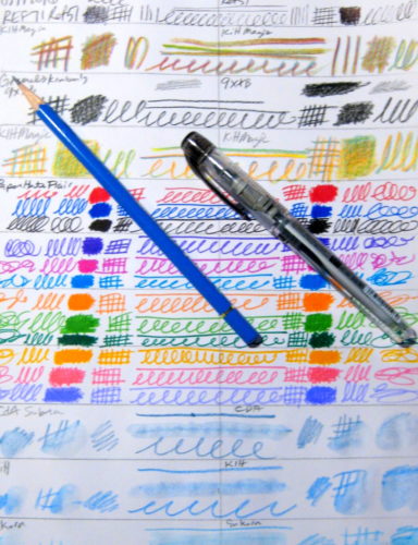
I label the top of the page with the date. I then fill in each row, across columns with various scribbles, hatches and line weights of the item I’m testing. With watercolors and markers I use a variety of amounts of pigment in water. After I’ve filled in a page, I cut off the right half of the page and hang it in a south facing window. I’ll notice shifts in color as quickly as in a week. The Kuretake Clean color brush markers? Oh so pretty, colors shifted in a week. Copic sketch markers? Same. Sharpies? Gone in 2, massive alterations in shade in a week.
Basically, I look at the sheet in a week, then again in 2 weeks. Sometimes it will take longer to notice changes if it has been cloudy or raining. Testing can also be done with a bulb that emits a full spectrum of light. Using sunlight is cheaper.
Why do I test? Not all of my art is made for sale, a great deal of what I create will never see the wall or sunlight other than when the pages of my journal are opened. But when I do create art that is for sale, it is important (to me) that if someone has paid me for my art that it is still there for them a year from now. I’ve sold work in the past only to find out that the pen I thought was lightfast, was indeed not.
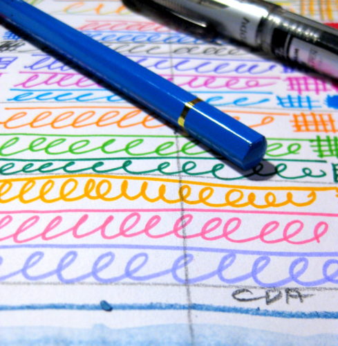
Oh before anyone asks, pencils made of graphite or carbon are lightfast. There is rarely any need to test them.
I’ve been seeing mentions of the TWSBI Precision for awhile now. When it first was introduced by TWSBI I drooled over it’s full metal body and retractable sleeve, all for $25. $25 is virtually unheard of when it comes to retractable tipped draughting pencils. Usually getting a retractable tipped pencil will cost $40 and up.
Initially, TWSBI was set to offer these in a range of colors, but it seems they are now set with just 2, silver and matte black. I ordered a black 0.7 with retractable tip*. It is $25 everywhere I’ve looked. I purchased mine from Jetpens. I suggest ordering via a 3rd party vendor for a number of reasons, but the biggest being that I’ve had shipping issues when ordering directly from TWSBI.
The Precision arrives in a card sleeve over a plastic box, with a foam insert to hold everything in place. Inside the box you have your pencil, 3 spare erasers, and a box of HB leads that are not labeled. The leads feel like classic Pentel Polymer HB leads. They are smooth and appropriately dark, but if you are like me you’ll soon switch over to Uni NanoDia in B or 2B. The erasers are each 2 inches long and a nice firm sticky eraser that really works well. I’m more than pleased with the TWSBI erasers. It’s the first mechanical eraser I’ve used and been pleased with. Not only is the eraser good, it’s of a meaningful length.
The pencil itself sports a knurled grip that is quite unique. Most knurled pieces feature a series of cuts that create a pattern of pyramids. The Precision uses a series of grids to create a series of rounded over rectangles. It’s grippy but doesn’t feel like I’m holding an emory board.** The grip area is a touch narrower than the rest of the hexagonal body. While the pencil is weighty, it’s not overly so. I’ve certainly used heavier fountain pens. But the all brass body on this pencil is reassuring. Because it is heavy I was quite worried that this would be uncomfortable for longer writing sessions. Now that I’ve used it for some time I find that it’s quite comfortable. It’s well balanced so it sits well in my hand and feels good even as I write my session note drafts as well as when I jot down quick ideas.
Because it’s a draughting pencil I had to take it apart and look at it’s guts. These are all metal all the way through. The guts are chromed and feel as sturdy as the body of the pen. I’m not sure what the inner bits are made of, but the body is brass. The tip and body threads are machined so well that I need to use a rubber band to gain enough grip to remove the tip from the body.
The nock mechanism is tight and sounds springy. By this I mean that I can hear the spring moving around as I depress the nock. Which has been described as metallic. It is a sharp noise. The nock itself is instantly engaged as soon as I depress it. This is in opposition to my KuruToga which has a spongy and less responsive nock mechanism. The Precision is louder than my Rotring 600, but not by much. I have to wonder if this is due to the metal body conducting sounds more directly than the plastic material in the Rotring 600.
I keep reaching for this pencil over and over again, over my Rotring 600 which is also new to my stable of mechanical pencils. Because of the retractable tip I’m able to slide this into my NockCo Fodderstack XL and take it with me without fear of damaging the tip or having the needle like tip stab me.
In short, I think if you enjoy mechanical pencils the TWSBI Precision is a must have. It’s really well made, feels great in the hand, and performs wonderfully. Thought TWSBI’s shipping is bunk, their customer service is wonderful. Should you have an issue, TWSBI will stand behind their products.
There are a lot of challenges on the internet- use this material, use that material, use only so many pens, etc… None of them really interested me. I dislike rules that aren’t my own… The first challenge that I’ve see that I really feel like I can do it the “6 Pencils for a Month” challenge that I first saw on the Erasable Facebook group.
Last month I struggled with which pencils to chose? I already had a pencil case full of 9 pencils. I chose not to take part in the challenge.
This month I decided to go with the following, with a few caveats, which I’ll detail later
My caveats, because I cannot follow someone else’s rules without also imposing my own to flaunt them, are as follow:
Another issue that I will be running into is that all summer I’ve knife sharpened all of my pencils into delicate hummingbird points. I’ve found that I can write for 4 or more pages with a pencil sharpened as such, and have grown quite fond of these points. The issue that I’m going to run into is that if I don’t point up my pencils before heading into school, I’m kinda screwed. I feel like I have to decide to either remember to sharpen the pencils the night before or sharpen them with the “long” point sharpener. *grumble* Knife sharpening in a outside of the art rooms is not looked upon kindly.
So that is my personal challenge, with caveats.
Because I am a visual person, I’ve always used some manner of large wall mounted calendar to keep track of the things I need to do. When I had a nifty office for my job, I had it mounted right next to my monitor and wrote in stuff as far in advance as I knew it was going to happen. I’d also add in a variety of things that were reoccurring. I attempted at one point to use a fancy Palm Pilot but it didn’t get my visual nature as well as a simple calendar.
Then I left my job and I used pocket planners alone, but I found that stuff would slip my mind. Last fall I started out with a simple piece of cardstock in a Trapper Keeper folder with a clear pocket on the front. Each class was assigned a color and I’d write out each assignment and the due date onto a Post-it of that color. I used the small 2×2 cube Post-its.
Not only was this visual, but when each task was accomplished I was able to rip the Post-it off, crumple it, then toss it into the trash. I’m telling you the feeling of tossing the Post-it was better than a gold star.
Enter this fall and a slightly fuller class load than the previous semesters, plus the looming possibility of having to write a thesis, and my simple piece of cardstock isn’t BIG enough. Yup, I’ve only got 2 of my 4 syllabi and the single sheet is full. Some of the notes are redundant- Blackboard responses to readings, ongoing art responses, etc… But for the most part, if I subtracted those, I’d still have a metric ton of Post-its. Plus, 2 more classes need to be added.
To accommodate the additional course load I decided to make a 5×4 landscape table in publisher, with a super thick grid. (PDF here.) Notice that there are no labels. I just write above the grid M-F. I omitted Saturday and Sunday because the grid was too small with them, and those days will simply be days for reading and writing, with the exception of weekends where I have class. I’ll have special Post-its for those weekends… Probably.
What this gives me is a flexible and HIGHLY visual calendar. I can see at a glance that the week of October 12-16th is going to be busy while the week of September 14th through 18th is going to be pretty quiet.
You can buy this already printed and with all 7 days from Post-it themselves. Or make one that works with whatever sticky notes you happen to have on hand. The grid was easy to set up in Publisher, but would also be just as easy to do in any word processing program like google docs.*
I also use Google Calendar to remind myself of reoccurring items like my Blackboard assignments. I tend to forget about things like that. though the due date is the day of the class, I tend to not have time on the day of the class and self impose that those assignments are finished in advance of the actual due date.